Why Your Marker Set Doesn’t Have a Dark Yellow
Where’s the Dark Yellow?
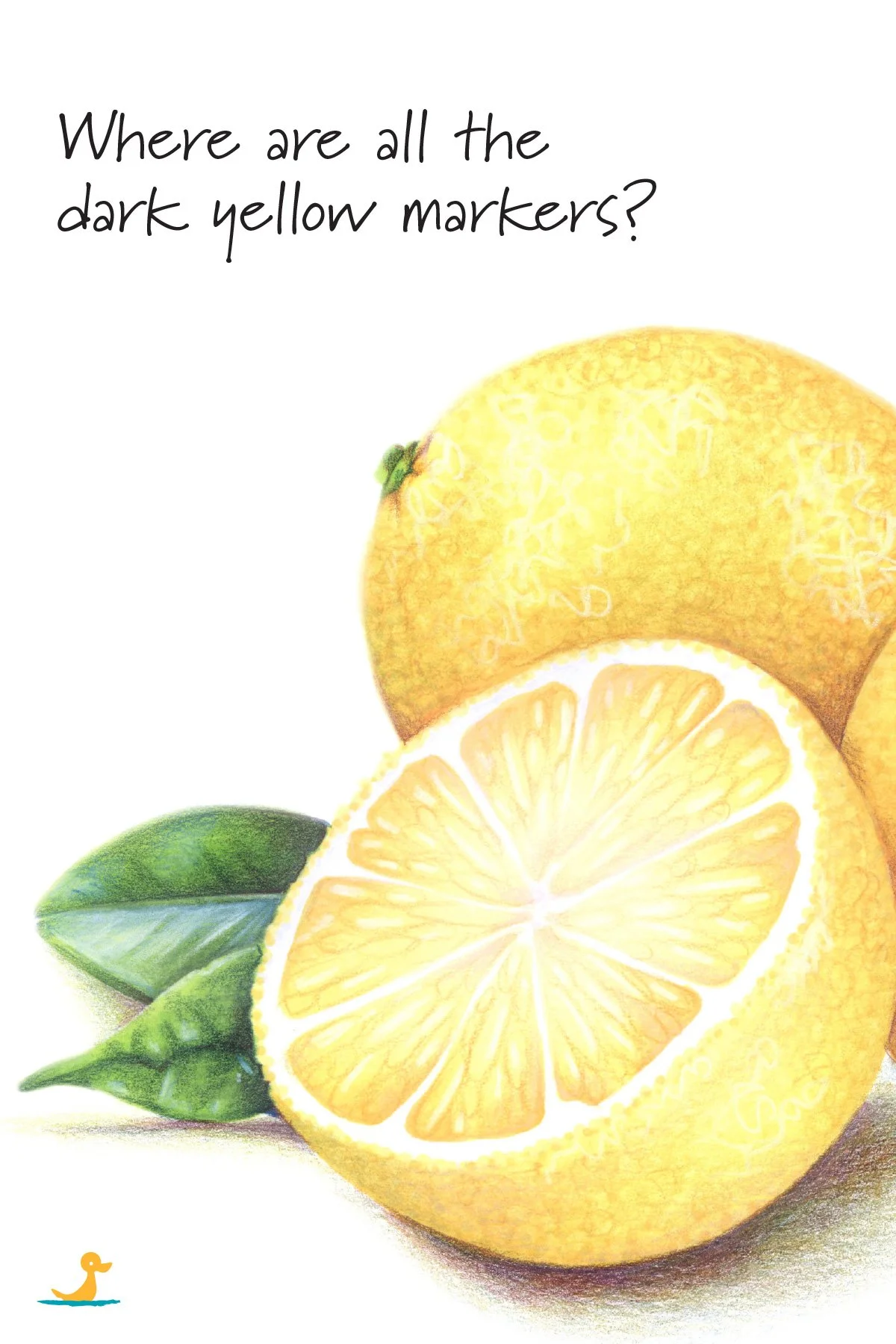
Bright yellow is easy to find.
Lemon yellow? Check.
Golden yellow? Got that too.
But the minute you want to shade any of that stuff? Uhhhh, you're outta luck.
So you shade yellow objects with orange markers.
Or you start with a lighter yellow than you actually wanted, so you have enough “darker yellows” left for shading.
But wait a minute...
Because your set does have dark yellows.
You just can't see 'em because you moved them over to the yuck section.
The problem is not the marker set
Copic has several dingy yellows in the Y family. Ohuhu has a similar number of murky yellow-browns.
These dark yellows exist.
The problem is, you don't see them as yellow.

Hiding in plain sight
Most colorists organize their markers and pencils and all their other art supplies in ROY G. BIV order: Red, orange, yellow, green, blue, indigo, violet.
Which works beautifully until brown shows up and ruins the seating chart.
Brown is what we call an "extra-spectral color" which means it does not fit into the rainbow.
Brown is a mixed color, I made a video all about it which you can watch here.
So when it comes time to organize your marker rainbow, most colorists make a separate brown, neutral, “yuck” section.
And guess where the dark yellows end up?
In the mud.
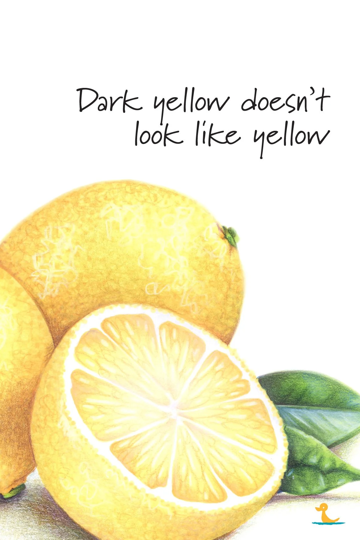
Dark yellow doesn't look like yellow
That's the key.
Dark yellow is not simply a bright yellow moved a little left or right on the color wheel.
Dark yellow loses chroma. It loses purity. It loses vibrancy.
The effect is that as yellow gets darker, it somehow feels less-than-yellow.
Your dark yellows are hiding under assumed names like:
ochre
mustard
olive yellow
dull gold
dirty cream
greenish tan
And I get it-- these are definitely not the pretty, sunshiny, cheerful yellows people want to color with.
Which is why you organized them down into the brown zone, right?
But later... and there's always a later, right?
Later, when you need to shade a lemon, you look in the yellow section and think you have no dark yellow.
But you do.
You just didn't think you'd ever need it.
Shading with black is not the answer
A common instinct is to darken yellow with black or gray.
Sounds good.
Looks terrible.
Yellow mixed with black reads as swamp green. Instead of creating a shady yellow, it looks like a week old bruise.
This is why professional artists often shade yellow with its complement instead.
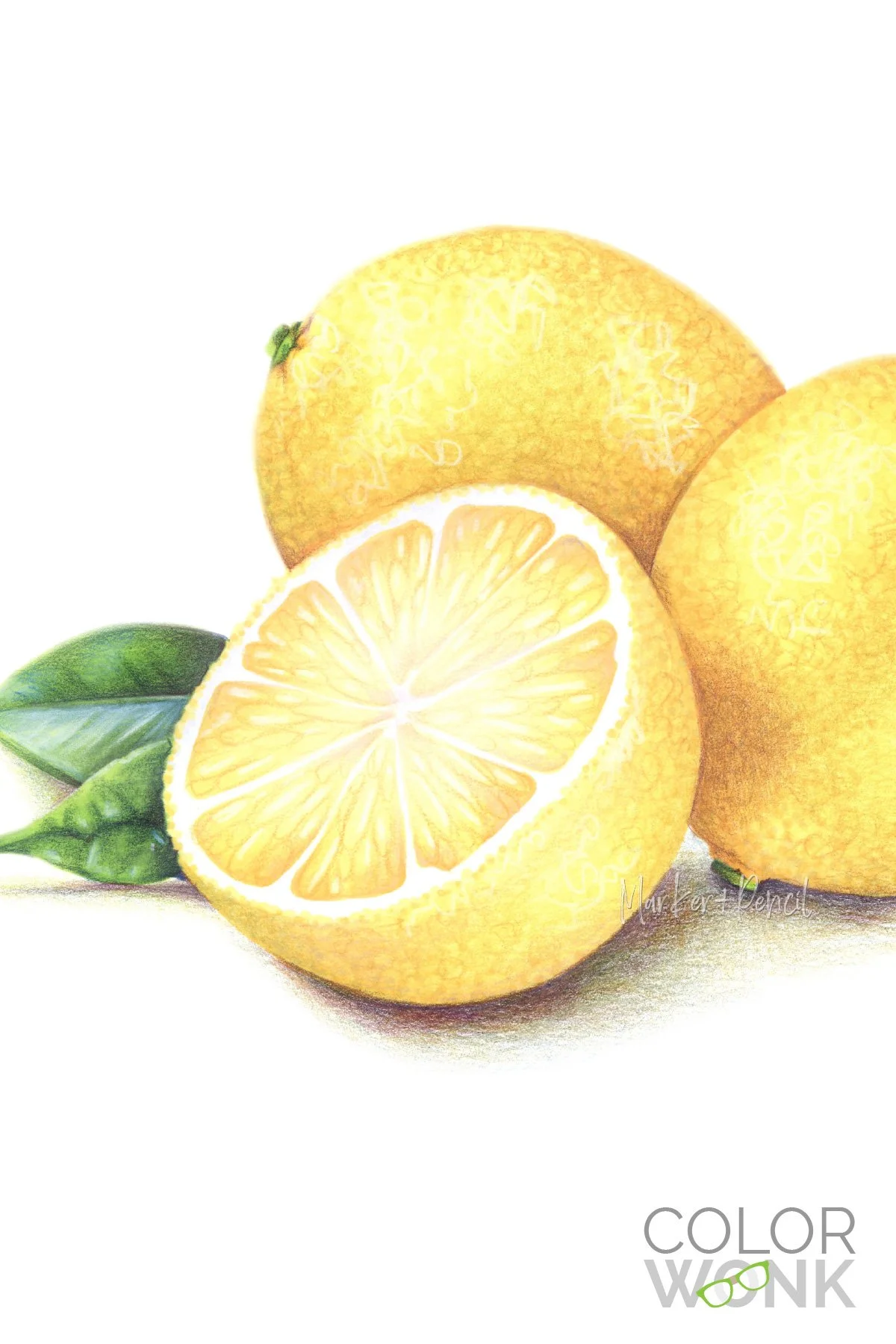
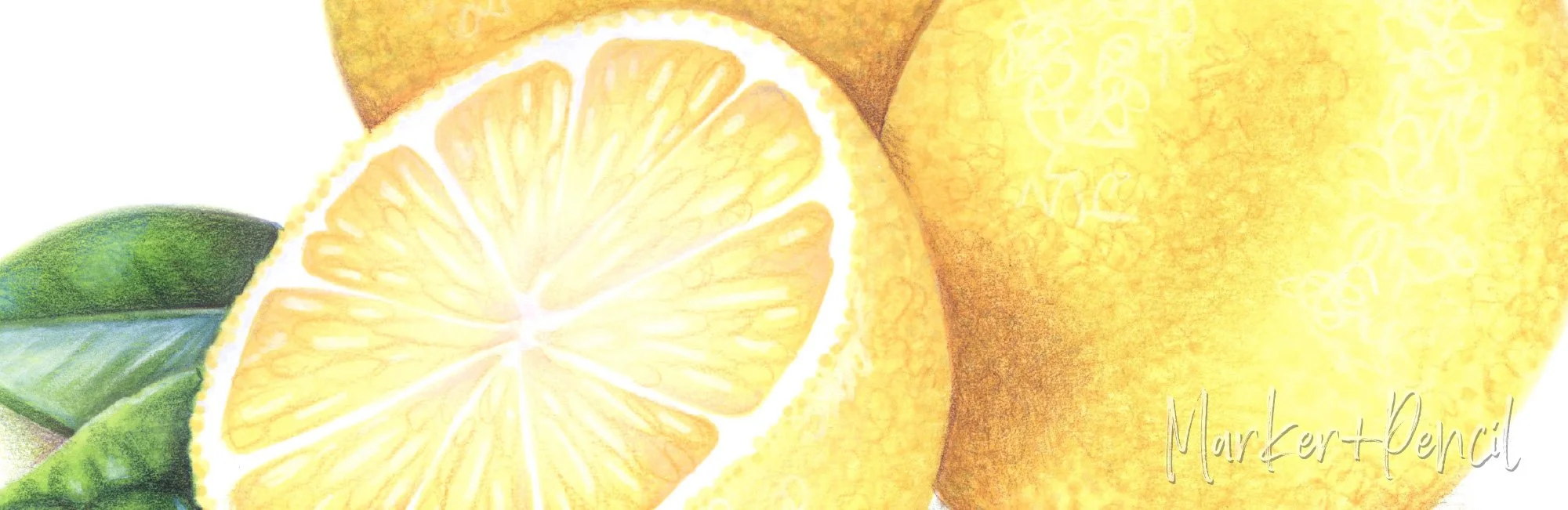
Yellow shaded with purple creates a warm shady color... like my lemons here. I shaded them with this purple pencil.
And yellow shaded with violet makes a cooler kind of shade. My rainboots were shaded with this violet pencil
Purple and violet neutralize yellow without pushing it into the orange or green families.
Why orange is risky
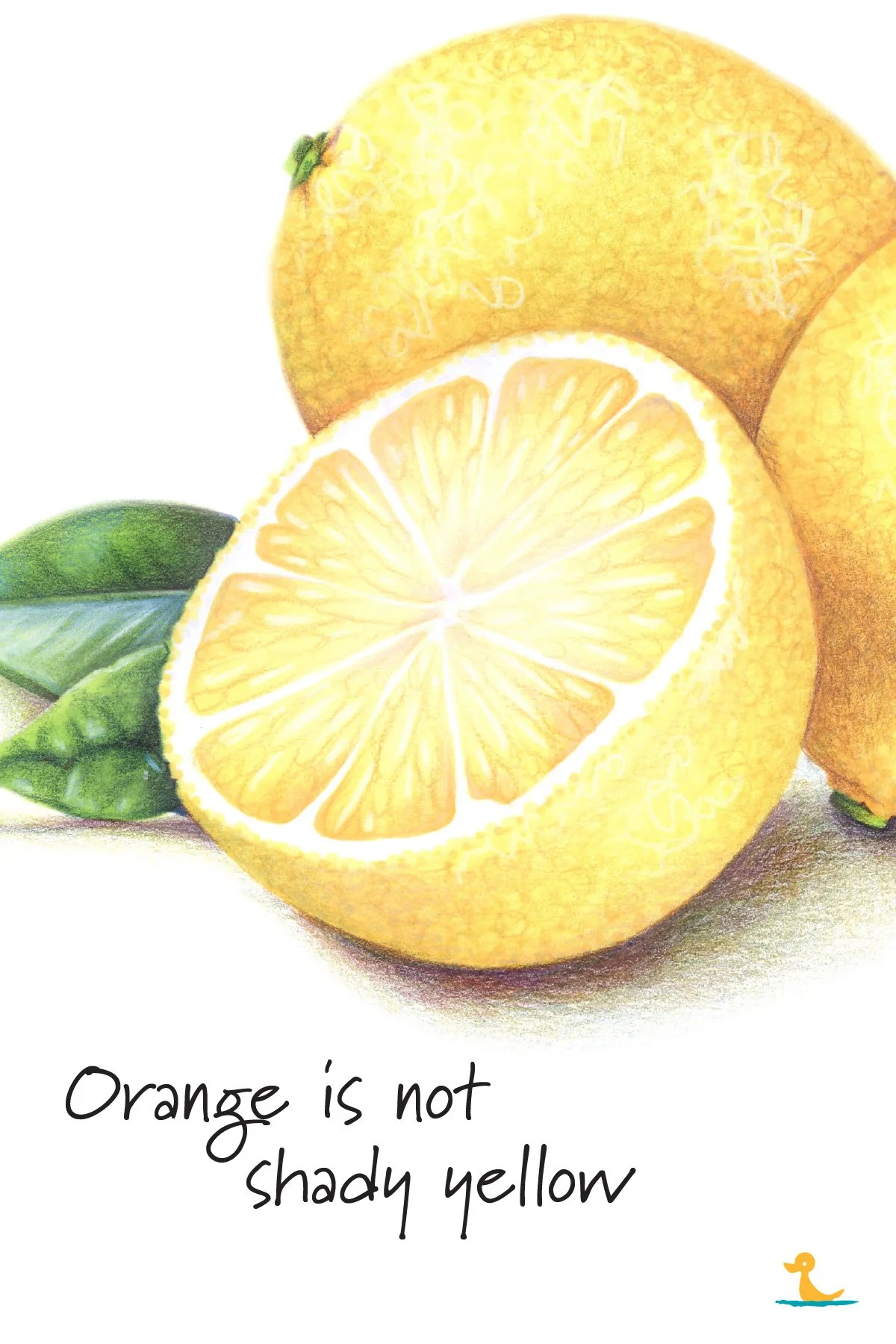
Orange feels like the obvious workaround and I'll admit, it's pretty rare to find a coloring tutorial that doesn't encourage this easy solution.
Orange feels darker than yellow. And the two colors are closely related. Orange sits right next to yellow on the color wheel. So orange feels logical.
But yellow has a very narrow identity.
Even a tiny shift toward orange can delete the feeling of yellow.
A lemon shaded with orange doesn't even look like like a lemon anymore. Suddenly it's a tangerine or some weird half-ripened clementine.
There's also the Chernobyl problem.
Orange is a loud and obnoxious color, there's a reason road cones and warning signs are orange.
So when you shade a introverted little lemon with orange, suddenly that shade feels lighter, brighter, and more in your face than the lemon itself.
Shade's not supposed to do that.
Orange is not automatically wrong.
But orange is most definitely not “shady yellow.”
How to spot shady yellow markers and pencils
Put your ugly yellows back into the yellow family.
I know it'll mess up your perfect rainbow, but the goal is to start seeing these colors as yellow rather than yuck.
Line up your bright yellows first, then place the dingy yellows, ochres, goldenrods, yellow-browns, olive yellows, and greeny-grays into your yellow section.
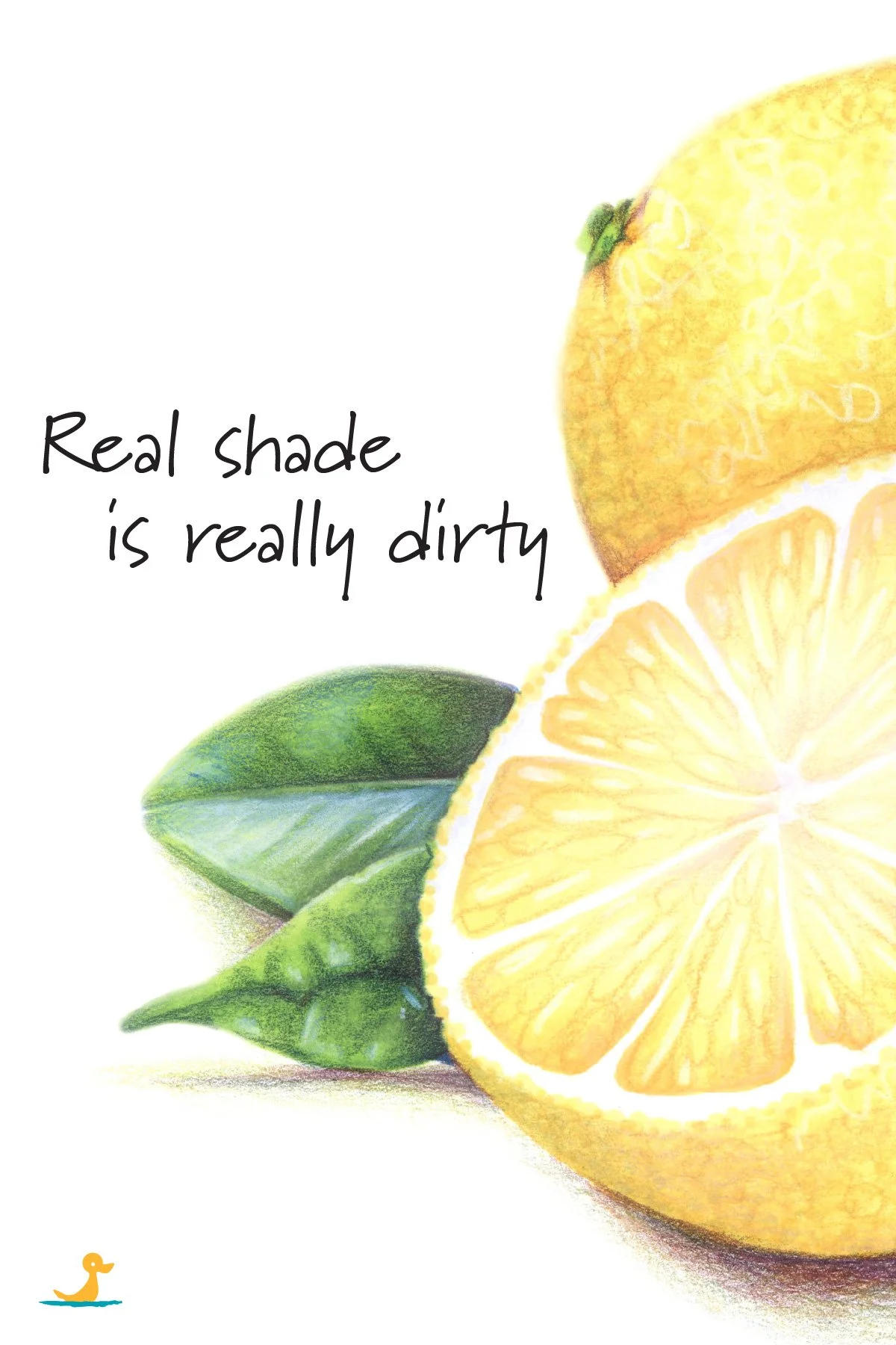
The more you see shady yellows in context, the more they'll feel like yellow relatives and partners, not strangers.
And don't talk yourself out of it because shady yellows feel to "too brown."
Every brown is a mixture. Some browns are greenish, some are reddish, and some are more golden or tan. When taken as a whole, most browns barely feel related.
The E family isn't a color family.
It's an orphanage.
If you can't spot the flavors of brown by eye, I have a tutorial here to help.
Just remember that the golden, yellow-based browns are your mis-filed dark yellows.
Shady yellows are the wallflowers.
They don't look like much standing all by themself but get 'em on the dance floor and they're the life of your yellow party.
The common mistake
The mistake is not that you need more markers or more pencils.
I mean, you can search high and low for better dark yellows but if you're looking for "yellow", you're never going to spot them.
The mistake is sorting supplies by how they look instead of how they behave.
A yellow-tan may look useless in the marker case.
But it may be exactly the shady color you need.
When life gives you lemons...
This is the color conundrum behind Lemon Zest.
The lesson is not “how to color lemons.”
It is about color-sculpting realistic and rounded lemons without turning them orange, brown, green, or muddy.
Yellow realism depends on finding the hidden dark yellows that rainbow-organization rejected.
Lemon Zest takes a closer, artistic look at yellow shading, creating the perfect dark yellows through layering, and why the correct color is often the one that originally made you say "yuck!"