B39 Prussian Blue: Copics Uncapped (Marker Swatch, Ink Testing)
B39 Prussian Blue
Let’s take a closer look at this Copic Marker and it’s ink characteristics.


B39 Prussian Blue is a green-shade blue Copic Marker reminiscent of Phthalo Blue watercolor. This intense marker color is useful for night skies, denim, and makes a beautiful underpaint. B39 is available in Copic Sketch, Ciao, and Classic marker styles.
Every Copic Marker has unique characteristics based on its unique ink formula.
Knowing how a color behaves will help you blend effectively and make art with confidence.
B39 Prussian Blue
Let’s take a closer look at this Copic Marker and its ink characteristics.
Temperature: A green-shade blue.
Resemblance: Phthalo Blue watercolor.
Actual Value: N9
All Copics are measured on a Neutral Gray value scale. The last number on the cap is supposed to indicate value but we’ve found discrepancies where the actual ink value is different than cap designation.
Cap Accuracy: Absolutely not! The cap is very misleading as the plastic on a Sketch marker is twice as dark as the actual ink.
Buildup: B39 has a moderate level of colorant. Exercise caution with more than 3 layers.
Shattering: Easily shatters into blue and magenta.
Chromatography testing shows this ink’s behavior when it comes in contact with #0 Colorless Blender (solvent). High shattering colors may leak unexpected color when you make corrections or attempt to blend with any color that has a high solvent to colorant ratio. Shattering is not bad, it’s just something to be aware of.

Staining: B39 like most blues, is not staining color but it is a bit clingier than expected.
Lift: Lifts with some effort. It’s not “erasable” but you should be able to push the color out of the way when making corrections.
See staining swatch. Sample was given 6 stripes of #0 Colorless Blender, drying between each stripe. Results indicate how much lifting you can expect.
Lightfast: Moderate lightfastness. The test sample did not change much but based on the B34 results, we know this color will fade during an extended test.
Samples were swatched on X-Press It Blending Card. 1 layer of ink was exposed to windowsill sunlight for 21 days. Approximately 10 hours of sun per day based on weather conditions. Note: we do not recommend displaying original Copic art under these conditions.
Natural Ink Family: B39 is the darkest marker in the B30 family but the parent ink is certainly a much darker blue, similar to what you see in blue ballpoint pens. B32 is the most diluted version that Copic currently makes. B30 would be a very welcome addition to the family.
I see a weird temperature discrepancy between B39 and the other B30s. Maybe it’s just my eyes. The other B30s feel like Phthalo Blue Green Shade watercolor. B39 should feel the greenest of them all, especially given the name Prussian Blue. And yet it doesn’t lean as green as I expected.
Family Members: B39, B37, B34, B32
We include this information because many Copic users never think deeper than the letter groupings (R, BV, G, etc.). Every ink has its own temperature variations and underlying flavors. Understanding what an ink looks like in its different dilutions helps when creating your own blending combinations.
Complement: A traditional orange. We suggest YR07 or YR16.
Underpaint: We suggest V09.
This is simply one suggestion. Many possible colors exist. Test to find a color that pleases you.
Pushing Pencil: Prismacolor 1067 90% Cool Grey pushes this color nicely.
VanillaArts.com (our sister site) teaches a Push & Pull technique for dimensional coloring. This is simply one suggestion. Many possible colors exist. Test to find a color that pleases you.
Vanilla Arts Classes using B39:

Copperbanded Butterflyfish: Amy explores the difference between pattern and texture. Find more info here.
We continue to create new content and classes and we will update here as more become available.
Visit the workshop resource page at our sister site VanillaArts.com for a wide variety of Copic classes.
Vanilla Arts Digi Stamps using B39:

Penny Candy: an incredibly flexible image- the color options are completely up to you! Use my sample color palette or make substitutions to match your favorite colors. Find more info here.

Vanilla Stamp Shop: a wide variety of Amy Shulke’s original, hand drawn digi stamps. Found at our sister site VanillaArts.com. Visit the stamp shop here.
Color palettes and swatches using B39:
We are building our palette and swatch collection a little more each week and will update here as more become available.
Visit the color resource page at our sister site VanillaArts.com for a wide variety of Copic palettes and swatches.
Looking for beautiful color palettes?
We absolutely love The Color Catalog 1 & 2 from Sarah Renae Clark. It puts hundreds of Copic friendly color palettes at your fingertips.
(note: affiliate link)














B37 Antwerp Blue: Copics Uncapped (Marker Swatch, Ink Testing)
B37 Antwerp Blue
Let’s take a closer look at this Copic Marker and it’s ink characteristics.
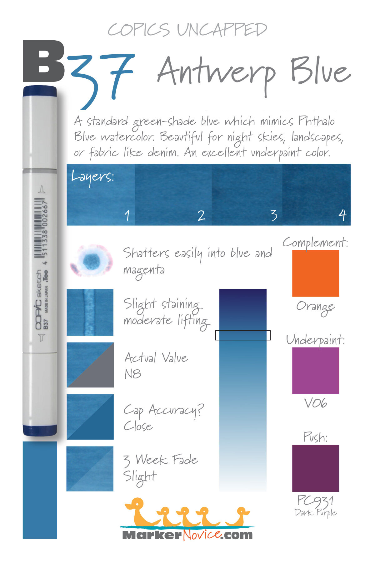
B37 Antwerp Blue is a standard green-shade blue Copic Marker reminiscent of Phthalo Blue watercolor. This intense marker color is useful for night skies, denim, and makes a beautiful underpaint. B37 is only available in Copic Sketch and Classic marker styles.
Every Copic Marker has unique characteristics based on its unique ink formula.
Knowing how a color behaves will help you blend effectively and make art with confidence.
B37 Antwerp Blue
Let’s take a closer look at this Copic Marker and its ink characteristics.
Temperature: A balanced blue that leans slightly green-shade.
Resemblance: Phthalo Blue watercolor.
Actual Value: N8
All Copics are measured on a Neutral Gray value scale. The last number on the cap is supposed to indicate value but we’ve found discrepancies where the actual ink value is different than cap designation.
Cap Accuracy: The plastic on a Sketch cap is the same color as 4 coats of B37. It’s often a surprise to see the ink is lighter than expected.
Buildup: B37 has a moderate level of colorant. Exercise caution with more than 3 layers.
Shattering: Easily shatters into blue and magenta.
Chromatography testing shows this ink’s behavior when it comes in contact with #0 Colorless Blender (solvent). High shattering colors may leak unexpected color when you make corrections or attempt to blend with any color that has a high solvent to colorant ratio. Shattering is not bad, it’s just something to be aware of.

Staining: B37 like most blues, is not staining color but it is a bit clingier than expected.
Lift: Lifts with some effort. It’s not “erasable” but you should be able to push the color out of the way when making corrections.
See staining swatch. Sample was given 6 stripes of #0 Colorless Blender, drying between each stripe. Results indicate how much lifting you can expect.
Lightfast: Moderate lightfastness. The test sample did not change much but based on the B34 results, we know this color will fade during an extended test.
Samples were swatched on X-Press It Blending Card. 1 layer of ink was exposed to windowsill sunlight for 21 days. Approximately 10 hours of sun per day based on weather conditions. Note: we do not recommend displaying original Copic art under these conditions.
Natural Ink Family: B37 is a slight dilution of B39, a dark Prussian Blue. B32 is the most diluted version that Copic currently makes. B30 would be a very welcome addition to the family.
Family Members: B39, B37, B34, B32
We include this information because many Copic users never think deeper than the letter groupings (R, BV, G, etc.). Every ink has its own temperature variations and underlying flavors. Understanding what an ink looks like in its different dilutions helps when creating your own blending combinations.
Complement: A traditional orange. We suggest YR07 or YR16
Underpaint: We suggest V06
This is simply one suggestion. Many possible colors exist. Test to find a color that pleases you.
Pushing Pencil: Prismacolor 931 Dark Purple makes beautiful pushes.
VanillaArts.com (our sister site) teaches a Push & Pull technique for dimensional coloring. This is simply one suggestion. Many possible colors exist. Test to find a color that pleases you.
Vanilla Arts Classes using B37:


Big Sable Point: A lesson on coloring realistic landscapes. Find more info here.
Color palettes and swatches using B37:
We are building our palette and swatch collection a little more each week and will update here as more become available.
Visit the color resource page at our sister site VanillaArts.com for a wide variety of Copic palettes and swatches.
Looking for beautiful color palettes?
We absolutely love The Color Catalog 1 & 2 from Sarah Renae Clark. It puts hundreds of Copic friendly color palettes at your fingertips.
(note: affiliate link)


B34 Manganese Blue: Copics Uncapped (Marker Swatch, Ink Testing)
B34 Manganese Blue
Let’s take a closer look at this Copic Marker and it’s ink characteristics.


B34 Manganese Blue is a green-shade blue Copic Marker reminiscent of Phthalo Blue watercolor. This beautiful marker color is useful for summer skies, denim, and blue eyes. Makes an excellent underpaint color. B34 is available only in Copic Sketch and Classic marker styles.
Every Copic Marker has unique characteristics based on its unique ink formula.
Knowing how a color behaves will help you blend effectively and make art with confidence.
B34 Manganese Blue
Let’s take a closer look at this Copic Marker and it’s ink characteristics.
Temperature: A balanced blue that looks a bit green-shade, but not much.
Resemblance: Diluted Phthalo Blue watercolor.
Actual Value: N4
All Copics are measured on a Neutral Gray value scale. The last number on the cap is supposed to indicate value but we’ve found discrepancies where the actual ink value is different than cap designation.
Cap Accuracy: The plastic on a Sketch cap is a close match to B34.
Buildup: B34 has a low level of colorant and high level of solvent in the formula. This color layers beautifully.
Shattering: No shattering.
Chromatography testing shows this ink’s behavior when it comes in contact with #0 Colorless Blender (solvent). High shattering colors may leak unexpected color when you make corrections or attempt to blend with any color that has a high solvent to colorant ratio. Shattering is not bad, it’s just something to be aware of.

Staining: B34 like most blues, is not staining color.
Lift: Very easy lifting and could be considered “erasable”.
See staining swatch. Sample was given 6 stripes of #0 Colorless Blender, drying between each stripe. Results indicate how much lifting you can expect.
Lightfast: Poor lightfastness. This color faded quickly and we suspect would disappear entirely if we extended the test time.
Samples were swatched on X-Press It Blending Card. 1 layer of ink was exposed to windowsill sunlight for 21 days. Approximately 10 hours of sun per day based on weather conditions. Note: we do not recommend displaying original Copic art under these conditions.
Natural Ink Family: B34 is a moderately diluted version of B39, a dark Prussian Blue.
Family Members: B39, B37, B34, B32
We include this information because many Copic users never think deeper than the letter groupings (R, BV, G, etc.). Every ink has its own temperature variations and underlying flavors. Understanding what an ink looks like in its different dilutions helps when creating your own blending combinations.
Complement: A medium orange. We suggest YR15
Underpaint: We suggest V25
This is simply one suggestion. Many possible colors exist. Test to find a color that pleases you.
Pushing Pencil: Prismacolor 901 Indigo Blue works beautifully over B34. It’s not a revolutionary choice but it works.
VanillaArts.com (our sister site) teaches a Push & Pull technique for dimensional coloring. This is simply one suggestion. Many possible colors exist. Test to find a color that pleases you.
Vanilla Arts Classes using B34:
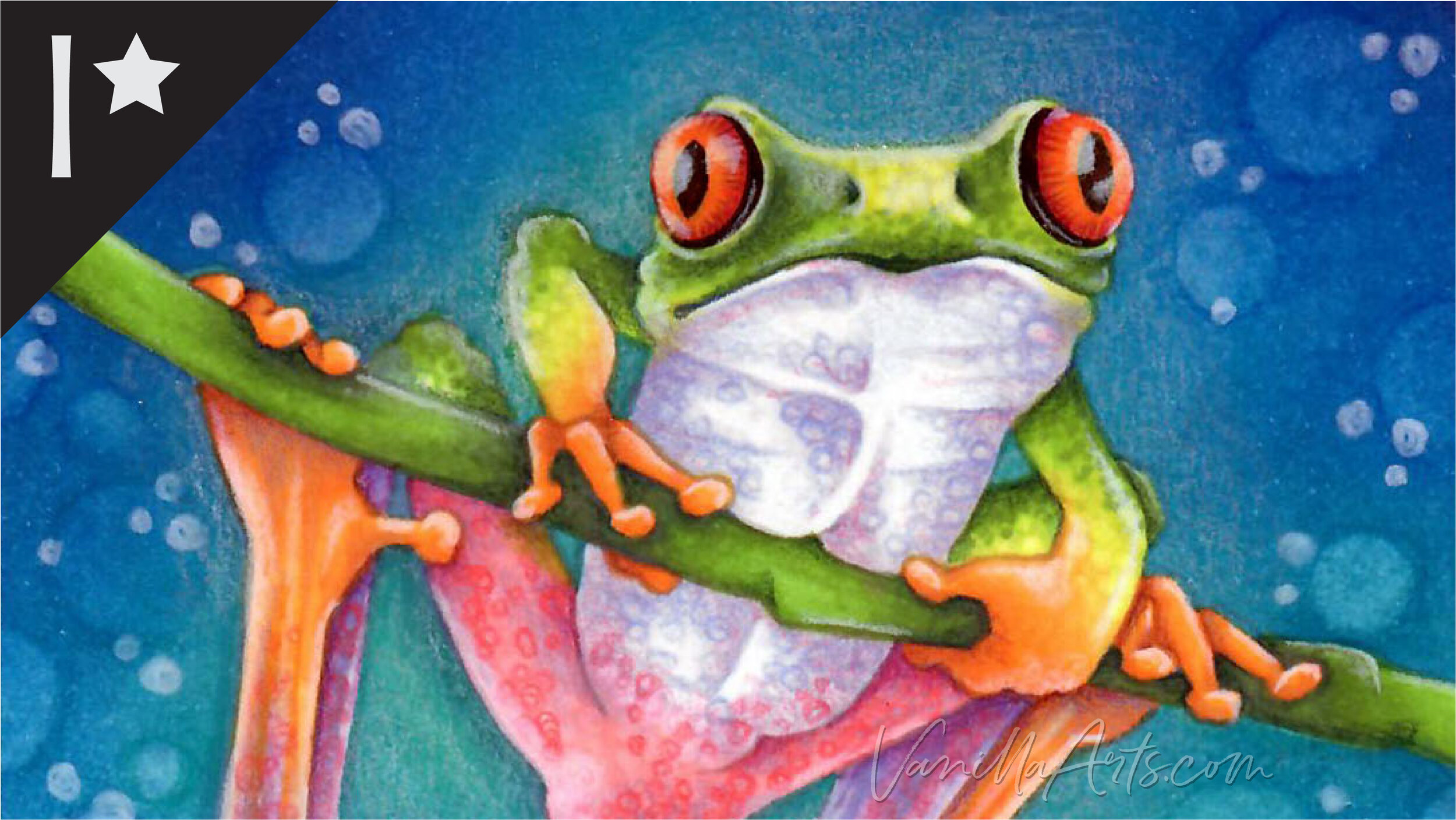
Tree Frog: Join Amy for a challenging lesson on rebel blending that blends green into yellow into violet into pink into white. Find more info here.
Vanilla Arts Digi Stamps using B34:
Snowman Supplies: an incredibly flexible stamp, perfect for birthdays, anniversaries, or any party. Find more info here.

We are building our palette and swatch collection a little more each week and will update here as more become available.
Visit the color resource page at our sister site VanillaArts.com for a wide variety of Copic palettes and swatches.
Looking for beautiful color palettes?
We absolutely love The Color Catalog 1 & 2 from Sarah Renae Clark. It puts hundreds of Copic friendly color palettes at your fingertips.
(note: affiliate link)


B32 Pale Blue: Copics Uncapped (Marker Swatch, Ink Testing)
B32 Pale Blue
Let’s take a closer look at this Copic Marker and it’s ink characteristics.


B32 Pale Blue is a green-shade blue Copic Marker which looks like diluted Phthalo Blue watercolor. This mild marker color is useful for sunny skies, clothing, and makes an excellent underpaint. B32 is available in Copic Sketch, Ciao, and Classic marker styles.
Every Copic Marker has unique characteristics based on its unique ink formula.
Knowing how a color behaves will help you blend effectively and make art with confidence.
B32 Pale Blue
Let’s take a closer look at this Copic Marker and it’s ink characteristics.
Temperature: A balanced blue that looks a bit green-shade, but not much.
Resemblance: Diluted Phthalo Blue watercolor.
Actual Value: N3.5 (darker than N3 but lighter than N4)
All Copics are measured on a Neutral Gray value scale. The last number on the cap is supposed to indicate value but we’ve found discrepancies where the actual ink value is different than cap designation.
Cap Accuracy: The plastic on a Sketch cap is a close match to B32. The plastic is just a bit cooler than the ink though which can lead to some confusion when you don’t get the cool blue expected.
Buildup: B32 has a low level of colorant and high level of solvent in the formula. This color layers beautifully.
Shattering: No shattering.
Chromatography testing shows this ink’s behavior when it comes in contact with #0 Colorless Blender (solvent). High shattering colors may leak unexpected color when you make corrections or attempt to blend with any color that has a high solvent to colorant ratio. Shattering is not bad, it’s just something to be aware of.

Staining: B32 like most blues, is not staining color.
Lift: Very easy lifting and could be considered “erasable”.
See staining swatch. Sample was given 6 stripes of #0 Colorless Blender, drying between each stripe. Results indicate how much lifting you can expect.
Lightfast: Terrible lightfastness. This color faded in the first week of testing and disappeared before the end of the testing period.
Samples were swatched on X-Press It Blending Card. 1 layer of ink was exposed to windowsill sunlight for 21 days. Approximately 10 hours of sun per day based on weather conditions. Note: we do not recommend displaying original Copic art under these conditions.
Natural Ink Family: B32 is a very diluted version of B39, a dark Prussian Blue.
Family Members: B39, B37, B34, B32
We include this information because many Copic users never think deeper than the letter groupings (R, BV, G, etc.). Every ink has its own temperature variations and underlying flavors. Understanding what an ink looks like in its different dilutions helps when creating your own blending combinations.
Complement: A light orange. We suggest YR12
Underpaint: We suggest V22
This is simply one suggestion. Many possible colors exist. Test to find a color that pleases you.
Pushing Pencil: Prismacolor 901 Indigo Blue works beautifully over B32. It doesn’t feel clever or revolutionary but it works.
VanillaArts.com (our sister site) teaches a Push & Pull technique for dimensional coloring. This is simply one suggestion. Many possible colors exist. Test to find a color that pleases you.
Vanilla Arts Classes using B32:

Candlelight: Amy explores her method for creating soft glows and lens flares. Find more info here.
Color palettes and swatches using B32:
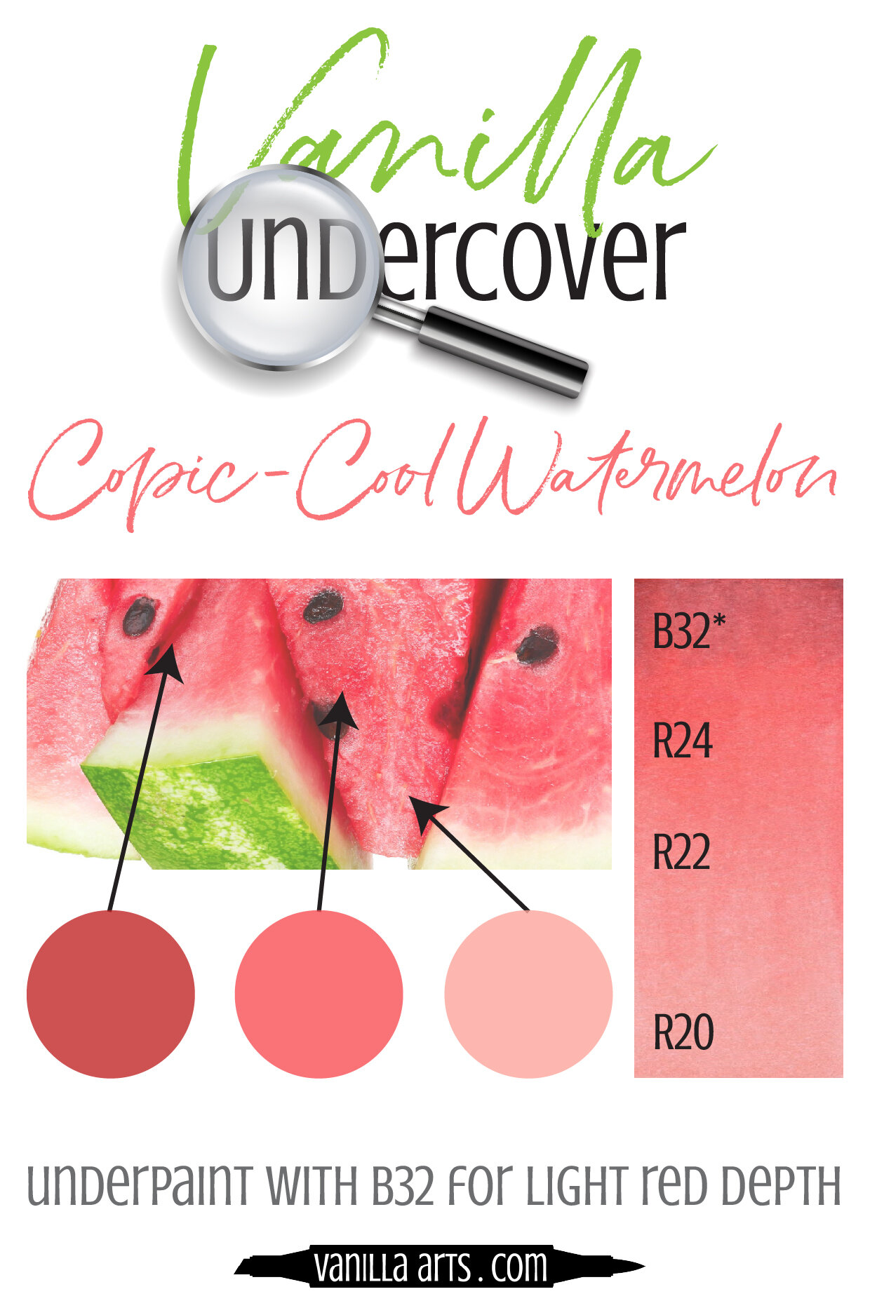
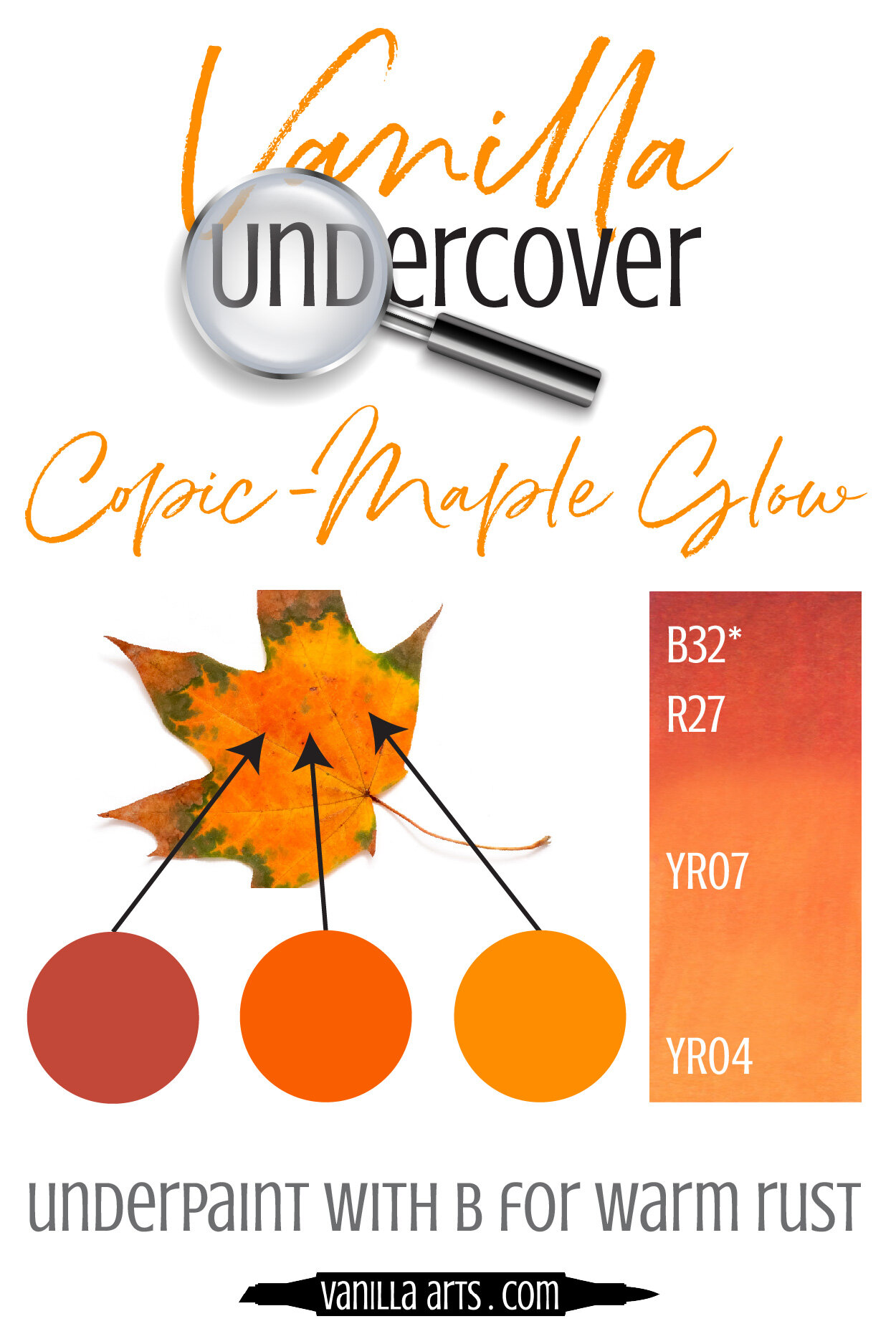


Visit the color resource page at our sister site VanillaArts.com for a wide variety of Copic palettes and swatches.
Looking for beautiful color palettes?
We absolutely love The Color Catalog 1 & 2 from Sarah Renae Clark. It puts hundreds of Copic friendly color palettes at your fingertips.
(note: affiliate link)


B29 Ultramarine: Copics Uncapped (Marker Swatch, Ink Testing)
B29 Ultramarine
Let’s take a closer look at this Copic Marker and it’s ink characteristics.


B29 Ultramarine is a red-shade, all purpose blue Copic Marker which closely resembles Ultramarine watercolor. This intense marker color is useful for clothing, water, and birds. B29 is available in Copic Sketch, Ciao, and Classic marker styles and is an excellent first purchase.
Every Copic Marker has unique characteristics based on its unique ink formula.
Knowing how a color behaves will help you blend effectively and make art with confidence.
B29 Ultramarine
Let’s take a closer look at this Copic Marker and it’s ink characteristics.
Temperature: A mildly reddish blue.
There is much debate in the art community over the true temperature of Ultramarine. Personally I think of Ultramarine paint as a neutral blue and the B29 marker feels slightly cooler than traditional Ultramarine.
Resemblance: Looks like a standard Ultramarine watercolor paint.
Actual Value: N9
All Copics are measured on a Neutral Gray value scale. The last number on the cap is supposed to indicate value but we’ve found discrepancies where the actual ink value is different than cap designation.
Cap Accuracy: Yes. The plastic end of a Sketch Marker matches 2 coats of the ink.
Buildup: B29 contains a lot of colorant. Caution should be used when layering beyond 2 coats.
Shattering: Does not shatter at all.
Chromatography testing shows this ink’s behavior when it comes in contact with #0 Colorless Blender (solvent). High shattering colors may leak unexpected color when you make corrections or attempt to blend with any color that has a high solvent to colorant ratio. Shattering is not bad, it’s just something to be aware of.
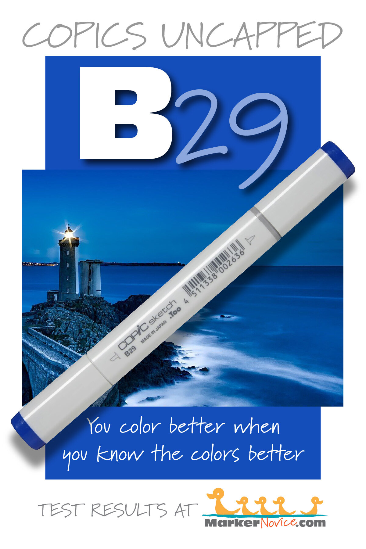
Staining: No staining. Blue Copics do not usually stain and even though this marker is a value 9, it doesn’t bond well with paper fibers. See the shattering sample for how easily it detached from the paper.
Lift: Lifts very easily. 6 applications was not enough to erase B29 but this is one of the few dark Copics which offers you a chance to make corrections.
See staining swatch. Sample was given 6 stripes of #0 Colorless Blender, drying between each stripe. Results indicate how much lifting you can expect.
Lightfast: Significant fading. We estimate more than 50% loss and assume this marker could fade to nothing if given time.
Samples were swatched on X-Press It Blending Card. 1 layer of ink was exposed to windowsill sunlight for 21 days. Approximately 10 hours of sun per day based on weather conditions. Note: we do not recommend displaying original Copic art under these conditions.
Natural Ink Family: B29 is the mother ink used to make the entire B20 family. All B20’s are dilutions of this marker.
Family Members: B29, B28, B26, B24, B23, B21.
We include this information because many Copic users never think deeper than the letter groupings (R, BV, G, etc.). Every ink has its own temperature variations and underlying flavors. Understanding what an ink looks like in its different dilutions helps when creating your own blending combinations.
Complement: Golden Orange, try Y38 or Y15
Underpaint: We suggest W07 (a warm gray to neutralize the cool shifted blue)
This is simply one suggestion. Many possible colors exist. Test to find a color that pleases you.
Pushing Pencil: We suggest Prismacolor 1067 90% Cool Grey
VanillaArts.com (our sister site) teaches a Push & Pull technique for dimensional coloring. This is simply one suggestion. Many possible colors exist. Test to find a color that pleases you.
Vanilla Arts Classes using B29:
We continue to create new content and classes and we will update here as more become available.
Visit the workshop resource page at our sister site VanillaArts.com for a wide variety of Copic classes.
Vanilla Arts Digi Stamps using B29:
We continue to create new content and stamps and we will update here as more become available.
Visit the stamp shop page at our sister site VanillaArts.com for a wide variety of Vanilla Arts stamps
Color palettes and swatches using B29:
We are building our palette and swatch collection a little more each week and will update here as more become available.
Visit the color resource page at our sister site VanillaArts.com for a wide variety of Copic palettes and swatches.
Looking for beautiful color palettes?
We absolutely love The Color Catalog 1 & 2 from Sarah Renae Clark. It puts hundreds of Copic friendly color palettes at your fingertips.
(note: affiliate link)