

Best Paper for Alcohol Markers: 6 Recommendations (2024)
What’s the best paper for coloring with Alcohol Markers?
Are you new to Copic, Olo, Ohuhu, Spectrum Noir, or Pro-Markers?
Or maybe you’ve been coloring for a while and you’re finally ready to invest in better paper? I’ve got six excellent papers for you to try plus a list of not-recommended papers.

The Best Paper for Alcohol Markers
Recommendations for beginners, intermediate, and advanced levels
What’s the Best Paper for Alcohol Markers?
Are you new to Copic Markers, Olo, Ohuhu, or Pro-Markers?
Or maybe you’ve been using markers for a while and you’re finally ready to invest in better paper?
My name is Amy Shulke— I’m a freelance technical illustrator and marker instructor. I’ve used art markers since my first year of art school back in 1989. I’ve tried a lot of marker papers. Which do I recommend?
First, relax. “Best paper” doesn’t exist.
Some brands are better than others but there isn’t one universal paper that works for everyone.
Today, I’m sharing my top six marker papers but it’s just my opinion.
From the size of our drawings to the colors we use— we have different needs. So there’s not one perfect paper for everyone.
But in general:
Those who color simple small stamped images with heavy outlines can get away with craft grade paper.
The larger you color, the more you need artist grade paper.
Anyone who blends needs a better quality paper.
If you use a lot of red, orange, pink, and violet you’ll need a premium paper.
And the newer you are to markers, the more you’ll benefit from better paper.
So let’s talk paper today but this is an opinionated conversation, not a declaration.
Try several brands to find which performs best for you.
BEGINNER WARNING!
Throughout this article, I’ll cover a few common myths and mistakes about marker paper. Here’s the first one I hear a lot.
Myth: “I’m only a beginner so I’m practicing on inexpensive paper.”
Learning on premium marker paper seems wasteful because every mistake is an expensive mistake. Why not learn on the cheap stuff and upgrade later?

Here’s the problem—
Bad paper teaches bad habits.
Which bad habits?
light to dark coloring
using more than 4 markers in a blending combination
excessive re-blending and fixing
over-inking
scrubbing a blend
These are inefficient coping mechanisms which people instinctually do on bad paper. You’re trying hard to make it work!
You learn to color differently than you would on better paper. Bad paper encourages bad habits.
And here’s the real stinker— when you finally upgrade to better paper, you’ll bring all your bad habits with you.
Good paper can’t fix bad technique.
Beginners need high quality marker paper more than anyone else.
Learning is easier and more enjoyable when you’re not struggling to make the best of bad paper.
So let’s get to it.
What are my top five paper selections this year? Let’s go in reverse order, ending with the paper I recommend most.
Six Favorite Papers for Alcohol Markers
(in reverse order but honestly, each of these papers may work for you)
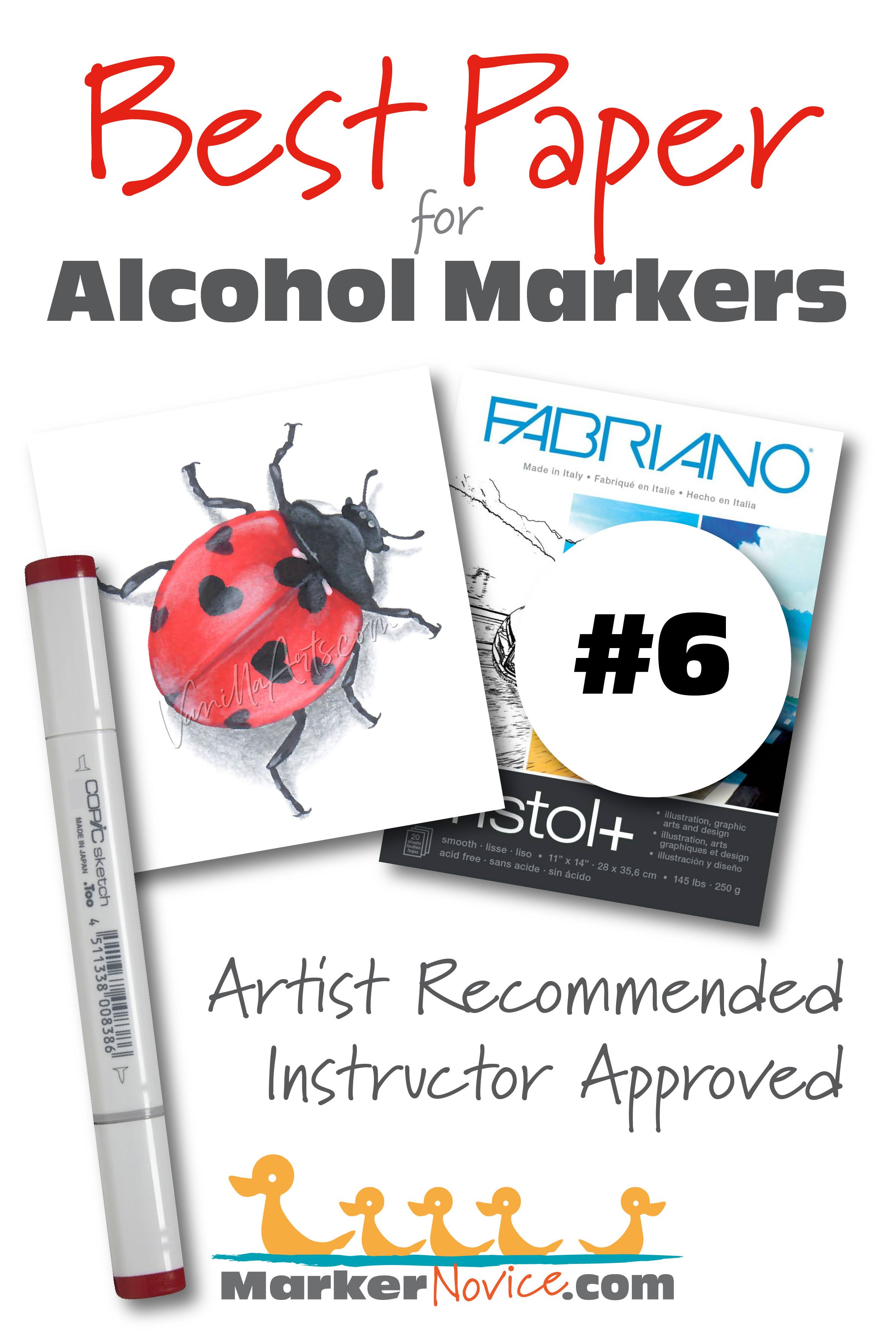
6. Fabriano Bristol +
WEIGHT: 145lb/250gsm
FORMAT: Gum (glue) bound pads from 9x12” to 14x17”
BUDGET: $.82 per 11x14” sheet (as of 07/2023)
I learned to use markers on Bristol in art school so I know firsthand it’s an excellent surface for beginners, News flash: I still use Bristol several times a week!
Bristol is not a brand, it’s a style of paper. Bristol is an uncoated paper made in “plys” or layers. The plys slow ink absorption, keeping the ink accessible for color building and smooth blending.
“Smooth” or “Plate” style Bristol is best for markers.
FABRIANO BRISTOL+ PROS:
Ink does not migrate deeply into the paper fibers right away - allows easy blending
Does not stain easily - smoother red, pink, purple blends
No feathering - most incorrectly call this “bleeding”. Bristol+ does not leak ink or “feather” out beyond your line art
Excellent value - feels and behaves like premium Bristol
Two sided - no front or back, use either side
Thin enough to feed through most printers
FABRIANO BRISTOL+ CONS:
Thinner than other Bristols — may bleed-through the backside after 5-6 layers
Colors lose a bit of vibrancy as the paper dries
I’ve not seen this brand carried in local art or craft stores
BEGINNER WARNING!
Myth: “I’m using a dupe of an expensive paper.”
There are no duplicates or exact substitions in the paper world. Every paper has a proprietary recipe and production process.
Two brands can be similar but they’re never the same.
Dupes are often suggested as an inexpensive alternative to a more expensive paper. Let me gently suggest that if a paper was truly a duplicate, the substitute would either drive the expensive company out of business or force them to lower their price. Has this happened? If not, it’s not a dupe!
I’ve used markers for over 35 years— dupes never live up to the promise. At this point, I’m convinced duplicate recommendations come from people who have never touched the original or don’t know enough to feel the difference.
Never worry about blending again
What’s standing between you and creative coloring? Blending!
There’s a lot to think about when you’re coloring. Which colors? Am I using enough ink? Why isn’t it blending? Can I blend it again or should I start over?
If you’re focused on all that stuff, you’ve left no room for creative thinking.
Artistry can only happen after you’ve mastered The Blend.
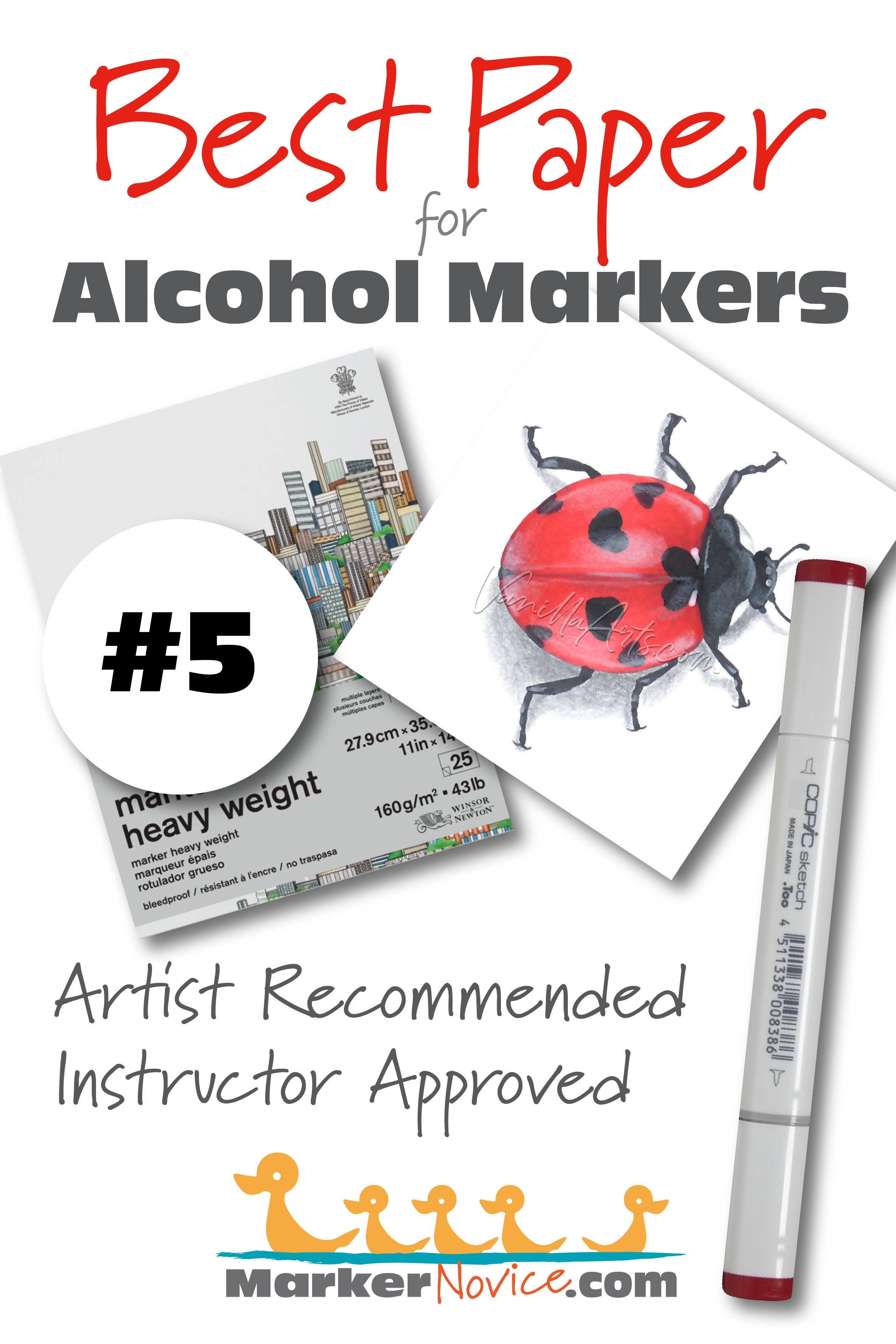
5. Winsor & Newton Marker Heavy Weight
WEIGHT: 43lb/160gsm
FORMAT: Gum bound pads from 9x12” to 11x14”
BUDGET: $.80 per 9x12” sheet (as of 07/2023)
WARNING: Make sure it’s “Marker Heavy Weight” and not “Winsor & Newton Marker” which is half the thickness and doesn’t blend well. I do not recommend the lightweight version!
Unlike Bristol, this paper was designed especially for use with alcohol markers. Inks blend easily, even with staining colors.
This is a “bleedproof” paper which means it’s a two ply with a polymer layer in between which blocks bleed-through. You can color on the front, then color on the back.
MARKER HEAVY WEIGHT PROS:
I consider this a self-blending paper which requires minimal ink and it self-smooths as the ink cures
Colors remain noticeably vibrant when dry
Does not stain - easier red, pink, purple blends
Thin enough to feed through most printers
Has enough tooth for soft colored pencils
MARKER HEAVY WEIGHT CONS:
Noticeably thinner than cardstock
Creases and dents easily - can not be healed
Pills on contact with water - not for use with water-based markers or water-soluble media, do not sprinkle with water
BEGINNER WARNING!
Myth: “Marker Paper is ideal for coloring with markers.”
Many beginners purchase Marker Paper because it says “Marker Paper” on the label— a logical but tragic mistake.
Sadly, many marker papers buckle when you try to blend. There’s also a weird thing where the first layer of ink looks fine but the second or third marker starts removing all the previous layers.
“OMG! This is terrible paper!”
Hang on. there’s a difference between “marker paper” and “paper for markers”.
Marker Paper is for people who DRAW with markers.
Marker Paper is NOT for people who BLEND with markers.
Many products with “Marker Paper” on the label are thin— thin enough to see though. That’s your first clue it’s NOT a blending paper.
Thin marker paper has been around since the 1950’s, long before anyone thought to blend with markers. It was designed for quick sketching with light layers. It’s used by architects, fashion/landscape/product designers, lettering specialists… basically any artist who needs to convey an idea to a client before starting the final drawing or painting.
Thin marker paper is not terrible.
Markers were around long before you. Not everything is about blending.
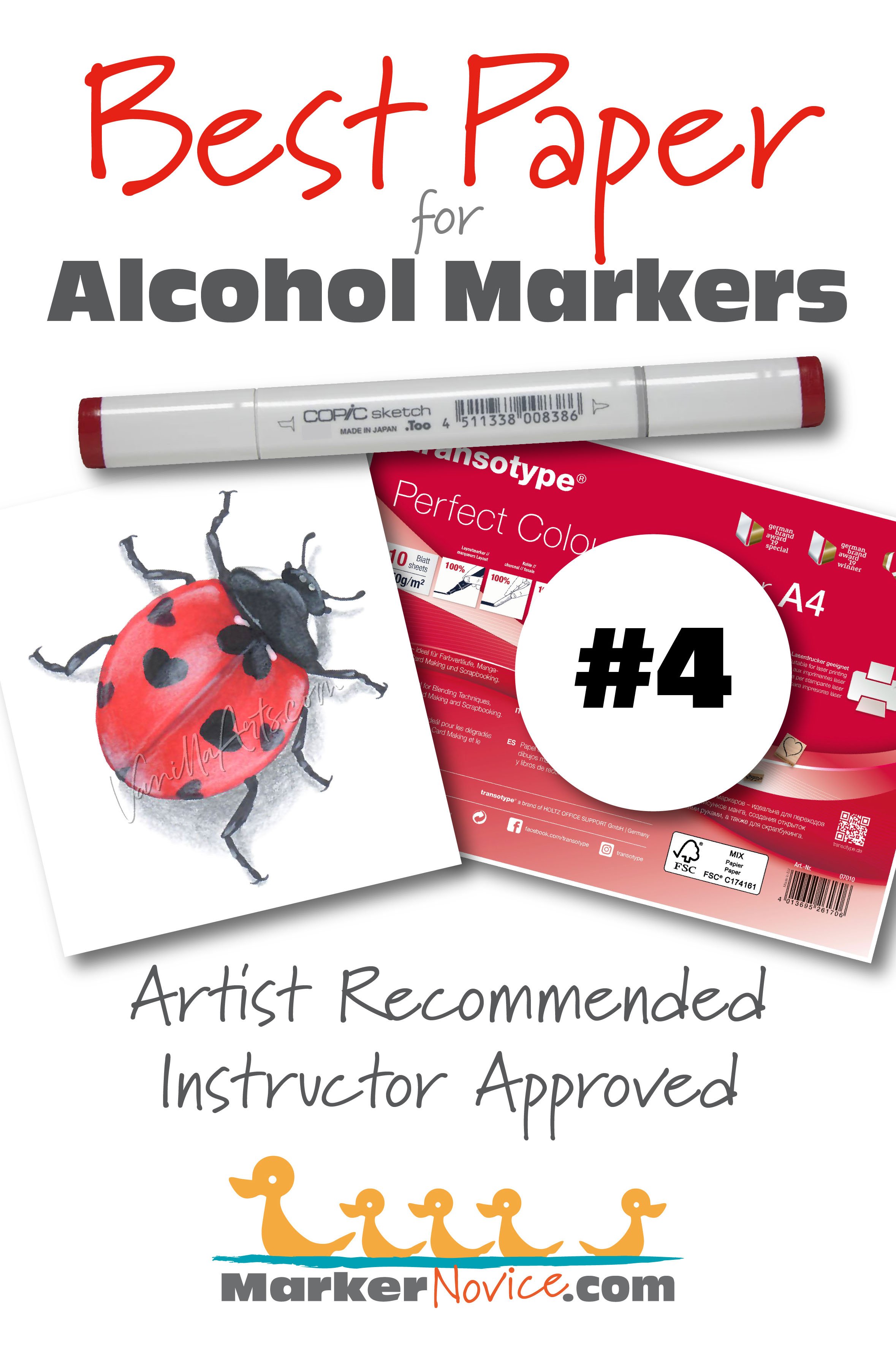
4. Transotype Perfect Colouring Paper
Here’s one for our European readers. Tansotype is not currently available in the US or Canada.
WEIGHT: 250gsm
FORMAT: loose packs of A4 size
BUDGET: .80 (Euro) per A4 (8.25x11.5”) sheet (as of 07/2023)
WARNING: Transotype also makes a “Bleedproof Alcohol Marker Pad” formerly known as the “Copic Bleedproof Pad”. See above warning about “marker paper”. The Bleedproof Pad is a thin marker paper and does not work for blending!
Perfect Colouring Paper is thicker and it’s excellent for blending.
I taught a few classes with Perfect Colouring Paper when it was available in the US. I keep hoping they’ll bring it back.
PERFECT COLOURING PAPER PROS:
Almost a self-blending paper which self-smooths as the ink cures
Originally developed for photo printers so it feeds easily through commercial and home printers
Has enough tooth for soft colored pencils
PERFECT COLOURING PAPER CONS:
Read my article about Perfect Colouring Paper here (back when it was sold in the US as “Holtz PCP”)
Ink colors mellow slightly, losing some vibrancy
BEGINNER WARNING!
Myth: “Copy paper works well for markers.”
Office grade printer paper and cardstock are intended for use with home printers and commercial grade copy machines.
Nobody wants to grab wet paper from a copy machine and we don’t want fresh copies to smear previous pages, so office grade paper is designed to absorb ink quickly and dry extremely fast.
This is the exact opposite of what we want for markers.
When paper dries too fast, markers leave streaks and blending is nearly impossible. Good marker paper is slow to absorb the ink and it stays wet longer allowing you lots of time to smooth and blend.
General Rule: If it’s sold for printers, don’t buy it for markers.
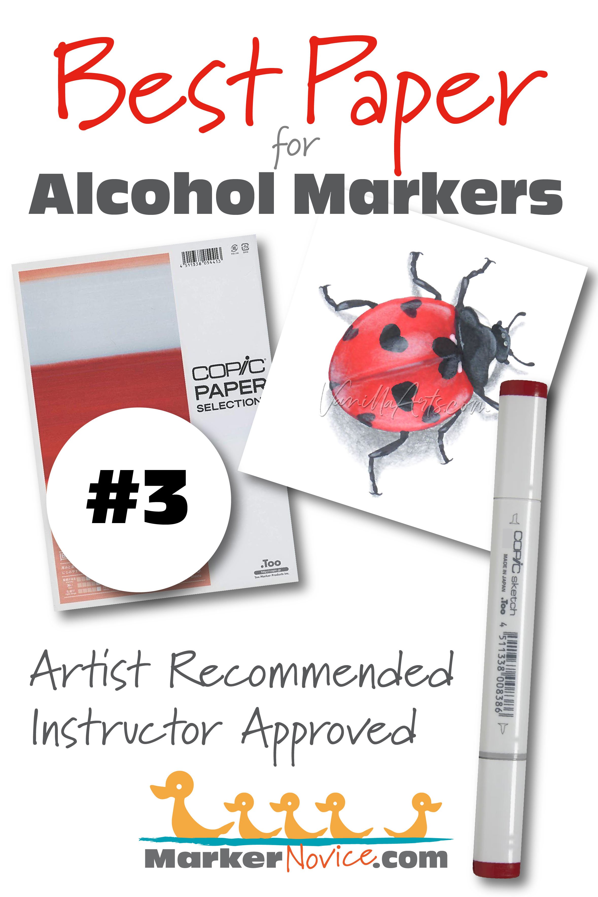
3. Copic Paper Selections: Thick Marker Paper
WEIGHT: 186.7gsm
FORMAT: loose packs of A4 size
BUDGET: $.77 per A4 (8.25x11.5”) sheet (as of 07/2023)
This paper works well with all brands of alcohol marker, not just Copic.
For the last decade, Copic has tried to sell their own paper, cardstock, and notebooks. Frankly, they’re terrible at outreach and their papers have been confusing and inconsistent. The labels and names change frequently and products appear with no launch and disappear without notice. I’d given up on Copic branded paper until my favorite paper of all time (Cryogen) was discontinued and I was forced to test lots of papers again.
The best of their “Paper Selections” line is the Thick Marker Paper which is seems close to my old favorite Cryogen. I hope Too continues making this paper. Crossing my fingers that it doesn’t go poof overnight.
THICK MARKER PAPER PROS:
A self-blending paper which self-smooths as the ink cures
Has a good amount of tooth for colored pencils
Easily feeds through my printer
Colors remain vibrant
Allows some water contact (but will pill if scrubbed)
THICK MARKER PAPER CONS:
WARNING: This paper does not like to be taped. Even gentle tape removes fibers and can damage the surface badly
This paper feathers slightly (ink seeps beyond the line if you color very slowly)
More bleed-through than the other favorites in this article
Looks like normal white cardstock so keep this separate from ordinary printer paper
BEGINNER WARNING!
Myth: “I use mixed media paper because it’s especially formulated for markers and more.”
Paper labels are confusing— not just beginners but even the pros.
Mixed Media is a way to sell one paper to lots of people. To do this, they list as many mediums on the label as possible. If a paper is even a little bit okay for markers, they will say “Amazing for Markers!!!” on the packaging.
Mixed Media paper sounds like it’s scientifically designed to be great for everything, right? Actually, all “mixed” means is that it doesn’t explode on contact with anything on the list. It’s the definition of mediocre paper— it isn’t bad but it’s also not amazing.
If a paper is good for everything, it’s not great at anything.
I think you can do better than “Doesn’t totally stink with markers!”
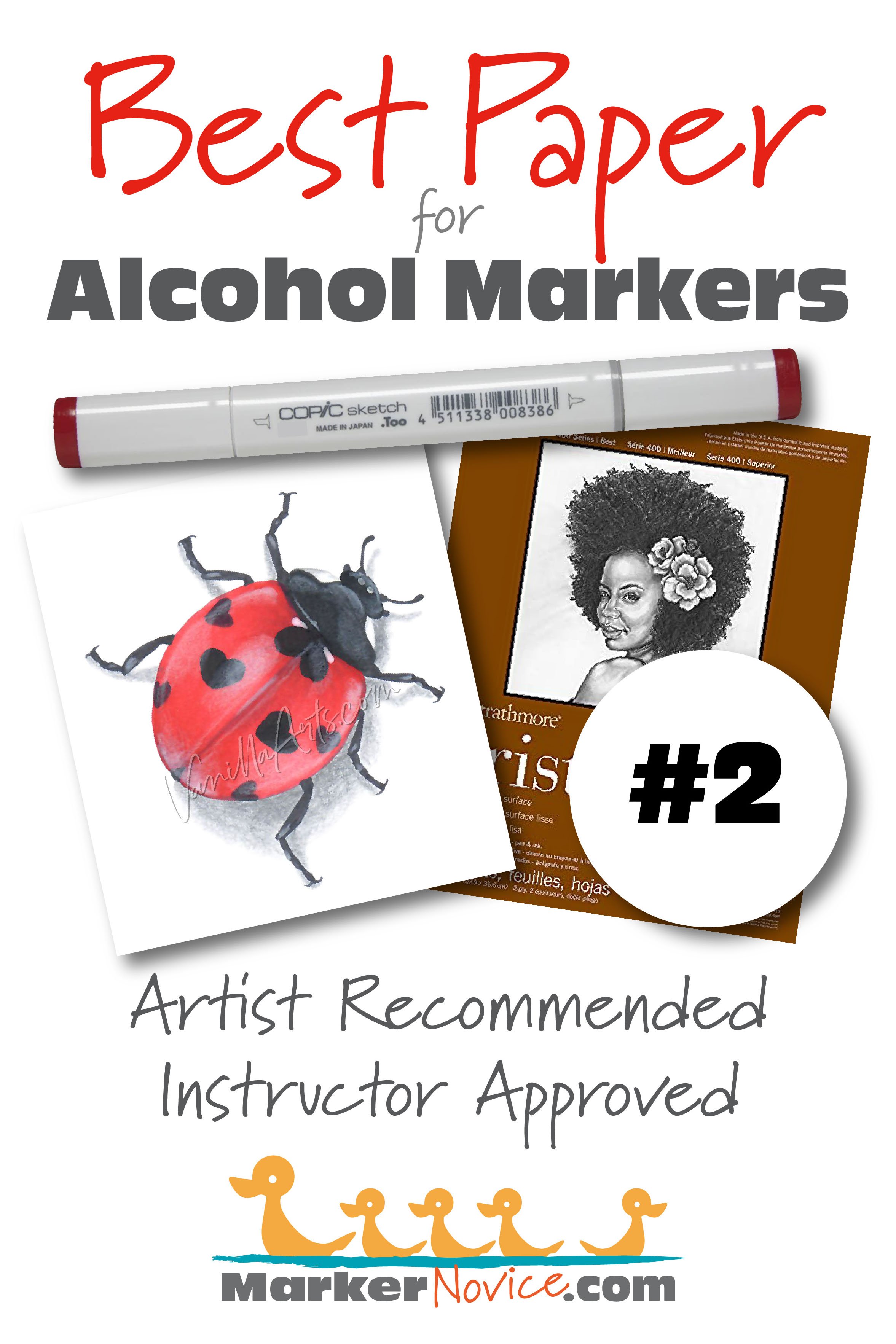
2. Strathmore Smooth Bristol
WEIGHT: 300 = 100lb/270gsm. 400 not listed but similar thickness
FORMAT: Gumbound pads from 9x12” to 18x42”. Loose sheets are 22x30”
BUDGET: $.47 (300) and $.69 (400) per 9x12” sheet (as of 07/2023)
Strathmore Bristol comes in graded levels— 300 (yellow label), 400 (brown label), and 500 (white label).
I currently teach advanced Marker + Colored Pencil classes with Strathmore Bristol (Smooth). Ideal marker papers tend to be ultra smooth so it’s hard to find an excellent marker paper with enough tooth for colored pencils. Strathmore 300 and 400 work nicely with both mediums.
300 is Strathmore’s basic Bristol. It feathers slightly so it’s not as ideal with markers but allows more colored pencil layers.
400 is better with markers and slightly less amenable to colored pencil. I personally prefer working on 400.
I do not recommend 500 as I don’t notice enough improvement over the 400 series to justify the price jump. At the 500 level, the Smooth finish is called “Plate” and is too smooth for pencils.
STRATHMORE BRISTOL PROS:
Colors stay vibrant and true
Large sheets for bigger projects
Allows waterbased media— not good for watercoloring but is friendly with water-based markers and inks
Scans and photographs well for digital art or print reproductions
STRATHMORE BRISTOL CONS:
300 Bristol feathers slightly (ink seeps beyond the line if you color very slowly). 400 does not feather.
May not feed through office printers (my two printers handle it well but most students report printer issues)
Too thick for card making
BEGINNER WARNING!
Myth: “Just find a heavy cardstock which doesn’t bleed-through to the backside.”
This is a common myth. In general, good blending paper tends to be thicker. Likewise, the worst papers are thin enough to bleed through at the first touch of a marker.
But there are many thick papers which are awful for markers and some thinner papers blend beautifully.
And as a marker instructor, seeing a bit of inky color on the backside is often the sign of a smooth blend on the front. Most beginners don’t use enough ink so I often check the backsides and encourage them to bleed more.
It’s not about paper weight or thickness. It’s about what the paper fibers do with the ink on contact.
When testing marker suitability, I watch to see how much ink the paper pulls from the marker. I take note of where the paper stores the ink (on the surface or deep in the core). I look at whether the paper fibers stain easily or if it releases the color quickly to allow blending.
Thickness is one of the last things I worry about.
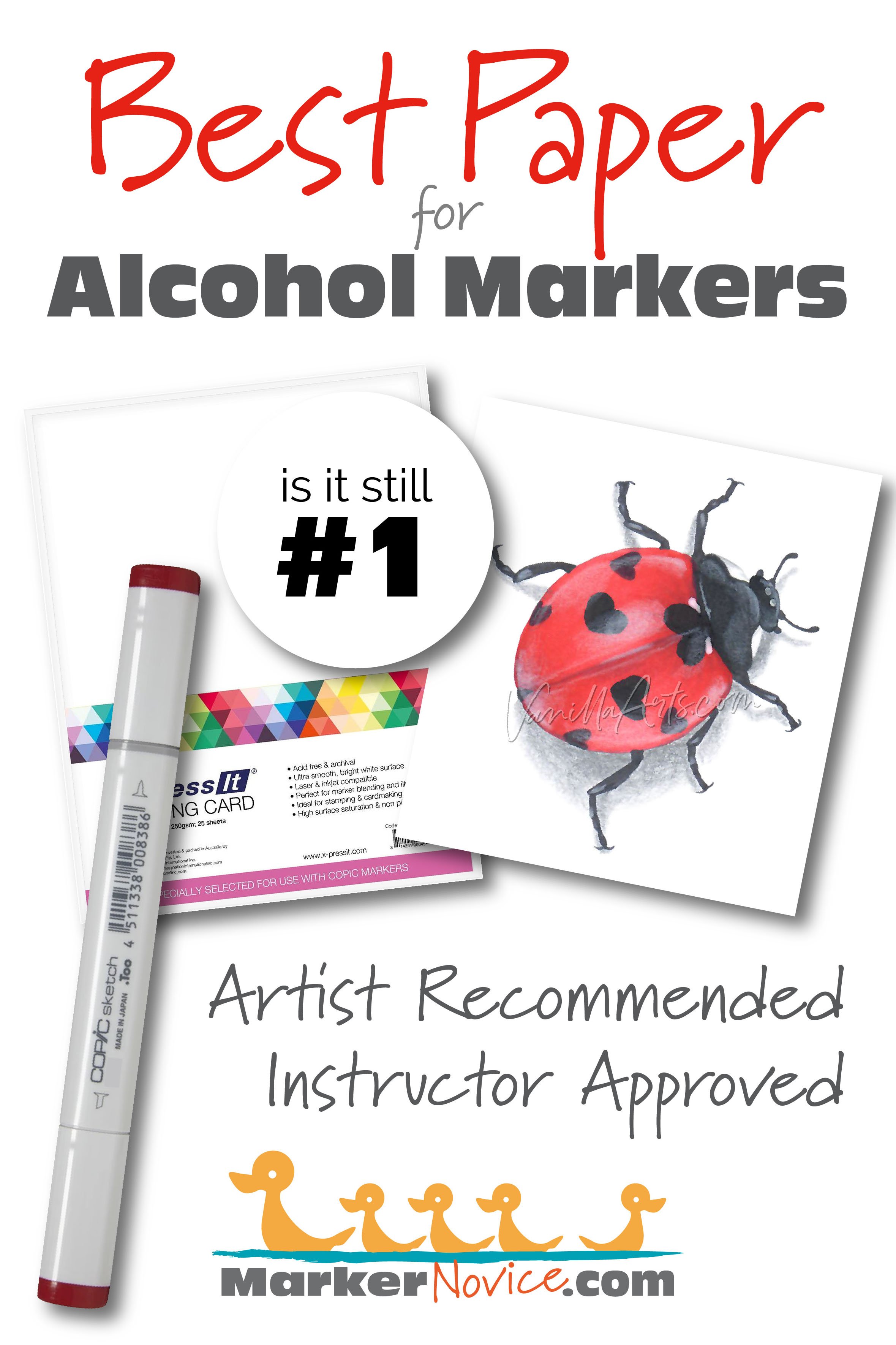
X-Press It Blending Card
WEIGHT: 250gsm
FORMAT: Loose sheets of 8.5 x 11”
BUDGET: $.40 per 8.5x11” sheet (as of 07/2023)
No surprise here. X-Press It Blending Card is my top recommended marker paper for all marker beginners, no matter what brand of alcohol marker you’re using.
X-Press It is required for several of my beginner classes. It’s that important.
This paper is a dream for blending! Like Bristol, XPI is a “ply” or layered paper. The front and back are coated with an ultra smooth fine-grain layer which keeps the marker ink sitting on the surface long enough to blend before the absorbent core takes over and holds the color. As the ink marinates on the paper, blends actually smooth themselves— in class, we call this self-blending effect “The Copic Fairy”.
X-Press It is relatively thin for the amount of ink it holds. It allows beginners to blend and reblend several times.
X-PRESS IT BLENDING CARD PROS:
Self blending
Holds many layers of ink
Improves the blend success rate for most beginners
Makes learning good technique easy
X-PRESS IT BLENDING CARD CONS:
Has a noticeably bluish tint which frustrates card makers
Colors lose a bit of vibrancy as the ink dries
Has a slight fleck (paper fibers which stay white). This is minor and noticeable only to those looking extremely close.
Too smooth for more than light layers of colored pencil
Extremely “allergic” to water! Bubbles and blisters immediately on contact
Mostly sold online
BEGINNER WARNING!
Myth: “Make sure to purchase acid-free archival paper for markers!”
Uhhh… hang on a sec, folks.
Alcohol markers are not lightfast.
So by the time your paper turns yellow, the ink will have long faded. Don’t worry about generational brands of paper and definitely don’t spend extra for it! Just color and enjoy your markers today and stop obsessing about what your grandkids will do with your art.
I’m researching a new article now
UP NEXT: Best Sketchbooks for Markers
(link coming soon)
What about other paper brands?
Whenever I recommend paper to students or readers, someone always asks:
“But what about ______? I’ve heard great things about it!”
As I said, I’ve tried a ton of papers in my career. I know which papers I like to work on.
But more importantly— as a teacher, I’ve observed student for years as they’ve learned to color and practice their skills. I’ve seen how the right paper can make learning a joy and how the wrong paper creates a cycle of failure.
Because someone always asks, here are other papers I’ve tried and why I’m not recommending them today.
Honorable Mention:
Cryogen Cardstock 89lb in Curious Metallic White - If I were writing this article last year, Cryogen would have been my #2 paper just below or in tieing with X-Press It Blending Card. In fact, for years, I’ve told students to start on XPI until they’ve mastered blending, then move to Cryogen. I absolutely love Cryogen!
Sadly, Cryogen is now out of production and the factory has closed. I’m now living off my stash, weighing each project to decide if it’s Cryogenworthy.
It’s not unusual for other companies to purchase the machinery and process for specific types of paper. I sincerely hope someone brings Cryogen back from the dead as I’ve not found a suitable replacement for it yet.
Paper that’s okay but not good enough to make my recommendation list:
Neenah Classic Crest Cover Solar White 110lb/297gsm (Also sold by Crafter’s Companion) - People frequently ask if I can recommend any office grade paper. Neenah CC is the closest I can get and even then, I don’t like it much. It’s economical and I understand why many card makers like to work with it. Unfortunately, the paper stains which makes it harder to blend reds or any ink with red in the formula. If you’re a card maker who uses stamps for simple coloring, go ahead and try it but I think Neenah CC is frustrating for those who color large or with realism. (Neenah CC at Amazon here)
Stonehenge White - I love Stonehenge White for use with colored pencils. I frequently use markers to basecoat my colored pencil drawings, a step which minimizes the amount of time it takes for a full colored pencil rendering, plus it adds vibrancy. Stonehenge is a little thirstier than true marker papers but I don’t mind. The real problem with Stonehenge for markers is that every once in a while, marker inks will break or separate on it, meaning that a BG marker will dry with a ring of green around it. I want to use it more, I just wish it wasn’t unpredictable. (Stonehenge White at Amazon here)
Deleter/Kent Comic 135gsm and Kent Paper 157gsm - Both papers are popular in Japan and with North American manga fans. I really want to like this paper but it’s too thin. The 157gsm doesn’t hold enough ink to allow much reblending and the 135gsm feels like sketch paper. After working on X-Press It and hearing about this mythical paper for years, I was disappointed. (Deleter/Kent at Amazon here)
Papers I Do NOT Recommended:
In no particular order.
Bee Artist Marker Paper - Bee has a lot of fans out there— I AM NOT ONE OF THEM. People keep recommending it to me and like a fool, I keep retrying it, even buying new sheets in case something has changed. Nope. Red inks stain and Bee bleeds more than it should. I think this is one of those papers people love when they’ve never tried good paper. (Bee AMP at Amazon here)
Hammermill Premium Color Copy Cover 110lb - Despite what the internet says, this paper is most definitely NOT a dupe of X-Press It!!! I do not understand why people love this paper other than the fact that it’s cheap and available at Walmart. This paper stains worse than Bee which makes certain blends frustrating and it bleeds on the 2nd layer of ink. If I had started with this paper, I would have quit long ago. (Hammermill PCCC at Amazon here)
Copic Paper Selections - Copic’s Thick Marker Paper is my #3 recommendation but I do not recommend their “PM” (thin paper) or “Custom Paper”. (Search "Copic Paper Selections" at Amazon here for the full line)
Winsor & Newton Classic Bleedproof Marker - Their “Marker Heavy Weight” is #4 on my recommended list but the thinner Classic Marker version is too thin for blending. (W&N Classic at Amazon here)
Gina K Pure Luxury - This was the first cardmaker recommended paper I ever purchased and it soured me right away. I’m sure it’s a lovely card backing but it’s awful for markers. It jams in my printer and even Multiliners smear when colored over!!! Worst of all, marker inks loose a ton of vibrancy as they dry. Literally a week later, the coloring looks 2-3 steps lighter. (No link)
Favini Art Paper - I’m searching for a Cryogen replacement and testing every paper I can get my hands on… but this ain’t it! I’ve tried about ten versions of Favini Art and all of it is miserably bad for markers, INCLUDING their “Marker Paper” and their “Bristol”. I expect to see ads for this paper as they try to enter the art market and yes, I expect to hear complaints afterward. (Here’s the Favini line carried at Amazon but there are more)
So there you go…
6 Best Papers for Alcohol Markers
Plus a list of tested but not-recommended papers.
Remember, there isn’t one best paper for everyone. My hope is that you’ll try several of my favorites to decide which works best for you.
X-Press It Blending Card
Strathmore 400 Bristol, Smooth Finish
Copic Paper Selections, Thick Marker Paper
Transotype Perfect Colouring Paper
Winsor & Newton Heavy Weight Marker
Fabriano Bristol Plus, Smooth
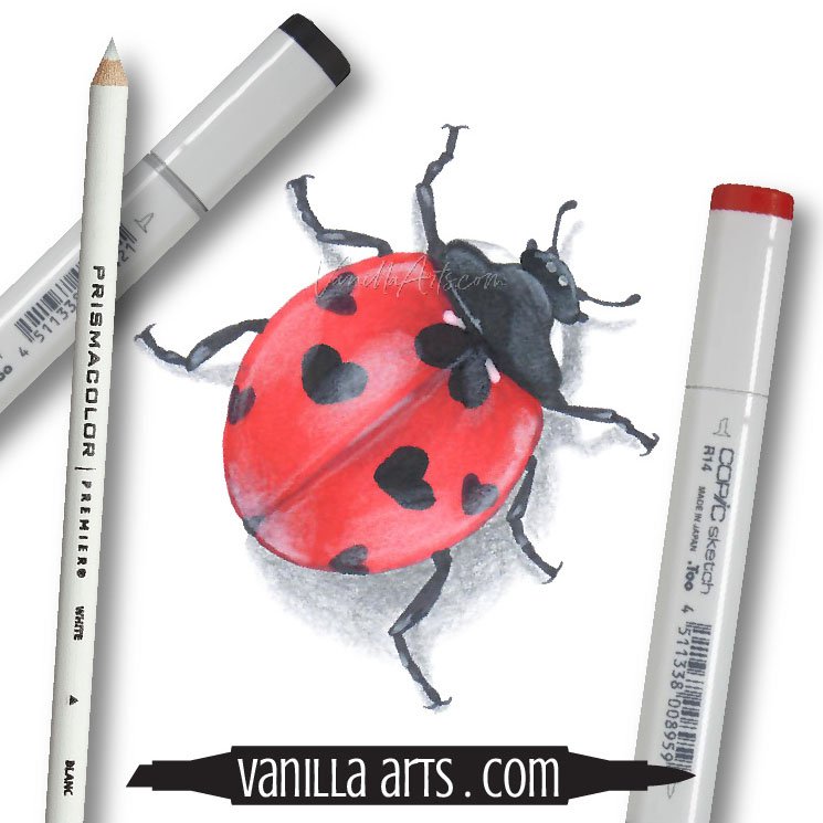
“Ladybug” colored by the author, Amy Shulke. Copic Markers plus Prismacolor Colored Pencil details on X-Press It Blending Card. 3 inches. Online class here.
Amy Shulke is a professional illustrator who has used Copic Markers since 1990. She teaches artistic coloring classes online at VanillaArts.com and locally in Michigan.
Marker Novice is Amy’s completely free resource devoted to beginner marker education. For intermediate/advanced artistic coloring articles, see her Studio Journal here.
Products mentioned in today’s article:




Best Beginner Copic Marker Blends: Green & Yellow-Green
Which Green and Yellow-Green Copics are Best for Beginners?
I asked three of my favorite marker instructors about which green and yellow-green markers they recommend for first time colorers.
Which markers offer students the best value?
Which Copic G and YGs are versatile enough to color many different green items?
Which green blending combinations do we teach with?
Which YG and G markers do we use in our own work?

Are you new to Copic Markers and wondering which colors to purchase first?
When you’re a beginner, selecting a handful of starter markers can be intimidating. There are so many colors! Which is best?
Is this a good green? It’s pretty but will it blend with anything?
Even with an art degree, I made rookie mistakes. Many of the Copics from my first set of 72 are still gathering dust today!
If I could go back in time, I’d focus on useful blending combinations rather than boxed sets and random Copics from the clearance bin. It’s only a bargain if you actually use the marker!
In the spirit of helping you avoid my mistakes, I started to wonder:
Which Green and Yellow-Green Copics are Best for Beginners?
I asked three of my favorite marker instructors about which green and yellow-green markers they recommend for first time colorers.
Which markers offer students the best value?
Which Copic G and YGs are versatile enough to color many different green items?
Which green blending combinations do we teach with?
Which YG and G markers do we use in our own work?
Which G and YG Copics are Best for Beginners?
If you’re new to Copic Markers, we recommend YG03 & YG17 as your starter greens. Add to this combination depending upon your taste. YG67 makes an excellent dark. YG21 adds light. For realism, underpaint with blue or violet.
We don’t recommend G markers for beginners. Skip the Gs to save money.
Let’s talk to four Copic instructors to learn more about Copic their favorite G and YG blending combinations.
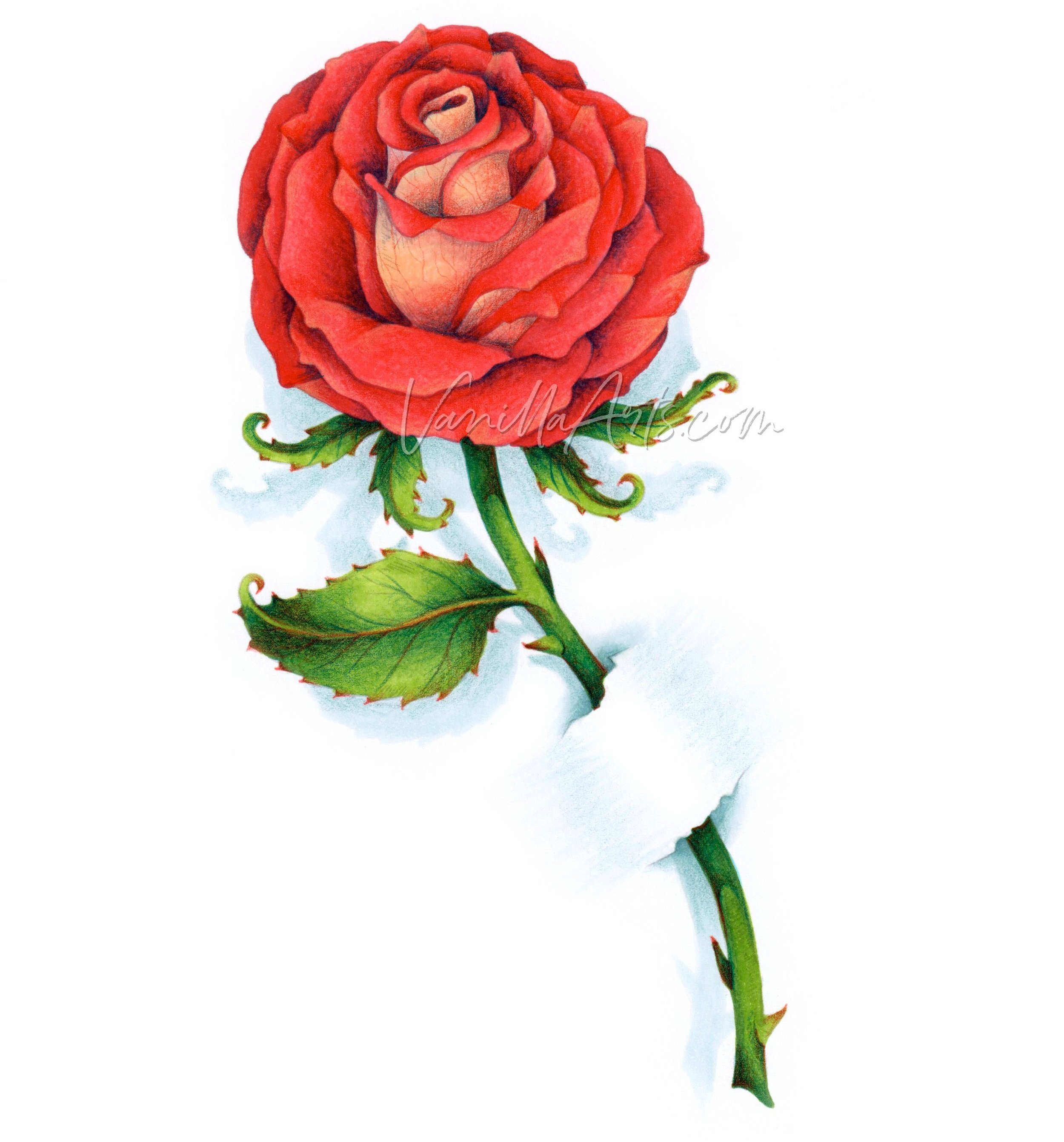
“Rosie Gets the Blues” Image from PowerPoppy.com, modified and colored by the author, Amy Shulke. Copic Markers and Prismacolor Colored Pencils on X-Press It Blending Card. Amy’s online class featuring this image teaches the secrets to easy complimentary blending. More info here.
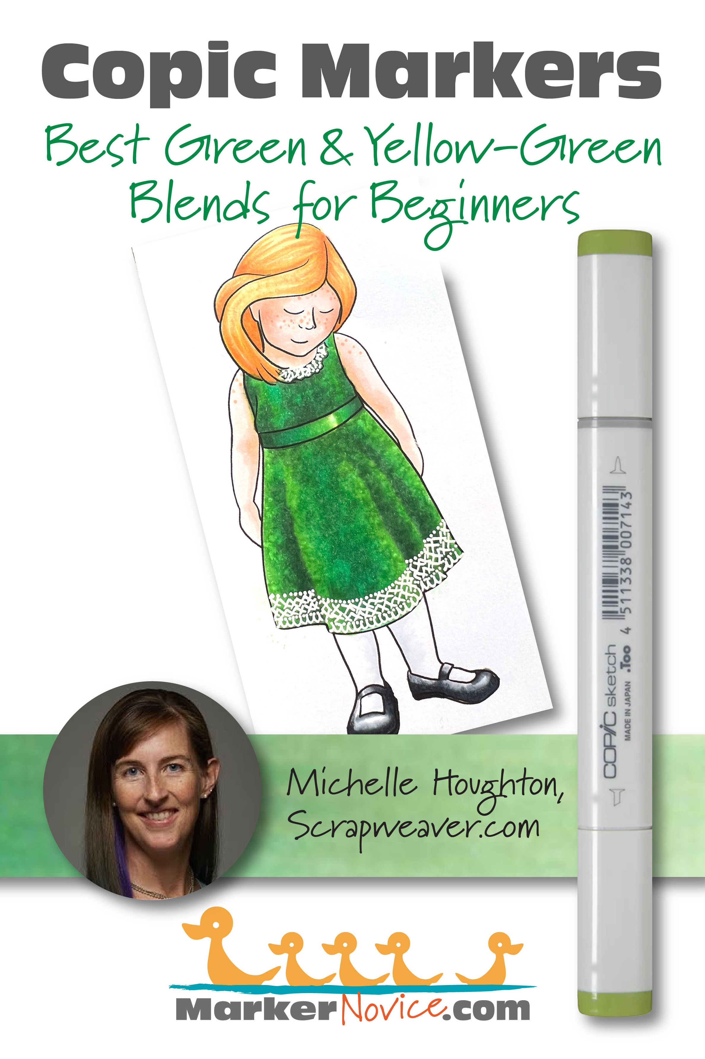
Michelle Houghton’s Favorite Green and Yellow-Green Copics
Note: As of 2024, Michelle is not currently teaching Copic classes. Find Michelle on her Copic in the Craftroom channel at YouTube and at Scrapweaver.com
Before we get to Michelle’s marker recommendations, I’d like to point something out…
Did you notice that this article covers both Green and Yellow-Green markers families?
There’s a reason.
All four Copic instructors in this article agree: We do not use G markers enough to recommend them for beginners.
Especially not when there are so many beautiful and easy-blending Yellow-Greens available!
Michelle explains why:
The G green Copic family regularly gets passed over for the yellow greens at my desk.
I think it has to do with WHAT I am coloring. Often, I’m coloring areas of foliage, leaves, grass, trees, etc. When I look at green objects in nature, they tend to lean toward the yellow side of the green family, so naturally, I reach for my YG markers.
I may use a G marker to cool the color of a leaf in cast shadow or for plants which lean into the blues like the needles on evergreen trees.
But more often than not, when I reach for a G Copic it’s for clothing or accessories, something that could just as easily be colored red or blue. In these cases, I’m choosing to color them green because I feel guilty for not using my G markers more often.
This is why you’ll see a strong theme repeated by each instructor here today.
Independently, we all find ourselves using YG markers far more than Gs.
So now that we’ve discussed what we don’t use, let’s get to the recommendations.
Michelle recommends YG01-YG03-YG63 for beginners.
As someone who teaches realistic coloring classes, I love Michelle’s YG combination even though I’ve never tried it before.
My reasoning is this:
YG01 is a lovely pale green with a strong feeling of sunshine to it.
YG03 is the easiest blending marker in the entire Copic collection. This marker is perfect for beginners because it literally blends with anything— I’ve even blended YG03 with Black 110 before!
And YG63 is one of my go-to green markers for realism. It has a gentle murkiness to it which perfectly captures the look of chartreuse in the shade.
I followed up with Michelle, to ask if she could also give you a good G combination— just in case someone reading this already owns a few Gs.
Michelle says:
“I don’t often reach for the G’s but when I do it is either G21-G24-G17 or G40-G43-G46”
Notice how Michelle jumps from the G-Twenties to G17? That’s particularly interesting to me. I’ll have more thoughts on this in my recommendation section below.
In the meantime, be sure to watch Michelle’s Copic in the Craftroom videos at YouTube. She has a ton of G and YG demos and tips for you. I’m only linking here to half of what she has available! Michelle is a valuable resource you simply can not miss.
Michelle’s YG info:
Michelle’s G info:
__________
Michelle is an elementary school teacher (BS Fine Arts, MA Education) with over 20 years of paper-crafting experience. She’s is a former Copic Certification Regional Instructor for Imagination International. Michelle runs the Copic in the Craftroom website and YouTube channel. Her Copic College events are favorites with Copic fans at all levels.. Visit her at Scrapweaver.com.
WE ASKED YOU!
Half of Vanilla Arts readers say YG67-YG17-YG03-YG01 is their favorite green blending combination.
And here’s where there may be a bit of bias showing…
Most Vanilla Arts readers are also Vanilla Arts students and I teach with these greens.
But for people to overwhelmingly cite this as their favorite and to use it in their personal work? It’s a sign that this combination not only blends easily but also looks great!
Cordine van der Touw’s Beginner Yellow-green Blend
See Cordine’s latest projects on her Facebook page here. You can also find her at Copic Marker Europe and Cordine’s latest classes for Copics at Colourstock.
Cordine recommends YG67-YG17-YG03 for your first green blending combination.
Cordine says:

I love the Vanilla combination of YG67-YG17-YG03, colored dark to light. I frequently underpaint it with B34.
This combination is easy to change around. I can go darker if I underpaint with B34 or go lighter if I leave the YG67 out of the combination.
What’s interesting is that Cordine’s tulips here use my Vanilla-student green combination and yet I didn’t recognize it!
This is because every colorer changes the look of a blending combination based upon their unique coloring instincts.
Cordine used the darker markers sparingly which makes her leaves look sunkissed and lightweight.
Compare Cordine’s leaves to the color swatch behind her photograph. I colored the swatch! We used the same markers and yet they look totally different!
I color like me and Cordine colors like Cordine. We’re different people and our coloring looks different too.
That’s actually a great beginner tip: Don’t feel bad when you faithfully follow a marker recipe but get different results. Everyone creates a distinctive look because we all use the colors in unique ratios. As long as it looks good, it doesn’t have to match the original sample!
And what about G markers?
When I asked Cordine for her favorite G combination, she quickly responded, “Nope, I pass on this color”.
Keep reading because Elena can help explain why we’re all less than enthusiastic about Copic’s G Markers.
__________
Cordine is an office manager in The Netherlands. She’s an avid paper crafter who loves card making, scrapbooking, and coloring stamps with Copic and colored pencils. She has taught Copic since 2013 for Colourstock as the Benelux region representative (Netherlands, Belgium, and Luxembourg). Contact Cordine here.
Elena Cazares’ Favorite YG Copic Blend
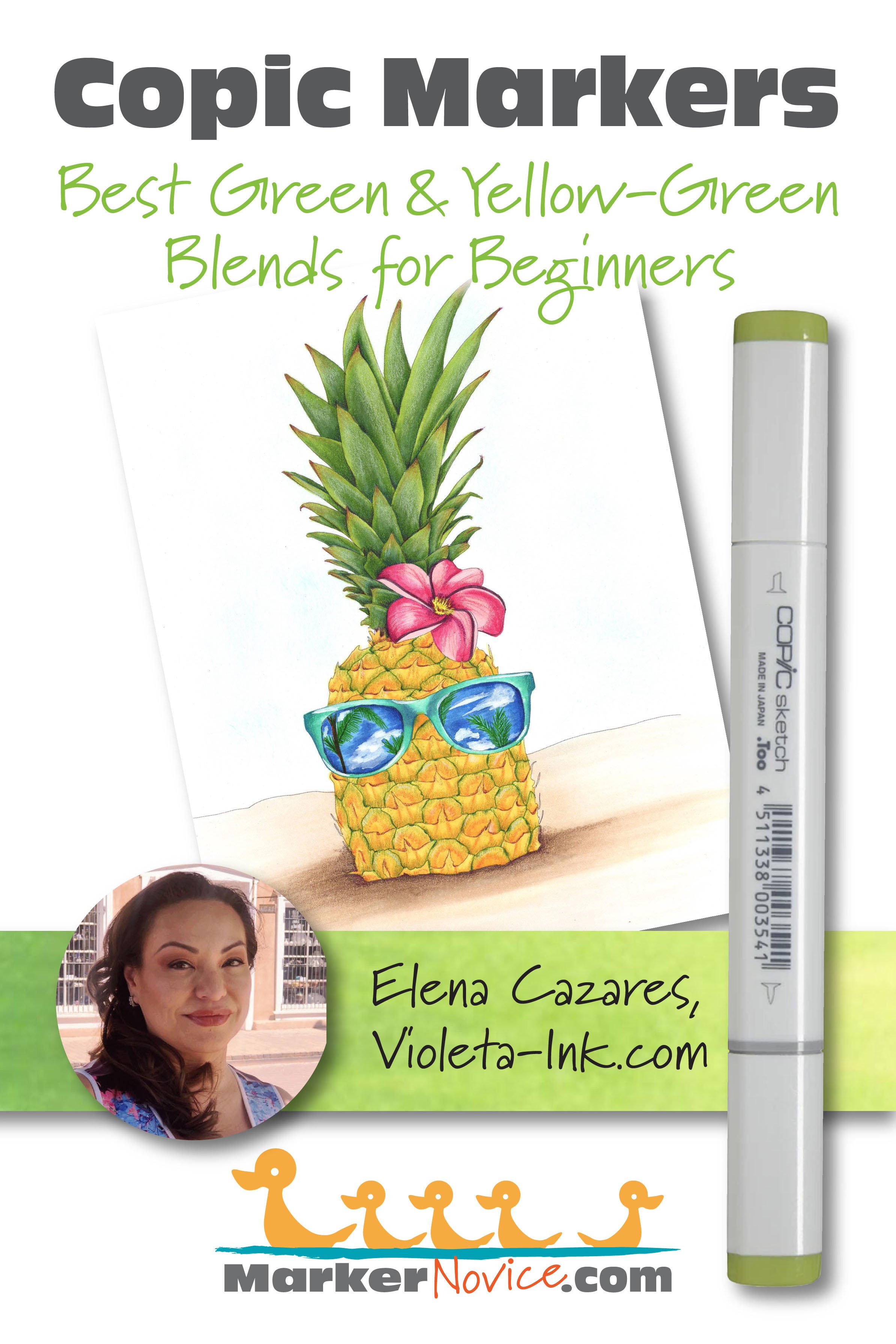
Elena recommends B34-YG17-YG03-YG00 for beginners. She colors them dark to light.
For Elena’s combination (as with all underpainting combinations) you must cover the blue completely with the YG17 to create the look of dark green.
Why does Elena love this B to YG combination so much?
This combo blends beautifully and it’s my safe haven. When I challenge myself on the flower petals or other hard parts of an image, I always fall back on this easy-blend recipe because I know it will work.
It’s a safe green but it’s definitely not plain looking!
The blue provides lots of shadiness to the darker end but YG03 and YG00 are bright and happy. This gives you lots of value range and makes your leaves very dimensional.
Plus, YG03 is just an amazing blender. Every marker blends when YG03 is there to make them play nice!
And what about a G marker recommendation?
I love to color botanicals and the G family doesn’t give me the natural, organic feel I want. So I really don’t have a G combination to recommend.
The G greens all have blue hints, especially the lightest ones. G colored leaves just don’t look right to me. They give off a mint feeling which I really don’t like. I want my flowers to be warm and full of life!
I will use Gs if I can’t avoid it, like for a class or in a demonstration but I don’t get excited about them. I bought almost all the G markers at once and was really disappointed with the way they looked. I thought I was getting a bargain but I just don’t use them a lot. I could have saved the money and bought better paper or coloring classes sooner!
Amy Shulke’s Favorite YG and G Blending Combinations
Hey, that’s me! You can find me here at MarkerNovice.com or at my artistic coloring site, VanillaArts.com.
So let’s get this out of the way right now. In some of my “Best Beginner Blend” articles, the four instructors here often disagree. Sometimes we disagree as a matter of taste, sometimes we’re simply recommending what we’re used to teaching with.
But today, we’re ALL in complete agreement. Beginners can skip the G family of markers.
In fact, we basically skipped a G article today. The Greens are so unnecessary that we couldn’t even give them their own spotlight.
I do not recommend G Copics for beginners because the Green family are harder to blend.

Ease of blending is incredibly important in my classes!
I only teach the blending process in a few beginner classes. After that, my workshops focus on more important things like underpainting, color sculpting for realism, casting shadows, and developing your artistic voice.
We don’t have time to waste on blending technique so I’m never going to tell students to drag out stubborn markers which misbehave or make them want to cry.
Besides, even if you do blend G markers well, they’ll still look weird and artificial. So all that work, for no payoff? No thanks!
If you didn’t catch the hint from Cordine and Elena above…
I teach beginner classes with YG17 and YG03. We underpaint them with either B34 or B23.
My personal favorite YG combination is BG05-YG17-Y03.
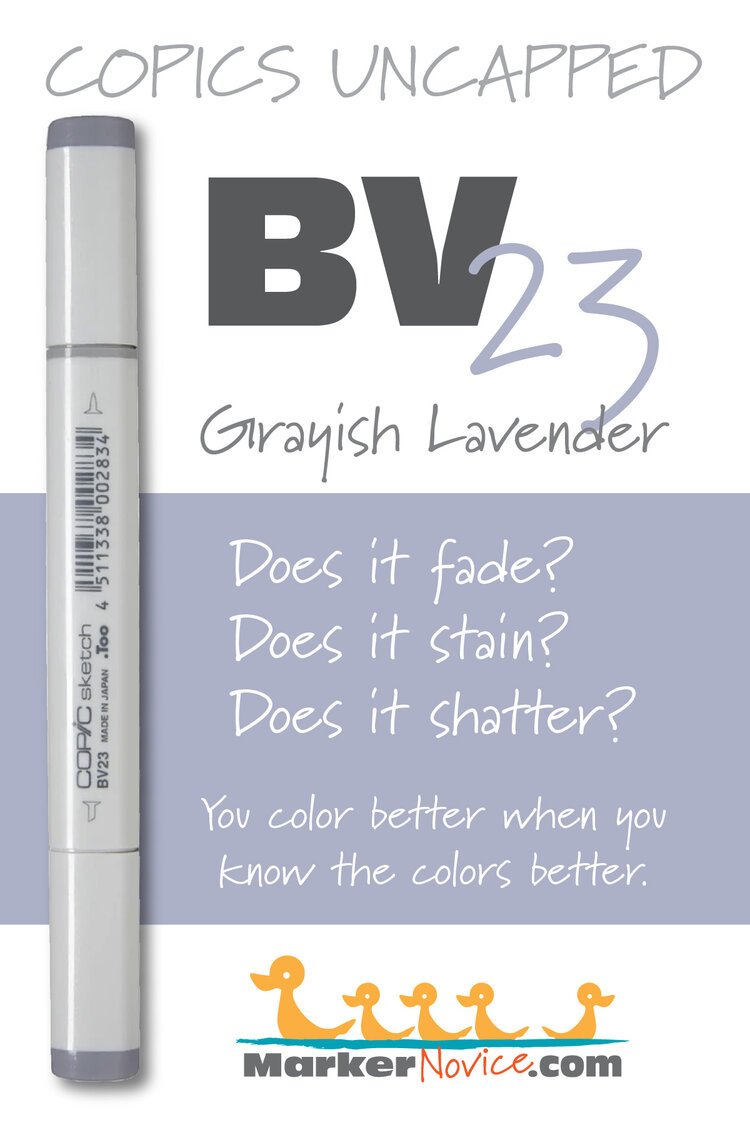
And if I’m shooting for realism, I use BV23-YG17-YG03.
See how I’m using the same two YG markers and changing the underpaint based on the situation? That’s versatility!
Plus, YG17-YG03 blends like a dream. You can blend it in your sleep.
You can see BG05-YG17-YG03 at work in my rose project here. A lot of folks assume I used green markers but that’s the magic of underpainting! I can shift the temperature of YG markers to create the look of a G marker without the notorious G behavioral issues.
Behavior issues?
More about green Copic behavior issues in the next section down but for now, understand that Gs are not beginner friendly. This makes it really hard for me to recommend a G blending combination today.
But if you’re going to push me— on a personal level, I’m very drawn to G24. The color indicator on the G24 cap is enticing, it’s my ideal greeny-green. “Willow” is a beautiful color and probably the most organic G marker Copic makes.
The problem is that there’s no one for G24 to play with. Normally we’d combine G24 with other markers from the G-Twenty family but G24 sits in-between two evil stepsisters. G28 refuses to blend with anyone and G21 has so much solvent in the mixture that it erases almost any color it touches.
So I can’t recommend G24 but I do want to try Michelle’s G21-G24-G17 combination. Maybe that’s the trick? I don’t know.
Like Michelle, I also use the G-Forty family but I add violet. I’ve taught with the G-Forties but they make a stylized green, not a realistic one.
And I’m very glad Michelle was so honest earlier about Green Guilt. I’ve felt the same thing. I don’t use G markers very often but I know my students want to learn how to use every Copic color. So when you see me using G, it’s usually because I’m catering to students, not because I like G markers.
If I have to recommend a G Copic combination, try V20-G46-G43-G40… but honestly, I’d skip it and purchase more YGs instead.

Do beginners need to underpaint green?
Not really.
If you’ve never drawn, painted, or used Copics before… well, there’s a lot to learn about Copics before you’re not a beginner anymore.
So concentrate on learning to blend before worrying about how to underpaint.
But once you’re blending well?
Yellow-Green is the easiest of all the Copic families to underpaint.
This is why I teach beginners to underpaint YG from the start. It’s the perfect introduction to underpainting because friendly markers like YG03 make the process so forgiving.
And once you learn to underpaint YGs, you can translate the technique to the other less-friendly color families.
But here’s the other reason why I encourage you to eventually add underpaint: Copic does not make many markers in realistic shade colors.
Real shade is not darker, real shade is murky.
Copic specializes in bold and bright colors, so when it comes time to color realistic shade and shadow with Copic, you have to mix correct shading colors yourself.
Underpainting is how we create new Copic colors.
Underpainting makes realistic coloring much easier.
Give underpainting a try with the YG family. They’re the easiest way to start.
Can you mix Copic G and YG markers together?
Absolutely!
You can blend any Copic marker with any other Copic marker.
Yes, some markers blend together more easily and some blends are definitely prettier than others…
But all Copics can blend with each other.
Why are green Copics stubborn?
G Copics have a few behavioral quirks. They’re stubborn blenders.
We actually call G28 “Satan’s Spit” because this marker doesn’t want to play nice with anyone.
(Make G28 your last green marker purchase. Use G29 instead.)
As a beginner, you may think of Copics as one kind of marker which comes in many colors…
But that’s not how it works.

Every Copic color uses a different ink formula. Each ink has unique behaviors and characteristics.
Copics are more like 358 people who all happen to find themselves in the same pizzeria on a Friday night. They all like pizza but the similarities end there.
The G family relies on several green inks which all have the nasty habit of staining the paper.
G ink is a “staining ink”; it soaks into the heart of the paper fibers and it doesn’t want to budge. This makes blending a challenge for beginners and frankly for advanced colorers who aren’t paying attention.
Staining inks make your blends look unsmooth or “choppy” but they also cause other issues:
Over-inking & oily patches
Shattering
When a green ink stains the paper, it requires more coats of blending ink to smooth the blend. Because you’re using more ink to blend, you run the risk of soaking the paper to the point where the paper can’t physically absorb more ink. When you over-ink, your coloring looks blotchy and oily.
Shattering is when you hit a medium or dark color with so much blending ink that the dark colorant starts to break apart into its simple ingredients. Green ink is a mixture of blue and yellow ink, so when green shatters, you’ll see blotches of yellow or blue and sometimes even pink, usually around the edges of a heavily blended area.
Yellow-Green ink is different. YG is a combination of green ink plus yellow ink. Yellow is the easiest-to-blend ink Copic makes. YG is a tame domesticated version of the ferocious green tiger.
This is why I use YG markers in beginner classes. The yellow ingredients make your life easier.
Why do light green Copics look a bit blue?
In the last section, I talked about G ink being a mixture of blue and yellow inks. I also said YG ink is G plus extra yellow ink.
The amount of yellow in the ink recipe determines whether the green is warm or cool.
More yellow = warm green
Less yellow = cool green
The entire G family is a cool green. They have more blue colorant than yellow.
Now here’s where artistic chemistry comes into play.
The lightest markers in every family end in zero. That zero indicates that the ink inside the marker has been diluted with a lot of solvent. Solvent basically “waters down” (dilutes) the color until it looks pale to you when applied to paper.
Less solvent = dark color
More solvent = pale color
Now remember when I said G was a mixture of blue plus yellow?
And you recall me saying that Y was the friendliest, easiest to blend of all the Copic inks?
And think back to when I said G can shatter if flooded with too much solvent?
At the factory, they add large amounts of solvent to G ink to make markers like G0000, G000, G00, G12, G21, or G40— they hyper-dilute the color to the point where the ink mixture is barely stable. It wants to shatter. The yellow is hanging on with all it’s might but there’s just soooooo much solvent. Often the yellow just slowly fades away…
Which leaves you with blue being the most visible color on the paper.
Pale G markers look bluish because the yellow has died.
So there you go,
The Best Green and Yellow-Green Copic Blending Combinations
If you’re new to Copic Markers, we highly recommend YG03 and YG17 as your starter greens. Frankly, I think you can use them for a lifetime.
What you add to this combination is entirely up to you. YG67 makes an excellent dark. YG21 or YG00 can add light. Or try underpainting with B34, BG05, or BV23… it’s really up to you!
Amy Shulke is a professional illustrator who has used Copic Markers since 1990. She teaches artistic coloring classes online at VanillaArts.com and locally in mid-Michigan.
Marker Novice is Amy’s completely free resource devoted to beginner marker education. For intermediate/advanced artistic coloring articles, see her Studio Journal here.

Marker Testing: Colors Mentioned Above


NOT RECOMMENDED - READ WHY


My love is like a red, red Copic…
Join Amy for a fun artistic coloring lesson in the Vanilla Workshop
Rosie Gets the Blues - Copic Marker + Prismacolor Colored Pencil
This Marker Painting Workshop was recorded live and demonstrated in real-time with no speed coloring or edits. Edited classes with perfect narration tend to make the coloring process look faster, easier, and smoother than it really is. Stop comparing yourself to the supermodel version of an artist!
Real time coloring with real mistakes and real fixes.
Class Printable Pack Includes:
Class syllabus with detailed recipe guide
Full color project sample
Guide to Copic base
Detailed color map
Project inspiration references







