
PB3 Cobalt Blue: Testing Ohuhu Markers for Lightfastness and Quality
PB3 Cobalt Blue
Let’s take a closer look at this Ohuhu Marker and its ink characteristics.
You were told “Ohuhu is the Copic slayer! They’re like Copic Markers but better!”
Is it true?
Every Ohuhu Marker has different characteristics based upon its unique ink formula. No matter how great they say the marker is, test results do not lie.
So are Ohuhu markers as great as you’ve heard?
Let’s look at Ohuhu PB3 to find out.
WARNING: Ohuhu markers have numbers on the cap but not on the body of the marker. We do not recommend coloring with both caps off due to the risk of accidentally placing the wrong caps on a marker.
Test results: Ohuhu PB3 Cobalt Blue
Refill: No
At this time, Ohuhu only sells refills for 50 colors (not exactly what they advertise, eh?). They do not sell refills for this marker so when it stops blending well, you’ll need to purchase a new marker. See Ohuhu’s current list of refills here.
Temperature: A red-shifted medium-dark blue.
Resemblance: Cobalt Deep watercolor
Actual Value: N10
Unlike Copic, Ohuhu does not measure value— this is a glaring deficiency which makes finding blending combinations harder than it has to be!
All Copics are measured on a Neutral Gray value scale. The last number on the Copic cap indicates the value. We’re using the Copic scale to measure Ohuhu until Ohuhu releases a reliable value scale.
Color Name: “Cobalt Blue” is an accurate name for this marker.
Many Ohuhu color names indicate a serious lack of English speaking staff at Ohuhu headquarters. It’s nice when one of their marker names actually makes sense.
Cap Accuracy: The plastic on an Ohuhu Honolulu PB3 is similar but slightly lighter than one layer of PB3 ink. This is a problem because almost nobody uses only one layer of marker ink. This is typical for Ohuhu and I suspect this is why so many people complain about Ohuhu cap accuracy. The plastic looks like one layer but the user applies 3 layers of ink.
A common complaint about Ohuhu is that the caps are not an accurate match to the ink inside the marker. I disagree. I have yet to find a marker that I’d classify as drastically wrong. The names may be odd and the numbering system is trash but for the. most part, the color of the plastic usually comes close to the ink.
Copic Substitution: Ohuhu B140 is slightly darker but similar to Copic’s B18. They are not the same ink due to the difference in test results.
Note: similar colors rarely behave the same way. From experience I can say Copic B18 is a moderatly easy blending marker which is typical for darker Copics. Meanwhile Ohuhu PB3 is a stubborn, staining color which is unusual for ANY blue marker. Blue is usually an easy ink to work with and yet PB3 is not. Keep this in mind for ALL art supplies, it’s not enough to match the color— two similar ink, pencil, or paint colors can behave radically different in usage. See Copic B18 test results here.
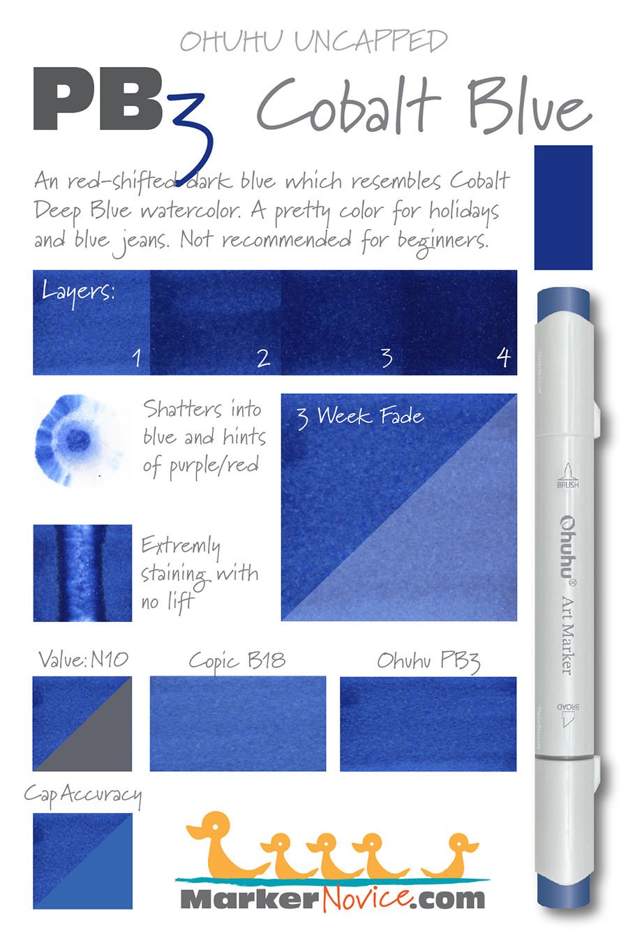
Buildup: PB3 reaches amost to maximum value at 2 coats. This makes the ink dangerous to work with. Most colorers use 3 layers for blending.
Overinking: As mentioned in above in “Buildup”, PB3 quickly reaches maximum value at 2 layers. 3-4 layers are what the average person uses in blending at which point PB3 will already be looking overinked and oily. This is why I will not recommend PB3 for beginners.
Shattering: PB3 shatters into two dyes on contact with colorless blender— blue with with a bit of purple or pink dye.
Chromatography testing shows this ink’s behavior when it comes in contact with #0 Colorless Blender (solvent). High shattering colors may leak unexpected color when you make corrections or attempt to blend with any color that has a high solvent to colorant ratio. Shattering is not bad, it’s just something to be aware of.
Staining: PB3 is an extremely staining color. Beware as you’re blending PB3 with a lighter color of ink as the solvent in the light ink may cause PB3 to separate. I saw hints of pink around the edges of several of my test swatches and I wasn’t even blending. PB3 almost shatters itself!
With alcohol markers, a staining ink is generally a sign of a low quality ink. Staining inks bond to the paper fibers and are reluctant to release. Staining inks make blending harder than it has to be!
Lift: PB3 is one of the worst lifting Ohuhu markers I’ve tried. Please look at the test sample above and note the extremely dark borders on the stripe where the colorless blender was applied. Would you want similar dark stripes to appear at the edges of your blend zones? Would you want these dark stripes where you’ve tried to make a correction?
See staining swatch. Sample was given 6 stripes of #0 Colorless Blender, drying between each stripe. Results indicate how much lifting you can expect.
Lightfast: PB3 faded by more than 50% during the test period. This is an unacceptable level of fade. For comparison, Copic B18 had a fade of about 10% during the same time frame..
Samples were swatched on X -Press It Blending Card. 1 layer of ink was exposed to windowsill sunlight for 21 days. Approximately 10 hours of sun per day based on weather conditions. Note: we do not recommend displaying original marker art under these conditions.
Ink Color Family: Okay, settle in because I’m going to rant.
What does PB mean?
Two possiblities spring to mind: Prussian Blue and Phthalo Blue.
This color family is definitely not Prussian. Prussian Blues tend to be green-shifted and PB3 here has actual red in the formula making it the OPPOSITE of Prussian.
Okay, so what about Phthalo Blue? This makes more sense. Actual Phthalo Blue comes in both green and red shift varieties. BUT there are no PB markers called Phthalo and PB5 is named “Prussian Blue”. If you name one of the PBs “Prussian” doesn’t that indicate you don’t mean Phthalo?
So how about if we look at the entire PB family: are most PB blues green shift (Prussian) or red shift (possible Phthalo)?
PB1, PB2, PB3, PB4, PB5, PB6 - red shift
PB7, PB8 - these aren’t blue, they’re cyan markers
PB9, PB10 - these aren’t blue, they’re greenish aqua
PB11 - green shift
Look, Ohuhu didn’t have to make this hard. Every single PB marker could have easily been called a B just like every other normal marker company in the world does. But no, Ohuhu purposefully goes out of their way to make things stupid. This is sheer, unadulterated stupidity.
The Ohuhu lettering system is complete garbage and doesn’t always make sense. Perhaps Ohuhu breaks the normal color family rules due to carelessness in the translation from Chinese to English. But actually, I suspect the confusion is to purposefully make it hard to track which colors are included in which sets and/or make it easy to change colors based on which ingredients are cheapest at the time.
Cap Numbering: The PB group includes 11 markers numbered from 1 to 11. The order of the PB numbers is not light to dark. The order is also not in groups of 3 (meaning 1,2,3 are one light medium, dark blending combination, then 4, 5, 6 and 7, 8,9 are other L-M-D combinations)
The PB markers aren’t even releated to each other (see the red/green shift breakdown above).
I see no reason why these markers are singled out as PBs and I suspect the numbers were assigned randomly.
Why do I feel like I’ve spent more time trying to figure out the Ohuhu numbering system than Ohuhu spent creating it?
Stupid. This is all so stupid.
As stated above, the Ohuhu numbering system generally makes no sense. The markers are not arranged in chromatic order so you can not trust the numbers to tell you whether this marker is lighter or darker than other Ohuhu markers with similar numbers.
I’m still early in the Ohuhu testing process. I will add more info to this article as I learn more and when I spot behavioral patterns.
From what I’ve learned so far, I will not be working with Ohuhu markers and I will discourage students from using them in my classes. They’re simply not worth the frustration.















B140 Aquamarine: Testing Ohuhu Markers for Lightfastness and Quality
B140 Aquamarine
Let’s take a closer look at this Ohuhu Marker and its ink characteristics.
You were told “Ohuhu is the Copic slayer! They’re like Copic Markers but better!”
Is it true?
Every Ohuhu Marker has different characteristics based upon its unique ink formula. No matter how great they say the marker is, test results do not lie.
So are Ohuhu markers as great as you’ve heard?
Let’s look at Ohuhu B140 to find out.
WARNING: Ohuhu markers have numbers on the cap but not on the body of the marker. We do not recommend coloring with both caps off due to the risk of accidentally placing the wrong caps on a marker.
Test results: Ohuhu B140 Aquamarine
Refill: At this time, Ohuhu only sells refills for 50 colors (not exactly what they advertise though, eh?). Fortunately they do sell refill ink for B140, so when this marker stops blending well, you can easily refill it to restore its potential. See Ohuhu’s current list of refills here.
Temperature: A red-shifted medium blue.
Resemblance: diluted Ultramarine Blue watercolor
Actual Value: N5
Unlike Copic, Ohuhu does not measure value— this is a glaring deficiency which makes finding blending combinations harder than it has to be!
All Copics are measured on a Neutral Gray value scale. The last number on the Copic cap indicates the value. We’re using the Copic scale to measure Ohuhu until Ohuhu releases a reliable value scale.
Color Name: This marker is ridiculously named Aquamarine.
The name on this marker is clearly a sign that Ohuhu does not employ anyone on the color development team who both speaks English and understands common color nomenclature. This color is not even remotely close to “Aquamarine”. I suspect they meant to name this “Ultramarine” but even that would be wrong because we usually think of Ultramarine as the full strength darker version of this color.
Cap Accuracy: The plastic on an Ohuhu Honolulu B140 is fairly close to the color of one coat of B140 ink. The plastic is a little duller and grayer but not so off that I’d complain about being deceived by the plastic.
A common complaint about Ohuhu is that the caps are not an accurate match to the ink inside the marker. I disagree. I have yet to find a marker that I’d classify as drastically wrong. The names may be odd and the numbering system is trash but for the. most part, the color of the plastic usually comes close to the ink.
Copic Substitution: Ohuhu B140 is slightly lighter but similar to Copic’s B24. They are not the same ink due to the difference in test results.
Note: similar colors rarely behave the same way. From experience I can tell you that Copic B24 is a relatively easy blending marker. I frequently teach with B24 because it’s easy for beginners. Ohuhu B140 is a staining color and is more stubborn than the Copic equivalent. Blue markers tend to be easy to blend with, the fact that the Ohuhu version is a staining color is surprising. Keep this in mind for ALL art supplies, it’s not enough to match the color, two similar inks, pencils, or paints can behave radically different in usage. See Copic B24 test results here.
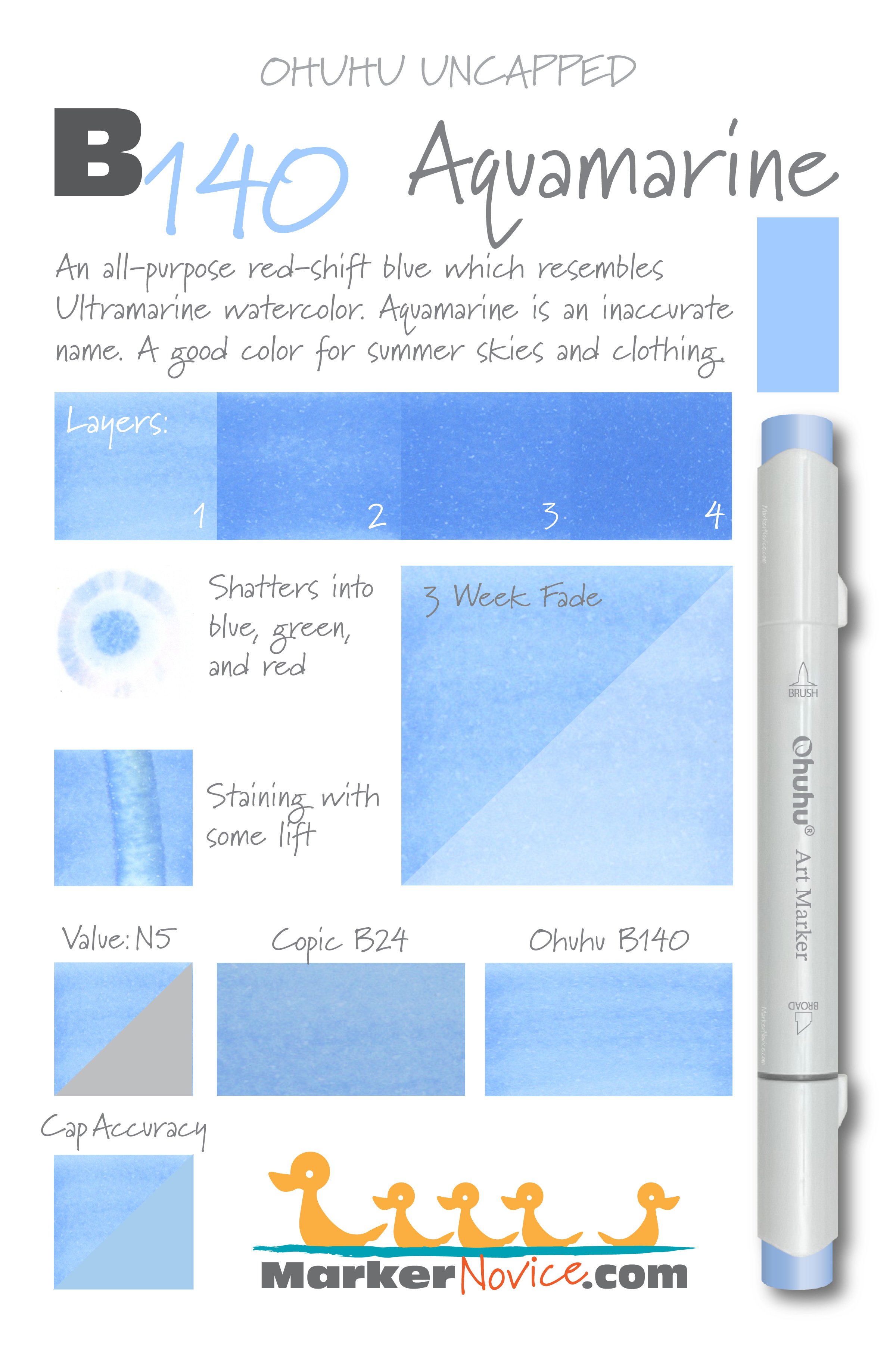
Buildup: B140 reaches a maximum value at 3 coats and looks smooth at 3 layers. Four layers does look oily.
Overinking: I do not recommend using more than 3 coats of B140. As with most Ohuhu markers, four layers looks exactly like three so why waste the ink?
Shattering: B140 shatters into three inks on contact with colorless blender— blue, green, and a soft red.
Chromatography testing shows this ink’s behavior when it comes in contact with #0 Colorless Blender (solvent). High shattering colors may leak unexpected color when you make corrections or attempt to blend with any color that has a high solvent to colorant ratio. Shattering is not bad, it’s just something to be aware of.
Staining: B140 is a staining color which is odd for a light blue ink. Beware as you’re blending B140 with a lighter color of ink as the solvent in the light ink may cause B140 to separate. I saw hints of green and red around the edges of several of my test swatches.
With alcohol markers, a staining ink is generally a sign of a low quality ink. Staining inks bond to the paper fibers and are reluctant to release. Staining inks make blending harder than it has to be!
Lift: The blue component of B140 ink lifted fairly well from the paper but the paper was left stained a noticeable light green.
See staining swatch. Sample was given 6 stripes of #0 Colorless Blender, drying between each stripe. Results indicate how much lifting you can expect.
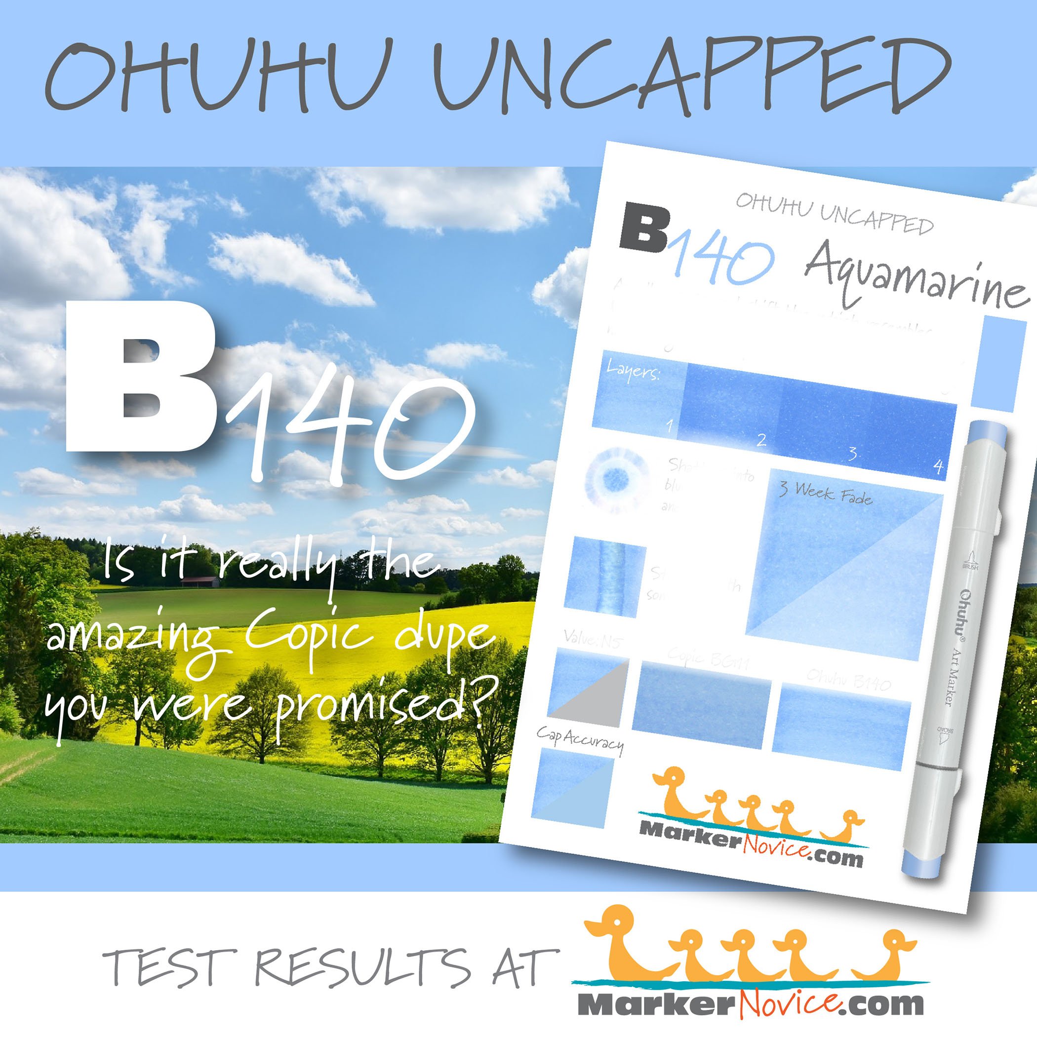
Lightfast: B140 faded by about 50% during the test period. This is average fading for Ohuhu. Copic B24 had a very mild fade rate of about 5%.
Samples were swatched on X -Press It Blending Card. 1 layer of ink was exposed to windowsill sunlight for 21 days. Approximately 10 hours of sun per day based on weather conditions. Note: we do not recommend displaying original marker art under these conditions.
Ink Color Family: Shockingly, Ohuhu does not include many blues in their 320 Honolulu sets. This is weird because blue inks are very common. Ohuhu classifies blues as B (blue) and PB. I have no idea what the P stands for. I first thought either “Prussian”, “Phthalo”, or “Pastel” but the PB marker colors do not look particularly Prussian or Phthalo, and they’re definitely not pastel.
The Ohuhu lettering system is complete garbage and doesn’t always make sense. Perhaps Ohuhu breaks the normal color family rules due to carelessness in the translation from Chinese to English. But actually, I suspect the confusion is to purposefully make it hard to track which colors are included in which sets and/or make it easy to change colors based on which ingredients are cheapest at the time.
Cap Numbering: There are only 20 Ohuhu B markers which all have 3 digit numbering. The markers do seem to make sense when divided by first number. If you’re trying to make blue blending combinations, try the B000’s, B100’s, B200’s, B300’s, or B400’s.
These groups are not related the way Copic number groups are*, so they will not blend as well, but at least the groups make a little bit of sense.
*B110 and B120 are not related, nor should B110 be in the same group as B180 or B190.
As stated above, the Ohuhu numbering system generally makes no sense. The markers are not arranged in chromatic order so you can not trust the numbers to tell you whether this marker is lighter or darker than other Ohuhu markers with similar numbers.
I’m still early in the Ohuhu testing process. I will add more info to this article as I learn more and when I spot behavioral patterns.
From what I’ve learned so far, I will not be working with Ohuhu markers and I will discourage students from using them in my classes. They’re simply not worth the frustration.
Learn about B140 “Aquamarine”, a blue Ohuhu Marker. We swatch and test Ohuhu colors- layering, staining, lift, value, lightfastness, saturation, and cap accuracy. | MarkerNovice.com | How to blend alcohol markers