
Y38 Honey: Copic Markers Uncapped ( Swatch, Ink Testing)
Y38 Honey
Let’s take a closer look at this Copic Marker and it’s ink characteristics.

Every Copic Marker has unique characteristics based on its unique ink formula.
Knowing how a color behaves will help you blend effectively and make art with confidence.
Y38 Honey
Let’s take a closer look at this Copic Marker and its ink characteristics.
Temperature: A warm, orangish yellow
Resemblance: Gamboge Yellow watercolor
Name: “Honey” is a pretty good name for this color. Real honey is never this color but I’ve seen similar shades of fabric, clothing, and craft paint yellow referred to as honey.
Marker Styles: Y38 is available in Sketch, Ciao, and Classic style markers.
For a Copic Wide marker in this color, you must purchase a “blank” or empty marker body and fill it with refill ink. Copic Wides have been do-it-yourself colors since 2019.
Copic makes refill inks for all 358 colors and every style of Copic is refillable.
Actual Value: N5
All Copics are measured on a Neutral Gray value scale. The last number on the cap is supposed to indicate value but we’ve found discrepancies where the actual ink value is different than cap designation.

Cap Accuracy: The colored plastic on a Sketch marker closely matches the color of 1-2 layers of Y38 ink.
Buildup: Y38 reaches maximum value at 3-4 layers
Shattering: Y38 does not shatter.
Chromatography testing shows this ink’s behavior when it comes in contact with #0 Colorless Blender (solvent). High shattering colors may leak unexpected color when you make corrections or attempt to blend with any color that has a high solvent to colorant ratio. Shattering is not bad, it’s just something to be aware of.
Staining: Y38 is partially staining. It tints the paper yellow but it’s because this is a dark and concentrated marker ink recipe. The actual colorant is not stubborn, does not bond with paper fibers, and is considered an easy-blending color.
Lift: Y38 has a moderate lift. Again, it’s not staining as much as this marker is rich in colorant. If this were a paint, we’d say it was “highly pigmented” and as such, there’s just a lot of colorant to lift.
See staining swatch. Sample was given 6 stripes of #0 Colorless Blender, drying between each stripe. Results indicate how much lifting you can expect.

Lightfast: Y38 faded a bit but very mild during the test period.
Samples were swatched on X-Press It Blending Card. 1 layer of ink was exposed to windowsill sunlight for 21 days. Approximately 10 hours of sun per day based on weather conditions. Note: we do not recommend displaying original Copic art under these conditions.
Natural Ink Family: Y38 is the darkest marker in the Y-Thirty family. The mother ink which forms this group is likely a yellowish orange ink but the diluted versions Copic uses are distinctly yellow. We wish Copic would produce a sub-zero series for this family as the current Y00’s feel too greenish and do not work well with any of the Y-Thirties.
Family Members: Y38, Y35, Y32
We include this information because many Copic users never think deeper than the letter groupings (R, BV, G, etc.). Every ink has its own temperature variations and underlying flavors. Understanding what an ink looks like in its different dilutions helps when creating your own blending combinations.
Complement: A medium true purple. We wish Copic made a color like this rather than the pinkish purples and violets in the V family.
Underpaint: We suggest V22.
This is simply one suggestion. Many possible colors exist. Test to find a color that pleases you.
Pushing Pencil: PC1008 Parma Violet is an excellent choice to shade this color. Please use very light pressure.
VanillaArts.com (our sister site) teaches a Push & Pull technique for dimensional coloring. This is simply one suggestion. Many possible colors exist. Test to find a color that pleases you.
YELLOW WORKSHOP

YELLOW COLORING KIT
COPIC TEST ARCHIVE

MAKE YELLOW BEAUTIFUL

UNDERPAINT BLENDING COMBINATIONS

Looking for beautiful color palettes?
We absolutely love The Color Catalog 1 & 2 from Sarah Renae Clark. It puts hundreds of Copic friendly color palettes at your fingertips.
(note: affiliate link)













Y23 Yellowish Beige: Copic Markers Uncapped ( Swatch, Ink Testing)
Y23 Yellowish Beige
Let’s take a closer look at this Copic Marker and it’s ink characteristics.
Every Copic Marker has unique characteristics based on its unique ink formula.
Knowing how a color behaves will help you blend effectively and make art with confidence.
Y23 Yellowish Beige
Let’s take a closer look at this Copic Marker and its ink characteristics.
Temperature: A warm, light yellow
Resemblance: Naples Yellow watercolor
Name: “Yellowish Beige” is a very generic name for this color, almost as if this was the last color of the day and they’d used up all their creativity on the other 358 marker. names. Yes, it’s yellowish. I’d argue that it’s not very beige.
Marker Styles: Y23 is only available in Sketch and Classic style markers.
For a Copic Wide marker in this color, you must purchase a “blank” or empty marker body and fill it with refill ink. Copic Wides have been do-it-yourself colors since 2019.
Copic makes refill inks for all 358 colors and every style of Copic is refillable.
Actual Value: N2.5
All Copics are measured on a Neutral Gray value scale. The last number on the cap is supposed to indicate value but we’ve found discrepancies where the actual ink value is different than cap designation.

Cap Accuracy: The colored plastic on a Sketch marker closely matches the color of 1-2 layers of Y23 ink.
Buildup: Y23 reaches maximum value at 4 layers
Shattering: Y23 does not shatter.
Chromatography testing shows this ink’s behavior when it comes in contact with #0 Colorless Blender (solvent). High shattering colors may leak unexpected color when you make corrections or attempt to blend with any color that has a high solvent to colorant ratio. Shattering is not bad, it’s just something to be aware of.
Staining: Y23 does not stain. This is typical of yellow inks and the light color reduces any possible staining even more.
Lift: Y23 lifts easily and can be considered a correctable, erasable color.
See staining swatch. Sample was given 6 stripes of #0 Colorless Blender, drying between each stripe. Results indicate how much lifting you can expect.

Lightfast: Y23 did not appreciably fade at all during the test period. If there’s any fading there, it’s not apparent to the naked eye.
Samples were swatched on X-Press It Blending Card. 1 layer of ink was exposed to windowsill sunlight for 21 days. Approximately 10 hours of sun per day based on weather conditions. Note: we do not recommend displaying original Copic art under these conditions.
Natural Ink Family: Y23 is dilution of Y28 but the mother ink which forms both markers is likely far more golden brown than anything Copic currently produces. Y22 is the at the lighter end of the Y-Twenty family. We wish Copic would produce a sub-zero series for this family as the current Y00’s feel too greenish and do not work well with Y23.
Family Members: Y28, Y26, Y23, Y21
We include this information because many Copic users never think deeper than the letter groupings (R, BV, G, etc.). Every ink has its own temperature variations and underlying flavors. Understanding what an ink looks like in its different dilutions helps when creating your own blending combinations.
Complement: A murky grayed violet like BV23 or if they made it, V23 (which does not exist, to our sorrow).
Underpaint: We suggest V0000
This is simply one suggestion. Many possible colors exist. Test to find a color that pleases you.
Pushing Pencil: PC1026 Grayed Lavender is an excellent choice to shade this color. Please use very light pressure.
VanillaArts.com (our sister site) teaches a Push & Pull technique for dimensional coloring. This is simply one suggestion. Many possible colors exist. Test to find a color that pleases you.
YELLOW WORKSHOP
YELLOW COLORING KIT
COPIC TEST ARCHIVE

MAKE YELLOW BEAUTIFUL
UNDERPAINT BLENDING COMBINATIONS
Looking for beautiful color palettes?
We absolutely love The Color Catalog 1 & 2 from Sarah Renae Clark. It puts hundreds of Copic friendly color palettes at your fingertips.
(note: affiliate link)

Y19 Napoli Yellow: Copics Uncapped (Marker Swatch, Ink Testing)
Y19 Napoli Yellow
Let’s take a closer look at this Copic Marker and it’s ink characteristics.

Y19 Napoli Yellow is a warm yellow Copic Marker which resembles Gamboge watercolor. This is an essential color for botanical artists but also useful for general year-round coloring. Y19 is only available in Sketch and Classic styles.
Y19 Napoli Yellow
Let’s take a closer look at this Copic Marker and its ink characteristics.
WARNING: THE Y-TEEN FAMILY HAS AN ERROR! Y17 is darker than both Y18 & Y19 which breaks the Copic numbering pattern! Y17 is the problem, not Y19. If you typically choose blending combinations based on the cap numbers, do not attempt to use Y19 as the darkest marker and Y17 as the middle, it will not work.
Temperature: A barely warm yellow. The Y-Teens are the most balanced/neutral in temperature than the other yellow number groups but Y19 does feel slightly warmer.
Resemblance: diluted Gamboge or Cadmium Yellow Dark watercolor.
Actual Value: N4. Notice the extreme discrepancy between the actual value and the value indication Y19 on the marker cap! This marker is not as dark as you’d expect!
All Copics are measured on a Neutral Gray value scale. The last number on the cap is supposed to indicate value but we’ve found discrepancies where the actual ink value is different than cap designation.
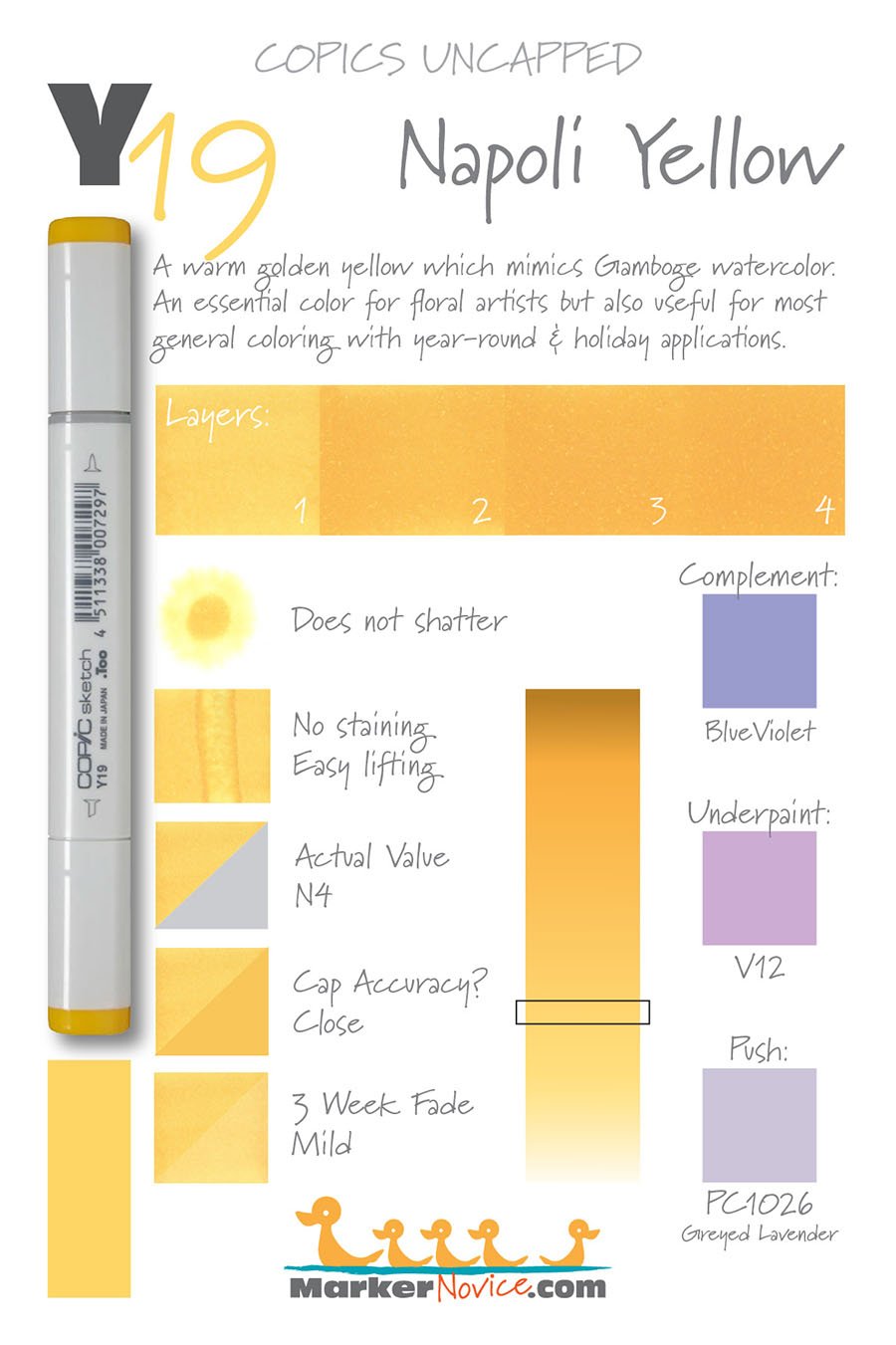
Cap Accuracy: Close. The plastic cap of a Sketch marker matches two coats of Y19.
Buildup: Y19 reaches maximum color at three layers. Any further layers begin to appear oily.
Shattering: Does not shatter.
Chromatography testing shows this ink’s behavior when it comes in contact with #0 Colorless Blender (solvent). High shattering colors may leak unexpected color when you make corrections or attempt to blend with any color that has a high solvent to colorant ratio. Shattering is not bad, it’s just something to be aware of.
Staining: Y19, as with other level 9 markers does tint the paper yellow but we found the ink moved rather well with more hits of colorless blender.
Lift: Lifts fairly easily but requires more than 6 applications of Colorless Blender to correct a mistake. It’s not stubborn, there’s simply a lot of colorant to move.
See staining swatch. Sample was given 6 stripes of #0 Colorless Blender, drying between each stripe. Results indicate how much lifting you can expect.
Lightfast: Fading was mild, less than a 10% fade.
Samples were swatched on X-Press It Blending Card. 1 layer of ink was exposed to windowsill sunlight for 21 days. Approximately 10 hours of sun per day based on weather conditions. Note: we do not recommend displaying original Copic art under these conditions.

Natural Ink Family: WARNING Y17 has been inserted into this group by mistake. Y17 is actually darker and warmer than Y18 and Y19.
We do not recommend using Y17 in blending combinations with Y18 or Y19 due to the value mismatch.
Y19 is a highly recommended color and I recommend the entire group (minus Y17) for all colorers.
Family Members: Y11, Y13, Y15, Y17*, Y18, Y19
Shop for Y markers at Violeta-ink.com (affiliate link).
We include this information because many Copic users never think deeper than the letter groupings (R, BV, G, etc.). Every ink has its own temperature variations and underlying flavors. Understanding what an ink looks like in its different dilutions helps when creating your own blending combinations.
Complement: A medium blue violet such as BV04 (affiliate link).
Underpaint: We suggest V12 (affiliate link).
This is simply one suggestion. Many possible colors exist. Test to find a color that pleases you.
Pushing Pencil: PC1026 Greyed Lavender (affiliate link) works wonderfully.
VanillaArts.com (our sister site) teaches a Push & Pull technique for dimensional coloring. This is simply one suggestion. Many possible colors exist. Test to find a color that pleases you.

Color palettes and swatches using yellow Copics:
Looking for beautiful color palettes?
We absolutely love The Color Catalog 1 & 2 from Sarah Renae Clark. It puts hundreds of Copic friendly color palettes at your fingertips.
(note: affiliate link)

Purchase Y19 at Violeta-Ink.com

Learn more about Y19 Napoli Yellow Copic Marker. We swatch and test Copic colors: layering, staining, lift, value, lightfastness, saturation, cap accuracy. | MarkerNovice.com | How to color with alcohol markers

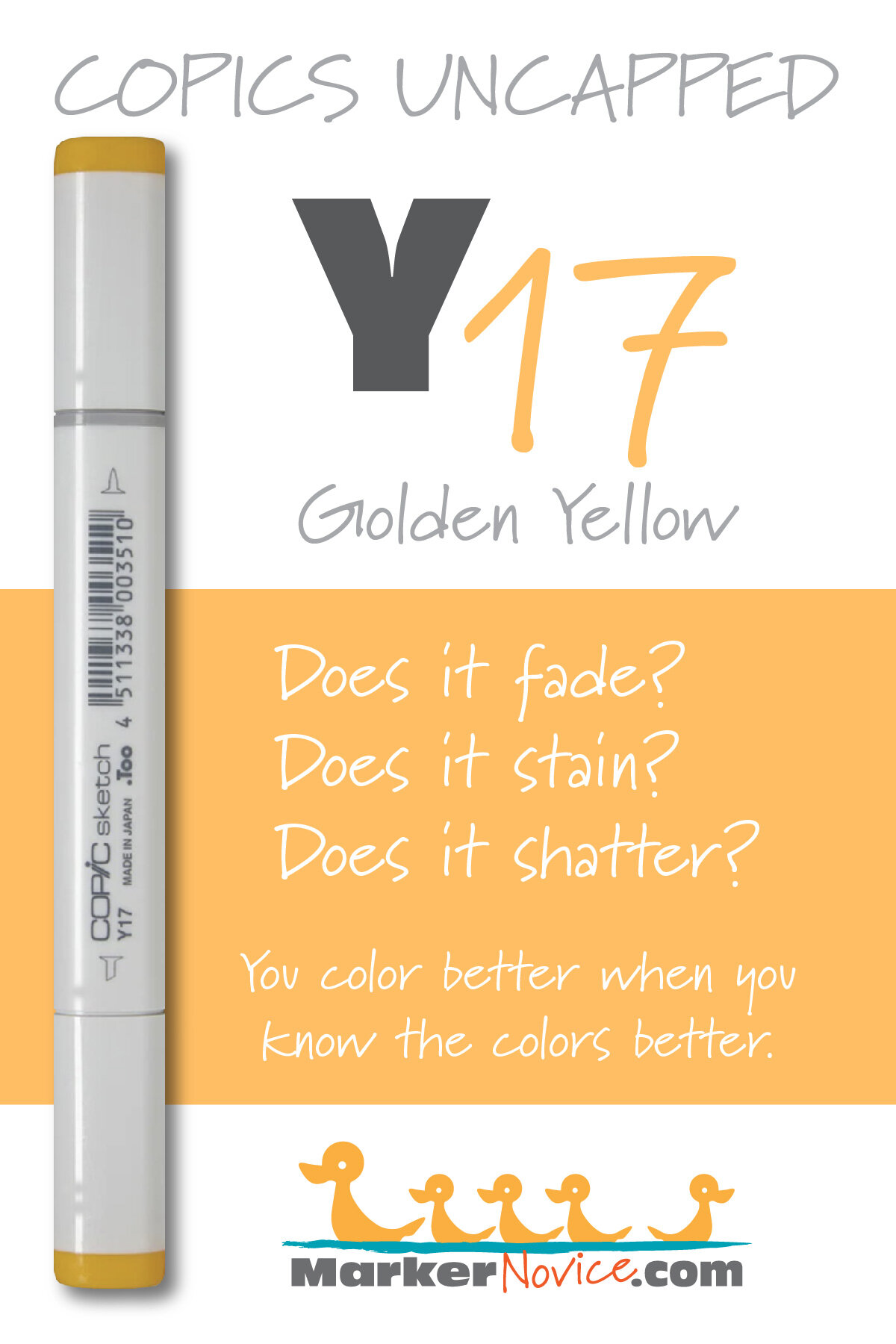
Y17 Golden Yellow: Copics Uncapped (Marker Swatch, Ink Testing)
Y17 Golden Yellow
Let’s take a closer look at this Copic Marker and it’s ink characteristics.

Y17 Golden Yellow is a warm yellow Copic Marker which resembles Gamboge watercolor. This ink is a mismatch to other inks in the same color series and not recommended. Y17 is available in Sketch, Ciao, and Classic styles.
Every Copic Marker has unique characteristics based on its unique ink formula.
Knowing how a color behaves will help you blend effectively and make art with confidence.
Y17 Golden Yellow
Let’s take a closer look at this Copic Marker and its ink characteristics.
WARNING: THIS COLOR HAS BEEN MIS-NUMBERED! Y17 is darker than Y18 & Y19 which breaks the Copic numbering pattern! We suspect this marker would be more accurately labeled in the Y30s group! Please read the test results below, especially the Natural Ink Family category for more proof.
Because this ink has been mis-numbered and because the color so closely resembles Y19 and Y38, we do not recommend this marker for purchase. Save this purchase for last and only if you’re compelled to own all 358 Copics.
Temperature: A warm yellow, unlike other members of the same color group (Y-teens)
Resemblance: Gamboge watercolor. (Other members of the Y-Teen family resemble Cadmium Yellow watercolor)
Actual Value: N4. Notice the extreme discrepancy between the actual value and the value indication Y17 on the marker cap! This marker is not as dark as you’d expect!
All Copics are measured on a Neutral Gray value scale. The last number on the cap is supposed to indicate value but we’ve found discrepancies where the actual ink value is different than cap designation.
Cap Accuracy: Close. The plastic cap of a Sketch marker is close to two coats of Y17.
Buildup: Y17 develops an oily or blotchy appearance on the first coat which doesn’t disappear until the color reaches full strength at 4 layers.
Shattering: Does not shatter.
Chromatography testing shows this ink’s behavior when it comes in contact with #0 Colorless Blender (solvent). High shattering colors may leak unexpected color when you make corrections or attempt to blend with any color that has a high solvent to colorant ratio. Shattering is not bad, it’s just something to be aware of.
Staining: Y17 does not stain the paper much. There was a slight yellow tint left after 6 stripes of colorless blender but we think this would disappear with a bit more blender.

Lift: Lifts fairly easily.
See staining swatch. Sample was given 6 stripes of #0 Colorless Blender, drying between each stripe. Results indicate how much lifting you can expect.
Lightfast: Fading was significant, about a 50% fade.
Samples were swatched on X-Press It Blending Card. 1 layer of ink was exposed to windowsill sunlight for 21 days. Approximately 10 hours of sun per day based on weather conditions. Note: we do not recommend displaying original Copic art under these conditions.
Natural Ink Family: WARNING Y17 has been inserted into the Y-Teen family but it doesn’t share the same base ink as Y11 through Y19. Y17 is actually darker and warmer than Y18 and Y19. We think Y17 would be more accurately placed as Y37 because it behaves like a lost member of the more golden Y30 family. The color of Y17 is midway between Y35 and Y38. It even blends better with Y35 than with Y15!
Family Members: Y11, Y13, Y15, Y17*, Y18, Y19
We include this information because many Copic users never think deeper than the letter groupings (R, BV, G, etc.). Every ink has its own temperature variations and underlying flavors. Understanding what an ink looks like in its different dilutions helps when creating your own blending combinations.
Complement: A medium blue violet such as BV04
Underpaint: We suggest V12
This is simply one suggestion. Many possible colors exist. Test to find a color that pleases you.
Pushing Pencil: Prismacolor 1026 Greyed Lavender works wonderfully.
VanillaArts.com (our sister site) teaches a Push & Pull technique for dimensional coloring. This is simply one suggestion. Many possible colors exist. Test to find a color that pleases you.
Vanilla Arts Classes using Y17:
We continue to create new content and classes and we will update here as more become available.
Visit the workshop resource page at our sister site VanillaArts.com for a wide variety of Copic & colored pencil classes.
Vanilla Arts Digi Stamps using Y17:
We continue to create new content and stamps and we will update here as more become available.
Visit the Stamp Shop resource page at our sister site VanillaArts.com for a wide variety of Vanilla Arts stamps.
Color palettes and swatches using Y17:

Looking for beautiful color palettes?
We absolutely love The Color Catalog 1 & 2 from Sarah Renae Clark. It puts hundreds of Copic friendly color palettes at your fingertips.
(note: affiliate link)


Y08 Acid Yellow: Copics Uncapped (Marker Swatch, Ink Testing)
Y08 Acid Yellow
Let’s take a closer look at this Copic Marker and it’s ink characteristics.
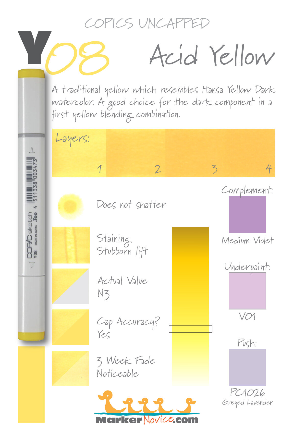
Y08 Acid Yellow is a traditional yellow Copic Marker which resembles Hansa Yellow Dark watercolor. A good choice for the dark component in a first yellow blending combination but this marker is not as dark as you’d expect. Y08 is available in Sketch, Ciao, and Classic styles.
Every Copic Marker has unique characteristics based on its unique ink formula.
Knowing how a color behaves will help you blend effectively and make art with confidence.
Y08 Acid Yellow
Let’s take a closer look at this Copic Marker and its ink characteristics.
Temperature: A standard traditional yellow, not noticeably cool or warm.
Resemblance: Hansa Yellow Dark watercolor.
Actual Value: N3. WARNING: This marker is not nearly as dark as the cap number indicates!
All Copics are measured on a Neutral Gray value scale. The last number on the cap is supposed to indicate value but we’ve found discrepancies where the actual ink value is different than cap designation.
Cap Accuracy: Close. The plastic cap of a Sketch marker is close to one coat of Y08.
Buildup: Y08 layers up to 3 coats without looking oily. Reaches maximum value at 3 coats.
Shattering: Does not shatter.
Chromatography testing shows this ink’s behavior when it comes in contact with #0 Colorless Blender (solvent). High shattering colors may leak unexpected color when you make corrections or attempt to blend with any color that has a high solvent to colorant ratio. Shattering is not bad, it’s just something to be aware of.

Staining: Y08 stains the paper with a vivid yellow.
Lift: You can push the color off to the side but this marker is stubborn and will not lift much.
See staining swatch. Sample was given 6 stripes of #0 Colorless Blender, drying between each stripe. Results indicate how much lifting you can expect.
Lightfast: Our swatch faded about 20% during the test period.
Samples were swatched on X-Press It Blending Card. 1 layer of ink was exposed to windowsill sunlight for 21 days. Approximately 10 hours of sun per day based on weather conditions. Note: we do not recommend displaying original Copic art under these conditions.
Natural Ink Family: Y08 is the dark end of the Y-Zero family. They are unnatural looking yellows with a chemical vibrancy to them. Several yellows in this family look like office high-lighters and the sub-zeros have a greenish glow to them. Even the caps are consistently misleading! Always keep in mind that this family is NOT what you expect, ever.
Family Members: Y0000, Y000, Y00, Y02, Y04, Y06, and Y08
We include this information because many Copic users never think deeper than the letter groupings (R, BV, G, etc.). Every ink has its own temperature variations and underlying flavors. Understanding what an ink looks like in its different dilutions helps when creating your own blending combinations.
Complement: A medium violet such as V15
Underpaint: We suggest V01 underneath Y08.
This is simply one suggestion. Many possible colors exist. Test to find a color that pleases you.
Pushing Pencil: Prismacolor 1026 Greyed Lavender works wonderfully.
VanillaArts.com (our sister site) teaches a Push & Pull technique for dimensional coloring. This is simply one suggestion. Many possible colors exist. Test to find a color that pleases you.
Vanilla Arts Classes using Y08:
We continue to create new content and classes and we will update here as more become available.
Visit the workshop resource page at our sister site VanillaArts.com for a wide variety of Copic classes.
Vanilla Arts Digi Stamps using Y08:
We continue to create new content and stamps and we will update here as more become available.
Visit the stamp shop page at our sister site VanillaArts.com for a wide variety of digi stamps.
Color palettes and swatches using Y08:
We are building our palette and swatch collection a little more each week and will update here as more become available.
Visit the color resource page at our sister site VanillaArts.com for a wide variety of Copic palettes and swatches.
Looking for beautiful color palettes?
We absolutely love The Color Catalog 1 & 2 from Sarah Renae Clark. It puts hundreds of Copic friendly color palettes at your fingertips.
(note: affiliate link)


Y00 Barium Yellow: Copics Uncapped (Marker Swatch, Ink Testing)
Y00 Barium Yellow
Let’s take a closer look at this Copic Marker and it’s ink characteristics.

Y00 Barium Yellow is a glowing yellow Copic Marker which resembles diluted Hansa Yellow watercolor. This marker looks like a pale yellow highlighter, adds an unnatural florescent greenish tint to blending combinations. Y00 is available in Sketch, Ciao, and Classic styles.
Every Copic Marker has unique characteristics based on its unique ink formula.
Knowing how a color behaves will help you blend effectively and make art with confidence.
Y00 Barium Yellow
Let’s take a closer look at this Copic Marker and its ink characteristics.
WARNING: This color does not reproduce well due to the florescent nature of the ink. The test graphic above has been digitally matched to the yellow values we see in real life but does not capture the true florescence of Y00.
Temperature: A standard yellow, not noticeably cool or warm. Be careful, this marker glows like a highlighter.
Resemblance: Diluted Hansa Yellow watercolor.
Actual Value: N0 (the glow throws this measurement off)
All Copics are measured on a Neutral Gray value scale. The last number on the cap is supposed to indicate value but we’ve found discrepancies where the actual ink value is different than cap designation.
Cap Accuracy: Close. The plastic cap of a Sketch marker is close to one coat of Y00 but is deceptive because the cap does not glow the way the ink does.
Buildup: Y00 layers extremely without looking oily. Reaches maximum value at 3-4 coats.
Shattering: Does not shatter.
Chromatography testing shows this ink’s behavior when it comes in contact with #0 Colorless Blender (solvent). High shattering colors may leak unexpected color when you make corrections or attempt to blend with any color that has a high solvent to colorant ratio. Shattering is not bad, it’s just something to be aware of.

Staining: Y00 does not stain the paper.
Lift: Lifts easily.
See staining swatch. Sample was given 6 stripes of #0 Colorless Blender, drying between each stripe. Results indicate how much lifting you can expect.
Lightfast: EXTREME FADING! Our Y00 swatch faded by about 90%. If we didn’t know there was supposed to be marker there, we would assume the paper was just a bit off colored in that spot.
Samples were swatched on X-Press It Blending Card. 1 layer of ink was exposed to windowsill sunlight for 21 days. Approximately 10 hours of sun per day based on weather conditions. Note: we do not recommend displaying original Copic art under these conditions.
Natural Ink Family: Y00 is at the lighterer end of the Y-Zero family. They are unnatural looking yellows with a chemical vibrancy to them. Several yellows in this family look like office high-lighters and the sub-zeros have a greenish glow to them. Even the caps are consistently misleading! Always keep in mind that this family is NOT what you expect, ever.
Family Members: Y0000, Y000, Y00, Y02, Y04, Y06, and Y08
We include this information because many Copic users never think deeper than the letter groupings (R, BV, G, etc.). Every ink has its own temperature variations and underlying flavors. Understanding what an ink looks like in its different dilutions helps when creating your own blending combinations.
Complement: A pale violet such as V20 or BV000
Underpaint: N/A - this marker is so light and glowing, there’s no point in underpainting it.
This is simply one suggestion. Many possible colors exist. Test to find a color that pleases you.
Pushing Pencil: Prismacolor 1026 Greyed Lavender works wonderfully.
VanillaArts.com (our sister site) teaches a Push & Pull technique for dimensional coloring. This is simply one suggestion. Many possible colors exist. Test to find a color that pleases you.
Vanilla Arts Classes using Y00:

Cheers: Amy explores how, and how not to approach glass objects in your stamp images. Find more info here.

Celebration Cupcake: Soft fluffy frosting and tasty cake. Color gentle waves of frosting & crisply folded pleats. You can use this technique on skirts, shirts, curtains, anything with folds! Find more info here.
Vanilla Arts Digi Stamps using Y00:
We continue to create new content and stamps and we will update here as more become available.
Visit the stamp shop page at our sister site VanillaArts.com for a wide variety of digi stamps.
Color palettes and swatches using Y00:
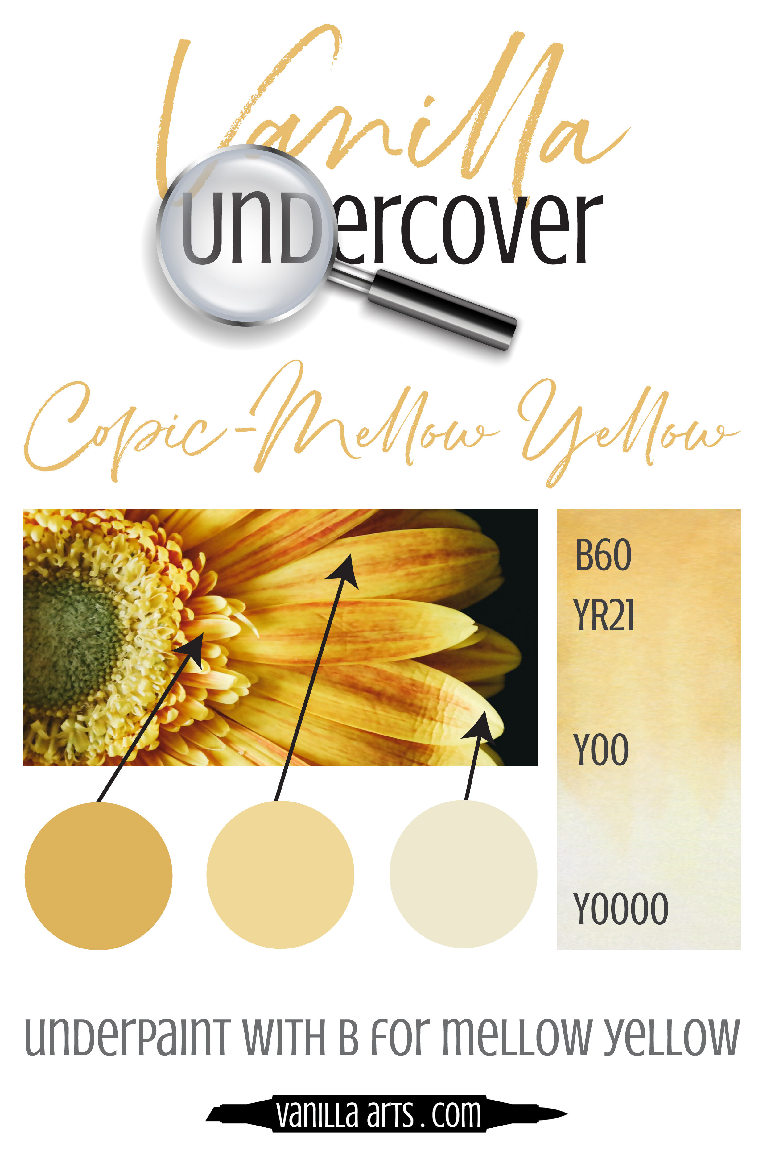
Looking for beautiful color palettes?
We absolutely love The Color Catalog 1 & 2 from Sarah Renae Clark. It puts hundreds of Copic friendly color palettes at your fingertips.
(note: affiliate link)
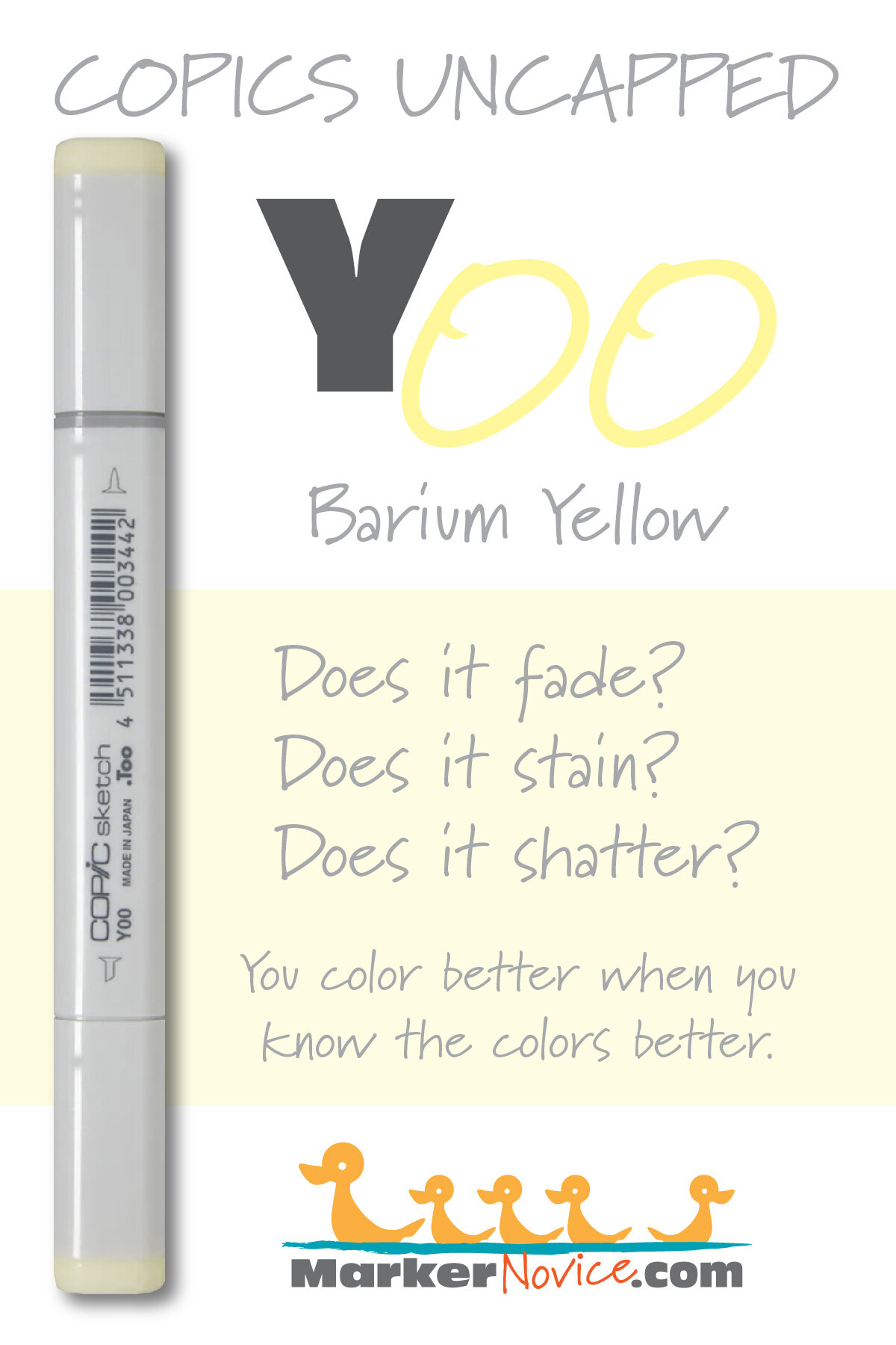

Y11 Pale Yellow: Copics Uncapped (Marker Swatch, Ink Testing)
Y11 Pale Yellow
Let’s take a closer look at this Copic Marker and it’s ink characteristics.

Y11 Pale Yellow is a pale traditional yellow Copic Marker which mimics diluted Cadmium Yellow Light watercolor. This yellow feels organic yet still clean and cheerful. Y11 is available in Sketch, Ciao, and Classic styles.
Every Copic Marker has unique characteristics based on its unique ink formula.
Knowing how a color behaves will help you blend effectively and make art with confidence.
Y11 Pale Yellow
Let’s take a closer look at this Copic Marker and its ink characteristics.
Temperature: A pale balanced yellow, not noticeably cool or warm.
Resemblance: diluted Cadmium Yellow Light watercolor.
Actual Value: N1
All Copics are measured on a Neutral Gray value scale. The last number on the cap is supposed to indicate value but we’ve found discrepancies where the actual ink value is different than cap designation.
Cap Accuracy: Close. The plastic cap of a Sketch marker is close to one coat of Y11.
Buildup: Y11 layers beautifully without looking oily. Take note that this ink does not build value well. Two coats looks almost like four coats.
Shattering: Does not shatter.
Chromatography testing shows this ink’s behavior when it comes in contact with #0 Colorless Blender (solvent). High shattering colors may leak unexpected color when you make corrections or attempt to blend with any color that has a high solvent to colorant ratio. Shattering is not bad, it’s just something to be aware of.

Staining: Y11 does not stain the paper.
Lift: Lifts easily.
See staining swatch. Sample was given 6 stripes of #0 Colorless Blender, drying between each stripe. Results indicate how much lifting you can expect.
Lightfast: Fading was extreme, about an 80% fade.
Samples were swatched on X-Press It Blending Card. 1 layer of ink was exposed to windowsill sunlight for 21 days. Approximately 10 hours of sun per day based on weather conditions. Note: we do not recommend displaying original Copic art under these conditions.
Natural Ink Family: Y11 is the light end of the Y-Teen family. They’re all traditional yellows which do not look florescent or unnatural.
Family Members: Y11, Y13, Y15, Y17*, Y18, Y19
*See Y17 for more info, this marker does not fit well into the family.
We include this information because many Copic users never think deeper than the letter groupings (R, BV, G, etc.). Every ink has its own temperature variations and underlying flavors. Understanding what an ink looks like in its different dilutions helps when creating your own blending combinations.
Complement: A pale violet such as BV20
Underpaint: We suggest BV0000
This is simply one suggestion. Many possible colors exist. Test to find a color that pleases you.
Pushing Pencil: Prismacolor 1026 Greyed Lavender works wonderfully.
VanillaArts.com (our sister site) teaches a Push & Pull technique for dimensional coloring. This is simply one suggestion. Many possible colors exist. Test to find a color that pleases you.
Vanilla Arts Classes using Y11:

Butterfly Shadows: A lesson on cast shadows to add life and reality to your coloring. Find more info here.
Vanilla Arts Digi Stamps using Y11:

Go Fish: This digital image is based on a live sketch, drawn at Amy’s local aquarium. You can tell he’s a sub-adult because his stripes haven't straightened out. The maze pattern they're born with eventually straightens to a very precise diagonal stripe. Find more info here.

Texas Yellow Rose: A beautiful botanical stamp originally created for students of the San Antonio Art Retreat. Colored in Copic & colored pencil but also perfect for watercolor & other mediums. It’s so easy to change the color palette for future projects! Find more info here.
Color palettes and swatches using Y11:

Looking for beautiful color palettes?
We absolutely love The Color Catalog 1 & 2 from Sarah Renae Clark. It puts hundreds of Copic friendly color palettes at your fingertips.
(note: affiliate link)


Y06 Yellow: Copics Uncapped (Marker Swatch, Ink Testing)
Y06 Yellow
Let’s take a closer look at this Copic Marker and it’s ink characteristics.

Y06 Yellow is a standard yellow Copic Marker which resembles Hansa Yellow watercolor. This is an intense yellow which easily dominates a color palette with an unnatural glow. Often looks like a highlighter. Y06 is available in Sketch, Ciao, and Classic styles.
Every Copic Marker has unique characteristics based on its unique ink formula.
Knowing how a color behaves will help you blend effectively and make art with confidence.
Y06 Yellow
Let’s take a closer look at this Copic Marker and its ink characteristics.
WARNING: This color does not reproduce well due to the florescent nature of the ink. The test graphic above has been scanned and digitally altered to come close to the authentic color but does not capture the radioactive glow of Y06.
Temperature: A standard yellow, not noticeably cool or warm. But be careful, this marker glows like a highlighter.
Resemblance: Hansa Yellow watercolor.
Actual Value: N3 (the glow throws this measurement off)
All Copics are measured on a Neutral Gray value scale. The last number on the cap is supposed to indicate value but we’ve found discrepancies where the actual ink value is different than cap designation.
Cap Accuracy: Close. The plastic cap of a Sketch marker is close to one coat of Y06 but is deceptive because the cap does not glow the way the ink does.
Buildup: Y06 layers without looking oily but oddly, this ink does not build value well. Two coats looks almost like four coats.
Shattering: Does not shatter.
Chromatography testing shows this ink’s behavior when it comes in contact with #0 Colorless Blender (solvent). High shattering colors may leak unexpected color when you make corrections or attempt to blend with any color that has a high solvent to colorant ratio. Shattering is not bad, it’s just something to be aware of.

Staining: Y06 does not stain the paper.
Lift: Lifts easily.
See staining swatch. Sample was given 6 stripes of #0 Colorless Blender, drying between each stripe. Results indicate how much lifting you can expect.
Lightfast: Fading was extreme and irregular, about a 50% fade. Strangely, this color did not just get lighter, it also browned to an unpleasant tan.
Samples were swatched on X-Press It Blending Card. 1 layer of ink was exposed to windowsill sunlight for 21 days. Approximately 10 hours of sun per day based on weather conditions. Note: we do not recommend displaying original Copic art under these conditions.
Natural Ink Family: Y06 is at the darker end of the Y-Zero family. They’re unnatural looking yellows with a chemical vibrancy to them. Several yellows in this family (especially Y06) look like office high-lighters if you’re not careful.
Family Members: Y0000, Y2000, Y00, Y02, Y04, Y06, and Y08.
We include this information because many Copic users never think deeper than the letter groupings (R, BV, G, etc.). Every ink has its own temperature variations and underlying flavors. Understanding what an ink looks like in its different dilutions helps when creating your own blending combinations.
Complement: A pale violet such as V22
Underpaint: We suggest V12
This is simply one suggestion. Many possible colors exist. Test to find a color that pleases you.
Pushing Pencil: Prismacolor 1026 Greyed Lavender works wonderfully.
VanillaArts.com (our sister site) teaches a Push & Pull technique for dimensional coloring. This is simply one suggestion. Many possible colors exist. Test to find a color that pleases you.
Vanilla Arts Classes using Y06:
Vanilla Arts Digi Stamps using Y06:
We continue to create new content and stamps and we will update here as more become available.
Visit the stamp shop page at our sister site VanillaArts.com for a wide variety of digi stamps.
Color palettes and swatches using Y06:
We are building our palette and swatch collection a little more each week and will update here as more become available.
Visit the color resource page at our sister site VanillaArts.com for a wide variety of Copic palettes and swatches.
Looking for beautiful color palettes?
We absolutely love The Color Catalog 1 & 2 from Sarah Renae Clark. It puts hundreds of Copic friendly color palettes at your fingertips.
(note: affiliate link)
