YG97 Spanish Olive: Copics Uncapped (Marker Swatch, Ink Testing)
YG97 Spanish Olive
Let’s take a closer look at this Copic Marker and it’s ink characteristics.

Every Copic Marker has different characteristics based upon its unique ink formula.
Knowing how a color behaves will help you blend effectively and make art with confidence.
YG97 Spanish Olive
Let’s take a closer look at this Copic Marker and its ink characteristics.
Temperature: A warm green
Resemblance: diluted Sap Green watercolor (one that leans a bit yellowish)
Name: “Spanish Olive” is an excellent name for this organic warm green which very much mimics the color of green olives. I do find it interesting that several years ago, Copic changed several color names to remove ethnic names and yet this one remains? Draw your own conclusions.
Copic Styles: YG97 is only available in Sketch and Classic style markers.
Actual Value: N7
All Copics are measured on a Neutral Gray value scale. The last number on the cap is supposed to indicate value but we’ve found discrepancies where the actual ink value is different than cap designation.
Cap Accuracy: The colored plastic on the Sketch cap matches 3=4 layers of YG97 ink. This can be startling when you first use YG97 as the color is lighter than expected.

Buildup: YG97 reaches maximum color value at 3 layers.
WARNING: This ink is unstable. YG97 can self-shatter, the dyes can separate from the formula leaking gold or brown along the outside edge of the color zone.
Shattering: Shatters into green with golden green seeping out at the margins. See warning above for YG97’s self-shattering behavior.
Chromatography testing shows this ink’s behavior when it comes in contact with #0 Colorless Blender (solvent). High shattering colors may leak unexpected color when you make corrections or attempt to blend with any color that has a high solvent to colorant ratio. Shattering is not bad, it’s just something to be aware of.
Staining: YG97 stains the paper light blue.
Lift: YG97 can be moved but hardly enough to correct a mistake. The paper is permanently stained light blue, the edges of the area exposed to colorless blender can look slightly metallic, a golden green. We do not recommend trying to lift this color due to the damage colorless blender will trigger.
See staining swatch. Sample was given 6 stripes of #0 Colorless Blender, drying between each stripe. Results indicate how much lifting you can expect.
Lightfast: YG97 faded by less than 5% during the test period.
Samples were swatched on X-Press It Blending Card. 1 layer of ink was exposed to windowsill sunlight for 21 days. Approximately 10 hours of sun per day based on weather conditions. Note: we do not recommend displaying original Copic art under these conditions.

Natural Ink Family: YG97 is at the darker end of the YG-Ninety family.
Family Members: YG91 YG93, YG95, YG97, YG99
We include this information because many Copic users never think deeper than the letter groupings (R, BV, G, etc.). Every ink has its own temperature variations and underlying flavors. Understanding what an ink looks like in its different dilutions helps when creating your own blending combinations.
Complement: A cool purple blue like BV13
Underpaint: BV11 desaturates YG97 very well.
This is simply one suggestion. Many possible colors exist. Test to find a color that pleases you.
Pushing Pencil: PC1078 Black Cherry provides a nicely desaturated push for YG63.
VanillaArts.com (our sister site) teaches a Push & Pull technique for dimensional coloring. This is simply one suggestion. Many possible colors exist. Test to find a color that pleases you.
GREEN WORKSHOP

GREEN COLORING KIT

GREEN TEST ARCHIVE

MAKE GREEN BEAUTIFUL

UNDERPAINT BLEND COMBINATIONS

Looking for beautiful color palettes?
We absolutely love The Color Catalog 1 & 2 from Sarah Renae Clark. It puts hundreds of Copic friendly color palettes at your fingertips.
(note: affiliate link)












YG63 Pea Green: Copics Uncapped (Marker Swatch, Ink Testing)
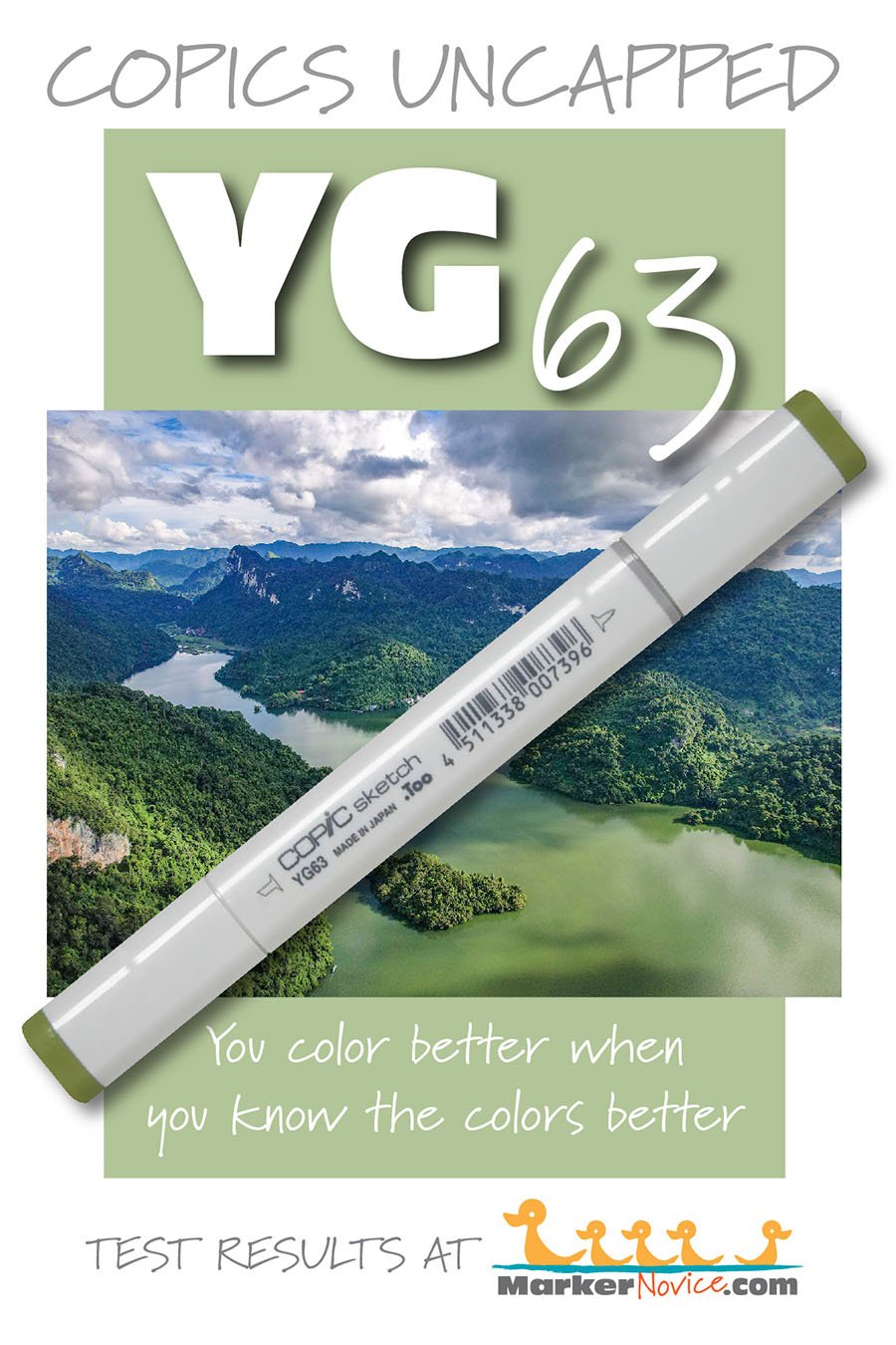
YG63 Pea Green
Let’s take a closer look at this Copic Marker and it’s ink characteristics.
Every Copic Marker has different characteristics based upon its unique ink formula.
Knowing how a color behaves will help you blend effectively and make art with confidence.
YG63 Pea Green
Let’s take a closer look at this Copic Marker and its ink characteristics.
Temperature: A warm green
Resemblance: diluted Sap Green watercolor.
Name: “Pea Green” is an excellent name for this organic soft green color.
Copic Styles: YG63 is available in Sketch, Classic, and Ciao style markers.
Actual Value: N4
All Copics are measured on a Neutral Gray value scale. The last number on the cap is supposed to indicate value but we’ve found discrepancies where the actual ink value is different than cap designation.
Cap Accuracy: The colored plastic on the Sketch cap matches 3-4 layers of YG63 ink. This can be startling when you first use YG63 as the color is lighter than expected.
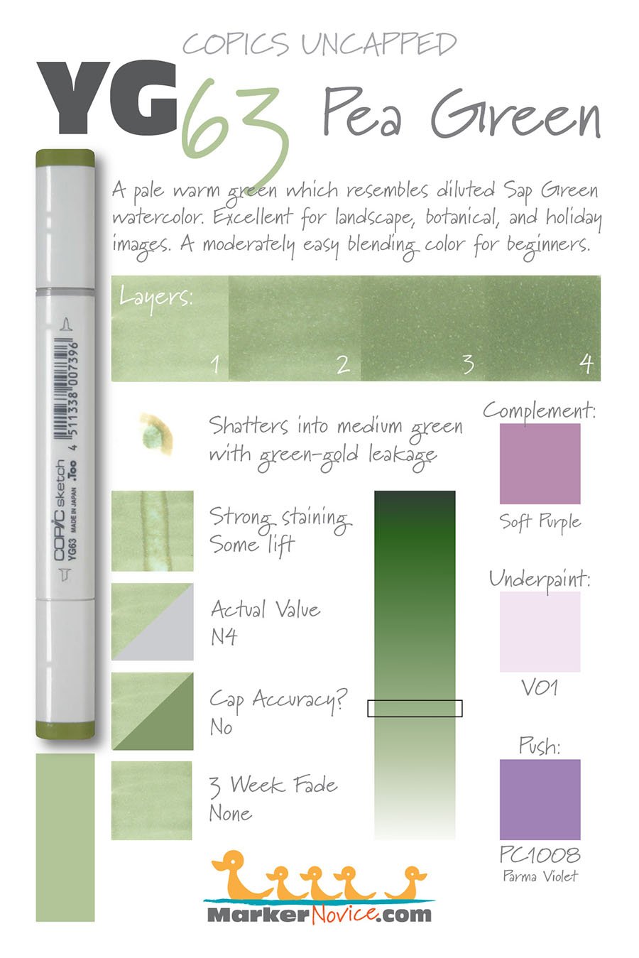
Buildup: YG63 reaches maximum color value at 3-4 layers.
WARNING: This ink is unstable. at four layers, YG63 can self-shatter, the dyes can separate from the formula leaking gold or brown along the outside edge of the color zone.
Shattering: Shatters into green with golden green seeping out at the margins. See warning above for YG63’s self-shattering behavior.
Chromatography testing shows this ink’s behavior when it comes in contact with #0 Colorless Blender (solvent). High shattering colors may leak unexpected color when you make corrections or attempt to blend with any color that has a high solvent to colorant ratio. Shattering is not bad, it’s just something to be aware of.
Staining: YG63 stains the paper light blue.
Lift: YG63 can be moved but not lifted. The paper is permanently stained light blue, the edges of the area exposed to colorless blender can look slightly metallic, a golden green. We do not recommend trying to lift this color due to the damage colorless blender will trigger.
See staining swatch. Sample was given 6 stripes of #0 Colorless Blender, drying between each stripe. Results indicate how much lifting you can expect.
Lightfast: YG63 did not fade at all during the testing period.
Samples were swatched on X-Press It Blending Card. 1 layer of ink was exposed to windowsill sunlight for 21 days. Approximately 10 hours of sun per day based on weather conditions. Note: we do not recommend displaying original Copic art under these conditions.
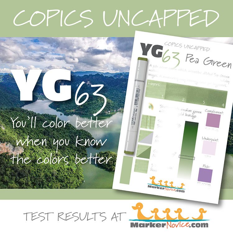
Natural Ink Family: YG63 is the middle of the YG-Sixty family.
Family Members: YG67, YG63, YG61
Shop for YG markers at Violeta-ink.com (affiliate link)
We include this information because many Copic users never think deeper than the letter groupings (R, BV, G, etc.). Every ink has its own temperature variations and underlying flavors. Understanding what an ink looks like in its different dilutions helps when creating your own blending combinations.
Complement: A cool, medium purple-pink like V05 (affiliate link)
Underpaint: V01 (affiliate link) desaturates YG17 with bright but natural look..
This is simply one suggestion. Many possible colors exist. Test to find a color that pleases you.
Pushing Pencil: PC1008 Parma Violet (affiliate link) provides a nicely desaturated push for YG63.
VanillaArts.com (our sister site) teaches a Push & Pull technique for dimensional coloring. This is simply one suggestion. Many possible colors exist. Test to find a color that pleases you.

Watermelon Stack, explore realistic pointillism. We’re doing more here than just dotting for fun!
Vanilla Arts Classes using light green:
Celebrate yellow-green with Sketch Garden digital stamps by Amy Shulke:
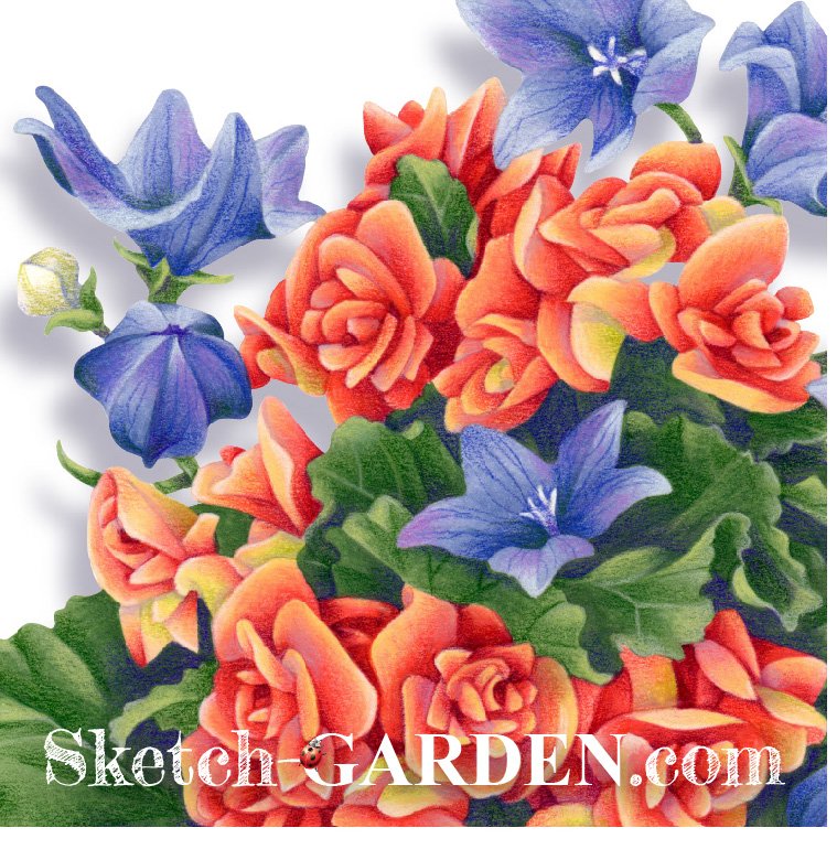

Visit the stamp shop page at our sister site VanillaArts.com for a wide variety of Copic kits.
Color palettes using light green:

Visit the color resource page at our sister site VanillaArts.com for a wide variety of Copic palettes and swatches.
Looking for beautiful color palettes?
We absolutely love The Color Catalog 1 & 2 from Sarah Renae Clark. It puts hundreds of Copic friendly color palettes at your fingertips.
(note: affiliate link)


YG23 New Leaf: Copics Uncapped (Marker Swatch, Ink Testing)
YG23 New Leaf
Let’s take a closer look at this Copic Marker and it’s ink characteristics.
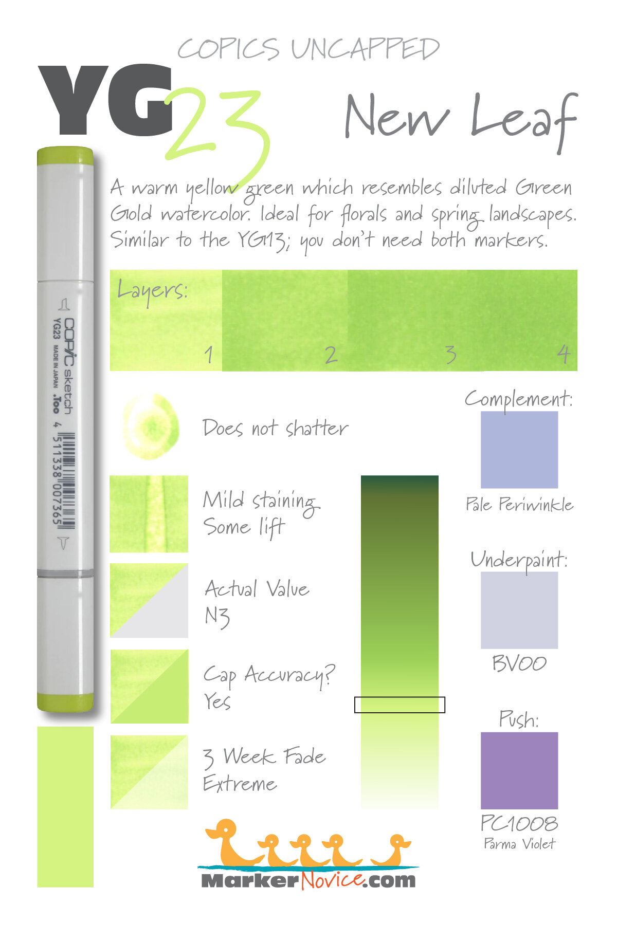
YG23 is a warm yellow green Copic Marker which closely resembles Green Gold watercolor. Ideal for florals and spring landscapes. Similar in color to YG03 and YG13; you don’t need all 3 markers. YG23 is available in Copic Sketch, Ciao, and Classic marker styles.
Every Copic Marker has unique characteristics based on its unique ink formula.
Knowing how a color behaves will help you blend effectively and make art with confidence.
YG23 New Leaf
Let’s take a closer look at this Copic Marker and its ink characteristics.
Special Purchasing Advice: YG23 is incredibly similar to YG03 and YG13. We do not recommend purchasing all three markers!
What are the differences? First off, understand that all three colors are incredibly similar! YG03 is the most yellow of the three, YG13 is the most green, YG23 sits between the two. The average person would never guess they were looking at 3 different colors. All three markers are the same value and mildly staining. All have extreme fading.
Which do we recommend purchasing? Of the three markers, we recommend YG03 because it’s the most stable ink formula and it’s the least likely to look oily or blotchy when layering. YG13 would be a good purchase for later because next to YG03, it does look slightly bluer. We recommend skipping YG23 entirely unless you’re at the final stages of building a complete collection.
Temperature: A warm yellow green.
Resemblance: Green Gold watercolor.
Actual Value: N3
All Copics are measured on a Neutral Gray value scale. The last number on the cap is supposed to indicate value but we’ve found discrepancies where the actual ink value is different than cap designation.
Cap Accuracy: Yes. The colored plastic on the Sketch cap closely resembles the color of YG23 ink.
Buildup: YG23 started to look oily at 2 layers but evens out on the third. Reaches maximum value at 3 layers.
Shattering: Does not shatter.
Chromatography testing shows this ink’s behavior when it comes in contact with #0 Colorless Blender (solvent). High shattering colors may leak unexpected color when you make corrections or attempt to blend with any color that has a high solvent to colorant ratio. Shattering is not bad, it’s just something to be aware of.
Staining: YG23 mildly stains the paper with a yellow tint.

Lift: This color can be shifted a bit but the yellow color never fully moves.
See staining swatch. Sample was given 6 stripes of #0 Colorless Blender, drying between each stripe. Results indicate how much lifting you can expect.
Lightfast: Extreme Fading! This is one of the most extreme fades we’ve seen. As a result, we do not recommend this marker. Use YG03 instead.
Samples were swatched on X-Press It Blending Card. 1 layer of ink was exposed to windowsill sunlight for 21 days. Approximately 10 hours of sun per day based on weather conditions. Note: we do not recommend displaying original Copic art under these conditions.
Natural Ink Family: YG23 is part of a very small family that resembles the YG-Teen family so closely that the 20s seems entirely redundant.
Family Members: YG21, YG23, YG25
We include this information because many Copic users never think deeper than the letter groupings (R, BV, G, etc.). Every ink has its own temperature variations and underlying flavors. Understanding what an ink looks like in its different dilutions helps when creating your own blending combinations.
Complement: A pale periwinkle that leans more towards violet than blue. If Copic were to create a BV32 or 33, I’d suggest it as a complement.
Underpaint: BV00 makes a lovely desaturation for YG23.
This is simply one suggestion. Many possible colors exist. Test to find a color that pleases you.
Pushing Pencil: Prismacolor 1088 Parma Violet provides a nicely desaturated push for YG23.
VanillaArts.com (our sister site) teaches a Push & Pull technique for dimensional coloring. This is simply one suggestion. Many possible colors exist. Test to find a color that pleases you.
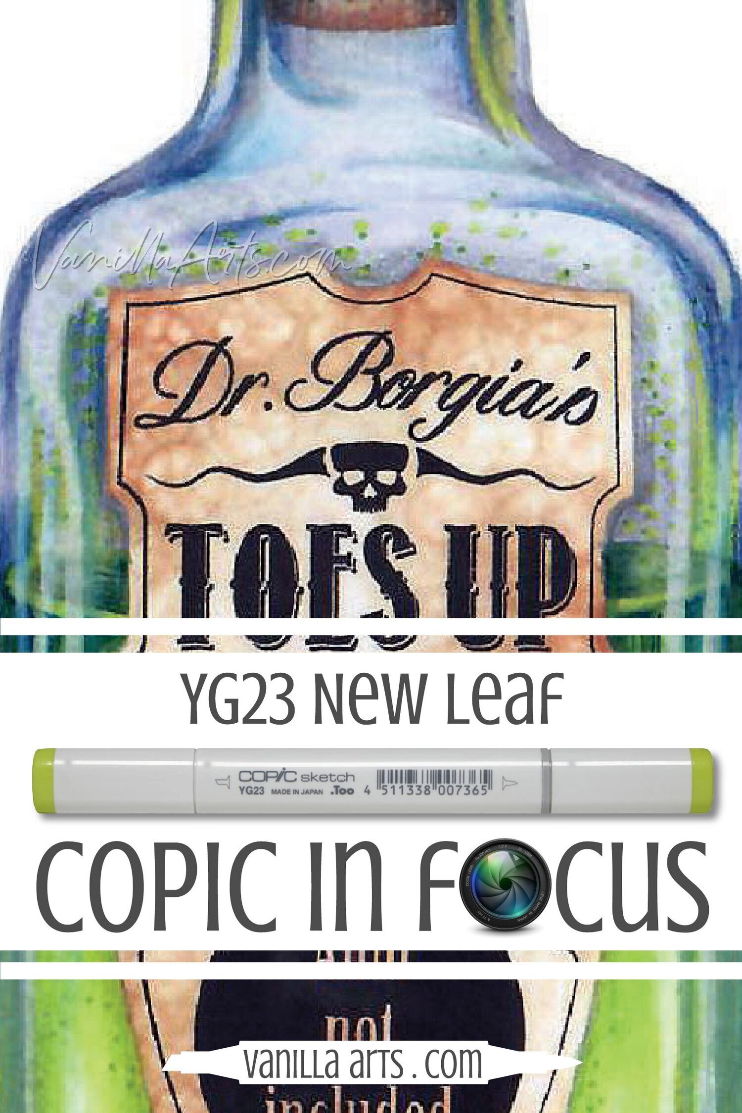
Want to know more about YG23 New Leaf?
Join us on our sister site, VanillaArts.com
Professional illustrator Amy Shulke shares how she uses YG23 in the classes she teaches, as a freelance artist, and in her own personal work.
Plus, she throws in lots of blending and usage tips for this beautiful color.
Vanilla Arts Classes using YG23:


Vanilla Arts Digi Stamps or Coloring Kits using YG23:
Color palettes and swatches using YG23:

Looking for beautiful color palettes?
We absolutely love The Color Catalog 1 & 2 from Sarah Renae Clark. It puts hundreds of Copic friendly color palettes at your fingertips.
(note: affiliate link)

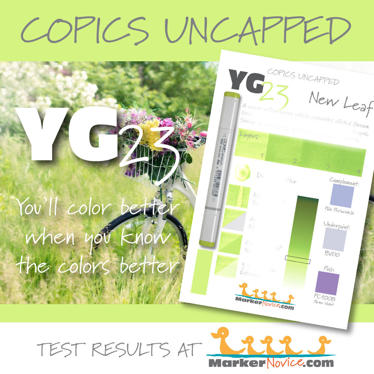

YG45 Cobalt Green: Copics Uncapped (Marker Swatch, Ink Testing)
YG45 Cobalt Green
Let’s take a closer look at this Copic Marker and it’s ink characteristics.
YG45 Cobalt Green is a warm sage green Copic Marker which mimics Cobalt Green watercolor. Useful for trees, muted florals, and holiday images. This is an unstable color, not recommended for beginners. YG45 is only available in Copic Sketch and Classic marker styles.
Every Copic Marker has different characteristics based upon its unique ink formula.
Knowing how a color behaves will help you blend effectively and make art with confidence.
YG45 Cobalt Green
Let’s take a closer look at this Copic Marker and its ink characteristics.
Temperature: A warm green.
Resemblance: diluted Cobalt Gold watercolor.
Actual Value: N5
All Copics are measured on a Neutral Gray value scale. The last number on the cap is supposed to indicate value but we’ve found discrepancies where the actual ink value is different than cap designation.
Cap Accuracy: The colored plastic on the Sketch cap closely matches 2 layers of YG45 ink.

Buildup: YG45 does not layer well. The ink develops oily streaks on the second layer.
WARNING: This ink is unstable. by three layers, the solvent in YG45 starts to damage itself, shattering the ink as you color. You’ll notice this self-shattering as golden bleeding around the outside edge of the area you’re coloring. At five layers, this ink mottles badly.
Shattering: Shatters into green with golden green seeping out at the margins. See warning above for YG45’s self-shattering behavior.
Chromatography testing shows this ink’s behavior when it comes in contact with #0 Colorless Blender (solvent). High shattering colors may leak unexpected color when you make corrections or attempt to blend with any color that has a high solvent to colorant ratio. Shattering is not bad, it’s just something to be aware of.
Staining: YG45 is highly staining
Lift: YG45 can be moved but not lifted. The paper is permanently stained light blue, the edges of the area exposed to colorless blender can look slightly metallic, a golden green. We do not recommend trying to lift this color due to the damage cycle colorless blender will trigger.
See staining swatch. Sample was given 6 stripes of #0 Colorless Blender, drying between each stripe. Results indicate how much lifting you can expect.
Lightfast: YG45 faded by about 5% during the testing period.
Samples were swatched on X-Press It Blending Card. 1 layer of ink was exposed to windowsill sunlight for 21 days. Approximately 10 hours of sun per day based on weather conditions. Note: we do not recommend displaying original Copic art under these conditions.
Natural Ink Family: YG45 is the darker of two markers in the YG-Forty family.
Family Members: YG41, YG45
We include this information because many Copic users never think deeper than the letter groupings (R, BV, G, etc.). Every ink has its own temperature variations and underlying flavors. Understanding what an ink looks like in its different dilutions helps when creating your own blending combinations.
Complement: A cool, medium purple-pink like V05
Underpaint: V01 desaturates YG17 with bright but natural look..
This is simply one suggestion. Many possible colors exist. Test to find a color that pleases you.
Pushing Pencil: Prismacolor 1090 Kelp Green provides a nicely desaturated push for YG41.
VanillaArts.com (our sister site) teaches a Push & Pull technique for dimensional coloring. This is simply one suggestion. Many possible colors exist. Test to find a color that pleases you.
Celebrate yellow-green with Sketch Garden digital stamps by Amy Shulke:
Visit the stamp shop page at our sister site VanillaArts.com for a wide variety of Copic kits.
Color palettes using light green:
Visit the color resource page at our sister site VanillaArts.com for a wide variety of Copic palettes and swatches.
Looking for beautiful color palettes?
We absolutely love The Color Catalog 1 & 2 from Sarah Renae Clark. It puts hundreds of Copic friendly color palettes at your fingertips.
(note: affiliate link)


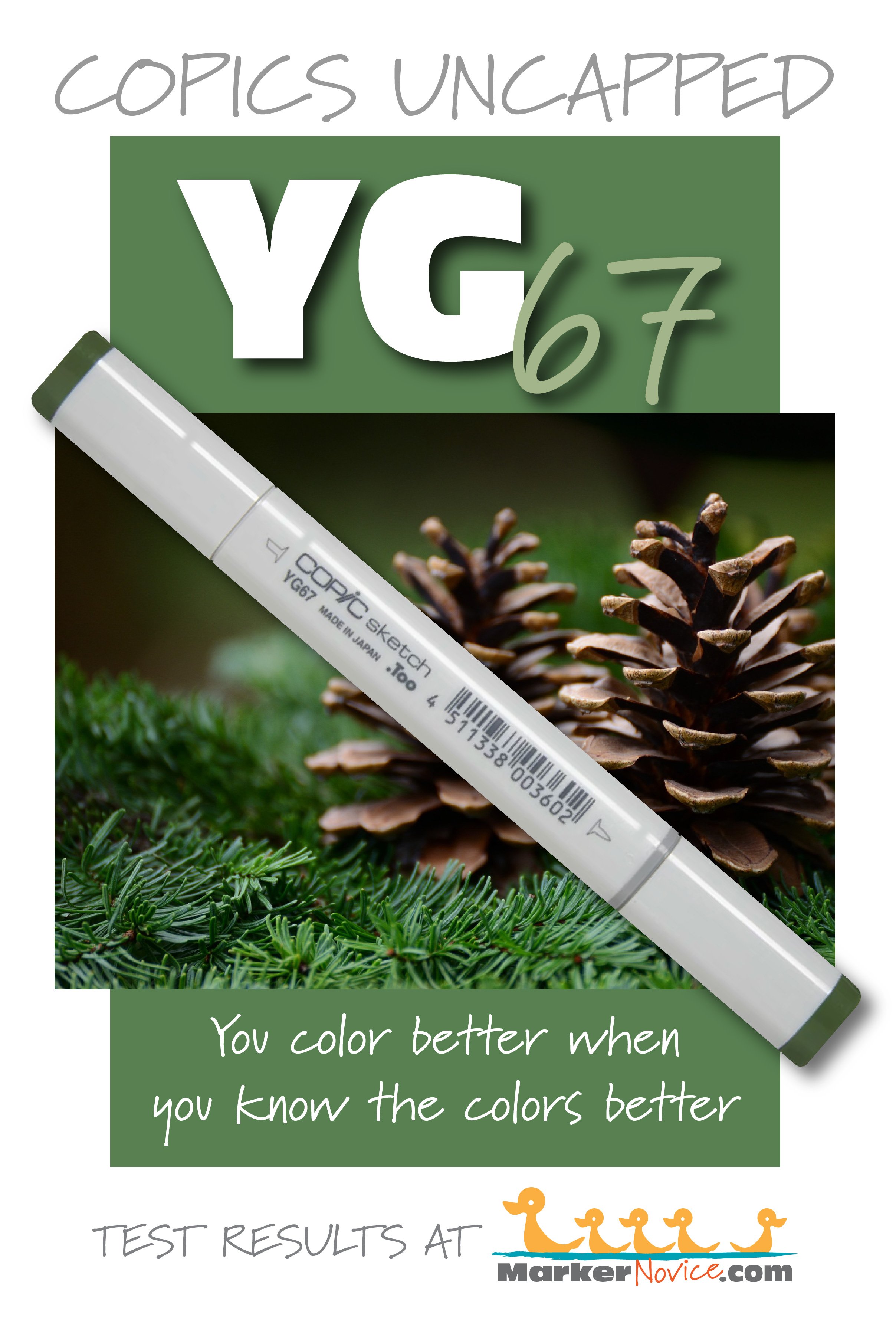
YG67 Moss: Copic Markers Uncapped (Swatching & Ink Testing)
YG67 Moss
Let’s take a closer look at this Copic Marker and it’s ink characteristics.
YG67 Moss is a soft leafy green Copic Marker which mimics Sap Green watercolor. Excellent for landscapes, realistic botanicals, and holiday images. YG67 is available in Copic Sketch, Ciao, and Classic marker styles.
Every Copic Marker has different characteristics based upon its unique ink formula.
Knowing how a color behaves will help you blend effectively and make art with confidence.
YG67 Moss
Let’s take a closer look at this Copic Marker and its ink characteristics.
Temperature: A warm yellow green.
Resemblance: Sap Green watercolor.
Actual Value: N7
All Copics are measured on a Neutral Gray value scale. The last number on the cap is supposed to indicate value but we’ve found discrepancies where the actual ink value is different than cap designation.
Cap Accuracy: The colored plastic on the Sketch cap closely matches 2 layers of YG67 ink.

Buildup: YG67 is a challenge to layer without appearing blotchy or oily. YG67 reaches maximum value at 4 layers.
Shattering: Shatters into medium green with strong green gold leakage at the margins.
Chromatography testing shows this ink’s behavior when it comes in contact with #0 Colorless Blender (solvent). High shattering colors may leak unexpected color when you make corrections or attempt to blend with any color that has a high solvent to colorant ratio. Shattering is not bad, it’s just something to be aware of.
Staining: YG67 strongly stains.
Lift: YG67 can be difficult to lift as the ink gathers easily and creates very strong outlines at the edge of the colorless blender margin. The paper remains yellowish.
See staining swatch. Sample was given 6 stripes of #0 Colorless Blender, drying between each stripe. Results indicate how much lifting you can expect.
Lightfast: YG67 did not noticeably fade during the testing period.
Samples were swatched on X-Press It Blending Card. 1 layer of ink was exposed to windowsill sunlight for 21 days. Approximately 10 hours of sun per day based on weather conditions. Note: we do not recommend displaying original Copic art under these conditions.
Natural Ink Family: YG67 is the darkest member of the YG-Sixty family.
Family Members: YG61, YG63, YG67
We include this information because many Copic users never think deeper than the letter groupings (R, BV, G, etc.). Every ink has its own temperature variations and underlying flavors. Understanding what an ink looks like in its different dilutions helps when creating your own blending combinations.
Complement: A medium purple like V06
Underpaint: V06 desaturates YG17 with bright but natural look..
This is simply one suggestion. Many possible colors exist. Test to find a color that pleases you.
Pushing Pencil: PC1078 Black Cherry (affiliate link) Prismacolor 1078 Black Cherry provides a nicely desaturated push for YG41.
VanillaArts.com (our sister site) teaches a Push & Pull technique for dimensional coloring. This is simply one suggestion. Many possible colors exist. Test to find a color that pleases you.
Celebrate yellow-green with Sketch Garden digital stamps by Amy Shulke:
Visit the stamp shop page at our sister site VanillaArts.com for a wide variety of Copic kits.
Color palettes using light green:
Visit the color resource page at our sister site VanillaArts.com for a wide variety of Copic palettes and swatches.
Looking for beautiful color palettes?
We absolutely love The Color Catalog 1 & 2 from Sarah Renae Clark. It puts hundreds of Copic friendly color palettes at your fingertips.
(note: affiliate link)


YG41 Pale Cobalt Green: Copics Uncapped (Marker Swatch, Ink Testing)
YG41 Pale Cobalt Green
Let’s take a closer look at this Copic Marker and it’s ink characteristics.
YG41 Pale Cobalt Green is a minty golden green Copic Marker which mimics Cobalt Green watercolor. Soft at one layer, this color builds to almost neon brightness, not recommended for nature images. YG41 is available in Copic Sketch, Ciao, and Classic marker styles.
Every Copic Marker has different characteristics based upon its unique ink formula.
Knowing how a color behaves will help you blend effectively and make art with confidence.
YG41 Pale Cobalt Green
Let’s take a closer look at this Copic Marker and its ink characteristics.
Temperature: A cooler yellow green.
Resemblance: diluted Cobalt Gold watercolor.
Actual Value: N2
All Copics are measured on a Neutral Gray value scale. The last number on the cap is supposed to indicate value but we’ve found discrepancies where the actual ink value is different than cap designation.
Cap Accuracy: The colored plastic on the Sketch cap closely matches 1-2 layers of YG41 ink. The cap appears slightly cooler than the actual ink.

Buildup: YG41 layers beautifully without streaking. It did not appear oily until 3 layers but never looked blotchy. YG41 reaches maximum value at 4 layers.
Shattering: Shatters into cool blue-green with yellow seeping out at the margins.
Chromatography testing shows this ink’s behavior when it comes in contact with #0 Colorless Blender (solvent). High shattering colors may leak unexpected color when you make corrections or attempt to blend with any color that has a high solvent to colorant ratio. Shattering is not bad, it’s just something to be aware of.
Staining: YG41 is highly staining. Not all staining markers are dark colors, this is one of the lightest staining colors we’ve noticed.
Lift: YG41 can be moved but not really lifted. It leaves a hard green edge, noticeably darker and more yellow green than the original ink. The paper remains permanently stained light blue.
See staining swatch. Sample was given 6 stripes of #0 Colorless Blender, drying between each stripe. Results indicate how much lifting you can expect.
Lightfast: YG41 faded by about 5-10% during the testing period.
Samples were swatched on X-Press It Blending Card. 1 layer of ink was exposed to windowsill sunlight for 21 days. Approximately 10 hours of sun per day based on weather conditions. Note: we do not recommend displaying original Copic art under these conditions.
Natural Ink Family: YG41 is the lighter of two markers in the YG-Forty family.
Family Members: YG41, YG45
We include this information because many Copic users never think deeper than the letter groupings (R, BV, G, etc.). Every ink has its own temperature variations and underlying flavors. Understanding what an ink looks like in its different dilutions helps when creating your own blending combinations.
Complement: A cool, medium pink like V01
Underpaint: V000 desaturates YG17 with bright but natural look..
This is simply one suggestion. Many possible colors exist. Test to find a color that pleases you.
Pushing Pencil: Prismacolor 1090 Kelp Green provides a nicely desaturated push for YG41.
VanillaArts.com (our sister site) teaches a Push & Pull technique for dimensional coloring. This is simply one suggestion. Many possible colors exist. Test to find a color that pleases you.
Vanilla Arts Classes using light green:
We currently do not use YG41 in any classes but these lessons offer a similar learning opportunity.
Celebrate yellow-green with Sketch Garden digital stamps by Amy Shulke:
Visit the stamp shop page at our sister site VanillaArts.com for a wide variety of Copic kits.
Color palettes using light green:
Visit the color resource page at our sister site VanillaArts.com for a wide variety of Copic palettes and swatches.
Looking for beautiful color palettes?
We absolutely love The Color Catalog 1 & 2 from Sarah Renae Clark. It puts hundreds of Copic friendly color palettes at your fingertips.
(note: affiliate link)


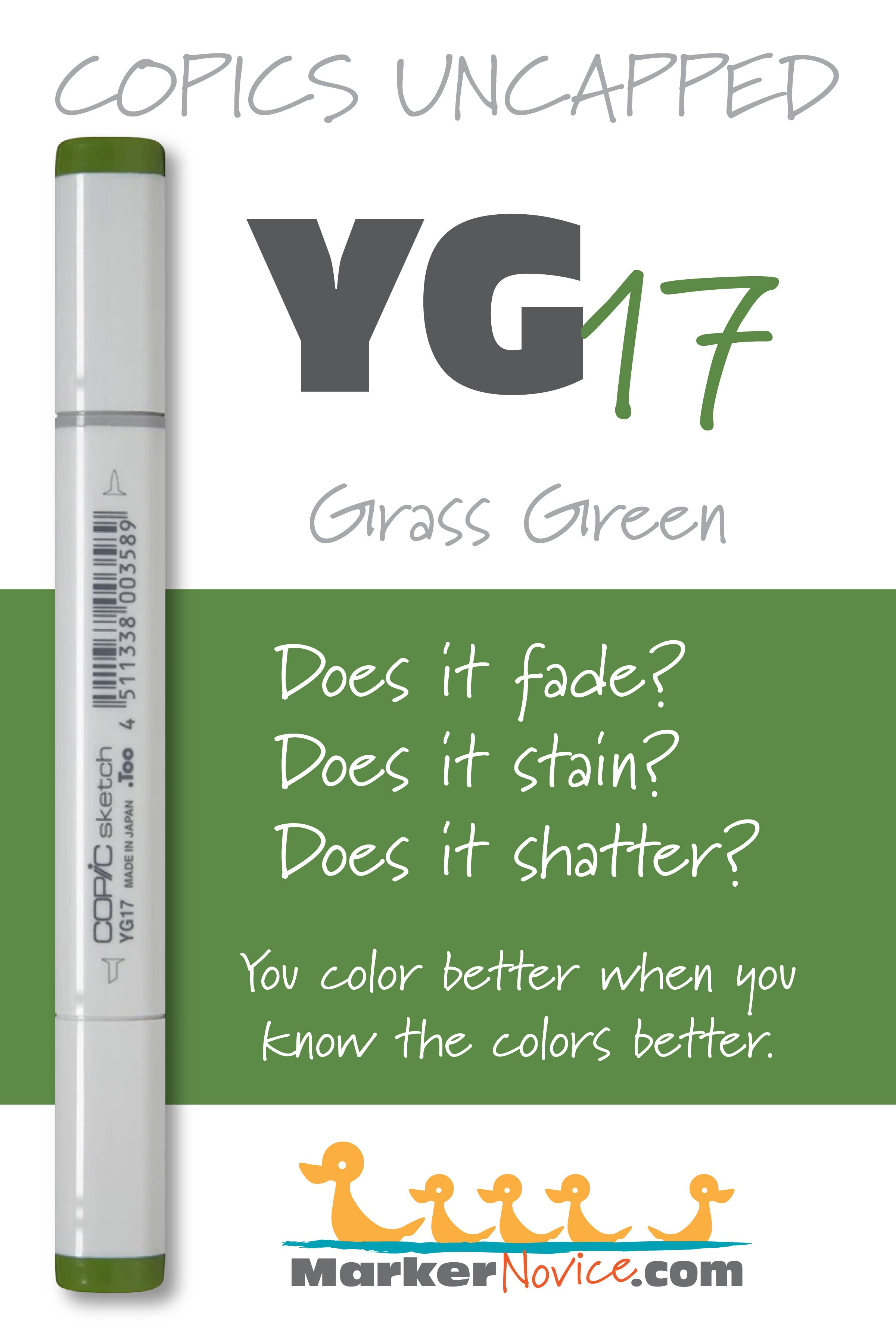
YG17 Grass Green: Copics Uncapped (Marker Swatch, Ink Testing)
YG17 Grass Green
Let’s take a closer look at this Copic Marker and it’s ink characteristics.

YG17 Grass Green is a warm golden green Copic Marker which resembles Green Gold watercolor. Ideal perfect for florals and spring landscapes. We highly recommend this easy-blending marker for beginners. YG17 is available in Copic Sketch, Ciao, and Classic marker styles.
Every Copic Marker has unique characteristics based on its unique ink formula.
Knowing how a color behaves will help you blend effectively and make art with confidence.
YG17 Grass Green
Let’s take a closer look at this Copic Marker and its ink characteristics.
Temperature: A warm golden green.
Resemblance: Green Gold watercolor.
Actual Value: N5.5 This marker is lighter than would be predicted from the value “7” listed on the marker cap number.
All Copics are measured on a Neutral Gray value scale. The last number on the cap is supposed to indicate value but we’ve found discrepancies where the actual ink value is different than cap designation.
Cap Accuracy: The cap is much darker than the ink. The colored plastic on the Sketch cap resembles more than 4 layers of YG17 ink.
Buildup: YG17 started to look oily at 3 layers. It reaches maximum value at 4 layers.
Shattering: Shatters into green with yellow seeping out at the margins.
Chromatography testing shows this ink’s behavior when it comes in contact with #0 Colorless Blender (solvent). High shattering colors may leak unexpected color when you make corrections or attempt to blend with any color that has a high solvent to colorant ratio. Shattering is not bad, it’s just something to be aware of.
Staining: YG17 mildly stains the paper leaving behind a bluish color.
Lift: The green aspects of this color can be shifted a bit but the paper remains stained with an odd bluish color with tinges of olive..
See staining swatch. Sample was given 6 stripes of #0 Colorless Blender, drying between each stripe. Results indicate how much lifting you can expect.
Lightfast: YG17 faded by about 10% during the testing period.
Samples were swatched on X-Press It Blending Card. 1 layer of ink was exposed to windowsill sunlight for 21 days. Approximately 10 hours of sun per day based on weather conditions. Note: we do not recommend displaying original Copic art under these conditions.
Natural Ink Family: YG17 is a at the darkest end of the YG-Teen family.
Family Members: YG11, YG13, YG17
Note: YG11 is cooler than both YG13 and YG17. This family seems like a mashup of unrelated inks.
We include this information because many Copic users never think deeper than the letter groupings (R, BV, G, etc.). Every ink has its own temperature variations and underlying flavors. Understanding what an ink looks like in its different dilutions helps when creating your own blending combinations.
Complement: A cool, medium pink like RV55
Underpaint: B34 desaturates YG17 with bright but natural look..
This is simply one suggestion. Many possible colors exist. Test to find a color that pleases you.
Pushing Pencil: Prismacolor 901 Indigo Blue provides a nicely desaturated push for YG11.
VanillaArts.com (our sister site) teaches a Push & Pull technique for dimensional coloring. This is simply one suggestion. Many possible colors exist. Test to find a color that pleases you.
Vanilla Arts Classes using YG17:

Oopsie Daisy, a beginner class on developing and using the flick technique for Copic Markers in both blending and non-blending situations.
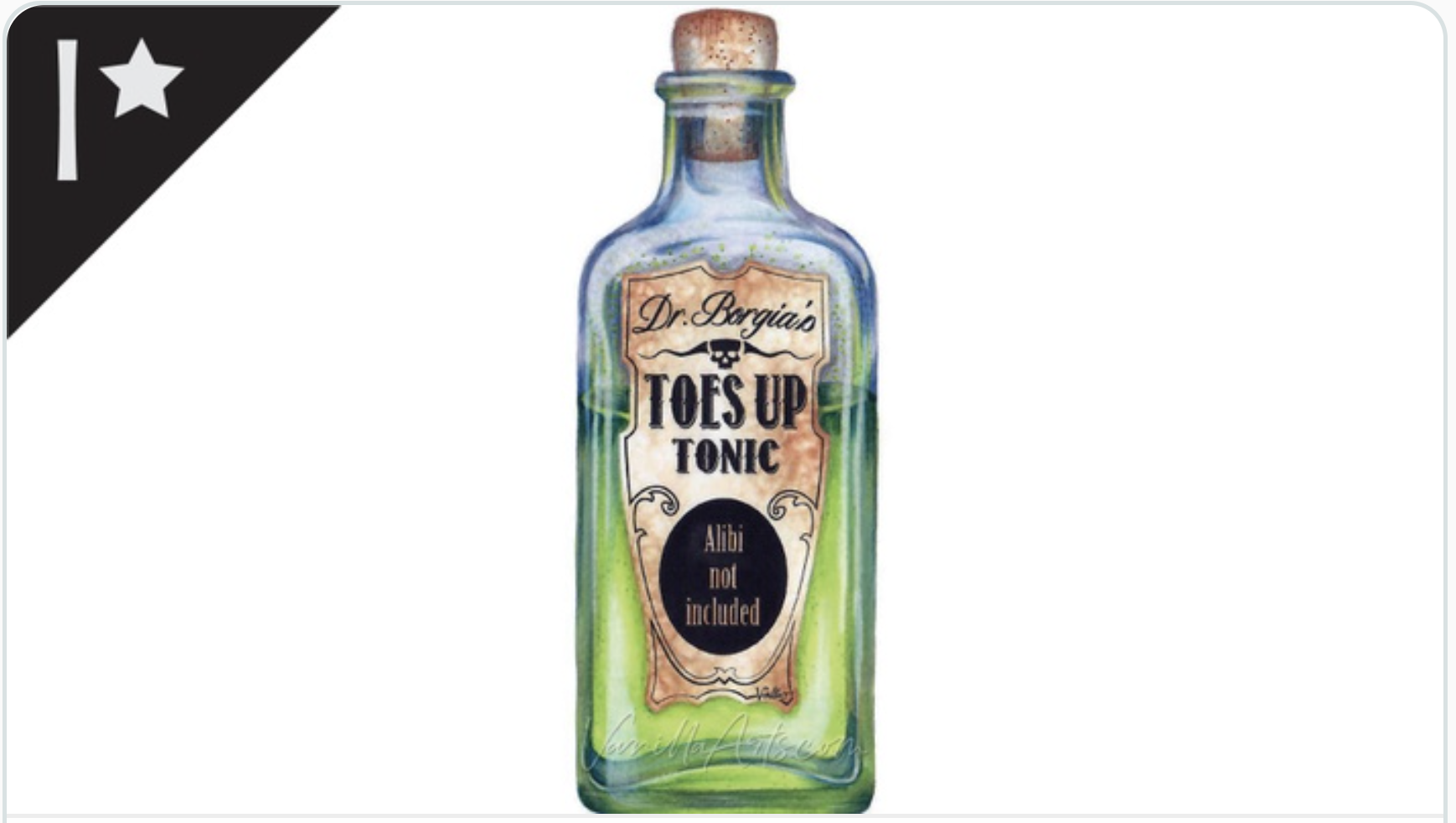
Tonic: an intermediate-challenge class on developing realistic texture with Copic Markers and colored pencils.
YG17 is one of the most popular markers on Amy’s class supply lists. Most of her floral images use YG17.
Visit the workshop resource page at our sister site VanillaArts.com for a wide variety of digital stamps.
Celebrate yellow-green with Sketch Garden digital stamps by Amy Shulke:
Visit the stamp shop page at our sister site VanillaArts.com for a wide variety of Copic kits.
Color palettes using YG17:
Visit the color resource page at our sister site VanillaArts.com for a wide variety of Copic palettes and swatches.
Looking for beautiful color palettes?
We absolutely love The Color Catalog 1 & 2 from Sarah Renae Clark. It puts hundreds of Copic friendly color palettes at your fingertips.
(note: affiliate link)


YG11 Mignonette: Copics Uncapped (Marker Swatch, Ink Testing)
YG11 Mignonette
Let’s take a closer look at this Copic Marker and it’s ink characteristics.

YG11 Mignonette is a pale yellow-green Copic Marker which mimics diluted Green Gold watercolor. Ideal perfect for florals and spring landscapes, this color also makes a cute background color. YG11 is available in Copic Sketch, Ciao, and Classic marker styles.
Every Copic Marker has unique characteristics based on its unique ink formula.
Knowing how a color behaves will help you blend effectively and make art with confidence.
YG11 Mignonette
Let’s take a closer look at this Copic Marker and its ink characteristics.
Temperature: A warm yellowish green.
Resemblance: diluted Green Gold watercolor.
Actual Value: N1All Copics are measured on a Neutral Gray value scale. The last number on the cap is supposed to indicate value but we’ve found discrepancies where the actual ink value is different than cap designation.
Cap Accuracy: It’s close. The colored plastic on the Sketch cap resembles 2 layers of YG11 although the transparency of the plastic makes the cap look a bit cooler than the ink color.
Buildup: YG11 started to look oily at 3 layers. It reaches maximum value around 3 layers as well.
Shattering: Shatters into green with yellow seeping out at the margins.
Chromatography testing shows this ink’s behavior when it comes in contact with #0 Colorless Blender (solvent). High shattering colors may leak unexpected color when you make corrections or attempt to blend with any color that has a high solvent to colorant ratio. Shattering is not bad, it’s just something to be aware of.
Staining: YG11 stains the paper with a faint yellow color.

Lift: This green aspects of this color can be shifted a bit but the yellow color never fully moves.
See staining swatch. Sample was given 6 stripes of #0 Colorless Blender, drying between each stripe. Results indicate how much lifting you can expect.
Lightfast: YG11 faded by about 30% during the testing period.
Samples were swatched on X-Press It Blending Card. 1 layer of ink was exposed to windowsill sunlight for 21 days. Approximately 10 hours of sun per day based on weather conditions. Note: we do not recommend displaying original Copic art under these conditions.
Natural Ink Family: YG11 is a at the lightest end of the YG-Teen family. Note that YG11 is cooler than both YG13 and YG17. This family seems like a mashup of unrelated inks.
Family Members: YG11, YG13, YG17
We include this information because many Copic users never think deeper than the letter groupings (R, BV, G, etc.). Every ink has its own temperature variations and underlying flavors. Understanding what an ink looks like in its different dilutions helps when creating your own blending combinations.
Complement: A very pale periwinkle like BV0000
Underpaint: BV0000 desaturates YG11 nicely.
This is simply one suggestion. Many possible colors exist. Test to find a color that pleases you.
Pushing Pencil: Prismacolor 1026 Greyed Lavender provides a nicely desaturated push for YG11.
VanillaArts.com (our sister site) teaches a Push & Pull technique for dimensional coloring. This is simply one suggestion. Many possible colors exist. Test to find a color that pleases you.
Vanilla Arts Classes using YG11:
Oopsie Daisy, a beginner class on developing and using the flick technique for Copic Markers in both blending and non-blending situations.
We continue to create new content and classes and we will update here as more become available.
Visit the workshop resource page at our sister site VanillaArts.com for a wide variety of digital stamps.
Vanilla Arts Digi Stamps using YG11:
We continue to create new content and stamps and we will update here as more become available.
Visit the stamp shop page at our sister site VanillaArts.com for a wide variety of Copic classes.
Color palettes and swatches using YG11:
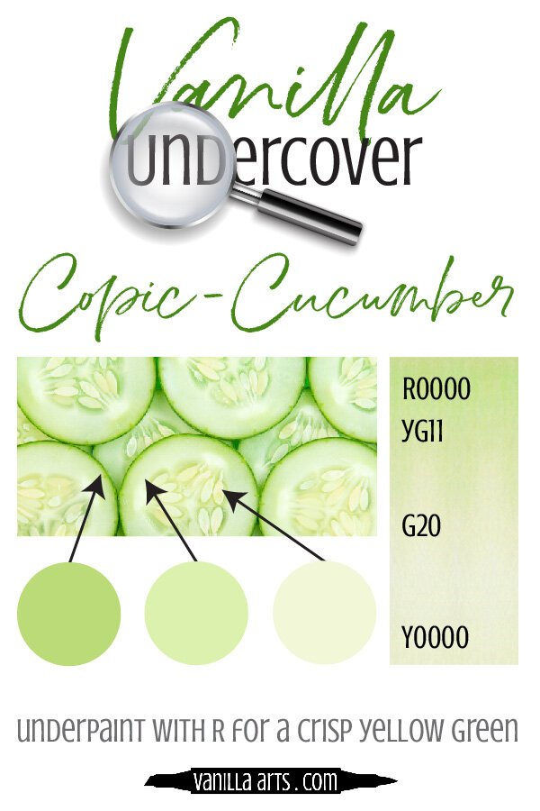
We are building our palette and swatch collection a little more each week and will update here as more become available.
Visit the color resource page at our sister site VanillaArts.com for a wide variety of Copic palettes and swatches.
Looking for beautiful color palettes?
We absolutely love The Color Catalog 1 & 2 from Sarah Renae Clark. It puts hundreds of Copic friendly color palettes at your fingertips.
(note: affiliate link)