

G00 Jade Green: Copics Uncapped (Marker Swatch, Ink Testing)
G00 Jade Green
Let’s take a closer look at this Copic Marker and it’s ink characteristics.


G00 Jade Green is a bleached warm green Copic Marker which resembles highly diluted Phthalo Green watercolor. This is an artificial looking green, most often used as s blending companion for darker greens. G21 is available in Copic Ciao, Sketch, and Classic marker styles.
Every Copic Marker has unique characteristics based on its unique ink formula.
Knowing how a color behaves will help you blend effectively and make art with confidence.
G00 Jade Green
Let’s take a closer look at this Copic Marker and its ink characteristics.
Temperature: A slightly warm green but strange things happen to inks when they’re overloaded with solvent. G00 has a bleached look and can create an oddly cool blend in some situations.
Resemblance: Highly diluted Phthalo Green watercolor.
Actual Value: N3 (note, this was unexpectedly dark for a sub-zero marker)
All Copics are measured on a Neutral Gray value scale. The last number on the cap is supposed to indicate value but we’ve found discrepancies where the actual ink value is different than cap designation.
Cap Accuracy: Yes. The colored plastic on the Sketch cap is close to the color of one layer of G00 ink.
Buildup: Layers well but reaches maximum value at only 3 coats.
Shattering: Shatters into green with mild yellow ink at the margins.
Be careful! This color contains a very high ratio of solvent and can easily damage the other colors in combination with it. G00 even shatters itself at 4 layers of ink.
Chromatography testing shows this ink’s behavior when it comes in contact with #0 Colorless Blender (solvent). High shattering colors may leak unexpected color when you make corrections or attempt to blend with any color that has a high solvent to colorant ratio. Shattering is not bad, it’s just something to be aware of.

Staining: G00 does not stain the paper.
Lift: G00 is such an easy lifting color and because it’s also pale, you can almost erase G00 with a colorless blender.
See staining swatch. Sample was given 6 stripes of #0 Colorless Blender, drying between each stripe. Results indicate how much lifting you can expect.
Lightfast: G00 was surprisingly lightfast, a very unexpected result. We were unable to see any fading in the 3 week test.
Samples were swatched on X-Press It Blending Card. 1 layer of ink was exposed to windowsill sunlight for 21 days. Approximately 10 hours of sun per day based on weather conditions. Note: we do not recommend displaying original Copic art under these conditions.
Natural Ink Family: G00 sits at the sub-zero end of the G-Zero family. The markers in this family are all artificial looking, it’s hard to find them in nature.
Family Members: G0000, G000, G00, G02, G03, G05 G07, G09
We include this information because many Copic users never think deeper than the letter groupings (R, BV, G, etc.). Every ink has its own temperature variations and underlying flavors. Understanding what an ink looks like in its different dilutions helps when creating your own blending combinations.
Complement: Pale violets like V20 or even BV000
Underpaint: We suggest BV000
This is simply one suggestion. Many possible colors exist. Test to find a color that pleases you.
Pushing Pencil: Prismacolor 1026 Greyed Lavender works well.
VanillaArts.com (our sister site) teaches a Push & Pull technique for dimensional coloring. This is simply one suggestion. Many possible colors exist. Test to find a color that pleases you.
Vanilla Arts Classes using G00:
We continue to create new content and classes and we will update here as more become available.
Visit the workshop resource page at our sister site VanillaArts.com for a wide variety of Copic classes.
Vanilla Arts Digi Stamps using G00:
We continue to create new content and classes and we will update here as more become available.
Visit the workshop resource page at our sister site VanillaArts.com for a wide variety of digital stamps.
Color palettes and swatches using G00:
We are building our palette and swatch collection a little more each week and will update here as more become available.
Visit the color resource page at our sister site VanillaArts.com for a wide variety of Copic palettes and swatches.
Looking for beautiful color palettes?
We absolutely love The Color Catalog 1 & 2 from Sarah Renae Clark. It puts hundreds of Copic friendly color palettes at your fingertips.
(note: affiliate link)














G21 Lime Green: Copics Uncapped (Marker Swatch, Ink Testing)
G21 Lime Green
Let’s take a closer look at this Copic Marker and it’s ink characteristics.

G21 Lime Green is a cool green Copic Marker which resembles highly diluted Hooker’s Green watercolor. This pretty ink is highly unstable and should be treated with caution. G21 is available in Copic Ciao, Sketch, and Classic marker styles.
Every Copic Marker has unique characteristics based on its unique ink formula.
Knowing how a color behaves will help you blend effectively and make art with confidence.
G21 Lime Green
Let’s take a closer look at this Copic Marker and its ink characteristics.
Temperature: A slightly warm green but the darker markers in the G20 series look cool.
Resemblance: Diluted Hooker’s Green watercolor.
Actual Value: N3 (note, this was unexpectedly dark)
All Copics are measured on a Neutral Gray value scale. The last number on the cap is supposed to indicate value but we’ve found discrepancies where the actual ink value is different than cap designation.
Cap Accuracy: Yes. The colored plastic on the Sketch cap is close to the color of one layer of G21 ink.
Buildup: Exercise caution! G21 looks patchy and oily with just one coat.
Shattering: Shatters into green with strong golden yellow ink at the margins.
Be careful! This color is very unstable. It shatters incredibly easy, even with itself! In the layering test above, look at the right edge of 4 layers. This golden color seeps out into the margins whenever we used more than one coat, you can see hints of the same gold in every test layer.
Chromatography testing shows this ink’s behavior when it comes in contact with #0 Colorless Blender (solvent). High shattering colors may leak unexpected color when you make corrections or attempt to blend with any color that has a high solvent to colorant ratio. Shattering is not bad, it’s just something to be aware of.

Staining: G21 is a staining color and left the paper with a definite blue tint.
Lift: This color is stubborn and does not lift well. This is very odd for such a light color.
See staining swatch. Sample was given 6 stripes of #0 Colorless Blender, drying between each stripe. Results indicate how much lifting you can expect.
Lightfast: G21 was surprisingly lightfast, a very unexpected result. We were unable to see any fading in the 3 week test.
Samples were swatched on X-Press It Blending Card. 1 layer of ink was exposed to windowsill sunlight for 21 days. Approximately 10 hours of sun per day based on weather conditions. Note: we do not recommend displaying original Copic art under these conditions.
Natural Ink Family: G21 sits at the lighter end of the G-Twenty family. The markers in this family are all quite pretty but each one has odd characteristics and idiosyncrasies.
Family Members: G29, G28, G24, G21, G20
We include this information because many Copic users never think deeper than the letter groupings (R, BV, G, etc.). Every ink has its own temperature variations and underlying flavors. Understanding what an ink looks like in its different dilutions helps when creating your own blending combinations.
Complement: Pale pinks like RV02 or RV52
Underpaint: We suggest RV02
This is simply one suggestion. Many possible colors exist. Test to find a color that pleases you.
Pushing Pencil: Prismacolor 956 Lilac works well.
VanillaArts.com (our sister site) teaches a Push & Pull technique for dimensional coloring. This is simply one suggestion. Many possible colors exist. Test to find a color that pleases you.
Vanilla Arts Classes using G21:
Vanilla Arts Digi Stamps using G21:
Fair Isle Stocking: life is full of texture. The first step to adding realism to your images is to admit that smooth blending is not appropriate for every single stamp image you color. Real life is full of lumpy, bumpy, and craggy surfaces. Find more info here.
Color palettes and swatches using G21:

Looking for beautiful color palettes?
We absolutely love The Color Catalog 1 & 2 from Sarah Renae Clark. It puts hundreds of Copic friendly color palettes at your fingertips.
(note: affiliate link)


G17 Forest Green: Copics Uncapped (Marker Swatch, Ink Testing)
G17 Forest Green
Let’s take a closer look at this Copic Marker and it’s ink characteristics.

G17 Forest Green is a cool green Copic Marker which resembles Phthalo Green Blue Shade watercolor. This ink is not as natural as the cap suggests and can be a stubborn blender. G17 is available in Copic Ciao, Sketch, and Classic marker styles.
Every Copic Marker has unique characteristics based on its unique ink formula.
Knowing how a color behaves will help you blend effectively and make art with confidence.
G17 Forest Green
Let’s take a closer look at this Copic Marker and its ink characteristics.
Temperature: A cool green.
Resemblance: Phthalo Green Blue Shade watercolor.
Actual Value: N6
All Copics are measured on a Neutral Gray value scale. The last number on the cap is supposed to indicate value but we’ve found discrepancies where the actual ink value is different than cap designation.
Cap Accuracy: No. The colored plastic on the Sketch cap is darker and warmer than G17 ink.
Buildup: G17 looks patchy and oily with just two coats.
Shattering: This color shatters into green with blue and yellow leakage.
Chromatography testing shows this ink’s behavior when it comes in contact with #0 Colorless Blender (solvent). High shattering colors may leak unexpected color when you make corrections or attempt to blend with any color that has a high solvent to colorant ratio. Shattering is not bad, it’s just something to be aware of.

Staining: G17 is a staining color and left the paper with a definite bluish tint.
Lift: This color is very stubborn.
See staining swatch. Sample was given 6 stripes of #0 Colorless Blender, drying between each stripe. Results indicate how much lifting you can expect.
Lightfast: G17 had an odd fade. It lightened by about 25% but more significantly, it turned a weird turquoise blue.
Samples were swatched on X-Press It Blending Card. 1 layer of ink was exposed to windowsill sunlight for 21 days. Approximately 10 hours of sun per day based on weather conditions. Note: we do not recommend displaying original Copic art under these conditions.
Natural Ink Family: G17 sits at the darker end of the G-Teen family. There isn’t a lot of difference between G16 and G17; in fact, it’s hard to justify the existence of both. A very unnatural color. When you think of “green” many people imagine this color but when you try to find this color in nature, you’ll find it’s actually an artificial green.
Family Members: G12, G14, G16, G17, and G19
We include this information because many Copic users never think deeper than the letter groupings (R, BV, G, etc.). Every ink has its own temperature variations and underlying flavors. Understanding what an ink looks like in its different dilutions helps when creating your own blending combinations.
Complement: Reddish Violets like RV66 or V05 complement both G16 and G17 well.
Underpaint: We suggest RV63 for underneath both G16 and G17.
This is simply one suggestion. Many possible colors exist. Test to find a color that pleases you.
Pushing Pencil: Prismacolor 901 Indigo Blue works well.
VanillaArts.com (our sister site) teaches a Push & Pull technique for dimensional coloring. This is simply one suggestion. Many possible colors exist. Test to find a color that pleases you.
Vanilla Arts Classes using G17:
We continue to create new content and classes and we will update here as more become available.
Visit the workshop resource page at our sister site VanillaArts.com for a wide variety of Copic classes.
Vanilla Arts Digi Stamps using G17:
We continue to create new content and stamps and we will update here as more become available.
Visit the stamp shop page at our sister site VanillaArts.com for a wide variety of digi stamps.
Color palettes and swatches using G17:
We are building our palette and swatch collection a little more each week and will update here as more become available.
Visit the color resource page at our sister site VanillaArts.com for a wide variety of Copic palettes and swatches.
Looking for beautiful color palettes?
We absolutely love The Color Catalog 1 & 2 from Sarah Renae Clark. It puts hundreds of Copic friendly color palettes at your fingertips.
(note: affiliate link)


G16 Malachite: Copics Uncapped (Marker Swatch, Ink Testing)
G16 Malachite
Let’s take a closer look at this Copic Marker and it’s ink characteristics.
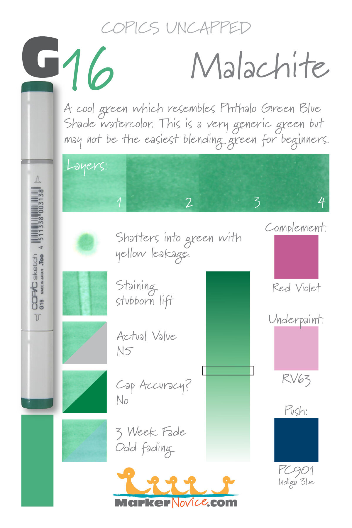
G16 Malachite is a cool green Copic Marker which resembles Phthalo Green BlueShade watercolor. This is a very generic green but may not be the easiest blending green for beginners. G16 is only available in Copic Sketch and Classic marker styles.
Every Copic Marker has unique characteristics based on its unique ink formula.
Knowing how a color behaves will help you blend effectively and make art with confidence.
G16 Malachite
Let’s take a closer look at this Copic Marker and its ink characteristics.
Temperature: A cool green.
Resemblance: Phthalo Green Blue Shade watercolor.
Actual Value: N5
All Copics are measured on a Neutral Gray value scale. The last number on the cap is supposed to indicate value but we’ve found discrepancies where the actual ink value is different than cap designation.
Cap Accuracy: No. The colored plastic on the Sketch cap is much darker than G16 ink.
Buildup: G16 layers well twice but anything beyond looks oily.
Shattering: This color shatters into green with yellow leakage.
Chromatography testing shows this ink’s behavior when it comes in contact with #0 Colorless Blender (solvent). High shattering colors may leak unexpected color when you make corrections or attempt to blend with any color that has a high solvent to colorant ratio. Shattering is not bad, it’s just something to be aware of.

Staining: G16 is a staining color and left the paper with a definite bluish tint.
Lift: This color doesn’t want to lift.
See staining swatch. Sample was given 6 stripes of #0 Colorless Blender, drying between each stripe. Results indicate how much lifting you can expect.
Lightfast: G16 had an odd fade. It lightened by about 10% but more significantly, it turned a weird turquoise blue.
Samples were swatched on X-Press It Blending Card. 1 layer of ink was exposed to windowsill sunlight for 21 days. Approximately 10 hours of sun per day based on weather conditions. Note: we do not recommend displaying original Copic art under these conditions.
Natural Ink Family: G16 sits in the middle of the G-Teen family. When you think of “green” many people imagine this color but when you try to find this color in nature, you’ll find it’s actually an artificial green.
Family Members: G12, G14, G16, G17, and G19
We include this information because many Copic users never think deeper than the letter groupings (R, BV, G, etc.). Every ink has its own temperature variations and underlying flavors. Understanding what an ink looks like in its different dilutions helps when creating your own blending combinations.
Complement: Reddish Violets like RV66 or V05 complement G16 well.
Underpaint: We suggest RV63
This is simply one suggestion. Many possible colors exist. Test to find a color that pleases you.
Pushing Pencil: Prismacolor 901 Indigo Blue works well.
VanillaArts.com (our sister site) teaches a Push & Pull technique for dimensional coloring. This is simply one suggestion. Many possible colors exist. Test to find a color that pleases you.
Vanilla Arts Classes using G16:

Box of Colors (Marker Painting Foundations 2) is a four episode Copic + Colored Pencil challenge for graduates of MPF. Covers color theory and form sculpting with group feedback. For more information: Box of Colors.
Vanilla Arts Digi Stamps using G16:
We continue to create new content and stamps and we will update here as more become available.
Visit the stamp shop page at our sister site VanillaArts.com for a wide variety of digi stamps.
Color palettes and swatches using G16:
We are building our palette and swatch collection a little more each week and will update here as more become available.
Visit the color resource page at our sister site VanillaArts.com for a wide variety of Copic palettes and swatches.
Looking for beautiful color palettes?
We absolutely love The Color Catalog 1 & 2 from Sarah Renae Clark. It puts hundreds of Copic friendly color palettes at your fingertips.
(note: affiliate link)

G99 Olive: Copics Uncapped (Marker Swatch, Ink Testing)
G99 Olive
Let’s take a closer look at this Copic Marker and it’s ink characteristics.


G99 Olive is a warm, muted green Copic Marker which closely resembles Chromium Green watercolor. This is a very natural marker color, ideal for botanicals, landscapes, and food illustration. G99 is available in Copic Sketch, Ciao, and Classic marker styles.
Every Copic Marker has unique characteristics based on its unique ink formula.
Knowing how a color behaves will help you blend effectively and make art with confidence.
G99 Olive
Let’s take a closer look at this Copic Marker and it’s ink characteristics.
Temperature: A warm and muted green
Resemblance: Chromium Green watercolor.
Actual Value: N8
All Copics are measured on a Neutral Gray value scale. The last number on the cap is supposed to indicate value but we’ve found discrepancies where the actual ink value is different than cap designation.
Cap Accuracy: The plastic on a Sketch cap matches 1 coat of G99.
Buildup: G99 is has a high proportion of colorant in the formula. Exercise caution when layering this color as it tends to look oily after 2 coats.
Shattering: Shatters into three colors, a high staining green, aqua, and a orangish-red.
Chromatography testing shows this ink’s behavior when it comes in contact with #0 Colorless Blender (solvent). High shattering colors may leak unexpected color when you make corrections or attempt to blend with any color that has a high solvent to colorant ratio. Shattering is not bad, it’s just something to be aware of.

Staining: G99 is a staining color, have patience when blending.
Lift: Very little lift. This is not a good candidate for correction.
See staining swatch. Sample was given 6 stripes of #0 Colorless Blender, drying between each stripe. Results indicate how much lifting you can expect.
Lightfast: Absolutely no fade was visible after the 3 week test period.
Samples were swatched on X-Press It Blending Card. 1 layer of ink was exposed to windowsill sunlight for 21 days. Approximately 10 hours of sun per day based on weather conditions. Note: we do not recommend displaying original Copic art under these conditions.
Natural Ink Family: G99 is the darkest marker in this number group but the mother ink is most likely a blackened green color. The color is so warm that it honestly feels as if it belongs in the YG group rather than G.
Family Members: G99, G94
We include this information because many Copic users never think deeper than the letter groupings (R, BV, G, etc.). Every ink has its own temperature variations and underlying flavors. Understanding what an ink looks like in its different dilutions helps when creating your own blending combinations.
Complement: A deep merlot style magenta like RV69
Underpaint: We suggest BV29
This is simply one suggestion. Many possible colors exist. Test to find a color that pleases you.
Pushing Pencil: Prismacolor 901 Indigo Blue works beautifully over G99.
VanillaArts.com (our sister site) teaches a Push & Pull technique for dimensional coloring. This is simply one suggestion. Many possible colors exist. Test to find a color that pleases you.
Vanilla Arts Classes using G99:
Vanilla Arts Digi Stamps using G99:
We continue to create new content and stamps and we will update here as more become available.
Visit the stamp shop page at our sister site VanillaArts.com for a wide variety of Copic classes.
Color palettes and swatches using G99:

We are building our palette and swatch collection a little more each week and will update here as more become available.
Visit the color resource page at our sister site VanillaArts.com for a wide variety of Copic palettes and swatches.
Looking for beautiful color palettes?
We absolutely love The Color Catalog 1 & 2 from Sarah Renae Clark. It puts hundreds of Copic friendly color palettes at your fingertips.
(note: affiliate link)


G28 Ocean Green: Copics Uncapped (Marker Swatch, Ink Testing)
G28 Ocean Green
Let’s take a closer look at this Copic Marker and it’s ink characteristics.


G28 Ocean Green is a standard cool green Copic Marker reminiscent of Hooker’s Green watercolor. This all purpose marker color is useful for botanicals and landscapes, pine trees and Christmas greenery. G28 is available in Copic Sketch, Ciao, and Classic marker styles.
Every Copic Marker has unique characteristics based on its unique ink formula.
Knowing how a color behaves will help you blend effectively and make art with confidence.
G28 Ocean Green
Let’s take a closer look at this Copic Marker and it’s ink characteristics.
Temperature: A cool deep green.
Resemblance: A soft version of Hooker’s Green watercolor.
Actual Value: N7
All Copics are measured on a Neutral Gray value scale. The last number on the cap is supposed to indicate value but we’ve found discrepancies where the actual ink value is different than cap designation.
Cap Accuracy: No. The plastic end of a Sketch Marker is just slightly darker and more vibrant than the actual ink color. The cap is actually accurate for 5 coats of this ink.
Buildup: G28 is heavily pigmented and overwhelms the paper easily.
Shattering: Breaks apart into 2 different greens with an olive color spreading across the paper beyond the stain.
Chromatography testing shows this ink’s behavior when it comes in contact with #0 Colorless Blender (solvent). High shattering colors may leak unexpected color when you make corrections or attempt to blend with any color that has a high solvent to colorant ratio. Shattering is not bad, it’s just something to be aware of.

Staining: Highly staining. I personally stopped teaching with this color because it barely blends and I refer to it as Satan’s Spit.
Lift: Does not lift, does not budge, almost laughs at you.
See staining swatch. Sample was given 6 stripes of #0 Colorless Blender, drying between each stripe. Results indicate how much lifting you can expect.
Lightfast: Fairly stable. No detectible fading during the test period.
Samples were swatched on X-Press It Blending Card. 1 layer of ink was exposed to windowsill sunlight for 21 days. Approximately 10 hours of sun per day based on weather conditions. Note: we do not recommend displaying original Copic art under these conditions.
Natural Ink Family: G28 should be a slightly diluted version of G29 but we strongly suspect G28 is a one-off formula which has been inserted into a close color family. To put it simply, G28 looks like G29 and G24 but they have totally different behavior traits. G28 is a cuckoo bird imposter. We recommend using G29 instead.
(Supposed) Family Members: G29, G28, G24, G21, G20
We include this information because many Copic users never think deeper than the letter groupings (R, BV, G, etc.). Every ink has its own temperature variations and underlying flavors. Understanding what an ink looks like in its different dilutions helps when creating your own blending combinations.
Complement: Hot Pink.
Underpaint: We suggest V06
This is simply one suggestion. Many possible colors exist. Test to find a color that pleases you.
Pushing Pencil: An all purpose suggestion is Prismacolor 901 Indigo Blue but 931 Dark Purple is also lovely.
VanillaArts.com (our sister site) teaches a Push & Pull technique for dimensional coloring. This is simply one suggestion. Many possible colors exist. Test to find a color that pleases you.
Vanilla Arts Classes using G28:
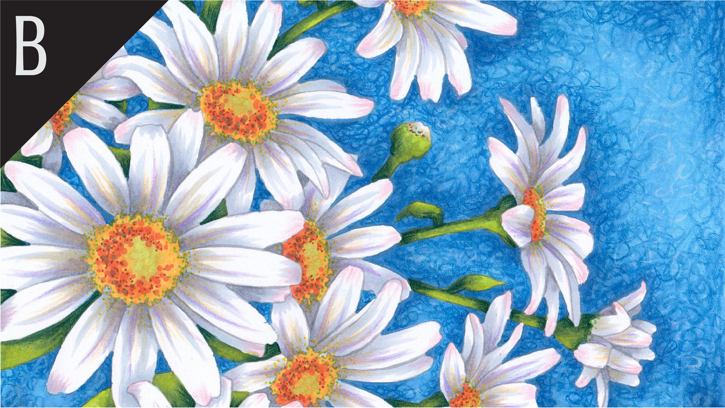
Oopsie Daisy: Start your marker painting journey with Oopsie Daisy and follow Amy as she covers the flick technique and how to use it with both marker and colored pencil to develop depth in floral images. Find more info here.
We continue to create new content and classes and we will update here as more become available.
Visit the workshop resource page at our sister site VanillaArts.com for a wide variety of Copic classes.
Vanilla Arts Digi Stamps using G28:
We continue to create new content and stamps and we will update here as more become available.
Visit the stamp shop page at our sister site VanillaArts.com for a wide variety of Vanilla Arts stamps.
Color palettes and swatches using G28:
We are building our palette and swatch collection a little more each week and will update here as more become available.
Visit the color resource page at our sister site VanillaArts.com for a wide variety of Copic palettes and swatches.
Looking for beautiful color palettes?
We absolutely love The Color Catalog 1 & 2 from Sarah Renae Clark. It puts hundreds of Copic friendly color palettes at your fingertips.
(note: affiliate link)

