YG41 Pale Cobalt Green: Copics Uncapped (Marker Swatch, Ink Testing)
YG41 Pale Cobalt Green
Let’s take a closer look at this Copic Marker and it’s ink characteristics.

YG41 Pale Cobalt Green is a minty golden green Copic Marker which mimics Cobalt Green watercolor. Soft at one layer, this color builds to almost neon brightness, not recommended for nature images. YG41 is available in Copic Sketch, Ciao, and Classic marker styles.
Every Copic Marker has different characteristics based upon its unique ink formula.
Knowing how a color behaves will help you blend effectively and make art with confidence.
YG41 Pale Cobalt Green
Let’s take a closer look at this Copic Marker and its ink characteristics.
Temperature: A cooler yellow green.
Resemblance: diluted Cobalt Gold watercolor.
Actual Value: N2
All Copics are measured on a Neutral Gray value scale. The last number on the cap is supposed to indicate value but we’ve found discrepancies where the actual ink value is different than cap designation.
Cap Accuracy: The colored plastic on the Sketch cap closely matches 1-2 layers of YG41 ink. The cap appears slightly cooler than the actual ink.

Buildup: YG41 layers beautifully without streaking. It did not appear oily until 3 layers but never looked blotchy. YG41 reaches maximum value at 4 layers.
Shattering: Shatters into cool blue-green with yellow seeping out at the margins.
Chromatography testing shows this ink’s behavior when it comes in contact with #0 Colorless Blender (solvent). High shattering colors may leak unexpected color when you make corrections or attempt to blend with any color that has a high solvent to colorant ratio. Shattering is not bad, it’s just something to be aware of.
Staining: YG41 is highly staining. Not all staining markers are dark colors, this is one of the lightest staining colors we’ve noticed.
Lift: YG41 can be moved but not really lifted. It leaves a hard green edge, noticeably darker and more yellow green than the original ink. The paper remains permanently stained light blue.
See staining swatch. Sample was given 6 stripes of #0 Colorless Blender, drying between each stripe. Results indicate how much lifting you can expect.
Lightfast: YG41 faded by about 5-10% during the testing period.
Samples were swatched on X-Press It Blending Card. 1 layer of ink was exposed to windowsill sunlight for 21 days. Approximately 10 hours of sun per day based on weather conditions. Note: we do not recommend displaying original Copic art under these conditions.
Natural Ink Family: YG41 is the lighter of two markers in the YG-Forty family.
Family Members: YG41, YG45
We include this information because many Copic users never think deeper than the letter groupings (R, BV, G, etc.). Every ink has its own temperature variations and underlying flavors. Understanding what an ink looks like in its different dilutions helps when creating your own blending combinations.
Complement: A cool, medium pink like V01
Underpaint: V000 desaturates YG17 with bright but natural look..
This is simply one suggestion. Many possible colors exist. Test to find a color that pleases you.
Pushing Pencil: Prismacolor 1090 Kelp Green provides a nicely desaturated push for YG41.
VanillaArts.com (our sister site) teaches a Push & Pull technique for dimensional coloring. This is simply one suggestion. Many possible colors exist. Test to find a color that pleases you.
Vanilla Arts Classes using light green:
We currently do not use YG41 in any classes but these lessons offer a similar learning opportunity.
Celebrate yellow-green with Sketch Garden digital stamps by Amy Shulke:

Visit the stamp shop page at our sister site VanillaArts.com for a wide variety of Copic kits.
Color palettes using light green:

Visit the color resource page at our sister site VanillaArts.com for a wide variety of Copic palettes and swatches.
Looking for beautiful color palettes?
We absolutely love The Color Catalog 1 & 2 from Sarah Renae Clark. It puts hundreds of Copic friendly color palettes at your fingertips.
(note: affiliate link)














R20 Blush: Copics Uncapped (Marker Swatch, Ink Testing)
R20 Blush
Let’s take a closer look at this Copic Marker and it’s ink characteristics.
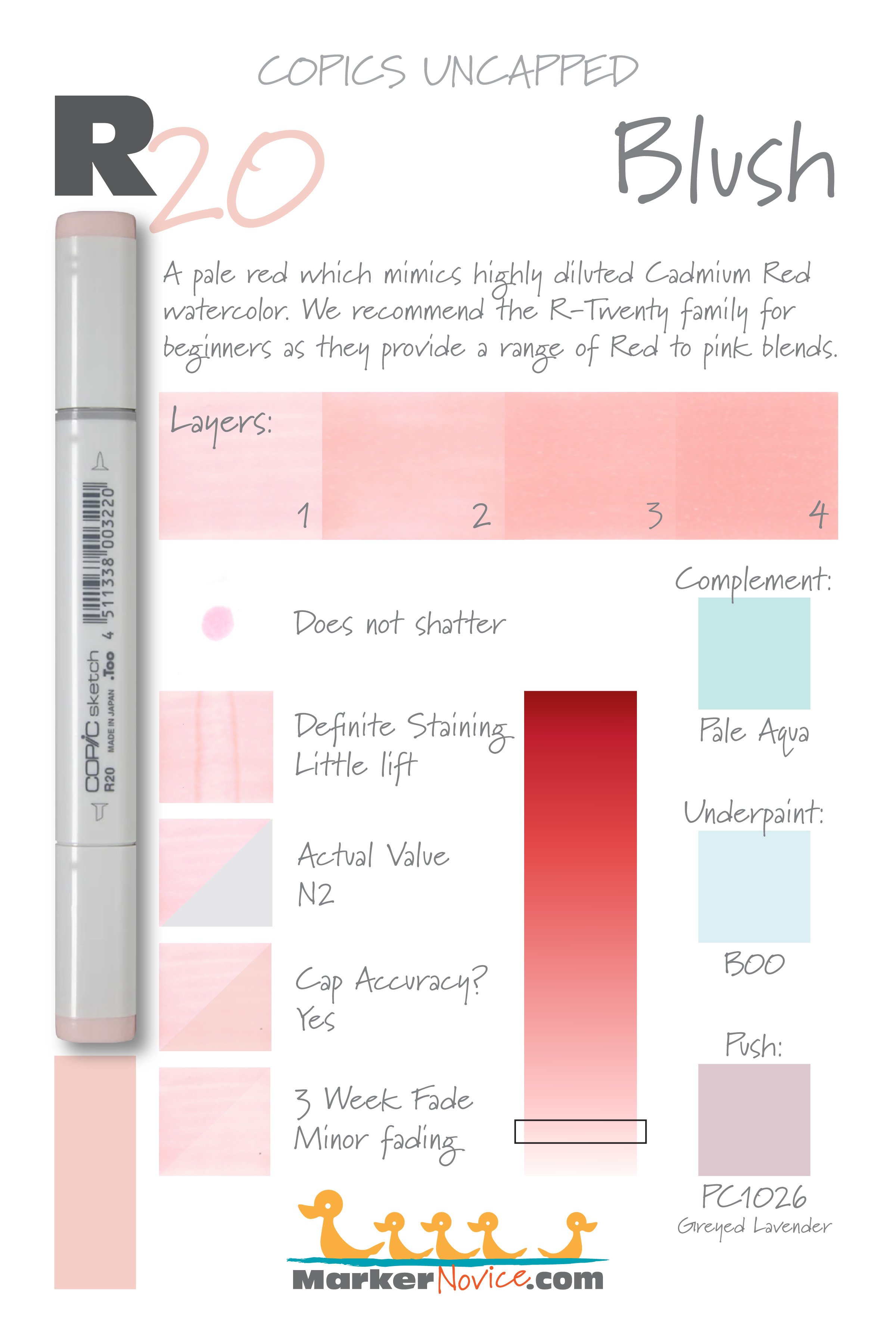

R20 Blush is a pale red Copic Marker which mimics highly diluted Cadmium Red watercolor. We recommend the R-Twenty family for beginners as they provide a range of Red to pink. R20 is available in Copic Sketch, Ciao, and Classic marker styles.
Every Copic Marker has unique characteristics based on its unique ink formula.
Knowing how a color behaves will help you blend effectively and make art with confidence.
R20 Blush
Let’s take a closer look at this Copic Marker and it’s ink characteristics.
Temperature: A warm pale red.
Resemblance: highly diluted Cadmium Red watercolor.
Actual Value: N2 (notice this is darker than the 0 value indicated on the marker cap)
All Copics are measured on a Neutral Gray value scale. The last number on the cap is supposed to indicate value but we’ve found discrepancies where the actual ink value is different than cap designation.
Cap Accuracy: The plastic on an R2o Sketch marker looks exactly like 1 coat of R20 ink.
Buildup: R20 layers well and reaches maximum value at 4 coats
Shattering: Does not shatter.
Chromatography testing shows this ink’s behavior when it comes in contact with #0 Colorless Blender (solvent). High shattering colors may leak unexpected color when you make corrections or attempt to blend with any color that has a high solvent to colorant ratio. Shattering is not bad, it’s just something to be aware of.
Staining: R20 definitely stains the paper. Note that staining is a characteristic of red ink, so even a light color can still stain.
Lift: This is a stubborn color which can be lightened but not totally lifted.
See staining swatch. Sample was given 6 stripes of #0 Colorless Blender, drying between each stripe. Results indicate how much lifting you can expect.
Lightfast: The sample faded about 10% during testing.
Samples were swatched on X-Press It Blending Card. 1 layer of ink was exposed to windowsill sunlight for 21 days. Approximately 10 hours of sun per day based on weather conditions. Note: we do not recommend displaying original Copic art under these conditions.
Natural Ink Family: R20 is the light end of the R-Twenty family. The R-Twenties are the most popular reds Copic makes and its light reds are often substituted for pink (even though they’re light red, not pink).
Family Members: R20, R22, R24, R27, R29.
We include this information because many Copic users never think deeper than the letter groupings (R, BV, G, etc.). Every ink has its own temperature variations and underlying flavors. Understanding what an ink looks like in its different dilutions helps when creating your own blending combinations.
Complement: A medium greenish blue like BG32
Underpaint: We suggest B00
This is simply one suggestion. Many possible colors exist. Test to find a color that pleases you.
Pushing Pencil: Prismacolor 1026 Greyed Lavender is a reliable choice.
VanillaArts.com (our sister site) teaches a Push & Pull technique for dimensional coloring. This is simply one suggestion. Many possible colors exist. Test to find a color that pleases you.
Vanilla Arts Classes using R20:

Celebration Cupcake: Soft fluffy frosting and tasty cake, perfect for any birthday celebration. Color gentle waves of frosting & crisply folded pleats. You can use this technique on skirts, shirts, curtains, anything with folds! Find more info here.

Jellybeans: Learn about the importance of coloring “form” accurately for realism. Find more info here.

Tree Frog: Learn to use Amy’s Rebel Blends concept for realism. Find more info here.
Vanilla Arts Digi Stamps using red:

Color palettes and swatches using R20:

Visit our archives for more great ways to use R20 Blush Copic Marker.
Looking for beautiful color palettes?
We absolutely love The Color Catalog 1 & 2 from Sarah Renae Clark. It puts hundreds of Copic friendly color palettes at your fingertips.
(note: affiliate link)


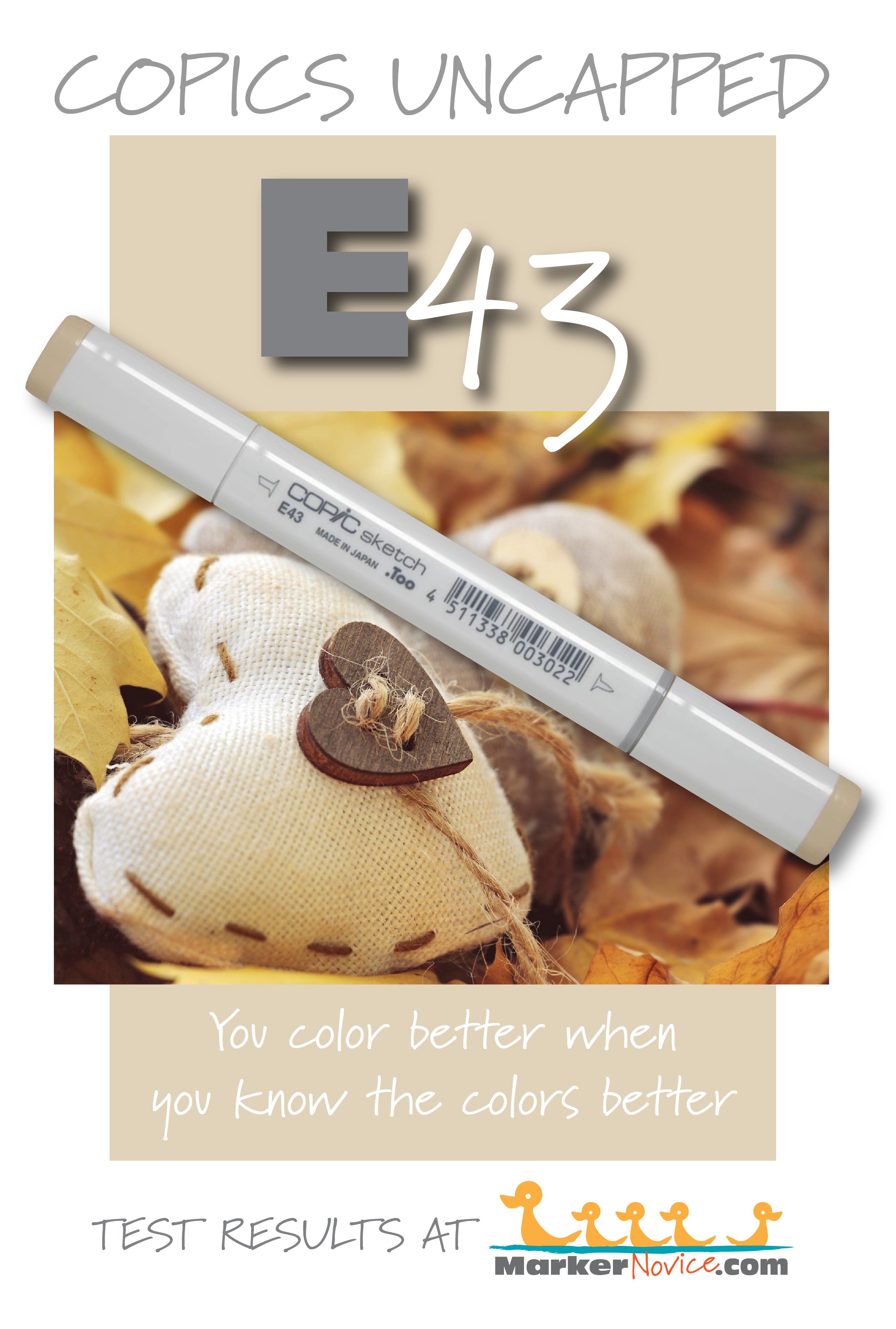
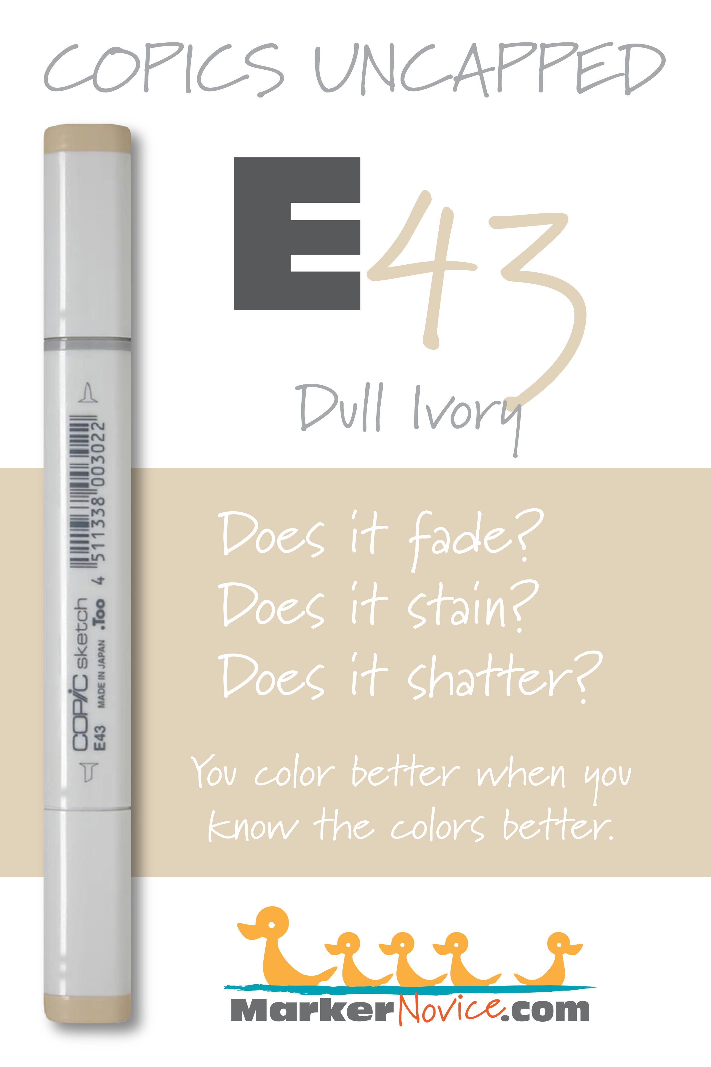
E43 Dull Ivory: Copics Uncapped (Marker Swatch, Ink Testing)
E43 Dull Ivory
Let’s take a closer look at this Copic Marker and it’s ink characteristics.

Every Copic Marker has unique characteristics based on its unique ink formula.
Knowing how a color behaves will help you blend effectively and make art with confidence.
E43 Dull Ivory
Let’s take a closer look at this Copic Marker and its ink characteristics.
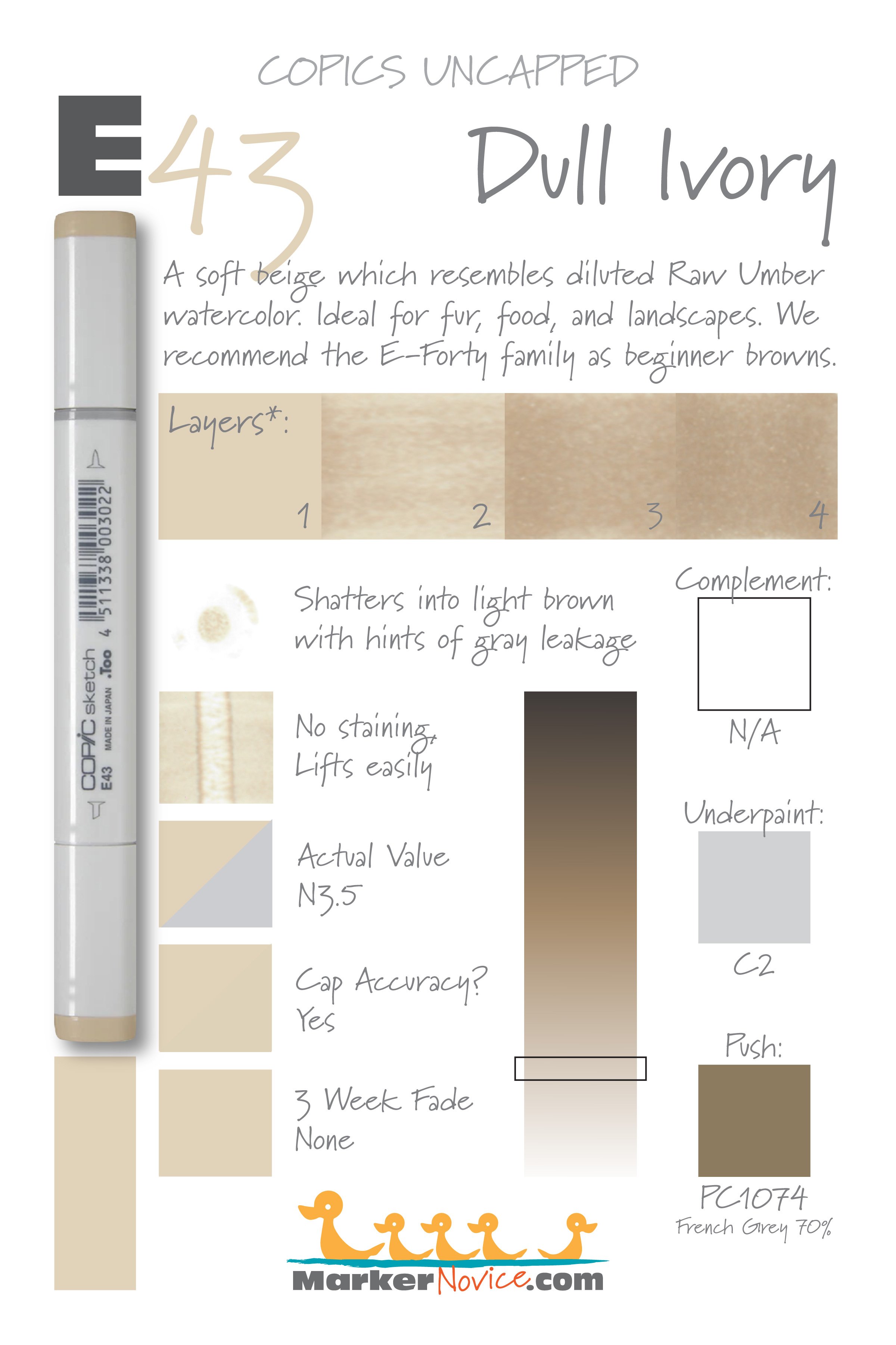
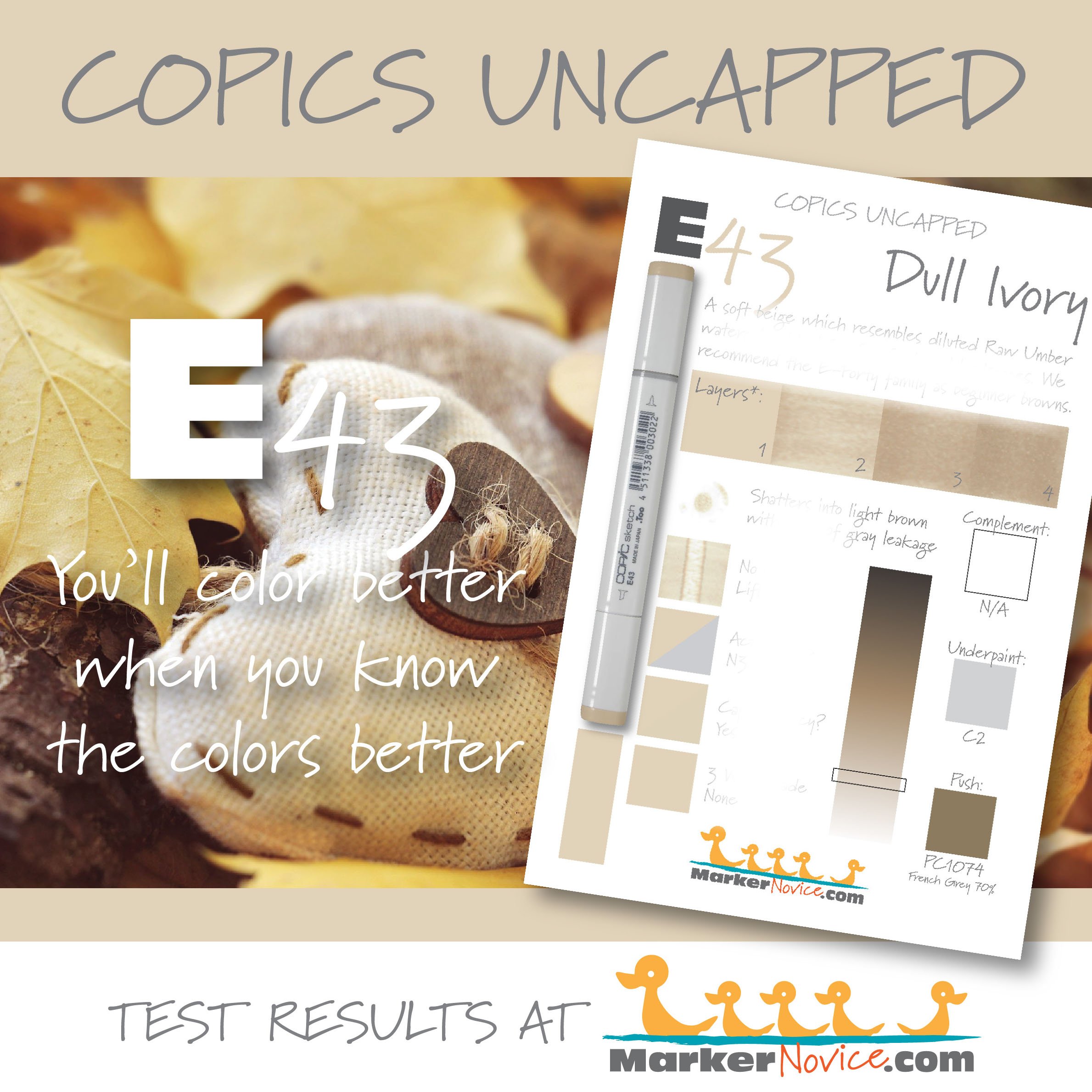
Note: The * asterisk in the test samples above indicate that we’ve used a digital sample in the graphic above. A single layer of E43 did not scan accurately but layers 2, 3, and 4 are shown as accurate real samples.
Temperature: A soft cool beige
Resemblance: Diluted Raw Umber watercolor
Actual Value: 3.5
All Copics are measured on a Neutral Gray value scale. The last number on the cap is supposed to indicate value but we’ve found discrepancies where the actual ink value is different than cap designation.
Cap Accuracy: The plastic on a Sketch marker cap correctly matches one coat of E43 ink.
Buildup: E43 starts to look oily on the second layer. It reaches maximum value at 4 layers.
Shattering: Shatters into beige with hints of cool gray leakage
Chromatography testing shows this ink’s behavior when it comes in contact with #0 Colorless Blender (solvent). High shattering colors may leak unexpected color when you make corrections or attempt to blend with any color that has a high solvent to colorant ratio. Shattering is not bad, it’s just something to be aware of.
Staining: E43 does not stain
Lift: E43 lifts easily
See staining swatch. Sample was given 6 stripes of #0 Colorless Blender, drying between each stripe. Results indicate how much lifting you can expect.
Lightfast: E43 did not fade during the testing period
Samples were swatched on X-Press It Blending Card. 1 layer of ink was exposed to windowsill sunlight for 21 days. Approximately 10 hours of sun per day based on weather conditions. Note: we do not recommend displaying original Copic art under these conditions.
Natural Ink Family: E43 is in the middle of the E-Forty family.
Family members: E40, E41, E42, E43, E44, E47, and E49
We include this information because many Copic users never think deeper than the letter groupings (R, BV, G, etc.). Every ink has its own temperature variations and underlying flavors. Understanding what an ink looks like in its different dilutions helps when creating your own blending combinations.
Complement: Brown is not a hue on the color wheel and does not have a complement.
Underpaint: C2 neutralizes this color well.
This is simply one suggestion. Many possible colors exist. Test to find a color that pleases you.
Pushing Pencil: Prismacolor 1074 French Grey 70% pushes this color nicely.
VanillaArts.com (our sister site) teaches a Push & Pull technique for dimensional coloring. This is simply one suggestion. Many possible colors exist. Test to find a color that pleases you.
Vanilla Arts Classes using E43:

Doughnut Stack: Learn to underpaint for photorealism. Includes Amy’s exclusive glaze technique. More info here.
Vanilla Arts Digi Stamps using light brown:
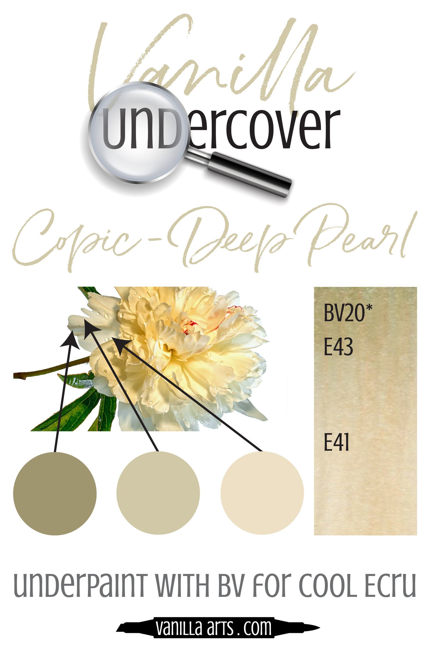
Color palettes and swatches using E43:

Looking for beautiful color palettes?
We absolutely love The Color Catalog 1 & 2 from Sarah Renae Clark. It puts hundreds of Copic friendly color palettes at your fingertips.
(note: affiliate link)


N7 Neutral Gray No. 7: Copics Uncapped (Marker Swatch, Ink Testing)
N7 Neutral Gray No. 7
Let’s take a closer look at this Copic Marker and it’s ink characteristics.
N7 Neutral Gray #7 is a balanced gray Copic Marker mimics Lamp Black watercolor. We highly recommend purchasing N grays as your first gray markers because of their usefulness and versatility. N7 is only available in Sketch and Classic Copic styles.
Every Copic Marker has unique characteristics based on its unique ink formula.
Knowing how a color behaves will help you blend effectively and make art with confidence.
N7 Neutral Gray No. 7
Let’s take a closer look at this Copic Marker and its ink characteristics.
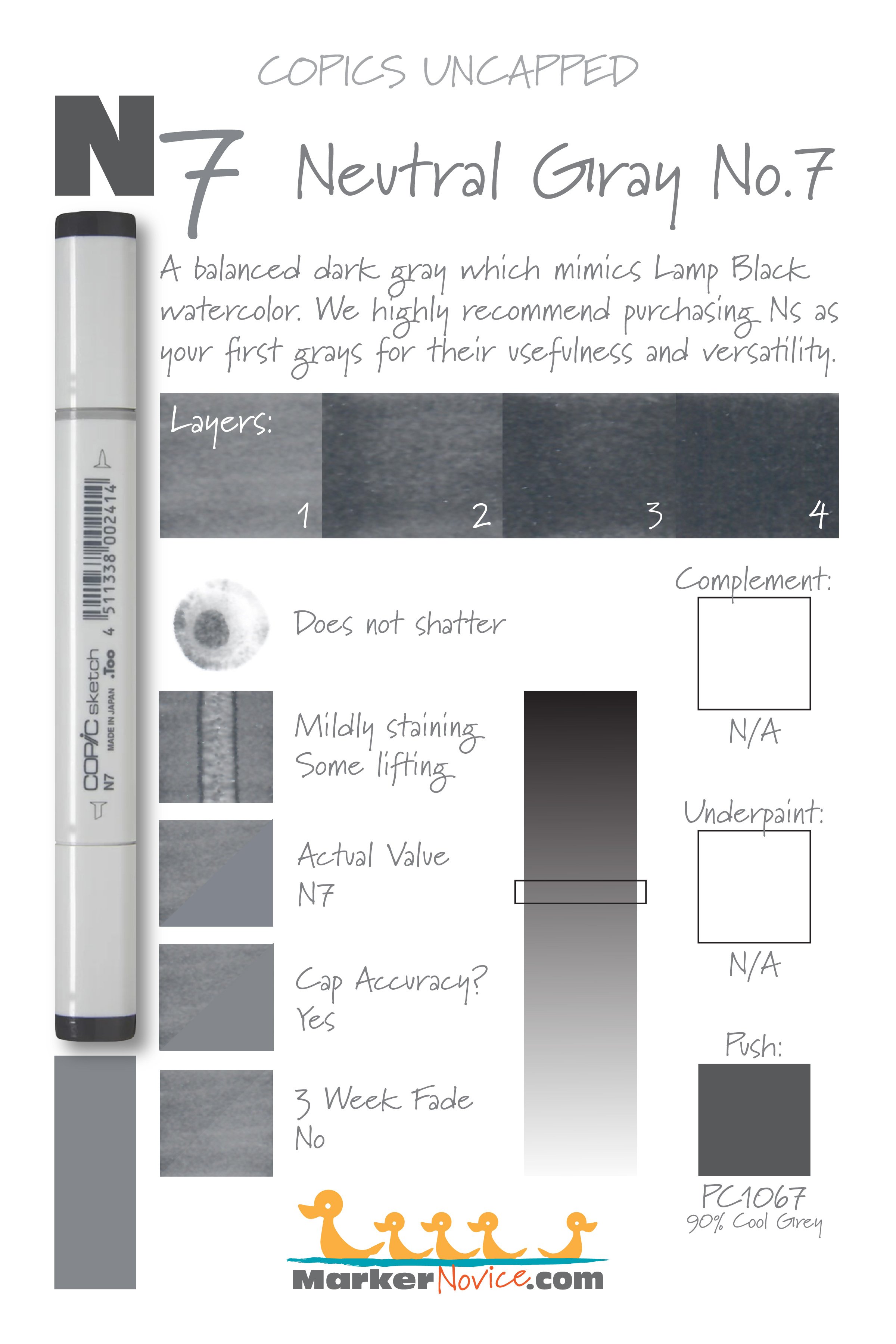
Temperature: A balanced gray, neither warm nor cool
Resemblance: Lamp Black watercolor
Actual Value: N7 (All Copic N grays match their true value. N is the only family where this is true.)
All Copics are measured on a Neutral Gray value scale. The last number on the cap is supposed to indicate value but we’ve found discrepancies where the actual ink value is different than cap designation.
Cap Accuracy: The plastic end of a Sketch Marker matches 1 coat of N7 ink.
Buildup: N7 reaches maximum color at 4 layers and starts to gather an oily appearance with the first layer.
Shattering: Does not shatter.
Chromatography testing shows this ink’s behavior when it comes in contact with #0 Colorless Blender (solvent). High shattering colors may leak unexpected color when you make corrections or attempt to blend with any color that has a high solvent to colorant ratio. Shattering is not bad, it’s just something to be aware of.

Staining: N7 is mildly staining as are most markers this dark.
Lift: N7 can be lifted a bit but you’re really just pushing the color aside, not removing it.
See staining swatch. Sample was given 6 stripes of #0 Colorless Blender, drying between each stripe. Results indicate how much lifting you can expect.
Lightfast: We did not notice any fading of N7 during the test period.
Samples were swatched on X-Press It Blending Card. 1 layer of ink was exposed to windowsill sunlight for 21 days. Approximately 10 hours of sun per day based on weather conditions. Note: we do not recommend displaying original Copic art under these conditions.
Natural Ink Family: N7 is in the middle of the Neutral Gray family.
Family Members: N10, N9, N8, N7, N6, N5, N4, N3, N2, N1, N0
We include this information because many Copic users never think deeper than the letter groupings (R, BV, G, etc.). Every ink has its own temperature variations and underlying flavors. Understanding what an ink looks like in its different dilutions helps when creating your own blending combinations.
Complement: N/A
Underpaint: N/A
Pushing Pencil: We suggest Prismacolor 1067 90% Cool Grey
VanillaArts.com (our sister site) teaches a Push & Pull technique for dimensional coloring. This is simply one suggestion. Many possible colors exist. Test to find a color that pleases you.
Vanilla Arts Classes using N7:

Vanilla Arts Digi Stamps using N7:
We continue to create new content and stamps and we will update here as more become available.
Visit the Stamp Shop resource page at our sister site VanillaArts.com for a wide variety of Vanilla Arts stamps.

Color palettes and swatches using N7:
Looking for beautiful color palettes?
We absolutely love The Color Catalog 1 & 2 from Sarah Renae Clark. It puts hundreds of Copic friendly color palettes at your fingertips.
(note: affiliate link)


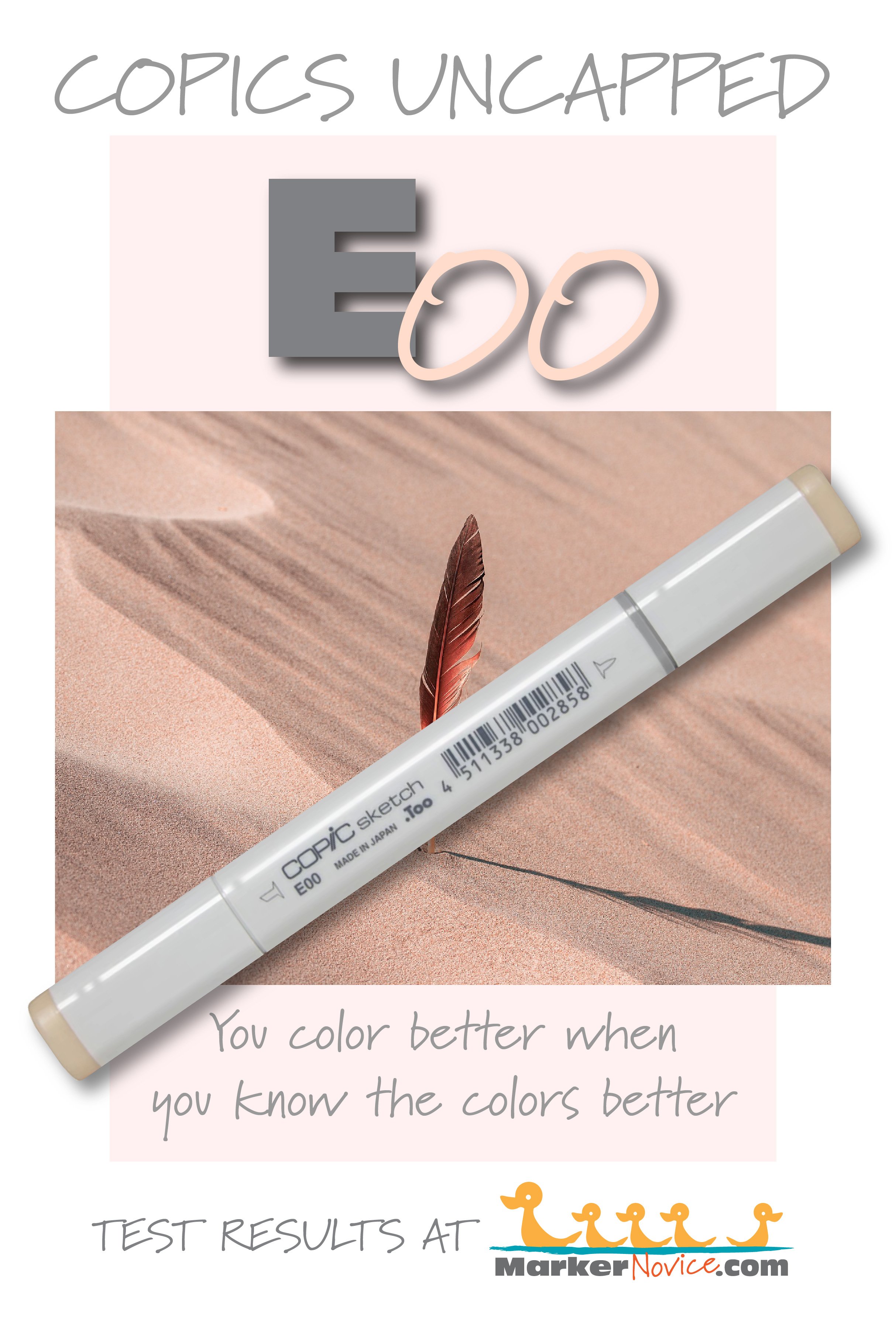
E00 Cotton Pearl: Copics Uncapped (Marker Swatch, Ink Testing)
E00 Cotton Pearl
Let’s take a closer look at this Copic Marker and it’s ink characteristics.
Every Copic Marker has unique characteristics based on its unique ink formula.
Knowing how a color behaves will help you blend effectively and make art with confidence.
E00 Cotton Pearl
Let’s take a closer look at this Copic Marker and its ink characteristics.
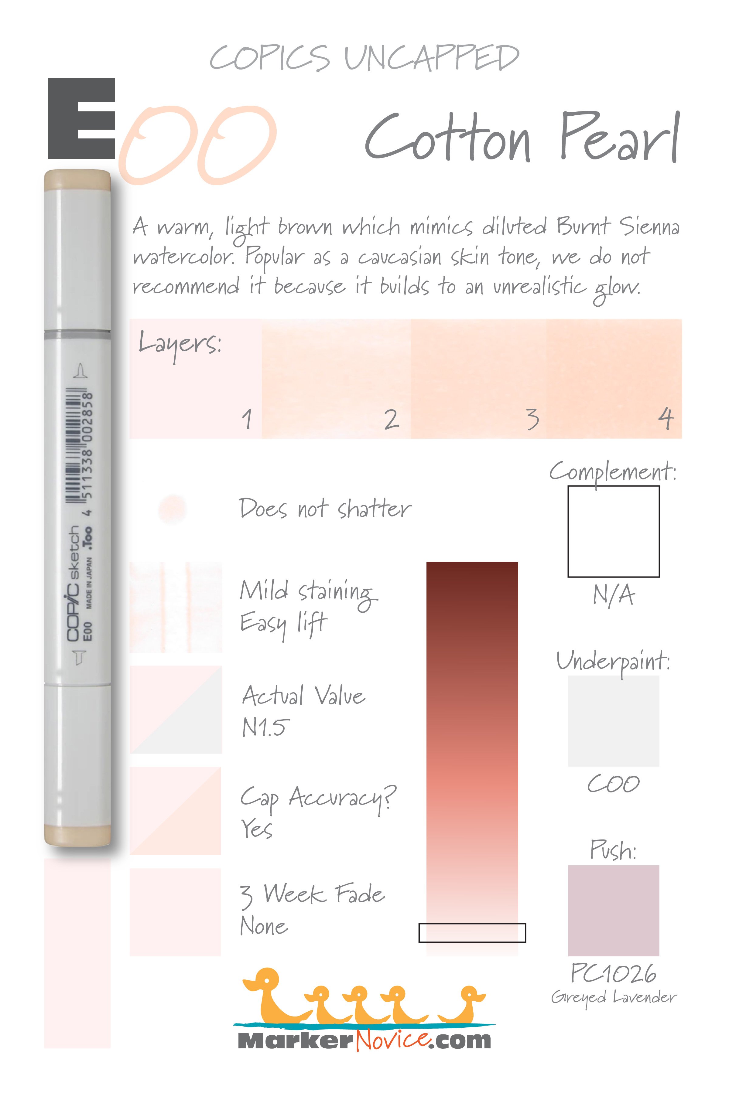
Note: This Copic Marker color has been renamed. Older markers may be marked “Skin White”
WARNING: E00 is an incredibly popular color and is likely their best selling E marker. This is because E00 is recommended by instructors and bloggers as a caucasian skin tone. WE DO NOT RECOMMEND COLORING SKIN WITH E00!
Yes, one layer of E00 resembles pale porcelain skin. But how often do you color skin without blending? 2 layers of E00 starts to take on an odd glow and by the time one has smooth blended their entire image, the skin starts to look very orange and fake with a noticeable florescence. Sadly, skin colored smoothly with E00 rarely looks real. Instead, try E50 which can be layered without the orange glow.
Temperature: A warm peach toned beige-brown
Resemblance: Highly diluted Burnt Sienna watercolor
Actual Value: 1.5 (note this marker looks very light but it’s about 2 steps darker than the cap value indicates)
All Copics are measured on a Neutral Gray value scale. The last number on the cap is supposed to indicate value but we’ve found discrepancies where the actual ink value is different than cap designation.
Cap Accuracy: Yes. The plastic on a Sketch marker cap matches 1-2 coats of E00.
Buildup: E00 layers beautifully and reaches maximum value at 4 coats.
Shattering: Does not shatter
Chromatography testing shows this ink’s behavior when it comes in contact with #0 Colorless Blender (solvent). High shattering colors may leak unexpected color when you make corrections or attempt to blend with any color that has a high solvent to colorant ratio. Shattering is not bad, it’s just something to be aware of.
Staining: E41 does not stain. Note, the photo of the test results above appear faded but this is a digital anomaly. One layer of E00 is hard to capture with a scanner.
Lift: E00 lifts very easily.
See staining swatch. Sample was given 6 stripes of #0 Colorless Blender, drying between each stripe. Results indicate how much lifting you can expect.
Lightfast: Shockingly, E00 did not fade at all during our test period.
Samples were swatched on X-Press It Blending Card. 1 layer of ink was exposed to windowsill sunlight for 21 days. Approximately 10 hours of sun per day based on weather conditions. Note: we do not recommend displaying original Copic art under these conditions.
Natural Ink Family: E00 is at the lighter end of the E-Zero family.
Family members: E0000, E000, E00, E01, E02, E04, E07, E08, E09
We include this information because many Copic users never think deeper than the letter groupings (R, BV, G, etc.). Every ink has its own temperature variations and underlying flavors. Understanding what an ink looks like in its different dilutions helps when creating your own blending combinations.
Complement: Brown is not a hue on the color wheel and does not have a complement.
Underpaint: C00 neutralizes this color well.
This is simply one suggestion. Many possible colors exist. Test to find a color that pleases you.
Pushing Pencil: Prismacolor 1026 Greyed Lavender pushes this color nicely.
VanillaArts.com (our sister site) teaches a Push & Pull technique for dimensional coloring. This is simply one suggestion. Many possible colors exist. Test to find a color that pleases you.
Vanilla Arts Classes using E00:
We have not taught a class using E00 to date. We will add the listing here if/when we do. In the meantime, please see our range of classes here.
Vanilla Arts Digi Stamps using light brown markers:
Color palettes and swatches using light brown:
Looking for beautiful color palettes?
We absolutely love The Color Catalog 1 & 2 from Sarah Renae Clark. It puts hundreds of Copic friendly color palettes at your fingertips.
(note: affiliate link)


R27 Cadmium Red: Copics Uncapped (Marker Swatch, Ink Testing)
R27 Cadmium Red
Let’s take a closer look at this Copic Marker and it’s ink characteristics.

R27 Cadmium Red is a balanced red Copic Marker which mimics diluted Cadmium Red watercolor. This is a very popular red which helps tame the stubborn tendencies of R29. R27 is available in Copic Sketch, Ciao, and Classic marker styles.
Every Copic Marker has unique characteristics based on its unique ink formula.
Knowing how a color behaves will help you blend effectively and make art with confidence.
R27 Cadmium Red
Let’s take a closer look at this Copic Marker and it’s ink characteristics.
Temperature: A balanced red.
Resemblance: Cadmium Red watercolor.
Actual Value: N7
All Copics are measured on a Neutral Gray value scale. The last number on the cap is supposed to indicate value but we’ve found discrepancies where the actual ink value is different than cap designation.
Cap Accuracy: The plastic on an R27 Sketch marker looks more like 4 coats of R27 but is also slightly warmer than the actual ink color.
Buildup: R27 layers well up to 3 layers. Beyond that, you’ll see slightly oily looking streaks or patches.
Shattering: Does not shatter.
Chromatography testing shows this ink’s behavior when it comes in contact with #0 Colorless Blender (solvent). High shattering colors may leak unexpected color when you make corrections or attempt to blend with any color that has a high solvent to colorant ratio. Shattering is not bad, it’s just something to be aware of.

Staining: R27 stains the paper.
Lift: Very little lifting.
See staining swatch. Sample was given 6 stripes of #0 Colorless Blender, drying between each stripe. Results indicate how much lifting you can expect.
Lightfast: The sample faded about 10% during testing.
Samples were swatched on X-Press It Blending Card. 1 layer of ink was exposed to windowsill sunlight for 21 days. Approximately 10 hours of sun per day based on weather conditions. Note: we do not recommend displaying original Copic art under these conditions.
Natural Ink Family: R27 is the dark end of the R-Twenty family. The R20s are the most popular reds Copic makes and its light reds are often substituted for pink (even though they’re light red, not pink).
R27 is often used in combination with R29, not because this value is truly needed in a red blending combination but because R29 is a stubborn blender and R27 gives the colorer an extra shot of solvent to make R29 blend.
Family Members: R20, R22, R24, R27, R29.
We include this information because many Copic users never think deeper than the letter groupings (R, BV, G, etc.). Every ink has its own temperature variations and underlying flavors. Understanding what an ink looks like in its different dilutions helps when creating your own blending combinations.
Complement: A medium true blue like B24
Underpaint: We suggest B93
This is simply one suggestion. Many possible colors exist. Test to find a color that pleases you.
Pushing Pencil: Prismacolor 931 Dark Purple is a reliable choice.
VanillaArts.com (our sister site) teaches a Push & Pull technique for dimensional coloring. This is simply one suggestion. Many possible colors exist. Test to find a color that pleases you.
Vanilla Arts Classes using R27:
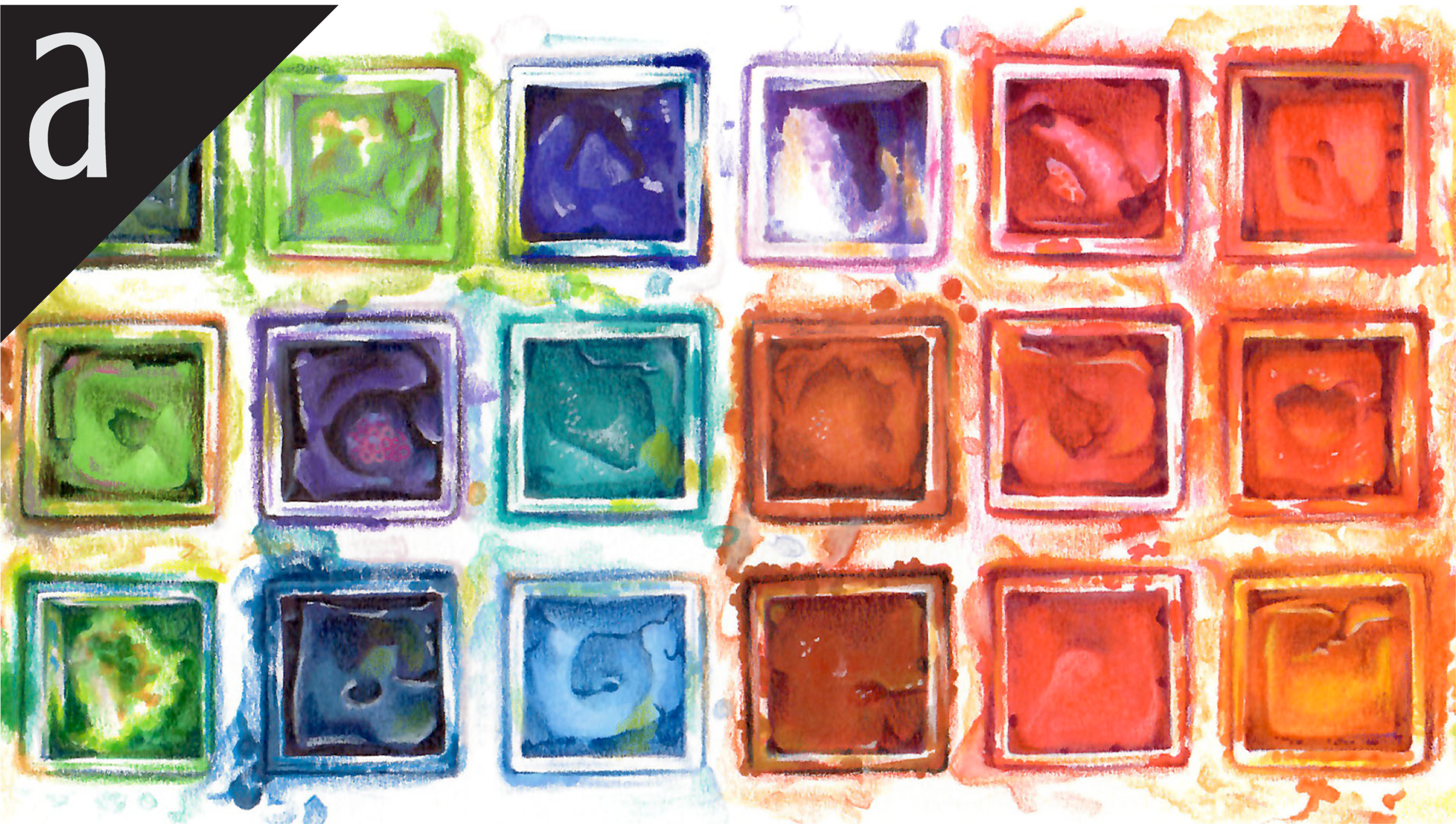
Box of Colors (MPF 2): a four episode Copic + Colored Pencil challenge for graduates of MPF. Covers color theory & form sculpting with group feedback. For more info: Box of Colors.

Doughnut Stack: Amy shows you why underpainting provides the basis for realistic coloring with accuracy. Find more info here.
Vanilla Arts Digi Stamps using R27:
We continue to create new digi stamps and we will update here as more become available.
Visit the stamp shop at our sister site VanillaArts.com for a wide variety of versatile digi stamps.
Color palettes and swatches using R27:


Looking for beautiful color palettes?
We absolutely love The Color Catalog 1 & 2 from Sarah Renae Clark. It puts hundreds of Copic friendly color palettes at your fingertips.
(note: affiliate link)


RV34 Dark Pink: Copics Uncapped (Marker Swatch, Ink Testing)
RV34 Dark Pink
Let’s take a closer look at this Copic Marker and it’s ink characteristics.

RV34 Dark Pink is a slightly dusty magenta Copic Marker which resembles Rose Madder watercolor. Ideal for coloring florals, spring images, Valentine’s Day, and intense pink projects. RV34 is available in Copic Sketch, Ciao, and Classic marker styles.
Every Copic Marker has unique characteristics based on its unique ink formula.
Knowing how a color behaves will help you blend effectively and make art with confidence.
RV34 Dark Pink
Let’s take a closer look at this Copic Marker and its ink characteristics.
Temperature: A slightly dusty magenta.
Resemblance: Rose Madder watercolor.
Actual Value: N4
All Copics are measured on a Neutral Gray value scale. The last number on the cap is supposed to indicate value but we’ve found discrepancies where the actual ink value is different than cap designation.
Cap Accuracy: Darker. The plastic on a Sketch marker matches the color of 4 to maybe 5 coats of B34.
Buildup: This color is not easy to layer smoothly. The color appears streaky all the way to four coats and starts gathering an oily look at three layers.
Shattering: Does not shatter.
Chromatography testing shows this ink’s behavior when it comes in contact with #0 Colorless Blender (solvent). High shattering colors may leak unexpected color when you make corrections or attempt to blend with any color that has a high solvent to colorant ratio. Shattering is not bad, it’s just something to be aware of.
Staining: Mildly staining.
Lift: Partial lifting. We were able to remove some of the pink colorant but the paper was left with a pale pink stain.
See staining swatch. Sample was given 6 stripes of #0 Colorless Blender, drying between each stripe. Results indicate how much lifting you can expect.
Lightfast: This color faded by about 10%.
Samples were swatched on X-Press It Blending Card. 1 layer of ink was exposed to windowsill sunlight for 21 days. Approximately 10 hours of sun per day based on weather conditions. Note: we do not recommend displaying original Copic art under these conditions.
Natural Ink Family: RV34 is the darker of only two markers in the RV-Thirty family.
Family Members: RV32, RV34
We include this information because many Copic users never think deeper than the letter groupings (R, BV, G, etc.). Every ink has its own temperature variations and underlying flavors. Understanding what an ink looks like in its different dilutions helps when creating your own blending combinations.
Complement: A soft medium green like G43
Underpaint: We suggest BG11
This is simply one suggestion. Many possible colors exist. Test to find a color that pleases you.
Pushing Pencil: Prismacolor 1008 Parma Violet if used with a light touch looks really good. If you use too much pressure, the area turns too purple.
VanillaArts.com (our sister site) teaches a Push & Pull technique for dimensional coloring. This is simply one suggestion. Many possible colors exist. Test to find a color that pleases you.
Vanilla Arts Classes using RV34:
We continue to create new content and classes and we will update here as more become available.
Visit the workshop resource page at our sister site VanillaArts.com for a wide variety of Copic classes.
Celebrate pink with Sketch Garden Digital Stamps by Amy Shulke:


Color palettes and swatches using RV34:


Visit the color resource page at our sister site VanillaArts.com for a wide variety of Copic palettes and swatches.
Looking for beautiful color palettes?
We absolutely love The Color Catalog 1 & 2 from Sarah Renae Clark. It puts hundreds of Copic friendly color palettes at your fingertips.
(note: affiliate link)


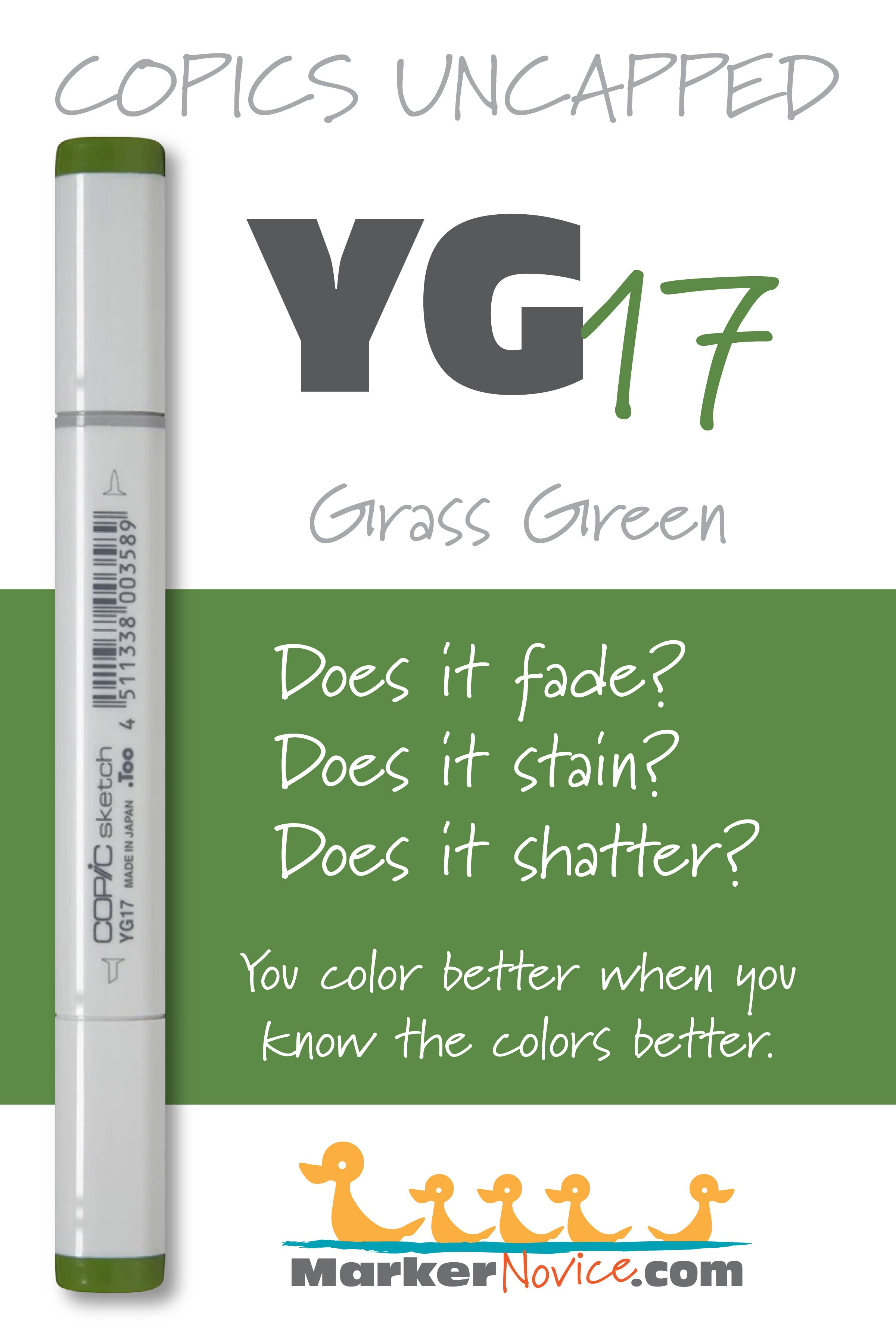
YG17 Grass Green: Copics Uncapped (Marker Swatch, Ink Testing)
YG17 Grass Green
Let’s take a closer look at this Copic Marker and it’s ink characteristics.

YG17 Grass Green is a warm golden green Copic Marker which resembles Green Gold watercolor. Ideal perfect for florals and spring landscapes. We highly recommend this easy-blending marker for beginners. YG17 is available in Copic Sketch, Ciao, and Classic marker styles.
Every Copic Marker has unique characteristics based on its unique ink formula.
Knowing how a color behaves will help you blend effectively and make art with confidence.
YG17 Grass Green
Let’s take a closer look at this Copic Marker and its ink characteristics.
Temperature: A warm golden green.
Resemblance: Green Gold watercolor.
Actual Value: N5.5 This marker is lighter than would be predicted from the value “7” listed on the marker cap number.
All Copics are measured on a Neutral Gray value scale. The last number on the cap is supposed to indicate value but we’ve found discrepancies where the actual ink value is different than cap designation.
Cap Accuracy: The cap is much darker than the ink. The colored plastic on the Sketch cap resembles more than 4 layers of YG17 ink.
Buildup: YG17 started to look oily at 3 layers. It reaches maximum value at 4 layers.
Shattering: Shatters into green with yellow seeping out at the margins.
Chromatography testing shows this ink’s behavior when it comes in contact with #0 Colorless Blender (solvent). High shattering colors may leak unexpected color when you make corrections or attempt to blend with any color that has a high solvent to colorant ratio. Shattering is not bad, it’s just something to be aware of.
Staining: YG17 mildly stains the paper leaving behind a bluish color.
Lift: The green aspects of this color can be shifted a bit but the paper remains stained with an odd bluish color with tinges of olive..
See staining swatch. Sample was given 6 stripes of #0 Colorless Blender, drying between each stripe. Results indicate how much lifting you can expect.
Lightfast: YG17 faded by about 10% during the testing period.
Samples were swatched on X-Press It Blending Card. 1 layer of ink was exposed to windowsill sunlight for 21 days. Approximately 10 hours of sun per day based on weather conditions. Note: we do not recommend displaying original Copic art under these conditions.
Natural Ink Family: YG17 is a at the darkest end of the YG-Teen family.
Family Members: YG11, YG13, YG17
Note: YG11 is cooler than both YG13 and YG17. This family seems like a mashup of unrelated inks.
We include this information because many Copic users never think deeper than the letter groupings (R, BV, G, etc.). Every ink has its own temperature variations and underlying flavors. Understanding what an ink looks like in its different dilutions helps when creating your own blending combinations.
Complement: A cool, medium pink like RV55
Underpaint: B34 desaturates YG17 with bright but natural look..
This is simply one suggestion. Many possible colors exist. Test to find a color that pleases you.
Pushing Pencil: Prismacolor 901 Indigo Blue provides a nicely desaturated push for YG11.
VanillaArts.com (our sister site) teaches a Push & Pull technique for dimensional coloring. This is simply one suggestion. Many possible colors exist. Test to find a color that pleases you.
Vanilla Arts Classes using YG17:

Oopsie Daisy, a beginner class on developing and using the flick technique for Copic Markers in both blending and non-blending situations.
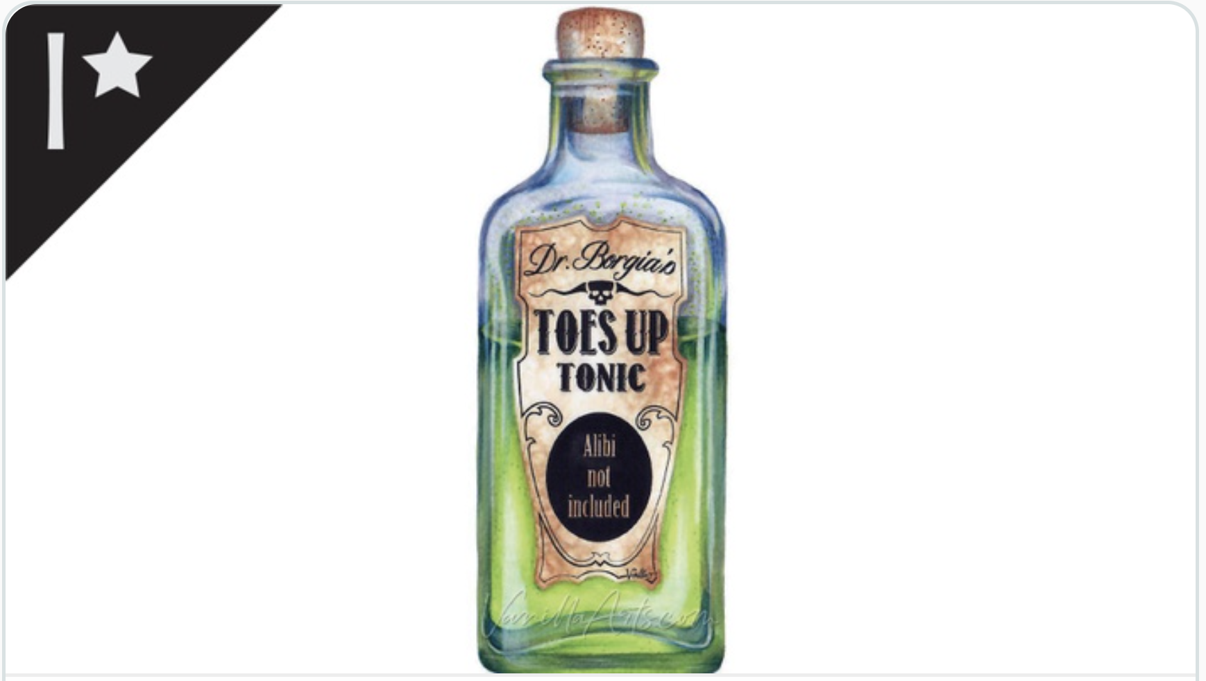
Tonic: an intermediate-challenge class on developing realistic texture with Copic Markers and colored pencils.
YG17 is one of the most popular markers on Amy’s class supply lists. Most of her floral images use YG17.
Visit the workshop resource page at our sister site VanillaArts.com for a wide variety of digital stamps.
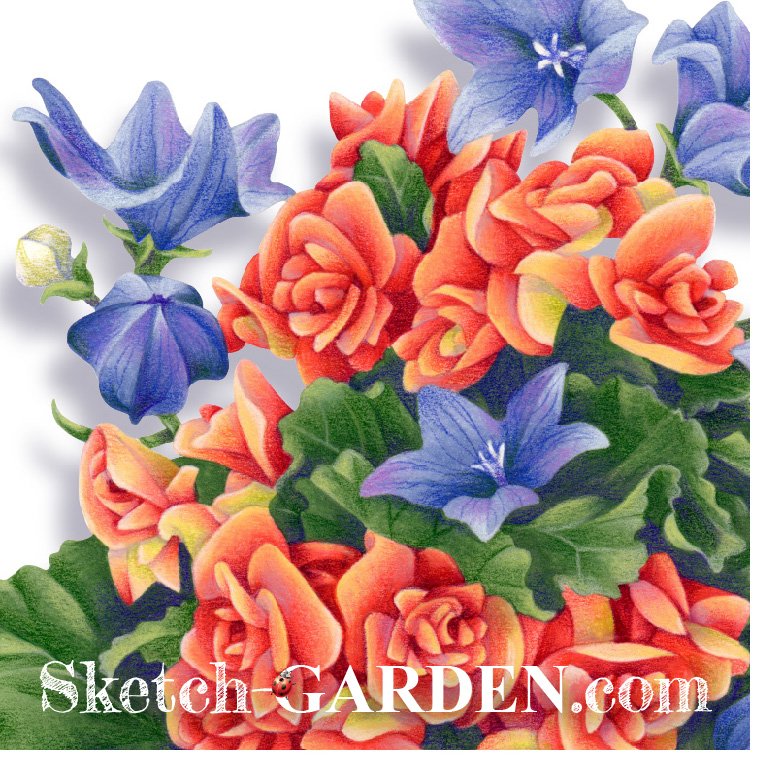
Celebrate yellow-green with Sketch Garden digital stamps by Amy Shulke:
Visit the stamp shop page at our sister site VanillaArts.com for a wide variety of Copic kits.
Color palettes using YG17:
Visit the color resource page at our sister site VanillaArts.com for a wide variety of Copic palettes and swatches.
Looking for beautiful color palettes?
We absolutely love The Color Catalog 1 & 2 from Sarah Renae Clark. It puts hundreds of Copic friendly color palettes at your fingertips.
(note: affiliate link)