

R02 Rose Salmon: Copics Uncapped (Marker Swatch, Ink Testing)
R02 Rose Salmon
Let’s take a closer look at this Copic Marker and it’s ink characteristics.


R02 Rose Salmon is a light warm red Copic Marker which resembles diluted Vermilion watercolor. This is a useful marker for beginners as it can substitute for pink yet blends easily with red. R02 is available in Copic Sketch, Ciao, and Classic marker styles.
Every Copic Marker has unique characteristics based on its unique ink formula.
Knowing how a color behaves will help you blend effectively and make art with confidence.
R02 Rose Salmon
Let’s take a closer look at this Copic Marker and it’s ink characteristics.
Temperature: A warm red.
Resemblance: Diluted Vermilion watercolor.
Previous Name: In older sets this marker may be called Flesh
Actual Value: N3
All Copics are measured on a Neutral Gray value scale. The last number on the cap is supposed to indicate value but we’ve found discrepancies where the actual ink value is different than cap designation.
Cap Accuracy: The plastic on an R02 Sketch marker is slightly translucent which throws off how the color appears. The plastic seems more of a neutralized orange than the actual ink.
Buildup: R02 layers beautifully.
Shattering: Does not shatter.
Chromatography testing shows this ink’s behavior when it comes in contact with #0 Colorless Blender (solvent). High shattering colors may leak unexpected color when you make corrections or attempt to blend with any color that has a high solvent to colorant ratio. Shattering is not bad, it’s just something to be aware of.

Staining: R02 stains the paper slightly. This is no surprise as reds tend to be staining.
Lift: No red lifts very well but you can lighten R02 with some effort. The paper will retain some color.
See staining swatch. Sample was given 6 stripes of #0 Colorless Blender, drying between each stripe. Results indicate how much lifting you can expect.
Lightfast: The sample faded about 10% during testing.
Samples were swatched on X-Press It Blending Card. 1 layer of ink was exposed to windowsill sunlight for 21 days. Approximately 10 hours of sun per day based on weather conditions. Note: we do not recommend displaying original Copic art under these conditions.
Natural Ink Family: R02 is at the lighter end of the R-Zero family which feels warmer as the colors get darker. The sub-zeros have a bleached, pinkish feel while the others feel more true to the red family.
Family Members: R0000, R000, R01, R02, R05, and R08.
We include this information because many Copic users never think deeper than the letter groupings (R, BV, G, etc.). Every ink has its own temperature variations and underlying flavors. Understanding what an ink looks like in its different dilutions helps when creating your own blending combinations.
Complement: A pale cyan like B01
Underpaint: We suggest B41
This is simply one suggestion. Many possible colors exist. Test to find a color that pleases you.
Pushing Pencil: Prismacolor 1026 Greyed Lavender is a reliable choice.
VanillaArts.com (our sister site) teaches a Push & Pull technique for dimensional coloring. This is simply one suggestion. Many possible colors exist. Test to find a color that pleases you.
Vanilla Arts Classes using R02:
Box of Colors (Marker Painting Foundations 2): a four episode Copic + Colored Pencil challenge for graduates of MPF. Covers color theory and form sculpting with group feedback. For more information: Box of Colors.

Luminous Lanterns: Amy covers soft and glowing light sources and how/when to use them. Find more info here.

Jellybeans: Amy shows you the roadmap to reading the form of an object; adding realism by interpreting photo references. Find more info here.
Vanilla Arts Digi Stamps using R02:
Color palettes and swatches using R02:


Looking for beautiful color palettes?
We absolutely love The Color Catalog 1 & 2 from Sarah Renae Clark. It puts hundreds of Copic friendly color palettes at your fingertips.
(note: affiliate link)














W7 Warm Gray No. 7: Copics Uncapped (Marker Swatch, Ink Testing)
W7 Warm Gray No. 7
Let’s take a closer look at this Copic Marker and it’s ink characteristics.

W7 Warm Gray #7 is a warm gray Copic Marker which resembles Davy’s Gray watercolor. This color is useful for underpaint, shade, fur, and natural landscapes. W7 is available in Copic Sketch, Ciao, and Classic marker styles.
Every Copic Marker has unique characteristics based on its unique ink formula.
Knowing how a color behaves will help you blend effectively and make art with confidence.
W7 Warm Gray No.7
Let’s take a closer look at this Copic Marker and its ink characteristics.
Temperature: A warm gray.
Resemblance: Davy’s Gray watercolor.
Actual Value: N7
All Copics are measured on a Neutral Gray value scale. The last number on the cap is supposed to indicate value but we’ve found discrepancies where the actual ink value is different than cap designation.
Cap Accuracy: Close. The cap on a Sketch marker matches 2 coats of W7.
Buildup: W7 layers up to 3 coats. Although the scanner did pick up some oily sheen in the sample card shown above, it’s less noticeable in real life.,
Shattering: Slight shattering into a gray with slight hints of brown along the outside of the puddle ring.
Chromatography testing shows this ink’s behavior when it comes in contact with #0 Colorless Blender (solvent). High shattering colors may leak unexpected color when you make corrections or attempt to blend with any color that has a high solvent to colorant ratio. Shattering is not bad, it’s just something to be aware of.

Staining: Copic grays are not generally staining but this is a dark color so it will tint the paper slightly.
Lift: Lifts with some effort but is too dark to be fully erased.
See staining swatch. Sample was given 6 stripes of #0 Colorless Blender, drying between each stripe. Results indicate how much lifting you can expect.
Lightfast: Slight fading was detected, perhaps about 15%.
Samples were swatched on X-Press It Blending Card. 1 layer of ink was exposed to windowsill sunlight for 21 days. Approximately 10 hours of sun per day based on weather conditions. Note: we do not recommend displaying original Copic art under these conditions.
Natural Ink Family: W7 is a diluted version of W10.
Family Members: W10, W9, W8, W7, W6, W5, W4, W3, W2, W1, W0, W00,
We include this information because many Copic users never think deeper than the letter groupings (R, BV, G, etc.). Every ink has its own temperature variations and underlying flavors. Understanding what an ink looks like in its different dilutions helps when creating your own blending combinations.
Complement: N/A
Underpaint: N/A
Pushing Pencil: We suggest Prismacolor 1099 Espresso to l push this color but will also shift it slightly more brownward.
VanillaArts.com (our sister site) teaches a Push & Pull technique for dimensional coloring. This is simply one suggestion. Many possible colors exist. Test to find a color that pleases you.
Vanilla Arts Classes using W7:
We continue to create new content and classes and we will update here as more become available.
Visit the workshop resource page at our sister site VanillaArts.com for a wide variety of Copic classes.
Vanilla Arts Digi Stamps using W7:
Color palettes and swatches using W7:
We are building our palette and swatch collection a little more each week and will update here as more become available.
Visit the color resource page at our sister site VanillaArts.com for a wide variety of Copic palettes and swatches.
Looking for beautiful color palettes?
We absolutely love The Color Catalog 1 & 2 from Sarah Renae Clark. It puts hundreds of Copic friendly color palettes at your fingertips.
(note: affiliate link)


E33 Sand: Copics Uncapped (Marker Swatch, Ink Testing)
E33 Sand
Let’s take a closer look at this Copic Marker and it’s ink characteristics.
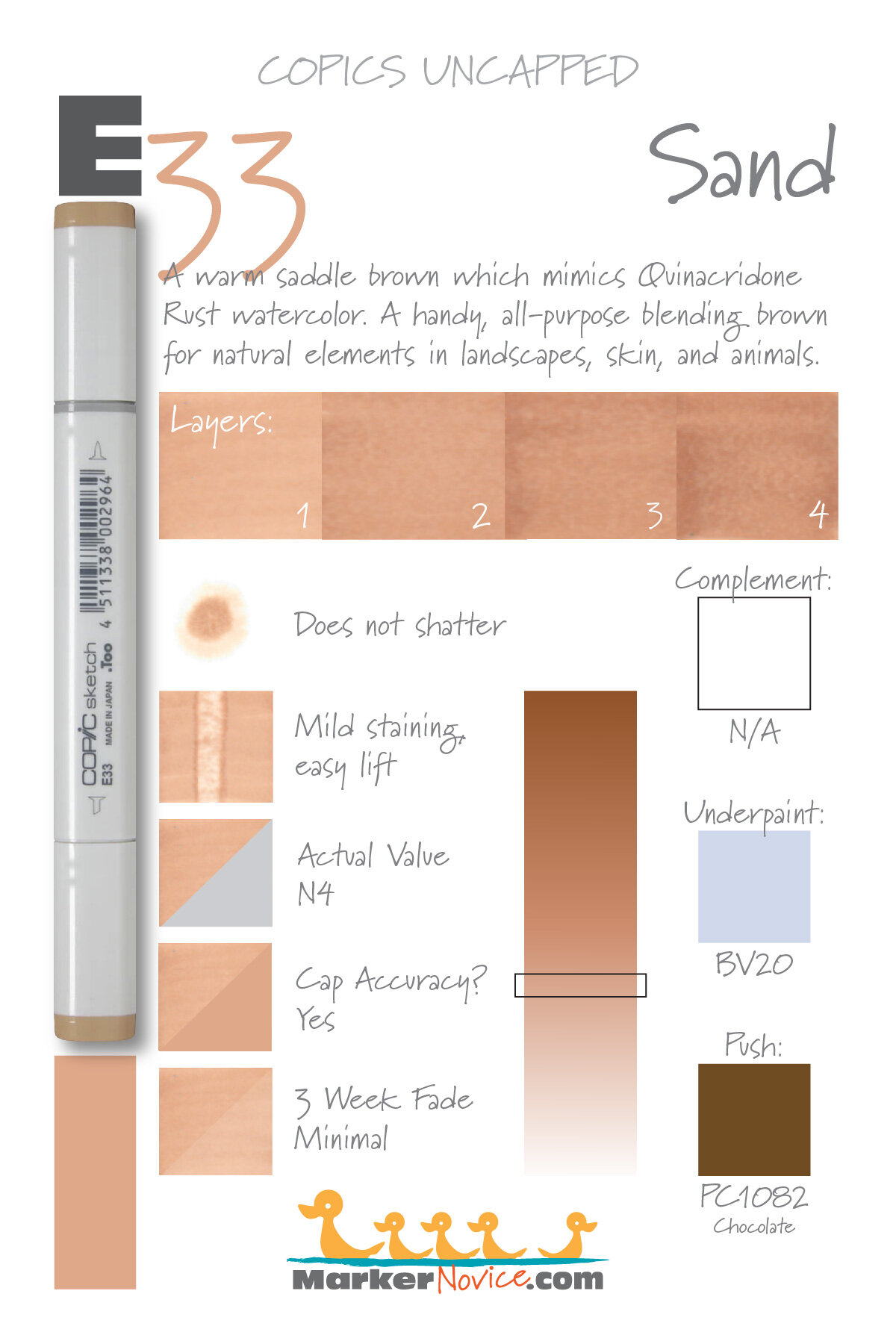

E33 Sand is a warm light saddle brown Copic Marker which mimics diluted Quinacridone Rust watercolor. An all-purpose blending brown for natural elements in landscapes, skin, and animals. E33 is available in Copic Sketch, Ciao, and Classic marker styles.
Every Copic Marker has unique characteristics based on its unique ink formula.
Knowing how a color behaves will help you blend effectively and make art with confidence.
E33 Sand
Let’s take a closer look at this Copic Marker and its ink characteristics.
Temperature: A warm, light saddle brown.
Resemblance: Quinacridone Rust Watercolor
Actual Value: N4
All Copics are measured on a Neutral Gray value scale. The last number on the cap is supposed to indicate value but we’ve found discrepancies where the actual ink value is different than cap designation.
Cap Accuracy: The plastic on a Sketch marker matches E33 ink.
Buildup: E33 layers beautifully up to 3 coats. It has definite oily splotches at 4 layers.
Shattering: Does not shatter.
Chromatography testing shows this ink’s behavior when it comes in contact with #0 Colorless Blender (solvent). High shattering colors may leak unexpected color when you make corrections or attempt to blend with any color that has a high solvent to colorant ratio. Shattering is not bad, it’s just something to be aware of.

Staining: Stains a bit.
Lift: An easy lifting color. Almost an erasable color but the paper remains a bit warm.
See staining swatch. Sample was given 6 stripes of #0 Colorless Blender, drying between each stripe. Results indicate how much lifting you can expect.
Lightfast: E33 faded about 10% during testing.
Samples were swatched on X-Press It Blending Card. 1 layer of ink was exposed to windowsill sunlight for 21 days. Approximately 10 hours of sun per day based on weather conditions. Note: we do not recommend displaying original Copic art under these conditions.
Natural Ink Family: E33 is at the lower end of the E-Thirty family. The browns feel warmer as the color gets darker.
Family Members: E30, E31, E33. E34, E35, E37, and E39.
We include this information because many Copic users never think deeper than the letter groupings (R, BV, G, etc.). Every ink has its own temperature variations and underlying flavors. Understanding what an ink looks like in its different dilutions helps when creating your own blending combinations.
Complement: Brown is not a hue on the colorwheel and does not have a complement.
Underpaint: BV20 neutralizes this color well.
This is simply one suggestion. Many possible colors exist. Test to find a color that pleases you.
Pushing Pencil: Prismacolor 1082 Chocolate pushes this color nicely.
VanillaArts.com (our sister site) teaches a Push & Pull technique for dimensional coloring. This is simply one suggestion. Many possible colors exist. Test to find a color that pleases you.
Vanilla Arts Classes using E33:


Vanilla Arts Digi Stamps using E33:

Color palettes and swatches using E33:

Looking for beautiful color palettes?
We absolutely love The Color Catalog 1 & 2 from Sarah Renae Clark. It puts hundreds of Copic friendly color palettes at your fingertips.
(note: affiliate link)


B06 Peacock Blue: Copics Uncapped (Marker Swatch, Ink Testing)
B06 Peacock Blue
Let’s take a closer look at this Copic Marker and it’s ink characteristics.


B06 Peacock Blue is a slightly green-shade blue Copic Marker which mimics Cerulean Blue watercolor. This is a great starter marker; a cheerful color for skies, backgrounds, and general coloring. B05 is only available in Copic Sketch and Classic marker styles.
Every Copic Marker has unique characteristics based on its unique ink formula.
Knowing how a color behaves will help you blend effectively and make art with confidence.
B06 Peacock Blue
Let’s take a closer look at this Copic Marker and its ink characteristics.
Temperature: A slightly green-shade blue.
Resemblance: Cerulean Blue watercolor.
Actual Value: N7
All Copics are measured on a Neutral Gray value scale. The last number on the cap is supposed to indicate value but we’ve found discrepancies where the actual ink value is different than cap designation.
Cap Accuracy: The plastic on a Sketch marker matches 2 coat of B06.
Buildup: B06 begins to look slightly oily at more than 2 layers.
Shattering: Does not shatter.
Chromatography testing shows this ink’s behavior when it comes in contact with #0 Colorless Blender (solvent). High shattering colors may leak unexpected color when you make corrections or attempt to blend with any color that has a high solvent to colorant ratio. Shattering is not bad, it’s just something to be aware of.

Staining: B06 stains the paper slightly.
Lift: This color lifts a bit with effort but can not be considered erasable.
See staining swatch. Sample was given 6 stripes of #0 Colorless Blender, drying between each stripe. Results indicate how much lifting you can expect.
Lightfast: Minimal fading.
Samples were swatched on X-Press It Blending Card. 1 layer of ink was exposed to windowsill sunlight for 21 days. Approximately 10 hours of sun per day based on weather conditions. Note: we do not recommend displaying original Copic art under these conditions.
Natural Ink Family: B06 is a very popular color and a good first purchase along with other members of the B-Zero family. Sadly, B06 is the darkest marker in this family. We would welcome the darker versions of this color.
Family Members: B0000, B000, B00, B01, B02, B04, B05, B06,
We include this information because many Copic users never think deeper than the letter groupings (R, BV, G, etc.). Every ink has its own temperature variations and underlying flavors. Understanding what an ink looks like in its different dilutions helps when creating your own blending combinations.
Complement: A true orange. We suggest YR07
Underpaint: We suggest V12
This is simply one suggestion. Many possible colors exist. Test to find a color that pleases you.
Pushing Pencil: Prismacolor 901 Indigo Blue pushes this color nicely.
VanillaArts.com (our sister site) teaches a Push & Pull technique for dimensional coloring. This is simply one suggestion. Many possible colors exist. Test to find a color that pleases you.
Vanilla Arts Classes using B06:
We continue to create new content and classes and we will update here as more become available.
Visit the workshop resource page at our sister site VanillaArts.com for a wide variety of Copic classes.
Vanilla Arts Digi Stamps using B06:
Color palettes and swatches using B06:
We are building our palette and swatch collection a little more each week and will update here as more become available.
Visit the color resource page at our sister site VanillaArts.com for a wide variety of Copic palettes and swatches.
Looking for beautiful color palettes?
We absolutely love The Color Catalog 1 & 2 from Sarah Renae Clark. It puts hundreds of Copic friendly color palettes at your fingertips.
(note: affiliate link)


G07 Nile Green: Copics Uncapped (Marker Swatch, Ink Testing)
G07 Nile Green
Let’s take a closer look at this Copic Marker and it’s ink characteristics.
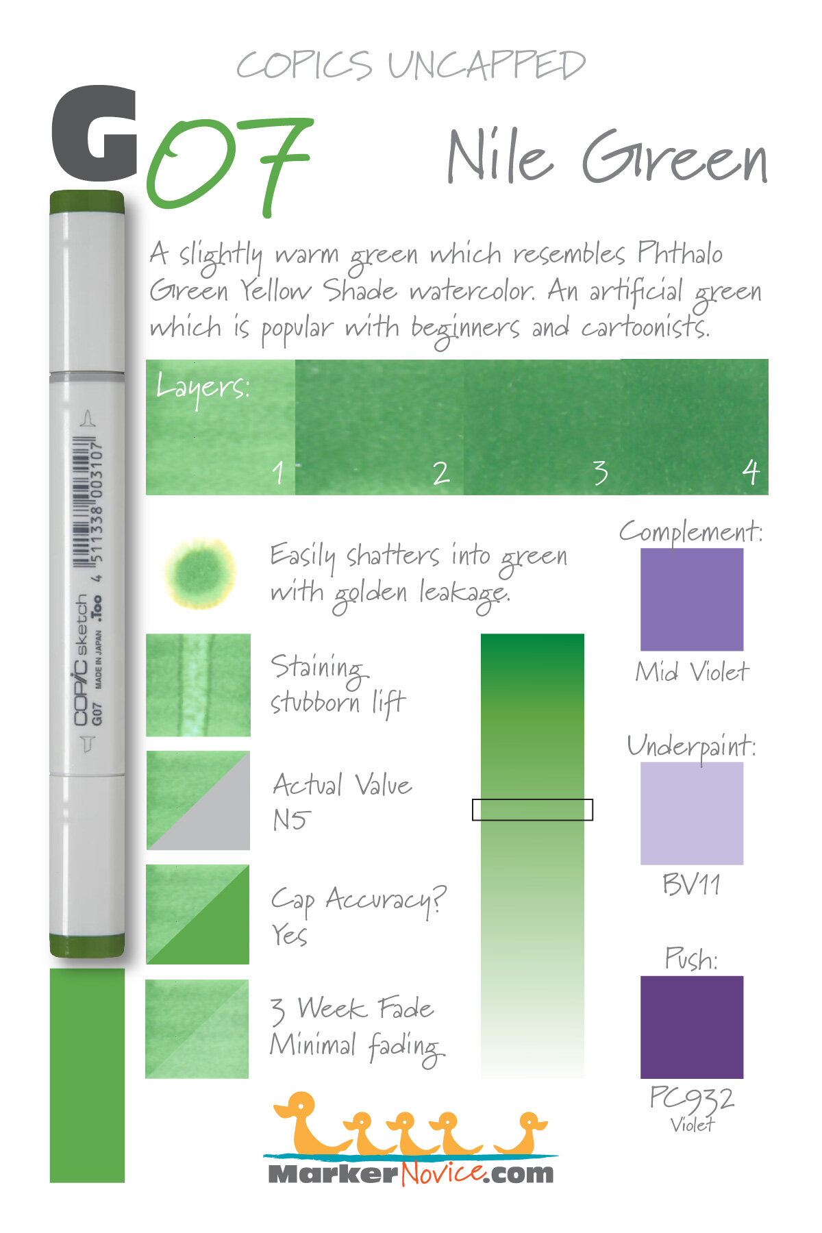

G07 Nile Green is a murky warm green Copic Marker which resembles Phthalo Green Yellow Shade watercolor. An artificial green which is popular with beginners and cartoonists. G07 is available in Copic Sketch, Ciao, and Classic marker styles.
Every Copic Marker has unique characteristics based on its unique ink formula.
Knowing how a color behaves will help you blend effectively and make art with confidence.
G07 Nile Green
Let’s take a closer look at this Copic Marker and its ink characteristics.
Temperature: A slightly warm green.
Resemblance: Phthalo Green Yellow Shade watercolor.
Actual Value: N5
All Copics are measured on a Neutral Gray value scale. The last number on the cap is supposed to indicate value but we’ve found discrepancies where the actual ink value is different than cap designation.
Cap Accuracy: Yes. The colored plastic on the Sketch cap closely resembles this ink color.
Buildup: G07 has quite a bit of colorant in the formula and looks oily even at 2 coats. Be very cautious.
Shattering: This color shatters very easily, leaking gold into the edges. Note that in the staining test, it also leaked gold. This color seems quite unstable.
Chromatography testing shows this ink’s behavior when it comes in contact with #0 Colorless Blender (solvent). High shattering colors may leak unexpected color when you make corrections or attempt to blend with any color that has a high solvent to colorant ratio. Shattering is not bad, it’s just something to be aware of.
Staining: G07 is a staining color and left the paper with a distinct bluish tint.
Lift: This color lifts a bit but it definitely left the paper blue and damaged.
See staining swatch. Sample was given 6 stripes of #0 Colorless Blender, drying between each stripe. Results indicate how much lifting you can expect.
Lightfast: G07 faded about 10% during the test period.
Samples were swatched on X-Press It Blending Card. 1 layer of ink was exposed to windowsill sunlight for 21 days. Approximately 10 hours of sun per day based on weather conditions. Note: we do not recommend displaying original Copic art under these conditions.
Natural Ink Family: G07 is at the darker end of the G-Zero family. This is an odd family because the colorant seems to react oddly with colorless blender solvent. Everything G03 and below looks distinctly cool while G05, 07, and 09 look warm. I think the solvent bleaches the green, giving it a bluish cast.
Family Members: G0000, G000, G00, G02, G03, G05, G07, G09
We include this information because many Copic users never think deeper than the letter groupings (R, BV, G, etc.). Every ink has its own temperature variations and underlying flavors. Understanding what an ink looks like in its different dilutions helps when creating your own blending combinations.
Complement: BV15 is a natural complement of G07.
Underpaint: We suggest BV11
This is simply one suggestion. Many possible colors exist. Test to find a color that pleases you.
Pushing Pencil: Try Prismacolor Violet 932 but use a soft pressure.
VanillaArts.com (our sister site) teaches a Push & Pull technique for dimensional coloring. This is simply one suggestion. Many possible colors exist. Test to find a color that pleases you.
Vanilla Arts Classes using G07:
Vanilla Arts Digi Stamps using G07:
We continue to create new content and classes and we will update here as more become available.
Visit the workshop resource page at our sister site VanillaArts.com for a wide variety of digi stamps.
Color palettes and swatches using G07:
We are building our palette and swatch collection a little more each week and will update here as more become available.
Visit the color resource page at our sister site VanillaArts.com for a wide variety of Copic palettes and swatches.
Looking for beautiful color palettes?
We absolutely love The Color Catalog 1 & 2 from Sarah Renae Clark. It puts hundreds of Copic friendly color palettes at your fingertips.
(note: affiliate link)


YR24 Pale Sepia: Copics Uncapped (Marker Swatch, Ink Testing)
YR24 Pale Sepia
Let’s take a closer look at this Copic Marker and it’s ink characteristics.

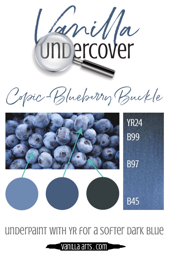
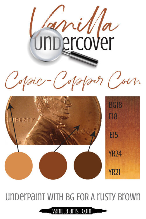
YR24 Pale Sepia is an earthy warm gold Copic Marker which resembles Quinacridone Gold watercolor. A beautiful color for landscapes and botanicals but also for fur and golden highlights in hair. YR24 is only available in Copic Sketch and Classic marker styles.
Every Copic Marker has unique characteristics based on its unique ink formula.
Knowing how a color behaves will help you blend effectively and make art with confidence.
YR24 Pale Sepia
Let’s take a closer look at this Copic Marker and its ink characteristics.
Temperature: An earthy warm gold.
Resemblance: Quinacridone Gold watercolor.
Actual Value: N5.5
All Copics are measured on a Neutral Gray value scale. The last number on the cap is supposed to indicate value but we’ve found discrepancies where the actual ink value is different than cap designation.
Cap Accuracy: The colored plastic on a Sketch marker resembles about 4 coats of YR24. It’s close but still misleading in it’s darkness.
Buildup: YR24 layers extremely well.
Shattering: Does not shatter.
Chromatography testing shows this ink’s behavior when it comes in contact with #0 Colorless Blender (solvent). High shattering colors may leak unexpected color when you make corrections or attempt to blend with any color that has a high solvent to colorant ratio. Shattering is not bad, it’s just something to be aware of.

Staining: Stains the paper with a light yellow tone
Lift: Stubborn. The ink can be moved a bit with colorless blender but it can only be lightened, not erased.
See staining swatch. Sample was given 6 stripes of #0 Colorless Blender, drying between each stripe. Results indicate how much lifting you can expect.
Lightfast: Slight fading.
Samples were swatched on X-Press It Blending Card. 1 layer of ink was exposed to windowsill sunlight for 21 days. Approximately 10 hours of sun per day based on weather conditions. Note: we do not recommend displaying original Copic art under these conditions.
Natural Ink Family: YR24 is in the middle of the YR-twenty family which starts with YG20 and runs to YR27 on the darker end. If Copic released a YR29 marker, it would resemble an earthy brown.
Family Members: YR20, YR21, YR23, YR24, YR27
We include this information because many Copic users never think deeper than the letter groupings (R, BV, G, etc.). Every ink has its own temperature variations and underlying flavors. Understanding what an ink looks like in its different dilutions helps when creating your own blending combinations.
Complement: We suggest a medium blue marker like B24
Underpaint: B00 neutralizes this color beautifully.
This is simply one suggestion. Many possible colors exist. Test to find a color that pleases you.
Pushing Pencil: Prismacolor 1026 Greyed Lavender is nice with YR24 but can not be applied too thickly.
VanillaArts.com (our sister site) teaches a Push & Pull technique for dimensional coloring. This is simply one suggestion. Many possible colors exist. Test to find a color that pleases you.
Vanilla Arts Classes using YR24:

Candlelight: Amy explores her method for creating soft glows and lens flares. Find more info here.
Sea Glass: Learn to create create texture and transparency and realistic glass highlights. Find more info here
Vanilla Arts Digi Stamps using YR24:

Color palettes and swatches using YR24:

Looking for beautiful color palettes?
We absolutely love The Color Catalog 1 & 2 from Sarah Renae Clark. It puts hundreds of Copic friendly color palettes at your fingertips.
(note: affiliate link)


RV29 Crimson: Copics Uncapped (Marker Swatch, Ink Testing)
RV29 Crimson
Let’s take a closer look at this Copic Marker and it’s ink characteristics.
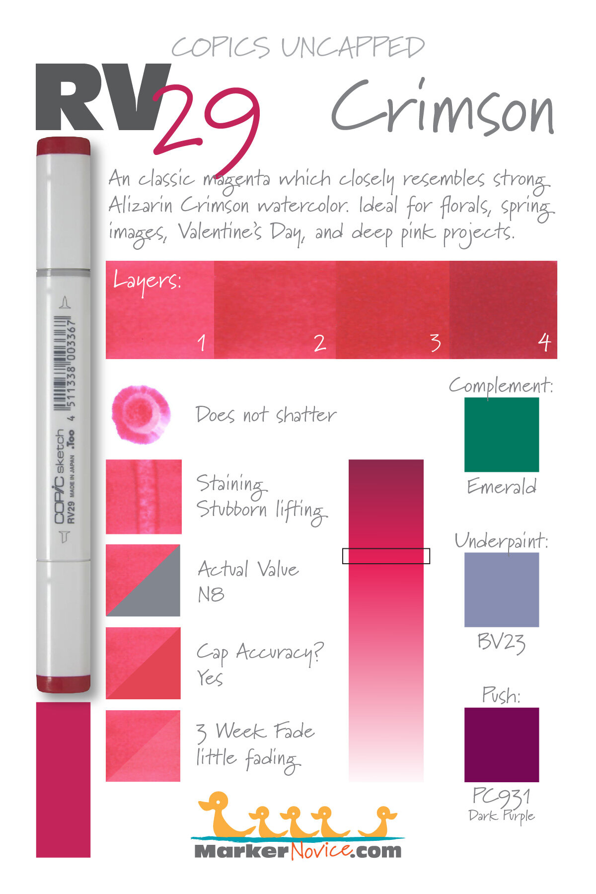
RV29 Crimson is a slightly warm magenta Copic Marker which closely resembles Alizarin Crimson watercolor. Ideal for coloring florals, bold spring images, Valentine’s Day, and deep pink projects. RV29 is only available in Copic Sketch, Ciao, and Classic marker styles.
Every Copic Marker has unique characteristics based on its unique ink formula.
Knowing how a color behaves will help you blend effectively and make art with confidence.
RV29 Crimson
Let’s take a closer look at this Copic Marker and its ink characteristics.
Temperature: A classic neutral magenta.
Resemblance: Alizarin Crimson watercolor.
Actual Value: N8.
All Copics are measured on a Neutral Gray value scale. The last number on the cap is supposed to indicate value but we’ve found discrepancies where the actual ink value is different than cap designation.
Cap Accuracy: Close. The plastic on a Sketch marker matches the color of 1 coat of RV29.
Buildup: This color layers beautifully up to 3 coats; exercise caution above this.
Shattering: Does not shatter.
Chromatography testing shows this ink’s behavior when it comes in contact with #0 Colorless Blender (solvent). High shattering colors may leak unexpected color when you make corrections or attempt to blend with any color that has a high solvent to colorant ratio. Shattering is not bad, it’s just something to be aware of.

Staining: Extremely staining.
Lift: Extremely stubborn. Consider this marker permanent.
See staining swatch. Sample was given 6 stripes of #0 Colorless Blender, drying between each stripe. Results indicate how much lifting you can expect.
Lightfast: This color faded by about 15%.
Samples were swatched on X-Press It Blending Card. 1 layer of ink was exposed to windowsill sunlight for 21 days. Approximately 10 hours of sun per day based on weather conditions. Note: we do not recommend displaying original Copic art under these conditions.
Natural Ink Family: RV29 is the darkest member of the RV-Twenty family. RV21 is the lightest version.
Family Members: RV21, RV23, RV25, and RV29
We include this information because many Copic users never think deeper than the letter groupings (R, BV, G, etc.). Every ink has its own temperature variations and underlying flavors. Understanding what an ink looks like in its different dilutions helps when creating your own blending combinations.
Complement: An emerald green like G19
Underpaint: We suggest BV23
This is simply one suggestion. Many possible colors exist. Test to find a color that pleases you.
Pushing Pencil: Prismacolor 931 Dark Purple looks wonderful.
VanillaArts.com (our sister site) teaches a Push & Pull technique for dimensional coloring. This is simply one suggestion. Many possible colors exist. Test to find a color that pleases you.
Vanilla Arts Classes using RV29:
We continue to create new content and classes and we will update here as more become available.
Visit the workshop resource page at our sister site VanillaArts.com for a wide variety of Copic classes.
Vanilla Arts Digi Stamps using RV29:
We continue to create new content and stamps and we will update here as more become available.
Visit the stamp shop page at our sister site VanillaArts.com for a wide variety of Copic classes.
Color palettes and swatches using RV29:
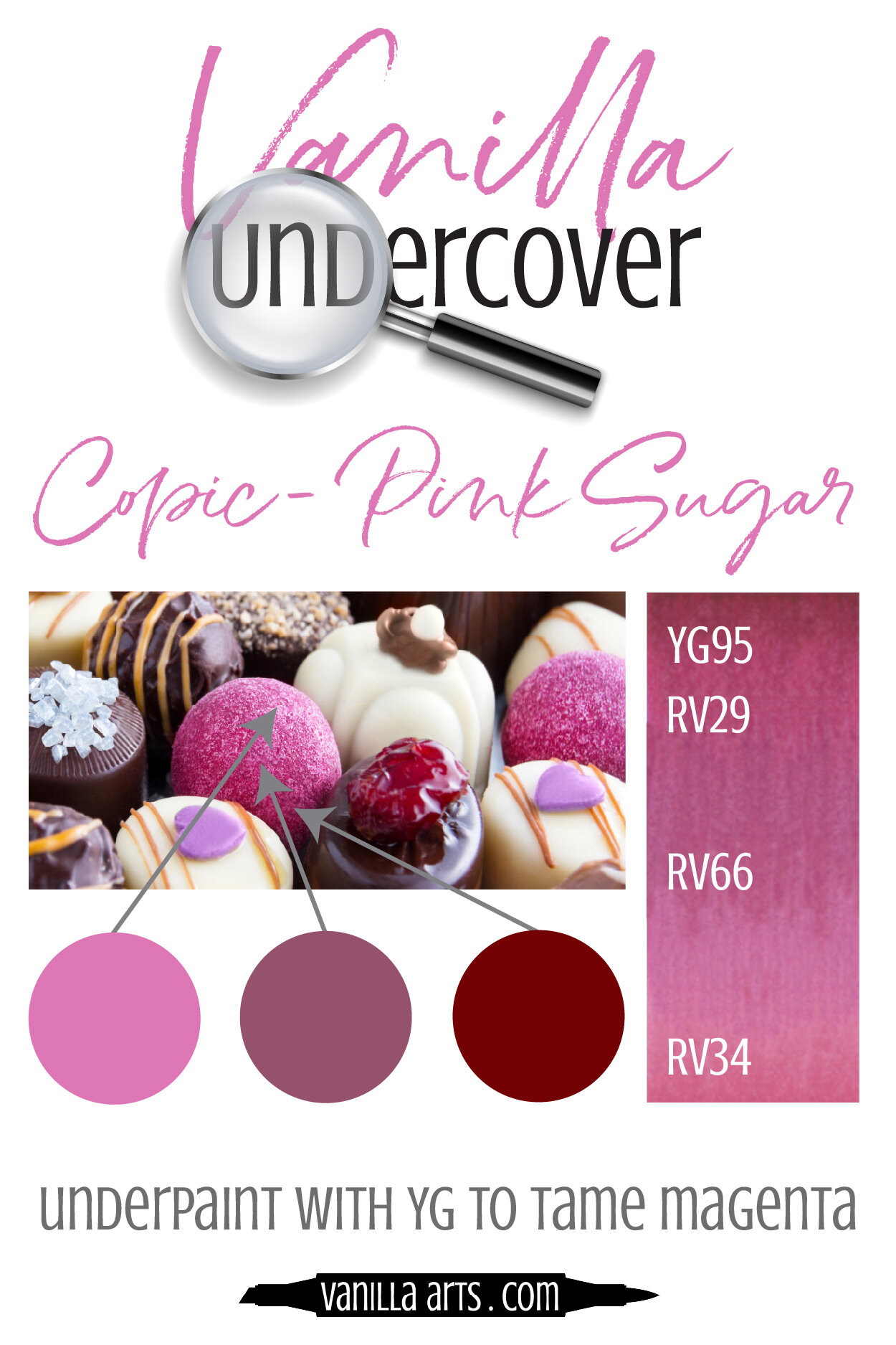

We are building our palette and swatch collection a little more each week and will update here as more become available.
Visit the color resource page at our sister site VanillaArts.com for a wide variety of Copic palettes and swatches.
Looking for beautiful color palettes?
We absolutely love The Color Catalog 1 & 2 from Sarah Renae Clark. It puts hundreds of Copic friendly color palettes at your fingertips.
(note: affiliate link)


W5 Warm Gray No. 5: Copics Uncapped (Marker Swatch, Ink Testing)
W5 Warm Gray No. 5
Let’s take a closer look at this Copic Marker and it’s ink characteristics.
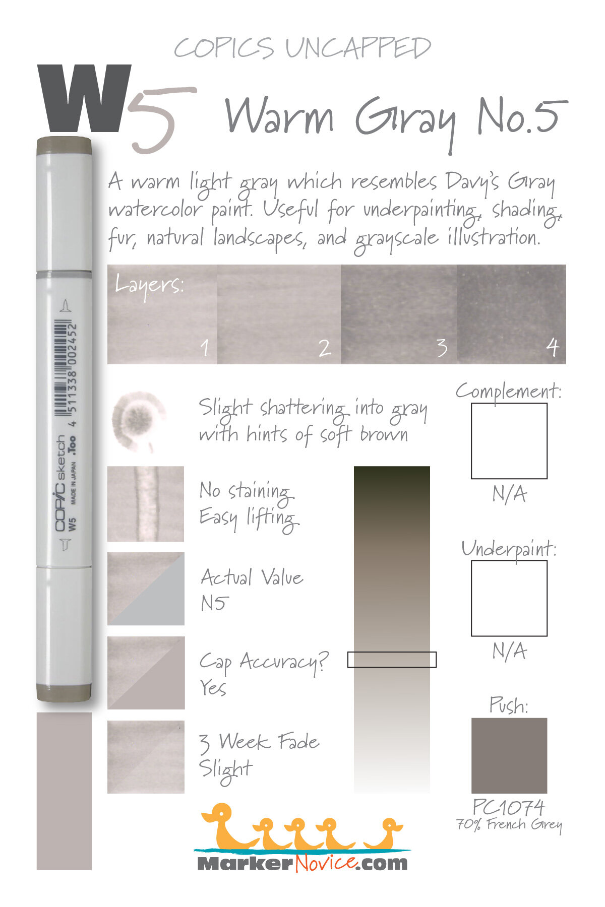
W5 Warm Gray #5 is a warm light gray Copic Marker which resembles Davy’s Gray watercolor. This color is useful for underpainting, general shading, fur, natural landscapes, and grayscale illustration. W5 is available in Copic Sketch, Ciao, and Classic marker styles.
Every Copic Marker has unique characteristics based on its unique ink formula.
Knowing how a color behaves will help you blend effectively and make art with confidence.
W5 Warm Gray No.5
Let’s take a closer look at this Copic Marker and its ink characteristics.
Temperature: A warm gray.
Resemblance: Davy’s Gray watercolor.
Actual Value: W5
All Copics are measured on a Neutral Gray value scale. The last number on the cap is supposed to indicate value but we’ve found discrepancies where the actual ink value is different than cap designation.
Cap Accuracy: Close. The cap on a Sketch marker matches 1 coats of W5.
Buildup: W5 layers beautifully.
Shattering: Slight shattering into a cool gray with hints of soft brown along the outside of the puddle ring.
Chromatography testing shows this ink’s behavior when it comes in contact with #0 Colorless Blender (solvent). High shattering colors may leak unexpected color when you make corrections or attempt to blend with any color that has a high solvent to colorant ratio. Shattering is not bad, it’s just something to be aware of.

Staining: No. Copic grays are not generally staining.
Lift: Lifts easily. This color isn’t fully erasable but it’s close.
See staining swatch. Sample was given 6 stripes of #0 Colorless Blender, drying between each stripe. Results indicate how much lifting you can expect.
Lightfast: Slight fading was detected, perhaps about 10%.
Samples were swatched on X-Press It Blending Card. 1 layer of ink was exposed to windowsill sunlight for 21 days. Approximately 10 hours of sun per day based on weather conditions. Note: we do not recommend displaying original Copic art under these conditions.
Natural Ink Family: W5 is a diluted version of W10.
Family Members: W10, W9, W8, W7, W6, W5, W4, W3, W2, W1, W0, W00
We include this information because many Copic users never think deeper than the letter groupings (R, BV, G, etc.). Every ink has its own temperature variations and underlying flavors. Understanding what an ink looks like in its different dilutions helps when creating your own blending combinations.
Complement: N/A
Underpaint: N/A
Pushing Pencil: We suggest Prismacolor 1074 70% French Grey with a very soft touch.
VanillaArts.com (our sister site) teaches a Push & Pull technique for dimensional coloring. This is simply one suggestion. Many possible colors exist. Test to find a color that pleases you.
Vanilla Arts Classes using W5:
We continue to create new content and classes and we will update here as more become available.
Visit the workshop resource page at our sister site VanillaArts.com for a wide variety of Copic classes.
Vanilla Arts Digi Stamps using W5:
Color palettes and swatches using W5:
We are building our palette and swatch collection a little more each week and will update here as more become available.
Visit the color resource page at our sister site VanillaArts.com for a wide variety of Copic palettes and swatches.
Looking for beautiful color palettes?
We absolutely love The Color Catalog 1 & 2 from Sarah Renae Clark. It puts hundreds of Copic friendly color palettes at your fingertips.
(note: affiliate link)
