

B02 Robin's Egg Blue: Copics Uncapped (Marker Swatch, Ink Testing)
B02 Robin’s Egg Blue
Let’s take a closer look at this Copic Marker and it’s ink characteristics.
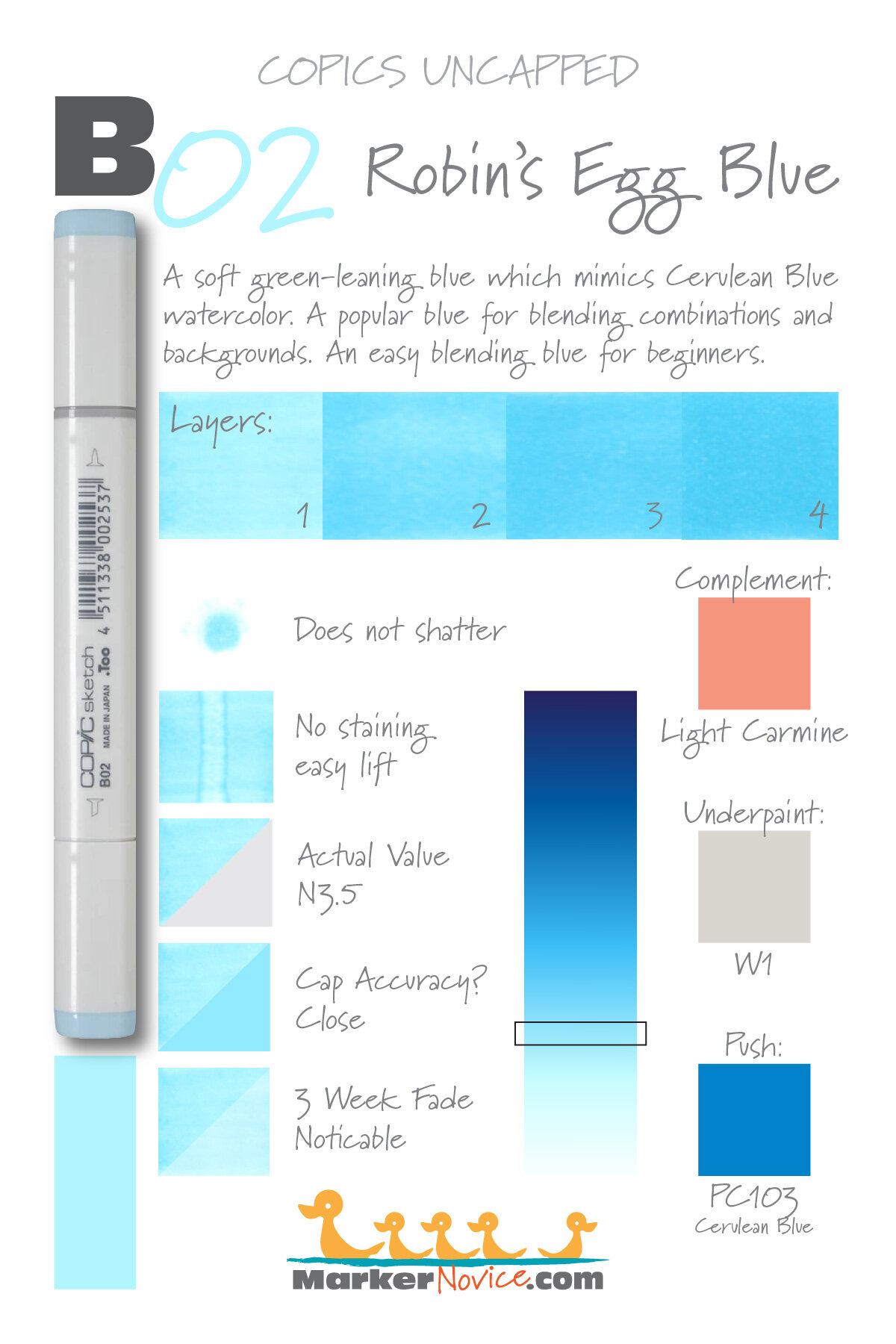

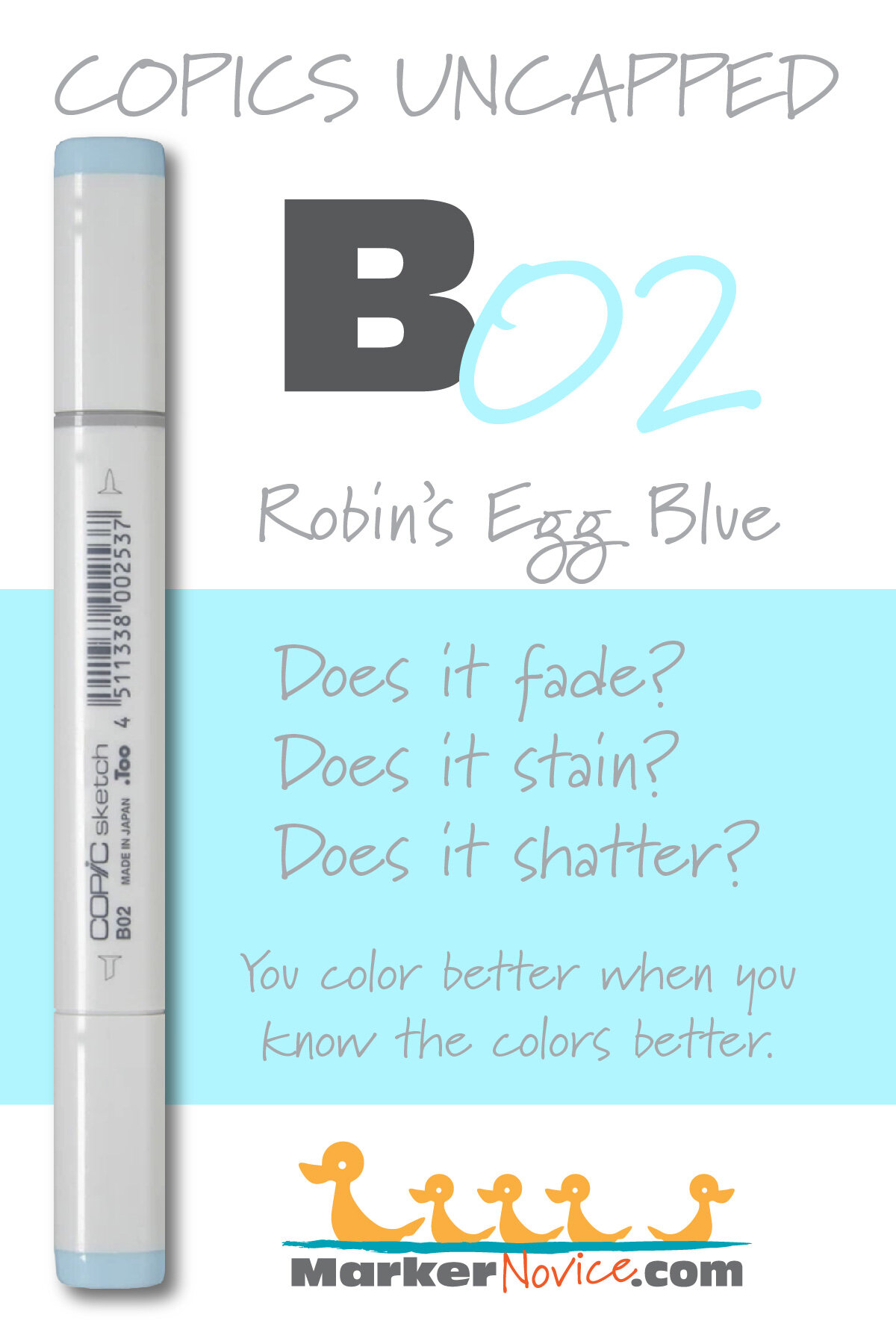
B02 Robin’s Egg Blue is a soft green-leaning blue Copic Marker which mimics Cerulean Blue watercolor. This is a popular blue for blending combinations and backgrounds. An easy blending blue for beginners. B02 is available in Copic Sketch, Ciao, and Classic marker styles.
Every Copic Marker has unique characteristics based on its unique ink formula.
Knowing how a color behaves will help you blend effectively and make art with confidence.
B02 Robin’s Egg Blue
Let’s take a closer look at this Copic Marker and its ink characteristics.
Temperature: A slightly greenish blue.
Resemblance: Cerulean Blue watercolor.
Actual Value: N3.5
All Copics are measured on a Neutral Gray value scale. The last number on the cap is supposed to indicate value but we’ve found discrepancies where the actual ink value is different than cap designation.
Cap Accuracy: The plastic on a Sketch marker is similar to one coat of B02 but the plastic is a bit more greenish.
Buildup: B02 begins to look oily on the first layer but seems to even out by 3 layers.
Shattering: Does not shatter.
Chromatography testing shows this ink’s behavior when it comes in contact with #0 Colorless Blender (solvent). High shattering colors may leak unexpected color when you make corrections or attempt to blend with any color that has a high solvent to colorant ratio. Shattering is not bad, it’s just something to be aware of.

Staining: B02 does not stain.
Lift: This color lifts easily. It’s not a complete lift but it’s close.
See staining swatch. Sample was given 6 stripes of #0 Colorless Blender, drying between each stripe. Results indicate how much lifting you can expect.
Lightfast: Faded by about 10%.
Samples were swatched on X-Press It Blending Card. 1 layer of ink was exposed to windowsill sunlight for 21 days. Approximately 10 hours of sun per day based on weather conditions. Note: we do not recommend displaying original Copic art under these conditions.
Natural Ink Family: B02 is at the light end of the B-Zero family. It’s a large family but Copic doesn’t make the darker end (no B08 or B09). This is a blue and a good investment for your first blue blends.
Family Members: B0000, B000, B00, B01, B02, B04, B05, B06
We include this information because many Copic users never think deeper than the letter groupings (R, BV, G, etc.). Every ink has its own temperature variations and underlying flavors. Understanding what an ink looks like in its different dilutions helps when creating your own blending combinations.
Complement: A light carmine red, not pink We suggest R02 or R05
Underpaint: We suggest W1
This is simply one suggestion. Many possible colors exist. Test to find a color that pleases you.
Pushing Pencil: We suggest Prismacolor 103 Cerulean Blue
VanillaArts.com (our sister site) teaches a Push & Pull technique for dimensional coloring. This is simply one suggestion. Many possible colors exist. Test to find a color that pleases you.
Vanilla Arts Classes using B02:
Vanilla Arts Digi Stamps using B02:
We continue to create new content and classes and we will update here as more become available.
Visit the workshop resource page at our sister site VanillaArts.com for a wide variety of Vanilla Arts stamps.
Color palettes and swatches using B02:

Looking for beautiful color palettes?
We absolutely love The Color Catalog 1 & 2 from Sarah Renae Clark. It puts hundreds of Copic friendly color palettes at your fingertips.
(note: affiliate link)













G05 Emerald Green: Copics Uncapped (Marker Swatch, Ink Testing)
G05 Emerald Green
Let’s take a closer look at this Copic Marker and it’s ink characteristics.


G05 Emerald Green is a warm green Copic Marker which resembles diluted Phthalo Green watercolor. This is a stereotypical green which is harder to find in nature than you’d expect. G05 is available in Copic Ciao, Sketch, and Classic marker styles.
Every Copic Marker has unique characteristics based on its unique ink formula.
Knowing how a color behaves will help you blend effectively and make art with confidence.
G05 Emerald Green
Let’s take a closer look at this Copic Marker and its ink characteristics.
Temperature: A slightly warm green
Resemblance: Phthalo Green watercolor.
Actual Value: N5
All Copics are measured on a Neutral Gray value scale. The last number on the cap is supposed to indicate value but we’ve found discrepancies where the actual ink value is different than cap designation.
Cap Accuracy: No. The colored plastic on the Sketch cap is closer to 5 layers of G05 ink. The cap is darker than the ink.
Buildup: Layers well but looks oily at 2 coats. The oily sheen looks smoother by 4 layers.
Shattering: Shatters into green with bright yellow leakage.
Chromatography testing shows this ink’s behavior when it comes in contact with #0 Colorless Blender (solvent). High shattering colors may leak unexpected color when you make corrections or attempt to blend with any color that has a high solvent to colorant ratio. Shattering is not bad, it’s just something to be aware of.

Staining: G05 mildly stains the paper.
Lift: G05 lifts moderately well, leaving behind slightly blue paper.
See staining swatch. Sample was given 6 stripes of #0 Colorless Blender, drying between each stripe. Results indicate how much lifting you can expect.
Lightfast: G05 has an odd fade. After the 3 week test, our sample didn’t appear to have lightened but was noticeably blue. This means the yellow ink in this green mixture faded but the blue ink was more lightfast.
Samples were swatched on X-Press It Blending Card. 1 layer of ink was exposed to windowsill sunlight for 21 days. Approximately 10 hours of sun per day based on weather conditions. Note: we do not recommend displaying original Copic art under these conditions.
Natural Ink Family: G05 sits in the middle of the G-Zero family. The markers in this family are all artificial looking, it’s hard to find them in nature.
Family Members: G0000, G000, G00, G02, G03, G05 G07, G09
We include this information because many Copic users never think deeper than the letter groupings (R, BV, G, etc.). Every ink has its own temperature variations and underlying flavors. Understanding what an ink looks like in its different dilutions helps when creating your own blending combinations.
Complement: Pale violets like V22 or BV02
Underpaint: We suggest BV31
This is simply one suggestion. Many possible colors exist. Test to find a color that pleases you.
Pushing Pencil: We suggest Prismacolor 1008 Parma Violet with very light pressure works well.
VanillaArts.com (our sister site) teaches a Push & Pull technique for dimensional coloring. This is simply one suggestion. Many possible colors exist. Test to find a color that pleases you.
Vanilla Arts Technique Classes using G05:
We continue to create new content and classes and we will update here as more become available.
Visit the workshop resource page at our sister site VanillaArts.com for a wide variety of Copic classes.
Vanilla Arts Digi Stamps using G05:
We continue to create new content and digital stamps and we will update here as more become available.
Visit the Vanilla Arts Stamp Shop at our sister site VanillaArts.com for a wide variety of digital stamps.
Color palettes and swatches using G05:
We are building our palette and swatch collection a little more each week and will update here as more become available.
Visit the color resource page at our sister site VanillaArts.com for a wide variety of Copic palettes and swatches.
Looking for beautiful color palettes?
We absolutely love The Color Catalog 1 & 2 from Sarah Renae Clark. It puts hundreds of Copic friendly color palettes at your fingertips.
(note: affiliate link)

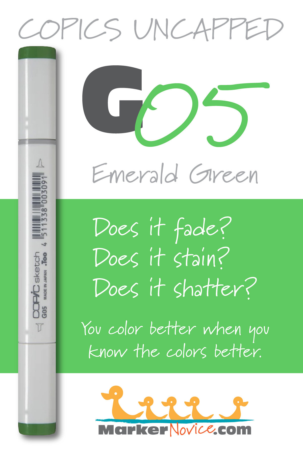

R59 Cardinal: Copics Uncapped (Marker Swatch, Ink Testing)
R59 Cardinal
Let’s take a closer look at this Copic Marker and it’s ink characteristics.


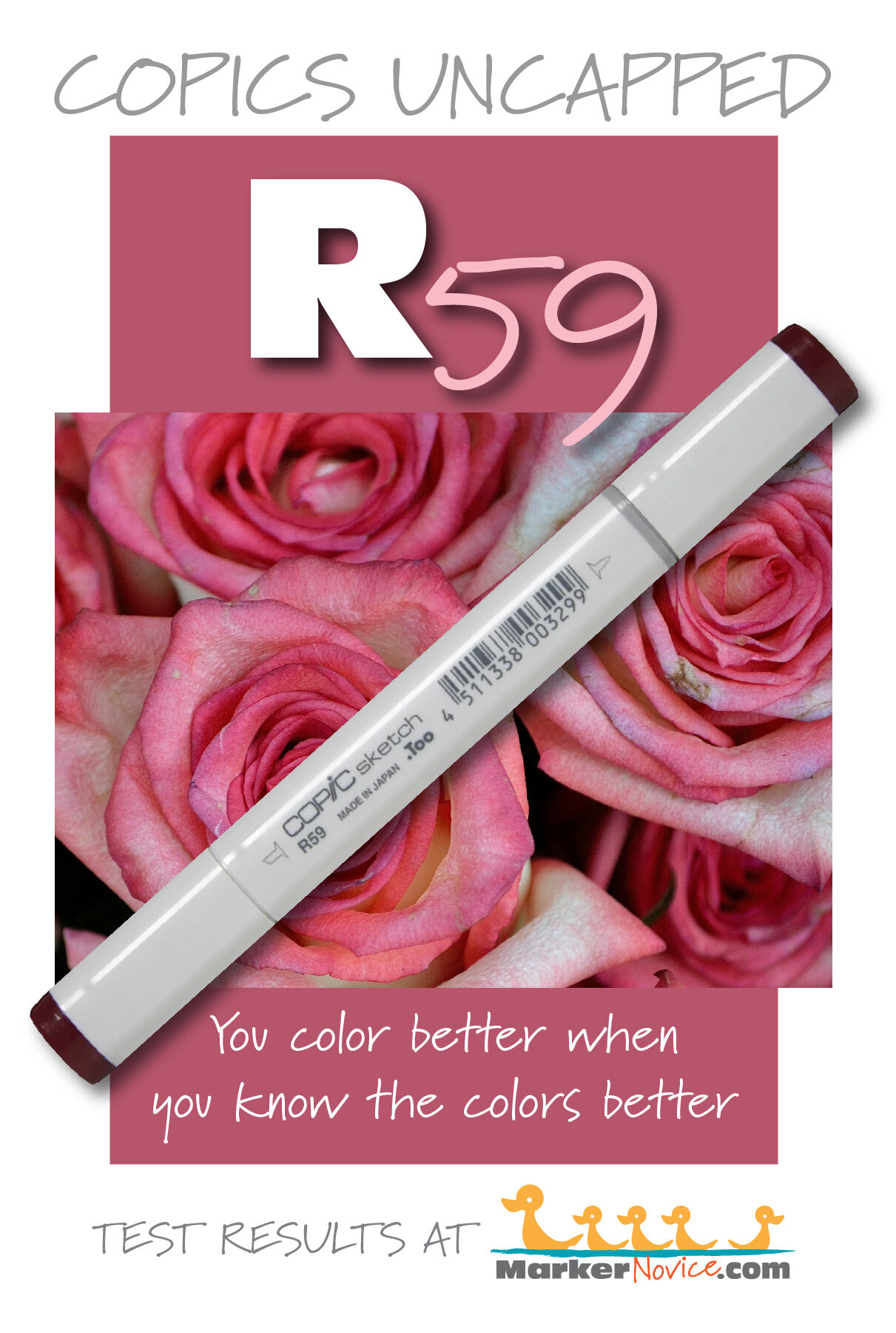
R59 Cardinal is a cool red Copic Marker that mimics Perylene Maroon watercolor. This marker is useful for shading organic reds, botanical and food illustration, and vintage looking holiday images. R59 is available in Copic Sketch, Ciao, and Classic marker styles.
Every Copic Marker has unique characteristics based on its unique ink formula.
Knowing how a color behaves will help you blend effectively and make art with confidence.
R59 Cardinal
Let’s take a closer look at this Copic Marker and it’s ink characteristics.
Temperature: A cool red.
Resemblance: Perylene Maroon watercolor.
Actual Value: N8
All Copics are measured on a Neutral Gray value scale. The last number on the cap is supposed to indicate value but we’ve found discrepancies where the actual ink value is different than cap designation.
Cap Accuracy: Close but darker. The plastic on an R59 Sketch cap matches 3-4 coats of R59.
Buildup: R59 develops oily looking patches on the second coat but by four coats, it smooths out.
Shattering: Does not shatter.
Chromatography testing shows this ink’s behavior when it comes in contact with #0 Colorless Blender (solvent). High shattering colors may leak unexpected color when you make corrections or attempt to blend with any color that has a high solvent to colorant ratio. Shattering is not bad, it’s just something to be aware of.
Staining: R59 is highly staining.
Lift: No red lifts very well. R59 can be lightened but never moved.
See staining swatch. Sample was given 6 stripes of #0 Colorless Blender, drying between each stripe. Results indicate how much lifting you can expect.
Lightfast: We saw very mild fading during the test period but we had to look pretty hard to find it. Less than 5%.
Samples were swatched on X-Press It Blending Card. 1 layer of ink was exposed to windowsill sunlight for 21 days. Approximately 10 hours of sun per day based on weather conditions. Note: we do not recommend displaying original Copic art under these conditions.
Natural Ink Family: R59 is at the dark end of the very small R50 family of natural but pinkish looking red markers.
R59 is often confused with R39— it’s not surprising, the colors are so incredibly close that we wonder why Copic produces both. If you’re a beginner, you don’t need both R39 and R59.
Family Members: R56 and R59
We include this information because many Copic users never think deeper than the letter groupings (R, BV, G, etc.). Every ink has its own temperature variations and underlying flavors. Understanding what an ink looks like in its different dilutions helps when creating your own blending combinations.
Complement: A slightly greenish Turquoise like BG18
Underpaint: We suggest B45
This is simply one suggestion. Many possible colors exist. Test to find a color that pleases you.
Pushing Pencil: Prismacolor 931 Dark Purple is a reliable choice.
VanillaArts.com (our sister site) teaches a Push & Pull technique for dimensional coloring. This is simply one suggestion. Many possible colors exist. Test to find a color that pleases you.
Vanilla Arts Classes using R59:

Candlelight: Amy explores her method for creating soft glows and lens flares. Find more info here.
Vanilla Arts Digi Stamps using R59:
We continue to create new content and stamps and we will update here as more become available.
Visit the Vanilla Stamp Shop at our sister site VanillaArts.com for a wide variety of Vanilla Arts Digi Stamps.
Color palettes and swatches using R59:

Looking for beautiful color palettes?
We absolutely love The Color Catalog 1 & 2 from Sarah Renae Clark. It puts hundreds of Copic friendly color palettes at your fingertips.
(note: affiliate link)


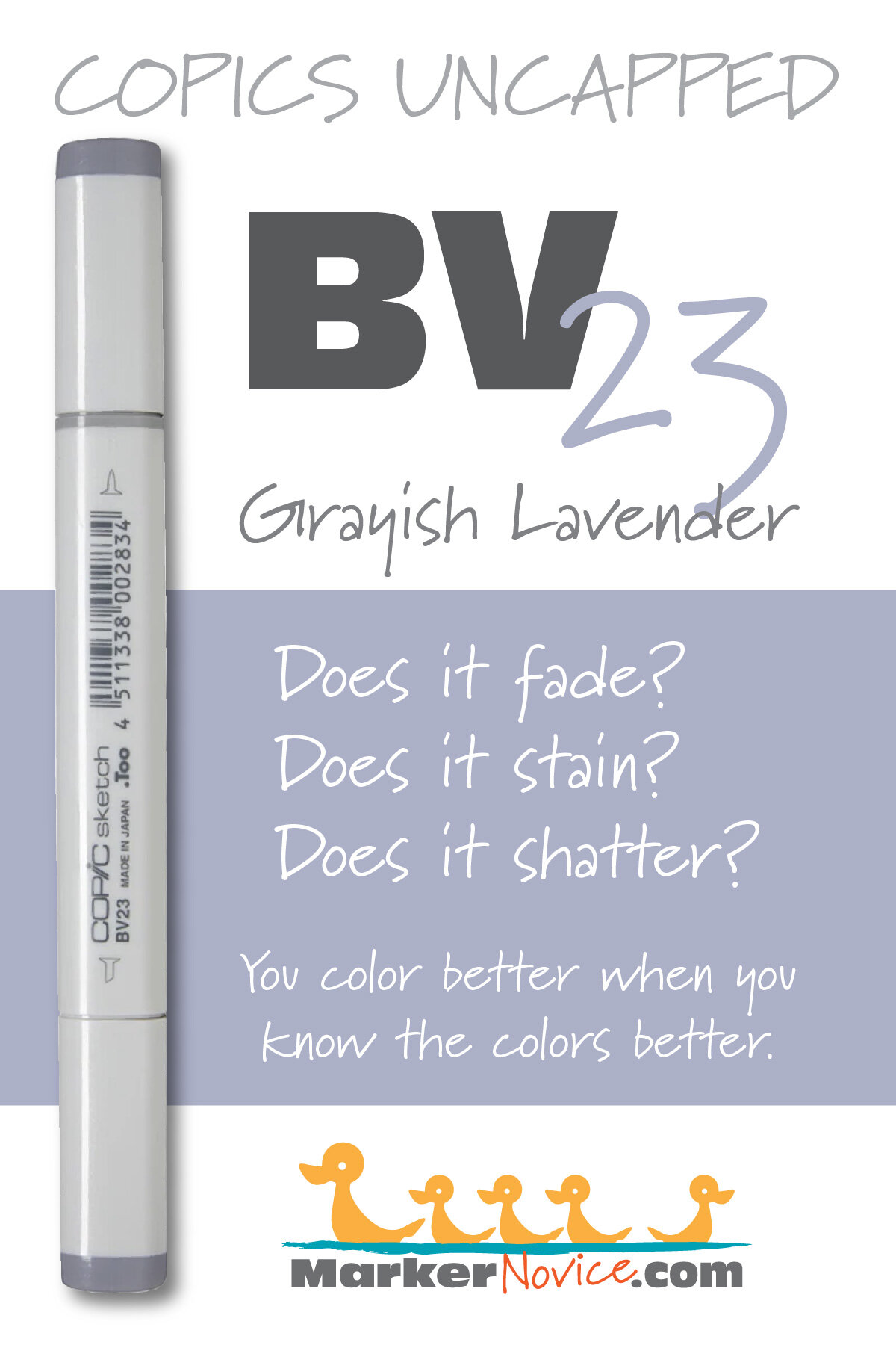
BV23 Grayish Lavender: Copics Uncapped (Marker Swatch, Ink Testing)
BV23 Grayish Lavender
Let’s take a closer look at this Copic Marker and it’s ink characteristics.
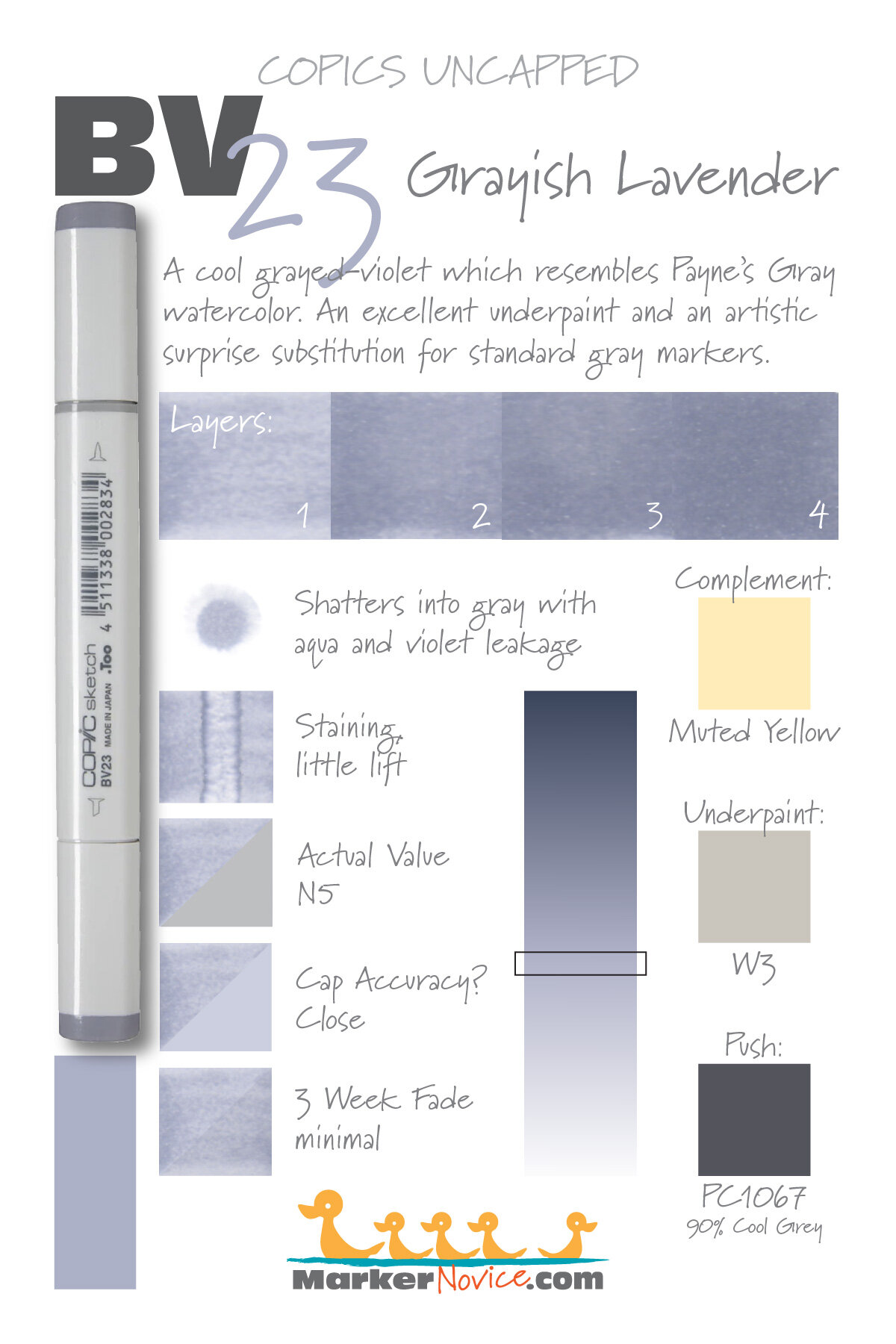

BV23 is a cool grayed-violet Copic Marker which resembles Payne’s Gray watercolor. This is an excellent underpaint and an artistic surprise substitution for standard grays. BV23 is available in Copic Sketch, Ciao, and Classic marker styles.
Every Copic Marker has unique characteristics based on its unique ink formula.
Knowing how a color behaves will help you blend effectively and make art with confidence.
BV23 Grayish Lavender
Let’s take a closer look at this Copic Marker and it’s ink characteristics.
Temperature: A cool grayed-violet
Resemblance: BV23 resembles some of the more violet versions of Payne’s Gray watercolor.
Actual Value: N5
All Copics are measured on a Neutral Gray value scale. The last number on the cap is supposed to indicate value but we’ve found discrepancies where the actual ink value is different than cap designation.
Cap Accuracy: The plastic end of a Sketch Marker is a close match to the color of 1 coat of BV23 ink, but the cap is more gray while the ink has a pronounced violet feel.
Buildup: BV23 starts to create oily patches on the first layer. Exercise caution when layering this color. Color reaches maximum value at 3 layers.
Shattering: BV23 shatters into gray with pale aqua and violet leakage around the edges.
Chromatography testing shows this ink’s behavior when it comes in contact with #0 Colorless Blender (solvent). High shattering colors may leak unexpected colors when you make corrections or attempt to blend with any color that has a high solvent to colorant ratio. Shattering is not bad, it’s just something to be aware of.

Staining: BV23 stains the paper blue
Lift: BV23 does not lift much.
See staining swatch. Sample was given 6 stripes of #0 Colorless Blender, drying between each stripe. Results indicate how much lifting you can expect.
Lightfast: BV23 showed a minimal amount of fade; we would expect further significant fading with extended testing times.
Samples were swatched on X-Press It Blending Card. 1 layer of ink was exposed to windowsill sunlight for 21 days. Approximately 10 hours of sun per day based on weather conditions. Note: we do not recommend displaying original Copic art under these conditions.
Natural Ink Family: BV23 at the middle of the of the BV-Twenty family. At Vanilla Arts, we use this marker family constantly and highly encourage intermediate to advanced students to work this marker family into their routine.
Family Members BV20, BV23, BV25, BV29
We include this information because many Copic users never think deeper than the letter groupings (R, BV, G, etc.). Every ink has it’s own temperature variations and underlying flavors. Understanding what an ink looks like in its different dilutions helps when creating your own blending combinations.
Complement: A pale muted yellow contrasts nicely. Try Y11 or Y32
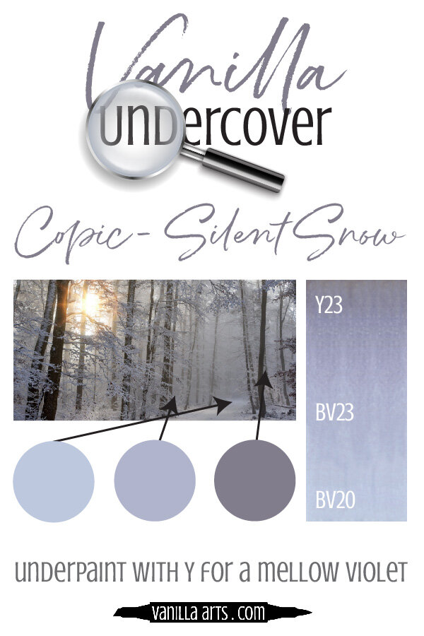
Underpaint: We suggest W3 underneath BV23.
This is simply one suggestion. Many possible colors exist. Test to find a color that pleases you.
Pushing Pencil: We suggest Prismacolor 1067 90% Cool Grey with an incredibly light pressure over BV23.
VanillaArts.com (our sister site) teaches a Push & Pull technique for dimensional coloring. This is simply one suggestion. Many possible colors exist. Test to find a color that pleases you.
Vanilla Arts Classes using BV23:

Box of Colors (Marker Painting Foundations 2) is a four episode Copic + Colored Pencil challenge for graduates of MPF. Covers color theory and form sculpting with group feedback. For more information: Box of Colors.
Vanilla Arts Digi Stamps using BV23:

Color palettes and swatches using BV23:
Looking for beautiful color palettes?
We absolutely love The Color Catalog 1 & 2 from Sarah Renae Clark. It puts hundreds of Copic friendly color palettes at your fingertips.
(note: affiliate link)


C2 Cool Gray No. 2: Copics Uncapped (Marker Swatch, Ink Testing)
C2 Cool Gray No. 2
Let’s take a closer look at this Copic Marker and it’s ink characteristics.

C2 Cool Gray #2 is a cool gray Copic Marker mimics diluted Neutral Tint watercolor. This color is useful as a base color, underpaint, or in blending combinations. C2 is available in Copic Sketch, Ciao, and Classic marker styles.
Every Copic Marker has unique characteristics based on its unique ink formula.
Knowing how a color behaves will help you blend effectively and make art with confidence.
C2 Cool Gray No. 2
Let’s take a closer look at this Copic Marker and its ink characteristics.
Temperature: A pale cool gray.
Resemblance: Diluted Neutral Tint watercolor.
Actual Value: N2
All Copics are measured on a Neutral Gray value scale. The last number on the cap is supposed to indicate value but we’ve found discrepancies where the actual ink value is different than cap designation.
Cap Accuracy: Yes. The plastic end of a Sketch Marker is just a bit lighter than 1 coat of C2.
Buildup: C2 reaches maximum color at 3 layers and can be layered without much oily appearance.
Shattering: Does not shatter.
Chromatography testing shows this ink’s behavior when it comes in contact with #0 Colorless Blender (solvent). High shattering colors may leak unexpected color when you make corrections or attempt to blend with any color that has a high solvent to colorant ratio. Shattering is not bad, it’s just something to be aware of.

Staining: C2 does not stain.
Lift: Lifts so easily and the color is pale enough that almost we consider this color erasable.
See staining swatch. Sample was given 6 stripes of #0 Colorless Blender, drying between each stripe. Results indicate how much lifting you can expect.
Lightfast: C2 lightened slightly during testing but the color is so light to begin with that it’s hard to say how much lightening occurred.
Samples were swatched on X-Press It Blending Card. 1 layer of ink was exposed to windowsill sunlight for 21 days. Approximately 10 hours of sun per day based on weather conditions. Note: we do not recommend displaying original Copic art under these conditions.
Natural Ink Family: C2 is a highly diluted version of C10.
Family Members: C10, C9, C8, C7, C6, C5, C4, C3, C2, C1, C0, C00
We include this information because many Copic users never think deeper than the letter groupings (R, BV, G, etc.). Every ink has its own temperature variations and underlying flavors. Understanding what an ink looks like in its different dilutions helps when creating your own blending combinations.
Complement: N/A
Underpaint: N/A
Pushing Pencil: We suggest Prismacolor 1063 50% Cool Grey
VanillaArts.com (our sister site) teaches a Push & Pull technique for dimensional coloring. This is simply one suggestion. Many possible colors exist. Test to find a color that pleases you.
Vanilla Arts Classes using C2:

Tonic: Amy covers the entire parchment technique and coloring authentic texture for realistic glass. Find more info here.
Vanilla Arts Digi Stamps using C2:
We continue to create new content and classes and we will update here as more become available.
Visit the workshop resource page at our sister site VanillaArts.com for a wide variety of Vanilla Arts stamps.
Color palettes and swatches using C2:
We are building our palette and swatch collection a little more each week and will update here as more become available.
Visit the color resource page at our sister site VanillaArts.com for a wide variety of Copic palettes and swatches.
Looking for beautiful color palettes?
We absolutely love The Color Catalog 1 & 2 from Sarah Renae Clark. It puts hundreds of Copic friendly color palettes at your fingertips.
(note: affiliate link)


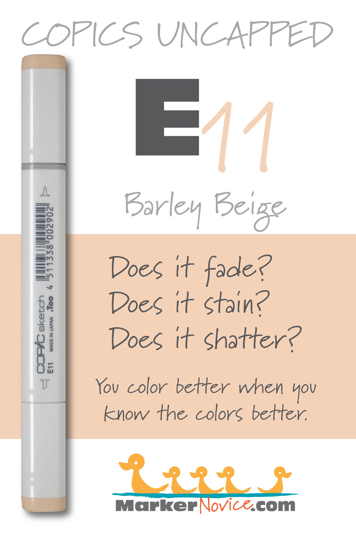
E11 Barley Beige: Copics Uncapped (Marker Swatch, Ink Testing)
E11 Barley Beige
Let’s take a closer look at this Copic Marker and it’s ink characteristics.


E11 Barley Beige is a warm brown Copic Marker which resembles diluted Raw Sienna watercolor. It is popular for skin tones but it’s not a realistic skin color. Good for general illustration. E11 is available in Copic Sketch, Ciao, and Classic marker styles.
Every Copic Marker has unique characteristics based on its unique ink formula.
Knowing how a color behaves will help you blend effectively and make art with confidence.
E11 Barley Beige
Let’s take a closer look at this Copic Marker and its ink characteristics.
WARNING: This marker is incredibly popular for coloring skin tones. We DO NOT RECOMMEND coloring anyone’s skin with E11. One coat of E11 does look a bit like some caucasian skin but when was the last time you colored skin with only one coat of one marker? Look at how unnaturally orange E11 looks with two or more coats. Nobody has skin this color!
Temperature: A warm brown.
Resemblance: Resembles diluted Raw Sienna watercolor (one of the redder Raw Siennas, many are more yellowish).
Actual Value: N3
All Copics are measured on a Neutral Gray value scale. The last number on the cap is supposed to indicate value but we’ve found discrepancies where the actual ink value is different than cap designation.
Cap Accuracy: The plastic indicator on a Sketch marker matches 1 coat of E11 ink.
Buildup: E11 can turn oily looking with just 2 layers. This is another negative issue when coloring skin tones because people tend to blend skin a lot more, trying to get a super-smooth finish. E11 simply gets too dark, too orange, and too oily to be a good skin color.
Shattering: Does not shatter.
Chromatography testing shows this ink’s behavior when it comes in contact with #0 Colorless Blender (solvent). High shattering colors may leak unexpected color when you make corrections or attempt to blend with any color that has a high solvent to colorant ratio. Shattering is not bad, it’s just something to be aware of.

Staining: Slightly staining. Typical of an ink with red in the formula.
Lift: Stubborn. The ink can be lightened but the paper remains pinkish brown.
See staining swatch. Sample was given 6 stripes of #0 Colorless Blender, drying between each stripe. Results indicate how much lifting you can expect.
Lightfast: Just a hint of fading, less than 5%.
Samples were swatched on X-Press It Blending Card. 1 layer of ink was exposed to windowsill sunlight for 21 days. Approximately 10 hours of sun per day based on weather conditions. Note: we do not recommend displaying original Copic art under these conditions.
Natural Ink Family: E11 sits at the light end of the E-Teen family which runs from E11 to E19 on the far end. Beware of the marker caps, many caps in this family are extremely misleading.
Family Members: E11, E13, E15. E17, E18, E19
We include this information because many Copic users never think deeper than the letter groupings (R, BV, G, etc.). Every ink has its own temperature variations and underlying flavors. Understanding what an ink looks like in its different dilutions helps when creating your own blending combinations.
Complement: Brown is not a hue on the colorwheel and does not have a complement.
Underpaint: B60 neutralizes this color well.
This is simply one suggestion. Many possible colors exist. Test to find a color that pleases you.
Pushing Pencil: Prismacolor 943 Burnt Ochre is very pretty over E11 but keep the pressure soft and the color light.
VanillaArts.com (our sister site) teaches a Push & Pull technique for dimensional coloring. This is simply one suggestion. Many possible colors exist. Test to find a color that pleases you.
Vanilla Arts Classes using E11:
We continue to create new content and classes and we will update here as more become available.
Visit the workshop resource page at our sister site VanillaArts.com for a wide variety of Copic classes.
Vanilla Arts Digi Stamps using E11:
We continue to create new content and classes and we will update here as more become available.
Visit the workshop resource page at our sister site VanillaArts.com for a wide variety of Vanilla Arts stamps.
Color palettes and swatches using E11:
We are building our palette and swatch collection a little more each week and will update here as more become available.
Visit the color resource page at our sister site VanillaArts.com for a wide variety of Copic palettes and swatches.
Looking for beautiful color palettes?
We absolutely love The Color Catalog 1 & 2 from Sarah Renae Clark. It puts hundreds of Copic friendly color palettes at your fingertips.
(note: affiliate link)


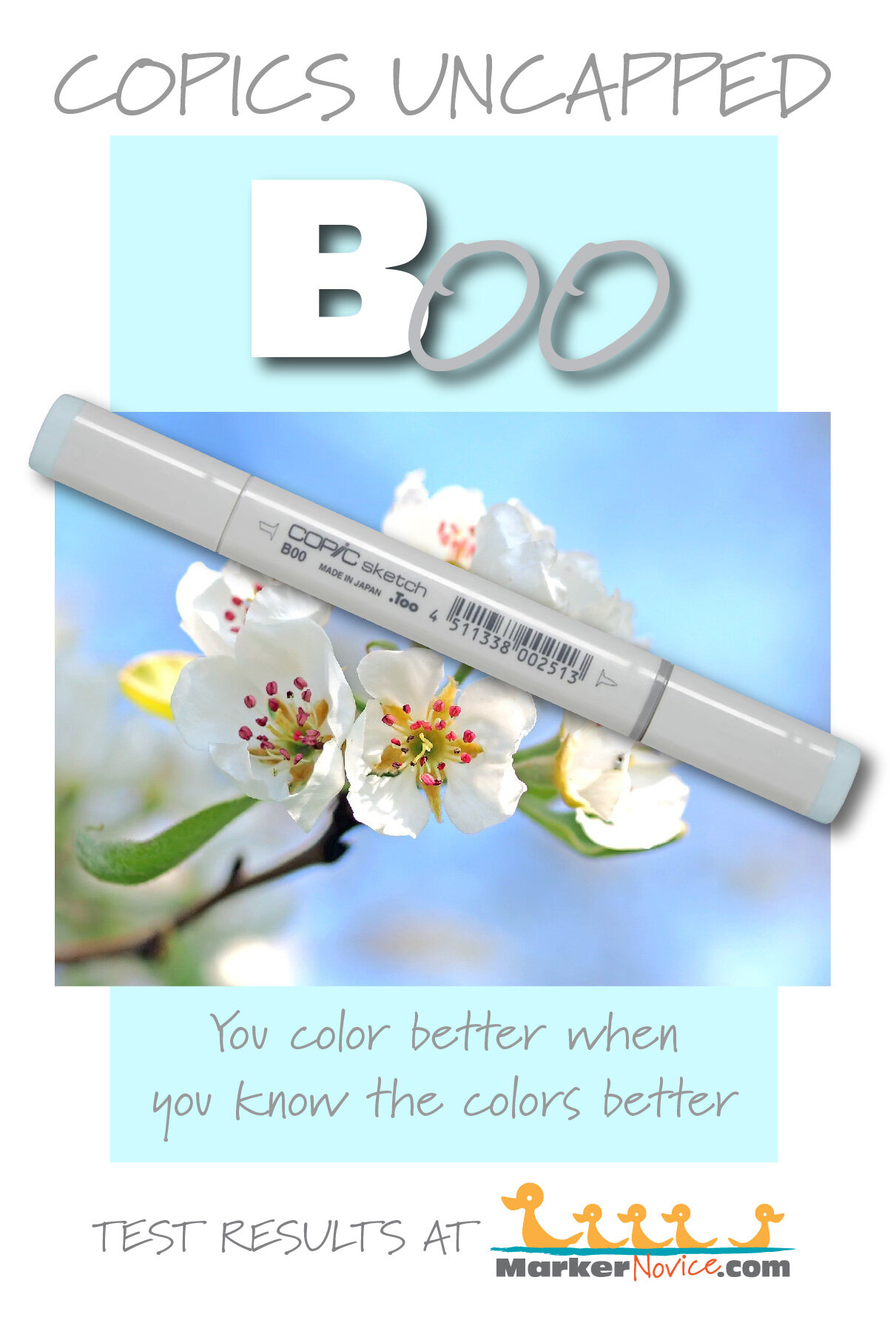
B00 Frost Blue: Copics Uncapped (Marker Swatch, Ink Testing)
B00 Frost Blue
Let’s take a closer look at this Copic Marker and it’s ink characteristics.

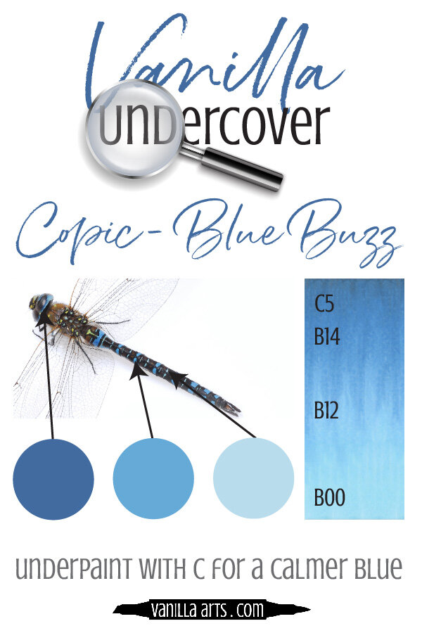
B00 Frost Blue is a pale green-leaning blue Copic Marker which resembles diluted Cerulean Blue watercolor. This is a popular blending companion for darker blues, perfect for skies and backgrounds. B00 is available in Copic Sketch, Ciao, and Classic marker styles.
Every Copic Marker has unique characteristics based on its unique ink formula.
Knowing how a color behaves will help you blend effectively and make art with confidence.
B00 Frost Blue
Let’s take a closer look at this Copic Marker and its ink characteristics.
Temperature: A slightly greenish blue.
Resemblance: Diluted Cerulean Blue watercolor.
Actual Value: N2
All Copics are measured on a Neutral Gray value scale. The last number on the cap is supposed to indicate value but we’ve found discrepancies where the actual ink value is different than cap designation.
Cap Accuracy: The plastic on a Sketch marker is similar to one coat of B00 but the plastic is a bit more greenish.
Buildup: B00 begins to look oily on the second layer but seems to even out by 4 layers.
Shattering: Does not shatter.
Chromatography testing shows this ink’s behavior when it comes in contact with #0 Colorless Blender (solvent). High shattering colors may leak unexpected color when you make corrections or attempt to blend with any color that has a high solvent to colorant ratio. Shattering is not bad, it’s just something to be aware of.
Staining: B00 does not stain.
Lift: This color lifts easily. It’s not a complete lift but it’s close.
See staining swatch. Sample was given 6 stripes of #0 Colorless Blender, drying between each stripe. Results indicate how much lifting you can expect.
Lightfast: Faded by about 10%.
Samples were swatched on X-Press It Blending Card. 1 layer of ink was exposed to windowsill sunlight for 21 days. Approximately 10 hours of sun per day based on weather conditions. Note: we do not recommend displaying original Copic art under these conditions.
Natural Ink Family: B00 is at the light end of the B-Zero family. It’s a large family but Copic doesn’t make the darker end (no B08 or B09). This is a blue and a good investment for your first blue blends.
Family Members: B0000, B000, B00, B01, B02, B04, B05, B06
We include this information because many Copic users never think deeper than the letter groupings (R, BV, G, etc.). Every ink has its own temperature variations and underlying flavors. Understanding what an ink looks like in its different dilutions helps when creating your own blending combinations.
Complement: A light red. We suggest R01 or R11
Underpaint: We suggest W0
This is simply one suggestion. Many possible colors exist. Test to find a color that pleases you.
Pushing Pencil: Prismacolor 1060 20% Cool Grey can add a bit of shade to this color but with any marker this light, your pencil strokes need to be ultra soft or the pencil will dominate the blend.
VanillaArts.com (our sister site) teaches a Push & Pull technique for dimensional coloring. This is simply one suggestion. Many possible colors exist. Test to find a color that pleases you.
Vanilla Arts Classes using B00:
Vanilla Arts Digi Stamps using B00:
We continue to create new content and classes and we will update here as more become available.
Visit the workshop resource page at our sister site VanillaArts.com for a wide variety of Vanilla Arts stamps.
Color palettes and swatches using B00:
Looking for beautiful color palettes?
We absolutely love The Color Catalog 1 & 2 from Sarah Renae Clark. It puts hundreds of Copic friendly color palettes at your fingertips.
(note: affiliate link)


R39 Garnet: Copics Uncapped (Marker Swatch, Ink Testing)
R39 Garnet
Let’s take a closer look at this Copic Marker and it’s ink characteristics.

R39 Garnet is a cool red Copic Marker that mimics Alizarin Crimson watercolor. This marker is useful for realistic red objects, food and botanical illustration, and holiday images. R39 is only available in Copic Sketch and Classic marker styles.
Every Copic Marker has unique characteristics based on its unique ink formula.
Knowing how a color behaves will help you blend effectively and make art with confidence.
R39 Garnet
Let’s take a closer look at this Copic Marker and it’s ink characteristics.
Temperature: A cool red.
Resemblance: Alizarin Crimson watercolor.
Actual Value: N8
All Copics are measured on a Neutral Gray value scale. The last number on the cap is supposed to indicate value but we’ve found discrepancies where the actual ink value is different than cap designation.
Cap Accuracy: Slightly dark. The plastic on an R39 Sketch cap matches 2 coats of R39.
Buildup: R39 develops oily looking patches on the second coat but by four coats, it seems to smooth out.
Shattering: Does not shatter.
Chromatography testing shows this ink’s behavior when it comes in contact with #0 Colorless Blender (solvent). High shattering colors may leak unexpected color when you make corrections or attempt to blend with any color that has a high solvent to colorant ratio. Shattering is not bad, it’s just something to be aware of.

Staining: R39 is highly staining.
Lift: No red lifts very well. R39 can be lightened but never moved.
See staining swatch. Sample was given 6 stripes of #0 Colorless Blender, drying between each stripe. Results indicate how much lifting you can expect.
Lightfast: We saw very mild fading during the test period but we had to look pretty hard to find it. Maybe about 5%.
Samples were swatched on X-Press It Blending Card. 1 layer of ink was exposed to windowsill sunlight for 21 days. Approximately 10 hours of sun per day based on weather conditions. Note: we do not recommend displaying original Copic art under these conditions.
Natural Ink Family: R39 is at the dark end of the R30 family of natural looking red markers.
Family Members: R39, R37, R35, R32, R30
We include this information because many Copic users never think deeper than the letter groupings (R, BV, G, etc.). Every ink has its own temperature variations and underlying flavors. Understanding what an ink looks like in its different dilutions helps when creating your own blending combinations.
Complement: A slightly greenish Turquoise like BG18
Underpaint: We suggest B45
This is simply one suggestion. Many possible colors exist. Test to find a color that pleases you.
Pushing Pencil: Prismacolor 931 Dark Purple is a reliable choice.
VanillaArts.com (our sister site) teaches a Push & Pull technique for dimensional coloring. This is simply one suggestion. Many possible colors exist. Test to find a color that pleases you.
Vanilla Arts Classes using R39:

Rustic Maple Leaf: Amy explores realistic shade and shadows, plus a fun lesson on faux wood backgrounds. Find more info here.

Gray Matter: Amy explores underpainting, a technique that increases the realism in colored images. Find more info here.
Vanilla Arts Digi Stamps using R39:
Color palettes and swatches using R39:
We are building our palette and swatch collection a little more each week and will update here as more become available.
Visit the color resource page at our sister site VanillaArts.com for a wide variety of Copic palettes and swatches.
Looking for beautiful color palettes?
We absolutely love The Color Catalog 1 & 2 from Sarah Renae Clark. It puts hundreds of Copic friendly color palettes at your fingertips.
(note: affiliate link)
