

W0 Warm Gray No. 0: Copics Uncapped (Marker Swatch, Ink Testing)
W0 Warm Gray No. 0
Let’s take a closer look at this Copic Marker and it’s ink characteristics.

Every Copic Marker has unique characteristics based on its unique ink formula.
Knowing how a color behaves will help you blend effectively and make art with confidence.
W0 Warm Gray No. 0
Let’s take a closer look at this Copic Marker and its ink characteristics.
Temperature: A warm, yellowed gray which can look brown or green in some color palettes
Resemblance: Davy’s Gray watercolor
Name: Warm Gray is an acceptable name for this color but I think Copic missed a golden opportunity to name this family “French Gray”. French is closer to the actual color, plus it sounds more desirable.
Copic Styles: W0 is available in Copic Sketch, Ciao, and Classic styles.
Actual Value: N0
All Copics are measured on a Neutral Gray value scale. The last number on the cap is supposed to indicate value but we’ve found discrepancies where the actual ink value is different than cap designation.

Cap Accuracy: The plastic end of an W0 Sketch Marker is very close to 1 layer of W0 ink but the plastic is slightly more yellowish
Buildup: W0 reaches maximum color at 3-4 layers
Shattering: INCONCLUSIVE. W0 is such a light color that it fades completely when dispersed in solvent. Other members of the W Gray family are a mixture of gray and brown colorant so we assume W0 follows the same pattern.
Chromatography testing shows this ink’s behavior when it comes in contact with #0 Colorless Blender (solvent). High shattering colors may leak unexpected color when you make corrections or attempt to blend with any color that has a high solvent to colorant ratio. Shattering is not bad, it’s just something to be aware of.
Staining: W0 is a non-staining color
Lift: W0 lifts easily from the paper and can almost be considered “erasable”
See staining swatch. Sample was given 6 stripes of #0 Colorless Blender, drying between each stripe. Results indicate how much lifting you can expect.

Lightfast: W0 did not fade during the test period. With a color this pale, we expected to see significant fading and yet there was no change in the swatch over 3 weeks. Excellent performance!
Samples were swatched on X-Press It Blending Card. 1 layer of ink was exposed to windowsill sunlight for 21 days. Approximately 10 hours of sun per day based on weather conditions. Note: we do not recommend displaying original Copic art under these conditions.
Natural Ink Family: W0 is at the lighter end of the Warm Gray family.
Family Members: W10, W9, W8, W7, W6, W5, W4, W3, W2, W1, W0, W00.
We include this information because many Copic users never think deeper than the letter groupings (R, BV, G, etc.). Every ink has its own temperature variations and underlying flavors. Understanding what an ink looks like in its different dilutions helps when creating your own blending combinations.
Complement: N/A
Underpaint: N/A
Pushing Pencil: We suggest PC1070 30% French Grey
VanillaArts.com (our sister site) teaches a Push & Pull technique for dimensional coloring. This is simply one suggestion. Many possible colors exist. Test to find a color that pleases you.
GRAY WORKSHOP

GRAY COLORING KIT

COPIC TEST ARCHIVE

MAKE GRAY BEAUTIFUL
UNDERPAINT BLENDING COMBINATIONS
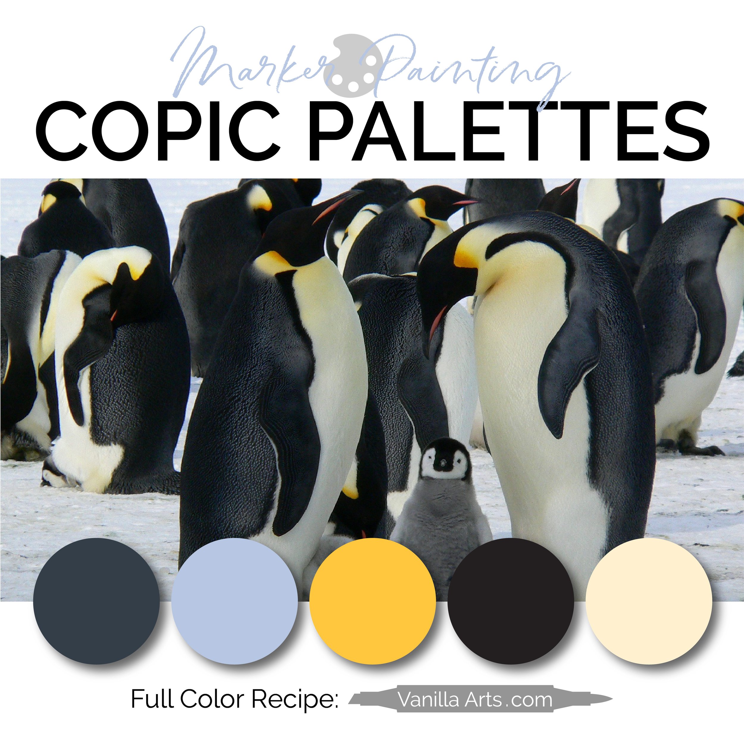
Looking for beautiful color palettes?
We absolutely love The Color Catalog 1 & 2 from Sarah Renae Clark. It puts hundreds of Copic friendly color palettes at your fingertips.
(note: affiliate link)













RV32 Shadow Pink: Copic Markers Uncapped (Swatch, Ink Testing)
RV32 Shadow Pink
Let’s take a closer look at this Copic Marker and it’s ink characteristics.


Every Copic Marker has unique characteristics based on its unique ink formula.
Knowing how a color behaves will help you blend effectively and make art with confidence.
RV32 Shadow Pink*
Let’s take a closer look at this Copic Marker and its ink characteristics.
* Be sure to read the color warning below for this color
Temperature: A cool, earthy, diluted magenta. This color has blue undertones but also something grayed in the mixture.
Resemblance: diluted Potter’s Pink watercolor
Name: “Shadow Pink” is a highly unusual name. I’ve never encountered it in other art supplies. I think Copic is signaling that there’s something brownish or desaturated in this color— it’s not your normal cheerful pink.
Marker Styles: RV32 is only available in Sketch and Classic style markers.
For a Copic Wide marker in this color, you must purchase a “blank” or empty marker body and fill it with refill ink. Copic Wides have been do-it-yourself colors since 2019.
Copic makes refill inks for all 358 colors and every style of Copic is refillable.
Actual Value: N2.5
All Copics are measured on a Neutral Gray value scale. The last number on the cap is supposed to indicate value but we’ve found discrepancies where the actual ink value is different than cap designation.
WARNING: This marker deviates from the normal Copic numbering system. RV32 and RV34 have been placed into the same number group (3) but the two inks are NOT related.
See shattering test below plus the shattering test for RV34 here as proof.
RV32 is made with a pink and gold ink blend while RV34 is a single source ink. This explains why the two markers do not blend easily with each other. An RV32-34 blend will require an extra amount of RV32 to make a smooth transition… and even on good paper, the blend may not fully smooth to your liking.

Cap Accuracy: Close. The colored plastic on a Sketch marker matches the color of 2 layers of RV32 ink.
Buildup: RV32 reaches maximum value at 4 layers but it starts to look over-inked and oily at 3 layers.
Shattering: RV32 shatters into a dirty pink plus gold
Chromatography testing shows this ink’s behavior when it comes in contact with #0 Colorless Blender (solvent). High shattering colors may leak unexpected color when you make corrections or attempt to blend with any color that has a high solvent to colorant ratio. Shattering is not bad, it’s just something to be aware of.
Staining: RV32 does not stain
Lift: RV32 lifts easily
See staining swatch. Sample was given 6 stripes of #0 Colorless Blender, drying between each stripe. Results indicate how much lifting you can expect.

Lightfast: RV32 faded less than 5% during the test period. The fade is almost imperceptible, I had to tilt the paper and re-swatch to confirm that I was truly detecting a fade. I almost want to rate this as “no fade”.
Samples were swatched on X-Press It Blending Card. 1 layer of ink was exposed to windowsill sunlight for 21 days. Approximately 10 hours of sun per day based on weather conditions. Note: we do not recommend displaying original Copic art under these conditions.
Natural Ink Family: As mentioned in the warning above, there is no natural RV-Thirty ink family. There are only two members of this group and they’re made with two completely different ink recipes. This explains why RV32 and RV34 are reluctant to blend with each other.
Family Members: RV32, RV34 (numerically adjacent but not related)
We include this information because many Copic users never think deeper than the letter groupings (R, BV, G, etc.). Every ink has its own temperature variations and underlying flavors. Understanding what an ink looks like in its different dilutions helps when creating your own blending combinations.
Complement: A light viridian green like G12
Underpaint: We suggest BG10
This is simply one suggestion. Many possible colors exist. Test to find a color that pleases you.
Pushing Pencil: PC1026 Greyed Lavender is a excellent choice.
VanillaArts.com (our sister site) teaches a Push & Pull technique for dimensional coloring. This is simply one suggestion. Many possible colors exist. Test to find a color that pleases you.
MAGENTA WORKSHOP

MAGENTA COLORING KIT

COPIC TEST ARCHIVE

MAKE MAGENTA BEAUTIFUL

UNDERPAINT BLENDING COMBINATIONS

Looking for beautiful color palettes?
We absolutely love The Color Catalog 1 & 2 from Sarah Renae Clark. It puts hundreds of Copic friendly color palettes at your fingertips.
(note: affiliate link)


N10 Neutral Gray No. 10: Copics Uncapped (Marker Swatch, Ink Testing)
N10 Neutral Gray No. 10
Let’s take a closer look at this Copic Marker and it’s ink characteristics.

Every Copic Marker has unique characteristics based on its unique ink formula.
Knowing how a color behaves will help you blend effectively and make art with confidence.
N10 Neutral Gray No. 10
Let’s take a closer look at this Copic Marker and its ink characteristics.
Temperature: A balanced gray, neither warm nor cool
Resemblance: Lamp Black watercolor
Name: The name is correct, this is a truly neutral gray
Copic Styles: N10 is only available in Copic Sketch and Classic styles. The Ciao line does not include any of the neutral grays.
Actual Value: N10 (All Copic N grays match their true value. N is the only family where this is true.)
All Copics are measured on a Neutral Gray value scale. The last number on the cap is supposed to indicate value but we’ve found discrepancies where the actual ink value is different than cap designation.

Cap Accuracy: The plastic end of an N10 Sketch Marker matches 2 coats of N10 ink.
Buildup: N10 reaches maximum color at 3 layers but starts to gather an oily appearance with the second layer.
Shattering: N10 shatters into gray with a burst of warm red leakage around the edges. Copic has added a second color to darken N8, N9, and N10 beyond the value of the master Neutral Gray base ink.
Chromatography testing shows this ink’s behavior when it comes in contact with #0 Colorless Blender (solvent). High shattering colors may leak unexpected color when you make corrections or attempt to blend with any color that has a high solvent to colorant ratio. Shattering is not bad, it’s just something to be aware of.
Staining: As with most darker Copic inks, N10 stains the paper.
Lift: N10 does not lift from the paper. This should be considered a permanent marker and efforts to erase or correct mistakes are futile.
See staining swatch. Sample was given 6 stripes of #0 Colorless Blender, drying between each stripe. Results indicate how much lifting you can expect.

Lightfast: N10 did not fade during the test period. With a color this dark, we expected to see a bit of lightening and yet there was no change in the swatch over 3 weeks. Excellent performance!
Samples were swatched on X-Press It Blending Card. 1 layer of ink was exposed to windowsill sunlight for 21 days. Approximately 10 hours of sun per day based on weather conditions. Note: we do not recommend displaying original Copic art under these conditions.
Natural Ink Family: N10 is at the darkest member of the Neutral Gray family. For a step darker, we recommend Copic 100 Black.
Family Members: N10, N9, N8, N7, N6, N5, N4, N3, N2, N1, N0.
We include this information because many Copic users never think deeper than the letter groupings (R, BV, G, etc.). Every ink has its own temperature variations and underlying flavors. Understanding what an ink looks like in its different dilutions helps when creating your own blending combinations.
Complement: N/A
Underpaint: N/A
Pushing Pencil: We suggest PC935 Black Prismacolor.
VanillaArts.com (our sister site) teaches a Push & Pull technique for dimensional coloring. This is simply one suggestion. Many possible colors exist. Test to find a color that pleases you.
GRAY WORKSHOP
GRAY COLORING KIT
COPIC TEST ARCHIVE

MAKE GRAY BEAUTIFUL
UNDERPAINT BLENDING COMBINATIONS
Looking for beautiful color palettes?
We absolutely love The Color Catalog 1 & 2 from Sarah Renae Clark. It puts hundreds of Copic friendly color palettes at your fingertips.
(note: affiliate link)

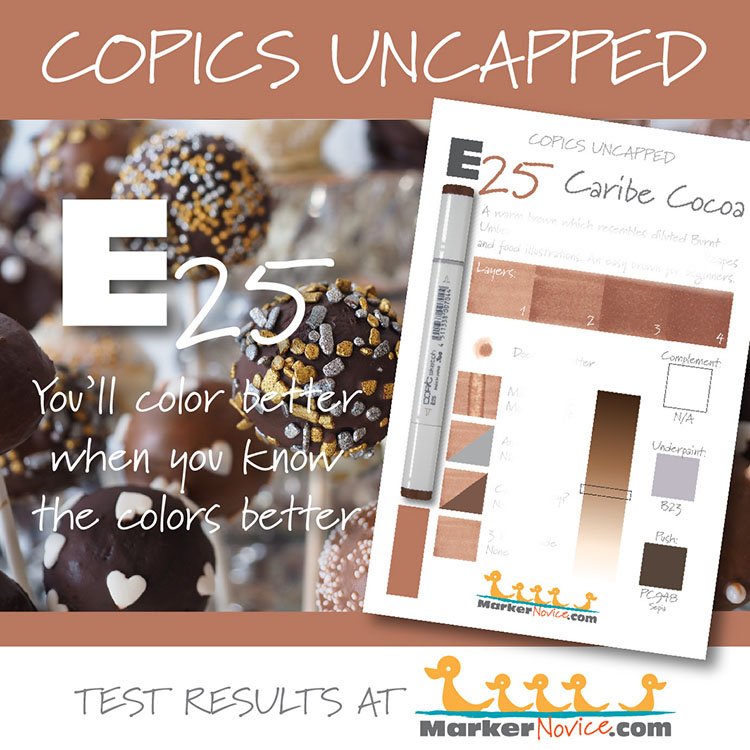
Copic E25 Caribe Cocoa: Swatch, Blend, Value, and Lightfast Testing.
E25 Caribe Cocoa
Let’s take a closer look at this Copic Marker and its ink characteristics.

Every Copic Marker has different characteristics based upon its unique ink formula.
Knowing how a color behaves will help you blend effectively and make art with confidence.
E25 Caribe Cocoa
Let’s take a closer look at this Copic Marker and its ink characteristics.
Temperature: A warm natural brown brown
Resemblance: one of the warmer Burnt Umber watercolors
Name: I’m assuming that “Caribe Cocoa” is meant to liken the color to that of cocoa powder made somewhere in the Caribbean. It’s not a name I’ve come across in art supplies. If I’m correct, Caribe Cocoa is an excellent name. Chocolate and cocoa are a unique brown which can be hard to capture without mixing paints. Copic E25 captures the color of milk chocolate perfectly.
Copic Styles: E25 is available in Sketch, Ciao, and Classic style Copic markers.
Actual Value: N6 (note: this is one of the few Copic markers that are darker than the cap indicates. Often, the ink is lighter than the last number indicator.)
All Copics are measured on a Neutral Gray value scale. The last number on the cap is supposed to indicate value but we’ve found discrepancies where the actual ink value is different than cap designation.
Cap Accuracy: No, the colored plastic on the Sketch cap is darker color as 4 layers of E25 ink. If you select this color expecting a dark chocolate brown, you will be disappointed.

Buildup: E25 reaches a maximum value at 4 layers. This color also tends to look blotchy and oily. For this reason, we are hesitant to recommend it to beginners as it requires a delicate touch.
Shattering: E25 does not shatter.
Chromatography testing shows this ink’s behavior when it comes in contact with #0 Colorless Blender (solvent). High shattering colors may leak unexpected color when you make corrections or attempt to blend with any color that has a high solvent to colorant ratio. Shattering is not bad, it’s just something to be aware of.
Staining: E25 stains the paper with a peachy warm color, the stained area matches E21 almost exactly. Staining markers do not blend as easily or as smoothly as non-staining Copics.
Lift: E25 can be lightened a bit but the paper will be permanently stained. The best you can hope for is to lighten mistakes enough to then camouflage them with another darker color.
See staining swatch. Sample was given 6 stripes of #0 Colorless Blender, drying between each stripe. Results indicate how much lifting you can expect.

Lightfast: E25 did not fade during the 3 week test period. AMAZING!
Samples were swatched on X-Press It Blending Card. 1 layer of ink was exposed to windowsill sunlight for 21 days. Approximately 10 hours of sun per day based on weather conditions. Note: we do not recommend displaying original Copic art under these conditions.
Natural Ink Family: E25 is at the dark of the E-Twenty family of brown Copics.
Family Members: E21, E23, E25, E27 E29
We include this information because many Copic users never think deeper than the letter groupings (R, BV, G, etc.). Every ink has its own temperature variations and underlying flavors. Understanding what an ink looks like in its different dilutions helps when creating your own blending combinations.
Complement: Brown is not a hue and therefore, not on the color wheel. It has no complement.
Underpaint: We suggest BV23
This is simply one suggestion. Many possible colors exist. Test to find a color that pleases you.
Pushing Pencil: Prismacolor PC948 Sepia is a safe choice. PC931 Dark Purple is an option for the daring and brave.
VanillaArts.com (our sister site) teaches a Push & Pull technique for dimensional coloring. This is simply one suggestion. Many possible colors exist. Test to find a color that pleases you.
BROWN EARTH WORKSHOP
BROWN COLORING KIT

COPIC TEST ARCHIVE
MAKE BROWN BEAUTIFUL

UNDERPAINT BLENDING COMBINATIONS

Looking for beautiful color palettes?
We absolutely love The Color Catalog 1 & 2 from Sarah Renae Clark. It puts hundreds of Copic friendly color palettes at your fingertips.
(note: affiliate link)


Copic G19 Bright Parrot Green: Swatch, Blend, Value, and Lightfast testing
G19 Bright Parrot Green
Let’s take a closer look at this Copic Marker and its ink characteristics.
Every Copic Marker has different characteristics based upon its unique ink formula.
Knowing how a color behaves will help you blend effectively and make art with confidence.
G19 Bright Parrot Green
Let’s take a closer look at this Copic Marker and its ink characteristics.
Temperature: A warm medium-dark green
Resemblance: Phthalo Green
Name: “Parrot Green” is a standard paint name but the name usually refers to a lighter color with stronger yellow tones. Copic often misses the mark on their color names which I blame on the language barrier from Japanese to English. In my opinion, this name is inaccurate and misleading.
Copic Styles: G19 is only available in Sketch and Classic style Copic markers.
Actual Value: N7 (this is significantly lighter than the number code indicates)
All Copics are measured on a Neutral Gray value scale. The last number on the cap is supposed to indicate value but we’ve found discrepancies where the actual ink value is different than cap designation.
Cap Accuracy: The colored plastic on the Sketch cap is darker than 4 layers of G19 ink. This combined with the inaccurate cap number is startling when you first use G19 as the color is lighter than expected.

Buildup: G19 reaches maximum color value at 3-4 layers. This color also looks blotchy at one layer but at two layers looks noticeably oily. There really isn’t a sweet spot between blotches and oil which makes this a hard color to work with and thus, I do not recommend G19 for beginners.
Shattering: Shatters into green with strong yellow color seeping out at the margins.
Chromatography testing shows this ink’s behavior when it comes in contact with #0 Colorless Blender (solvent). High shattering colors may leak unexpected color when you make corrections or attempt to blend with any color that has a high solvent to colorant ratio. Shattering is not bad, it’s just something to be aware of.
Staining: G19 stains the paper blue.
Lift: G19 can be lightened a bit but the paper will be permanently stained. The best you can hope for is to lighten mistakes enough to then camouflage them with another color.
See staining swatch. Sample was given 6 stripes of #0 Colorless Blender, drying between each stripe. Results indicate how much lifting you can expect.

Lightfast: G19, like several other G markers has an extremely odd fade. The color did not lighten but the swatch turned noticeably bluish. This is a blended ink (see shattering sample) and the yellow ink component faded entirely while the blue ink remained lightfast.
Samples were swatched on X-Press It Blending Card. 1 layer of ink was exposed to windowsill sunlight for 21 days. Approximately 10 hours of sun per day based on weather conditions. Note: we do not recommend displaying original Copic art under these conditions.
Natural Ink Family: G19 is the darkest marker in the G-Teen family. I stronly suspect G12 and G14 were shifted into this group and they’re not chemically related to G16, G17, or G19.
Family Members: G12, G14, G16, G17, G19
We include this information because many Copic users never think deeper than the letter groupings (R, BV, G, etc.). Every ink has its own temperature variations and underlying flavors. Understanding what an ink looks like in its different dilutions helps when creating your own blending combinations.
Complement: A medium deep red violet like RV66
Underpaint: We suggest BV23
This is simply one suggestion. Many possible colors exist. Test to find a color that pleases you.
Pushing Pencil: Prismacolor 931 Dark Purple is an excellent choice
VanillaArts.com (our sister site) teaches a Push & Pull technique for dimensional coloring. This is simply one suggestion. Many possible colors exist. Test to find a color that pleases you.
GREEN WORKSHOP

GREEN COLORING KIT

COPIC TEST ARCHIVE

MAKE GREEN BEAUTIFUL

UNDERPAINT BLENDING COMBINATIONS

Looking for beautiful color palettes?
We absolutely love The Color Catalog 1 & 2 from Sarah Renae Clark. It puts hundreds of Copic friendly color palettes at your fingertips.
(note: affiliate link)

Y38 Honey: Copic Markers Uncapped ( Swatch, Ink Testing)
Y38 Honey
Let’s take a closer look at this Copic Marker and it’s ink characteristics.
Every Copic Marker has unique characteristics based on its unique ink formula.
Knowing how a color behaves will help you blend effectively and make art with confidence.
Y38 Honey
Let’s take a closer look at this Copic Marker and its ink characteristics.
Temperature: A warm, orangish yellow
Resemblance: Gamboge Yellow watercolor
Name: “Honey” is a pretty good name for this color. Real honey is never this color but I’ve seen similar shades of fabric, clothing, and craft paint yellow referred to as honey.
Marker Styles: Y38 is available in Sketch, Ciao, and Classic style markers.
For a Copic Wide marker in this color, you must purchase a “blank” or empty marker body and fill it with refill ink. Copic Wides have been do-it-yourself colors since 2019.
Copic makes refill inks for all 358 colors and every style of Copic is refillable.
Actual Value: N5
All Copics are measured on a Neutral Gray value scale. The last number on the cap is supposed to indicate value but we’ve found discrepancies where the actual ink value is different than cap designation.

Cap Accuracy: The colored plastic on a Sketch marker closely matches the color of 1-2 layers of Y38 ink.
Buildup: Y38 reaches maximum value at 3-4 layers
Shattering: Y38 does not shatter.
Chromatography testing shows this ink’s behavior when it comes in contact with #0 Colorless Blender (solvent). High shattering colors may leak unexpected color when you make corrections or attempt to blend with any color that has a high solvent to colorant ratio. Shattering is not bad, it’s just something to be aware of.
Staining: Y38 is partially staining. It tints the paper yellow but it’s because this is a dark and concentrated marker ink recipe. The actual colorant is not stubborn, does not bond with paper fibers, and is considered an easy-blending color.
Lift: Y38 has a moderate lift. Again, it’s not staining as much as this marker is rich in colorant. If this were a paint, we’d say it was “highly pigmented” and as such, there’s just a lot of colorant to lift.
See staining swatch. Sample was given 6 stripes of #0 Colorless Blender, drying between each stripe. Results indicate how much lifting you can expect.

Lightfast: Y38 faded a bit but very mild during the test period.
Samples were swatched on X-Press It Blending Card. 1 layer of ink was exposed to windowsill sunlight for 21 days. Approximately 10 hours of sun per day based on weather conditions. Note: we do not recommend displaying original Copic art under these conditions.
Natural Ink Family: Y38 is the darkest marker in the Y-Thirty family. The mother ink which forms this group is likely a yellowish orange ink but the diluted versions Copic uses are distinctly yellow. We wish Copic would produce a sub-zero series for this family as the current Y00’s feel too greenish and do not work well with any of the Y-Thirties.
Family Members: Y38, Y35, Y32
We include this information because many Copic users never think deeper than the letter groupings (R, BV, G, etc.). Every ink has its own temperature variations and underlying flavors. Understanding what an ink looks like in its different dilutions helps when creating your own blending combinations.
Complement: A medium true purple. We wish Copic made a color like this rather than the pinkish purples and violets in the V family.
Underpaint: We suggest V22.
This is simply one suggestion. Many possible colors exist. Test to find a color that pleases you.
Pushing Pencil: PC1008 Parma Violet is an excellent choice to shade this color. Please use very light pressure.
VanillaArts.com (our sister site) teaches a Push & Pull technique for dimensional coloring. This is simply one suggestion. Many possible colors exist. Test to find a color that pleases you.
YELLOW WORKSHOP

YELLOW COLORING KIT
COPIC TEST ARCHIVE

MAKE YELLOW BEAUTIFUL

UNDERPAINT BLENDING COMBINATIONS

Looking for beautiful color palettes?
We absolutely love The Color Catalog 1 & 2 from Sarah Renae Clark. It puts hundreds of Copic friendly color palettes at your fingertips.
(note: affiliate link)

RV25 Dog Rose Flower: Copic Markers Uncapped (Swatch, Ink Testing)
RV25 Dog Rose Flower
Let’s take a closer look at this Copic Marker and it’s ink characteristics.
Every Copic Marker has unique characteristics based on its unique ink formula.
Knowing how a color behaves will help you blend effectively and make art with confidence.
RV25 Dog Rose Flower
Let’s take a closer look at this Copic Marker and its ink characteristics.
Temperature: A balanced medium magenta. This color doesn’t feel obviously warm or cool shifted.
Resemblance: Alizarin Crimson watercolor
Name: “Dog Rose Flower” is a long name which barely fits on the cap and for all the trouble, this is a mediocre name. Dog Roses come in a wide variety of pinks encompassing light to dark pinks and warm to cool pinks. So while “Dog Rose” is okay for pink, it does nothing to bring this particular pink to mind.
Marker Styles: RV25 is only available in Sketch and Classic style markers.
For a Copic Wide marker in this color, you must purchase a “blank” or empty marker body and fill it with refill ink. Copic Wides have been do-it-yourself colors since 2019.
Copic makes refill inks for all 358 colors and every style of Copic is refillable.
Actual Value: N6
All Copics are measured on a Neutral Gray value scale. The last number on the cap is supposed to indicate value but we’ve found discrepancies where the actual ink value is different than cap designation.

Cap Accuracy: Close. The colored plastic on a Sketch marker matches the color of 2-3 layers of RV25 ink.
NOTE: The cap plastic on Sketch RV25 varies. Some use a day-glow pink plastic which definitely does not match this ink.
Buildup: RV25 reaches maximum value at 4 layers
Shattering: RV25 does not shatter. We did notice an oddity with this ink in that when wet, it appears florescent. This glow dies back as it dries. The cured color is bright but not neon.
Chromatography testing shows this ink’s behavior when it comes in contact with #0 Colorless Blender (solvent). High shattering colors may leak unexpected color when you make corrections or attempt to blend with any color that has a high solvent to colorant ratio. Shattering is not bad, it’s just something to be aware of.
Staining: RV25 is a surprising color. It stains only mildly which is unusual for anything in the R or RV families.
Lift: RV25 lifts shockingly well. We’d never consider this color erasable but there’s a great chance you can move mistakes back inside the lines. You’ll never get back to clean white paper but this liftability is a refreshing change.
See staining swatch. Sample was given 6 stripes of #0 Colorless Blender, drying between each stripe. Results indicate how much lifting you can expect.

Lightfast: RV25 faded about 20% during the test period. This is about average for darker Copic pinks and reds.
Samples were swatched on X-Press It Blending Card. 1 layer of ink was exposed to windowsill sunlight for 21 days. Approximately 10 hours of sun per day based on weather conditions. Note: we do not recommend displaying original Copic art under these conditions.
Natural Ink Family: RV25 is at the darker end of the R-Twenty family with RV29 at the dark end and RV21 at the lightest end.
Family Members: RV21, RV23, RV25, RV29
We include this information because many Copic users never think deeper than the letter groupings (R, BV, G, etc.). Every ink has its own temperature variations and underlying flavors. Understanding what an ink looks like in its different dilutions helps when creating your own blending combinations.
Complement: A darker viridian green like G16 or G17
Underpaint: We suggest B91
This is simply one suggestion. Many possible colors exist. Test to find a color that pleases you.
Pushing Pencil: PC1008 Parma Violet is a good choice to shade this color. Please use very light pressure.
VanillaArts.com (our sister site) teaches a Push & Pull technique for dimensional coloring. This is simply one suggestion. Many possible colors exist. Test to find a color that pleases you.
MAGENTA WORKSHOP
MAGENTA COLORING KIT
COPIC TEST ARCHIVE

MAKE MAGENTA BEAUTIFUL
UNDERPAINT BLENDING COMBINATIONS
Looking for beautiful color palettes?
We absolutely love The Color Catalog 1 & 2 from Sarah Renae Clark. It puts hundreds of Copic friendly color palettes at your fingertips.
(note: affiliate link)

N8 Neutral Gray No. 8: Copics Uncapped (Marker Swatch, Ink Testing)
N8 Neutral Gray No. 8
Let’s take a closer look at this Copic Marker and it’s ink characteristics.
Every Copic Marker has unique characteristics based on its unique ink formula.
Knowing how a color behaves will help you blend effectively and make art with confidence.
N8 Neutral Gray No. 8
Let’s take a closer look at this Copic Marker and its ink characteristics.
Temperature: A balanced gray, neither warm nor cool
Resemblance: Lamp Black watercolor
Name: The name is correct, this is a truly neutral gray
Copic Styles: N8 is only available in Copic Sketch and Classic styles. The Ciao line does not include any of the neutral grays.
Actual Value: N8 (All Copic N grays match their true value. N is the only family where this is true.)
All Copics are measured on a Neutral Gray value scale. The last number on the cap is supposed to indicate value but we’ve found discrepancies where the actual ink value is different than cap designation.

Cap Accuracy: The plastic end of an N8 Sketch Marker matches 2-3 coats of N8 ink.
Buildup: N8 reaches maximum color at 4 layers but starts to gather an oily appearance with the second layer.
Shattering: N8 shatters into gray with a bit of gold leakage around the edges. Copic has added another ink color to darken N8, N9, and N10.
Chromatography testing shows this ink’s behavior when it comes in contact with #0 Colorless Blender (solvent). High shattering colors may leak unexpected color when you make corrections or attempt to blend with any color that has a high solvent to colorant ratio. Shattering is not bad, it’s just something to be aware of.
Staining: As with most darker Copic inks, N8 stains the paper.
Lift: N8 does not lift much from the paper. This should be considered a permanent marker and efforts to erase or correct mistakes are fairly futile.
See staining swatch. Sample was given 6 stripes of #0 Colorless Blender, drying between each stripe. Results indicate how much lifting you can expect.

Lightfast: N8 did not fade during the test period. With a color this dark, we expected to see a bit of lightening and yet there was no change in the swatch over 3 weeks. Excellent performance!
Samples were swatched on X-Press It Blending Card. 1 layer of ink was exposed to windowsill sunlight for 21 days. Approximately 10 hours of sun per day based on weather conditions. Note: we do not recommend displaying original Copic art under these conditions.
Natural Ink Family: N8 is at the darker end of the Neutral Gray family.
Family Members: N10, N9, N8, N7, N6, N5, N4, N3, N2, N1, N0.
We include this information because many Copic users never think deeper than the letter groupings (R, BV, G, etc.). Every ink has its own temperature variations and underlying flavors. Understanding what an ink looks like in its different dilutions helps when creating your own blending combinations.
Complement: N/A
Underpaint: N/A
Pushing Pencil: We suggest PC935 Black Prismacolor.
VanillaArts.com (our sister site) teaches a Push & Pull technique for dimensional coloring. This is simply one suggestion. Many possible colors exist. Test to find a color that pleases you.
GRAY WORKSHOP
GRAY COLORING KIT
COPIC TEST ARCHIVE

MAKE GRAY BEAUTIFUL
UNDERPAINT BLENDING COMBINATIONS
Looking for beautiful color palettes?
We absolutely love The Color Catalog 1 & 2 from Sarah Renae Clark. It puts hundreds of Copic friendly color palettes at your fingertips.
(note: affiliate link)