

G85 Verdigris: Copics Uncapped (Marker Swatch, Ink Testing)
G85 Verdigris
Let’s take a closer look at this Copic Marker and it’s ink characteristics.


G85 is a slightly warm green Copic Marker which resembles Chromium Oxide Green watercolor. This is a natural green for landscapes and floral images. G85 is available in Copic Ciao, Sketch, and Classic marker styles.
Every Copic Marker has unique characteristics based on its unique ink formula.
Knowing how a color behaves will help you blend effectively and make art with confidence.
G85 Verdigris
Let’s take a closer look at this Copic Marker and its ink characteristics.
Temperature: A slightly warm, slightly grayed green.
Resemblance: Chromium Oxide Green watercolor.
Actual Value: N5
All Copics are measured on a Neutral Gray value scale. The last number on the cap is supposed to indicate value but we’ve found discrepancies where the actual ink value is different than cap designation.
Cap Accuracy: Holy cow, no, no NO! The colored plastic on the Sketch cap incredibly dark and very bluish green. To say this cap is inaccurate would grossly understate the reality of this error. This is the most-wrong cap in the whole entire Copic collection. Wow. Just wow.
Buildup: G28 doesn’t get oily the way some colors do— it’s really only at four layers that we start to see the blotchy look.
Layering: G85 is slow to get to maximum value. Note how similar the color is from the second layer onward. It’s odd that you can’t build more color from this marker.
Shattering: Shatters into a warmer green with faint gray leakage.
Chromatography testing shows this ink’s behavior when it comes in contact with #0 Colorless Blender (solvent). High shattering colors may leak unexpected color when you make corrections or attempt to blend with any color that has a high solvent to colorant ratio. Shattering is not bad, it’s just something to be aware of.
Staining: G85 is mildly staining color and left the paper with a moderate green tint.

Lift: This color isn’t dark enough to be truly stubborn. You can get some lift but not as much as we expected.
See staining swatch. Sample was given 6 stripes of #0 Colorless Blender, drying between each stripe. Results indicate how much lifting you can expect.
Lightfast: G85 is not a durable color. The swatch faded very early in testing and by the end had turned extremely yellowish.
Samples were swatched on X-Press It Blending Card. 1 layer of ink was exposed to windowsill sunlight for 21 days. Approximately 10 hours of sun per day based on weather conditions. Note: we do not recommend displaying original Copic art under these conditions.
Natural Ink Family: G85 sits at the dark end of the G-Eighty family. There are only two markers in this family and because it’s such an organic green, we wish there were more available. We’re wishing for a G87 and G89 someday.
Family Members: G85, G82
We include this information because many Copic users never think deeper than the letter groupings (R, BV, G, etc.). Every ink has its own temperature variations and underlying flavors. Understanding what an ink looks like in its different dilutions helps when creating your own blending combinations.
Complement: A cool temperature pink like RV63
Underpaint: We suggest BV13
This is simply one suggestion. Many possible colors exist. Test to find a color that pleases you.
Pushing Pencil: Prismacolor 931 Dark Purple works very well.
VanillaArts.com (our sister site) teaches a Push & Pull technique for dimensional coloring. This is simply one suggestion. Many possible colors exist. Test to find a color that pleases you.
Vanilla Arts Classes using G85:
Vanilla Arts Digi Stamps using G85:
We continue to create new content and stamps and we will update here as more become available.
Visit the stamp shop page at our sister site VanillaArts.com for a wide variety of digi stamps.
Color palettes and swatches using G85:
We are building our palette and swatch collection a little more each week and will update here as more become available.
Visit the color resource page at our sister site VanillaArts.com for a wide variety of Copic palettes and swatches.
Looking for beautiful color palettes?
We absolutely love The Color Catalog 1 & 2 from Sarah Renae Clark. It puts hundreds of Copic friendly color palettes at your fingertips.
(note: affiliate link)














Y17 Golden Yellow: Copics Uncapped (Marker Swatch, Ink Testing)
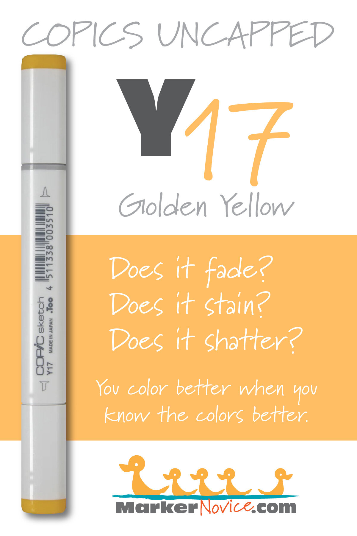
Y17 Golden Yellow
Let’s take a closer look at this Copic Marker and it’s ink characteristics.


Y17 Golden Yellow is a warm yellow Copic Marker which resembles Gamboge watercolor. This ink is a mismatch to other inks in the same color series and not recommended. Y17 is available in Sketch, Ciao, and Classic styles.
Every Copic Marker has unique characteristics based on its unique ink formula.
Knowing how a color behaves will help you blend effectively and make art with confidence.
Y17 Golden Yellow
Let’s take a closer look at this Copic Marker and its ink characteristics.
WARNING: THIS COLOR HAS BEEN MIS-NUMBERED! Y17 is darker than Y18 & Y19 which breaks the Copic numbering pattern! We suspect this marker would be more accurately labeled in the Y30s group! Please read the test results below, especially the Natural Ink Family category for more proof.
Because this ink has been mis-numbered and because the color so closely resembles Y19 and Y38, we do not recommend this marker for purchase. Save this purchase for last and only if you’re compelled to own all 358 Copics.
Temperature: A warm yellow, unlike other members of the same color group (Y-teens)
Resemblance: Gamboge watercolor. (Other members of the Y-Teen family resemble Cadmium Yellow watercolor)
Actual Value: N4. Notice the extreme discrepancy between the actual value and the value indication Y17 on the marker cap! This marker is not as dark as you’d expect!
All Copics are measured on a Neutral Gray value scale. The last number on the cap is supposed to indicate value but we’ve found discrepancies where the actual ink value is different than cap designation.
Cap Accuracy: Close. The plastic cap of a Sketch marker is close to two coats of Y17.
Buildup: Y17 develops an oily or blotchy appearance on the first coat which doesn’t disappear until the color reaches full strength at 4 layers.
Shattering: Does not shatter.
Chromatography testing shows this ink’s behavior when it comes in contact with #0 Colorless Blender (solvent). High shattering colors may leak unexpected color when you make corrections or attempt to blend with any color that has a high solvent to colorant ratio. Shattering is not bad, it’s just something to be aware of.
Staining: Y17 does not stain the paper much. There was a slight yellow tint left after 6 stripes of colorless blender but we think this would disappear with a bit more blender.

Lift: Lifts fairly easily.
See staining swatch. Sample was given 6 stripes of #0 Colorless Blender, drying between each stripe. Results indicate how much lifting you can expect.
Lightfast: Fading was significant, about a 50% fade.
Samples were swatched on X-Press It Blending Card. 1 layer of ink was exposed to windowsill sunlight for 21 days. Approximately 10 hours of sun per day based on weather conditions. Note: we do not recommend displaying original Copic art under these conditions.
Natural Ink Family: WARNING Y17 has been inserted into the Y-Teen family but it doesn’t share the same base ink as Y11 through Y19. Y17 is actually darker and warmer than Y18 and Y19. We think Y17 would be more accurately placed as Y37 because it behaves like a lost member of the more golden Y30 family. The color of Y17 is midway between Y35 and Y38. It even blends better with Y35 than with Y15!
Family Members: Y11, Y13, Y15, Y17*, Y18, Y19
We include this information because many Copic users never think deeper than the letter groupings (R, BV, G, etc.). Every ink has its own temperature variations and underlying flavors. Understanding what an ink looks like in its different dilutions helps when creating your own blending combinations.
Complement: A medium blue violet such as BV04
Underpaint: We suggest V12
This is simply one suggestion. Many possible colors exist. Test to find a color that pleases you.
Pushing Pencil: Prismacolor 1026 Greyed Lavender works wonderfully.
VanillaArts.com (our sister site) teaches a Push & Pull technique for dimensional coloring. This is simply one suggestion. Many possible colors exist. Test to find a color that pleases you.
Vanilla Arts Classes using Y17:
We continue to create new content and classes and we will update here as more become available.
Visit the workshop resource page at our sister site VanillaArts.com for a wide variety of Copic & colored pencil classes.
Vanilla Arts Digi Stamps using Y17:
We continue to create new content and stamps and we will update here as more become available.
Visit the Stamp Shop resource page at our sister site VanillaArts.com for a wide variety of Vanilla Arts stamps.
Color palettes and swatches using Y17:

Looking for beautiful color palettes?
We absolutely love The Color Catalog 1 & 2 from Sarah Renae Clark. It puts hundreds of Copic friendly color palettes at your fingertips.
(note: affiliate link)


RV21 Light Pink: Copics Uncapped (Marker Swatch, Ink Testing)
RV21 Light Pink
Let’s take a closer look at this Copic Marker and it’s ink characteristics.

RV21 Light Pink is a classic light magenta Copic Marker which mimics diluted Alizarin Crimson watercolor. Ideal for coloring florals, spring images, Valentine’s Day, and highlighting deep pink projects. RV21 is available in Copic Sketch, Ciao, and Classic marker styles.
Every Copic Marker has unique characteristics based on its unique ink formula.
Knowing how a color behaves will help you blend effectively and make art with confidence.
RV21 Light Pink
Let’s take a closer look at this Copic Marker and its ink characteristics.
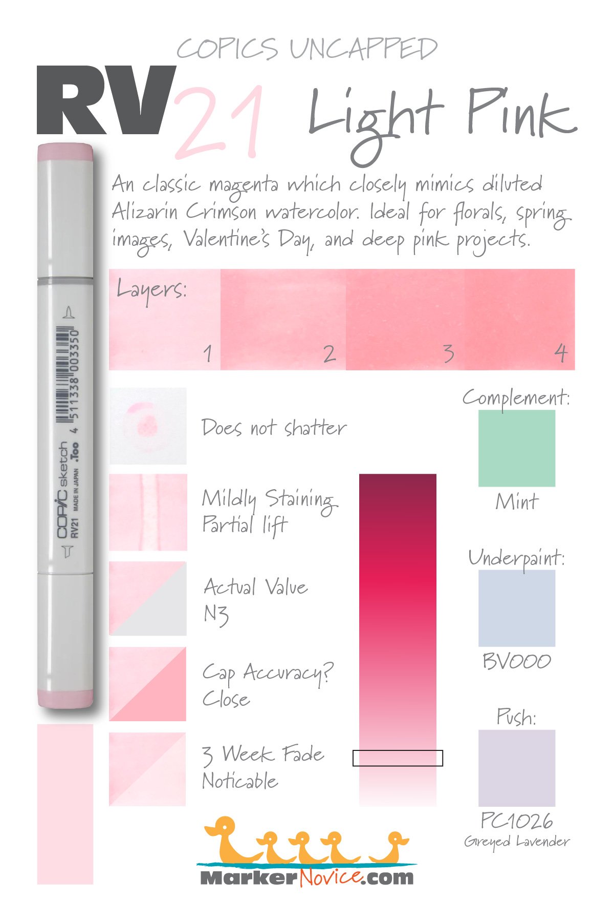
Temperature: A classic neutral magenta.
Resemblance: diluted Alizarin Crimson watercolor.
Actual Value: N3.
All Copics are measured on a Neutral Gray value scale. The last number on the cap is supposed to indicate value but we’ve found discrepancies where the actual ink value is different than cap designation.
Cap Accuracy: Close. The plastic on a Sketch marker matches the color of two coats of RV21.
Buildup: This color layers beautifully up to 3 coats; exercise caution above this as the color begins to look excessively oily. Reaches maximum value at 3 layers.
Shattering: Does not shatter.
Chromatography testing shows this ink’s behavior when it comes in contact with #0 Colorless Blender (solvent). High shattering colors may leak unexpected color when you make corrections or attempt to blend with any color that has a high solvent to colorant ratio. Shattering is not bad, it’s just something to be aware of.

Staining: Mildly staining.
Lift: Partial lifting. We were able to remove most of the pink colorant but the paper was left with a noticeable yellowish stain.
See staining swatch. Sample was given 6 stripes of #0 Colorless Blender, drying between each stripe. Results indicate how much lifting you can expect.
Lightfast: This color faded by about 50%.
Samples were swatched on X-Press It Blending Card. 1 layer of ink was exposed to windowsill sunlight for 21 days. Approximately 10 hours of sun per day based on weather conditions. Note: we do not recommend displaying original Copic art under these conditions.
Natural Ink Family: RV21 is the lightest member of the RV-Twenty family. RV29 is the darkest version.
Family Members: RV21, RV23, RV25, and RV29
We include this information because many Copic users never think deeper than the letter groupings (R, BV, G, etc.). Every ink has its own temperature variations and underlying flavors. Understanding what an ink looks like in its different dilutions helps when creating your own blending combinations.
Complement: A light mint green like G00
Underpaint: We suggest BV000
This is simply one suggestion. Many possible colors exist. Test to find a color that pleases you.
Pushing Pencil: PC1026 Grayed Lavender used with a light touch looks really good. If you use too much pressure, the area turns too purple.
VanillaArts.com (our sister site) teaches a Push & Pull technique for dimensional coloring. This is simply one suggestion. Many possible colors exist. Test to find a color that pleases you.
Vanilla Arts Classes using RV21:
We continue to create new content and classes and we will update here as more become available.
Visit the workshop resource page at our sister site VanillaArts.com for a wide variety of Copic classes.
Vanilla Arts Digi Stamps using RV21:
We continue to create new content and stamps and we will update here as more become available.
Visit the stamp shop page at our sister site VanillaArts.com for a wide variety of Copic classes.
Color palettes and swatches using RV21:
We are building our palette and swatch collection a little more each week and will update here as more become available.
Visit the color resource page at our sister site VanillaArts.com for a wide variety of Copic palettes and swatches.
Looking for beautiful color palettes?
We absolutely love The Color Catalog 1 & 2 from Sarah Renae Clark. It puts hundreds of Copic friendly color palettes at your fingertips.
(note: affiliate link)

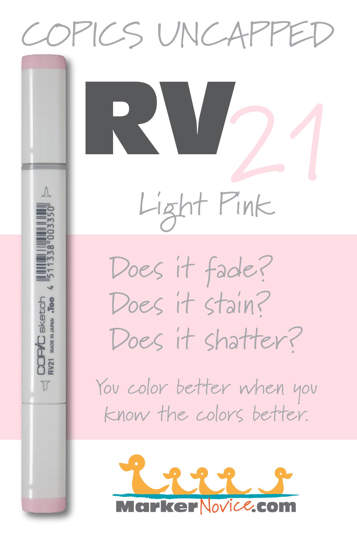
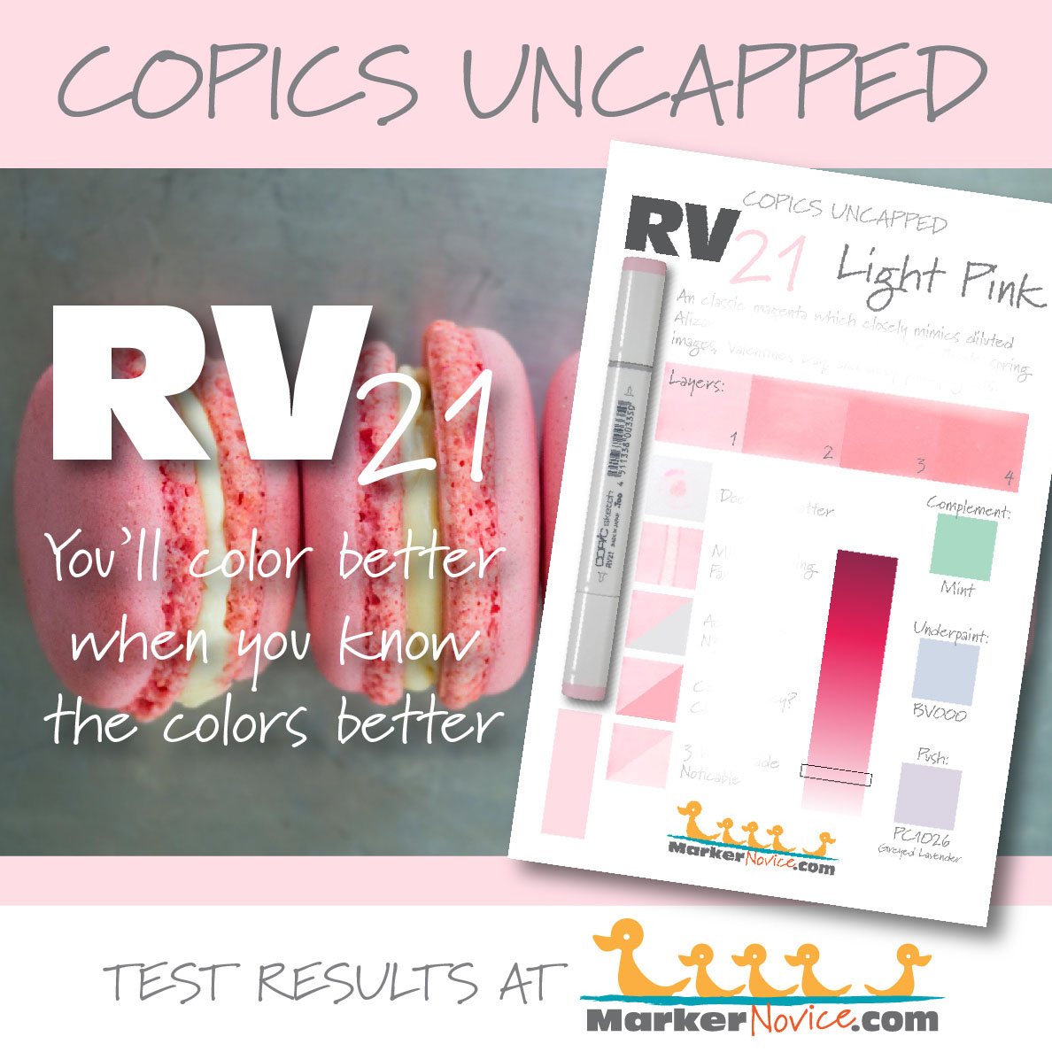

V17 Amethyst: Copics Uncapped (Marker Swatch, Ink Testing)
V17 Amethyst
Let’s take a closer look at this Copic Marker and it’s ink characteristics.


V17 Amethyst is a medium violet Copic Marker which mimics Ultramarine Violet watercolor. An easy blending marker; a recommended first purchase with V15. Great for general coloring. is available in Copic Sketch, Ciao, and Classic marker styles.
Every Copic Marker has unique characteristics based on its unique ink formula.
Knowing how a color behaves will help you blend effectively and make art with confidence.
V17 Amethyst
Let’s take a closer look at this Copic Marker and it’s ink characteristics.
Temperature: A warm violet.
Resemblance: Ultramarine Violet watercolor.
Actual Value: N6
All Copics are measured on a Neutral Gray value scale. The last number on the cap is supposed to indicate value but we’ve found discrepancies where the actual ink value is different than cap designation.
Cap Accuracy: Close. The plastic end of a Sketch Marker is close to thre layers of V17 ink color.
Buildup: V17 can look oily or blotchy at 2 layers. Reaches maximum color at 4 layers.
Shattering: Shatters easily into a violet with pink leakage.
Chromatography testing shows this ink’s behavior when it comes in contact with #0 Colorless Blender (solvent). High shattering colors may leak unexpected color when you make corrections or attempt to blend with any color that has a high solvent to colorant ratio. Shattering is not bad, it’s just something to be aware of.

Staining: Leaves an odd bluish stain to the paper.
Lift: Stubborn. Does not lift easily.
See staining swatch. Sample was given 6 stripes of #0 Colorless Blender, drying between each stripe. Results indicate how much lifting you can expect.
Lightfast: This color faded by about 5-10% during the test period.
Samples were swatched on X-Press It Blending Card. 1 layer of ink was exposed to windowsill sunlight for 21 days. Approximately 10 hours of sun per day based on weather conditions. Note: we do not recommend displaying original Copic art under these conditions.
Natural Ink Family: V17 is at the dark of the V-Teen family.
Family Members: V12, V15, V17
We include this information because many Copic users never think deeper than the letter groupings (R, BV, G, etc.). Every ink has its own temperature variations and underlying flavors. Understanding what an ink looks like in its different dilutions helps when creating your own blending combinations.
Complement: We suggest a traditional green like G16
Underpaint: N5 neutralizes this color well.
This is simply one suggestion. Many possible colors exist. Test to find a color that pleases you.
Pushing Pencil: Prismacolor 132 Dioxazine Purple Hue pushes this color well but use a light touch.
VanillaArts.com (our sister site) teaches a Push & Pull technique for dimensional coloring. This is simply one suggestion. Many possible colors exist. Test to find a color that pleases you.
Vanilla Arts Classes using V17:

Copperbanded Butterflyfish: Amy explores the difference between pattern and texture. Find more info here.

Ink & Hydrangea: Amy shows you the theory behind color shifting for depth and the use of temperature to indicate distance. Find more info here.
Vanilla Arts Digi Stamps using V17:

Color palettes and swatches using V17:


Looking for beautiful color palettes?
We absolutely love The Color Catalog 1 & 2 from Sarah Renae Clark. It puts hundreds of Copic friendly color palettes at your fingertips.
(note: affiliate link)

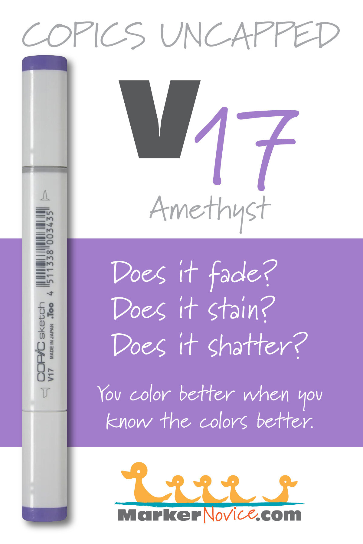


E35 Chamois: Copics Uncapped (Marker Swatch, Ink Testing)
E35 Chamois
Let’s take a closer look at this Copic Marker and it’s ink characteristics.
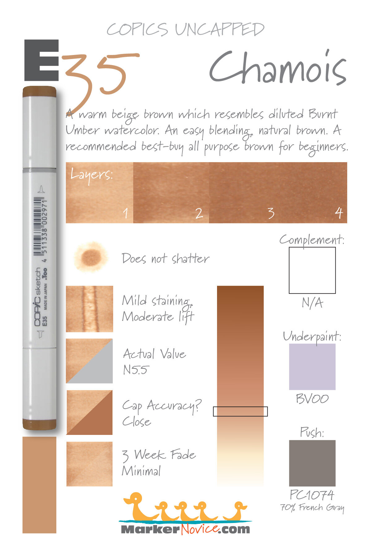

E35 Chamois is a warm beige brown Copic Marker which resembles diluted Burnt Umber watercolor. An easy blending, natural brown. A recommended best buy for beginners. E35 is available in Copic Sketch, Ciao, and Classic marker styles.
Every Copic Marker has unique characteristics based on its unique ink formula.
Knowing how a color behaves will help you blend effectively and make art with confidence.
E35 Chamois
Let’s take a closer look at this Copic Marker and its ink characteristics.
Temperature: A warm beige brown.
Resemblance: Diluted Burnt Umber watercolor
Actual Value: N5.5
All Copics are measured on a Neutral Gray value scale. The last number on the cap is supposed to indicate value but we’ve found discrepancies where the actual ink value is different than cap designation.
Cap Accuracy: Close. The plastic on a Sketch marker matches 3 coats of E35 ink.
Buildup: E35 layers well and builds to maximum value at 3 layers.
Shattering: Does not shatter.
Chromatography testing shows this ink’s behavior when it comes in contact with #0 Colorless Blender (solvent). High shattering colors may leak unexpected color when you make corrections or attempt to blend with any color that has a high solvent to colorant ratio. Shattering is not bad, it’s just something to be aware of.
Staining: Stains the paper with a slight bit of yellow which doesn’t seem to fully move.

Lift: You can lift some of this color but the paper remains stained.
See staining swatch. Sample was given 6 stripes of #0 Colorless Blender, drying between each stripe. Results indicate how much lifting you can expect.
Lightfast: We observed very minor fading during the test period.
Samples were swatched on X-Press It Blending Card. 1 layer of ink was exposed to windowsill sunlight for 21 days. Approximately 10 hours of sun per day based on weather conditions. Note: we do not recommend displaying original Copic art under these conditions.
Natural Ink Family: E35 is in the middle of the E-Thirty family. This family of browns feel warmer as the color gets darker.
Family Members: E30, E31, E33. E34, E35, E37, and E39
We include this information because many Copic users never think deeper than the letter groupings (R, BV, G, etc.). Every ink has its own temperature variations and underlying flavors. Understanding what an ink looks like in its different dilutions helps when creating your own blending combinations.
Complement: Brown is not a hue on the color wheel and does not have a complement.
Underpaint: BV00 neutralizes this color well.
This is simply one suggestion. Many possible colors exist. Test to find a color that pleases you.
Pushing Pencil: Prismacolor 1074 70% French Grey pushes this color nicely.
VanillaArts.com (our sister site) teaches a Push & Pull technique for dimensional coloring. This is simply one suggestion. Many possible colors exist. Test to find a color that pleases you.
Vanilla Arts Classes using E35:
Expressive Sunflowers: a revolutionary lesson on dimension, introducing the concept of color sculpting. Learn to use your chisel nib to color sculpt. Find more info here.

Robin’s Nest: A lesson on building up realistic texture using freehand strokes. Find more info here.

Chocolate Box: Amy shows you how to create darker colors than Copic makes, essential to creating realistic deep dark areas. Find more info here.
Vanilla Arts Digi Stamps using E35:
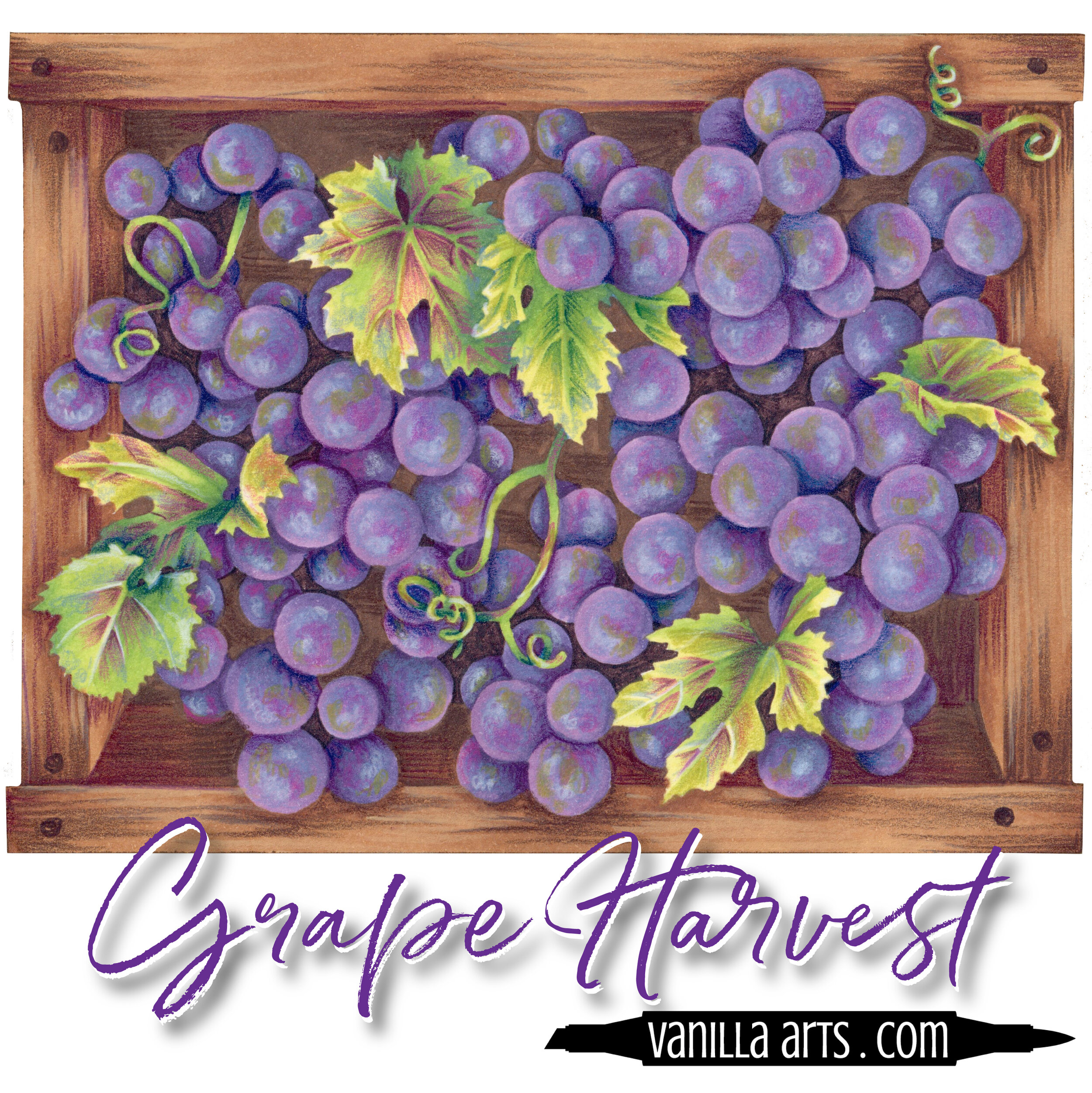
Color palettes and swatches using E35:
We are building our palette and swatch collection a little more each week and will update here as more become available.
Visit the color resource page at our sister site VanillaArts.com for a wide variety of Copic palettes and swatches.
Looking for beautiful color palettes?
We absolutely love The Color Catalog 1 & 2 from Sarah Renae Clark. It puts hundreds of Copic friendly color palettes at your fingertips.
(note: affiliate link)


C10 Cool Gray No. 10: Copics Uncapped (Marker Swatch, Ink Testing)
C10 Cool Gray No. 10
Let’s take a closer look at this Copic Marker and it’s ink characteristics.

C10 Cool Gray #10 is a cool gray Copic Marker mimics Neutral Tint watercolor. This color is useful as a base color, underpaint, or in blending combinations. C10 is only available in Copic Sketch and Classic marker styles.
Every Copic Marker has unique characteristics based on its unique ink formula.
Knowing how a color behaves will help you blend effectively and make art with confidence.
C10 Cool Gray No. 10
Let’s take a closer look at this Copic Marker and its ink characteristics.
Temperature: A cool gray
Resemblance: Neutral Tint watercolor
Actual Value: N10.5
All Copics are measured on a Neutral Gray value scale. The last number on the cap is supposed to indicate value but we’ve found discrepancies where the actual ink value is different than cap designation.
Cap Accuracy: Close. The plastic end of a Sketch Marker matches 2 coats of C10.
Buildup: C10 reaches maximum color at 4 layers but starts to gather an oily appearance at 2 layers.
Shattering: Shatters into dark gray with blue and yellow leakage around the margins.
Chromatography testing shows this ink’s behavior when it comes in contact with #0 Colorless Blender (solvent). High shattering colors may leak unexpected color when you make corrections or attempt to blend with any color that has a high solvent to colorant ratio. Shattering is not bad, it’s just something to be aware of.
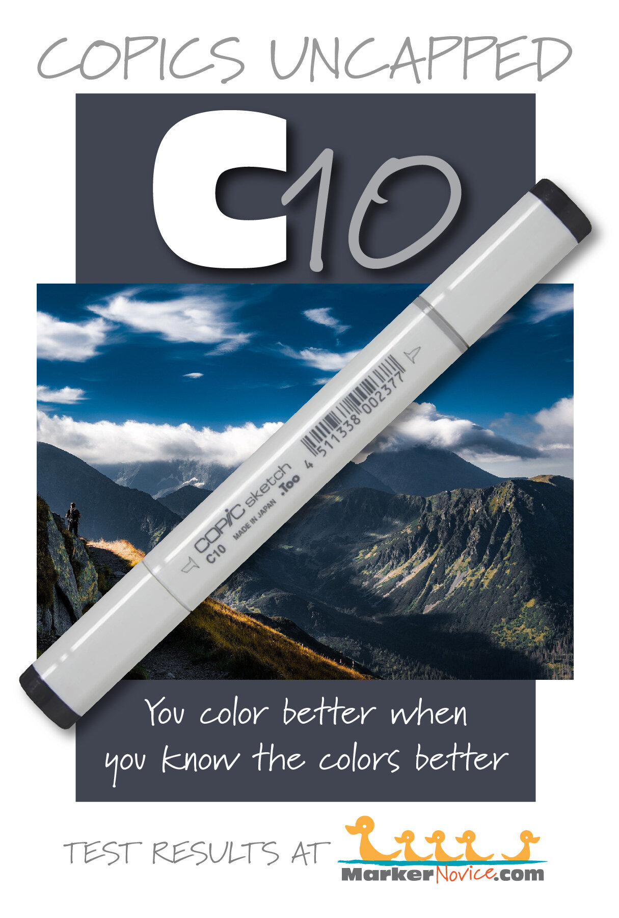
Staining: C10 stains the paper with a dark gray tint.
Lift: C10 does not lift.
See staining swatch. Sample was given 6 stripes of #0 Colorless Blender, drying between each stripe. Results indicate how much lifting you can expect.
Lightfast: C10 faded about 5% during the testing period and we would expect this to continue at a faster pace with extended testing.
Samples were swatched on X-Press It Blending Card. 1 layer of ink was exposed to windowsill sunlight for 21 days. Approximately 10 hours of sun per day based on weather conditions. Note: we do not recommend displaying original Copic art under these conditions.
Natural Ink Family: C10 is a slightly diluted version of Black 100.
Family Members: C10, C9, C8, C7, C6, C5, C4, C3, C2, C1, C0, C00
We include this information because many Copic users never think deeper than the letter groupings (R, BV, G, etc.). Every ink has its own temperature variations and underlying flavors. Understanding what an ink looks like in its different dilutions helps when creating your own blending combinations.
Complement: N/A
Underpaint: N/A
Pushing Pencil: We suggest Prismacolor 935 Black
VanillaArts.com (our sister site) teaches a Push & Pull technique for dimensional coloring. This is simply one suggestion. Many possible colors exist. Test to find a color that pleases you.
Vanilla Arts Classes using C10:
We continue to create new content and classes and we will update here as more become available.
Visit the workshop resource page at our sister site VanillaArts.com for a wide variety of Copic classes.
Vanilla Arts Digi Stamps using C10:
We continue to create new content and stamps and we will update here as more become available.
Visit the Stamp Shop resource page at our sister site VanillaArts.com for a wide variety of Vanilla Arts stamps.
Color palettes and swatches using C10:
We are building our palette and swatch collection a little more each week and will update here as more become available.
Visit the color resource page at our sister site VanillaArts.com for a wide variety of Copic palettes and swatches.
Looking for beautiful color palettes?
We absolutely love The Color Catalog 1 & 2 from Sarah Renae Clark. It puts hundreds of Copic friendly color palettes at your fingertips.
(note: affiliate link)


B21 Baby Blue: Copics Uncapped (Marker Swatch, Ink Testing)
B21 Baby Blue
Let’s take a closer look at this Copic Marker and it’s ink characteristics.
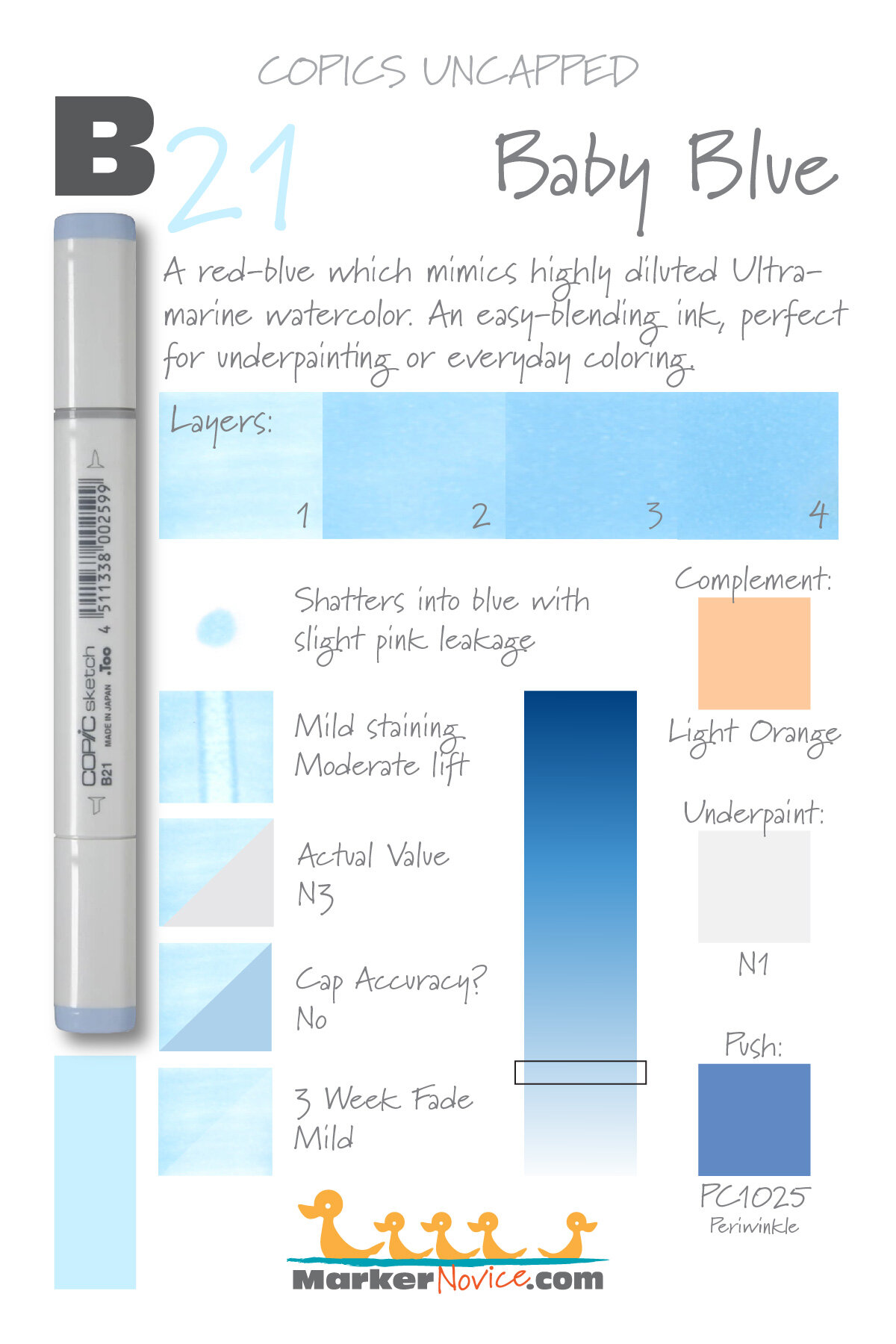

B21 Baby Blue is a light red-blue Copic Marker which mimics highly diluted Ultramarine Blue watercolor. This is an easy-blending ink, perfect for underpainting or everyday coloring. B21 is only available in Copic Sketch and Classic marker styles.
Every Copic Marker has unique characteristics based on its unique ink formula.
Knowing how a color behaves will help you blend effectively and make art with confidence.
B21 Baby Blue
Let’s take a closer look at this Copic Marker and its ink characteristics.
Temperature: A slightly reddish blue.
Resemblance: Diluted Ultramarine Blue watercolor.
Actual Value: N3
All Copics are measured on a Neutral Gray value scale. The last number on the cap is supposed to indicate value but we’ve found discrepancies where the actual ink value is different than cap designation.
Cap Accuracy: The plastic on a Sketch marker is darker and more neutralized than B21 ink.
Buildup: B21 begins to look oily at more than 2 layers. The ink reaches maximum color at 3-4 layers.
Shattering: Mild shattering into blue with a pale pink leakage on the edge.
Chromatography testing shows this ink’s behavior when it comes in contact with #0 Colorless Blender (solvent). High shattering colors may leak unexpected color when you make corrections or attempt to blend with any color that has a high solvent to colorant ratio. Shattering is not bad, it’s just something to be aware of.

Staining: B21 stains the paper with a slightly yellow cast.
Lift: This color lifts because it’s fairly light to begin with.
See staining swatch. Sample was given 6 stripes of #0 Colorless Blender, drying between each stripe. Results indicate how much lifting you can expect.
Lightfast: Faded by about 5%.
Samples were swatched on X-Press It Blending Card. 1 layer of ink was exposed to windowsill sunlight for 21 days. Approximately 10 hours of sun per day based on weather conditions. Note: we do not recommend displaying original Copic art under these conditions.
Natural Ink Family: B21 is at the light end of the B-Twenty family. This is a popular marker family and a good investment for your first blue blends.
Family Members: B21, B23, B24, B26, B28, B29
We include this information because many Copic users never think deeper than the letter groupings (R, BV, G, etc.). Every ink has its own temperature variations and underlying flavors. Understanding what an ink looks like in its different dilutions helps when creating your own blending combinations.
Complement: A soft orange. We suggest YR01
Underpaint: We suggest N1
This is simply one suggestion. Many possible colors exist. Test to find a color that pleases you.
Pushing Pencil: Prismacolor 1025 Periwinkle pushes this color nicely with a pleasant cool temperature.
VanillaArts.com (our sister site) teaches a Push & Pull technique for dimensional coloring. This is simply one suggestion. Many possible colors exist. Test to find a color that pleases you.
Vanilla Arts Classes using B21:
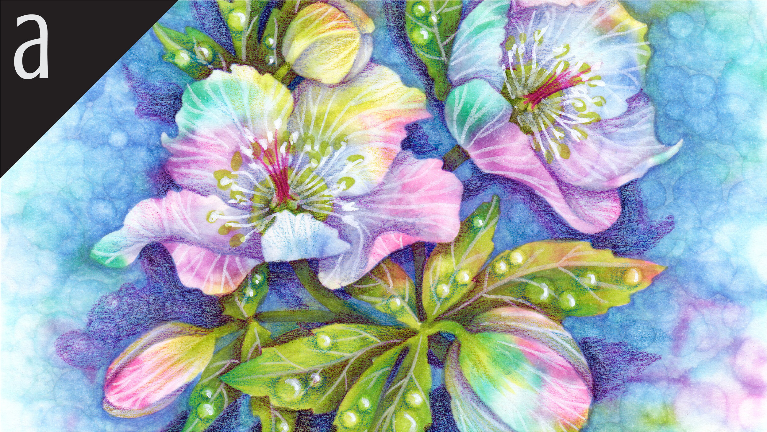
Spring Rain: a challenge level lesson which forces you out of your comfort zone. Celebrate the shape instead of the object with an introduction to negative painting. Find more info here.
Vanilla Arts Digi Stamps using B21:
We continue to create new content and stamps and we will update here as more become available.
Visit the stamp shop page at our sister site VanillaArts.com for a wide variety of digi stamps.
Color palettes and swatches using B21:

Looking for beautiful color palettes?
We absolutely love The Color Catalog 1 & 2 from Sarah Renae Clark. It puts hundreds of Copic friendly color palettes at your fingertips.
(note: affiliate link)


G29 Pine Tree Green: Copics Uncapped (Marker Swatch, Ink Testing)
G29 Pine Tree Green
Let’s take a closer look at this Copic Marker and it’s ink characteristics.

G29 Pine Tree Green is an organic, balanced green Copic Marker which closely resembles Hooker’s Green watercolor. This is a lovely green for trees, leaves, landscapes, and holiday images. G29 is available in Copic Ciao, Sketch, and Classic marker styles.
Every Copic Marker has unique characteristics based on its unique ink formula.
Knowing how a color behaves will help you blend effectively and make art with confidence.
G29 Pine Tree Green
Let’s take a closer look at this Copic Marker and its ink characteristics.
Temperature: A slightly blueish but otherwise balanced green.
Resemblance: Hooker’s Green watercolor.
Actual Value: N8
All Copics are measured on a Neutral Gray value scale. The last number on the cap is supposed to indicate value but we’ve found discrepancies where the actual ink value is different than cap designation.
Cap Accuracy: No. The colored plastic on the Sketch cap is closer to four coats of G29 and the plastic is more vibrant and saturated than G29 ink.
Buildup: Exercise caution! G29 looks patchy and oily with just one coat. It reaches maximum value at 5 layers.
Shattering: Shatters into green with strong golden yellow ink at the margins.
Chromatography testing shows this ink’s behavior when it comes in contact with #0 Colorless Blender (solvent). High shattering colors may leak unexpected color when you make corrections or attempt to blend with any color that has a high solvent to colorant ratio. Shattering is not bad, it’s just something to be aware of.

Staining: G29 is a staining color and left the paper with a definite blue tint.
Lift: This color is stubborn and does not lift well.
See staining swatch. Sample was given 6 stripes of #0 Colorless Blender, drying between each stripe. Results indicate how much lifting you can expect.
Lightfast: G29 was surprisingly lightfast. We saw just a faint amount of fading during the 3 week test.
Samples were swatched on X-Press It Blending Card. 1 layer of ink was exposed to windowsill sunlight for 21 days. Approximately 10 hours of sun per day based on weather conditions. Note: we do not recommend displaying original Copic art under these conditions.
Natural Ink Family: G29 sits at the dark end of the G-Twenty family. The markers in this family are all quite pretty but each one has odd characteristics and idiosyncrasies.
Family Members: G29, G28, G24, G21, G20
We include this information because many Copic users never think deeper than the letter groupings (R, BV, G, etc.). Every ink has its own temperature variations and underlying flavors. Understanding what an ink looks like in its different dilutions helps when creating your own blending combinations.
Complement: Magenta pinks like RV17
Underpaint: We suggest V06
This is simply one suggestion. Many possible colors exist. Test to find a color that pleases you.
Pushing Pencil: Prismacolor 931 Dark Purple works very well.
VanillaArts.com (our sister site) teaches a Push & Pull technique for dimensional coloring. This is simply one suggestion. Many possible colors exist. Test to find a color that pleases you.
Vanilla Arts Classes using G29:

Gray Matter: Amy explores underpainting, a technique that increases the realism in colored images. Find more info here.
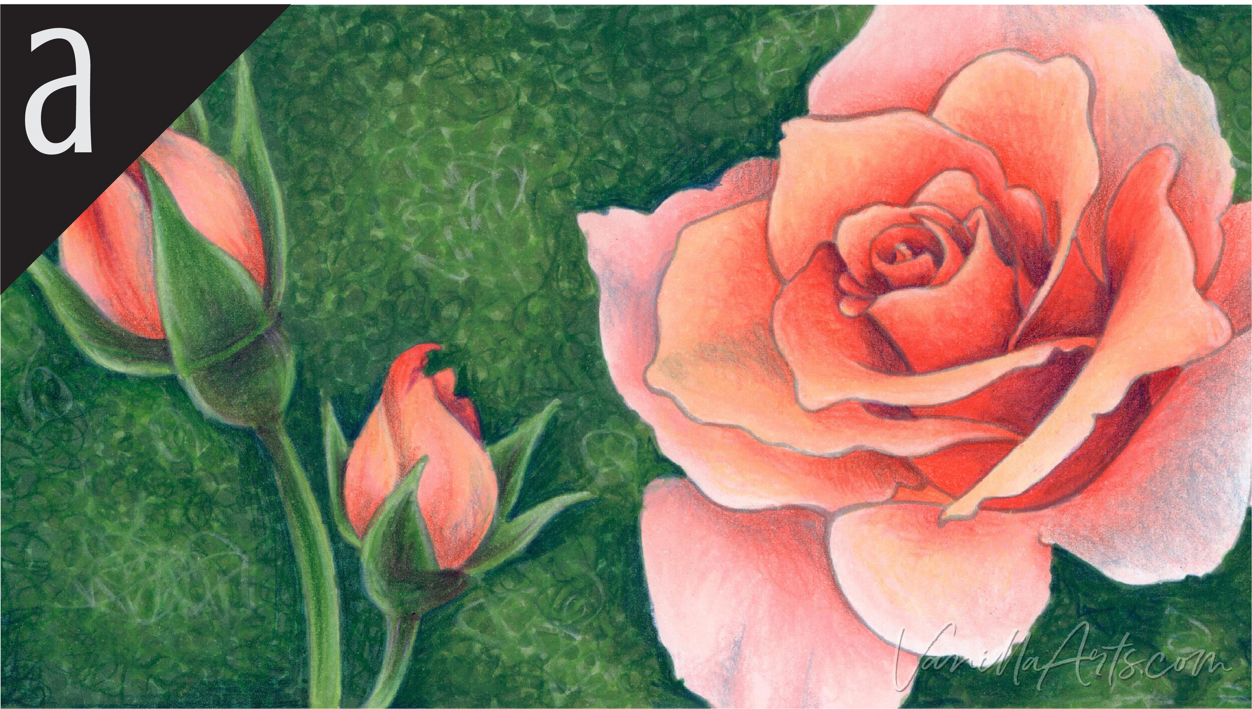
Peach Rose: A lesson on drawing greater inspiration from photo references. Learn how to better see what's in the photograph and to translate that into marker and pencil coloring. Find more info here.

Ink & Hydrangea: Amy shows you the theory behind color shifting for depth and the use of temperature to indicate distance. Find more info here.
Vanilla Arts Digi Stamps using G29:
We continue to create new content and stamps and we will update here as more become available.
Visit the stamp shop page at our sister site VanillaArts.com for a wide variety of digi stamps.
Color palettes and swatches using G29:

Looking for beautiful color palettes?
We absolutely love The Color Catalog 1 & 2 from Sarah Renae Clark. It puts hundreds of Copic friendly color palettes at your fingertips.
(note: affiliate link)

