BG13 Mint Green: Copics Uncapped (Marker Swatch, Ink Testing)
BG13 Mint Green
Let’s take a closer look at this Copic Marker and its ink characteristics.
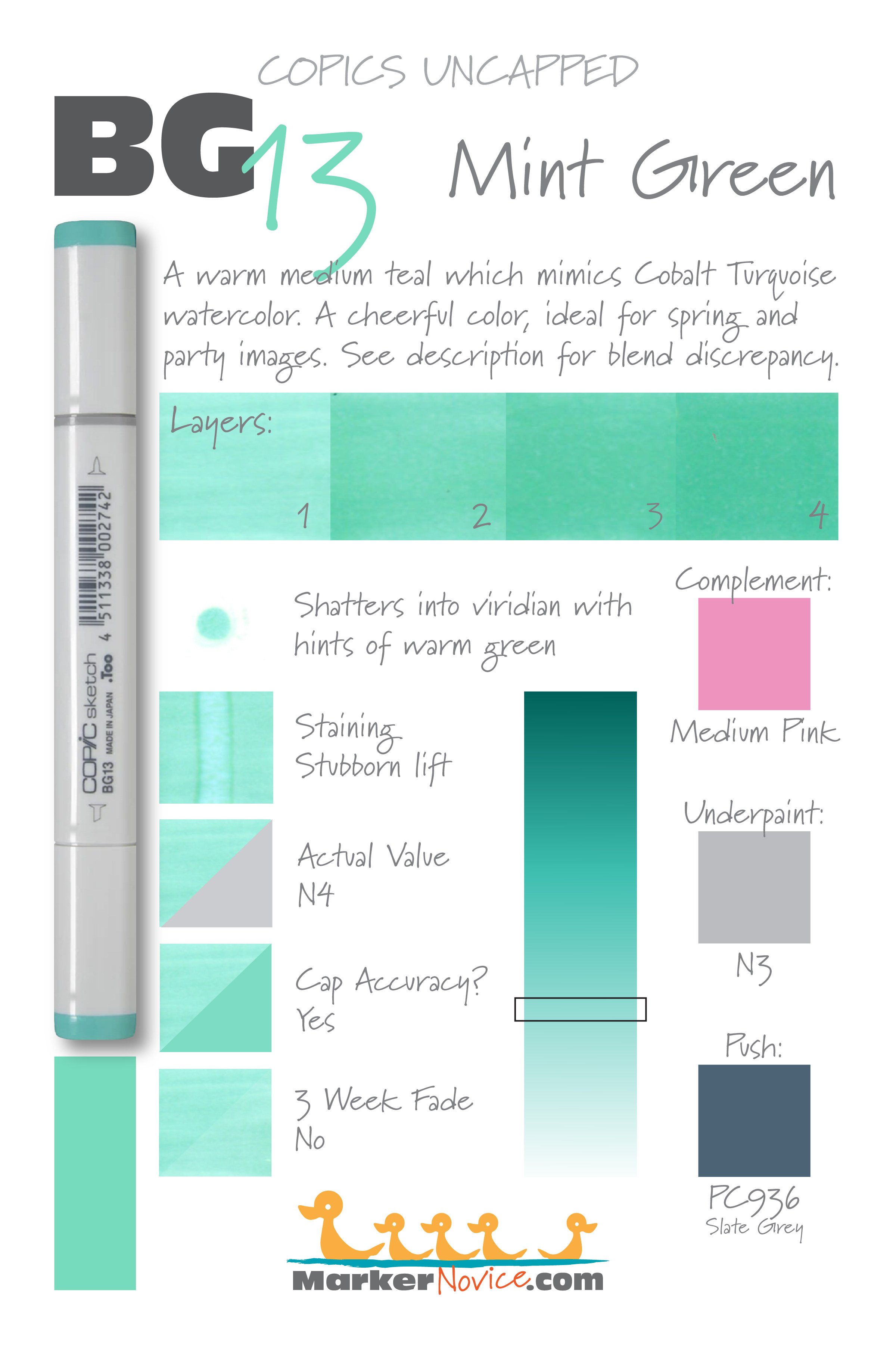

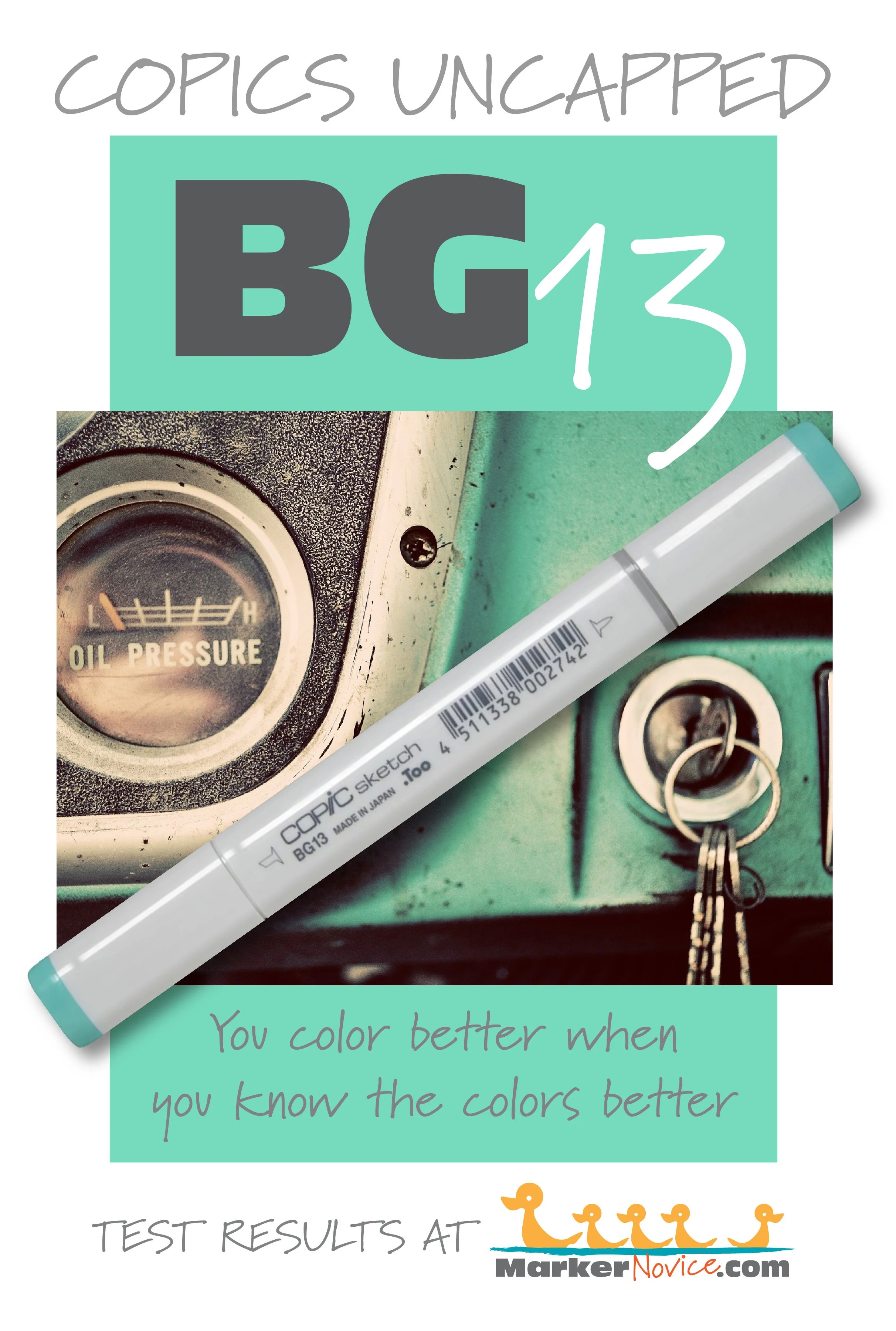
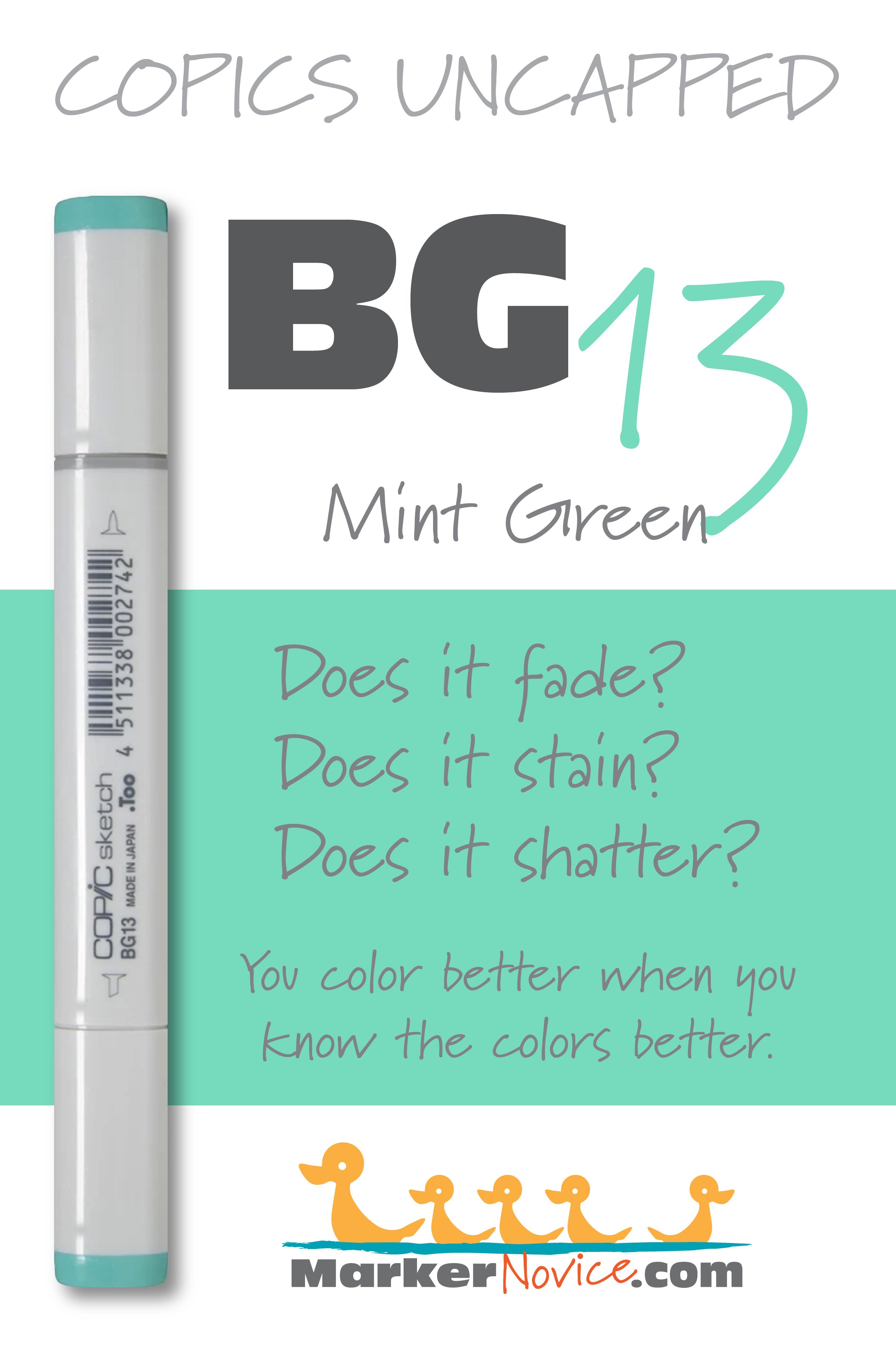
BG13 Mint Green is a warm medium teal Copic Marker which mimics Cobalt Turquoise watercolor. A cheerful color, ideal for spring and party images. BG13 is available in Copic Sketch, Ciao, and Classic marker styles.
Every Copic Marker has unique characteristics based on its unique ink formula.
Knowing how a color behaves will help you blend effectively and make art with confidence.
BG13 Mint Green
Let’s take a closer look at this Copic Marker and its ink characteristics.
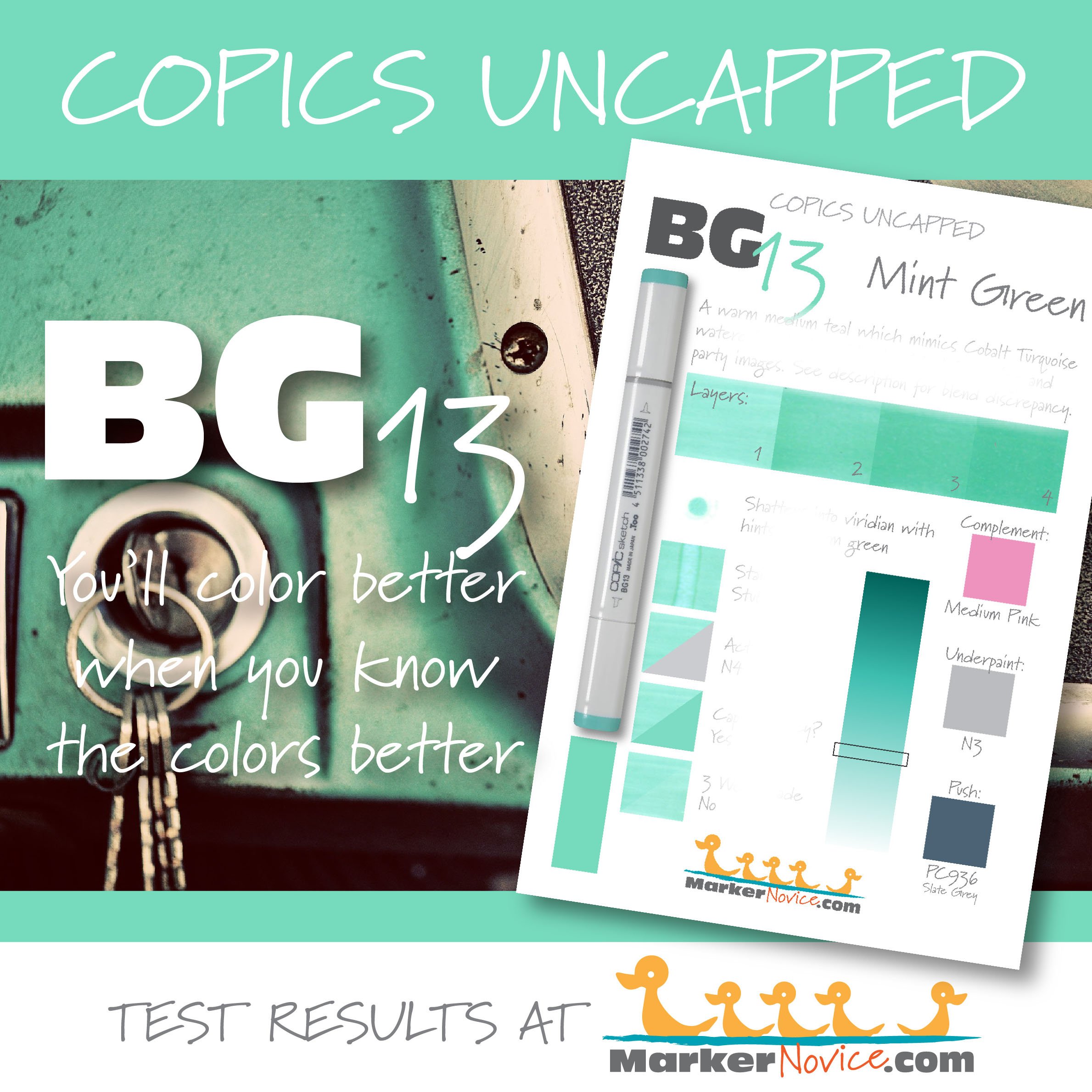
Temperature: A warm, medium teal.
Resemblance: Cobalt Turquoise watercolor.
Actual Value: N4 (please read the Natural Ink Family info below for a blending warning)
All Copics are measured on a Neutral Gray value scale. The last number on the cap is supposed to indicate value but we’ve found discrepancies where the actual ink value is different than cap designation.
Cap Accuracy: The plastic on a Sketch marker accurately resembles 1-2 coats of BG13 ink.
Buildup: BG13 layers well and reaches maximum value at 3 coats.
Shattering: Shatters into viridian with hints of warm greenish gold leakage. We also noted that at 4 layers of ink, we saw this golden color around the outer edges of the sample.
Chromatography testing shows this ink’s behavior when it comes in contact with #0 Colorless Blender (solvent). High shattering colors may leak unexpected color when you make corrections or attempt to blend with any color that has a high solvent to colorant ratio. Shattering is not bad, it’s just something to be aware of.
Staining: BG13 is a staining color.
Lift: BG13 can be lightened slightly but the paper remains a light blue color and the edges of the lifted area look noticeably green.
See staining swatch. Sample was given 6 stripes of #0 Colorless Blender, drying between each stripe. Results indicate how much lifting you can expect.
Lightfast: Our swatch did not fade at all during the test period.
Samples were swatched on X-Press It Blending Card. 1 layer of ink was exposed to windowsill sunlight for 21 days. Approximately 10 hours of sun per day based on weather conditions. Note: we do not recommend displaying original Copic art under these conditions.
Natural Ink Family: BG13 is in the middle of of the BG-Teen family. To be honest, this group feels like semi-related markers which have been mashed together into a single family. BG10 and 11 are close but related while BG13 and BG15 glow. Then BG18 has a bit of murkiness to it.
WARNING: In keeping with our theory that the BG-Teens are only semi-related, please notice that both BG13 and BG15 measure a value of 4. If BG13 was truly a dilution of BG15, they would not measure as the same value. This causes a lot of confusion when users try to color blending combinations such as BG11-BG13-BG15 or BG13-BG15-BG18, only to find that they do not create the expected light-medium-dark effect. It’s not your eyes, these markers are misnumbered and not related!
Family Members: BG18, BG15, BG13, BG11, BG10
We include this information because many Copic users never think deeper than the letter groupings (R, BV, G, etc.). Every ink has its own temperature variations and underlying flavors. Understanding what an ink looks like in its different dilutions helps when creating your own blending combinations.
Complement: A pale pink like RV00
Underpaint: We suggest underpainting with soft gray like N3
This is simply one suggestion. Many possible colors exist. Test to find a color that pleases you.
Pushing Pencil: Prismacolor 936 Slate Grey is perfect for pushing BG11 if used with an extremely light touch.
VanillaArts.com (our sister site) teaches a Push & Pull technique for dimensional coloring. This is simply one suggestion. Many possible colors exist. Test to find a color that pleases you.
Vanilla Arts Classes using BG13:
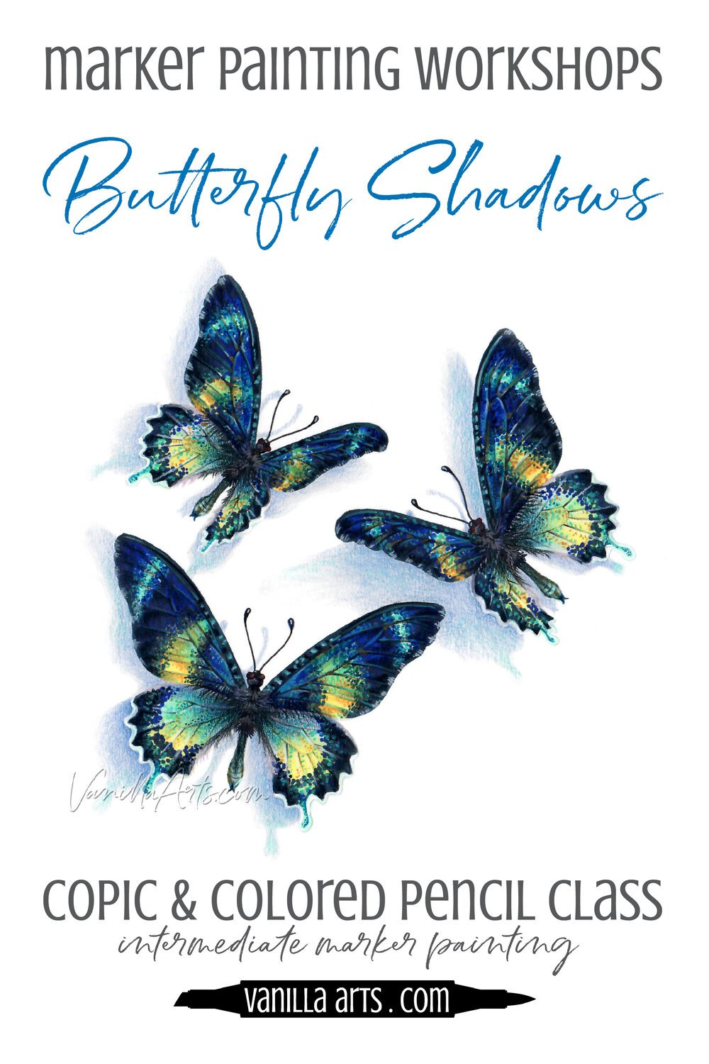

Vanilla Arts Digi Stamps using BG13:


Color palettes and swatches using BG13:
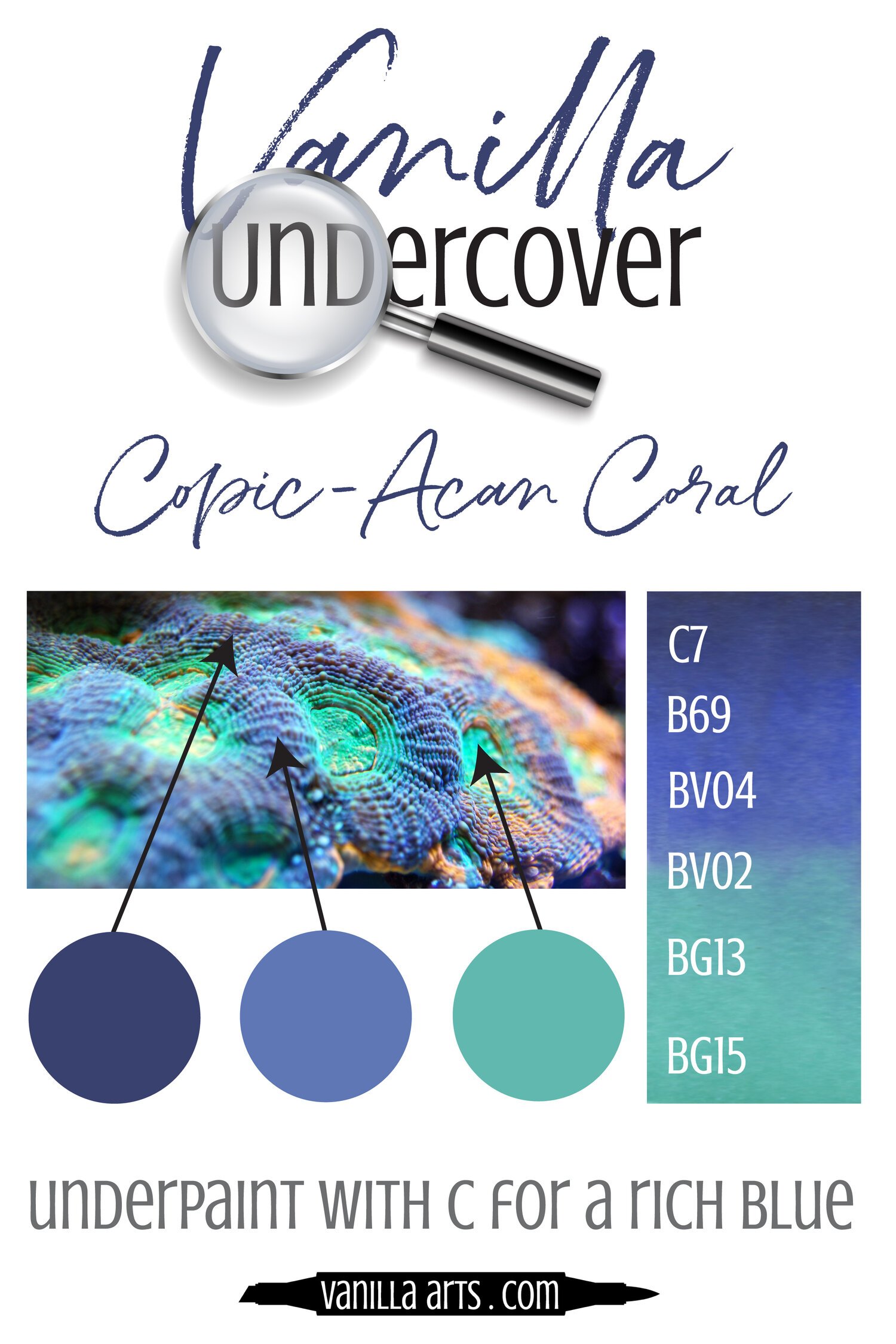
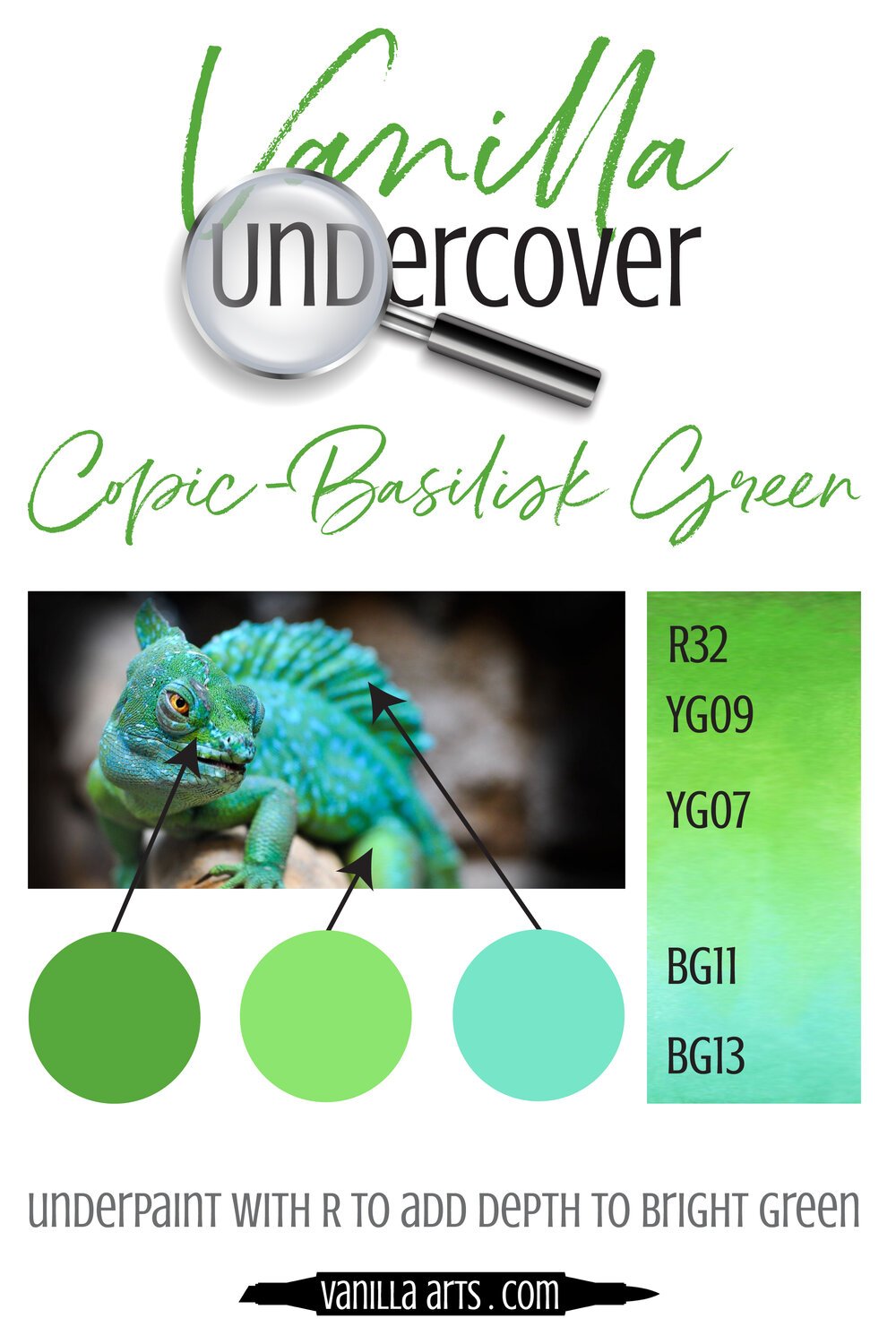
Looking for beautiful color palettes?
We absolutely love The Color Catalog 1 & 2 from Sarah Renae Clark. It puts hundreds of Copic friendly color palettes at your fingertips.
(note: affiliate link)













N5 Neutral Gray No. 5: Copics Uncapped (Marker Swatch, Ink Testing)
N5 Neutral Gray No. 5
Let’s take a closer look at this Copic Marker and it’s ink characteristics.

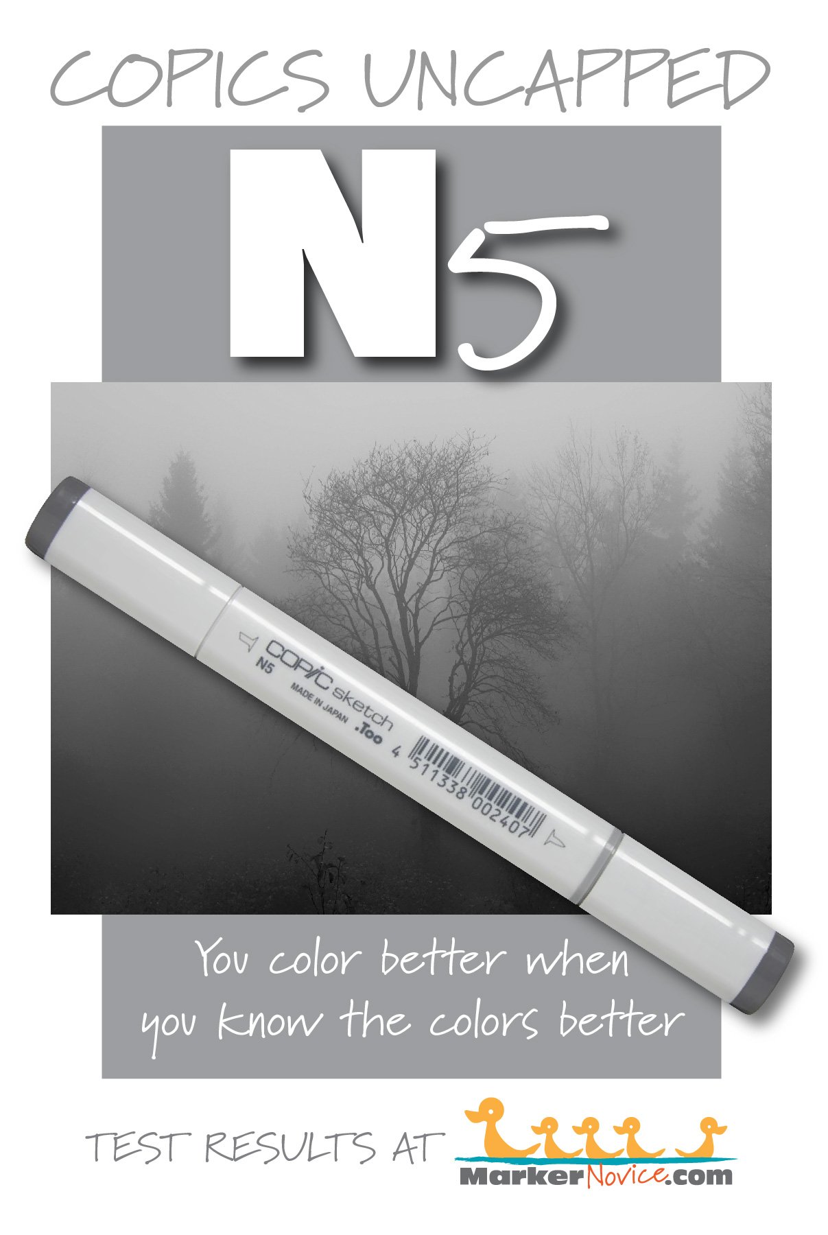
N5 Neutral Gray #5 is a balanced gray Copic Marker mimics Lamp Black watercolor. We highly recommend purchasing N grays as your first gray markers because of their usefulness and versatility. N5 is only available in Sketch and Classic Copic styles.
Every Copic Marker has unique characteristics based on its unique ink formula.
Knowing how a color behaves will help you blend effectively and make art with confidence.
N5 Neutral Gray No. 5
Let’s take a closer look at this Copic Marker and its ink characteristics.
Temperature: A balanced gray, neither warm nor cool
Resemblance: Lamp Black watercolor
Actual Value: N5 (All Copic N grays match their true value. N is the only family where this is true.)
All Copics are measured on a Neutral Gray value scale. The last number on the cap is supposed to indicate value but we’ve found discrepancies where the actual ink value is different than cap designation.
Cap Accuracy: It’s close. The plastic end of a Sketch Marker matches 2 coats of N5 ink.
Buildup: N5 reaches maximum color at 4 layers and starts to gather an oily appearance with the first layer.
Shattering: Does not shatter.
Chromatography testing shows this ink’s behavior when it comes in contact with #0 Colorless Blender (solvent). High shattering colors may leak unexpected color when you make corrections or attempt to blend with any color that has a high solvent to colorant ratio. Shattering is not bad, it’s just something to be aware of.
Staining: N5 does not stain the paper.
Lift: N5 can be lifted a bit but you’re really just pushing the color aside, not removing it.
See staining swatch. Sample was given 6 stripes of #0 Colorless Blender, drying between each stripe. Results indicate how much lifting you can expect.
Lightfast: N5 faded by less than 5%.
Samples were swatched on X-Press It Blending Card. 1 layer of ink was exposed to windowsill sunlight for 21 days. Approximately 10 hours of sun per day based on weather conditions. Note: we do not recommend displaying original Copic art under these conditions.
Natural Ink Family: N5 is in the middle of the Neutral Gray family.
Family Members: N10, N9, N8, N7, N6, N5, N4, N3, N2, N1, N0
We include this information because many Copic users never think deeper than the letter groupings (R, BV, G, etc.). Every ink has its own temperature variations and underlying flavors. Understanding what an ink looks like in its different dilutions helps when creating your own blending combinations.
Complement: N/A
Underpaint: N/A
Pushing Pencil: We suggest Prismacolor 1067 90% Cool Grey
VanillaArts.com (our sister site) teaches a Push & Pull technique for dimensional coloring. This is simply one suggestion. Many possible colors exist. Test to find a color that pleases you.
Vanilla Arts Classes using N5:
Complementary Pears: Learn to color smart, create focal points to give your coloring projects the professional look! Find more info here.
Vanilla Arts Digi Stamps using N5:
We continue to create new content and stamps and we will update here as more become available.
Visit the Stamp Shop resource page at our sister site VanillaArts.com for a wide variety of Vanilla Arts stamps.
Color palettes and swatches using N5:
We are building our palette and swatch collection a little more each week and will update here as more become available.
Visit the color resource page at our sister site VanillaArts.com for a wide variety of Copic palettes and swatches.
Looking for beautiful color palettes?
We absolutely love The Color Catalog 1 & 2 from Sarah Renae Clark. It puts hundreds of Copic friendly color palettes at your fingertips.
(note: affiliate link)


E41 Pearl White: Copics Uncapped (Marker Swatch, Ink Testing)
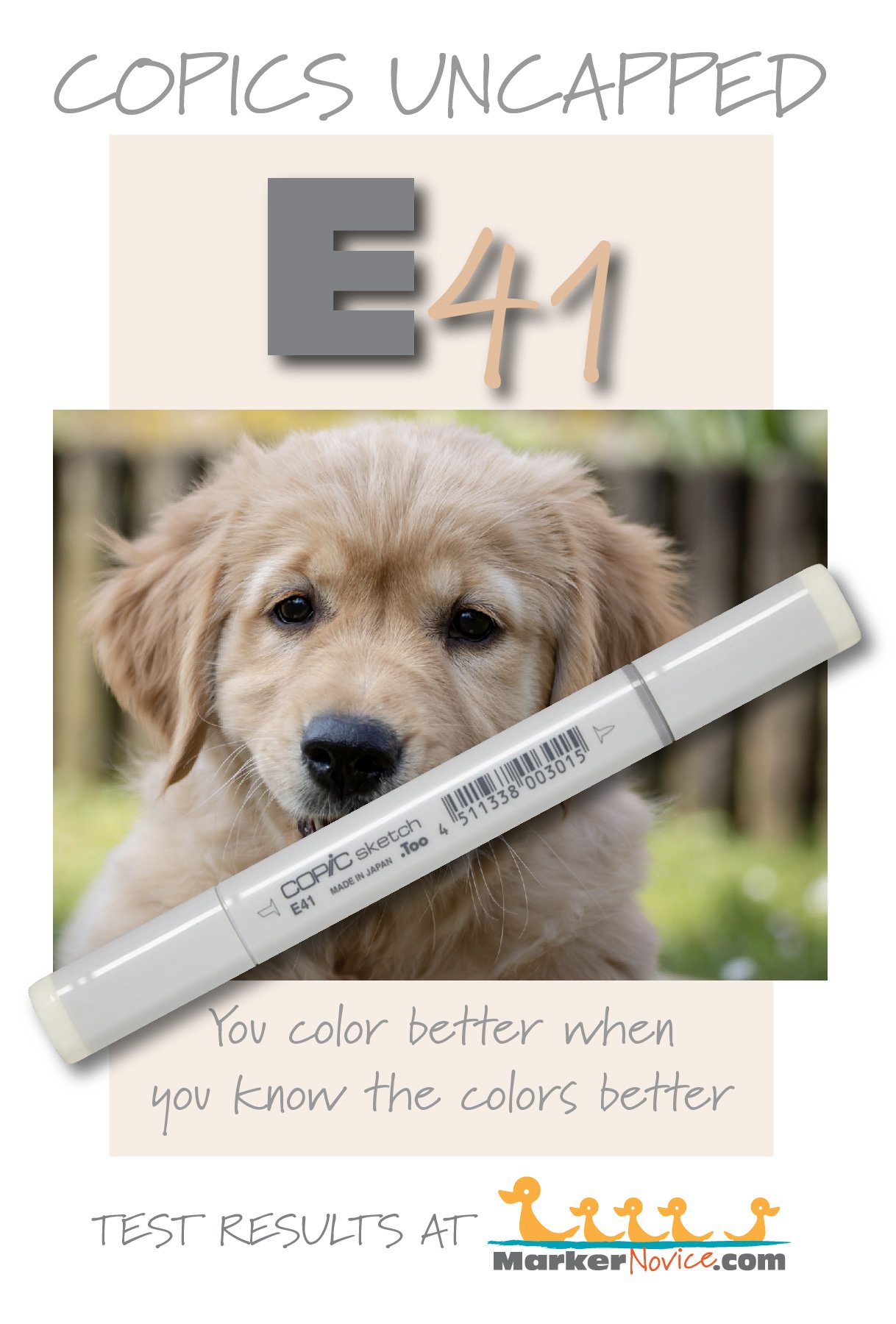
E41 Pearl White
Let’s take a closer look at this Copic Marker and it’s ink characteristics.


Every Copic Marker has unique characteristics based on its unique ink formula.
Knowing how a color behaves will help you blend effectively and make art with confidence.
E41 Pearl WHite
Let’s take a closer look at this Copic Marker and its ink characteristics.
Note: The * asterisk in the test samples above indicate that we’re using digital samples of the color in the test results graphic above. E41 is so pale that a single layer was invisible to the scanner and it photographed much warmer than the color in real life. I’ve taken great pains to reproduce the test swatches, matching the real color as accurately as possible.
Temperature: A slightly cool beige
Resemblance: Highly diluted Raw Umber watercolor
Actual Value: N0.5 (slightly between level 0 and 1)
All Copics are measured on a Neutral Gray value scale. The last number on the cap is supposed to indicate value but we’ve found discrepancies where the actual ink value is different than cap designation.
Cap Accuracy: No. The plastic on a Sketch marker cap looks like it belongs to a pale yellow marker rather than brownish E41 ink.
Buildup: E41 starts to look oily on the second layer. It reaches maximum value at 3 layers.
Shattering: Shatters into a very faint beige with hints of cool gray leakage. Note that the shattering photo above has been darkened to make the test results more visible.
Chromatography testing shows this ink’s behavior when it comes in contact with #0 Colorless Blender (solvent). High shattering colors may leak unexpected color when you make corrections or attempt to blend with any color that has a high solvent to colorant ratio. Shattering is not bad, it’s just something to be aware of.
Staining: E41 does not stain. Note, the photo of the test results above has been darkened slightly but appears more yellowish than the actual swatch. This color was very hard to pick up on camera.
Lift: E41 is a pale, non-staining color which lifts so easily, it might be called “erasable”.
See staining swatch. Sample was given 6 stripes of #0 Colorless Blender, drying between each stripe. Results indicate how much lifting you can expect.
Lightfast: E41 did not lighten at all during the testing period, unlike E40 which turned yellowish. This is a much more stable color than E40.
Samples were swatched on X-Press It Blending Card. 1 layer of ink was exposed to windowsill sunlight for 21 days. Approximately 10 hours of sun per day based on weather conditions. Note: we do not recommend displaying original Copic art under these conditions.
Natural Ink Family: E41 is in the lightest of the E-Forty family. We strongly suspect that E41 does not share the same colorant as the other members of this family, as it is slightly warmer and has a different fade characteristic than all the other E-Forty colors.
IMPORTANT: E40 and E41 are so strikingly similar that we feel it is unnecessary to own both markers. The colors are not the same when placed side by side but they’re so similar, anyone viewing your art will never know which marker you used. We recommend E41 more than E40 based on lightfastness.
Family members: E40, E41, E42, E43, E44, E47, and E49.
We include this information because many Copic users never think deeper than the letter groupings (R, BV, G, etc.). Every ink has its own temperature variations and underlying flavors. Understanding what an ink looks like in its different dilutions helps when creating your own blending combinations.
Complement: Brown is not a hue on the color wheel and does not have a complement.
Underpaint: C00 neutralizes this color well.
This is simply one suggestion. Many possible colors exist. Test to find a color that pleases you.
Pushing Pencil: Prismacolor 1083 Putty Beige pushes this color nicely.
VanillaArts.com (our sister site) teaches a Push & Pull technique for dimensional coloring. This is simply one suggestion. Many possible colors exist. Test to find a color that pleases you.
Vanilla Arts Classes using E41:

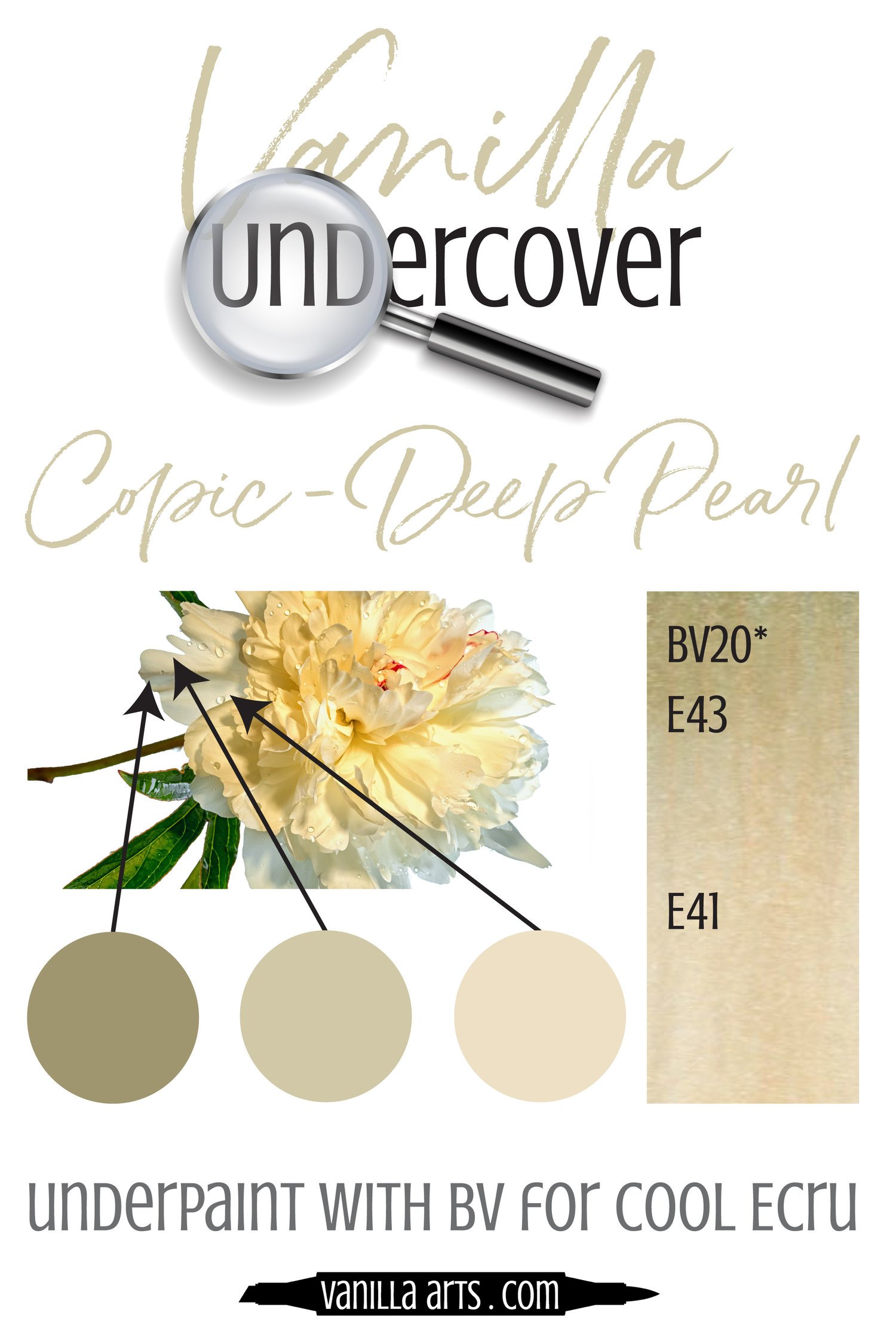
Luminous Lanterns: Amy covers soft and glowing light sources and how/when to use them. Find more info here.
Vanilla Arts Digi Stamps using E41:
Color palettes and swatches using E41:

Looking for beautiful color palettes?
We absolutely love The Color Catalog 1 & 2 from Sarah Renae Clark. It puts hundreds of Copic friendly color palettes at your fingertips.
(note: affiliate link)


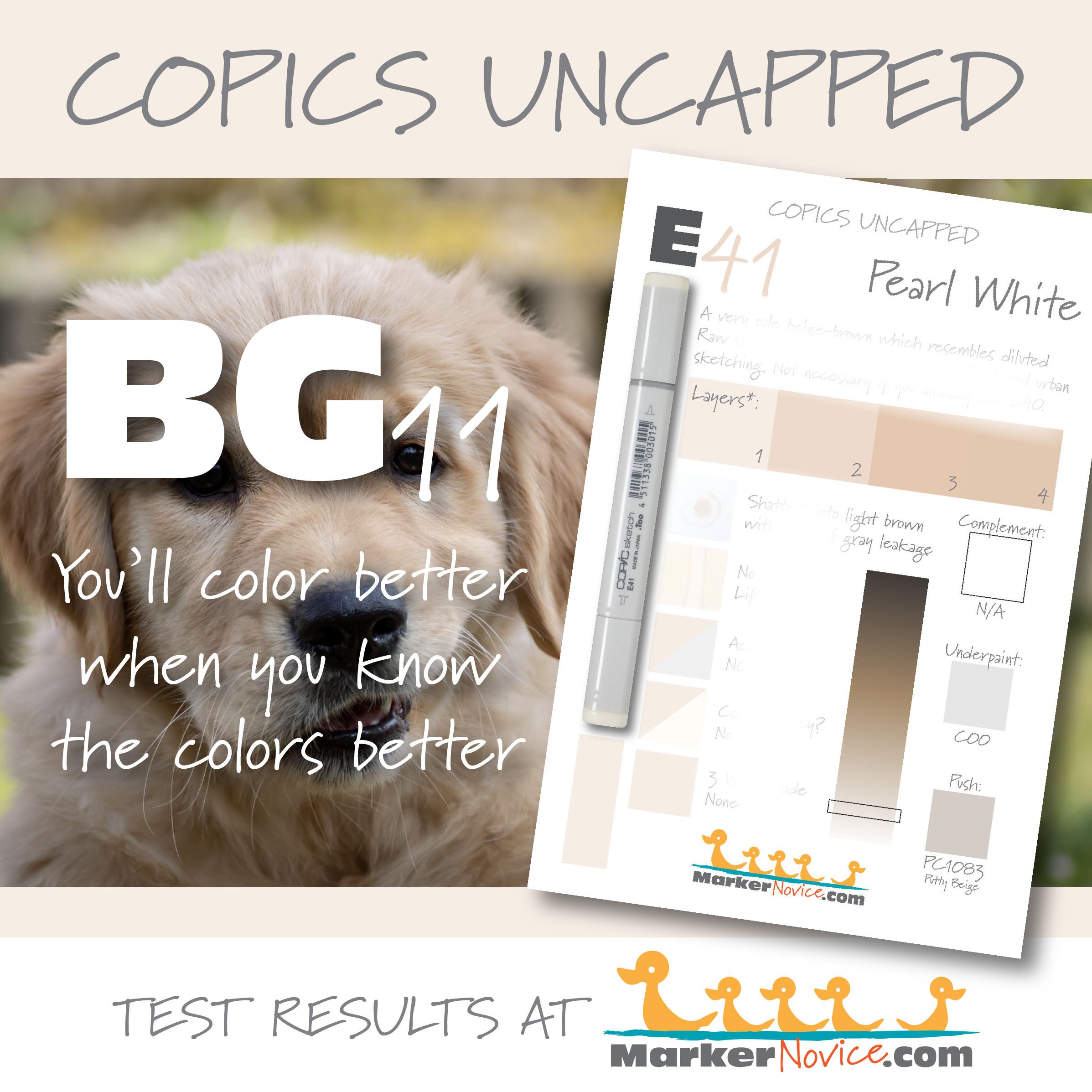

B45 Smoky Blue: Copics Uncapped (Marker Swatch, Ink Testing)
B45 Smoky Blue
Let’s take a closer look at this Copic Marker and it’s ink characteristics.
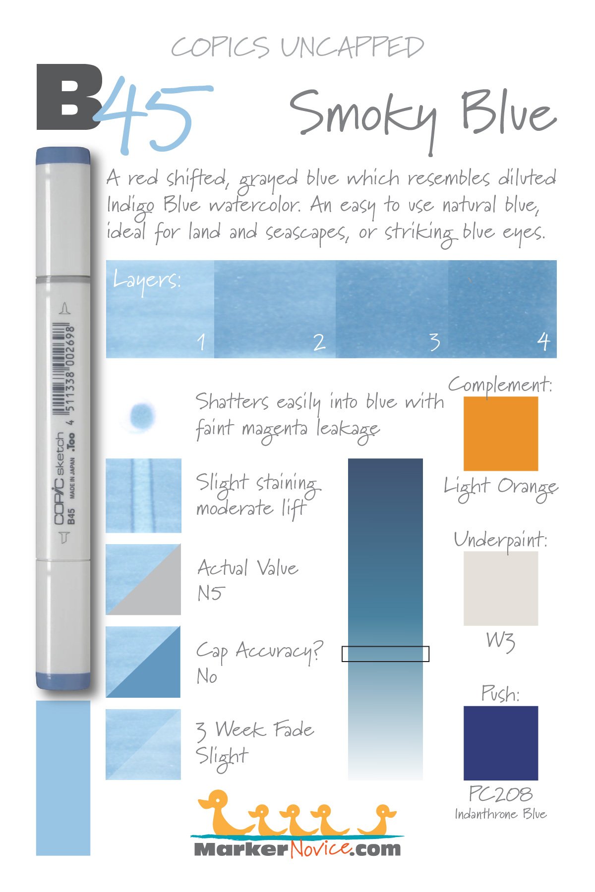

B45 Smoky Blue is a red-shifted gray blue Copic Marker which resembles diluted Indigo Blue watercolor. This is an easy to use natural blue, ideal for land and seascapes or striking blue eyes. B45 is available in Copic Sketch, Ciao, and Classic marker styles.
Every Copic Marker has unique characteristics based on its unique ink formula.
Knowing how a color behaves will help you blend effectively and make art with confidence.
B45 Smoky Blue
Let’s take a closer look at this Copic Marker and its ink characteristics.
Temperature: A red-shifted and grayed blue.
Resemblance: Indigo Blue watercolor.
Actual Value: N5
All Copics are measured on a Neutral Gray value scale. The last number on the cap is supposed to indicate value but we’ve found discrepancies where the actual ink value is different than cap designation.
Cap Accuracy: The plastic on a Sketch marker is darker than the color of B45 ink; more equivalent to 4-5 coats of this ink.
Buildup: B45 reaches maximum color at three to four layers.
Shattering: Shatters very easily with faint magenta leakage.
Chromatography testing shows this ink’s behavior when it comes in contact with #0 Colorless Blender (solvent). High shattering colors may leak unexpected color when you make corrections or attempt to blend with any color that has a high solvent to colorant ratio. Shattering is not bad, it’s just something to be aware of.
Staining: B45 stains the paper blue.

Lift: This color lifts moderately well but leaves stained paper behind.
See staining swatch. Sample was given 6 stripes of #0 Colorless Blender, drying between each stripe. Results indicate how much lifting you can expect.
Lightfast: We saw slight fading during the test period, perhaps 10%
Samples were swatched on X-Press It Blending Card. 1 layer of ink was exposed to windowsill sunlight for 21 days. Approximately 10 hours of sun per day based on weather conditions. Note: we do not recommend displaying original Copic art under these conditions.
Natural Ink Family: B45 is one of only two markers in the very small B-Forty family. We wish Copic would expand this very natural blue which would be very popular with those who prefer more realistic, less bright colors.
Family Members: B45 and B41
We include this information because many Copic users never think deeper than the letter groupings (R, BV, G, etc.). Every ink has its own temperature variations and underlying flavors. Understanding what an ink looks like in its different dilutions helps when creating your own blending combinations.
Complement: A light orange color like YR12 or YR65
Underpaint: We suggest W3 or even W4
This is simply one suggestion. Many possible colors exist. Test to find a color that pleases you.
Pushing Pencil: PC208 Indanthrone Blue can darken B45 nicely.
VanillaArts.com (our sister site) teaches a Push & Pull technique for dimensional coloring. This is simply one suggestion. Many possible colors exist. Test to find a color that pleases you.
Vanilla Arts Classes using B45:
Vanilla Arts Digi Stamps using B45:
Color palettes and swatches using B45:


Looking for beautiful color palettes?
We absolutely love The Color Catalog 1 & 2 from Sarah Renae Clark. It puts hundreds of Copic friendly color palettes at your fingertips.
(note: affiliate link)


BG11 Moon White: Copics Uncapped (Marker Swatch, Ink Testing)
BG11 Moon White
Let’s take a closer look at this Copic Marker and its ink characteristics.
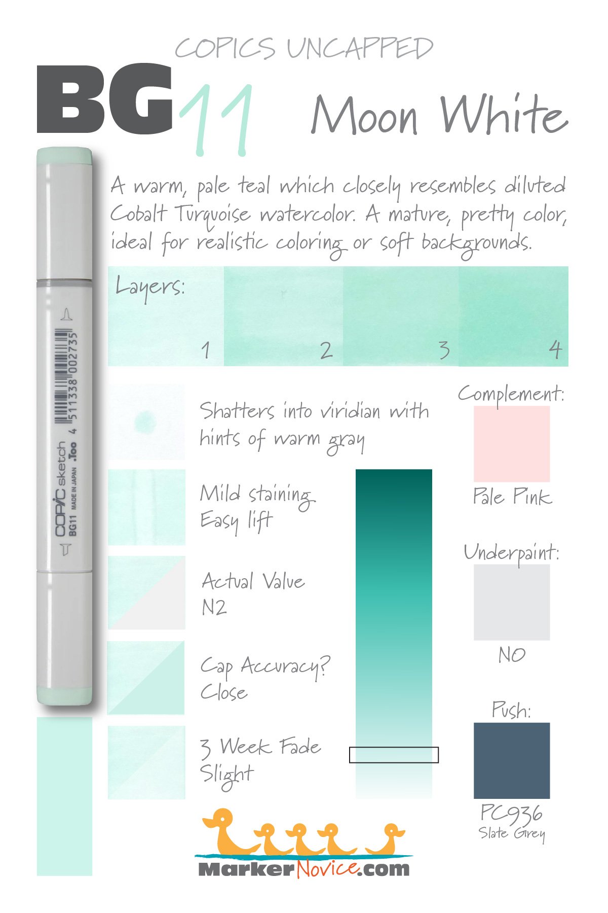
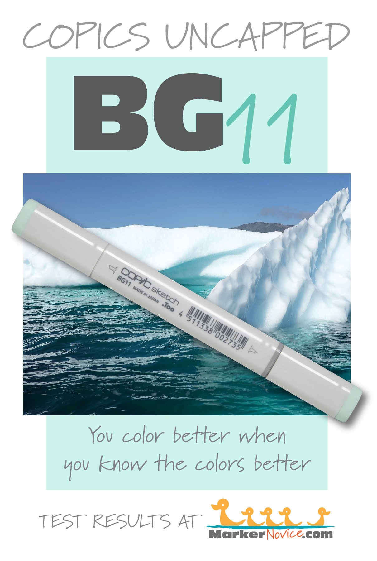
BG11 Moon White is a pale teal Copic Marker which resembles highly diluted Cobalt Turquoise watercolor. A mature, pretty color, ideal for realistic coloring and soft backgrounds. BG11 is only available in Copic Sketch and Classic marker styles.
Every Copic Marker has unique characteristics based on its unique ink formula.
Knowing how a color behaves will help you blend effectively and make art with confidence.
BG11 Moon White
Let’s take a closer look at this Copic Marker and its ink characteristics.
Temperature: A warm teal.
Resemblance: highly diluted Cobalt Turquoise watercolor.
Actual Value: N2
All Copics are measured on a Neutral Gray value scale. The last number on the cap is supposed to indicate value but we’ve found discrepancies where the actual ink value is different than cap designation.
Cap Accuracy: The plastic on a Sketch marker resembles 2 coats of BG11 ink.
Buildup: BG11 layers beautifully and reaches maximum value at 4 coats.
Shattering: Shatters into viridian with hints of warm gray leakage. The test sample is so faint though, that the leakage is only visible upon very close examination.
Chromatography testing shows this ink’s behavior when it comes in contact with #0 Colorless Blender (solvent). High shattering colors may leak unexpected color when you make corrections or attempt to blend with any color that has a high solvent to colorant ratio. Shattering is not bad, it’s just something to be aware of.
Staining: BG11 is mildly staining but the color itself is so pale that the staining isn’t super-noticable.
Lift: BG11 lifts very easily.
See staining swatch. Sample was given 6 stripes of #0 Colorless Blender, drying between each stripe. Results indicate how much lifting you can expect.
Lightfast: The fade was slight on this marker, about 15%.
Samples were swatched on X-Press It Blending Card. 1 layer of ink was exposed to windowsill sunlight for 21 days. Approximately 10 hours of sun per day based on weather conditions. Note: we do not recommend displaying original Copic art under these conditions.
Natural Ink Family: BG11 is at the lighter end of the BG-Teen family. To be honest, this group feels like semi-related markers which have been mashed together into a single family. BG10 and 11 are close but related while BG13 and BG15 glow. Then BG18 has a bit of murkiness to it.
Family Members: BG18, BG15, BG13, BG11, BG10
We include this information because many Copic users never think deeper than the letter groupings (R, BV, G, etc.). Every ink has its own temperature variations and underlying flavors. Understanding what an ink looks like in its different dilutions helps when creating your own blending combinations.
Complement: A pale pink like RV00 or RV10
Underpaint: We suggest underpainting with soft gray like N0
This is simply one suggestion. Many possible colors exist. Test to find a color that pleases you.
Pushing Pencil: Prismacolor 936 Slate Grey is perfect for pushing BG11 if used with an extremely light touch.
VanillaArts.com (our sister site) teaches a Push & Pull technique for dimensional coloring. This is simply one suggestion. Many possible colors exist. Test to find a color that pleases you.
Vanilla Arts Classes using BG11:
Vanilla Arts Digi Stamps using BG11:
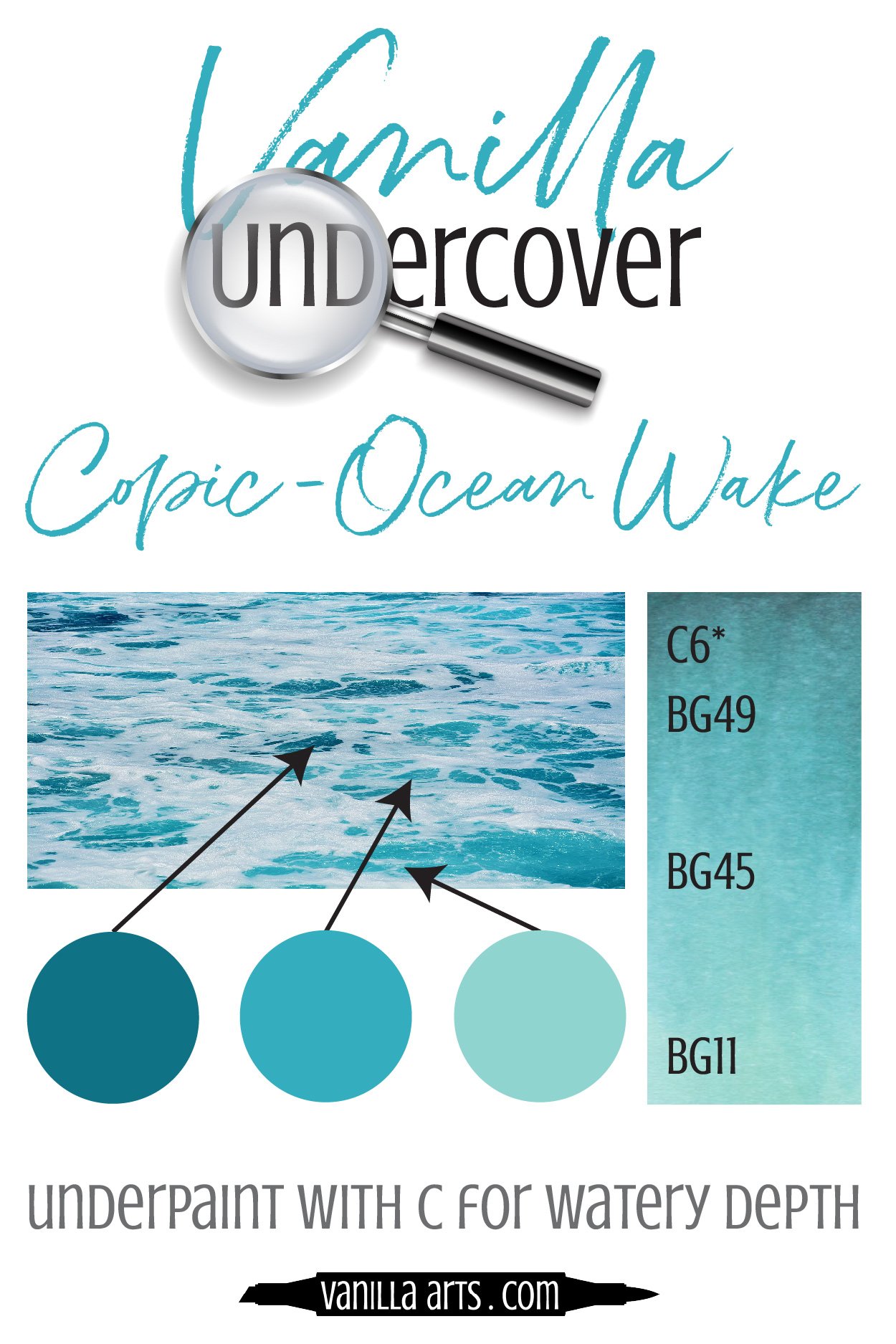
Color palettes and swatches using BG11:
Looking for beautiful color palettes?
We absolutely love The Color Catalog 1 & 2 from Sarah Renae Clark. It puts hundreds of Copic friendly color palettes at your fingertips.
(note: affiliate link)
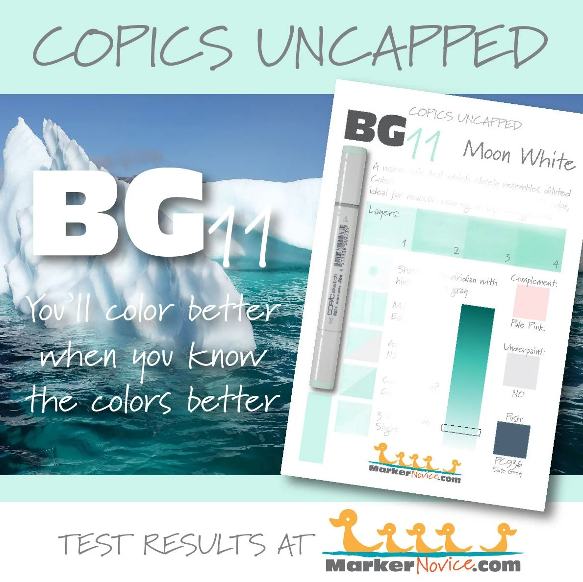

YG11 Mignonette: Copics Uncapped (Marker Swatch, Ink Testing)
YG11 Mignonette
Let’s take a closer look at this Copic Marker and it’s ink characteristics.

YG11 Mignonette is a pale yellow-green Copic Marker which mimics diluted Green Gold watercolor. Ideal perfect for florals and spring landscapes, this color also makes a cute background color. YG11 is available in Copic Sketch, Ciao, and Classic marker styles.
Every Copic Marker has unique characteristics based on its unique ink formula.
Knowing how a color behaves will help you blend effectively and make art with confidence.
YG11 Mignonette
Let’s take a closer look at this Copic Marker and its ink characteristics.
Temperature: A warm yellowish green.
Resemblance: diluted Green Gold watercolor.
Actual Value: N1All Copics are measured on a Neutral Gray value scale. The last number on the cap is supposed to indicate value but we’ve found discrepancies where the actual ink value is different than cap designation.
Cap Accuracy: It’s close. The colored plastic on the Sketch cap resembles 2 layers of YG11 although the transparency of the plastic makes the cap look a bit cooler than the ink color.
Buildup: YG11 started to look oily at 3 layers. It reaches maximum value around 3 layers as well.
Shattering: Shatters into green with yellow seeping out at the margins.
Chromatography testing shows this ink’s behavior when it comes in contact with #0 Colorless Blender (solvent). High shattering colors may leak unexpected color when you make corrections or attempt to blend with any color that has a high solvent to colorant ratio. Shattering is not bad, it’s just something to be aware of.
Staining: YG11 stains the paper with a faint yellow color.

Lift: This green aspects of this color can be shifted a bit but the yellow color never fully moves.
See staining swatch. Sample was given 6 stripes of #0 Colorless Blender, drying between each stripe. Results indicate how much lifting you can expect.
Lightfast: YG11 faded by about 30% during the testing period.
Samples were swatched on X-Press It Blending Card. 1 layer of ink was exposed to windowsill sunlight for 21 days. Approximately 10 hours of sun per day based on weather conditions. Note: we do not recommend displaying original Copic art under these conditions.
Natural Ink Family: YG11 is a at the lightest end of the YG-Teen family. Note that YG11 is cooler than both YG13 and YG17. This family seems like a mashup of unrelated inks.
Family Members: YG11, YG13, YG17
We include this information because many Copic users never think deeper than the letter groupings (R, BV, G, etc.). Every ink has its own temperature variations and underlying flavors. Understanding what an ink looks like in its different dilutions helps when creating your own blending combinations.
Complement: A very pale periwinkle like BV0000
Underpaint: BV0000 desaturates YG11 nicely.
This is simply one suggestion. Many possible colors exist. Test to find a color that pleases you.
Pushing Pencil: Prismacolor 1026 Greyed Lavender provides a nicely desaturated push for YG11.
VanillaArts.com (our sister site) teaches a Push & Pull technique for dimensional coloring. This is simply one suggestion. Many possible colors exist. Test to find a color that pleases you.
Vanilla Arts Classes using YG11:

Oopsie Daisy, a beginner class on developing and using the flick technique for Copic Markers in both blending and non-blending situations.
We continue to create new content and classes and we will update here as more become available.
Visit the workshop resource page at our sister site VanillaArts.com for a wide variety of digital stamps.
Vanilla Arts Digi Stamps using YG11:
We continue to create new content and stamps and we will update here as more become available.
Visit the stamp shop page at our sister site VanillaArts.com for a wide variety of Copic classes.
Color palettes and swatches using YG11:
We are building our palette and swatch collection a little more each week and will update here as more become available.
Visit the color resource page at our sister site VanillaArts.com for a wide variety of Copic palettes and swatches.
Looking for beautiful color palettes?
We absolutely love The Color Catalog 1 & 2 from Sarah Renae Clark. It puts hundreds of Copic friendly color palettes at your fingertips.
(note: affiliate link)
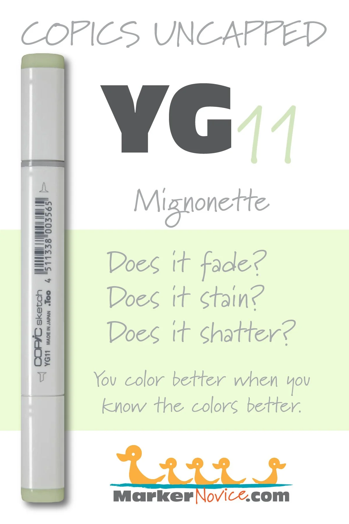


N3 Neutral Gray No. 3: Copics Uncapped (Marker Swatch, Ink Testing)
N3 Neutral Gray No. 3
Let’s take a closer look at this Copic Marker and it’s ink characteristics.
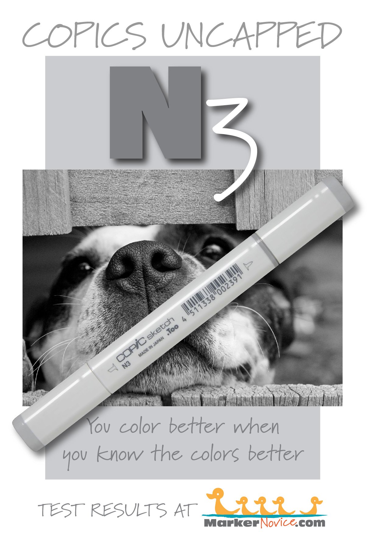
N3 Neutral Gray #3 is a balanced gray Copic Marker mimics diluted Lamp Black watercolor. We highly recommend purchasing N grays as your first gray markers because of their usefulness and versatility. N3 is only available in Sketch and Classic Copic styles.
Every Copic Marker has unique characteristics based on its unique ink formula.
Knowing how a color behaves will help you blend effectively and make art with confidence.
N3 Neutral Gray No. 3
Let’s take a closer look at this Copic Marker and its ink characteristics.
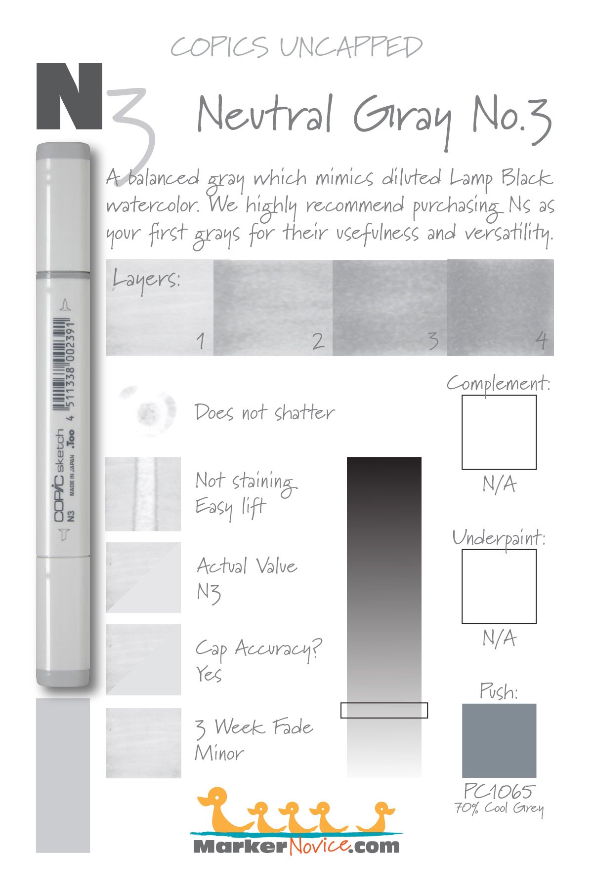
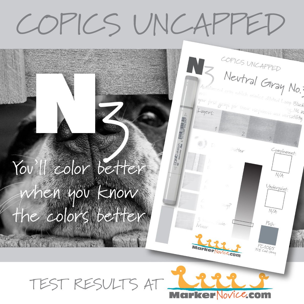
Temperature: A balanced gray, neither warm nor cool
Resemblance: diluted Lamp Black watercolor
Actual Value: N3 (All Copic N grays match their true value. N is the only family where this is true.)
All Copics are measured on a Neutral Gray value scale. The last number on the cap is supposed to indicate value but we’ve found discrepancies where the actual ink value is different than cap designation.
Cap Accuracy: Yes. The plastic end of a Sketch Marker matches 1 coats of N3.
Buildup: N3 reaches maximum color at 4-5 layers and starts to gather an oily appearance at 2 layers.
Shattering: Does not shatter.
Chromatography testing shows this ink’s behavior when it comes in contact with #0 Colorless Blender (solvent). High shattering colors may leak unexpected color when you make corrections or attempt to blend with any color that has a high solvent to colorant ratio. Shattering is not bad, it’s just something to be aware of.
Staining: N3 does not stain the paper.
Lift: N3 lifts easily.
See staining swatch. Sample was given 6 stripes of #0 Colorless Blender, drying between each stripe. Results indicate how much lifting you can expect.
Lightfast: N3 faded about 10%.
Samples were swatched on X-Press It Blending Card. 1 layer of ink was exposed to windowsill sunlight for 21 days. Approximately 10 hours of sun per day based on weather conditions. Note: we do not recommend displaying original Copic art under these conditions.
Natural Ink Family: N3 is in the middle of the Neutral Gray family.
Family Members: N10, N9, N8, N7, N6, N5, N4, N3, N2, N1, N0
We include this information because many Copic users never think deeper than the letter groupings (R, BV, G, etc.). Every ink has its own temperature variations and underlying flavors. Understanding what an ink looks like in its different dilutions helps when creating your own blending combinations.
Complement: N/A
Underpaint: N/A
Pushing Pencil: We suggest Prismacolor 1065 70% Cool Grey
VanillaArts.com (our sister site) teaches a Push & Pull technique for dimensional coloring. This is simply one suggestion. Many possible colors exist. Test to find a color that pleases you.
Vanilla Arts Classes using N3:
Vanilla Arts Digi Stamps using N3:
We continue to create new content and stamps and we will update here as more become available.
Visit the Stamp Shop resource page at our sister site VanillaArts.com for a wide variety of Vanilla Arts stamps.
Color palettes and swatches using N3:
We are building our palette and swatch collection a little more each week and will update here as more become available.
Visit the color resource page at our sister site VanillaArts.com for a wide variety of Copic palettes and swatches.
Looking for beautiful color palettes?
We absolutely love The Color Catalog 1 & 2 from Sarah Renae Clark. It puts hundreds of Copic friendly color palettes at your fingertips.
(note: affiliate link)


E40 Brick White: Copics Uncapped (Marker Swatch, Ink Testing)
E40 Brick White
Let’s take a closer look at this Copic Marker and it’s ink characteristics.
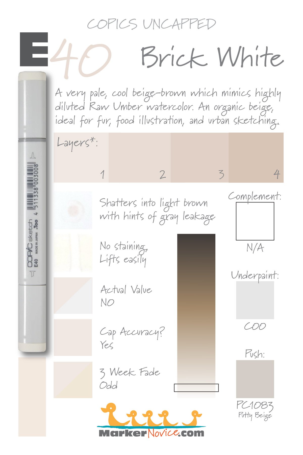
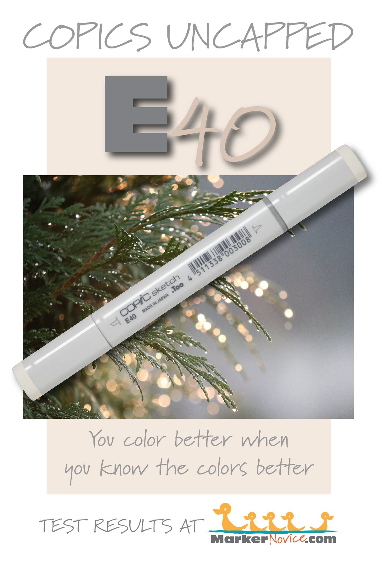
E40 Brick White is a cool beige-brown Copic Marker which mimics highly diluted Raw Umber watercolor. An organic beige, ideal for fur, food illustration, and urban sketching. E40 is available in Copic Sketch, Ciao, and Classic marker styles.
Every Copic Marker has unique characteristics based on its unique ink formula.
Knowing how a color behaves will help you blend effectively and make art with confidence.
E40 Brick WHite
Let’s take a closer look at this Copic Marker and its ink characteristics.
Note: The * asterisk in the test samples above indicate that we’re using digital samples of the color in the test results graphic above. E40 is so pale that a single layer was invisible to the scanner and it photographed much warmer than the color in real life. I’ve taken great pains to reproduce the test swatches, matching the real color as accurately as possible.
Temperature: A cool brown.
Resemblance: Highly diluted Raw Umber watercolor
Actual Value: N0
All Copics are measured on a Neutral Gray value scale. The last number on the cap is supposed to indicate value but we’ve found discrepancies where the actual ink value is different than cap designation.
Cap Accuracy: Yes. The plastic on a Sketch marker matches 1 coat of E40 ink.
Buildup: E40 starts to look oily on the second layer. It reaches maximum value at 4 layers.
Shattering: Shatters into a very faint beige with hints of cool gray leakage. Note that the shattering photo above has been darkened to make the test results more visible.
Chromatography testing shows this ink’s behavior when it comes in contact with #0 Colorless Blender (solvent). High shattering colors may leak unexpected color when you make corrections or attempt to blend with any color that has a high solvent to colorant ratio. Shattering is not bad, it’s just something to be aware of.
Staining: E40 does not stain. Note, the photo of the test results above has been darkened slightly but appears more yellowish than the actual swatch. This color was very hard to pick up on camera.
Lift: E40 is a pale, non-staining color which lifts so easily, it might be called “erasable”.
See staining swatch. Sample was given 6 stripes of #0 Colorless Blender, drying between each stripe. Results indicate how much lifting you can expect.
Lightfast: E40 did not lighten during the testing period as much as it yellowed. We suspect the cool gray additive shown in the shattering test was the only colorant to fade, leaving the beige brown colorant behind.
Samples were swatched on X-Press It Blending Card. 1 layer of ink was exposed to windowsill sunlight for 21 days. Approximately 10 hours of sun per day based on weather conditions. Note: we do not recommend displaying original Copic art under these conditions.
Natural Ink Family: E40 is in the lightest of the E-Forty family. This family of browns feel cooler and more organic as the color gets darker.
Family Members: E40, E41, E42, E43. E44, E47, and E49
We include this information because many Copic users never think deeper than the letter groupings (R, BV, G, etc.). Every ink has its own temperature variations and underlying flavors. Understanding what an ink looks like in its different dilutions helps when creating your own blending combinations.
Complement: Brown is not a hue on the color wheel and does not have a complement.
Underpaint: C00 neutralizes this color well but so does BV0000
This is simply one suggestion. Many possible colors exist. Test to find a color that pleases you.
Pushing Pencil: Prismacolor 1083 Putty Beige pushes this color nicely.
VanillaArts.com (our sister site) teaches a Push & Pull technique for dimensional coloring. This is simply one suggestion. Many possible colors exist. Test to find a color that pleases you.
Vanilla Arts Classes using E40:
Luminous Lanterns: Amy covers soft and glowing light sources and how/when to use them. Find more info here.
Vanilla Arts Digi Stamps using E40:
We continue to create new content and stamps and we will update here as more become available.
Visit the stamp shop page at our sister site VanillaArts.com for a wide variety of digi stamps.
Color palettes and swatches using E40:
We are building our palette and swatch collection a little more each week and will update here as more become available.
Visit the color resource page at our sister site VanillaArts.com for a wide variety of Copic palettes and swatches.
Looking for beautiful color palettes?
We absolutely love The Color Catalog 1 & 2 from Sarah Renae Clark. It puts hundreds of Copic friendly color palettes at your fingertips.
(note: affiliate link)