
V04 Lilac: Copics Uncapped (Marker Swatch, Ink Testing)
V04 Lilac
Let’s take a closer look at this Copic Marker and it’s ink characteristics.

V04 Lilac is a cheerful, warm purple Copic Marker which resembles highly diluted Cobalt Violet watercolor. This mid-value marker color is useful for spring florals, happy backgrounds, and underpainting greens. V04 is available in Copic Sketch, Ciao, and Classic marker styles.
Every Copic Marker has unique characteristics based on its unique ink formula.
Knowing how a color behaves will help you blend effectively and make art with confidence.
V04 Lilac
Let’s take a closer look at this Copic Marker and it’s ink characteristics.
Temperature: A warm purple with a slight pink cast.
Resemblance: Cobalt Violet watercolor.
Actual Value: N4
All Copics are measured on a Neutral Gray value scale. The last number on the cap is supposed to indicate value but we’ve found discrepancies where the actual ink value is different than cap designation.
Cap Accuracy: Yes. The plastic end of a Sketch Marker is very close to the ink color.
Buildup: V04 is not heavily laden with colorant and withstands moderate layering.
Shattering: Does not shatter at all.
Chromatography testing shows this ink’s behavior when it comes in contact with #0 Colorless Blender (solvent). High shattering colors may leak unexpected color when you make corrections or attempt to blend with any color that has a high solvent to colorant ratio. Shattering is not bad, it’s just something to be aware of.

Staining: We were shocked at how little this stains.
Lift: Lifts easily. You can consider the color “erasable”.
See staining swatch. Sample was given 6 stripes of #0 Colorless Blender, drying between each stripe. Results indicate how much lifting you can expect.
Lightfast: No. This color turned pink and faded by about 30%.
Samples were swatched on X-Press It Blending Card. 1 layer of ink was exposed to windowsill sunlight for 21 days. Approximately 10 hours of sun per day based on weather conditions. Note: we do not recommend displaying original Copic art under these conditions.
Natural Ink Family: V04 is a moderate dilution of V09. At the opposite end, V0000 is the highly diluted version. The pink cast to this family is why the sub-zeros feel pale pink rather than purple.
Family Members: V09, V06, V05, V04, V01, V00, V000, V0000
We include this information because many Copic users never think deeper than the letter groupings (R, BV, G, etc.). Every ink has its own temperature variations and underlying flavors. Understanding what an ink looks like in its different dilutions helps when creating your own blending combinations.
Complement: We suggest G03 or G24
Underpaint: G03 neutralizes this color beautifully.
This is simply one suggestion. Many possible colors exist. Test to find a color that pleases you.
Pushing Pencil: Prismacolor 931 Dark Purple is a reliable choice.
VanillaArts.com (our sister site) teaches a Push & Pull technique for dimensional coloring. This is simply one suggestion. Many possible colors exist. Test to find a color that pleases you.
Vanilla Arts Classes using V04:
Vanilla Arts Digi Stamps using V04:
We continue to create new content and stamps and we will update here as more become available.
Visit the stamp shop page at our sister site VanillaArts.com for a wide variety of Vanilla Stamp shop.
Color palettes and swatches using V04:
We are building our palette and swatch collection a little more each week and will update here as more become available.
Visit the color resource page at our sister site VanillaArts.com for a wide variety of Copic palettes and swatches.
Looking for beautiful color palettes?
We absolutely love The Color Catalog 1 & 2 from Sarah Renae Clark. It puts hundreds of Copic friendly color palettes at your fingertips.
(note: affiliate link)














C1 Cool Gray No. 1: Copics Uncapped (Marker Swatch, Ink Testing)
C1 Cool Gray No. 1
Let’s take a closer look at this Copic Marker and it’s ink characteristics.


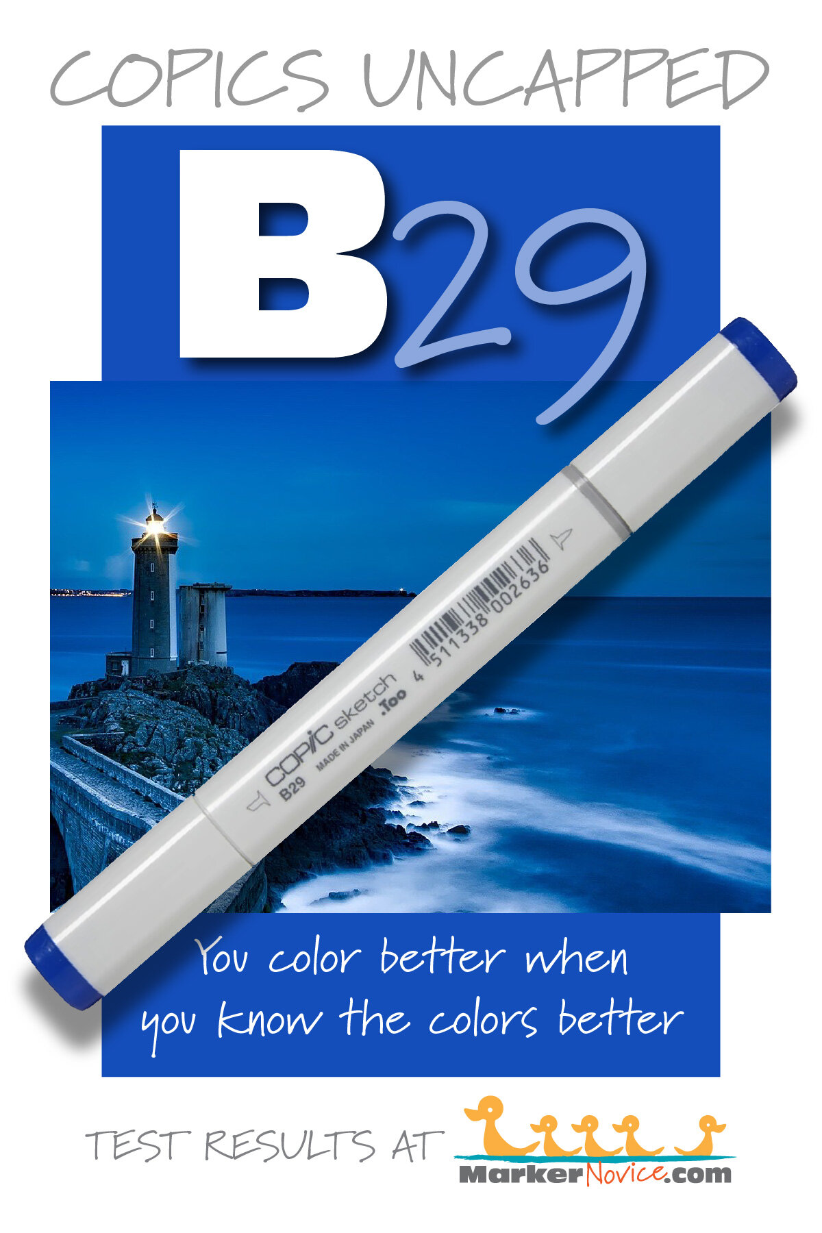
C1 Cool Gray #1 is a cool, faint gray Copic Marker which looks like highly diluted Neutral Tint watercolor. This pale marker color is useful for softening the edges of shadows. C1 is available in Copic Sketch, Ciao, and Classic marker styles.
Every Copic Marker has unique characteristics based on its unique ink formula.
Knowing how a color behaves will help you blend effectively and make art with confidence.
C1 Cool Gray No. 1
Let’s take a closer look at this Copic Marker and it’s ink characteristics.
Temperature: A barely-there cool gray.
Resemblance: A highly diluted Neutral Tint watercolor.
Actual Value: N1
All Copics are measured on a Neutral Gray value scale. The last number on the cap is supposed to indicate value but we’ve found discrepancies where the actual ink value is different than cap designation.
Cap Accuracy: Yes. The plastic end of a Sketch Marker is very close to the ink color.
Buildup: C1 is mostly solvent and can be layered without worry.
Shattering: Does not shatter at all.
Chromatography testing shows this ink’s behavior when it comes in contact with #0 Colorless Blender (solvent). High shattering colors may leak unexpected color when you make corrections or attempt to blend with any color that has a high solvent to colorant ratio. Shattering is not bad, it’s just something to be aware of.

Staining: No. Copic grays are not generally staining and there’s barely any colorant in this marker.
Lift: Lifts easily. You can consider the color “erasable”.
See staining swatch. Sample was given 6 stripes of #0 Colorless Blender, drying between each stripe. Results indicate how much lifting you can expect.
Lightfast: No. This color disappeared early in the test period.
Samples were swatched on X-Press It Blending Card. 1 layer of ink was exposed to windowsill sunlight for 21 days. Approximately 10 hours of sun per day based on weather conditions. Note: we do not recommend displaying original Copic art under these conditions.
Natural Ink Family: C1 is a highly diluted version of C10.
Family Members: C10, C9, C8, C7, C6, C5, C4, C3, C2, C1, C0, C00.
We include this information because many Copic users never think deeper than the letter groupings (R, BV, G, etc.). Every ink has its own temperature variations and underlying flavors. Understanding what an ink looks like in its different dilutions helps when creating your own blending combinations.
Complement: N/A
Underpaint: N/A
This is simply one suggestion. Many possible colors exist. Test to find a color that pleases you.
Pushing Pencil: We suggest Prismacolor 1060 20% Cool Grey but a soft blue or grayed lavender would look very artistic.
VanillaArts.com (our sister site) teaches a Push & Pull technique for dimensional coloring. This is simply one suggestion. Many possible colors exist. Test to find a color that pleases you.
Vanilla Arts Classes using C1:

Celebration Cupcake: Soft fluffy frosting and tasty cake. Color gentle waves of frosting & crisply folded pleats. Use this technique on skirts, shirts, curtains, anything with folds! Find more info here.
Vanilla Arts Digi Stamps using C1:
We continue to create new content and stamps and we will update here as more become available.
Visit the stamp shop page at our sister site VanillaArts.com for a wide variety of Vanilla Arts stamps.
Color palettes and swatches using C1:
We are building our palette and swatch collection a little more each week and will update here as more become available.
Visit the color resource page at our sister site VanillaArts.com for a wide variety of Copic palettes and swatches.
Looking for beautiful color palettes?
We absolutely love The Color Catalog 1 & 2 from Sarah Renae Clark. It puts hundreds of Copic friendly color palettes at your fingertips.
(note: affiliate link)


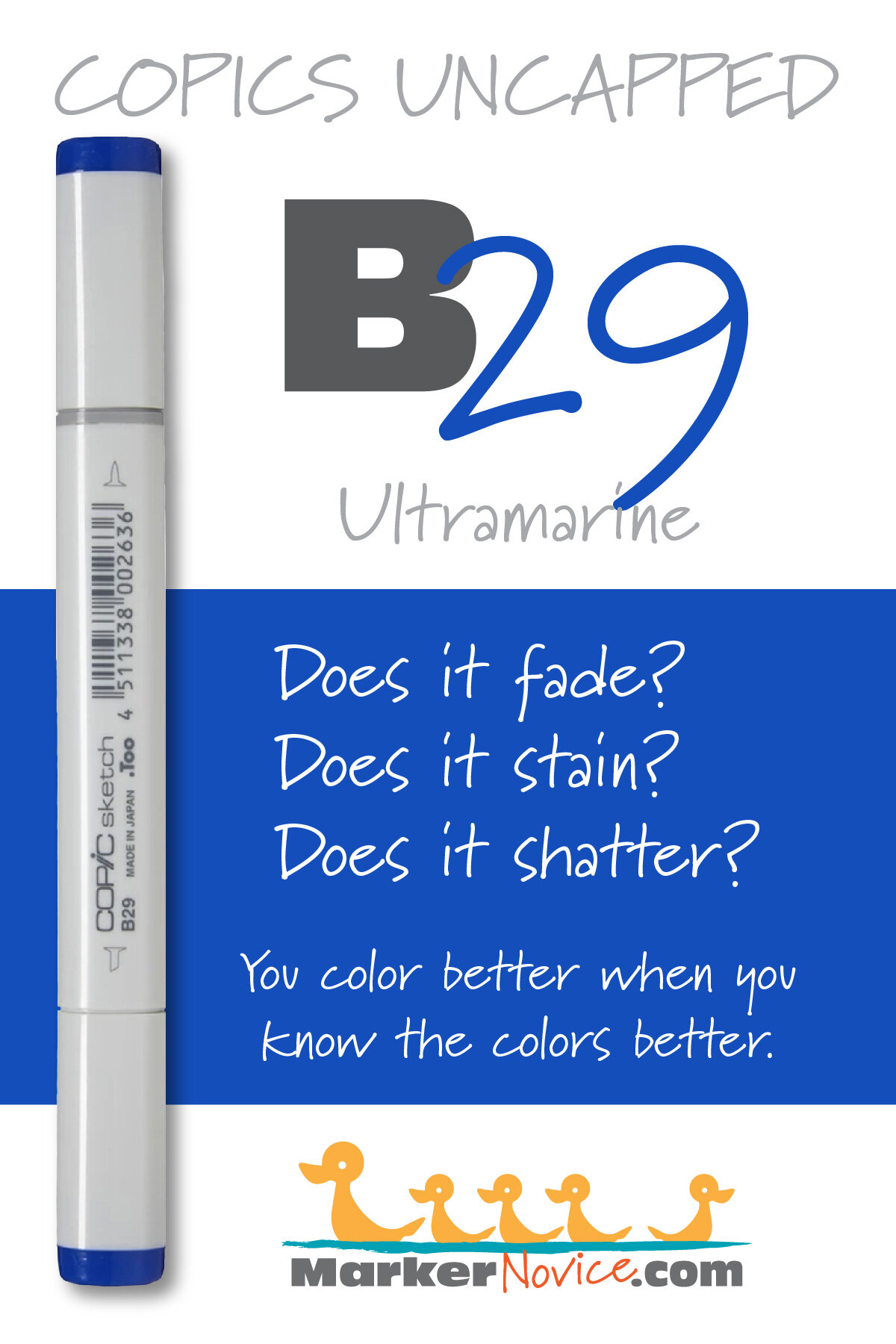
B29 Ultramarine: Copics Uncapped (Marker Swatch, Ink Testing)
B29 Ultramarine
Let’s take a closer look at this Copic Marker and it’s ink characteristics.


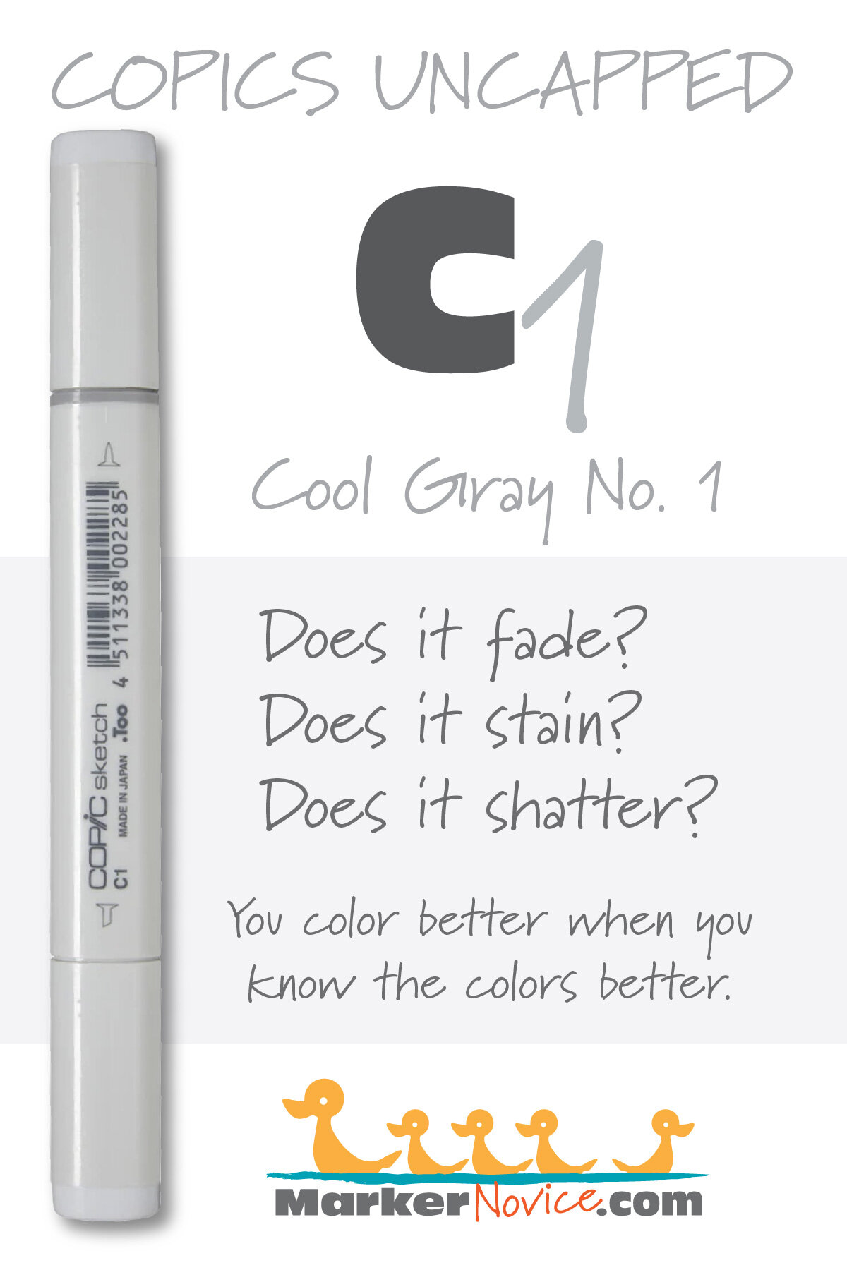
B29 Ultramarine is a red-shade, all purpose blue Copic Marker which closely resembles Ultramarine watercolor. This intense marker color is useful for clothing, water, and birds. B29 is available in Copic Sketch, Ciao, and Classic marker styles and is an excellent first purchase.
Every Copic Marker has unique characteristics based on its unique ink formula.
Knowing how a color behaves will help you blend effectively and make art with confidence.
B29 Ultramarine
Let’s take a closer look at this Copic Marker and it’s ink characteristics.
Temperature: A mildly reddish blue.
There is much debate in the art community over the true temperature of Ultramarine. Personally I think of Ultramarine paint as a neutral blue and the B29 marker feels slightly cooler than traditional Ultramarine.
Resemblance: Looks like a standard Ultramarine watercolor paint.
Actual Value: N9
All Copics are measured on a Neutral Gray value scale. The last number on the cap is supposed to indicate value but we’ve found discrepancies where the actual ink value is different than cap designation.
Cap Accuracy: Yes. The plastic end of a Sketch Marker matches 2 coats of the ink.
Buildup: B29 contains a lot of colorant. Caution should be used when layering beyond 2 coats.
Shattering: Does not shatter at all.
Chromatography testing shows this ink’s behavior when it comes in contact with #0 Colorless Blender (solvent). High shattering colors may leak unexpected color when you make corrections or attempt to blend with any color that has a high solvent to colorant ratio. Shattering is not bad, it’s just something to be aware of.
Staining: No staining. Blue Copics do not usually stain and even though this marker is a value 9, it doesn’t bond well with paper fibers. See the shattering sample for how easily it detached from the paper.
Lift: Lifts very easily. 6 applications was not enough to erase B29 but this is one of the few dark Copics which offers you a chance to make corrections.
See staining swatch. Sample was given 6 stripes of #0 Colorless Blender, drying between each stripe. Results indicate how much lifting you can expect.
Lightfast: Significant fading. We estimate more than 50% loss and assume this marker could fade to nothing if given time.
Samples were swatched on X-Press It Blending Card. 1 layer of ink was exposed to windowsill sunlight for 21 days. Approximately 10 hours of sun per day based on weather conditions. Note: we do not recommend displaying original Copic art under these conditions.
Natural Ink Family: B29 is the mother ink used to make the entire B20 family. All B20’s are dilutions of this marker.
Family Members: B29, B28, B26, B24, B23, B21.
We include this information because many Copic users never think deeper than the letter groupings (R, BV, G, etc.). Every ink has its own temperature variations and underlying flavors. Understanding what an ink looks like in its different dilutions helps when creating your own blending combinations.
Complement: Golden Orange, try Y38 or Y15
Underpaint: We suggest W07 (a warm gray to neutralize the cool shifted blue)
This is simply one suggestion. Many possible colors exist. Test to find a color that pleases you.
Pushing Pencil: We suggest Prismacolor 1067 90% Cool Grey
VanillaArts.com (our sister site) teaches a Push & Pull technique for dimensional coloring. This is simply one suggestion. Many possible colors exist. Test to find a color that pleases you.
Vanilla Arts Classes using B29:
We continue to create new content and classes and we will update here as more become available.
Visit the workshop resource page at our sister site VanillaArts.com for a wide variety of Copic classes.
Vanilla Arts Digi Stamps using B29:
We continue to create new content and stamps and we will update here as more become available.
Visit the stamp shop page at our sister site VanillaArts.com for a wide variety of Vanilla Arts stamps
Color palettes and swatches using B29:
We are building our palette and swatch collection a little more each week and will update here as more become available.
Visit the color resource page at our sister site VanillaArts.com for a wide variety of Copic palettes and swatches.
Looking for beautiful color palettes?
We absolutely love The Color Catalog 1 & 2 from Sarah Renae Clark. It puts hundreds of Copic friendly color palettes at your fingertips.
(note: affiliate link)


G28 Ocean Green: Copics Uncapped (Marker Swatch, Ink Testing)
G28 Ocean Green
Let’s take a closer look at this Copic Marker and it’s ink characteristics.


G28 Ocean Green is a standard cool green Copic Marker reminiscent of Hooker’s Green watercolor. This all purpose marker color is useful for botanicals and landscapes, pine trees and Christmas greenery. G28 is available in Copic Sketch, Ciao, and Classic marker styles.
Every Copic Marker has unique characteristics based on its unique ink formula.
Knowing how a color behaves will help you blend effectively and make art with confidence.
G28 Ocean Green
Let’s take a closer look at this Copic Marker and it’s ink characteristics.
Temperature: A cool deep green.
Resemblance: A soft version of Hooker’s Green watercolor.
Actual Value: N7
All Copics are measured on a Neutral Gray value scale. The last number on the cap is supposed to indicate value but we’ve found discrepancies where the actual ink value is different than cap designation.
Cap Accuracy: No. The plastic end of a Sketch Marker is just slightly darker and more vibrant than the actual ink color. The cap is actually accurate for 5 coats of this ink.
Buildup: G28 is heavily pigmented and overwhelms the paper easily.
Shattering: Breaks apart into 2 different greens with an olive color spreading across the paper beyond the stain.
Chromatography testing shows this ink’s behavior when it comes in contact with #0 Colorless Blender (solvent). High shattering colors may leak unexpected color when you make corrections or attempt to blend with any color that has a high solvent to colorant ratio. Shattering is not bad, it’s just something to be aware of.

Staining: Highly staining. I personally stopped teaching with this color because it barely blends and I refer to it as Satan’s Spit.
Lift: Does not lift, does not budge, almost laughs at you.
See staining swatch. Sample was given 6 stripes of #0 Colorless Blender, drying between each stripe. Results indicate how much lifting you can expect.
Lightfast: Fairly stable. No detectible fading during the test period.
Samples were swatched on X-Press It Blending Card. 1 layer of ink was exposed to windowsill sunlight for 21 days. Approximately 10 hours of sun per day based on weather conditions. Note: we do not recommend displaying original Copic art under these conditions.
Natural Ink Family: G28 should be a slightly diluted version of G29 but we strongly suspect G28 is a one-off formula which has been inserted into a close color family. To put it simply, G28 looks like G29 and G24 but they have totally different behavior traits. G28 is a cuckoo bird imposter. We recommend using G29 instead.
(Supposed) Family Members: G29, G28, G24, G21, G20
We include this information because many Copic users never think deeper than the letter groupings (R, BV, G, etc.). Every ink has its own temperature variations and underlying flavors. Understanding what an ink looks like in its different dilutions helps when creating your own blending combinations.
Complement: Hot Pink.
Underpaint: We suggest V06
This is simply one suggestion. Many possible colors exist. Test to find a color that pleases you.
Pushing Pencil: An all purpose suggestion is Prismacolor 901 Indigo Blue but 931 Dark Purple is also lovely.
VanillaArts.com (our sister site) teaches a Push & Pull technique for dimensional coloring. This is simply one suggestion. Many possible colors exist. Test to find a color that pleases you.
Vanilla Arts Classes using G28:
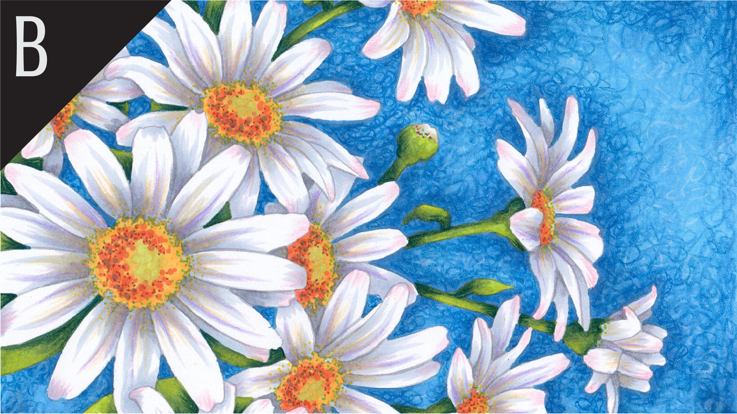
Oopsie Daisy: Start your marker painting journey with Oopsie Daisy and follow Amy as she covers the flick technique and how to use it with both marker and colored pencil to develop depth in floral images. Find more info here.
We continue to create new content and classes and we will update here as more become available.
Visit the workshop resource page at our sister site VanillaArts.com for a wide variety of Copic classes.
Vanilla Arts Digi Stamps using G28:
We continue to create new content and stamps and we will update here as more become available.
Visit the stamp shop page at our sister site VanillaArts.com for a wide variety of Vanilla Arts stamps.
Color palettes and swatches using G28:
We are building our palette and swatch collection a little more each week and will update here as more become available.
Visit the color resource page at our sister site VanillaArts.com for a wide variety of Copic palettes and swatches.
Looking for beautiful color palettes?
We absolutely love The Color Catalog 1 & 2 from Sarah Renae Clark. It puts hundreds of Copic friendly color palettes at your fingertips.
(note: affiliate link)


Y13 Lemon Yellow: Copics Uncapped (Marker Swatch, Ink Testing)
Y13 Lemon Yellow
Let’s take a closer look at this Copic Marker and it’s ink characteristics.


Y13 Lemon Yellow is a neutral yellow Copic Marker which doesn’t feel overtly warm or cool. This color is reminiscent of Aureolin watercolor. This delicate marker color is useful for sunny flower petals and makes an excellent bright underpaint. Y13 is available in Copic Sketch and Classic marker styles.
Every Copic Marker has unique characteristics based on its unique ink formula.
Knowing how a color behaves will help you blend effectively and make art with confidence.
Y13 Lemon Yellow
Let’s take a closer look at this Copic Marker and it’s ink characteristics.
Temperature: A neutral yellow, not obviously warm or cool.
Resemblance: Very reminiscent of Aureolin watercolor but also a close match to Winsor Lemon.
Actual Value: N2
All Copics are measured on a Neutral Gray value scale. The last number on the cap is supposed to indicate value but we’ve found discrepancies where the actual ink value is different than cap designation.
Cap Accuracy: Close. The plastic end of a Sketch Marker is just slightly more vibrant than the actual ink color.
Buildup: Y13 is moderately pigmented and layers beautifully.
Shattering: No shattering at all.
Chromatography testing shows this ink’s behavior when it comes in contact with #0 Colorless Blender (solvent). High shattering colors may leak unexpected color when you make corrections or attempt to blend with any color that has a high solvent to colorant ratio. Shattering is not bad, it’s just something to be aware of.

Staining: Not staining, an easy blending color.
Lift: Lifts easily.
See staining swatch. Sample was given 6 stripes of #0 Colorless Blender, drying between each stripe. Results indicate how much lifting you can expect.
Lightfast: Relatively stable. Fade was only visible on close examination. Perhaps about 10% loss.
Samples were swatched on X-Press It Blending Card. 1 layer of ink was exposed to windowsill sunlight for 21 days. Approximately 10 hours of sun per day based on weather conditions. Note: we do not recommend displaying original Copic art under these conditions.
Natural Ink Family: Y13 is a moderate dilution version of Y19. Y19 itself seems like a diluted version of a far more golden master ink formula.
Family Members Y19, Y18, Y17, Y15, Y13, Y11
We include this information because many Copic users never think deeper than the letter groupings (R, BV, G, etc.). Every ink has its own temperature variations and underlying flavors. Understanding what an ink looks like in its different dilutions helps when creating your own blending combinations.
Complement: A very pale periwinkle blue.
Underpaint: We suggest V01 or BV000
This is simply one suggestion. Many possible colors exist. Test to find a color that pleases you.
Pushing Pencil: We suggest Prismacolor 1026 Greyed Lavender
VanillaArts.com (our sister site) teaches a Push & Pull technique for dimensional coloring. This is simply one suggestion. Many possible colors exist. Test to find a color that pleases you.
Vanilla Arts Classes using Y13:

SPF 50 For Yellow: Learn to control your yellow markers and you learn to control the vibrancy of yellow in any project! can master this method because color control is for everyone. Find more info here.

Expressive Sunflowers: focus on your color sculpting and make your projects look dimensional. Use your chisel nib and create dimensional, and completely unblended art! Find more info here.
Vanilla Arts Digi Stamps using Y13:
We continue to create new content and stamps and we will update here as more become available.
Visit the stamp shop page at our sister site VanillaArts.com for a wide variety of Vanilla Arts stamps.
Color palettes and swatches using Y13:


Visit the color resource page at our sister site VanillaArts.com for a wide variety of Copic palettes and swatches.
Looking for beautiful color palettes?
We absolutely love The Color Catalog 1 & 2 from Sarah Renae Clark. It puts hundreds of Copic friendly color palettes at your fingertips.
(note: affiliate link)


R32 Peach: Copics Uncapped (Marker Swatch, Ink Testing)
R32 Peach
Let’s take a closer look at this Copic Marker and it’s ink characteristics.


R32 Peach is a warm, light red Copic Marker, diluted to a peachy pink. It looks like a watery Carmine or Red Madder watercolor. This soft marker color is useful for sun kissed flower petals and blushing cheeks. R32 is available in Copic Sketch, Ciao, and Classic marker styles.
Color better with R32. Every Copic Marker has unique characteristics based on its unique ink formula.
Knowing how a color behaves will help you blend effectively and make art with confidence.
R32 Peach
Let’s take a closer look at this Copic Marker and it’s ink characteristics.
Temperature: A warm light red.
Resemblance: Looks like a very watery dilution of Carmine or Madder watercolor. The Copic name is deceiving, this color is light red, definitely not peach.
Actual Value: N3
All Copics are measured on a Neutral Gray value scale. The last number on the cap is supposed to indicate value but we’ve found discrepancies where the actual ink value is different than cap designation.
Cap Accuracy: Close. The plastic end of a Sketch Marker is just slightly darker than the actual ink color.
Buildup: R32 is moderately pigmented and is easily layered.
Shattering: No visible shattering but there was a slight bit of warm yellow leakage at the outside edge of the ring. We don’t expect this color to shatter under normal conditions.
Chromatography testing shows this ink’s behavior when it comes in contact with #0 Colorless Blender (solvent). High shattering colors may leak unexpected color when you make corrections or attempt to blend with any color that has a high solvent to colorant ratio. Shattering is not bad, it’s just something to be aware of.

Staining: Reds are almost always staining colors but R32 has been diluted with enough solvent that it’s a fairly easy blender.
Lift: Moderate (reds tend be slightly stubborn)
See staining swatch. Sample was given 6 stripes of #0 Colorless Blender, drying between each stripe. Results indicate how much lifting you can expect.
Lightfast: Surprisingly stable. Fade was only visible on close examination. Perhaps about 5% loss.
Samples were swatched on X-Press It Blending Card. 1 layer of ink was exposed to windowsill sunlight for 21 days. Approximately 10 hours of sun per day based on weather conditions. Note: we do not recommend displaying original Copic art under these conditions.
Natural Ink Family: R32 is a high dilution version of R39 but feels oddly warmer than R39. R30 is the most denatured version.
Family Members R39, R37, R35, R32, R30
We include this information because many Copic users never think deeper than the letter groupings (R, BV, G, etc.). Every ink has its own temperature variations and underlying flavors. Understanding what an ink looks like in its different dilutions helps when creating your own blending combinations.
Complement: Pale Cyan, in the clean blue family. We suggest B01, B02, or B52.
Underpaint: We suggest BV20 to shade this color.
This is simply one suggestion. Many possible colors exist. Test to find a color that pleases you.
Pushing Pencil: We suggest Prismacolor 1079 Blue Violet Lake.
VanillaArts.com (our sister site) teaches a Push & Pull technique for dimensional coloring. This is simply one suggestion. Many possible colors exist. Test to find a color that pleases you.
Vanilla Arts Classes using R32:

Chocolate Box: learn how to create darker colors that Copic doesn’t make, essential to creating realistic deep dark areas. Find more info here.
Vanilla Arts Digi Stamps using R32:

Color palettes and swatches using R32:
We are building our palette and swatch collection a little more each week and will update here as more become available.
Visit the color resource page at our sister site VanillaArts.com for a wide variety of Copic palettes and swatches.
Looking for beautiful color palettes?
We absolutely love The Color Catalog 1 & 2 from Sarah Renae Clark. It puts hundreds of Copic friendly color palettes at your fingertips.
(note: affiliate link)


BV08 Blue Violet: Copics Uncapped (Marker Swatch, Ink Testing)
BV08 Blue Violet
Let’s take a closer look at this Copic Marker and it’s ink characteristics.


BV08 Blue Violet is a cool, blue-based deep purple Copic Marker reminiscent of Shadow Violet watercolor. This intense marker color is useful for night skies, shady niches, or concord grapes on the vine. BV08 is available in Copic Sketch, Ciao, and Classic marker styles.
Every Copic Marker has unique characteristics based on its unique ink formula.
Knowing how a color behaves will help you blend effectively and make art with confidence.
BV08 Blue Violet
Let’s take a closer look at this Copic Marker and it’s ink characteristics.
Temperature: A cool purple
Resemblance: Blue Violet strongly resembles a Shadow Violet watercolor pigment mixture.
Actual Value: N9
All Copics are measured on a Neutral Gray value scale. The last number on the cap is supposed to indicate value but we’ve found discrepancies where the actual ink value is different than cap designation.
Cap Accuracy: No. The plastic end of a Sketch Marker DOES NOT match the actual ink color. The cap is significantly darker than the ink.
Buildup: BV08 is highly pigmented and layers build quickly to an oversaturated look. By layer #3 the color was overly dark and oily. We do not recommend heavy applications.
Shattering: Leaks strong streaks of magenta. This effect would be noticeable when making corrections with a #0 marker.
Chromatography testing shows this ink’s behavior when it comes in contact with #0 Colorless Blender (solvent). High shattering colors may leak unexpected colors when you make corrections or attempt to blend with any color that has a high solvent to colorant ratio. Shattering is not bad, it’s just something to be aware of.

Staining: This is a staining color that resists correction or lifting and may be stubborn during blending.
Lift: Minimal
See staining swatch. Sample was given 6 stripes of #0 Colorless Blender, drying between each stripe. Results indicate how much lifting you can expect.
Lightfast: Not lightfast. Moderate fade was obvious.
Samples were swatched on X-Press It Blending Card. 1 layer of ink was exposed to windowsill sunlight for 21 days. Approximately 10 hours of sun per day based on weather conditions. Note: we do not recommend displaying original Copic art under these conditions.
Natural Ink Family: BV08 is a slight dilution of BV09 (which Copic does not sell). BV09 would be a violet deep enough to look almost black. At the opposite end, BV0000 has been denatured enough to seem cool white.
Family Members BV08, BV04, BV02, BV01, BV00, BV000, BV0000
We include this information because many Copic users never think deeper than the letter groupings (R, BV, G, etc.). Every ink has it’s own temperature variations and underlying flavors. Understanding what an ink looks like in its different dilutions helps when creating your own blending combinations.
Complement: Gold Green, in the YG or chartreuse family. Copic does not currently produce a direct complement in this color.
Underpaint: We suggest B99 to deepen BV08
This is simply one suggestion. Many possible colors exist. Test to find a color that pleases you.
Pushing Pencil: We suggest Prismacolor 1067 90% Cool Grey.
VanillaArts.com (our sister site) teaches a Push & Pull technique for dimensional coloring. This is simply one suggestion. Many possible colors exist. Test to find a color that pleases you.
Vanilla Arts Classes using BV08:

Complementary Pears: Learn to color smart, create focal points to give your coloring projects the professional look! Find more info here.

Cup of Columbine: Explore form and shape and an introduction to neutral palettes. Includes a discussion on depth for three dimensional forms. Find more info here.
Vanilla Arts Digi Stamps using BV08:
We continue to create new content and stamps and we will update here as more become available.
Visit the stamp shop page at our sister site VanillaArts.com for a wide variety of Vanilla Arts stamps.
Color palettes and swatches using BV08:

Looking for beautiful color palettes?
We absolutely love The Color Catalog 1 & 2 from Sarah Renae Clark. It puts hundreds of Copic friendly color palettes at your fingertips.
(note: affiliate link)

