YG91 Putty: Copics Uncapped (Marker Swatch, Ink Testing)
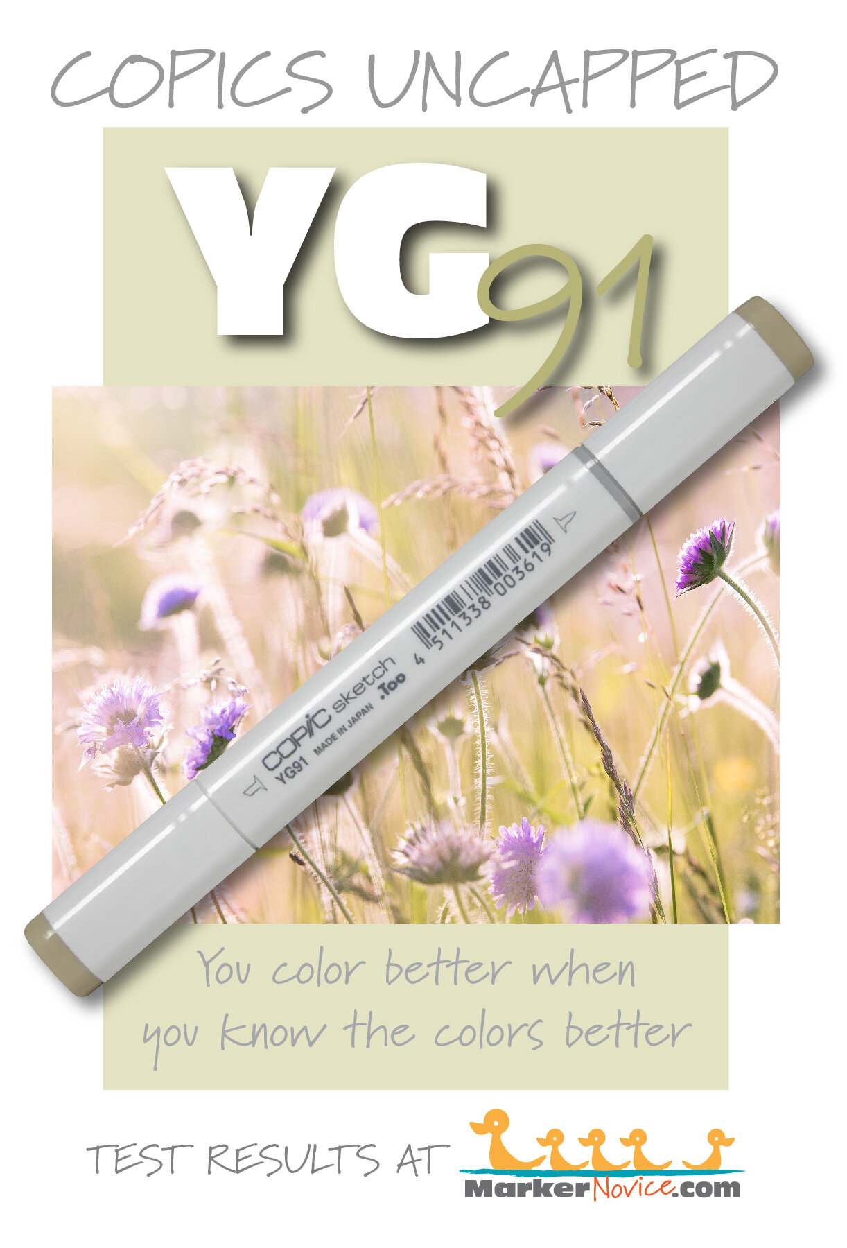
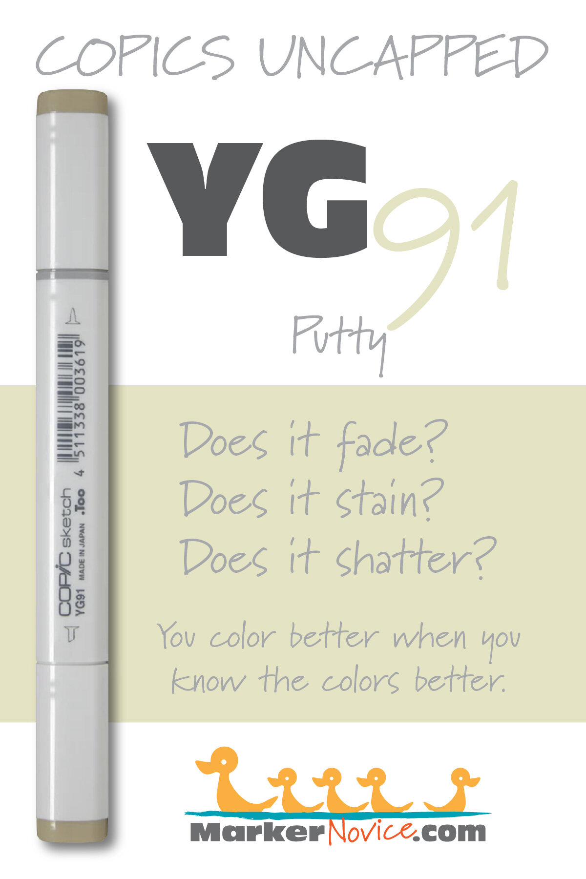
YG91 Putty
Let’s take a closer look at this Copic Marker and it’s ink characteristics.


YG91 is a pale murky yellow green Copic Marker which mimics diluted Chromium Green watercolor. It’s a strange color which most people will rarely use on it’s own. YG91 is available in Copic Sketch, Ciao, and Classic marker styles.
Every Copic Marker has unique characteristics based on its unique ink formula.
Knowing how a color behaves will help you blend effectively and make art with confidence.
YG91 Putty
Let’s take a closer look at this Copic Marker and its ink characteristics.
Temperature: A watery, murky yellow green.
Resemblance: Highly diluted Chromium Green watercolor.
Actual Value: N3
All Copics are measured on a Neutral Gray value scale. The last number on the cap is supposed to indicate value but we’ve found discrepancies where the actual ink value is different than cap designation.
Cap Accuracy: Yes. The colored plastic on the Sketch cap closely resembles this ink color.
Buildup: YG91 layers beautifully.
Shattering: Shatters into green with gold seeping out at the margins.
Chromatography testing shows this ink’s behavior when it comes in contact with #0 Colorless Blender (solvent). High shattering colors may leak unexpected color when you make corrections or attempt to blend with any color that has a high solvent to colorant ratio. Shattering is not bad, it’s just something to be aware of.
Staining: YG91 is mildly staining.
Lift: This color lifts a bit. Minor errors can be corrected but the paper will never be white-white again.
See staining swatch. Sample was given 6 stripes of #0 Colorless Blender, drying between each stripe. Results indicate how much lifting you can expect.
Lightfast: ODD FADE. The green colorant in this ink blend faded but the golden color did not. So this color didn’t fade, it yellowed.
Samples were swatched on X-Press It Blending Card. 1 layer of ink was exposed to windowsill sunlight for 21 days. Approximately 10 hours of sun per day based on weather conditions. Note: we do not recommend displaying original Copic art under these conditions.
Natural Ink Family: YG91 is the lightest in the YG90 series and is a highly diluted version of YG99.
Family Members: YG91, YG93, YG95, YG97, YG99
We include this information because many Copic users never think deeper than the letter groupings (R, BV, G, etc.). Every ink has its own temperature variations and underlying flavors. Understanding what an ink looks like in its different dilutions helps when creating your own blending combinations.
Complement: A pale periwinkle that leans more towards violet than blue. If Copic were to create a BV32 or 33, I’d suggest it as a complement.
Underpaint: BV31 makes a lovely desaturation for YG91.
This is simply one suggestion. Many possible colors exist. Test to find a color that pleases you.
Pushing Pencil: Prismacolor 1097 Moss Green looks beautiful over YG91.
VanillaArts.com (our sister site) teaches a Push & Pull technique for dimensional coloring. This is simply one suggestion. Many possible colors exist. Test to find a color that pleases you.
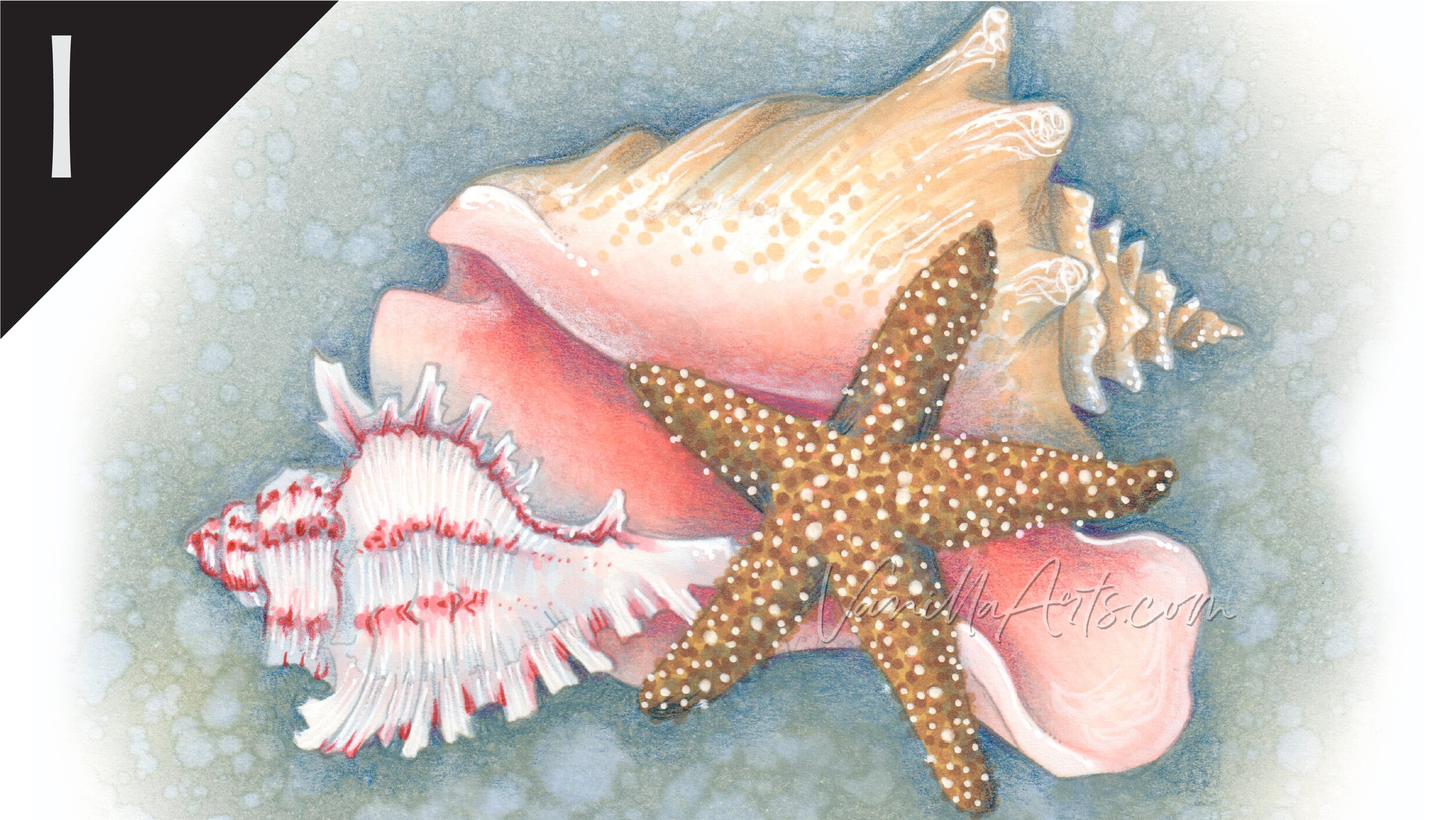
Seashell Trio: A lesson on delicate pinks and browns for realistic shells. Find more info here.
We continue to create new content and classes and we will update here as more become available.
Visit the workshop resource page at our sister site VanillaArts.com for a wide variety of Copic classes.
Vanilla Arts Digi Stamps using YG91:

Blue Swan: This swan shines in the light, a perfect opportunity to push with cool colors and pull with sunshine warms. Find more info here.
We continue to create new content and stamps and we will update here as more become available.
Visit the stamp shop page at our sister site VanillaArts.com for a wide variety of Copic classes.
Color palettes and swatches using YG91:
We are building our palette and swatch collection a little more each week and will update here as more become available.
Visit the color resource page at our sister site VanillaArts.com for a wide variety of Copic palettes and swatches.
Looking for beautiful color palettes?
We absolutely love The Color Catalog 1 & 2 from Sarah Renae Clark. It puts hundreds of Copic friendly color palettes at your fingertips.
(note: affiliate link)













YR14 Caramel: Copics Uncapped (Marker Swatch, Ink Testing)
YR14 Caramel
Let’s take a closer look at this Copic Marker and it’s ink characteristics.
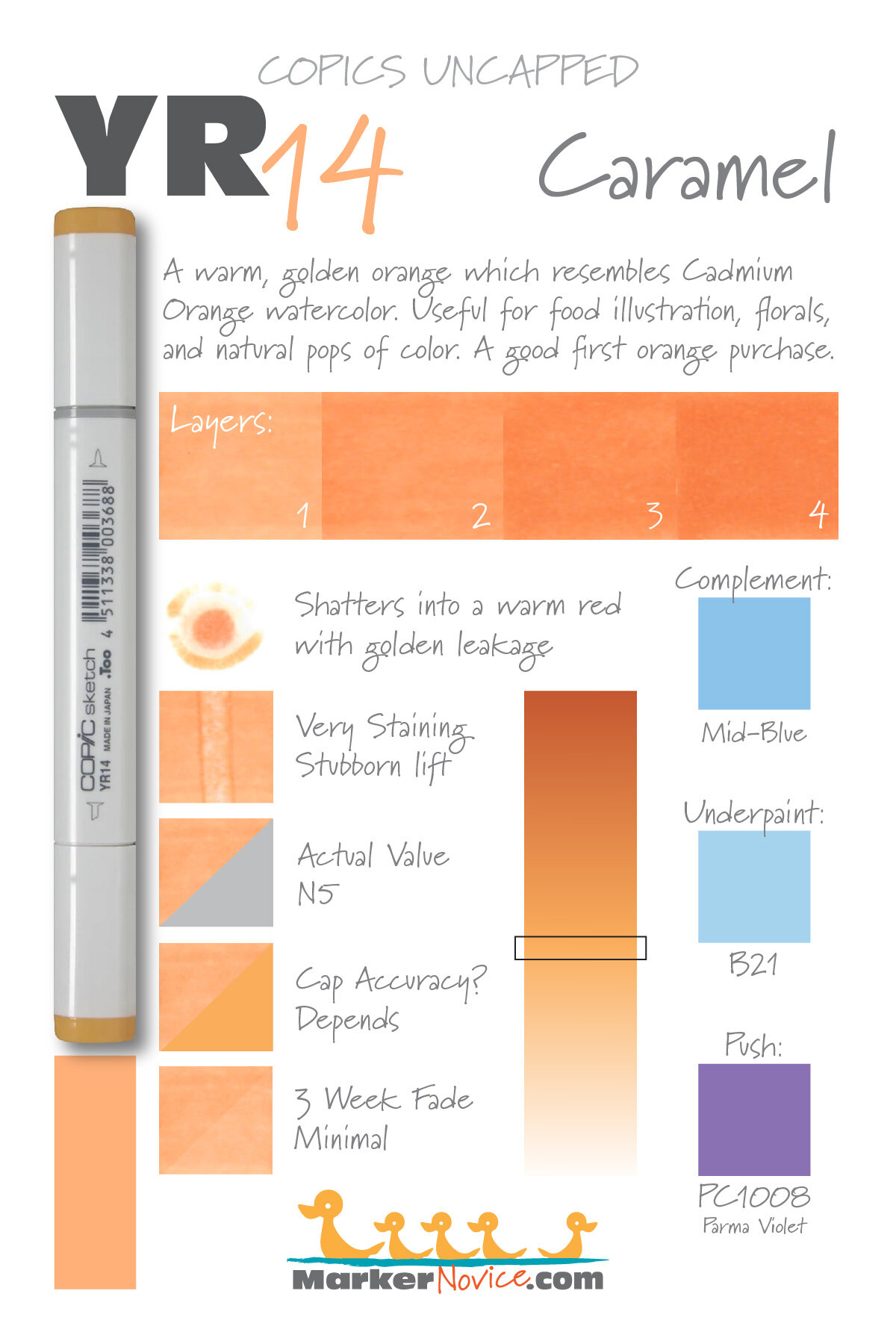

YR14 Caramel is a warm golden orange Copic Marker which resembles Cadmium Orange watercolor. This mellow color is useful for food illustration, florals, and natural pops of color. YR14 is only available in Copic Sketch and Classic marker styles.
Every Copic Marker has unique characteristics based on its unique ink formula.
Knowing how a color behaves will help you blend effectively and make art with confidence.
YR14 Caramel
Let’s take a closer look at this Copic Marker and its ink characteristics.
Temperature: A warm golden orange.
Resemblance: Cadmium Orange watercolor.
Actual Value: N5
All Copics are measured on a Neutral Gray value scale. The last number on the cap is supposed to indicate value but we’ve found discrepancies where the actual ink value is different than cap designation.
Cap Accuracy: WARNING! This is one of the most deceptive marker caps Copic makes. I have the old version of YG14 and my cap is a deep golden brown, about 4 times darker than the ink color. Copic changed the plastic they use but the new cap is more yellow than the ink color.
I suspect the “Caramel” name was bestowed based on the old brown caps, the ink is definitely not caramel colored.

Buildup: YR14 layers well.
Shattering: Shatters into a warm reddish orange with golden leakage around the puddle margins.
Chromatography testing shows this ink’s behavior when it comes in contact with #0 Colorless Blender (solvent). High shattering colors may leak unexpected color when you make corrections or attempt to blend with any color that has a high solvent to colorant ratio. Shattering is not bad, it’s just something to be aware of.
Staining: This color is very staining.
Lift: Stubborn. The ink can be moved a bit with colorless blender but it can only be lightened, not erased.
See staining swatch. Sample was given 6 stripes of #0 Colorless Blender, drying between each stripe. Results indicate how much lifting you can expect.
Lightfast: Minimal fading.
Samples were swatched on X-Press It Blending Card. 1 layer of ink was exposed to windowsill sunlight for 21 days. Approximately 10 hours of sun per day based on weather conditions. Note: we do not recommend displaying original Copic art under these conditions.
Natural Ink Family: YR14 is in the middle of the YR-teen family with YR12 on the light end and YR18 on the darker end. We suspect the mother ink is much darker than YR18.
WARNING, the caps on this entire family are wildly wrong on older marker sets.
Family Members: YR12, YR14, YR15, YR16, YR18
We include this information because many Copic users never think deeper than the letter groupings (R, BV, G, etc.). Every ink has its own temperature variations and underlying flavors. Understanding what an ink looks like in its different dilutions helps when creating your own blending combinations.
Complement: We suggest a medium blue marker like B32 or B34
Underpaint: B21neutralizes this color beautifully.
This is simply one suggestion. Many possible colors exist. Test to find a color that pleases you.
Pushing Pencil: Prismacolor 1008 Parma Violet is beautiful with YR14.
VanillaArts.com (our sister site) teaches a Push & Pull technique for dimensional coloring. This is simply one suggestion. Many possible colors exist. Test to find a color that pleases you.
Vanilla Arts Classes using YR14:
We continue to create new content and classes and we will update here as more become available.
Visit the workshop resource page at our sister site VanillaArts.com for a wide variety of Copic classes.
Vanilla Arts Digi Stamps using YR14:
We continue to create new content and stamps and we will update here as more become available.
Visit the stamp shop at our sister site VanillaArts.com for a wide variety of Copic classes.
Color palettes and swatches using YR14:
We are building our palette and swatch collection a little more each week and will update here as more become available.
Visit the color resource page at our sister site VanillaArts.com for a wide variety of Copic palettes and swatches.
Looking for beautiful color palettes?
We absolutely love The Color Catalog 1 & 2 from Sarah Renae Clark. It puts hundreds of Copic friendly color palettes at your fingertips.
(note: affiliate link)


RV11 Pink: Copics Uncapped (Marker Swatch, Ink Testing)
RV11 Pink
Let’s take a closer look at this Copic Marker and it’s ink characteristics.


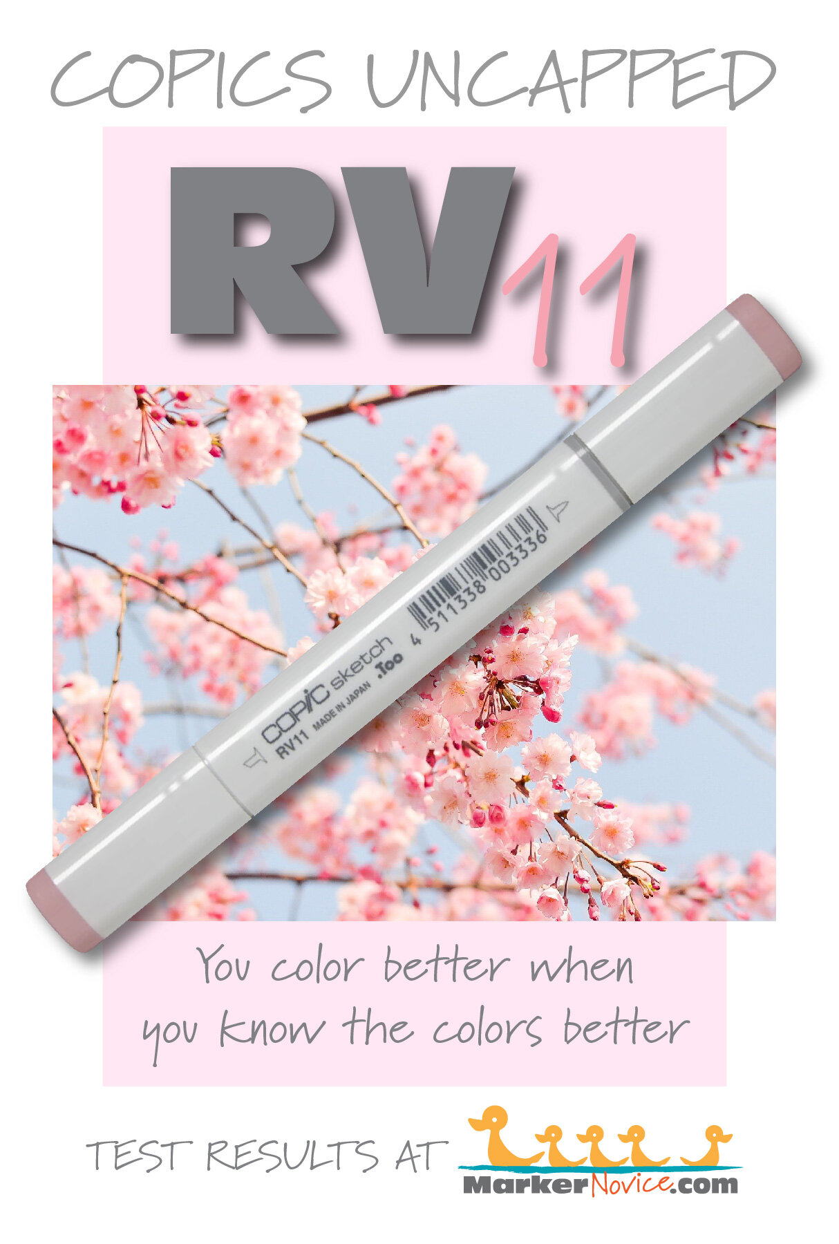
RV11 is a slightly warm magenta Copic Marker which mimics Quinacridone Fuchsia watercolor. This pale but cute color is useful for coloring florals, soft spring images, and delicate pastel projects. RV11 is only available in Copic Sketch and Classic marker styles.
Every Copic Marker has unique characteristics based on its unique ink formula.
Knowing how a color behaves will help you blend effectively and make art with confidence.
RV11 PInk
Let’s take a closer look at this Copic Marker and its ink characteristics.
Temperature: An ever-so slightly warm magenta.
Resemblance: Quinacridone Fuchsia watercolor.
Actual Value: N2.
All Copics are measured on a Neutral Gray value scale. The last number on the cap is supposed to indicate value but we’ve found discrepancies where the actual ink value is different than cap designation.
Cap Accuracy: Close. The plastic on a Sketch marker matches the color of 2-3 coats of RV11.
Buildup: This color layers beautifully.
Shattering: The color is pale and lightened even more in testing but we think we see the ink shatter into pink with a hint of something warmer like gold.
Chromatography testing shows this ink’s behavior when it comes in contact with #0 Colorless Blender (solvent). High shattering colors may leak unexpected color when you make corrections or attempt to blend with any color that has a high solvent to colorant ratio. Shattering is not bad, it’s just something to be aware of.
Staining: Most reds and magentas are staining and this color still stains even though it’s pale.
Lift: RV11 is stubborn and doesn’t lift much.
See staining swatch. Sample was given 6 stripes of #0 Colorless Blender, drying between each stripe. Results indicate how much lifting you can expect.
Lightfast: The fading was subtle but we’d expect it to increase during a longer test.
Samples were swatched on X-Press It Blending Card. 1 layer of ink was exposed to windowsill sunlight for 21 days. Approximately 10 hours of sun per day based on weather conditions. Note: we do not recommend displaying original Copic art under these conditions.
Natural Ink Family: RV11 is just a smidgen darker than RV10, the lightest color in the RV-teen family. RV19 is the darker end.
Family Members: RV10, RV11, RV13, RV14, RV17, RV19
We include this information because many Copic users never think deeper than the letter groupings (R, BV, G, etc.). Every ink has its own temperature variations and underlying flavors. Understanding what an ink looks like in its different dilutions helps when creating your own blending combinations.
Complement: A pale greenish blue like BG10
Underpaint: We suggest C0. Be careful, RV11 doesn’t cover much.
This is simply one suggestion. Many possible colors exist. Test to find a color that pleases you.
Pushing Pencil: Prismacolor 1026 Greyed Lavenderis the ideal choice.
VanillaArts.com (our sister site) teaches a Push & Pull technique for dimensional coloring. This is simply one suggestion. Many possible colors exist. Test to find a color that pleases you.
Vanilla Arts Classes using RV11:
Color palettes and swatches using RV11:

We are building our palette and swatch collection a little more each week and will update here as more become available.
Visit the color resource page at our sister site VanillaArts.com for a wide variety of Copic palettes and swatches.
Looking for beautiful color palettes?
We absolutely love The Color Catalog 1 & 2 from Sarah Renae Clark. It puts hundreds of Copic friendly color palettes at your fingertips.
(note: affiliate link)


W1 Warm Gray No. 1: Copics Uncapped (Marker Swatch, Ink Testing)
W1 Warm Gray No. 1
Let’s take a closer look at this Copic Marker and it’s ink characteristics.

W1 Warm Gray #1 is a highly diluted warm gray Copic Marker reminiscent of Titanium Gray watercolor. This color is useful for shading organic white objects like fur, cement, and white botanicals. W1 is available in Copic Sketch, Ciao, and Classic marker styles.
Every Copic Marker has unique characteristics based on its unique ink formula.
Knowing how a color behaves will help you blend effectively and make art with confidence.
W1 Gray No. 1
Let’s take a closer look at this Copic Marker and its ink characteristics.
Temperature: An extremely light, warm gray.
Resemblance: Titanium Gray watercolor.
Actual Value: W1
All Copics are measured on a Neutral Gray value scale. The last number on the cap is supposed to indicate value but we’ve found discrepancies where the actual ink value is different than cap designation.
Cap Accuracy: No. The cap is darker but also more golden than the actual ink.
Buildup: W1 has very little colorant and can be layered extensively.
Shattering: The ink is so pale that the test swatch was hard to visualize. We can see gray but there are hints of a peachy-brown leakage color at the margins of the spot.
Chromatography testing shows this ink’s behavior when it comes in contact with #0 Colorless Blender (solvent). High shattering colors may leak unexpected color when you make corrections or attempt to blend with any color that has a high solvent to colorant ratio. Shattering is not bad, it’s just something to be aware of.

Staining: No. Copic grays are not generally staining.
Lift: Lifts easily. This color is so pale, you can consider it erasable.
See staining swatch. Sample was given 6 stripes of #0 Colorless Blender, drying between each stripe. Results indicate how much lifting you can expect.
Lightfast: No fade was detected.
Samples were swatched on X-Press It Blending Card. 1 layer of ink was exposed to windowsill sunlight for 21 days. Approximately 10 hours of sun per day based on weather conditions. Note: we do not recommend displaying original Copic art under these conditions.
Natural Ink Family: W1 is a highly diluted version of W10.
Family Members: W10, W9, W8, W7, W6, W5, W4, W3, W2, W1, W0, W00,
We include this information because many Copic users never think deeper than the letter groupings (R, BV, G, etc.). Every ink has its own temperature variations and underlying flavors. Understanding what an ink looks like in its different dilutions helps when creating your own blending combinations.
Complement: N/A
Underpaint: N/A
Pushing Pencil: We suggest Prismacolor 1070 30% French Grey with a very soft touch.
VanillaArts.com (our sister site) teaches a Push & Pull technique for dimensional coloring. This is simply one suggestion. Many possible colors exist. Test to find a color that pleases you.
Looking for beautiful color palettes?
We absolutely love The Color Catalog 1 & 2 from Sarah Renae Clark. It puts hundreds of Copic friendly color palettes at your fingertips.
(note: affiliate link)


E09 Burnt Sienna: Copics Uncapped (Marker Swatch, Ink Testing)
E09 Burnt Sienna
Let’s take a closer look at this Copic Marker and it’s ink characteristics.
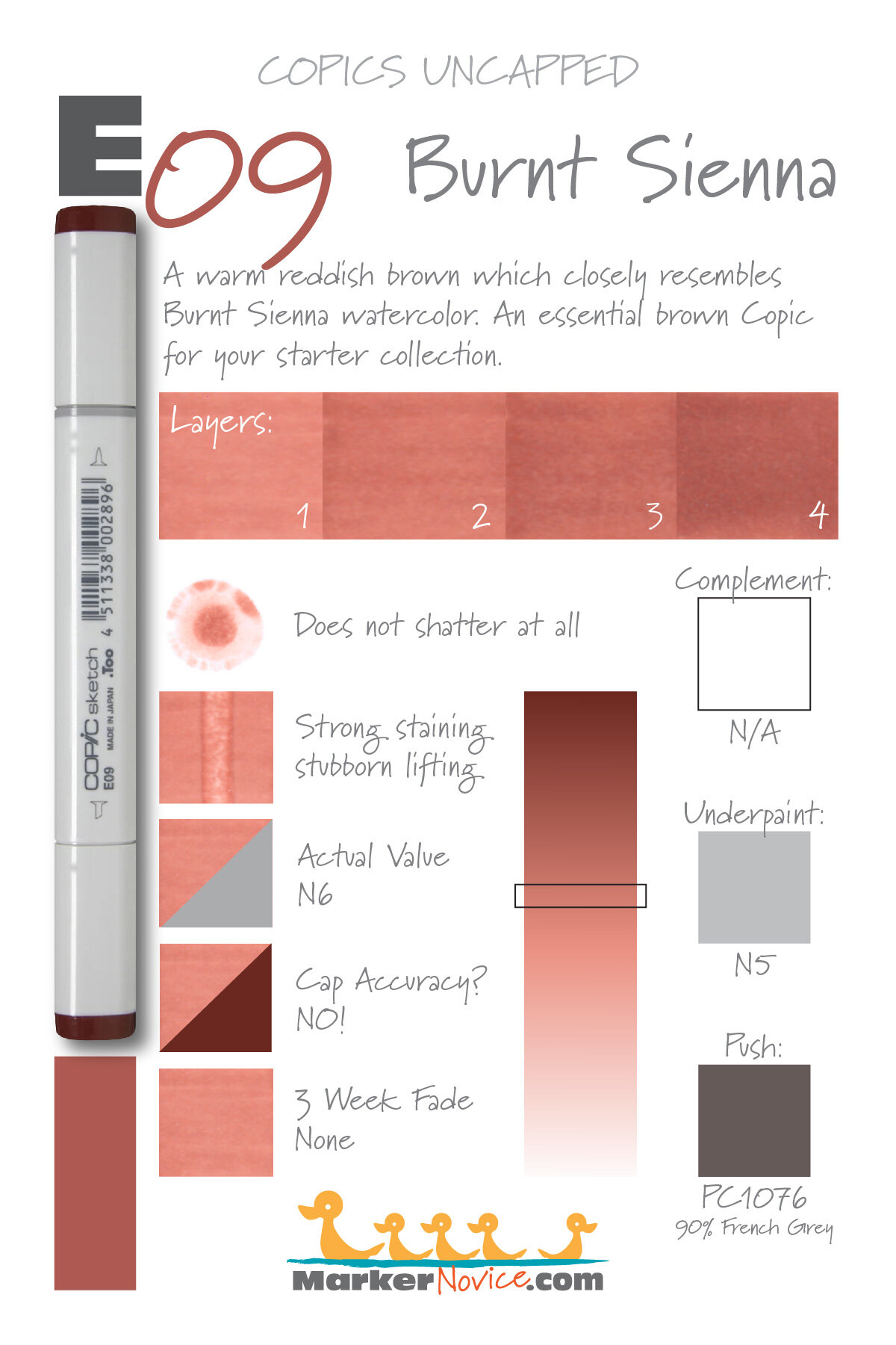
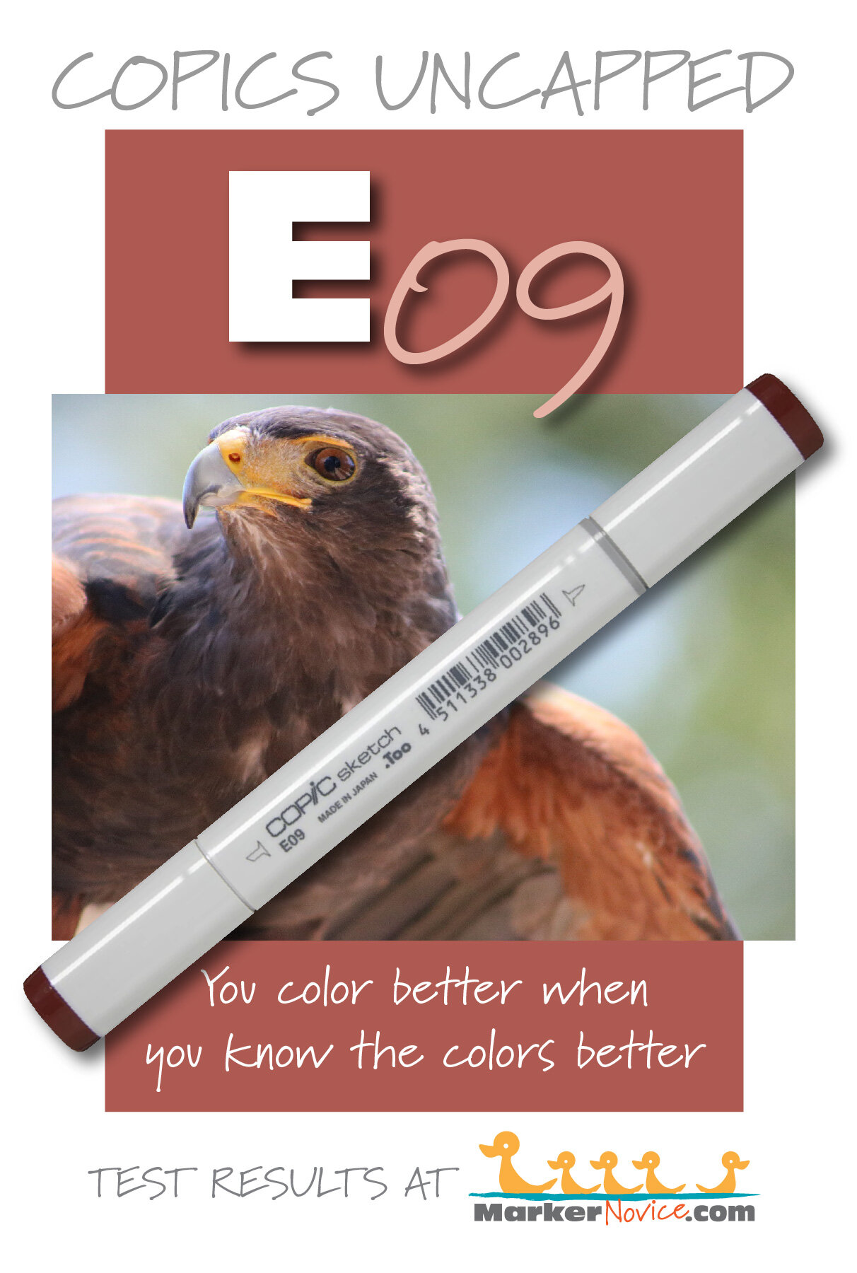
E09 Burnt Sienna is a warm reddish brown Copic Marker which mimics Burnt Sienna watercolor. This is an all purpose color and an essential marker for your starter collection. E09 is only available in Copic Sketch and Classic marker styles.
Every Copic Marker has unique characteristics based on its unique ink formula.
Knowing how a color behaves will help you blend effectively and make art with confidence.
E09 Burnt Sienna
Let’s take a closer look at this Copic Marker and its ink characteristics.
Temperature: A warm reddish brown.
Resemblance: Burnt Sienna watercolor.
Actual Value: N6
All Copics are measured on a Neutral Gray value scale. The last number on the cap is supposed to indicate value but we’ve found discrepancies where the actual ink value is different than cap designation.
Cap Accuracy: NO! The plastic on a Sketch marker is twice as dark as 4 coats of E09.
Buildup: E09 layers surprisingly well for a darker Copic ink. Even with 4 coats, we did not see much oiliness.
Shattering: Does not shatter at all.
Chromatography testing shows this ink’s behavior when it comes in contact with #0 Colorless Blender (solvent). High shattering colors may leak unexpected color when you make corrections or attempt to blend with any color that has a high solvent to colorant ratio. Shattering is not bad, it’s just something to be aware of.
Staining: Strong staining. Typical of an ink with red in the formula.
Lift: Stubborn. The ink can be lightened but the paper remains pinkish brown.
See staining swatch. Sample was given 6 stripes of #0 Colorless Blender, drying between each stripe. Results indicate how much lifting you can expect.
Lightfast: No fading.
Samples were swatched on X-Press It Blending Card. 1 layer of ink was exposed to windowsill sunlight for 21 days. Approximately 10 hours of sun per day based on weather conditions. Note: we do not recommend displaying original Copic art under these conditions.
Natural Ink Family: E09 should be the mother ink for this family with the other markers all being dilutions of E09. We suspect the mother ink is significantly darker.
Family Members: E09, E08, E07. E04, E02, E01, E00, E000, E000
We include this information because many Copic users never think deeper than the letter groupings (R, BV, G, etc.). Every ink has its own temperature variations and underlying flavors. Understanding what an ink looks like in its different dilutions helps when creating your own blending combinations.
Complement: Brown is not a hue on the colorwheel and does not have a complement.
Underpaint: N5 neutralizes this color well. This entire number series doesn’t cover the underpaint as well as you’d expect, so be careful not to choose an underpaint too potent to melt.
This is simply one suggestion. Many possible colors exist. Test to find a color that pleases you.
Pushing Pencil: Prismacolor 1076 90% French Grey is perfect for Burnt Sienna.
VanillaArts.com (our sister site) teaches a Push & Pull technique for dimensional coloring. This is simply one suggestion. Many possible colors exist. Test to find a color that pleases you.
Vanilla Arts Classes using E09:
We continue to create new content and classes and we will update here as more become available.
Visit the workshop resource page at our sister site VanillaArts.com for a wide variety of Copic classes.
Vanilla Arts Digi Stamps using E09:
We continue to create new content and stamps and we will update here as more become available.
Visit the stamp shop page at our sister site VanillaArts.com for a wide variety of Copic classes.
Color palettes and swatches using E09:
We are building our palette and swatch collection a little more each week and will update here as more become available.
Visit the color resource page at our sister site VanillaArts.com for a wide variety of Copic palettes and swatches.
Looking for beautiful color palettes?
We absolutely love The Color Catalog 1 & 2 from Sarah Renae Clark. It puts hundreds of Copic friendly color palettes at your fingertips.
(note: affiliate link)


BG18 Teal Blue: Copics Uncapped (Marker Swatch, Ink Testing)
BG18 Teal Blue
Let’s take a closer look at this Copic Marker and it’s ink characteristics.
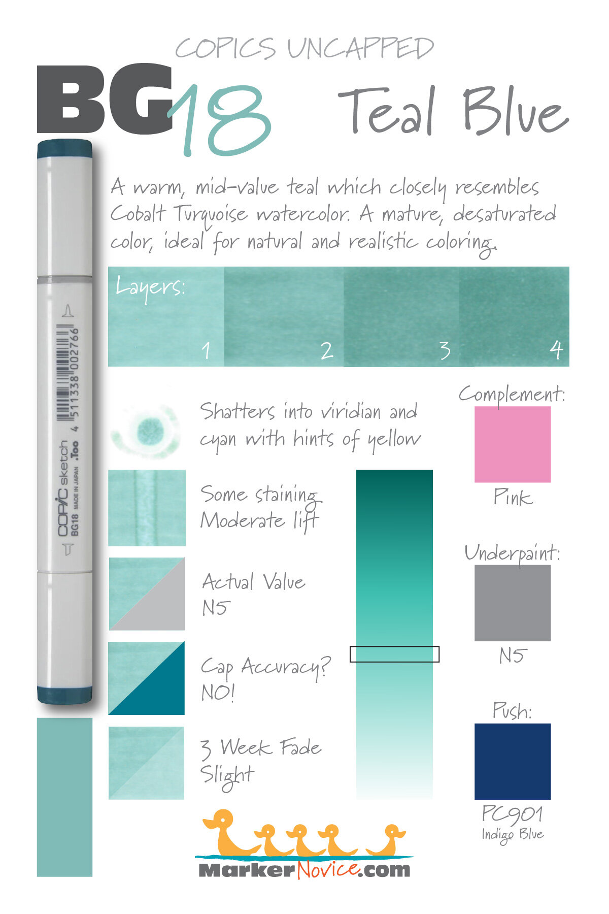
BG18 Teal Blue is a diluted teal Copic Marker which resembles Cobalt Turquoise watercolor. This is a mature, desaturated color, ideal for natural and realistic coloring. BG18 is only available in Copic Sketch and Classic marker styles.
Every Copic Marker has unique characteristics based on its unique ink formula.
Knowing how a color behaves will help you blend effectively and make art with confidence.
BG18 Teal Blue
Let’s take a closer look at this Copic Marker and its ink characteristics.
Temperature: A warm teal.
Resemblance: Moderately diluted Cobalt Turquoise watercolor.
Actual Value: N5 (note this is much lighter than the 8 in “BG18” indicates)
All Copics are measured on a Neutral Gray value scale. The last number on the cap is supposed to indicate value but we’ve found discrepancies where the actual ink value is different than cap designation.
Cap Accuracy: NO! The plastic on a Sketch marker is incredibly misleading. Not only is the plastic too dark but it’s also too blue. This really bothers me because I love this ink but I don’t use it much because I forget how wrong the cap is.
Buildup: BG18 layers beautifully.
Shattering: Shatters into viridian and cyan with faint hints of yellow on the outer edge.
Chromatography testing shows this ink’s behavior when it comes in contact with #0 Colorless Blender (solvent). High shattering colors may leak unexpected color when you make corrections or attempt to blend with any color that has a high solvent to colorant ratio. Shattering is not bad, it’s just something to be aware of.

Staining: BG18 stains slightly.
Lift: A moderate lifting color. It’s not erasable but you can soften some mistakes.
See staining swatch. Sample was given 6 stripes of #0 Colorless Blender, drying between each stripe. Results indicate how much lifting you can expect.
Lightfast: The fade was slight on this marker, less than 10%.
Samples were swatched on X-Press It Blending Card. 1 layer of ink was exposed to windowsill sunlight for 21 days. Approximately 10 hours of sun per day based on weather conditions. Note: we do not recommend displaying original Copic art under these conditions.
Natural Ink Family: BG18 should be a darker version of the other markers in this family. This doesn’t seem to be true. BG13 and BG15 are glowing colors, so BG18 should be glowing and dark, yet it’s a mild color with a bit of murkiness to it.
Family Members: BG18, BG15, BG13, BG11, BG10
We include this information because many Copic users never think deeper than the letter groupings (R, BV, G, etc.). Every ink has its own temperature variations and underlying flavors. Understanding what an ink looks like in its different dilutions helps when creating your own blending combinations.
Complement: A medium standard pink like RV13.
Underpaint: We suggest underpainting with medium gray like N5
This is simply one suggestion. Many possible colors exist. Test to find a color that pleases you.
Pushing Pencil: Prismacolor Indigo Blue 901 is perfect for pushing BG18.
VanillaArts.com (our sister site) teaches a Push & Pull technique for dimensional coloring. This is simply one suggestion. Many possible colors exist. Test to find a color that pleases you.
Vanilla Arts Classes using BG18:
We continue to create new content and classes and we will update here as more become available.
Visit the workshop resource page at our sister site VanillaArts.com for a wide variety of Copic classes.
Vanilla Arts Digi Stamps using BG18:
We continue to create new content and stamps and we will update here as more become available.
Visit the stamp shop page at our sister site VanillaArts.com for a wide variety of Copic classes.
Color palettes and swatches using BG18:

We are building our palette and swatch collection a little more each week and will update here as more become available.
Visit the color resource page at our sister site VanillaArts.com for a wide variety of Copic palettes and swatches.
Looking for beautiful color palettes?
We absolutely love The Color Catalog 1 & 2 from Sarah Renae Clark. It puts hundreds of Copic friendly color palettes at your fingertips.
(note: affiliate link)

YG13 Chartreuse: Copics Uncapped (Marker Swatch, Ink Testing)
YG13 Chartreuse
Let’s take a closer look at this Copic Marker and it’s ink characteristics.

YG13 is a warm chartreuse Copic Marker which mimics Green Gold watercolor. This marker is perfect for florals and spring landscapes, but can look obnoxiously bright if not controlled. YG13 is only available in Copic Sketch and Classic marker styles.
Every Copic Marker has unique characteristics based on its unique ink formula.
Knowing how a color behaves will help you blend effectively and make art with confidence.
YG13 Chartreuse
Let’s take a closer look at this Copic Marker and its ink characteristics.
Temperature: A warm chartreuse green.
Resemblance: Green Gold watercolor.
Actual Value: N3
All Copics are measured on a Neutral Gray value scale. The last number on the cap is supposed to indicate value but we’ve found discrepancies where the actual ink value is different than cap designation.
Cap Accuracy: Yes. The colored plastic on the Sketch cap closely resembles this ink color.
Buildup: YG13 started to look oily at 3 layers. Exercise caution.
Shattering: Shatters into green with yellow seeping out at the margins.
Chromatography testing shows this ink’s behavior when it comes in contact with #0 Colorless Blender (solvent). High shattering colors may leak unexpected color when you make corrections or attempt to blend with any color that has a high solvent to colorant ratio. Shattering is not bad, it’s just something to be aware of.

Staining: YG13 stains the paper with an odd yellow-gold color.
Lift: This color can be shifted a bit but the yellow color never fully moves.
See staining swatch. Sample was given 6 stripes of #0 Colorless Blender, drying between each stripe. Results indicate how much lifting you can expect.
Lightfast: Extreme Fading! This is one of the most extreme fades we’ve seen. As a result, we do not recommend this marker. Use YG03 instead.
Samples were swatched on X-Press It Blending Card. 1 layer of ink was exposed to windowsill sunlight for 21 days. Approximately 10 hours of sun per day based on weather conditions. Note: we do not recommend displaying original Copic art under these conditions.
Natural Ink Family: YG13 seems like a stand-alone color. It should be a darker version of YG11 but it is not. It should be a dilution of YG17 but it’s definitely different. This family seems like a mashup of unrelated inks.
Family Members: YG11, YG13, YG17
We include this information because many Copic users never think deeper than the letter groupings (R, BV, G, etc.). Every ink has its own temperature variations and underlying flavors. Understanding what an ink looks like in its different dilutions helps when creating your own blending combinations.
Complement: A pale periwinkle that leans more towards violet than blue. If Copic were to create a BV32 or 33, I’d suggest it as a complement.
Underpaint: BV00 makes a lovely desaturation for YG13.
This is simply one suggestion. Many possible colors exist. Test to find a color that pleases you.
Pushing Pencil: Prismacolor 1088 Parma Violet provides a nicely desaturated push for YG13.
VanillaArts.com (our sister site) teaches a Push & Pull technique for dimensional coloring. This is simply one suggestion. Many possible colors exist. Test to find a color that pleases you.
Vanilla Arts Classes using YG13:
We continue to create new content and classes and we will update here as more become available.
Visit the workshop resource page at our sister site VanillaArts.com for a wide variety of digital stamps.
Vanilla Arts Digi Stamps using YG13:
We continue to create new content and stamps and we will update here as more become available.
Visit the stamp shop page at our sister site VanillaArts.com for a wide variety of Copic classes.
Color palettes and swatches using YG13:

We are building our palette and swatch collection a little more each week and will update here as more become available.
Visit the color resource page at our sister site VanillaArts.com for a wide variety of Copic palettes and swatches.
Looking for beautiful color palettes?
We absolutely love The Color Catalog 1 & 2 from Sarah Renae Clark. It puts hundreds of Copic friendly color palettes at your fingertips.
(note: affiliate link)


YR09 Chinese Orange: Copics Uncapped (Marker Swatch, Ink Testing)
YR09 Chinese Orange
Let’s take a closer look at this Copic Marker and it’s ink characteristics.
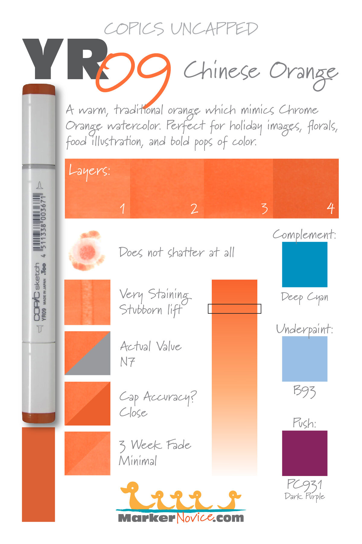
YR09 Chinese Orange is a warm traditional orange Copic Marker which mimics Chrome Orange watercolor. This bold marker color is perfect for holiday images, florals, and food illustration. YR09 is only available in Copic Sketch and Classic marker styles.
Every Copic Marker has unique characteristics based on its unique ink formula.
Knowing how a color behaves will help you blend effectively and make art with confidence.
YR09 Chinese Orange
Let’s take a closer look at this Copic Marker and its ink characteristics.
Temperature: A warm traditional orange.
Resemblance: Chrome Orange watercolor.
Actual Value: N7
All Copics are measured on a Neutral Gray value scale. The last number on the cap is supposed to indicate value but we’ve found discrepancies where the actual ink value is different than cap designation.
Cap Accuracy: Close; the cap is the same color as 3 coats of YR07.
Buildup: YR07 layers well up to 3 coats. Exercise extreme caution for anything beyond this.
Shattering: Does not shatter at all.
Chromatography testing shows this ink’s behavior when it comes in contact with #0 Colorless Blender (solvent). High shattering colors may leak unexpected color when you make corrections or attempt to blend with any color that has a high solvent to colorant ratio. Shattering is not bad, it’s just something to be aware of.

Staining: Some staining. Typical of an ink with red in the formula.
Lift: Stubborn. The ink can be moved a bit with colorless blender but it can only be lightened, not erased.
See staining swatch. Sample was given 6 stripes of #0 Colorless Blender, drying between each stripe. Results indicate how much lifting you can expect.
Lightfast: Minimal fade, but the amount of fade was minor. This was shocking because we expected this color to fade much more.
Samples were swatched on X-Press It Blending Card. 1 layer of ink was exposed to windowsill sunlight for 21 days. Approximately 10 hours of sun per day based on weather conditions. Note: we do not recommend displaying original Copic art under these conditions.
Natural Ink Family: YR09 is the mother ink for the entire YR0 family. The other colors are all dilutions of this ink.
Family Members: YR09, YR07, YR04, YR02, YR01, YR00, YR000, YR0000
We include this information because many Copic users never think deeper than the letter groupings (R, BV, G, etc.). Every ink has its own temperature variations and underlying flavors. Understanding what an ink looks like in its different dilutions helps when creating your own blending combinations.
Complement: We suggest a medium deep cyan marker like B16
Underpaint: B93 neutralizes this color well. This entire number series doesn’t cover the underpaint as well as you’d expect, so be careful not to choose a blue too potent to melt.
This is simply one suggestion. Many possible colors exist. Test to find a color that pleases you.
Pushing Pencil: Prismacolor 931 Dark Purple is ideal for YR09.
VanillaArts.com (our sister site) teaches a Push & Pull technique for dimensional coloring. This is simply one suggestion. Many possible colors exist. Test to find a color that pleases you.
Vanilla Arts Classes using YR09:
We continue to create new content and classes and we will update here as more become available.
Visit the workshop resource page at our sister site VanillaArts.com for a wide variety of Copic classes.
Vanilla Arts Digi Stamps using YR09:
We continue to create new content and stamps and we will update here as more become available.
Visit the stamp shop page at our sister site VanillaArts.com for a wide variety of Copic classes.
Color palettes and swatches using YR09:
We are building our palette and swatch collection a little more each week and will update here as more become available.
Visit the color resource page at our sister site VanillaArts.com for a wide variety of Copic palettes and swatches.
Looking for beautiful color palettes?
We absolutely love The Color Catalog 1 & 2 from Sarah Renae Clark. It puts hundreds of Copic friendly color palettes at your fingertips.
(note: affiliate link)