

B41 Powder Blue: Copics Uncapped (Marker Swatch, Ink Testing)
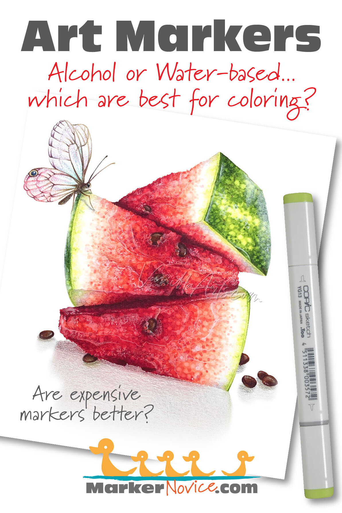
B41 Powder Blue
Let’s take a closer look at this Copic Marker and it’s ink characteristics.
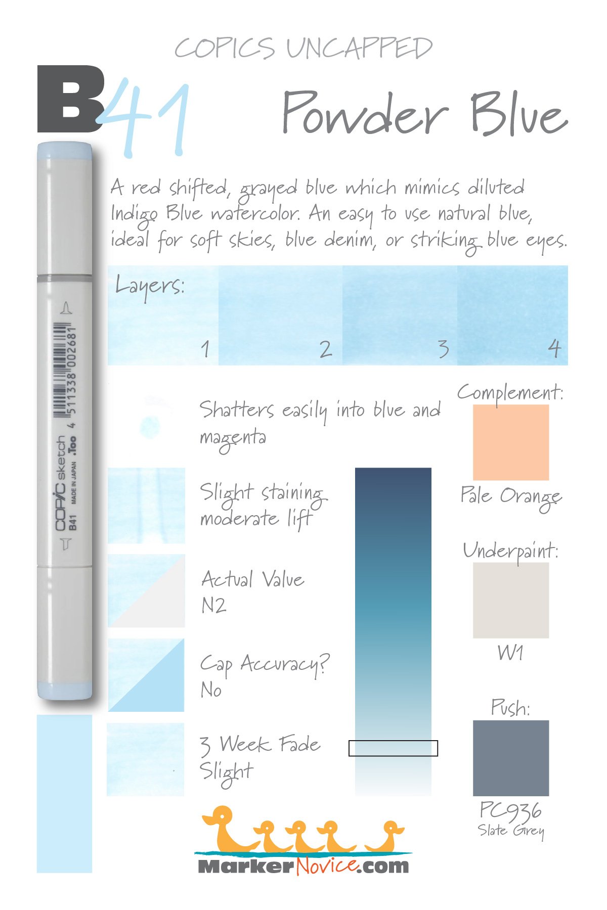

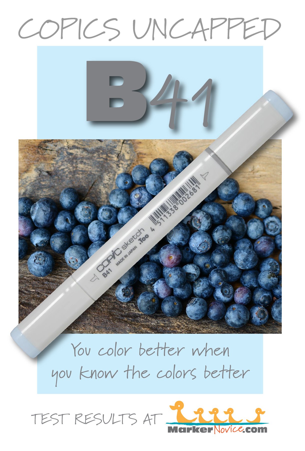
B41 Powder Blue is a red-shifted blue Copic Marker which mimics diluted Indigo Blue watercolor. This is an easy to use natural blue, ideal for soft skies, blue denim, or striking blue eyes. B41 is only available in Copic Sketch and Classic marker styles.
Every Copic Marker has unique characteristics based on its unique ink formula.
Knowing how a color behaves will help you blend effectively and make art with confidence.
B41 Powder Blue
Let’s take a closer look at this Copic Marker and its ink characteristics.
Temperature: A red-shifted and grayed blue.
Resemblance: Diluted Indigo Blue watercolor.
Actual Value: N2
All Copics are measured on a Neutral Gray value scale. The last number on the cap is supposed to indicate value but we’ve found discrepancies where the actual ink value is different than cap designation.
Cap Accuracy: The plastic on a Sketch marker is both brighter and darker than the color of B41 ink.
Buildup: B41 reaches maximum color at more than four layers. A single layer can look oily but it smooths out by 3 layers.
Shattering: Shatters very easily with magenta leakage.
Chromatography testing shows this ink’s behavior when it comes in contact with #0 Colorless Blender (solvent). High shattering colors may leak unexpected color when you make corrections or attempt to blend with any color that has a high solvent to colorant ratio. Shattering is not bad, it’s just something to be aware of.
Staining: B41 stains the paper slightly blue.
Lift: This color lifts moderately well with just a bit of blue tint left behind.
See staining swatch. Sample was given 6 stripes of #0 Colorless Blender, drying between each stripe. Results indicate how much lifting you can expect.
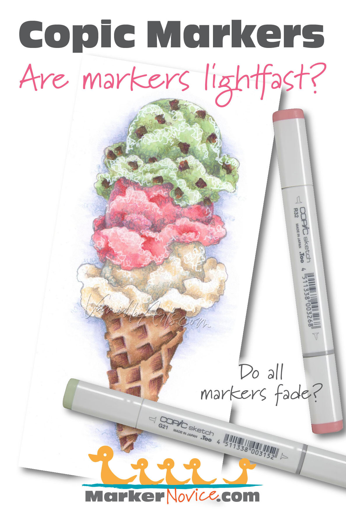
Lightfast: We saw slight fading during the test period, perhaps 5%
Samples were swatched on X-Press It Blending Card. 1 layer of ink was exposed to windowsill sunlight for 21 days. Approximately 10 hours of sun per day based on weather conditions. Note: we do not recommend displaying original Copic art under these conditions.
Natural Ink Family: B41 is one of only two markers in the very small B-Forty family. We wish Copic would expand this very natural blue which would be very popular with those who prefer more realistic, less bright colors.
Family Members: B45 and B41
We include this information because many Copic users never think deeper than the letter groupings (R, BV, G, etc.). Every ink has its own temperature variations and underlying flavors. Understanding what an ink looks like in its different dilutions helps when creating your own blending combinations.
Complement: A pale orange or peach color like YR01 or even R01
Underpaint: We suggest W1
This is simply one suggestion. Many possible colors exist. Test to find a color that pleases you.
Pushing Pencil: Prismacolor 936 Slate Grey would darken and desaturate B41 nicely but be sure to use soft pressure to avoid over-graying the blue.
VanillaArts.com (our sister site) teaches a Push & Pull technique for dimensional coloring. This is simply one suggestion. Many possible colors exist. Test to find a color that pleases you.
Vanilla Arts Classes using B41:

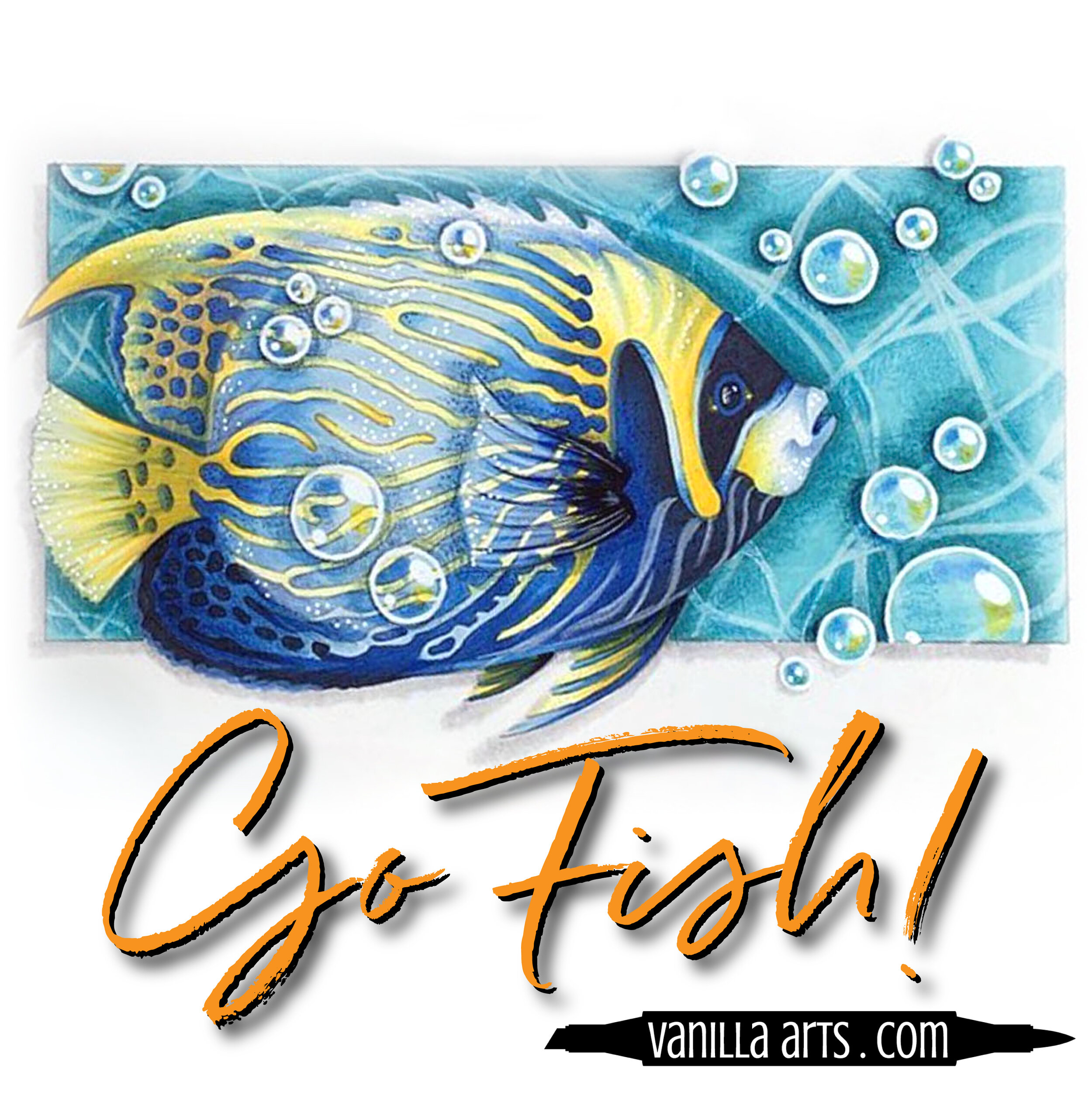
Copperbanded Butterflyfish: Amy explores the difference between pattern and texture. Find more info here.
Vanilla Arts Digi Stamps using B41:
Color palettes and swatches using B41:




Looking for beautiful color palettes?
We absolutely love The Color Catalog 1 & 2 from Sarah Renae Clark. It puts hundreds of Copic friendly color palettes at your fingertips.
(note: affiliate link)














BG02 New Blue: Copics Uncapped (Marker Swatch, Ink Testing)
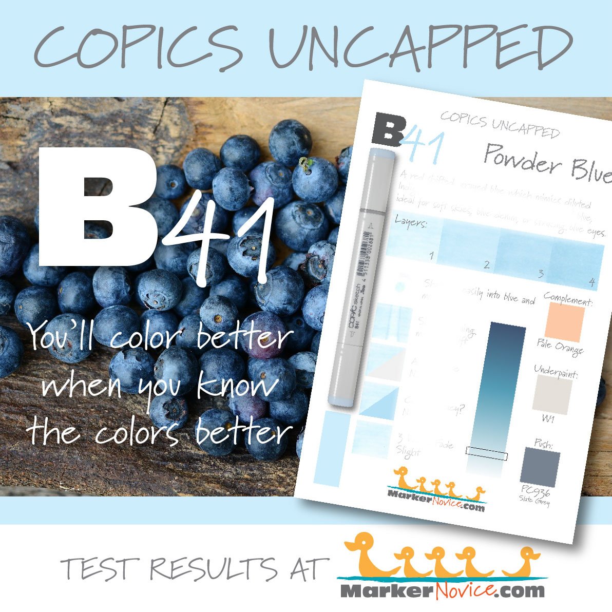
BG02 New Blue
Let’s take a closer look at this Copic Marker and it’s ink characteristics.


BG02 New Blue is green-shifted blue Copic Marker which mimics Phthalo Turquoise watercolor. This is a natual sea blue-green which is perfect for water scenes and landscapes. BG02 is only available in Copic Sketch and Classic marker styles.
Every Copic Marker has unique characteristics based on its unique ink formula.
Knowing how a color behaves will help you blend effectively and make art with confidence.
BG02 New Blue
Let’s take a closer look at this Copic Marker and its ink characteristics.
Temperature: A green-leaning blue
Resemblance: Phthalo Turquoise watercolor.
Actual Value: N3
All Copics are measured on a Neutral Gray value scale. The last number on the cap is supposed to indicate value but we’ve found discrepancies where the actual ink value is different than cap designation.
Cap Accuracy: The plastic on a Sketch marker matches 1-2 coats of BG02
Buildup: BG02 reaches full strength at 4 layers and does not develop any mottled oily appearance.
Shattering: BG02 does not appear to shatter.
Chromatography testing shows this ink’s behavior when it comes in contact with #0 Colorless Blender (solvent). High shattering colors may leak unexpected color when you make corrections or attempt to blend with any color that has a high solvent to colorant ratio. Shattering is not bad, it’s just something to be aware of.
Staining: BG02 is slightly staining and left the paper noticeably yellowed.

Lift: BG02 is a bit stubborn. We were surprised how little lifting occurred, despite the pale color value.
See staining swatch. Sample was given 6 stripes of #0 Colorless Blender, drying between each stripe. Results indicate how much lifting you can expect.
Lightfast: The fade was slight on this marker, about 10%.
Samples were swatched on X-Press It Blending Card. 1 layer of ink was exposed to windowsill sunlight for 21 days. Approximately 10 hours of sun per day based on weather conditions. Note: we do not recommend displaying original Copic art under these conditions.
Natural Ink Family: BG02 is in the mid-range of a large blue family.
Family Members: BG09, BG07, BG05, BG02, BG01, BG000, BG0000.
We include this information because many Copic users never think deeper than the letter groupings (R, BV, G, etc.). Every ink has its own temperature variations and underlying flavors. Understanding what an ink looks like in its different dilutions helps when creating your own blending combinations.
Complement: A light scarlet or carmine red such as R02
Underpaint: We suggest underpainting with light gray like N2
This is simply one suggestion. Many possible colors exist. Test to find a color that pleases you.
Pushing Pencil: Prismacolor 901 Indigo Blue is perfect for pushing BG02 if used with a very light pressure.
VanillaArts.com (our sister site) teaches a Push & Pull technique for dimensional coloring. This is simply one suggestion. Many possible colors exist. Test to find a color that pleases you.
Vanilla Arts Classes using BG02:
Vanilla Arts Digi Stamps using BG02:
We continue to create new content and stamps and we will update here as more become available.
Visit the stamp shop page at our sister site VanillaArts.com for a wide variety of Copic classes.
Color palettes and swatches using BG02:

Looking for beautiful color palettes?
We absolutely love The Color Catalog 1 & 2 from Sarah Renae Clark. It puts hundreds of Copic friendly color palettes at your fingertips.
(note: affiliate link)



YG07 Acid Green: Copics Uncapped (Marker Swatch, Ink Testing)
YG07 Acid Green
Let’s take a closer look at this Copic Marker and it’s ink characteristics.

YG07 is a medium chartreuse Copic Marker which looks like Sap Green watercolor. It is nice for florals, cartoons, and youthful party themed images. YG07 is only available in Copic Sketch and Classic marker styles.
Every Copic Marker has unique characteristics based on its unique ink formula.
Knowing how a color behaves will help you blend effectively and make art with confidence.
YG07 Acid Green
Let’s take a closer look at this Copic Marker and its ink characteristics.
Temperature: A warm chartreuse green.
Resemblance: Diluted Sap Green watercolor.
Actual Value: N4 (notice how much lighter this is than the “7” indicates)
All Copics are measured on a Neutral Gray value scale. The last number on the cap is supposed to indicate value but we’ve found discrepancies where the actual ink value is different than cap designation.
Cap Accuracy: Yes, it’s close. The colored plastic on the Sketch cap resembles 2 coats of YG07 ink.
Buildup: YG07 reaches maximum value at 4 layers, starts to look oily at the same level.
Shattering: Slight shattering, breaks into green with yellowish green leakage.
Chromatography testing shows this ink’s behavior when it comes in contact with #0 Colorless Blender (solvent). High shattering colors may leak unexpected color when you make corrections or attempt to blend with any color that has a high solvent to colorant ratio. Shattering is not bad, it’s just something to be aware of.
Staining: YG07 is slightly staining.

Lift: This color can be lifted a bit but it does leave traces of bluish green on the paper.
See staining swatch. Sample was given 6 stripes of #0 Colorless Blender, drying between each stripe. Results indicate how much lifting you can expect.
Lightfast: YG07 had a noticeably odd face. It didn’t lighten much but the swatch was obviously cooler and more mint style G green than YG.
Samples were swatched on X-Press It Blending Card. 1 layer of ink was exposed to windowsill sunlight for 21 days. Approximately 10 hours of sun per day based on weather conditions. Note: we do not recommend displaying original Copic art under these conditions.
Natural Ink Family: YG07 is bit odd for the YG-Zero family. It feels like we have two formulas in one family. YG0000 to YG03 are more yellow while YG05 to YG09 are more blue.
Family Members: YG0000, YG00, YG01, YG03, YG05, YG06, YG07, YG09
We include this information because many Copic users never think deeper than the letter groupings (R, BV, G, etc.). Every ink has its own temperature variations and underlying flavors. Understanding what an ink looks like in its different dilutions helps when creating your own blending combinations.
Complement: A pale periwinkle that leans more towards violet than blue. If Copic were to create a BV32 or 33, I’d suggest it as a complement.
Underpaint: BV00 makes a lovely desaturation for YG07.
This is simply one suggestion. Many possible colors exist. Test to find a color that pleases you.
Pushing Pencil: Prismacolor 1088 Parma Violet provides a nicely desaturated push for YG03.
VanillaArts.com (our sister site) teaches a Push & Pull technique for dimensional coloring. This is simply one suggestion. Many possible colors exist. Test to find a color that pleases you.
Vanilla Arts Classes using YG07:
Box of Colors (Marker Painting Foundations 2) is a four episode Copic + Colored Pencil challenge for graduates of MPF. Covers color theory and form sculpting with group feedback. For more information: Box of Colors.
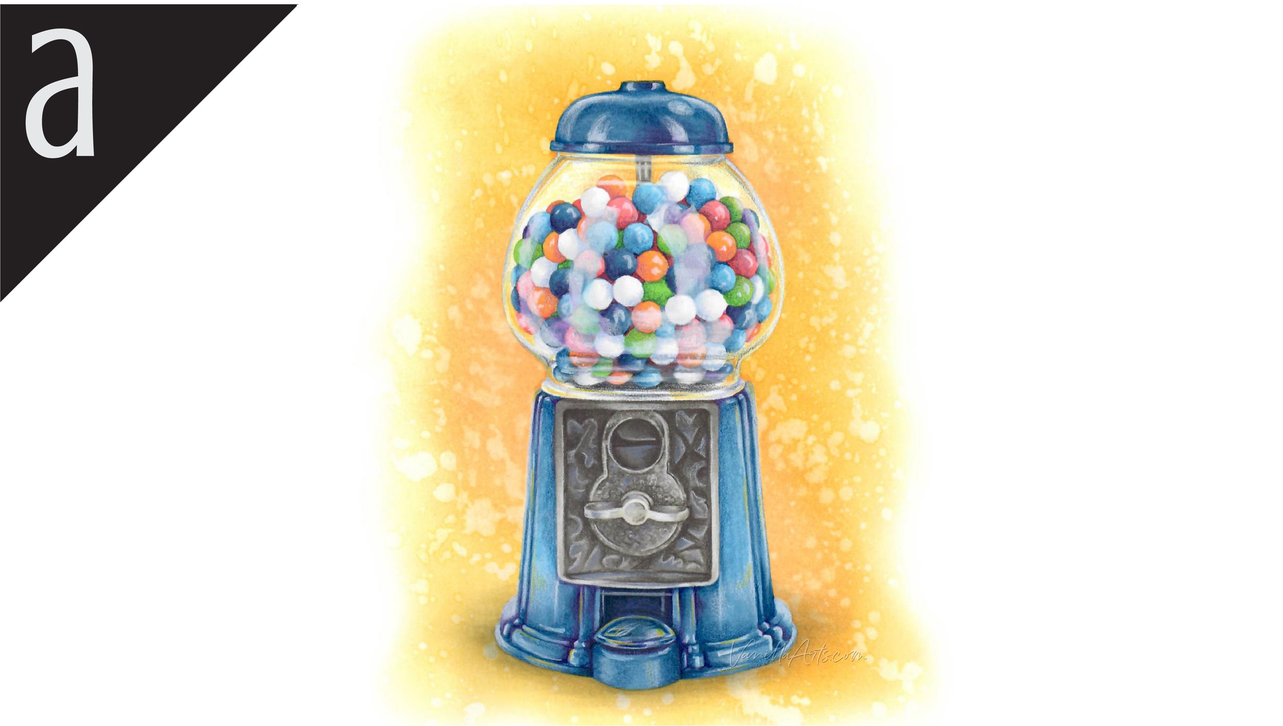
Penny Candy: understanding color as value. An in-depth lesson on how to alter the color of your photo references without sacrificing realism. Find more info here.
Vanilla Arts Digi Stamps using YG07:
We continue to create new content and stamps and we will update here as more become available.
Visit the stamp shop page at our sister site VanillaArts.com for a wide variety of Copic classes.
Color palettes and swatches using YG07:


Looking for beautiful color palettes?
We absolutely love The Color Catalog 1 & 2 from Sarah Renae Clark. It puts hundreds of Copic friendly color palettes at your fingertips.
(note: affiliate link)


RV06 Cerise: Copics Uncapped (Marker Swatch, Ink Testing)
RV06 Cerise
Let’s take a closer look at this Copic Marker and it’s ink characteristics.


RV06 Cerise is an artificially bright cool magenta Copic Marker which mimics Opera Rose watercolor. Not a realistic color but fun for florals, cartoons, and party images. RV06 is available in Copic Sketch, Ciao, and Classic marker styles.
Every Copic Marker has unique characteristics based on its unique ink formula.
Knowing how a color behaves will help you blend effectively and make art with confidence.
RV06 Cerise
Let’s take a closer look at this Copic Marker and its ink characteristics.
Temperature: A brightened neutral magenta.
Resemblance: Opera Rose watercolor.
Actual Value: N5.
All Copics are measured on a Neutral Gray value scale. The last number on the cap is supposed to indicate value but we’ve found discrepancies where the actual ink value is different than cap designation.
Cap Accuracy: No. The plastic on a Sketch marker is the correct value but much warmer than the color of 1 coat of RV06.
Buildup: RV06 reaches maximum value at 3-4 coats but develops slightly oily streaks at 2 layers.
Shattering: Does not shatter.
Chromatography testing shows this ink’s behavior when it comes in contact with #0 Colorless Blender (solvent). High shattering colors may leak unexpected color when you make corrections or attempt to blend with any color that has a high solvent to colorant ratio. Shattering is not bad, it’s just something to be aware of.

Staining: Staining.
Lift: Stubborn lifting and the ink turns oddly florescent when touched with colorless blender.
See staining swatch. Sample was given 6 stripes of #0 Colorless Blender, drying between each stripe. Results indicate how much lifting you can expect.
Lightfast: Extreme fading. This color faded by about 50%.
Samples were swatched on X-Press It Blending Card. 1 layer of ink was exposed to windowsill sunlight for 21 days. Approximately 10 hours of sun per day based on weather conditions. Note: we do not recommend displaying original Copic art under these conditions.
Natural Ink Family: RV06 is towards the dark end of the R-Zero family with RV09 at the dark end and RV0000 at the lightest end. WARNING: After complete testing of the RV-Zero family, I do not recommend purchasing this family of Copics, nor do I recommend using them due to their fade rate plus the obnoxious glow they provide. Try the RV-Ten’s instead.
Family Members: RV0000, RV000, RV00, RV02, RV04, RV06, RV09
We include this information because many Copic users never think deeper than the letter groupings (R, BV, G, etc.). Every ink has its own temperature variations and underlying flavors. Understanding what an ink looks like in its different dilutions helps when creating your own blending combinations.
Complement: A minty true green like G02
Underpaint: We suggest G02
This is simply one suggestion. Many possible colors exist. Test to find a color that pleases you.
Pushing Pencil: Prismacolor 931 Dark Purple looks wonderful.
VanillaArts.com (our sister site) teaches a Push & Pull technique for dimensional coloring. This is simply one suggestion. Many possible colors exist. Test to find a color that pleases you.
Vanilla Arts Classes using RV06:
We continue to create new content and classes and we will update here as more become available.
Visit the workshop resource page at our sister site VanillaArts.com for a wide variety of Copic classes.
Vanilla Arts Digi Stamps using RV06:
We continue to create new content and stamps and we will update here as more become available.
Visit the stamp shop page at our sister site VanillaArts.com for a wide variety of Copic classes.
Color palettes and swatches using RV06:

Looking for beautiful color palettes?
We absolutely love The Color Catalog 1 & 2 from Sarah Renae Clark. It puts hundreds of Copic friendly color palettes at your fingertips.
(note: affiliate link)

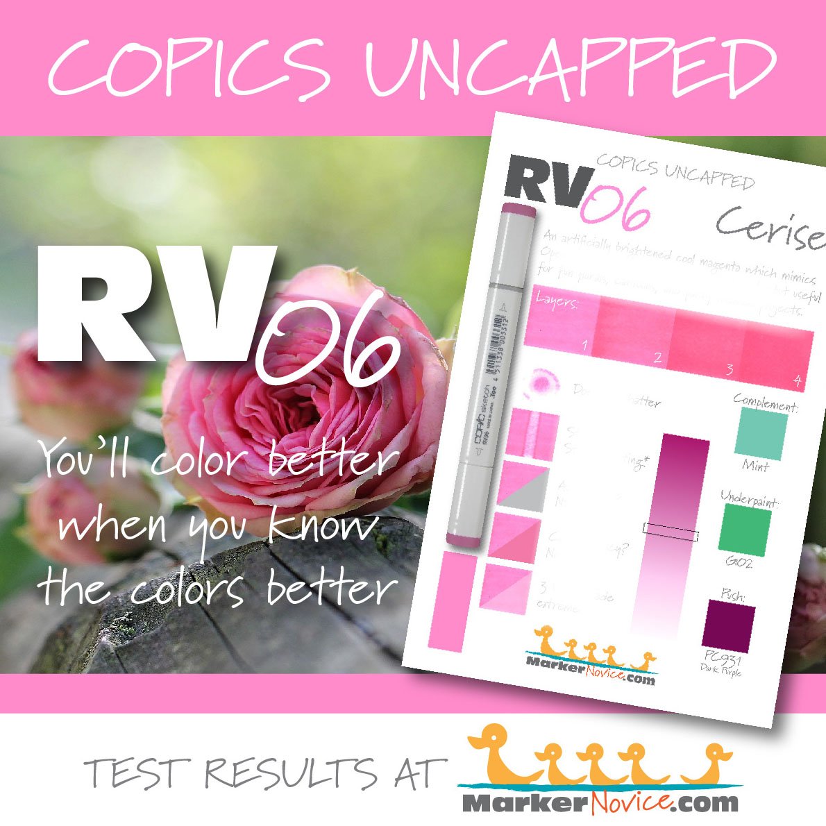

YG99 Marine Green: Copics Uncapped (Marker Swatch, Ink Testing)
YG99 Marine Green
Let’s take a closer look at this Copic Marker and it’s ink characteristics.

YG99 is a murky warm green Copic Marker which mimics Chromium Green watercolor. Excellent for landscapes, realistic botanicals, and it makes a charming alternative Christmas Green. YG99 is only available in Copic Sketch and Classic marker styles.
Every Copic Marker has unique characteristics based on its unique ink formula.
Knowing how a color behaves will help you blend effectively and make art with confidence.
YG99 Marine green
Let’s take a closer look at this Copic Marker and its ink characteristics.
Temperature: A murky warm green.
Resemblance: Chromium Green watercolor.
Actual Value: N8
All Copics are measured on a Neutral Gray value scale. The last number on the cap is supposed to indicate value but we’ve found discrepancies where the actual ink value is different than cap designation.
Cap Accuracy: No. The colored plastic on the Sketch cap is much darker than the ink. It’s closer to 4-5 coats of YG99 ink.
Buildup: YG99 does not layer well. The ink develops a strong oily look at just two layers. Exercise caution when reblending with YG99. Reaches maximum value at 4 layers.
Shattering: Shatters into dark green with strong dark gold seeping out at the margins.
Chromatography testing shows this ink’s behavior when it comes in contact with #0 Colorless Blender (solvent). High shattering colors may leak unexpected color when you make corrections or attempt to blend with any color that has a high solvent to colorant ratio. Shattering is not bad, it’s just something to be aware of.
Staining: YG99 is strongly staining.

Lift: This color really makes a mess when you try to lift it. The ink gets pushed aside leaving dark dry-lines and the paper stains an odd blue green. To make matters worse, the gold leaks out into the white, uncolored margins around the lifting area as it drys. We do not recommend trying to correct this marker at all!
See staining swatch. Sample was given 6 stripes of #0 Colorless Blender, drying between each stripe. Results indicate how much lifting you can expect.
Lightfast: Shockingly, we saw very little change to the swatch, less than 5% fading. We do think the swatch would behave very much like YG97 or YG95 if the testing time was extended (fading to an odd yellow).
Samples were swatched on X-Press It Blending Card. 1 layer of ink was exposed to windowsill sunlight for 21 days. Approximately 10 hours of sun per day based on weather conditions. Note: we do not recommend displaying original Copic art under these conditions.
Natural Ink Family: YG99 is the darker end of the YG-ninety family with YG91 on the light end.
Family Members: YG91, YG93, YG95, YG97, YG99
We include this information because many Copic users never think deeper than the letter groupings (R, BV, G, etc.). Every ink has its own temperature variations and underlying flavors. Understanding what an ink looks like in its different dilutions helps when creating your own blending combinations.
Complement: BV34 or BV04 is a good periwinkle style blue-violet.
Underpaint: We suggest BV25
This is simply one suggestion. Many possible colors exist. Test to find a color that pleases you.
Pushing Pencil: Try Prismacolor 1078 Black Cherry but use a light pressure.
VanillaArts.com (our sister site) teaches a Push & Pull technique for dimensional coloring. This is simply one suggestion. Many possible colors exist. Test to find a color that pleases you.
Vanilla Arts Classes using YG99:

Ink Frog: A lesson on alternative blending methods & creating warm characters. Find more info here.
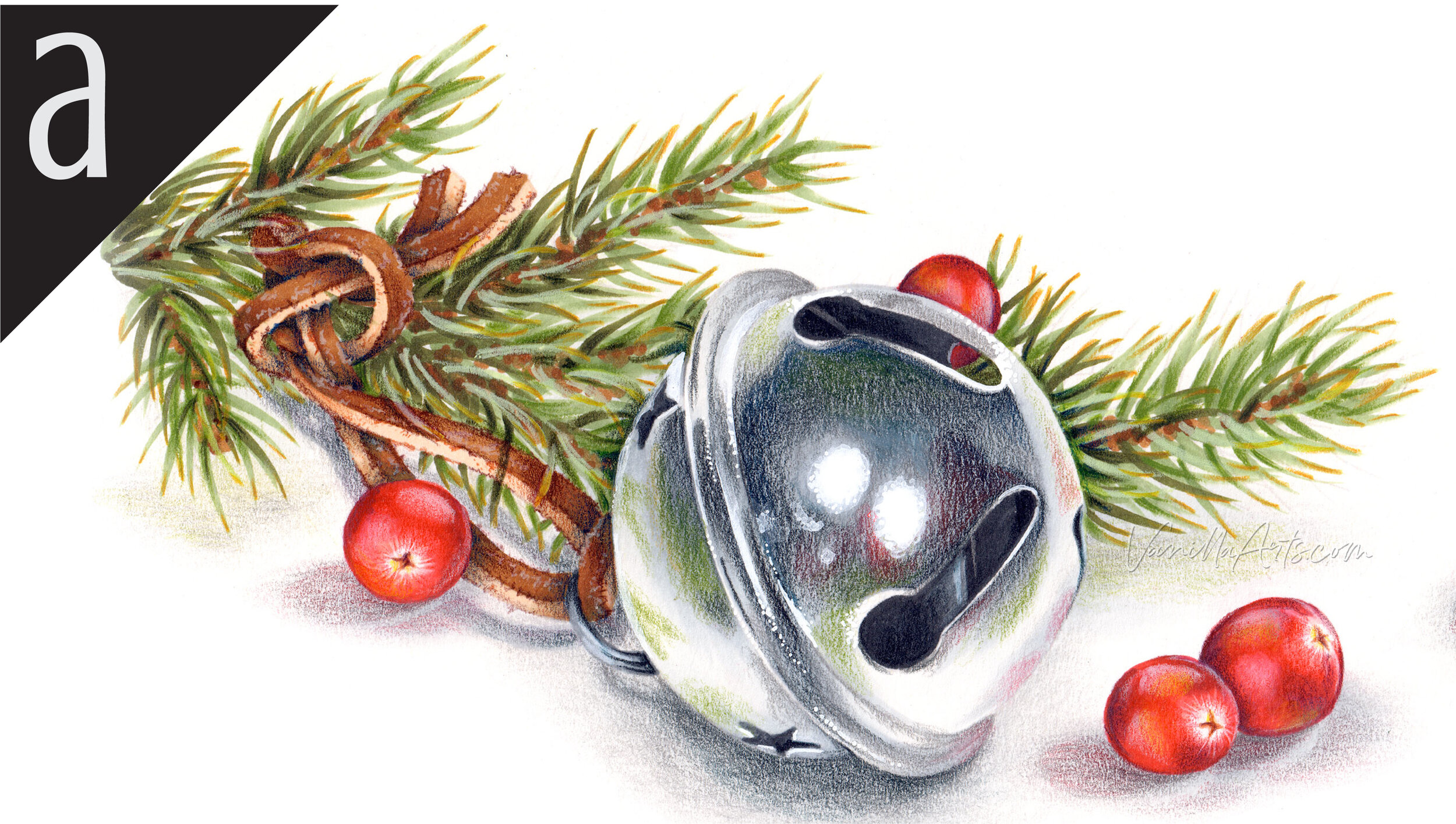
Sleigh Bell: explore the difference between highlights and reflections, a process that’s essential to capturing the look of shiny metal objects which look touchably real. Find more info here.
Vanilla Arts Digi Stamps using YG99:

Color palettes and swatches using YG99:
We are building our palette and swatch collection a little more each week and will update here as more become available.
Visit the color resource page at our sister site VanillaArts.com for a wide variety of Copic palettes and swatches.
Looking for beautiful color palettes?
We absolutely love The Color Catalog 1 & 2 from Sarah Renae Clark. It puts hundreds of Copic friendly color palettes at your fingertips.
(note: affiliate link)


N1 NeutralGray No. 1: Copics Uncapped (Marker Swatch, Ink Testing)
N1 Neutral Gray No. 1
Let’s take a closer look at this Copic Marker and it’s ink characteristics.

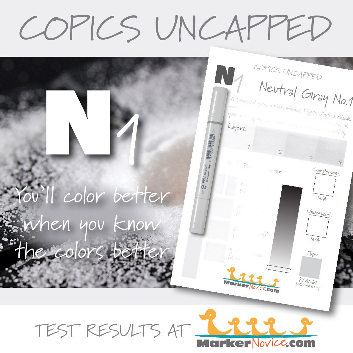
N1 Neutral Gray #1 is a balanced gray Copic Marker mimics highly diluted Black watercolor. We highly recommend purchasing N grays as your first gray markers because of their usefulness and versatility. N1 is only available in Sketch and Classic Copic styles.
Every Copic Marker has unique characteristics based on its unique ink formula.
Knowing how a color behaves will help you blend effectively and make art with confidence.
N1 Neutral Gray No. 1
Let’s take a closer look at this Copic Marker and its ink characteristics.
Temperature: A balanced gray, neither warm nor cool
Resemblance: diluted Black watercolor
Actual Value: N1 (All Copic N grays match their true value. N is the only family where this is true.)
All Copics are measured on a Neutral Gray value scale. The last number on the cap is supposed to indicate value but we’ve found discrepancies where the actual ink value is different than cap designation.
Cap Accuracy: Yes. The plastic end of a Sketch Marker matches 1 coats of N1.
Buildup: N1 reaches maximum color at 4-5 layers and starts to gather an oily appearance at 4 layers.
Shattering: Does not shatter.
Chromatography testing shows this ink’s behavior when it comes in contact with #0 Colorless Blender (solvent). High shattering colors may leak unexpected color when you make corrections or attempt to blend with any color that has a high solvent to colorant ratio. Shattering is not bad, it’s just something to be aware of.

Staining: N1 does not stain the paper.
Lift: N1 lifts easily.
See staining swatch. Sample was given 6 stripes of #0 Colorless Blender, drying between each stripe. Results indicate how much lifting you can expect.
Lightfast: N1 faded slightly, less than 10% and the fade turned the color slightly cooler than neutral.
Samples were swatched on X-Press It Blending Card. 1 layer of ink was exposed to windowsill sunlight for 21 days. Approximately 10 hours of sun per day based on weather conditions. Note: we do not recommend displaying original Copic art under these conditions.
Natural Ink Family: N1 is at the low end of the Neutral Gray family.
Family Members: N10, N9, N8, N7, N6, N5, N4, N3, N2, N1, N0
We include this information because many Copic users never think deeper than the letter groupings (R, BV, G, etc.). Every ink has its own temperature variations and underlying flavors. Understanding what an ink looks like in its different dilutions helps when creating your own blending combinations.
Complement: N/A
Underpaint: N/A
Pushing Pencil: We suggest Prismacolor 1061 30% Cool Grey
VanillaArts.com (our sister site) teaches a Push & Pull technique for dimensional coloring. This is simply one suggestion. Many possible colors exist. Test to find a color that pleases you.
Vanilla Arts Classes using N1:
Vanilla Arts Digi Stamps using N1:
We continue to create new content and stamps and we will update here as more become available.
Visit the Stamp Shop resource page at our sister site VanillaArts.com for a wide variety of Vanilla Arts stamps.
Color palettes and swatches using N1:
We are building our palette and swatch collection a little more each week and will update here as more become available.
Visit the color resource page at our sister site VanillaArts.com for a wide variety of Copic palettes and swatches.
Looking for beautiful color palettes?
We absolutely love The Color Catalog 1 & 2 from Sarah Renae Clark. It puts hundreds of Copic friendly color palettes at your fingertips.
(note: affiliate link)



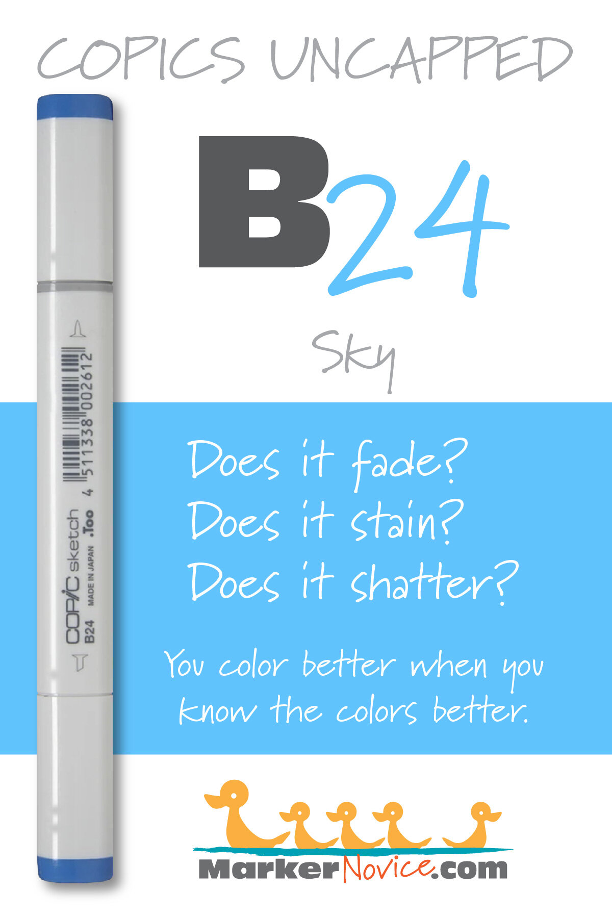
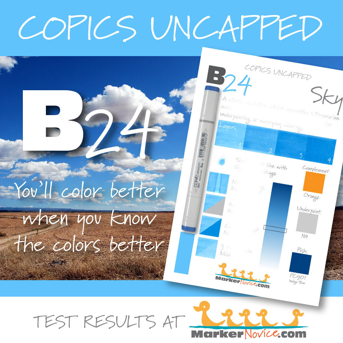
B24 Sky: Copics Uncapped (Marker Swatch, Ink Testing)
B24 Sky
Let’s take a closer look at this Copic Marker and it’s ink characteristics.
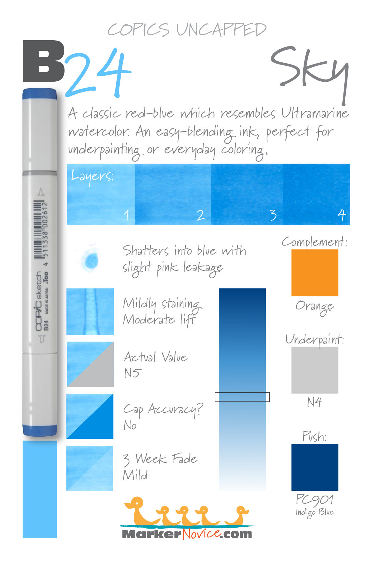
B24 Sky is a classic red-blue Copic Marker which resembles Ultramarine Blue watercolor. This is an easy-blending ink, perfect for underpainting or everyday coloring. B24 is available in Copic Sketch, Ciao, and Classic marker styles.
Every Copic Marker has unique characteristics based on its unique ink formula.
Knowing how a color behaves will help you blend effectively and make art with confidence.
B24 Sky
Let’s take a closer look at this Copic Marker and its ink characteristics.
Temperature: A slightly reddish blue.
Resemblance: Ultramarine Blue watercolor.
Actual Value: N5
All Copics are measured on a Neutral Gray value scale. The last number on the cap is supposed to indicate value but we’ve found discrepancies where the actual ink value is different than cap designation.
Cap Accuracy: The plastic on a Sketch marker is darker than 4 coats of B24 ink. Beware, this marker is lighter than you’d expect from the cap.
Buildup: B24 begins to look oily with the first layer but evens out by the third. This ink reaches maximum color at 4 layers.
Shattering: Mild shattering into blue with a pale pink leakage on the far outside edge.
Chromatography testing shows this ink’s behavior when it comes in contact with #0 Colorless Blender (solvent). High shattering colors may leak unexpected color when you make corrections or attempt to blend with any color that has a high solvent to colorant ratio. Shattering is not bad, it’s just something to be aware of.
Staining: B24 is mildly staining and leaves the paper with a slightly yellow cast.

Lift: This color can be moved to lessen a mistake but it’s only a moderate lift. The mistake will still be obvious.
See staining swatch. Sample was given 6 stripes of #0 Colorless Blender, drying between each stripe. Results indicate how much lifting you can expect.
Lightfast: Faded by about 5%.
Samples were swatched on X-Press It Blending Card. 1 layer of ink was exposed to windowsill sunlight for 21 days. Approximately 10 hours of sun per day based on weather conditions. Note: we do not recommend displaying original Copic art under these conditions.
Natural Ink Family: B24 is in the middle of the B-Twenty family. This is a popular marker family and a good investment for your first blue blends.
Family Members: B21, B23, B24, B26, B28, B29
We include this information because many Copic users never think deeper than the letter groupings (R, BV, G, etc.). Every ink has its own temperature variations and underlying flavors. Understanding what an ink looks like in its different dilutions helps when creating your own blending combinations.
Complement: A soft orange. We suggest YR04 or YR15
Underpaint: We suggest N4
This is simply one suggestion. Many possible colors exist. Test to find a color that pleases you.
Pushing Pencil: Prismacolor 901 Indigo Blue pushes this color nicely with a pleasant cool temperature.
VanillaArts.com (our sister site) teaches a Push & Pull technique for dimensional coloring. This is simply one suggestion. Many possible colors exist. Test to find a color that pleases you.
Vanilla Arts Classes using B24:

Oopsie Daisy: Start your marker painting journey with Oopsie Daisy and follow Amy as she covers the flick technique and how to use it with both marker and colored pencil to develop depth in floral images. Find more info here.
Box of Colors (Marker Painting Foundations 2) is a four episode Copic + Colored Pencil challenge for graduates of MPF. Covers color theory and form sculpting with group feedback. For more information: Box of Colors.
Vanilla Arts Digi Stamps using B24:
Color palettes and swatches using B24:
We are building our palette and swatch collection a little more each week and will update here as more become available.
Visit the color resource page at our sister site VanillaArts.com for a wide variety of Copic palettes and swatches.
Looking for beautiful color palettes?
We absolutely love The Color Catalog 1 & 2 from Sarah Renae Clark. It puts hundreds of Copic friendly color palettes at your fingertips.
(note: affiliate link)

E39 Leather: Copics Uncapped (Marker Swatch, Ink Testing)
E39 Leather
Let’s take a closer look at this Copic Marker and it’s ink characteristics.


E39 Leather is a warm brown Copic Marker which closely resembles a warmer Burnt Umber watercolor. An easy blending, organic, all purpose brown. A recommended best buy for beginners. E39 is only available in Copic Sketch and Classic marker styles.
Every Copic Marker has unique characteristics based on its unique ink formula.
Knowing how a color behaves will help you blend effectively and make art with confidence.
E39 Leather
Let’s take a closer look at this Copic Marker and its ink characteristics.
Temperature: A warm brown.
Resemblance: Burnt Umber watercolor
Actual Value: N7
All Copics are measured on a Neutral Gray value scale. The last number on the cap is supposed to indicate value but we’ve found discrepancies where the actual ink value is different than cap designation.
Cap Accuracy: No. The plastic on a Sketch marker is darker than 5 coats of E39 ink. Beware, this marker is a lot lighter than you’d expect from the cap indicator.
Buildup: E39 starts to look oily on the second layer and never really smooths out until 5 coats at which point the color is excessively dark. It builds to maximum value at 5 layers.
Shattering: Does not shatter.
Chromatography testing shows this ink’s behavior when it comes in contact with #0 Colorless Blender (solvent). High shattering colors may leak unexpected color when you make corrections or attempt to blend with any color that has a high solvent to colorant ratio. Shattering is not bad, it’s just something to be aware of.
Staining: Stains the paper light brown.

Lift: This color does not lift much (which is not surprising from the darkest marker in any Copic number group).
See staining swatch. Sample was given 6 stripes of #0 Colorless Blender, drying between each stripe. Results indicate how much lifting you can expect.
Lightfast: We observed very minor fading during the test period.
Samples were swatched on X-Press It Blending Card. 1 layer of ink was exposed to windowsill sunlight for 21 days. Approximately 10 hours of sun per day based on weather conditions. Note: we do not recommend displaying original Copic art under these conditions.
Natural Ink Family: E39 is in the darkest of the E-Thirty family. This family of browns feel warmer as the color gets darker.
Family Members: E30, E31, E33. E34, E35, E37, and E39
We include this information because many Copic users never think deeper than the letter groupings (R, BV, G, etc.). Every ink has its own temperature variations and underlying flavors. Understanding what an ink looks like in its different dilutions helps when creating your own blending combinations.
Complement: Brown is not a hue on the color wheel and does not have a complement.
Underpaint: BV02 neutralizes this color well.
This is simply one suggestion. Many possible colors exist. Test to find a color that pleases you.
Pushing Pencil: Prismacolor 1076 90% French Grey pushes this color nicely.
VanillaArts.com (our sister site) teaches a Push & Pull technique for dimensional coloring. This is simply one suggestion. Many possible colors exist. Test to find a color that pleases you.
Vanilla Arts Classes using E39:
Box of Colors (Marker Painting Foundations 2) is a four episode Copic + Colored Pencil challenge for graduates of MPF. Covers color theory and form sculpting with group feedback. For more information: Box of Colors.

Chocolate Box: Amy shows you how to create darker colors than Copic makes, essential to creating realistic deep dark areas. Find more info here.
Vanilla Arts Digi Stamps using E39:
We continue to create new content and stamps and we will update here as more become available.
Visit the stamp shop page at our sister site VanillaArts.com for a wide variety of digi stamps.
Color palettes and swatches using E39:
We are building our palette and swatch collection a little more each week and will update here as more become available.
Visit the color resource page at our sister site VanillaArts.com for a wide variety of Copic palettes and swatches.
Looking for beautiful color palettes?
We absolutely love The Color Catalog 1 & 2 from Sarah Renae Clark. It puts hundreds of Copic friendly color palettes at your fingertips.
(note: affiliate link)


