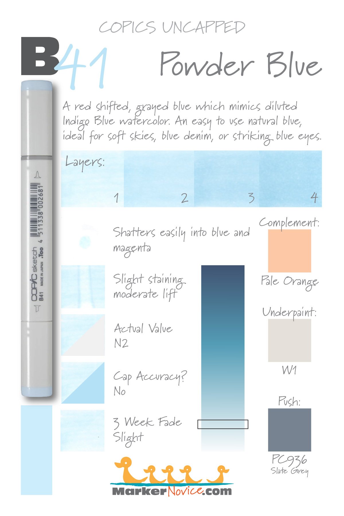
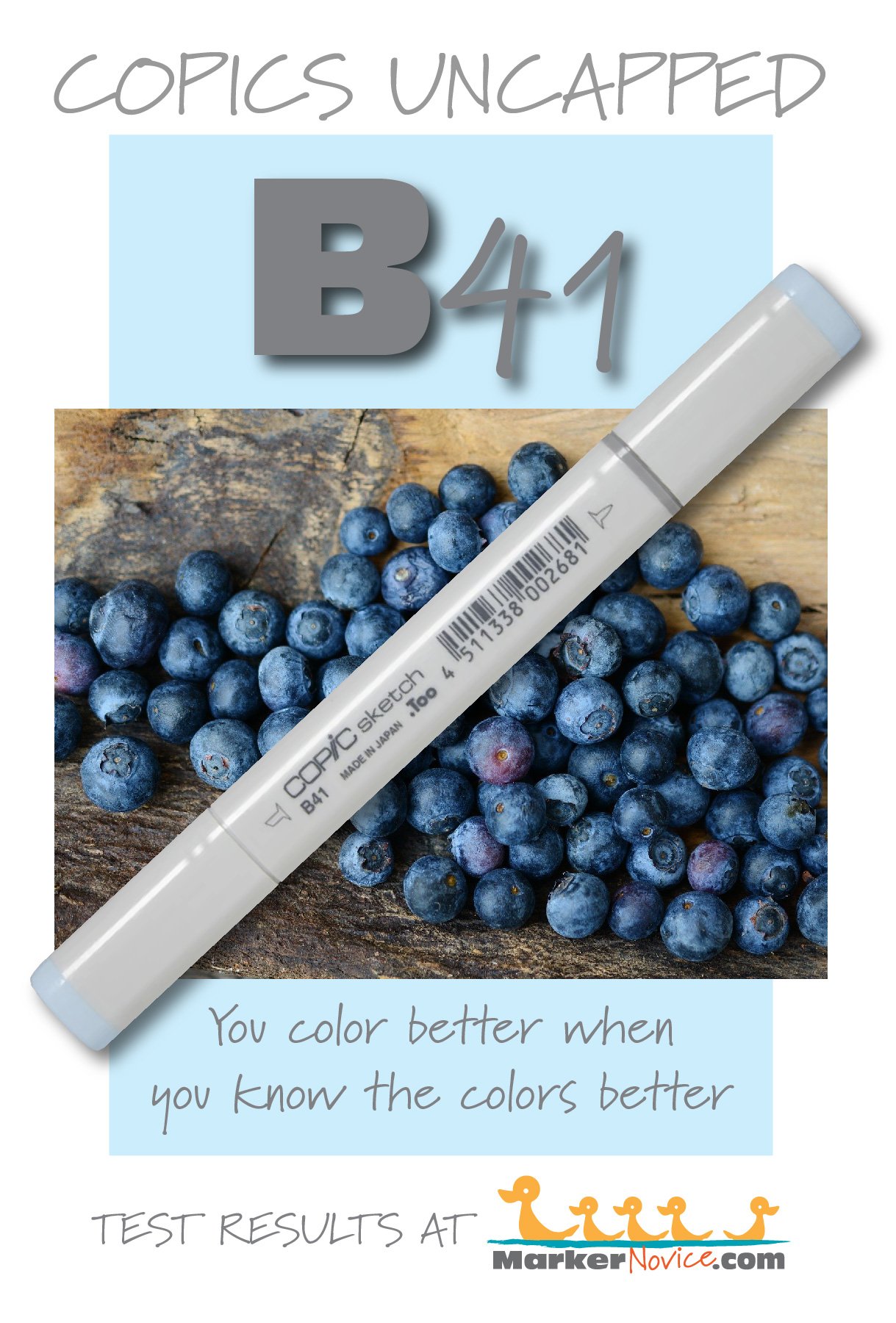
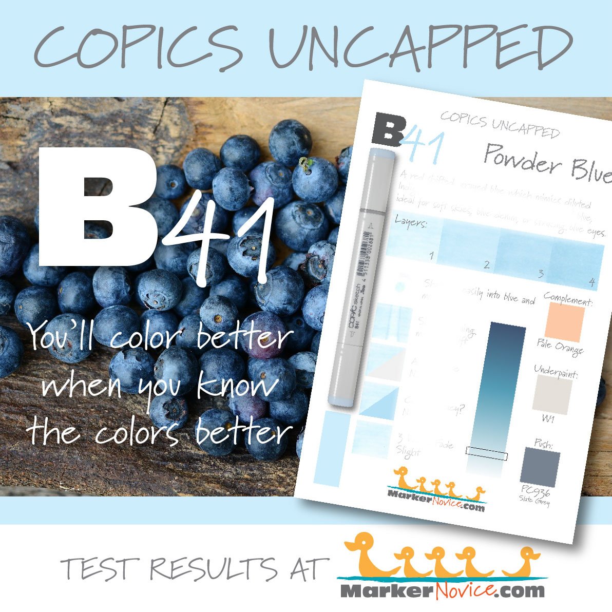
B41 Powder Blue is a red-shifted blue Copic Marker which mimics diluted Indigo Blue watercolor. This is an easy to use natural blue, ideal for soft skies, blue denim, or striking blue eyes. B41 is only available in Copic Sketch and Classic marker styles.
Every Copic Marker has unique characteristics based on its unique ink formula.
Knowing how a color behaves will help you blend effectively and make art with confidence.
B41 Powder Blue
Let’s take a closer look at this Copic Marker and its ink characteristics.
Temperature: A red-shifted and grayed blue.
Resemblance: Diluted Indigo Blue watercolor.
Actual Value: N2
All Copics are measured on a Neutral Gray value scale. The last number on the cap is supposed to indicate value but we’ve found discrepancies where the actual ink value is different than cap designation.
Cap Accuracy: The plastic on a Sketch marker is both brighter and darker than the color of B41 ink.
Buildup: B41 reaches maximum color at more than four layers. A single layer can look oily but it smooths out by 3 layers.
Shattering: Shatters very easily with magenta leakage.
Chromatography testing shows this ink’s behavior when it comes in contact with #0 Colorless Blender (solvent). High shattering colors may leak unexpected color when you make corrections or attempt to blend with any color that has a high solvent to colorant ratio. Shattering is not bad, it’s just something to be aware of.
Staining: B41 stains the paper slightly blue.
Lift: This color lifts moderately well with just a bit of blue tint left behind.
See staining swatch. Sample was given 6 stripes of #0 Colorless Blender, drying between each stripe. Results indicate how much lifting you can expect.
Lightfast: We saw slight fading during the test period, perhaps 5%
Samples were swatched on X-Press It Blending Card. 1 layer of ink was exposed to windowsill sunlight for 21 days. Approximately 10 hours of sun per day based on weather conditions. Note: we do not recommend displaying original Copic art under these conditions.
Natural Ink Family: B41 is one of only two markers in the very small B-Forty family. We wish Copic would expand this very natural blue which would be very popular with those who prefer more realistic, less bright colors.
Family Members: B45 and B41
We include this information because many Copic users never think deeper than the letter groupings (R, BV, G, etc.). Every ink has its own temperature variations and underlying flavors. Understanding what an ink looks like in its different dilutions helps when creating your own blending combinations.
Complement: A pale orange or peach color like YR01 or even R01
Underpaint: We suggest W1
This is simply one suggestion. Many possible colors exist. Test to find a color that pleases you.
Pushing Pencil: Prismacolor 936 Slate Grey would darken and desaturate B41 nicely but be sure to use soft pressure to avoid over-graying the blue.
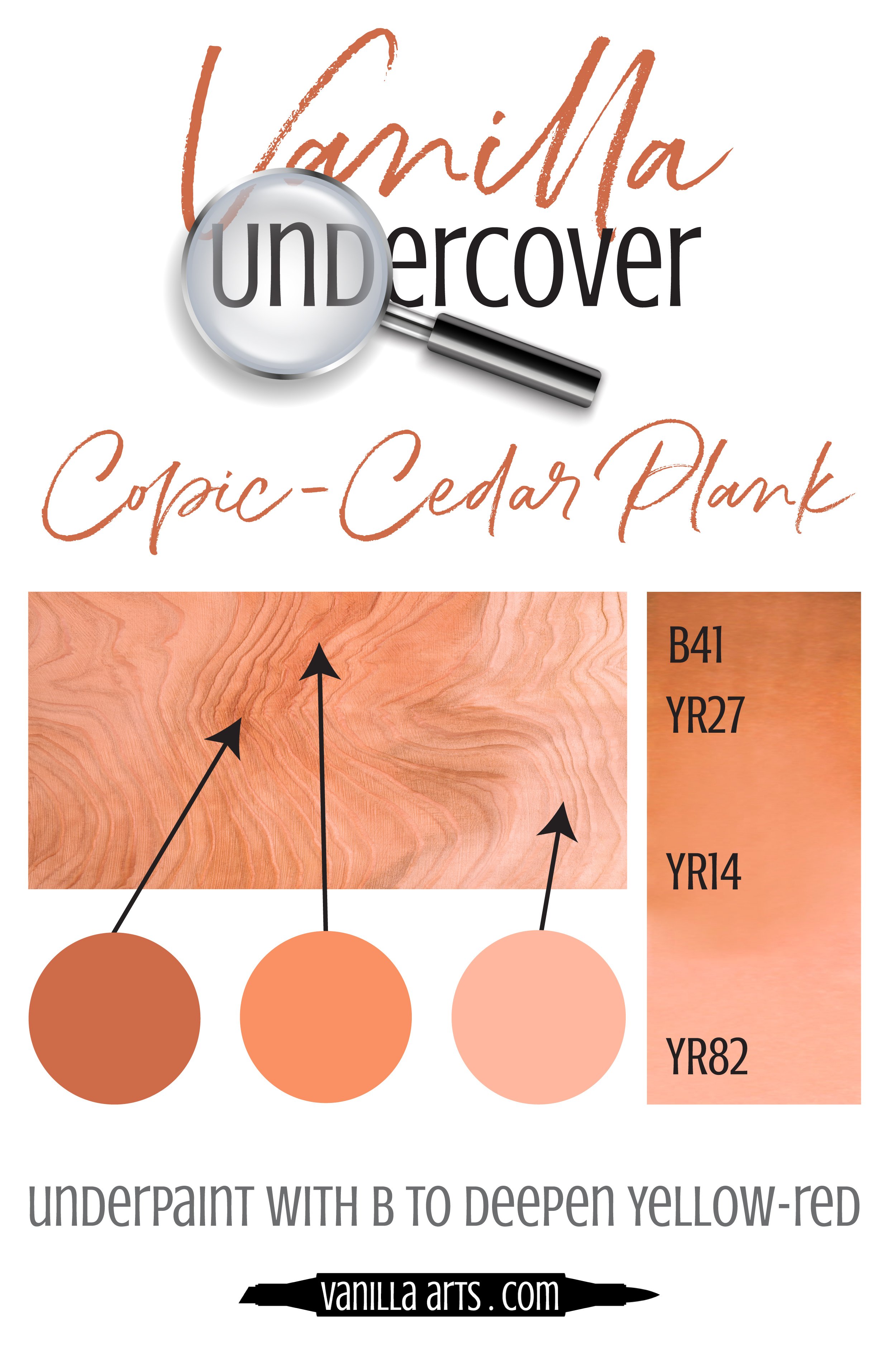
VanillaArts.com (our sister site) teaches a Push & Pull technique for dimensional coloring. This is simply one suggestion. Many possible colors exist. Test to find a color that pleases you.
Vanilla Arts Classes using B41:
Copperbanded Butterflyfish: Amy explores the difference between pattern and texture. Find more info here.
Vanilla Arts Digi Stamps using B41:
Color palettes and swatches using B41:
Looking for beautiful color palettes?
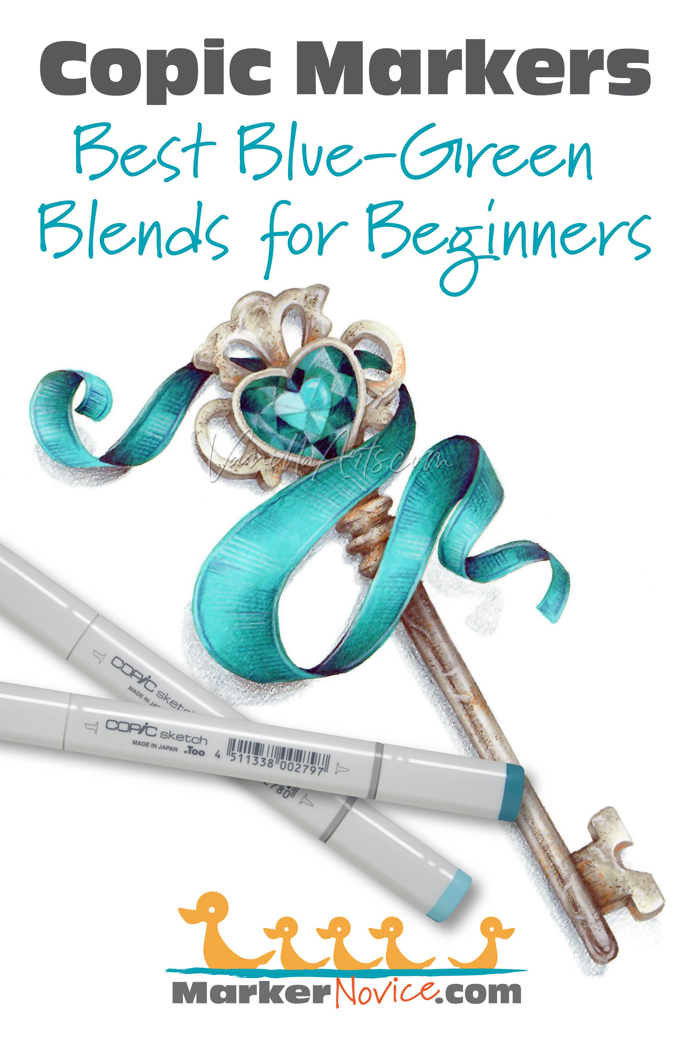
We absolutely love The Color Catalog 1 & 2 from Sarah Renae Clark. It puts hundreds of Copic friendly color palettes at your fingertips.
(note: affiliate link)

