“Which black Copic Marker should I buy first?”
This is a common question for beginners— because if you’re looking at online swatches, it’s hard to tell the difference between Black 100 and Black 110.
But I also get a similar question from experienced Copic users.
People often wonder, “Am I using the correct black? When should I use Black and when should I use Special Black?”
What’s the difference between Copic Black 100 and Special Black 110?
My answer might not be what you expect.
100 Versus 110
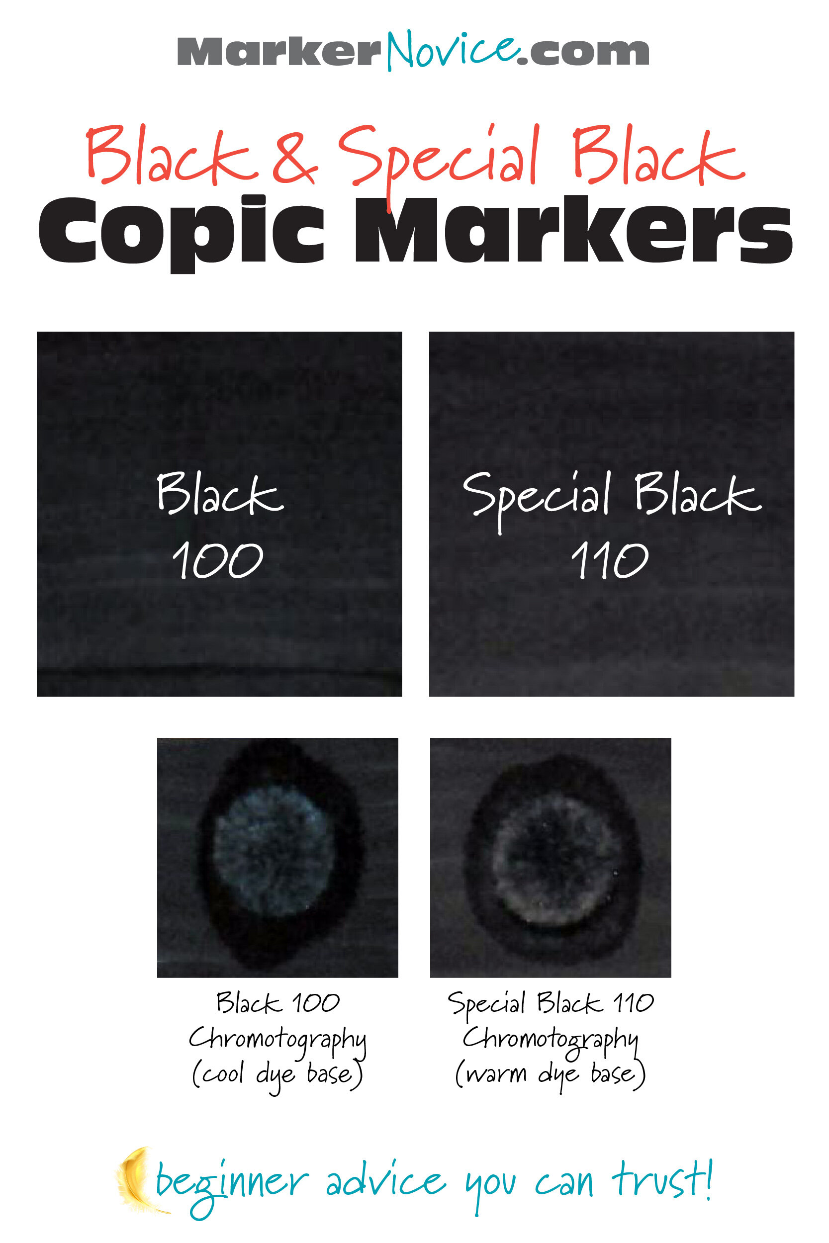
Copic Marker makes two subtly different black markers. Black 100 is a cool black. Special Black 110 is a warm black. The difference is only apparent when the inks are placed side by side.
Which black Copic Marker is best for beginners? Let’s find out!
First, A Word About Copic Ink…
The fact that we’re calling it Copic Ink means we have some explaining to do.
Copic Ink is actually dye.
In art mediums, it’s important to understand the difference between dyes and pigments.
Why? Because this is critical to understanding how your Copic Markers behave.
I’m not going to go deep on dye versus pigment but here’s a quick summary:
Pigments are:
Finely ground minerals, metals, or other substances
Must be used with a binder (pigments will not adhere to paper or canvas without help from “glue”)
Not soluble in water, alcohol, or other solvents
Tend to be lightfast
Opaque
Used in paints, colored pencils, pastels, glazes
Dyes are:
Microscopic molecules of colorant
Soluble in water, alcohol, or other solvents
Sink into the paper and stain the fibers rather than sit on the surface
Not lightfast (often “fugitive”— meaning it will fade over time, even in a dark drawer!)
Transparent (due to extremely small particle size)
Used in pens, markers, and calligraphy dip-pen inks. Also is a primary component of craft-grade and student-grade art supplies
Copic Ink is dye.
You must always keep in mind that you’re dealing with a dye that’s transparent and absolutely NOT lightfast.
The other drawback to dye is that a truly black dye does not exist.
There are many black pigments but if you want black dye, you have to mix a bunch of colors to create a dark color which looks black-ish.
Black dye really just an intense mixture of something blue plus something magenta with other colors thrown in for good luck.
The Copic may say Black 100 or Special Black 110 on the cap but neither marker is actually black.
And that’s the key:
The difference between black 100 and 110 is all about the mixture.
Copic Black 100
Copic’s Black 100 is made with a base of blue dye.
There are other colors in the mix but the highest percentage is blue.
The heavy blue concentration is why Black 100 feels slightly cool in temperature. Copic 100 works very well with the C series of Cool Gray Copics.
In the Copic Numbering System, think of 100 as C11.
The coolness of 100 is amplified by some papers.
The blue notes are most noticeable when you single-coat the area with just one layer of ink. It’s much less obvious if you build the layers, using 2-3 coats of 100.
Special Black 110
Copic’s Special Black 110 is made with a base of magenta and green dye.
110 is not as noticeably warm as the Black 100 is cool. There is a slightly pinkish sheen to Special Black if viewed wet, under a lamp, with the paper tilted at an angle. The warmth is much less obvious when the ink is dry.
In the Copic Numbering System, think of 110 as T11.
The warmth of 110 is amplified by some papers.
The warm notes are most noticeable when wet. It’s also more pronounced when you single-coat the area with just one layer of ink. It’s much less obvious if you use 2-3 coats of 110.
Side By Side: Black Copic Comparison
I’m going to be honest here:
There is a difference between 100 and 110— but don’t worry about it.
You have to place the colors side by side in order to really see the distinction.
I can’t think of a single project in my entire 30 year career where I’ve used both blacks together. I always use one or the other, never both.
Side by side, 100 looks a little cooler. Side by side, 110 looks a little warmer. But it’s not a major difference, even when you’re deliberately looking for the differences.
I’m pretty sensitive to color…
I’m one of the few people who actually enjoys figuring out which colors an artist used and why…
I hyper-analyze stuff for fun…
But even I’m not enough of a color nerd to immediately notice which black you’re using in random projects.
#100 and #110 are both basically black.
The Myth of “Darker”
Okay, I’m about to get nerdy on you. But I warned ya!
If you Google “What’s the difference between Black and Special Black?” you’re going to get several results which say 100 is darker than 110.
I disagree.
I think both blacks are the similar in value. Neither is significantly “darker” or “deeper” than the other.
I think it’s an optical illusion.
Color temperature is important to the human eye and brain.
We use subtle shifts in color temperature to gauge distance and depth.
Cool colors recede. As objects get farther away from us, they appear more muted and generally cooler.
Warm colors feel closer. Objects that are close to us feel more saturated and generally warmer.
I think this is what’s happening when people compare Black 100 and Special Black 110 side by side.
110 is warmer, therefore it feels closer and brighter. 100 is cooler and feels farther away. If you do a single coat of each color, Special Black jumps forward and yells “Hello!” while 100 kinda waits for you to notice her.
You’ll see similar color temperature discussions with painting blue skies in color theory classes. Green-shift blues simply do not recede into the distance the way red-shift blues do. It makes a difference in painting landscapes and I don’t see why this same difference isn’t as obvious to people with black Copic Markers.
People are misinterpreting 100’s cool distance for “darkness”.
Which Black Copic is best for beginners?
The answer is simpler than you’d expect:
It doesn’t matter.
If you buy a boxed set, use whichever black which comes in the set. Don’t even bother buying the other one.
If you don’t have either black, buy the black that’s on sale.
As I said earlier, the difference is only noticable when you place the blacks side by side— and I’ve NEVER used both blacks in the same project.
I didn’t own both blacks until maybe 2017? I had access to both at the office and I still didn’t use both.
It didn’t kill me.
And in teaching? All of my class supply lists say:
Black 100 or Special Black 110, either will work
Why a “Special” Black?
I’ve heard students talk about a Gray Rule for Copics.
If the object you color is a living thing, use warm gray. Warm grays add life.
If the object you color is not living, use a cool gray.
But I’m a complete over-thinker. What about a blue whale? He’s cool and he’s also alive. What about an antique silver spoon? It’s not living but it’s a warm version of silver. And please tell me, is a wooden table alive or dead?
It’s made of wood, wood was once alive but now it’s dead?See? Now we’re having stupid debates about whether wood is alive when all we wanted to do was use a simple gray marker.
I know. I’m sorry. I was born to poke holes in dumb rules.
Anyway, back to black…
Is there maybe a black rule too?
It could be something like: Use Black 100 with cool grays but switch to Special Black 110 when using warm?
Is that why Copic introduced a secondary, “special” black?
And if so, what black should we use with the neutral grays?
Nope.
Special Black was never meant for you. Black 110 belongs to the people in the print industry.
Remember, Copics were originally developed as a tool for commercial artists, graphic illustrators, and designers.
In this article, we’ve only addressed the way the two black markers physically look in real life, in person, right in front of your face.
Commercial artists on the other hand, do not sell original marker art; we make art and illustrations for print media. Everything we draw is designed to be photographed or scanned, then printed for mass distribution.
Cameras and scanners are different than the human eye. Mechanical lenses sense color differently. If you’re working in grayscale for print media, you don’t want to risk your black looking weirdly blue.
Especially not back in the days before Photoshop.
This is why the Toner (T) Grays and Special Black exist. They’re a consistent grayscale required for reliable accuracy in print reproduction of commercial art.
It’s a relic left over from a time before many of you were born.
Back in the dinosaur days when we did everything by hand, we needed stuff like Special Black.
Now we don’t.
I Don’t Use Black!
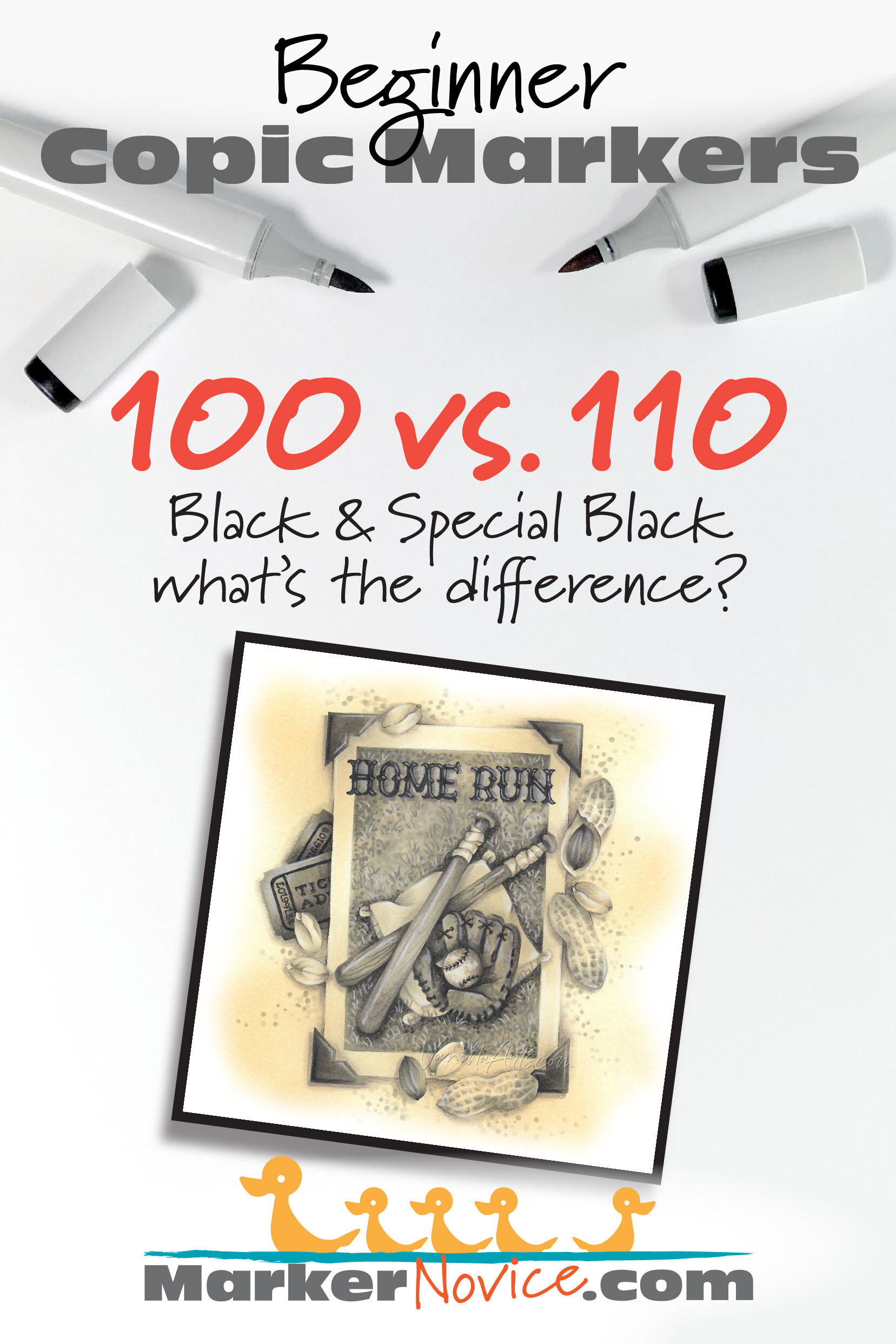
Confession time. The Home Run project you see here?
There’s no black Copic in it.
I colored this with a range of Warm Gray Copics. It’s W2, W4, W6, and W8.
No black!
Frankly, I don’t use black much. I can layer and create richer and prettier blacks than either 100 or 11o.
Besides, black is depth killer. How do you shade something that’s already black?
If you understand how to manage values, you don’t need Black or Special Black.
The darkest marker I use is the occasional hit of C9.
I have black on my starter kit list ONLY because I know people will want it at Halloween. Most of the year, my blacks sit untouched and unloved… I use them to label boxes more than coloring.
The dirty truth is that you don’t really need EITHER black.
If you purchase a Copic Gray set, you’re better off with the Gray #10 that comes in the set. Your art will be more creative and visually dynamic for it.
For further information about black-free coloring:
I’ve got a free video at YouTube that talks about why I avoid using black.
And I’ve got a full article about the Dangers of Black at my primary site, VanillaArts.com.
Should You purchase Copic 100 or 110?
Get whatever’s on sale and don’t worry about buying the other. You’ll never use both on the same project and that’s the only time anyone would ever notice a difference.
The difference between Copic Black 100 and Special Black 110 is very subtle. 100 is cooler and 110 is slightly warm.
But with 2-3 coats of either black and after the ink has dried, the color difference is almost imperceptible.
Both markers will fit in fine with anything you color.
Save money: skip one of the blacks.
Amy Shulke is a professional illustrator who has used Copic Markers since 1990. She teaches artistic coloring classes online at VanillaArts.com and locally in south-eastern Michigan.
Marker Novice is Amy’s completely free resource devoted to beginner marker education. For intermediate/advanced artistic coloring articles, see her Studio Journal here.
Click to receive Marker Novice & Vanilla updates in your Pinterest feed


