You’ve heard about the mysterious Copic Marker number code.
Many blogs and beginner Copic videos try to explain the code… but the standard explanation always leaves me more confused than before.
How does the Copic Numbering System REALLY work?
The truth is different than what you’ve read.
Copic’s Numbering System
The Copic Numbering System describes an ink classification rather than a color. The letter indicates the color family. The first number designates a mother ink formula. The final number tells the color value. Understanding the code makes blending easier by helping you select similar markers to use in combination.
My explanation is probably different than what you’ve read before.
Let’s look at why.
First: Forget What You’ve Been Told!
I’ve heard so many people explain the numbering system wrong.
Part of the problem is Copic keeps changing their explanation.
Copic (Too) is a Japanese company. For decades, they’ve relied upon distributors to educate customers in their native language.
When I received my first Copic chart back in the early 1990’s the Numbering System explanation made sense.
But over the years, Copic distributors tried to simplify the answer. Then they simplified the simplification, then they did it again. We’re at the point now where the current explanation is unrecognizable to many experienced Copic artists.
Frankly, the explanation on the official Copic website is just plain WRONG.
Why is it wrong? Because they incorrectly define the word “saturation”. Words have meanings and saturation is not as they describe.
The other reason why I want you to forget what you’ve heard: the person who taught you was likely taught by someone else who was taught by someone else…
It’s like a game of telephone.
Everyone just repeats what they think they heard. Now it’s all garbled.
The standard explanation does not make sense because it incorrectly uses the words “saturation”, “value”, and “vibrancy”. Many crafters miss the discrepancy but anyone who has taken color theory classes wonders “What???”
The Letter: Color Family
This is the part I don’t quibble with. It’s pretty straight forward:
Copic groups all related colors into specific color families.
Copic Families
R = Red
YR = Yellow Red (orange)
Y = Yellow
YG = Yellow Green (warm greens)
G = Green (cool greens)
BG = Blue Green (aqua and turquoise)
B = Blue
BV = Blue Violet (violets which lean strongly towards blue)
V = Violet (most read as warmer purple)
RV = Red Violet (magenta)
E = Earth (browns ranging from warm to cool)
N = Neutral Gray
C = Cool Gray
W = Warm Gray
T = Toner Gray (slightly warm, matches copy machine toner)
F = Florescent (8 specialty highlighter type colors, not related by color)
Colorless Blender (#0) and the two blacks (#100 and #110) are the exceptions to the rule. These three markers do not carry a letter in their code.
Combination Letters?
Here’s a tidbit nobody ever explains well.
Ever wonder why they call it YR instead of O for orange or why it’s RV instead of M for magenta or P for pink?
Copic is telling you a secret: Combination letters are actually combination inks.
YR inks are not orange inks. It’s a mix of Y ink and R ink. The effect is orange but the ingredients are Y and R.
RV inks are not pink inks. It’s a blend of something R mixed with something V.
Why is this good to know?
BV23 is a combination ink; it’s a mixture of blue ink (B) and violet ink (V). They literally mixed two inks to make this color of blue-violet.
This is important because ink combinations are less stable than single inks.
Under the right conditions, you can accidentally shatter the ink combination.
If you use lots of colorless blender (or a marker with a high colorless blender content) next to BV23, you’ll see hints of pink and some warmer blue leaking out around the edges of BV23. It’s actually very pretty but if you’re trying to blend or want something with a clean edge, you really don’t want pink leakage.
As an artist, when I’m feeling playful, I deliberately choose combination inks but I avoid easy-to-shatter markers when teaching beginners to blend.
(Link leads to the recommended supply page on our main site, VanillaArts.com. We keep one list for both sites to insure the links and buying tips are current.)
First Number: The Mother Ink
Okay, here’s where the old literature is better than new Copic charts.
Current literature and many instructors calls the first number a Blending Group.
The first number is absolutely not a blending group because Copics were developed 20 years before marker blending was invented.
You’ll see the first number described as “saturation”. I’ve heard many people explain that as the first number goes up, the colors get muddier or grayer.
This is NOT true!
The YR20 series is a warm brassy set of golds. They’re not the least bit gray. The Y30’s are saturated and bright while the Y20’s are a little dingy. This is the opposite of what today’s instructors tell you.
(Remember, many “instructors” are simply good colorers rather than trained artists who understand applied color theory.)
The B60 series is clean periwinkle. In fact, B69 and B79 are textbook definitions of saturated color. They’re not dirty colors and yet they sit between blue-gray B40’s and slightly blackened B90’s.
(Again, this negates the idea that the higher the first number, the less saturated the color.)
“The higher the first number, the less saturated the color” sounds completely logical until you physically look at the markers. The rule fails in every color family!
So what’s really going on?
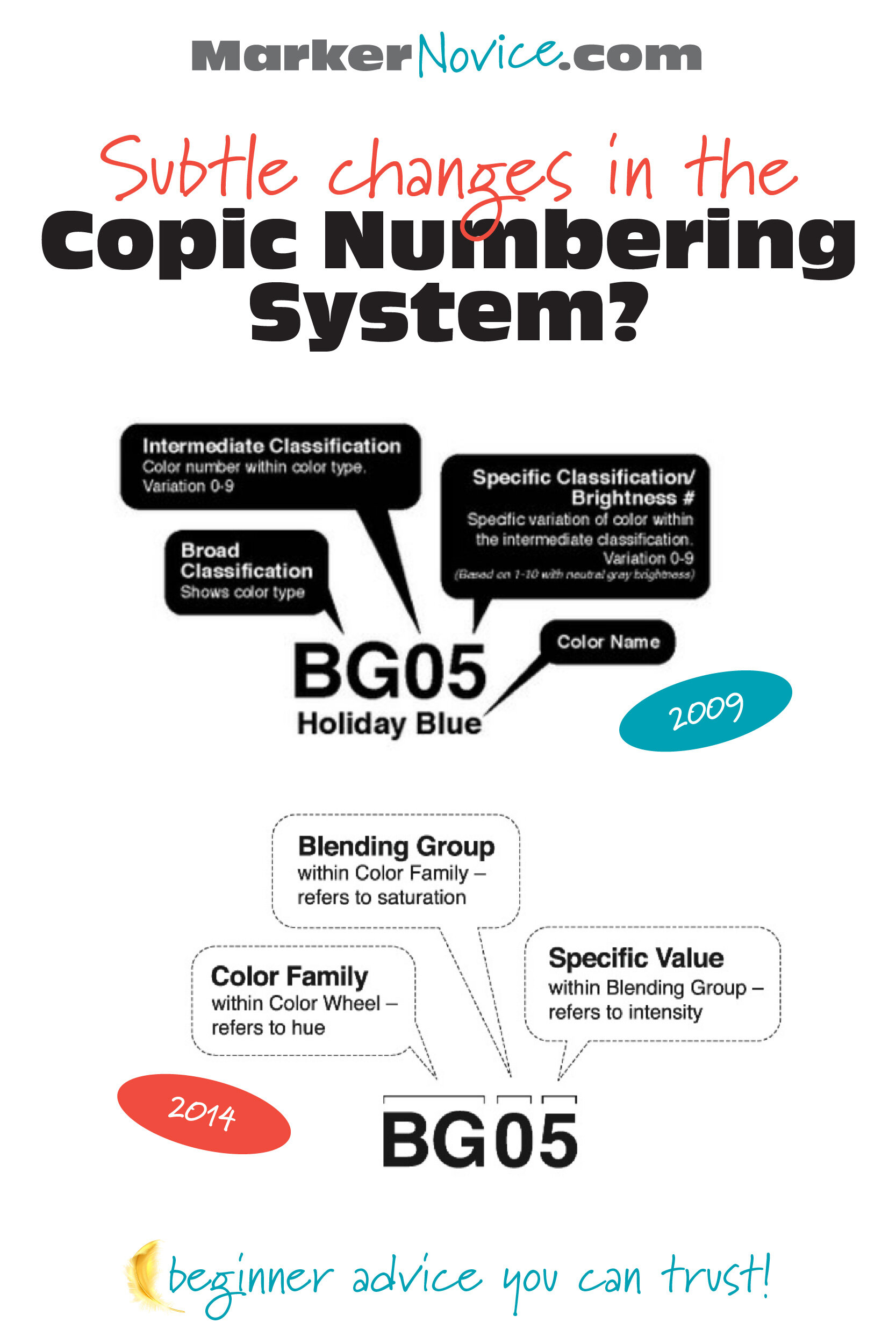
If we go back to the old literature, there’s a clue. The first number was formerly called an “Intermediate Classification”. You can see the 2009 explanation compared to the 2014 explanation here.
In the 2009 version, look at the details below “Intermediate Classification”…
What’s a “Color Type”?
Copic uses the first number to tell us the Mother Ink.
The Mother Ink gives birth to every marker in a color series.
Let’s say Copic has a dark red ink. They call it Red Ink #2. Red #2 is a mother ink.
They use this Red #2 mother to produce a dark red marker called R29. They keep using this mother to then create more dilutions of the same color— R27, R24, R22, R21, and R20. If they wanted to invent a new marker, like R25, R23, or even R28.5, they’d start with the mother, Red #2.
Blue #9 is used to produce B99, B97, B95, B93, and B91. The number 9 has nothing to do with saturation. #9 is the 9th blue series, 9 is the designation for the Mother Ink.
The first number tells you the ink genealogy. It’s a recipe guide.
This is why you’ll hear instructors talk about Natural Blending Groups. A natural blend would be 2-3 markers (or more) that all share the same Mother.
Natural Blending Groups blend very easily because chemically, they’re siblings. They share a Mother recipe, so they practically blend themselves on contact.
BEST BEGINNER ADVICE: Pay attention to the Mother numbers! Buy your markers in sets or trios that share a first number and you’ll always have easy-blending combinations. It’s not magic, it’s chemistry!
Last Number: Value (kinda-maybe-sorta)
The last number is what gets mangled all the time!
Want to hear something funny?
The last number ACTUALLY indicates color saturation.
People yammer about saturation for the first number when it’s really the second number that’s all about saturation!
Saturation is the purity of a color. Reach up into a rainbow and grab a hand-full of pure saturated color. Now add anything to that rainbow-saturated color and you start to DE-saturate it.
You can desaturate color with gray or black but you can also desaturate with white. Pink is a desaturated version of saturated magenta.
In the case of Copic, they desaturate with Colorless Blender.
Start with a B29 Mother Ink and add a little Colorless Blender. You just made B28. Now add more Colorless Blender and you’ve made B27 or B26. As the last number gets lower, the color gets less and less saturated.
So why did I say the last number was value?
Because Copic doesn’t just splash Colorless Blender into the recipes willy-nilly. They measure the color very carefully on a value scale.
Which value scale?
The fine print on the old, old, old charts tells us that Copic uses their Neutral Gray markers to measure the value of ALL OTHER COPIC MARKERS.
Yes, that’s a fact worth yelling about.
So the value of an N5 is equal to the value of B05, Y95, V15, R85, and even Y35. They are all a value level 5!
I’ve written more about Copic values at my main site VanillaArts.com. The article includes an interesting brain-test for you. How accurately do you see values?
But wait…
I said the last number equals value but in a “kinda-maybe-sorta” way. Why did I use weasel words?
Well, Copic is a little weird. They measure value accurately but they do it completely backwards.
In other art mediums and every color theory class all around the world, pure black is a low level zero and pure white is a high level ten.
In Copic, the blacks are HIGH and the whites are LOW.
Copic could’ve made it sooooo easy… but no.
BEST BEGINNER ADVICE: As you choose blending combinations, avoid choosing markers with the same last numbers. If the last numbers are the same, you’re not getting any lighter or darker. The most attractive blends skip 2-3 value digits in the last number. Try B99, BG57, BG53, it’s gorgeous!
What Mother Ink are the 00’s From?
Honestly? I’m not sure.
00’s, in theory, should be from the #zero Mother Ink but there are always a few aughts that feel odd to me.
Take the Gs for instance. G03 and G07 (Mother Ink = Zero) are very classic grassy greens. But G000 and G0000 seem very blue.
The Rs also feel funky. R08, R05, R02, and R01 are all warm light-reds but R00, R000, and R0000 have a cool cast. That doesn’t fit.
My personal theory is that the double, triple, and quad zero markers are all unstable. These markers contain a ton of Colorless Blender. It’s the equivalent of you bathing in bleach. When the solvent levels get crazy-high, the colors skew weird.
Why Aren’t Copic Numbers Sequential?
Great question!
The gaps in the numbering system are reserved for future marker colors.
They don’t make a YR87 yet. When they finally get around to it, there is a logical space waiting for it.
Copic would start with the YR#8 Mother Ink and add colorless blender until it measures a 7 on the Copic Neutral Gray Scale.
See? It’s chemistry!
Gray Numbering
Why do grays only have one number?
Because for grays, the letter is not the color family.
GRAY is the color family.
N, C, W, & T are the Mother Ink.
Then the single number is the value.
Get it?
What About Names?
Ignore them.
I use YG03 on a daily basis and I have no clue what the name is.
Copic people don’t use Copic names.
pssstttt… YG03 is “Yellow Green”. Nope, I’ll never remember that.
How do I Pronounce the Copic Number code?
Okay, someone out there started making a big deal about this. It almost sounds snooty when they over-annunciate every individual number.
“Always say B. THREE. FOUR! Never say B-thirty-four.”
Wanna know what? I really don’t care.
I picked up my first Copic in 1990 and EVERYONE in the entire graphics department said “thirty-four”.
I never heard “three-four” until it hit the internet a couple years ago.
I took Copic certification and everyone said thirty-four, even the instructor who had been working for Copic for over a decade.
It’s dumb.
We’re all adults. You can quickly translate numbers without waggling your finger at yokels like me who say thirty-four.
There you go!
Everything you need to know about the Copic Numbering System…
plus a little bit more.
Just remember:
Copic Numbering tells you about the ink formula, not the ink color.
The letter indicates the color family
The first number is the Mother Ink
The second number is the value (kinda)
The numbering is the best part about Copic Markers for beginners.
The numbers make it easy to pick blending combinations and to predict how colors will look and how blends will behave.
I know it’s tempting to grab markers based on the plastic cap color but it’s wise to start learning the numbering system instead. With twenty-five (oops, Two-Five) years of experience, I still use the numbers daily.
It’s a skill you’ll never outgrow.
Amy Shulke is a professional illustrator who has used Copic Markers since 1990. She teaches artistic coloring classes online at VanillaArts.com.
Marker Novice is Amy’s completely free resource devoted to beginner marker education. For intermediate/advanced artistic coloring articles, see her Studio Journal here.
Click to receive Marker Novice & Vanilla updates in your Pinterest feed


