

E19 Redwood: Copics Uncapped (Alcohol Marker Swatch, Ink Testing)
E19 Redwood
Let’s take a closer look at this Copic Marker and its ink characteristics.

Every Copic Marker has different characteristics based upon its unique ink formula.
Knowing how a color behaves will help you blend effectively and make art with confidence.
E19 Redwood
Let’s take a closer look at this Copic Marker and its ink characteristics.
Temperature: A warm reddish brown
Resemblance: Burnt Sienna watercolor
Name: “Redwood” is a good name for this color. It’s not a standard art supply color name but it closely resembles the color of Sequoia Redwood tree bark.
Copic Styles: E19 is only available in Sketch and Classic style Copic markers.
Actual Value: N8
All Copics are measured on a Neutral Gray value scale. The last number on the cap is supposed to indicate value but we’ve found discrepancies where the actual ink value is different than cap designation.
Cap Accuracy: The colored plastic on the Sketch cap is about the same color as 4 layers of E19 ink. If you select this color expecting a very dark red-brown, you will be disappointed.

Buildup: E19 reaches a maximum value extremely fast, at only 2-3 layers. This color also tends to look blotchy and oily. For this reason, we are hesitant to recommend it to beginners as it requires a light touch.
Shattering: E19 does not shatter.
Chromatography testing shows this ink’s behavior when it comes in contact with #0 Colorless Blender (solvent). High shattering colors may leak unexpected color when you make corrections or attempt to blend with any color that has a high solvent to colorant ratio. Shattering is not bad, it’s just something to be aware of.
Staining: E19 stains the paper golden orange. Staining markers do not blend or blend as smoothly as non-staining Copics. This color requires more moisture to blend smoothly but remember, it tends to look oily… basically, you’re doomed if you do, doomed if you don’t.
Lift: E19 can be lifted a bit but the paper will be permanently stained orange. The best you can hope for is to lighten mistakes enough to then camouflage them with another darker color.
See staining swatch. Sample was given 6 stripes of #0 Colorless Blender, drying between each stripe. Results indicate how much lifting you can expect.

Lightfast: E19 did not fade during the 3 week test period. AMAZING!
Samples were swatched on X-Press It Blending Card. 1 layer of ink was exposed to windowsill sunlight for 21 days. Approximately 10 hours of sun per day based on weather conditions. Note: we do not recommend displaying original Copic art under these conditions.
Natural Ink Family: E19 is at the dark of the E-Teen (or Tens) family of reddish brown Copics.
Family Members: E11, E13, E15, E17, E18, E19
We include this information because many Copic users never think deeper than the letter groupings (R, BV, G, etc.). Every ink has its own temperature variations and underlying flavors. Understanding what an ink looks like in its different dilutions helps when creating your own blending combinations.
Complement: Brown is not a hue and therefore, not on the color wheel. It has no complement.
Underpaint: We suggest BV25
This is simply one suggestion. Many possible colors exist. Test to find a color that pleases you.
Pushing Pencil: Prismacolor PC947 Dark Umber is a safe choice. PC931 Dark Purple is an option for the daring and brave.
VanillaArts.com (our sister site) teaches a Push & Pull technique for dimensional coloring. This is simply one suggestion. Many possible colors exist. Test to find a color that pleases you.
BROWN EARTH WORKSHOP

BROWN COLORING KIT

COPIC TEST ARCHIVE

MAKE BROWN BEAUTIFUL

UNDERPAINT BLENDING COMBINATIONS

Looking for beautiful color palettes?
We absolutely love The Color Catalog 1 & 2 from Sarah Renae Clark. It puts hundreds of Copic friendly color palettes at your fingertips.
(note: affiliate link)













G09 Veronese Green: Copics Uncapped (Alcohol Marker Swatch, Ink Testing)
G09 Veronese Green
Let’s take a closer look at this Copic Marker and its ink characteristics.
Every Copic Marker has different characteristics based upon its unique ink formula.
Knowing how a color behaves will help you blend effectively and make art with confidence.
G09 Veronese Green
Let’s take a closer look at this Copic Marker and its ink characteristics.
Temperature: A warm medium green
Resemblance: Phthalo Green
Name: “Veronese Green” is a standard paint name. I tend to think of Veronese as bluer than this green but it’s close enough.
Copic Styles: G09 is only available in Sketch and Classic style Copic markers.
Actual Value: N6 (this is significantly lighter than the number code indicates)
All Copics are measured on a Neutral Gray value scale. The last number on the cap is supposed to indicate value but we’ve found discrepancies where the actual ink value is different than cap designation.
Cap Accuracy: The colored plastic on the Sketch cap is darker than 4 layers of G09 ink. This combined with the inaccurate cap number is startling when you first use G09 as the color is lighter than expected.

Buildup: G09 reaches maximum color value at 4 layers.
Shattering: Shatters into green with yellow and a minty blue-green color seeping out at the margins.
Chromatography testing shows this ink’s behavior when it comes in contact with #0 Colorless Blender (solvent). High shattering colors may leak unexpected color when you make corrections or attempt to blend with any color that has a high solvent to colorant ratio. Shattering is not bad, it’s just something to be aware of.
Staining: G09 stains the paper green. Despite being a staining color, G09 actually blends fairly well with other G-Zero markers.
Lift: G09 can be lifted a bit but the paper will be permanently stained green. The best you can hope for is to lighten mistakes enough to then camouflage them with another color.
See staining swatch. Sample was given 6 stripes of #0 Colorless Blender, drying between each stripe. Results indicate how much lifting you can expect.

Lightfast: G09 has an odd fade. The color only lightened about 15% but the swatch turned noticeably bluish. Further proof that G09 is a composite ink recipe— the yellowish green ink faded, leaving behind only the bluer green ink.
Samples were swatched on X-Press It Blending Card. 1 layer of ink was exposed to windowsill sunlight for 21 days. Approximately 10 hours of sun per day based on weather conditions. Note: we do not recommend displaying original Copic art under these conditions.
Natural Ink Family: G09 is at the dark of the G-Zero
Family Members: G0000, G000, G00, G02, G03, G05, G07, G09
We include this information because many Copic users never think deeper than the letter groupings (R, BV, G, etc.). Every ink has its own temperature variations and underlying flavors. Understanding what an ink looks like in its different dilutions helps when creating your own blending combinations.
Complement: A cool, medium violet like V25
Underpaint: We suggest BV23
This is simply one suggestion. Many possible colors exist. Test to find a color that pleases you.
Pushing Pencil: Prismacolor PC932 Violet is an excellent choice
VanillaArts.com (our sister site) teaches a Push & Pull technique for dimensional coloring. This is simply one suggestion. Many possible colors exist. Test to find a color that pleases you.
GREEN WORKSHOP

GREEN COLORING KIT

COPIC TEST ARCHIVE

MAKE GREEN BEAUTIFUL

UNDERPAINT BLENDING COMBINATIONS

Looking for beautiful color palettes?
We absolutely love The Color Catalog 1 & 2 from Sarah Renae Clark. It puts hundreds of Copic friendly color palettes at your fingertips.
(note: affiliate link)

Y23 Yellowish Beige: Copic Markers Uncapped ( Swatch, Ink Testing)
Y23 Yellowish Beige
Let’s take a closer look at this Copic Marker and it’s ink characteristics.

Every Copic Marker has unique characteristics based on its unique ink formula.
Knowing how a color behaves will help you blend effectively and make art with confidence.
Y23 Yellowish Beige
Let’s take a closer look at this Copic Marker and its ink characteristics.
Temperature: A warm, light yellow
Resemblance: Naples Yellow watercolor
Name: “Yellowish Beige” is a very generic name for this color, almost as if this was the last color of the day and they’d used up all their creativity on the other 358 marker. names. Yes, it’s yellowish. I’d argue that it’s not very beige.
Marker Styles: Y23 is only available in Sketch and Classic style markers.
For a Copic Wide marker in this color, you must purchase a “blank” or empty marker body and fill it with refill ink. Copic Wides have been do-it-yourself colors since 2019.
Copic makes refill inks for all 358 colors and every style of Copic is refillable.
Actual Value: N2.5
All Copics are measured on a Neutral Gray value scale. The last number on the cap is supposed to indicate value but we’ve found discrepancies where the actual ink value is different than cap designation.

Cap Accuracy: The colored plastic on a Sketch marker closely matches the color of 1-2 layers of Y23 ink.
Buildup: Y23 reaches maximum value at 4 layers
Shattering: Y23 does not shatter.
Chromatography testing shows this ink’s behavior when it comes in contact with #0 Colorless Blender (solvent). High shattering colors may leak unexpected color when you make corrections or attempt to blend with any color that has a high solvent to colorant ratio. Shattering is not bad, it’s just something to be aware of.
Staining: Y23 does not stain. This is typical of yellow inks and the light color reduces any possible staining even more.
Lift: Y23 lifts easily and can be considered a correctable, erasable color.
See staining swatch. Sample was given 6 stripes of #0 Colorless Blender, drying between each stripe. Results indicate how much lifting you can expect.

Lightfast: Y23 did not appreciably fade at all during the test period. If there’s any fading there, it’s not apparent to the naked eye.
Samples were swatched on X-Press It Blending Card. 1 layer of ink was exposed to windowsill sunlight for 21 days. Approximately 10 hours of sun per day based on weather conditions. Note: we do not recommend displaying original Copic art under these conditions.
Natural Ink Family: Y23 is dilution of Y28 but the mother ink which forms both markers is likely far more golden brown than anything Copic currently produces. Y22 is the at the lighter end of the Y-Twenty family. We wish Copic would produce a sub-zero series for this family as the current Y00’s feel too greenish and do not work well with Y23.
Family Members: Y28, Y26, Y23, Y21
We include this information because many Copic users never think deeper than the letter groupings (R, BV, G, etc.). Every ink has its own temperature variations and underlying flavors. Understanding what an ink looks like in its different dilutions helps when creating your own blending combinations.
Complement: A murky grayed violet like BV23 or if they made it, V23 (which does not exist, to our sorrow).
Underpaint: We suggest V0000
This is simply one suggestion. Many possible colors exist. Test to find a color that pleases you.
Pushing Pencil: PC1026 Grayed Lavender is an excellent choice to shade this color. Please use very light pressure.
VanillaArts.com (our sister site) teaches a Push & Pull technique for dimensional coloring. This is simply one suggestion. Many possible colors exist. Test to find a color that pleases you.
YELLOW WORKSHOP

YELLOW COLORING KIT
COPIC TEST ARCHIVE

MAKE YELLOW BEAUTIFUL

UNDERPAINT BLENDING COMBINATIONS

Looking for beautiful color palettes?
We absolutely love The Color Catalog 1 & 2 from Sarah Renae Clark. It puts hundreds of Copic friendly color palettes at your fingertips.
(note: affiliate link)


RV17 Deep Magenta: Copic Markers Uncapped ( Swatch, Ink Testing)
RV17 Deep Magenta
Let’s take a closer look at this Copic Marker and it’s ink characteristics.
Every Copic Marker has unique characteristics based on its unique ink formula.
Knowing how a color behaves will help you blend effectively and make art with confidence.
RV17 Deep Magenta
Let’s take a closer look at this Copic Marker and its ink characteristics.
Temperature: A warm, deep magenta
Resemblance: Quinacridone Magenta watercolor
Name: “Deep Magenta” is a good descriptive name for this color. This name is often used for the same color in other art supplies such as paint, pastels, and colored pencils.
Marker Styles: RV17 is only available in Sketch and Classic style markers.
For a Copic Wide marker in this color, you must purchase a “blank” or empty marker body and fill it with refill ink. Copic Wides have been do-it-yourself colors since 2019.
Copic makes refill inks for all 358 colors and every style of Copic is refillable.
Actual Value: N7
All Copics are measured on a Neutral Gray value scale. The last number on the cap is supposed to indicate value but we’ve found discrepancies where the actual ink value is different than cap designation.

Cap Accuracy: Close. The colored plastic on a Sketch marker matches the color of 2 layers of RV17 ink.
Buildup: RV17 reaches maximum value at 3 layers
Shattering: RV17 has me questioning whether it shatters or not. Inks made from a single colorant do not shatter. The other RV-Teen markers do not shatter, so odds are that RV17 should also be a single colorant. But when I look at the swatch, I see hints of a dark purple or dark blue-gray inside the center dot. Therefore, I think RV17 may have been darkened slightly with a secondary color.
Chromatography testing shows this ink’s behavior when it comes in contact with #0 Colorless Blender (solvent). High shattering colors may leak unexpected color when you make corrections or attempt to blend with any color that has a high solvent to colorant ratio. Shattering is not bad, it’s just something to be aware of.
Staining: RV17 stains, as would any color this dark, especially a dark from the R, or RV family.
Lift: RV17 does not lift but can be lightened somewhat. Mistakes with this marker should be considered permanent.
See staining swatch. Sample was given 6 stripes of #0 Colorless Blender, drying between each stripe. Results indicate how much lifting you can expect.

Lightfast: RV17 did not appreciably fade during the test period. There is a slight lightening but less than 2%.
Samples were swatched on X-Press It Blending Card. 1 layer of ink was exposed to windowsill sunlight for 21 days. Approximately 10 hours of sun per day based on weather conditions. Note: we do not recommend displaying original Copic art under these conditions.
Natural Ink Family: RV17 is at the darker end of the R-Teen family with RV19 at the dark end and RV10 at the lightest end.
Family Members: RV10, RV11, RV13, RV14, RV17, RV19
We include this information because many Copic users never think deeper than the letter groupings (R, BV, G, etc.). Every ink has its own temperature variations and underlying flavors. Understanding what an ink looks like in its different dilutions helps when creating your own blending combinations.
Complement: A darker viridian green like G09 or G17
Underpaint: We suggest G02
This is simply one suggestion. Many possible colors exist. Test to find a color that pleases you.
Pushing Pencil: PC931 Dark Purple is a good choice to shade this color. Please use very light pressure.
VanillaArts.com (our sister site) teaches a Push & Pull technique for dimensional coloring. This is simply one suggestion. Many possible colors exist. Test to find a color that pleases you.
MAGENTA WORKSHOP
MAGENTA COLORING KIT

COPIC TEST ARCHIVE

MAKE MAGENTA BEAUTIFUL

UNDERPAINT BLENDING COMBINATIONS

Looking for beautiful color palettes?
We absolutely love The Color Catalog 1 & 2 from Sarah Renae Clark. It puts hundreds of Copic friendly color palettes at your fingertips.
(note: affiliate link)

N4 Neutral Gray No. 4: Copics Uncapped (Marker Swatch, Ink Testing)
N4 Neutral Gray No. 4
Let’s take a closer look at this Copic Marker and it’s ink characteristics.
Every Copic Marker has unique characteristics based on its unique ink formula.
Knowing how a color behaves will help you blend effectively and make art with confidence.
N4 Neutral Gray No. 4
Let’s take a closer look at this Copic Marker and its ink characteristics.
Temperature: A balanced gray, neither warm nor cool
Resemblance: Lamp Black watercolor
Name: The name is correct, this is a truly neutral gray
Copic Styles: N4 is only available in Copic Sketch and Classic styles. The Ciao line does not include any of the neutral grays.
Actual Value: N4 (All Copic N grays match their true value. N is the only family where this is true.)
All Copics are measured on a Neutral Gray value scale. The last number on the cap is supposed to indicate value but we’ve found discrepancies where the actual ink value is different than cap designation.

Cap Accuracy: The plastic end of an N4 Sketch Marker matches 1 coat of N4 ink.
Buildup: N4 reaches maximum color at 3-4 layers but starts to gather an oily appearance with the second layer.
Shattering: N4 does not shatter.
Chromatography testing shows this ink’s behavior when it comes in contact with #0 Colorless Blender (solvent). High shattering colors may leak unexpected color when you make corrections or attempt to blend with any color that has a high solvent to colorant ratio. Shattering is not bad, it’s just something to be aware of.
Staining: N4 does not seem to stain the paper, surprising for a color with this much value.
Lift: N4 lifts with patient work and can be considered mostly correctable.
See staining swatch. Sample was given 6 stripes of #0 Colorless Blender, drying between each stripe. Results indicate how much lifting you can expect.

Lightfast: N4 did not appreciably fade during the test period.
Samples were swatched on X-Press It Blending Card. 1 layer of ink was exposed to windowsill sunlight for 21 days. Approximately 10 hours of sun per day based on weather conditions. Note: we do not recommend displaying original Copic art under these conditions.
Natural Ink Family: N4 is in the middle of the Neutral Gray family.
Family Members: N10, N9, N8, N7, N6, N5, N4, N3, N2, N1, N0.
We include this information because many Copic users never think deeper than the letter groupings (R, BV, G, etc.). Every ink has its own temperature variations and underlying flavors. Understanding what an ink looks like in its different dilutions helps when creating your own blending combinations.
Complement: N/A
Underpaint: N/A
Pushing Pencil: We suggest PC1067 90% Cool Grey Prismacolor.
VanillaArts.com (our sister site) teaches a Push & Pull technique for dimensional coloring. This is simply one suggestion. Many possible colors exist. Test to find a color that pleases you.
GRAY WORKSHOP

GRAY COLORING KIT

COPIC TEST ARCHIVE

MAKE GRAY BEAUTIFUL
UNDERPAINT BLENDING COMBINATIONS
Looking for beautiful color palettes?
We absolutely love The Color Catalog 1 & 2 from Sarah Renae Clark. It puts hundreds of Copic friendly color palettes at your fingertips.
(note: affiliate link)


B16 Cyanine Blue: Copics Uncapped (Marker Swatch, Ink Testing)
B16 Cyanine Blue
Let’s take a closer look at this Copic Marker and it’s ink characteristics.

Every Copic Marker has unique characteristics based on its unique ink formula.
Knowing how a color behaves will help you blend effectively and make art with confidence.
B16 Cyanine Blue
Let’s take a closer look at this Copic Marker and its ink characteristics.
Temperature: A slightly red-shifted blue.
Resemblance: Cobalt Blue watercolor.
Name: “Cyanine Blue” implies a relationship to the color Cyan which is a slightly green shifted bluish color. B16 actually leans the opposite direction making Cyanine a misleading name for this blue.
Copic Styles: B16 is only available in the Copic Sketch and Classic style markers. There is no B16 in the Ciao line.
Actual Value: N6
All Copics are measured on a Neutral Gray value scale. The last number on the cap is supposed to indicate value but we’ve found discrepancies where the actual ink value is different than cap designation.
Cap Accuracy: The plastic on a B16 Sketch marker is close to 1-2 layers of B16 ink.

Buildup: B16 reaches maximum color at four layers.
Shattering: B16 shatters into blue with pink leakage.
Chromatography testing shows this ink’s behavior when it comes in contact with #0 Colorless Blender (solvent). High shattering colors may leak unexpected color when you make corrections or attempt to blend with any color that has a high solvent to colorant ratio. Shattering is not bad, it’s just something to be aware of.
Staining: B16 stains the paper with just a hint of yellowness.
Lift: This color lifts a bit, enough to lighten a mistake but not erase it.
See staining swatch. Sample was given 6 stripes of #0 Colorless Blender, drying between each stripe. Results indicate how much lifting you can expect.
Lightfast: We saw no appreciable fading during the test period,
Samples were swatched on X-Press It Blending Card. 1 layer of ink was exposed to windowsill sunlight for 21 days. Approximately 10 hours of sun per day based on weather conditions. Note: we do not recommend displaying original Copic art under these conditions.

Natural Ink Family: B16 is in the middle of the Copic B-Teen family. This is a useful blue family but also an easy blending set of markers which is why we strongly recommend for beginners.
Family Members: B12, B14, B16, B18
We include this information because many Copic users never think deeper than the letter groupings (R, BV, G, etc.). Every ink has its own temperature variations and underlying flavors. Understanding what an ink looks like in its different dilutions helps when creating your own blending combinations.
Complement: A light orange or soft red color like YR16.
Underpaint: We suggest a violet like V15 or V17. For something less strong, try N3 or N4.
This is simply one suggestion. Many possible colors exist. Test to find a color that pleases you.
Pushing Pencil: With light pressure, PC931 Dark Purple makes a lovely push for B16.
VanillaArts.com (our sister site) teaches a Push & Pull technique for dimensional coloring. This is simply one suggestion. Many possible colors exist. Test to find a color that pleases you.
BLUE WORKSHOP

BLUE COLORING KIT

COPIC TEST ARCHIVE

MAKE BLUE BEAUTIFUL

UNDERPAINT BLENDING COMBINATIONS

Looking for beautiful color palettes?
We absolutely love The Color Catalog 1 & 2 from Sarah Renae Clark. It puts hundreds of Copic friendly color palettes at your fingertips.
(note: affiliate link)


YG97 Spanish Olive: Copics Uncapped (Marker Swatch, Ink Testing)
YG97 Spanish Olive
Let’s take a closer look at this Copic Marker and it’s ink characteristics.
Every Copic Marker has different characteristics based upon its unique ink formula.
Knowing how a color behaves will help you blend effectively and make art with confidence.
YG97 Spanish Olive
Let’s take a closer look at this Copic Marker and its ink characteristics.
Temperature: A warm green
Resemblance: diluted Sap Green watercolor (one that leans a bit yellowish)
Name: “Spanish Olive” is an excellent name for this organic warm green which very much mimics the color of green olives. I do find it interesting that several years ago, Copic changed several color names to remove ethnic names and yet this one remains? Draw your own conclusions.
Copic Styles: YG97 is only available in Sketch and Classic style markers.
Actual Value: N7
All Copics are measured on a Neutral Gray value scale. The last number on the cap is supposed to indicate value but we’ve found discrepancies where the actual ink value is different than cap designation.
Cap Accuracy: The colored plastic on the Sketch cap matches 3=4 layers of YG97 ink. This can be startling when you first use YG97 as the color is lighter than expected.

Buildup: YG97 reaches maximum color value at 3 layers.
WARNING: This ink is unstable. YG97 can self-shatter, the dyes can separate from the formula leaking gold or brown along the outside edge of the color zone.
Shattering: Shatters into green with golden green seeping out at the margins. See warning above for YG97’s self-shattering behavior.
Chromatography testing shows this ink’s behavior when it comes in contact with #0 Colorless Blender (solvent). High shattering colors may leak unexpected color when you make corrections or attempt to blend with any color that has a high solvent to colorant ratio. Shattering is not bad, it’s just something to be aware of.
Staining: YG97 stains the paper light blue.
Lift: YG97 can be moved but hardly enough to correct a mistake. The paper is permanently stained light blue, the edges of the area exposed to colorless blender can look slightly metallic, a golden green. We do not recommend trying to lift this color due to the damage colorless blender will trigger.
See staining swatch. Sample was given 6 stripes of #0 Colorless Blender, drying between each stripe. Results indicate how much lifting you can expect.
Lightfast: YG97 faded by less than 5% during the test period.
Samples were swatched on X-Press It Blending Card. 1 layer of ink was exposed to windowsill sunlight for 21 days. Approximately 10 hours of sun per day based on weather conditions. Note: we do not recommend displaying original Copic art under these conditions.

Natural Ink Family: YG97 is at the darker end of the YG-Ninety family.
Family Members: YG91 YG93, YG95, YG97, YG99
We include this information because many Copic users never think deeper than the letter groupings (R, BV, G, etc.). Every ink has its own temperature variations and underlying flavors. Understanding what an ink looks like in its different dilutions helps when creating your own blending combinations.
Complement: A cool purple blue like BV13
Underpaint: BV11 desaturates YG97 very well.
This is simply one suggestion. Many possible colors exist. Test to find a color that pleases you.
Pushing Pencil: PC1078 Black Cherry provides a nicely desaturated push for YG63.
VanillaArts.com (our sister site) teaches a Push & Pull technique for dimensional coloring. This is simply one suggestion. Many possible colors exist. Test to find a color that pleases you.
GREEN WORKSHOP

GREEN COLORING KIT
GREEN TEST ARCHIVE

MAKE GREEN BEAUTIFUL
UNDERPAINT BLEND COMBINATIONS

Looking for beautiful color palettes?
We absolutely love The Color Catalog 1 & 2 from Sarah Renae Clark. It puts hundreds of Copic friendly color palettes at your fingertips.
(note: affiliate link)
YR21 Cream: Copic Markers Uncapped (Test and swatch Alcohol Ink)
YR21 Cream
Let’s take a closer look at this Copic Marker and it’s ink characteristics.

Not every Copic marker behaves the same. Every alcohol ink color has unique characteristics based on its exclusive chemical ink formula.
Knowing how a color behaves will help you blend effectively and make art with confidence.
YR21 Cream
Let’s take a closer look at this Copic Marker and its ink characteristics.
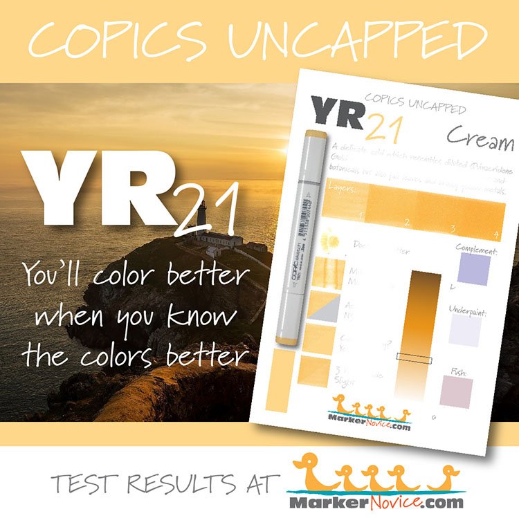
Temperature: A warm pale gold
Resemblance: Diluted Quinacridone Gold watercolor.
Name: “Cream” is not an appropriate name for this color. Real cream (the dairy product) is a soft white. Butter, which is made from concentrated cream, is not even a yellow this dark. Additionally, in art supplies, “cream” is commonly used for a yellowish beige. I suspect this is one of those situations where something was lost in the translation from Japanese to English.
Copic Marker Styles: YR21 is only available in Sketch and Classic style Copics.
Copic makes refill inks for every color they produce.
Actual Value: N3.5 (Note the cap number indicates this color should be a value 1.)
All Copics are measured on a Neutral Gray value scale. The last number on the cap is supposed to indicate value but we’ve found discrepancies where the actual ink value is different than cap designation.

Cap Accuracy: Yes, the plastic on a Sketch marker matches 1 layer of YR21 ink
Buildup: YR21 layers well, reaching a maximum value at three layers of ink
Shattering: YR21 ink does not shatter.
Chromatography testing shows this ink’s behavior when it comes in contact with #0 Colorless Blender (solvent). High shattering colors may leak unexpected color when you make corrections or attempt to blend with any color that has a high solvent to colorant ratio. Shattering is not bad, it’s just something to be aware of.
Staining: This color is mildly staining. The darker YR-Twenty markers are staining, so this marker is probably friendlier due to the lightness of the color.
Lift: Lifts with effort.
See staining swatch. Sample was given 6 stripes of #0 Colorless Blender, drying between each stripe. Results indicate how much lifting you can expect.
Lightfast: Minimal fading, I estimate less than 5%
Samples were swatched on X-Press It Blending Card. 1 layer of ink was exposed to windowsill sunlight for 21 days. Approximately 10 hours of sun per day based on weather conditions. Note: we do not recommend displaying original Copic art under these conditions.
Natural Ink Family: YR21 is at the lighter end of the YR-Twenty family.
Family Members: YR20, YR21, YR23, YR24, YR27
We include this information because many Copic users never think deeper than the letter groupings (R, BV, G, etc.). Every ink has its own temperature variations and underlying flavors. Understanding what an ink looks like in its different dilutions helps when creating your own blending combinations.
Complement: We suggest a medium blue marker like BV01.
Underpaint: BV0000 neutralizes this color nicely.
This is simply one suggestion. Many possible colors exist. Test to find a color that pleases you.
Pushing Pencil: PC1026 Greyed Lavender is a universal push for light yellows. It works wonderfully with YR21.
VanillaArts.com (our sister site) teaches a Push & Pull technique for dimensional coloring. This is simply one suggestion. Many possible colors exist. Test to find a color that pleases you.
Looking for beautiful color palettes?
We absolutely love The Color Catalog 1 & 2 from Sarah Renae Clark. It puts hundreds of Copic friendly color palettes at your fingertips.
(note: affiliate link)

