Not every Copic marker behaves the same. Every alcohol ink color has unique characteristics based on its exclusive chemical ink formula.
Knowing how a color behaves will help you blend effectively and make art with confidence.
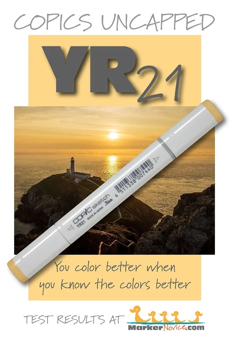
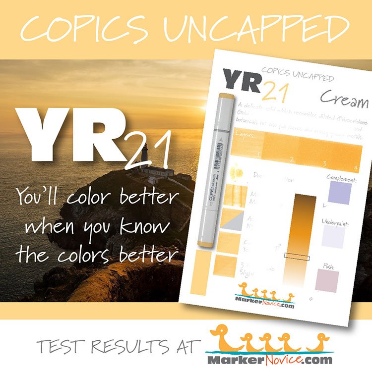
YR21 Cream
Let’s take a closer look at this Copic Marker and its ink characteristics.
Temperature: A warm pale gold
Resemblance: Diluted Quinacridone Gold watercolor.
Name: “Cream” is not an appropriate name for this color. Real cream (the dairy product) is a soft white. Butter, which is made from concentrated cream, is not even a yellow this dark. Additionally, in art supplies, “cream” is commonly used for a yellowish beige. I suspect this is one of those situations where something was lost in the translation from Japanese to English.
Copic Marker Styles: YR21 is only available in Sketch and Classic style Copics.
Copic makes refill inks for every color they produce.
Actual Value: N3.5 (Note the cap number indicates this color should be a value 1.)
All Copics are measured on a Neutral Gray value scale. The last number on the cap is supposed to indicate value but we’ve found discrepancies where the actual ink value is different than cap designation.
Cap Accuracy: Yes, the plastic on a Sketch marker matches 1 layer of YR21 ink
Buildup: YR21 layers well, reaching a maximum value at three layers of ink
Shattering: YR21 ink does not shatter.
Chromatography testing shows this ink’s behavior when it comes in contact with #0 Colorless Blender (solvent). High shattering colors may leak unexpected color when you make corrections or attempt to blend with any color that has a high solvent to colorant ratio. Shattering is not bad, it’s just something to be aware of.
Staining: This color is mildly staining. The darker YR-Twenty markers are staining, so this marker is probably friendlier due to the lightness of the color.
Lift: Lifts with effort.
See staining swatch. Sample was given 6 stripes of #0 Colorless Blender, drying between each stripe. Results indicate how much lifting you can expect.
Lightfast: Minimal fading, I estimate less than 5%
Samples were swatched on X-Press It Blending Card. 1 layer of ink was exposed to windowsill sunlight for 21 days. Approximately 10 hours of sun per day based on weather conditions. Note: we do not recommend displaying original Copic art under these conditions.
Natural Ink Family: YR21 is at the lighter end of the YR-Twenty family.
Family Members: YR20, YR21, YR23, YR24, YR27
We include this information because many Copic users never think deeper than the letter groupings (R, BV, G, etc.). Every ink has its own temperature variations and underlying flavors. Understanding what an ink looks like in its different dilutions helps when creating your own blending combinations.
Complement: We suggest a medium blue marker like BV01.
Underpaint: BV0000 neutralizes this color nicely.
This is simply one suggestion. Many possible colors exist. Test to find a color that pleases you.
Pushing Pencil: PC1026 Greyed Lavender is a universal push for light yellows. It works wonderfully with YR21.
VanillaArts.com (our sister site) teaches a Push & Pull technique for dimensional coloring. This is simply one suggestion. Many possible colors exist. Test to find a color that pleases you.
Looking for beautiful color palettes?
We absolutely love The Color Catalog 1 & 2 from Sarah Renae Clark. It puts hundreds of Copic friendly color palettes at your fingertips.
(note: affiliate link)

