
Y21 Buttercup Yellow: Copics Uncapped (Marker Swatch, Ink Testing)
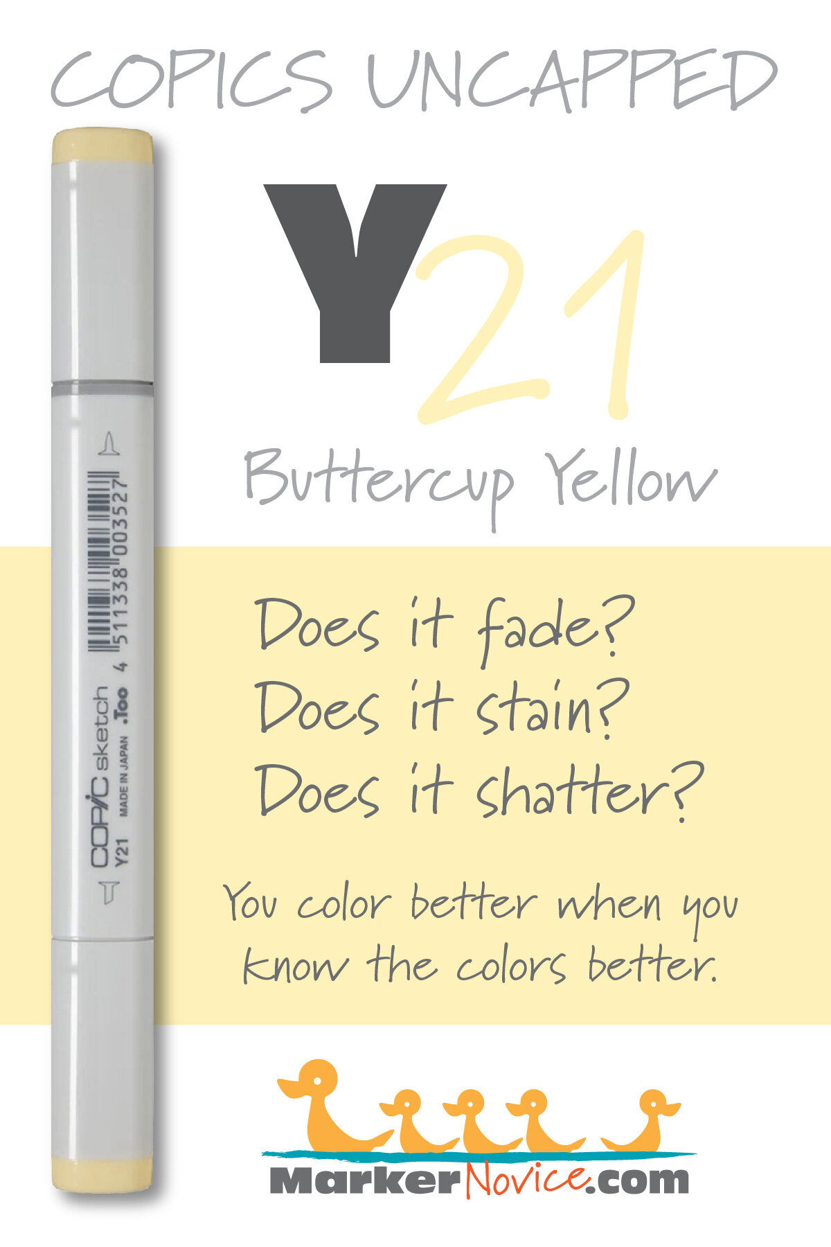
Y21 Buttercup Yellow
Let’s take a closer look at this Copic Marker and it’s ink characteristics.


Y21 Buttercup Yellow is a pale, warm buttery yellow Copic Marker reminiscent of diluted Naples Yellow watercolor. This organic looking marker color is useful for botanicals, landscapes, and portraiture. Y21 is available in Copic Sketch, Ciao, and Classic marker styles.
Every Copic Marker has unique characteristics based on its unique ink formula.
Knowing how a color behaves will help you blend effectively and make art with confidence.
Y21 Buttercup Yellow
Let’s take a closer look at this Copic Marker and it’s ink characteristics.
Temperature: A warm golden-butter yellow
Resemblance: Highly diluted Naples Yellow watercolor.
Actual Value: N1.5
All Copics are measured on a Neutral Gray value scale. The last number on the cap is supposed to indicate value but we’ve found discrepancies where the actual ink value is different than cap designation.
Cap Accuracy: Yes. The plastic on a Sketch cap matches the ink color closely.
Buildup: Y21 is has a low amount of colorant and can be layered with ease.
Shattering: Does not shatter at all.
Chromatography testing shows this ink’s behavior when it comes in contact with #0 Colorless Blender (solvent). High shattering colors may leak unexpected color when you make corrections or attempt to blend with any color that has a high solvent to colorant ratio. Shattering is not bad, it’s just something to be aware of.

Staining: Y21 does not stain the paper.
Lift: Easily liftable, practically “erasable”.
See staining swatch. Sample was given 6 stripes of #0 Colorless Blender, drying between each stripe. Results indicate how much lifting you can expect.
Lightfast: Slight fading. We would expect this color to be badly damaged if we extended the test time.
Samples were swatched on X-Press It Blending Card. 1 layer of ink was exposed to windowsill sunlight for 21 days. Approximately 10 hours of sun per day based on weather conditions. Note: we do not recommend displaying original Copic art under these conditions.
Natural Ink Family: Y21 is dilution of Y28 but the mother ink which forms both markers is likely far more golden brown than anything Copic currently produces. Y21 is the palest dilution available in this family and we wish Copic would produce a sub-zero series for this family as the current Y00’s feel too greenish.
Family Members: Y28, Y26, Y23, Y21
We include this information because many Copic users never think deeper than the letter groupings (R, BV, G, etc.). Every ink has its own temperature variations and underlying flavors. Understanding what an ink looks like in its different dilutions helps when creating your own blending combinations.
Complement: A pale blue violet like BV20
Underpaint: We suggest BV000
This is simply one suggestion. Many possible colors exist. Test to find a color that pleases you.
Pushing Pencil: Prismacolor 1026 Greyed Lavender can be used very lightly. It’s an opaque pencil so be careful not to accidentally mask this beautiful yellow.
VanillaArts.com (our sister site) teaches a Push & Pull technique for dimensional coloring. This is simply one suggestion. Many possible colors exist. Test to find a color that pleases you.
Vanilla Arts Classes using Y21:

Cheers: Amy explores how, and how not to approach glass objects in your stamp images. Find more info here.
Vanilla Arts Digi Stamps using Y21:
Blue Swan: Grace and elegance. A white swan that’s every color except white, a perfect opportunity to push with cool colors and pull with sunshine warms. Find more info here.
Color palettes and swatches using Y21:
We are building our palette and swatch collection a little more each week and will update here as more become available.
Visit the color resource page at our sister site VanillaArts.com for a wide variety of Copic palettes and swatches.
Looking for beautiful color palettes?
We absolutely love The Color Catalog 1 & 2 from Sarah Renae Clark. It puts hundreds of Copic friendly color palettes at your fingertips.
(note: affiliate link)













YR00 Powder Pink: Copics Uncapped (Marker Swatch, Ink Testing)
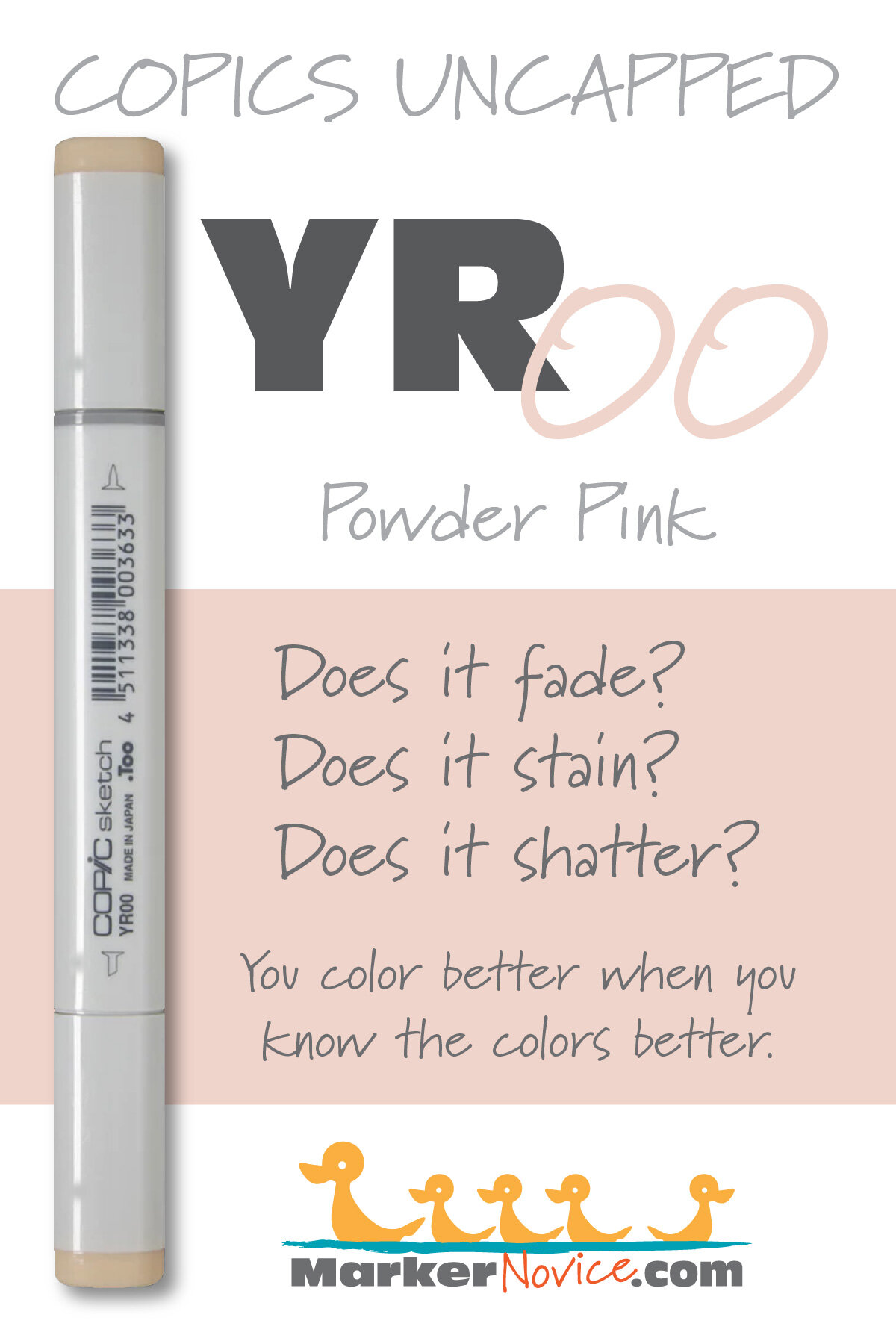
YR00 Powder Pink
Let’s take a closer look at this Copic Marker and it’s ink characteristics.


YR00 Powder Pink is a highly diluted warm peach Copic Marker which closely resembles Chrome Orange watercolor. Many use this delicate color for caucasian skin but it’s also lovely in florals and food illustration. YR00 is available in Copic Sketch, Ciao, and Classic marker styles.
Every Copic Marker has unique characteristics based on its unique ink formula.
Knowing how a color behaves will help you blend effectively and make art with confidence.
YR00 Powder Pink
Let’s take a closer look at this Copic Marker and it’s ink characteristics.
Temperature: A pale warm orange.
Resemblance: Very diluted Chrome Orange watercolor.
Actual Value: N2— Beware! This marker has a severe discrepancy between the cap value (sub-0) and the actual value (2)
All Copics are measured on a Neutral Gray value scale. The last number on the cap is supposed to indicate value but we’ve found discrepancies where the actual ink value is different than cap designation.
Cap Accuracy: Yes. The plastic end of a Sketch Marker is very close to the ink color.
Buildup: YR00 has a nominal amount of colorant and can be layered with ease.
Shattering: Does not shatter at all.
Chromatography testing shows this ink’s behavior when it comes in contact with #0 Colorless Blender (solvent). High shattering colors may leak unexpected color when you make corrections or attempt to blend with any color that has a high solvent to colorant ratio. Shattering is not bad, it’s just something to be aware of.

Staining: No staining, which is surprising given that reds and pinks usually stain.
Lift: Lifts easily. This color is practically “erasable”.
See staining swatch. Sample was given 6 stripes of #0 Colorless Blender, drying between each stripe. Results indicate how much lifting you can expect.
Lightfast: Yes? We were shocked at the test results. We were not able to detect any hint of fade. If we run an extended test in the future, we intend to include this color for further testing.
Samples were swatched on X-Press It Blending Card. 1 layer of ink was exposed to windowsill sunlight for 21 days. Approximately 10 hours of sun per day based on weather conditions. Note: we do not recommend displaying original Copic art under these conditions.
Natural Ink Family: YR00 is a highly diluted version of YR09.
Family Members: YR09, YR07, YR04, YR02, YR01, YR00, YR000, YR0000
We include this information because many Copic users never think deeper than the letter groupings (R, BV, G, etc.). Every ink has its own temperature variations and underlying flavors. Understanding what an ink looks like in its different dilutions helps when creating your own blending combinations.
Complement: We suggest a pale cyan color like B41
Underpaint: B000 neutralizes this color well. It seems a fairly wimpy color, so be careful not to choose a blue too potent to melt.
This is simply one suggestion. Many possible colors exist. Test to find a color that pleases you.
Pushing Pencil: Prismacolor 1103 Caribbean Sea if used with barely any pressure looks beautiful.
VanillaArts.com (our sister site) teaches a Push & Pull technique for dimensional coloring. This is simply one suggestion. Many possible colors exist. Test to find a color that pleases you.
Vanilla Arts Classes using YR00:
We continue to create new content and classes and we will update here as more become available.
Visit the workshop resource page at our sister site VanillaArts.com for a wide variety of Copic classes.
Vanilla Arts Digi Stamps using YR00:
We continue to create new content and stamps and we will update here as more become available.
Visit the stamp shop page at our sister site VanillaArts.com for a wide variety of Copic classes.
Color palettes and swatches using YR00:
We are building our palette and swatch collection a little more each week and will update here as more become available.
Visit the color resource page at our sister site VanillaArts.com for a wide variety of Copic palettes and swatches.
Looking for beautiful color palettes?
We absolutely love The Color Catalog 1 & 2 from Sarah Renae Clark. It puts hundreds of Copic friendly color palettes at your fingertips.
(note: affiliate link)


V06 Lavender: Copics Uncapped (Marker Swatch, Ink Testing)
V06 Lavender
Let’s take a closer look at this Copic Marker and it’s ink characteristics.


V06 Lavender is a warm, rosy purple Copic Marker reminiscent of Violet Rose watercolor. This intense marker color is useful for spring or autumn florals, and holiday images. V06 is available in Copic Sketch, Ciao, and Classic marker styles.
Every Copic Marker has unique characteristics based on its unique ink formula.
Knowing how a color behaves will help you blend effectively and make art with confidence.
V06 Lavender
Let’s take a closer look at this Copic Marker and it’s ink characteristics.
Temperature: A warm purple with a distinct pink cast.
Resemblance: Violet Rose watercolor.
Actual Value: N6
All Copics are measured on a Neutral Gray value scale. The last number on the cap is supposed to indicate value but we’ve found discrepancies where the actual ink value is different than cap designation.
Cap Accuracy: Yes. The plastic end of a Sketch Marker is very close to the ink color.
Buildup: V06 is moderately laden with colorant and withstands some layering but exercise caution above 3 coats.
Shattering: Does not shatter at all.
Chromatography testing shows this ink’s behavior when it comes in contact with #0 Colorless Blender (solvent). High shattering colors may leak unexpected color when you make corrections or attempt to blend with any color that has a high solvent to colorant ratio. Shattering is not bad, it’s just something to be aware of.

Staining: No staining, which is surprising given that reds and pinks usually stain.
Lift: Lifts easily. This color is too dark to be considered fully “erasable” but you should be able to make some corrections.
See staining swatch. Sample was given 6 stripes of #0 Colorless Blender, drying between each stripe. Results indicate how much lifting you can expect.
Lightfast: No. This color faded by about 10% and shifted even further towards pink. It certainly would fade in extended testing.
Samples were swatched on X-Press It Blending Card. 1 layer of ink was exposed to windowsill sunlight for 21 days. Approximately 10 hours of sun per day based on weather conditions. Note: we do not recommend displaying original Copic art under these conditions.
Natural Ink Family: V06 is a mid-range dilution of V09. At the opposite end, V0000 is the highly diluted version. The pink cast to this family is why the sub-zeros feel pale pink rather than purple.
Family Members: V09, V06, V05, V04, V01, V00, V000, V0000
We include this information because many Copic users never think deeper than the letter groupings (R, BV, G, etc.). Every ink has its own temperature variations and underlying flavors. Understanding what an ink looks like in its different dilutions helps when creating your own blending combinations.
Complement: We suggest a clean green like G24 or G05
Underpaint: BV25 neutralizes this color well with reliable results.
This is simply one suggestion. Many possible colors exist. Test to find a color that pleases you.
Pushing Pencil: Prismacolor 931 Dark Purple is a reliable choice.
VanillaArts.com (our sister site) teaches a Push & Pull technique for dimensional coloring. This is simply one suggestion. Many possible colors exist. Test to find a color that pleases you.
Looking for beautiful color palettes?
We absolutely love The Color Catalog 1 & 2 from Sarah Renae Clark. It puts hundreds of Copic friendly color palettes at your fingertips.
(note: affiliate link)

C3 Cool Gray No. 3: Copics Uncapped (Marker Swatch, Ink Testing)
C3 Cool Gray No. 3
Let’s take a closer look at this Copic Marker and it’s ink characteristics.


C3 Cool Gray #3 is a cool, faint gray Copic Marker which resembles diluted Neutral Tint watercolor. This pale marker color is useful for delicate gray objects and makes an excellent underpaint. C3 is available in Copic Sketch, Ciao, and Classic marker styles.
Every Copic Marker has unique characteristics based on its unique ink formula.
Knowing how a color behaves will help you blend effectively and make art with confidence.
C3 Cool Gray No. 3
Let’s take a closer look at this Copic Marker and it’s ink characteristics.
Temperature: A pale cool gray.
Resemblance: A highly diluted Neutral Tint watercolor.
Actual Value: N3
All Copics are measured on a Neutral Gray value scale. The last number on the cap is supposed to indicate value but we’ve found discrepancies where the actual ink value is different than cap designation.
Cap Accuracy: Yes. The plastic end of a Sketch Marker is very close to the ink color.
Buildup: C3 has a high solvent to colorant ratio and can be layered without worry.
Shattering: Does not shatter at all.
Chromatography testing shows this ink’s behavior when it comes in contact with #0 Colorless Blender (solvent). High shattering colors may leak unexpected color when you make corrections or attempt to blend with any color that has a high solvent to colorant ratio. Shattering is not bad, it’s just something to be aware of.

Staining: No. Copic grays are not generally staining.
Lift: Lifts easily. You can consider the color “erasable”.
See staining swatch. Sample was given 6 stripes of #0 Colorless Blender, drying between each stripe. Results indicate how much lifting you can expect.
Lightfast: No. There was mild fading which we expect would continue during an extended test period. This color looks like it would disappear over a few months.
Samples were swatched on X-Press It Blending Card. 1 layer of ink was exposed to windowsill sunlight for 21 days. Approximately 10 hours of sun per day based on weather conditions. Note: we do not recommend displaying original Copic art under these conditions.
Natural Ink Family: C3 is a diluted version of C10.
Family Members: C10, C9, C8, C7, C6, C5, C4, C3, C2, C1, C0, C00,
We include this information because many Copic users never think deeper than the letter groupings (R, BV, G, etc.). Every ink has its own temperature variations and underlying flavors. Understanding what an ink looks like in its different dilutions helps when creating your own blending combinations.
Complement: N/A
Underpaint: N/A
Pushing Pencil: We suggest Prismacolor 1065 50% Cool Grey but a soft blue would look very artistic.
VanillaArts.com (our sister site) teaches a Push & Pull technique for dimensional coloring. This is simply one suggestion. Many possible colors exist. Test to find a color that pleases you.
Vanilla Arts Classes using C3:

Red Bird: explores bird anatomy and the use of photo references to improve your coloring on any bird themed stamp. Includes smooth ink background method. Find more info here.
Color palettes and swatches using C3:
We are building our palette and swatch collection a little more each week and will update here as more become available.
Visit the color resource page at our sister site VanillaArts.com for a wide variety of Copic palettes and swatches.
Looking for beautiful color palettes?
We absolutely love The Color Catalog 1 & 2 from Sarah Renae Clark. It puts hundreds of Copic friendly color palettes at your fingertips.
(note: affiliate link)


B32 Pale Blue: Copics Uncapped (Marker Swatch, Ink Testing)
B32 Pale Blue
Let’s take a closer look at this Copic Marker and it’s ink characteristics.


B32 Pale Blue is a green-shade blue Copic Marker which looks like diluted Phthalo Blue watercolor. This mild marker color is useful for sunny skies, clothing, and makes an excellent underpaint. B32 is available in Copic Sketch, Ciao, and Classic marker styles.
Every Copic Marker has unique characteristics based on its unique ink formula.
Knowing how a color behaves will help you blend effectively and make art with confidence.
B32 Pale Blue
Let’s take a closer look at this Copic Marker and it’s ink characteristics.
Temperature: A balanced blue that looks a bit green-shade, but not much.
Resemblance: Diluted Phthalo Blue watercolor.
Actual Value: N3.5 (darker than N3 but lighter than N4)
All Copics are measured on a Neutral Gray value scale. The last number on the cap is supposed to indicate value but we’ve found discrepancies where the actual ink value is different than cap designation.
Cap Accuracy: The plastic on a Sketch cap is a close match to B32. The plastic is just a bit cooler than the ink though which can lead to some confusion when you don’t get the cool blue expected.
Buildup: B32 has a low level of colorant and high level of solvent in the formula. This color layers beautifully.
Shattering: No shattering.
Chromatography testing shows this ink’s behavior when it comes in contact with #0 Colorless Blender (solvent). High shattering colors may leak unexpected color when you make corrections or attempt to blend with any color that has a high solvent to colorant ratio. Shattering is not bad, it’s just something to be aware of.

Staining: B32 like most blues, is not staining color.
Lift: Very easy lifting and could be considered “erasable”.
See staining swatch. Sample was given 6 stripes of #0 Colorless Blender, drying between each stripe. Results indicate how much lifting you can expect.
Lightfast: Terrible lightfastness. This color faded in the first week of testing and disappeared before the end of the testing period.
Samples were swatched on X-Press It Blending Card. 1 layer of ink was exposed to windowsill sunlight for 21 days. Approximately 10 hours of sun per day based on weather conditions. Note: we do not recommend displaying original Copic art under these conditions.
Natural Ink Family: B32 is a very diluted version of B39, a dark Prussian Blue.
Family Members: B39, B37, B34, B32
We include this information because many Copic users never think deeper than the letter groupings (R, BV, G, etc.). Every ink has its own temperature variations and underlying flavors. Understanding what an ink looks like in its different dilutions helps when creating your own blending combinations.
Complement: A light orange. We suggest YR12
Underpaint: We suggest V22
This is simply one suggestion. Many possible colors exist. Test to find a color that pleases you.
Pushing Pencil: Prismacolor 901 Indigo Blue works beautifully over B32. It doesn’t feel clever or revolutionary but it works.
VanillaArts.com (our sister site) teaches a Push & Pull technique for dimensional coloring. This is simply one suggestion. Many possible colors exist. Test to find a color that pleases you.
Vanilla Arts Classes using B32:

Candlelight: Amy explores her method for creating soft glows and lens flares. Find more info here.
Color palettes and swatches using B32:
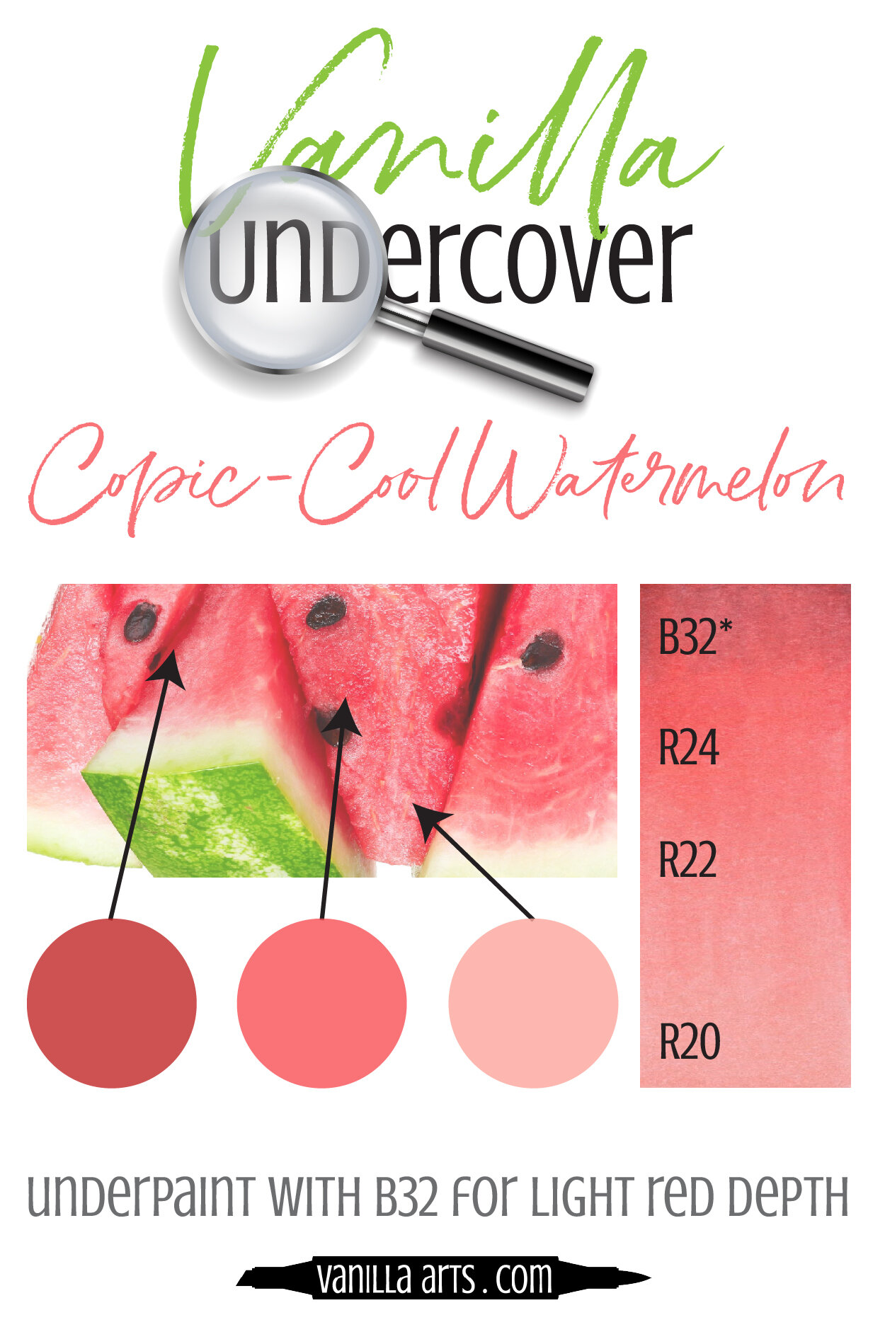
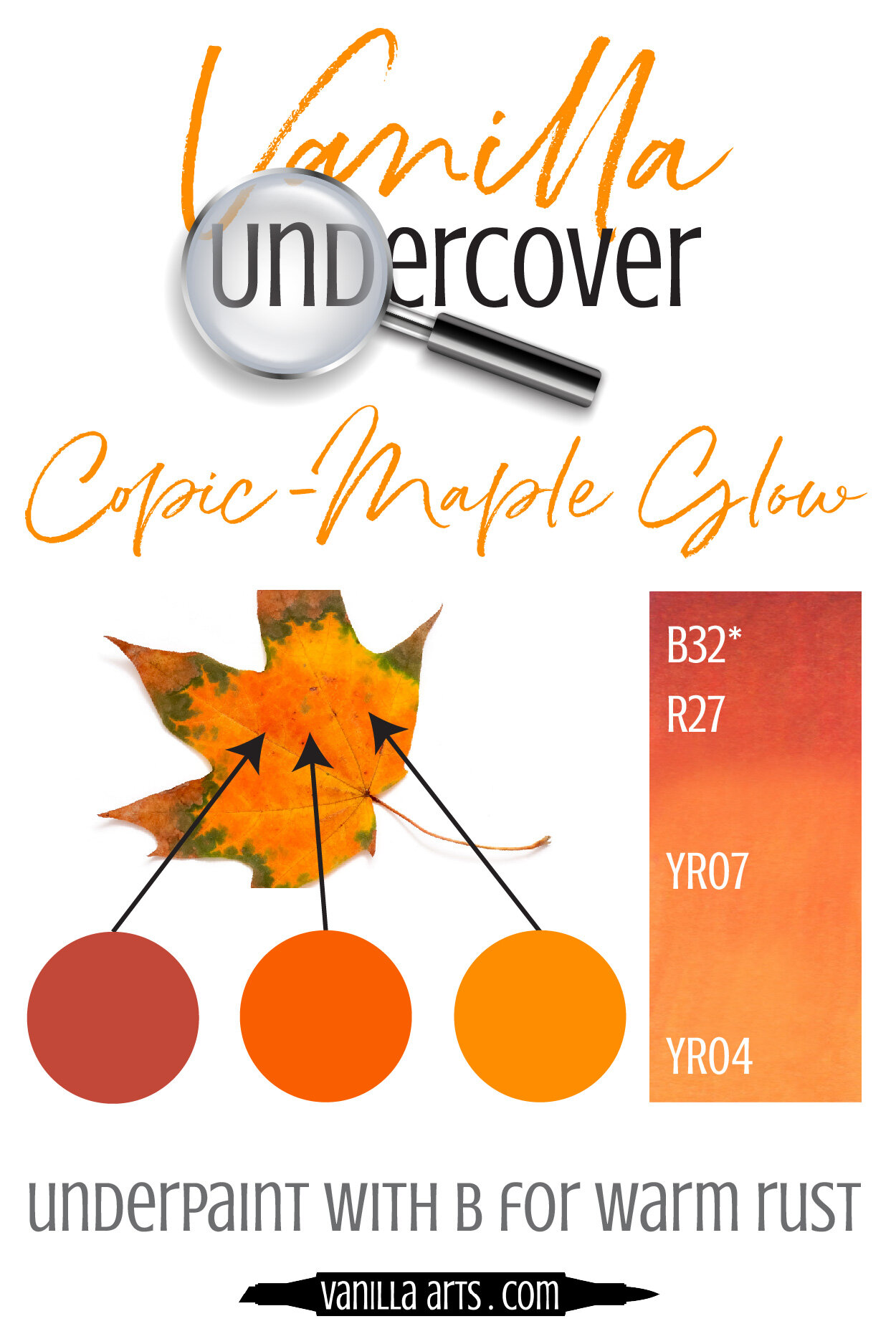


Visit the color resource page at our sister site VanillaArts.com for a wide variety of Copic palettes and swatches.
Looking for beautiful color palettes?
We absolutely love The Color Catalog 1 & 2 from Sarah Renae Clark. It puts hundreds of Copic friendly color palettes at your fingertips.
(note: affiliate link)


G99 Olive: Copics Uncapped (Marker Swatch, Ink Testing)
G99 Olive
Let’s take a closer look at this Copic Marker and it’s ink characteristics.


G99 Olive is a warm, muted green Copic Marker which closely resembles Chromium Green watercolor. This is a very natural marker color, ideal for botanicals, landscapes, and food illustration. G99 is available in Copic Sketch, Ciao, and Classic marker styles.
Every Copic Marker has unique characteristics based on its unique ink formula.
Knowing how a color behaves will help you blend effectively and make art with confidence.
G99 Olive
Let’s take a closer look at this Copic Marker and it’s ink characteristics.
Temperature: A warm and muted green
Resemblance: Chromium Green watercolor.
Actual Value: N8
All Copics are measured on a Neutral Gray value scale. The last number on the cap is supposed to indicate value but we’ve found discrepancies where the actual ink value is different than cap designation.
Cap Accuracy: The plastic on a Sketch cap matches 1 coat of G99.
Buildup: G99 is has a high proportion of colorant in the formula. Exercise caution when layering this color as it tends to look oily after 2 coats.
Shattering: Shatters into three colors, a high staining green, aqua, and a orangish-red.
Chromatography testing shows this ink’s behavior when it comes in contact with #0 Colorless Blender (solvent). High shattering colors may leak unexpected color when you make corrections or attempt to blend with any color that has a high solvent to colorant ratio. Shattering is not bad, it’s just something to be aware of.

Staining: G99 is a staining color, have patience when blending.
Lift: Very little lift. This is not a good candidate for correction.
See staining swatch. Sample was given 6 stripes of #0 Colorless Blender, drying between each stripe. Results indicate how much lifting you can expect.
Lightfast: Absolutely no fade was visible after the 3 week test period.
Samples were swatched on X-Press It Blending Card. 1 layer of ink was exposed to windowsill sunlight for 21 days. Approximately 10 hours of sun per day based on weather conditions. Note: we do not recommend displaying original Copic art under these conditions.
Natural Ink Family: G99 is the darkest marker in this number group but the mother ink is most likely a blackened green color. The color is so warm that it honestly feels as if it belongs in the YG group rather than G.
Family Members: G99, G94
We include this information because many Copic users never think deeper than the letter groupings (R, BV, G, etc.). Every ink has its own temperature variations and underlying flavors. Understanding what an ink looks like in its different dilutions helps when creating your own blending combinations.
Complement: A deep merlot style magenta like RV69
Underpaint: We suggest BV29
This is simply one suggestion. Many possible colors exist. Test to find a color that pleases you.
Pushing Pencil: Prismacolor 901 Indigo Blue works beautifully over G99.
VanillaArts.com (our sister site) teaches a Push & Pull technique for dimensional coloring. This is simply one suggestion. Many possible colors exist. Test to find a color that pleases you.
Vanilla Arts Classes using G99:
Vanilla Arts Digi Stamps using G99:
We continue to create new content and stamps and we will update here as more become available.
Visit the stamp shop page at our sister site VanillaArts.com for a wide variety of Copic classes.
Color palettes and swatches using G99:

We are building our palette and swatch collection a little more each week and will update here as more become available.
Visit the color resource page at our sister site VanillaArts.com for a wide variety of Copic palettes and swatches.
Looking for beautiful color palettes?
We absolutely love The Color Catalog 1 & 2 from Sarah Renae Clark. It puts hundreds of Copic friendly color palettes at your fingertips.
(note: affiliate link)


Y15 Cadmium Yellow: Copics Uncapped (Marker Swatch, Ink Testing)
Y15 Cadmium Yellow
Let’s take a closer look at this Copic Marker and it’s ink characteristics.
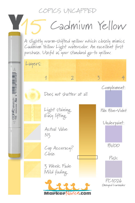
Y15 Cadmium Yellow is a warm yellow Copic Marker which closely resembles Cadmium Yellow Light watercolor. This is an extremely useful and versatile color and highly recommended as a first purchase. Y15 is available in Copic Sketch, Ciao, and Classic marker styles.
Every Copic Marker has unique characteristics based on its unique ink formula.
Knowing how a color behaves will help you blend effectively and make art with confidence.
Y15 Cadmium Yellow
Let’s take a closer look at this Copic Marker and it’s ink characteristics.
Temperature: A slightly warm-shift yellow
Resemblance: Cadmium Yellow Light watercolor.
Actual Value: N3
All Copics are measured on a Neutral Gray value scale. The last number on the cap is supposed to indicate value but we’ve found discrepancies where the actual ink value is different than cap designation.
Cap Accuracy: Close. The plastic on a Sketch cap matches 2 coats of Y15.
Buildup: Y15 is has a low amount of colorant and can be layered with ease.
Shattering: Does not shatter at all.
Chromatography testing shows this ink’s behavior when it comes in contact with #0 Colorless Blender (solvent). High shattering colors may leak unexpected color when you make corrections or attempt to blend with any color that has a high solvent to colorant ratio. Shattering is not bad, it’s just something to be aware of.

Staining: Y15 has just a bit of grab so it may stain papers of lesser quality.
Lift: It took a few coats to start lifting but Y15 is basically a correctible color with patience.
See staining swatch. Sample was given 6 stripes of #0 Colorless Blender, drying between each stripe. Results indicate how much lifting you can expect.
Lightfast: Mild fading but we’d expect this color to be badly damaged if we doubled the test time.
Samples were swatched on X-Press It Blending Card. 1 layer of ink was exposed to windowsill sunlight for 21 days. Approximately 10 hours of sun per day based on weather conditions. Note: we do not recommend displaying original Copic art under these conditions.
Natural Ink Family: Y15 is dilution of Y19 but the mother ink which forms both markers is likely far more mustard-brown looking than anything Copic currently produces. Y11 is the palest dilution in this family but we would love to see a Y10 in the future.
Family Members: Y19, Y18, (Y17*), Y15, Y13, Y11
*Please note that Y17 is a cuckoo-bird color that has been badly shoehorned into the group. The other markers in this family are all standard dilutions
We include this information because many Copic users never think deeper than the letter groupings (R, BV, G, etc.). Every ink has its own temperature variations and underlying flavors. Understanding what an ink looks like in its different dilutions helps when creating your own blending combinations.
Complement: A warm blue violet like BV04
Underpaint: We suggest BV00
This is simply one suggestion. Many possible colors exist. Test to find a color that pleases you.
Pushing Pencil: Prismacolor 1026 Greyed Lavender can be used lightly. It’s an opaque pencil so be careful not to accidentally mask this beautiful yellow.
VanillaArts.com (our sister site) teaches a Push & Pull technique for dimensional coloring. This is simply one suggestion. Many possible colors exist. Test to find a color that pleases you.
Vanilla Arts Classes using Y15:

Oopsie Daisy: Start your marker painting journey with Oopsie Daisy and follow Amy as she covers the flick technique and how to use it with both marker and colored pencil to develop depth in floral images. Find more info here.

Copperbanded Butterflyfish: Amy explores the difference between pattern and texture. Find more info here.
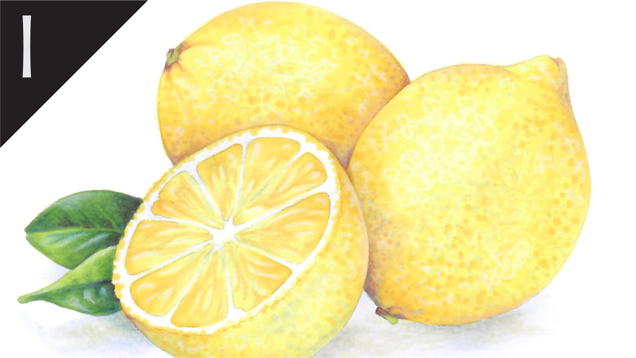
Lemon Zest: Amy shows you how to modify the underpainting technique to shade yellow objects with realism and beauty. Find more info here.
Vanilla Arts Digi Stamps using Y15:

Color palettes and swatches using Y15:
We are building our palette and swatch collection a little more each week and will update here as more become available.
Visit the color resource page at our sister site VanillaArts.com for a wide variety of Copic palettes and swatches.
Looking for beautiful color palettes?
We absolutely love The Color Catalog 1 & 2 from Sarah Renae Clark. It puts hundreds of Copic friendly color palettes at your fingertips.
(note: affiliate link)


R37 Carmine: Copics Uncapped (Marker Swatch, Ink Testing)
R37 Carmine
Let’s take a closer look at this Copic Marker and it’s ink characteristics.


R37 Carmine is a slightly cool red Copic Marker reminiscent of Alizarin Crimson watercolor. This vibrant marker color is useful for coloring realistic red objects, Christmas images, and food illustration. R37 is available in Copic Sketch, Ciao, and Classic marker styles.
Every Copic Marker has unique characteristics based on its unique ink formula.
Knowing how a color behaves will help you blend effectively and make art with confidence.
R37 Carmine
Let’s take a closer look at this Copic Marker and it’s ink characteristics.
Temperature: A slightly cool red.
Resemblance: Alizarin Crimson watercolor.
Actual Value: N7
All Copics are measured on a Neutral Gray value scale. The last number on the cap is supposed to indicate value but we’ve found discrepancies where the actual ink value is different than cap designation.
Cap Accuracy: Slightly dark. The plastic on a Sketch cap matches 3 coats of R37.
Buildup: R37 is has a large amount of colorant but can be layered with caution.
Shattering: Does not shatter at all.
Chromatography testing shows this ink’s behavior when it comes in contact with #0 Colorless Blender (solvent). High shattering colors may leak unexpected color when you make corrections or attempt to blend with any color that has a high solvent to colorant ratio. Shattering is not bad, it’s just something to be aware of.

Staining: R37 stains but not nearly as bad as warmer reds.
Lift: No red lifts very well but you can lighten R37 a bit.
See staining swatch. Sample was given 6 stripes of #0 Colorless Blender, drying between each stripe. Results indicate how much lifting you can expect.
Lightfast: We did not see any fade during the 3 week test period.
Samples were swatched on X-Press It Blending Card. 1 layer of ink was exposed to windowsill sunlight for 21 days. Approximately 10 hours of sun per day based on weather conditions. Note: we do not recommend displaying original Copic art under these conditions.
Natural Ink Family: R37 is a slight dilution of R39. At the opposite end, R30 is the highly diluted version but the lower end of the family skews a bit warmer.
Family Members: R39, R37, R35, R32, R30.
We include this information because many Copic users never think deeper than the letter groupings (R, BV, G, etc.). Every ink has its own temperature variations and underlying flavors. Understanding what an ink looks like in its different dilutions helps when creating your own blending combinations.
Complement: A slightly greenish Turquoise like BG13
Underpaint: We suggest B45
This is simply one suggestion. Many possible colors exist. Test to find a color that pleases you.
Pushing Pencil: Prismacolor 931 Dark Purple is a reliable choice.
VanillaArts.com (our sister site) teaches a Push & Pull technique for dimensional coloring. This is simply one suggestion. Many possible colors exist. Test to find a color that pleases you.
Vanilla Arts Classes using R37:
Vanilla Arts Digi Stamps using R37:
Color palettes and swatches using R37:

Looking for beautiful color palettes?
We absolutely love The Color Catalog 1 & 2 from Sarah Renae Clark. It puts hundreds of Copic friendly color palettes at your fingertips.
(note: affiliate link)

