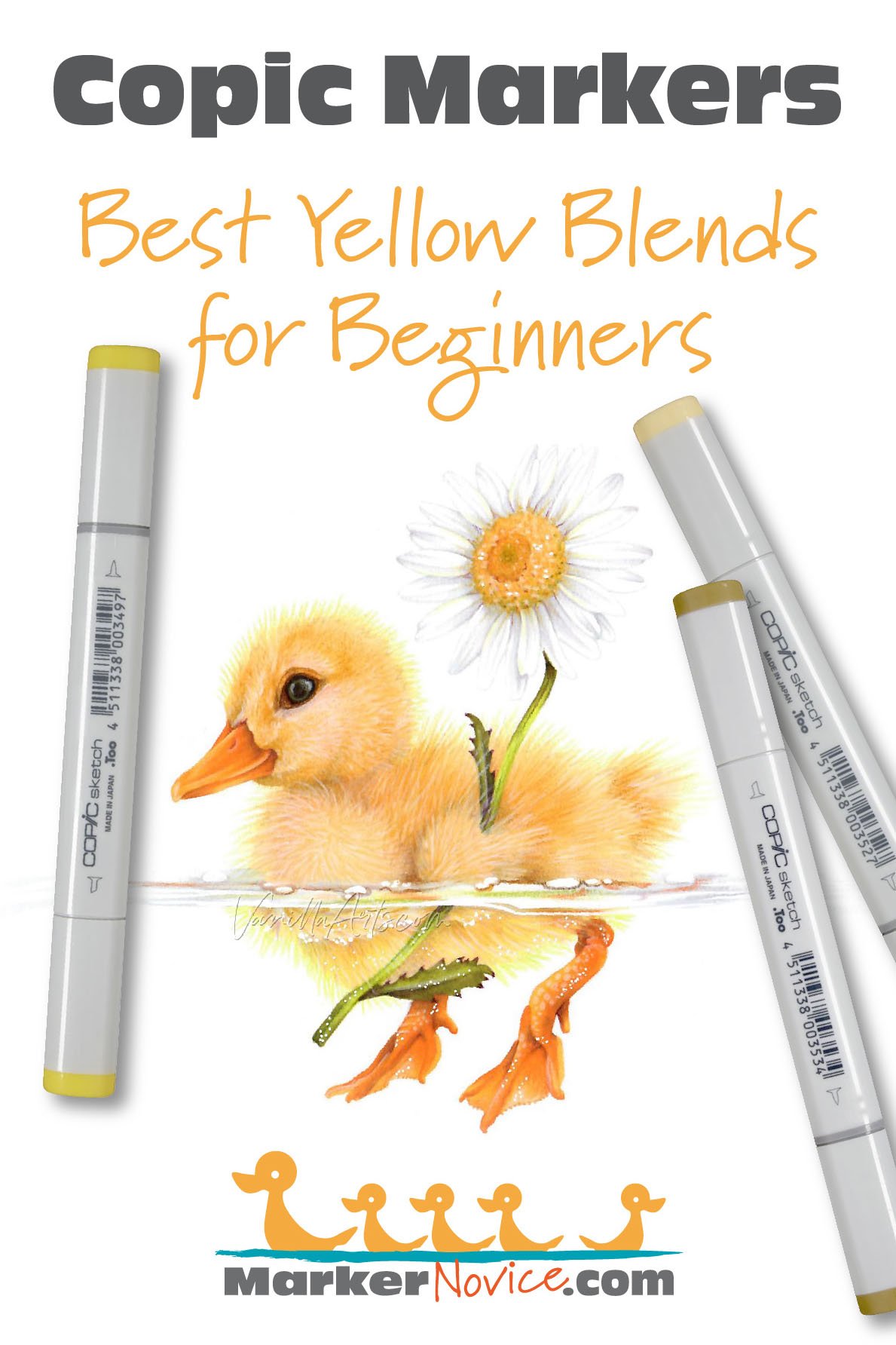
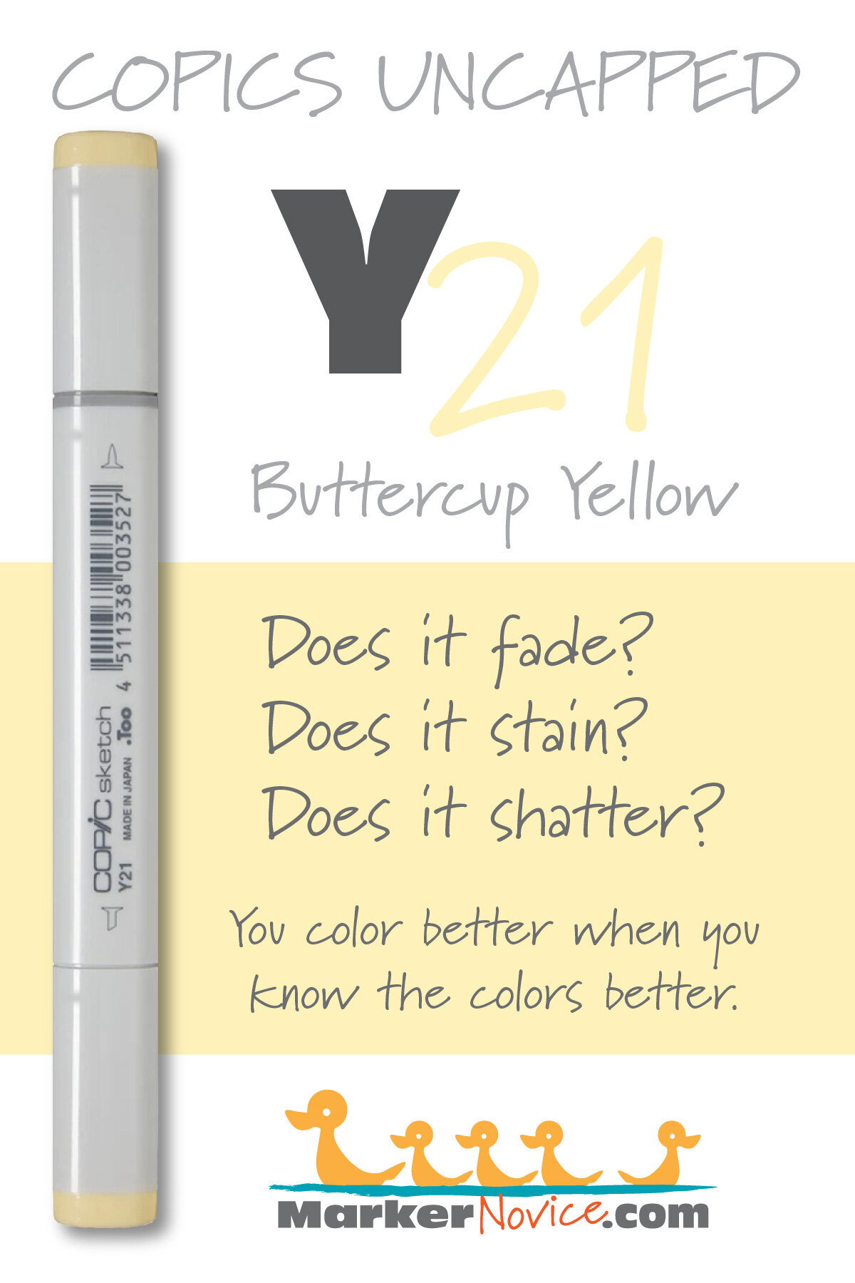
Y21 Buttercup Yellow: Copics Uncapped (Marker Swatch, Ink Testing)


Y21 Buttercup Yellow is a pale, warm buttery yellow Copic Marker reminiscent of diluted Naples Yellow watercolor. This organic looking marker color is useful for botanicals, landscapes, and portraiture. Y21 is available in Copic Sketch, Ciao, and Classic marker styles.
Every Copic Marker has unique characteristics based on its unique ink formula.
Knowing how a color behaves will help you blend effectively and make art with confidence.
Y21 Buttercup Yellow
Let’s take a closer look at this Copic Marker and it’s ink characteristics.
Temperature: A warm golden-butter yellow
Resemblance: Highly diluted Naples Yellow watercolor.
Actual Value: N1.5
All Copics are measured on a Neutral Gray value scale. The last number on the cap is supposed to indicate value but we’ve found discrepancies where the actual ink value is different than cap designation.
Cap Accuracy: Yes. The plastic on a Sketch cap matches the ink color closely.
Buildup: Y21 is has a low amount of colorant and can be layered with ease.
Shattering: Does not shatter at all.
Chromatography testing shows this ink’s behavior when it comes in contact with #0 Colorless Blender (solvent). High shattering colors may leak unexpected color when you make corrections or attempt to blend with any color that has a high solvent to colorant ratio. Shattering is not bad, it’s just something to be aware of.

Staining: Y21 does not stain the paper.
Lift: Easily liftable, practically “erasable”.
See staining swatch. Sample was given 6 stripes of #0 Colorless Blender, drying between each stripe. Results indicate how much lifting you can expect.
Lightfast: Slight fading. We would expect this color to be badly damaged if we extended the test time.
Samples were swatched on X-Press It Blending Card. 1 layer of ink was exposed to windowsill sunlight for 21 days. Approximately 10 hours of sun per day based on weather conditions. Note: we do not recommend displaying original Copic art under these conditions.
Natural Ink Family: Y21 is dilution of Y28 but the mother ink which forms both markers is likely far more golden brown than anything Copic currently produces. Y21 is the palest dilution available in this family and we wish Copic would produce a sub-zero series for this family as the current Y00’s feel too greenish.
Family Members: Y28, Y26, Y23, Y21
We include this information because many Copic users never think deeper than the letter groupings (R, BV, G, etc.). Every ink has its own temperature variations and underlying flavors. Understanding what an ink looks like in its different dilutions helps when creating your own blending combinations.
Complement: A pale blue violet like BV20
Underpaint: We suggest BV000
This is simply one suggestion. Many possible colors exist. Test to find a color that pleases you.
Pushing Pencil: Prismacolor 1026 Greyed Lavender can be used very lightly. It’s an opaque pencil so be careful not to accidentally mask this beautiful yellow.
VanillaArts.com (our sister site) teaches a Push & Pull technique for dimensional coloring. This is simply one suggestion. Many possible colors exist. Test to find a color that pleases you.
Vanilla Arts Classes using Y21:

Cheers: Amy explores how, and how not to approach glass objects in your stamp images. Find more info here.
Vanilla Arts Digi Stamps using Y21:
Blue Swan: Grace and elegance. A white swan that’s every color except white, a perfect opportunity to push with cool colors and pull with sunshine warms. Find more info here.
Color palettes and swatches using Y21:
We are building our palette and swatch collection a little more each week and will update here as more become available.
Visit the color resource page at our sister site VanillaArts.com for a wide variety of Copic palettes and swatches.
Looking for beautiful color palettes?
We absolutely love The Color Catalog 1 & 2 from Sarah Renae Clark. It puts hundreds of Copic friendly color palettes at your fingertips.
(note: affiliate link)