
B37 Antwerp Blue: Copics Uncapped (Marker Swatch, Ink Testing)
B37 Antwerp Blue
Let’s take a closer look at this Copic Marker and it’s ink characteristics.
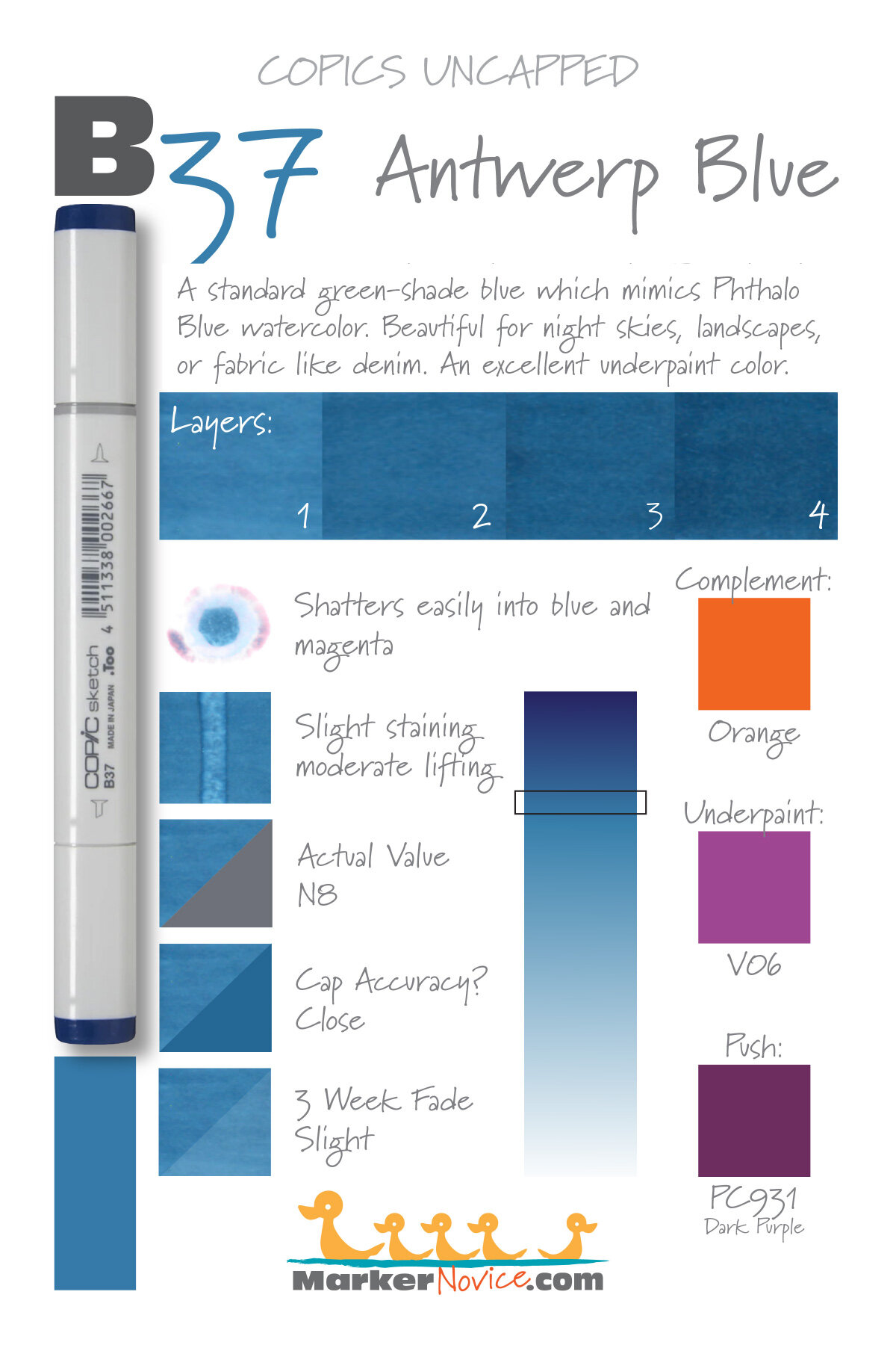

B37 Antwerp Blue is a standard green-shade blue Copic Marker reminiscent of Phthalo Blue watercolor. This intense marker color is useful for night skies, denim, and makes a beautiful underpaint. B37 is only available in Copic Sketch and Classic marker styles.
Every Copic Marker has unique characteristics based on its unique ink formula.
Knowing how a color behaves will help you blend effectively and make art with confidence.
B37 Antwerp Blue
Let’s take a closer look at this Copic Marker and its ink characteristics.
Temperature: A balanced blue that leans slightly green-shade.
Resemblance: Phthalo Blue watercolor.
Actual Value: N8
All Copics are measured on a Neutral Gray value scale. The last number on the cap is supposed to indicate value but we’ve found discrepancies where the actual ink value is different than cap designation.
Cap Accuracy: The plastic on a Sketch cap is the same color as 4 coats of B37. It’s often a surprise to see the ink is lighter than expected.
Buildup: B37 has a moderate level of colorant. Exercise caution with more than 3 layers.
Shattering: Easily shatters into blue and magenta.
Chromatography testing shows this ink’s behavior when it comes in contact with #0 Colorless Blender (solvent). High shattering colors may leak unexpected color when you make corrections or attempt to blend with any color that has a high solvent to colorant ratio. Shattering is not bad, it’s just something to be aware of.

Staining: B37 like most blues, is not staining color but it is a bit clingier than expected.
Lift: Lifts with some effort. It’s not “erasable” but you should be able to push the color out of the way when making corrections.
See staining swatch. Sample was given 6 stripes of #0 Colorless Blender, drying between each stripe. Results indicate how much lifting you can expect.
Lightfast: Moderate lightfastness. The test sample did not change much but based on the B34 results, we know this color will fade during an extended test.
Samples were swatched on X-Press It Blending Card. 1 layer of ink was exposed to windowsill sunlight for 21 days. Approximately 10 hours of sun per day based on weather conditions. Note: we do not recommend displaying original Copic art under these conditions.
Natural Ink Family: B37 is a slight dilution of B39, a dark Prussian Blue. B32 is the most diluted version that Copic currently makes. B30 would be a very welcome addition to the family.
Family Members: B39, B37, B34, B32
We include this information because many Copic users never think deeper than the letter groupings (R, BV, G, etc.). Every ink has its own temperature variations and underlying flavors. Understanding what an ink looks like in its different dilutions helps when creating your own blending combinations.
Complement: A traditional orange. We suggest YR07 or YR16
Underpaint: We suggest V06
This is simply one suggestion. Many possible colors exist. Test to find a color that pleases you.
Pushing Pencil: Prismacolor 931 Dark Purple makes beautiful pushes.
VanillaArts.com (our sister site) teaches a Push & Pull technique for dimensional coloring. This is simply one suggestion. Many possible colors exist. Test to find a color that pleases you.
Vanilla Arts Classes using B37:


Big Sable Point: A lesson on coloring realistic landscapes. Find more info here.
Color palettes and swatches using B37:
We are building our palette and swatch collection a little more each week and will update here as more become available.
Visit the color resource page at our sister site VanillaArts.com for a wide variety of Copic palettes and swatches.
Looking for beautiful color palettes?
We absolutely love The Color Catalog 1 & 2 from Sarah Renae Clark. It puts hundreds of Copic friendly color palettes at your fingertips.
(note: affiliate link)














BG10 Cool Shadow: Copics Uncapped (Marker Swatch, Ink Testing)
BG10 Cool Shadow
Let’s take a closer look at this Copic Marker and it’s ink characteristics.
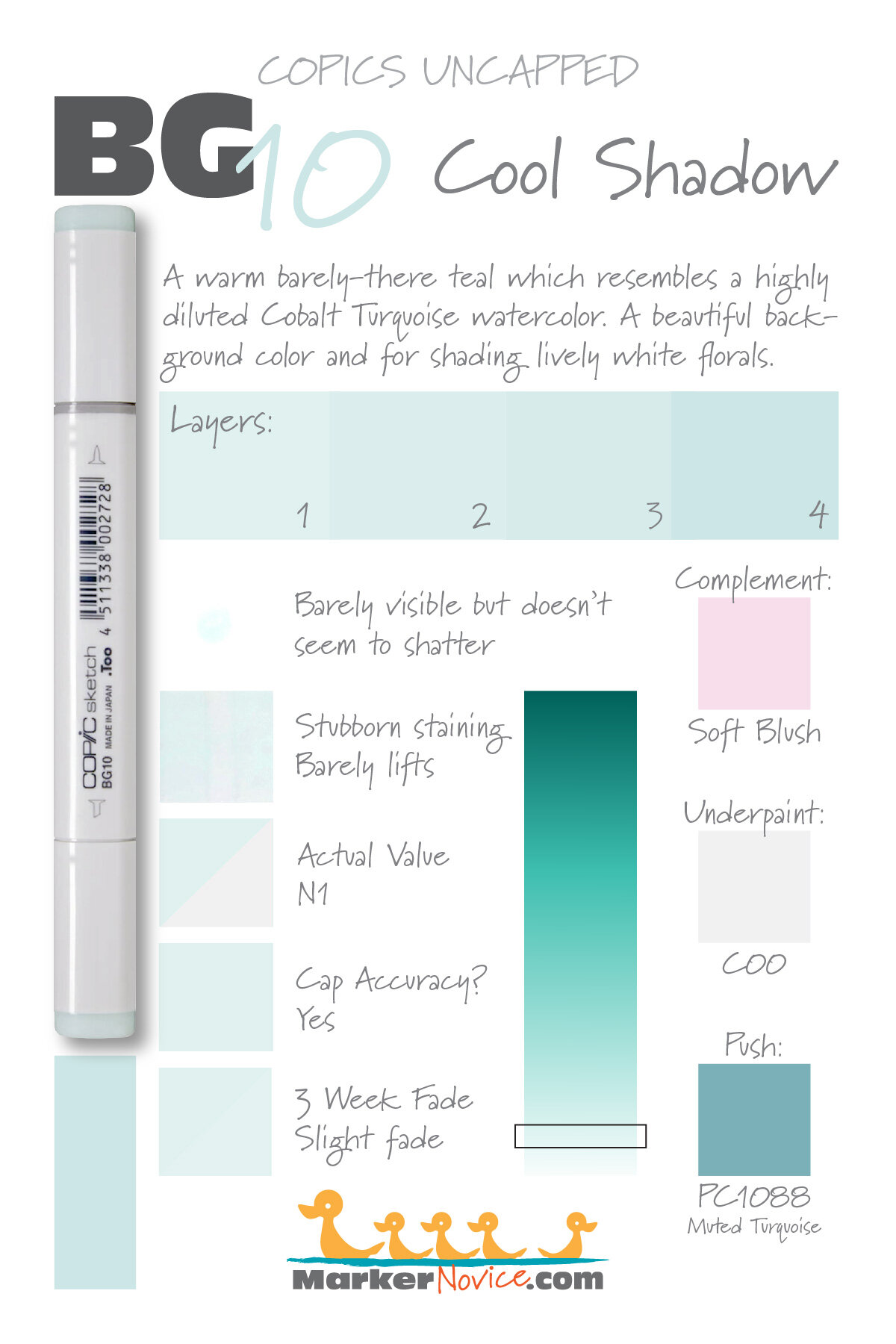

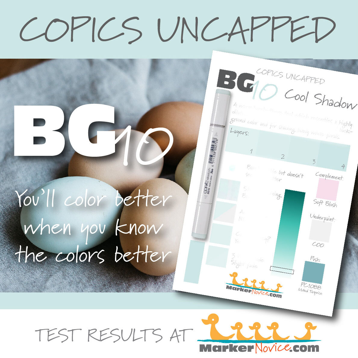
BG10 Cool Shadow is a warm, barely-there teal Copic Marker reminiscent of highly diluted Cobalt Turquoise watercolor. This pale marker color makes beautiful backgrounds and shading delicate white florals. BG10 is available in Copic Sketch, Ciao, and Classic marker styles.
Every Copic Marker has unique characteristics based on its unique ink formula.
Knowing how a color behaves will help you blend effectively and make art with confidence.
BG10 Cool Shadow
Let’s take a closer look at this Copic Marker and its ink characteristics.
WARNING: This color falls into the non-photo blue/green family. We were unable to capture the real life look of this color in photographs or scans. The chromatography (shattering) sample above is a scan of the actual test swatch. The staining/lift sample is a photograph, darkened slightly to show the lift stripe. All other swatches above were computer generated to replicate the real life look of this difficult-to-capture color.
This should tell you something important about BG10. If you create projects with the intention of distributing them either digitally or printed, use of BG10 may be problematic.
Temperature: A barely-there warm teal
Resemblance: highly diluted Cobalt Turquoise watercolor.
Actual Value: N1
All Copics are measured on a Neutral Gray value scale. The last number on the cap is supposed to indicate value but we’ve found discrepancies where the actual ink value is different than cap designation.
Cap Accuracy: Yes. The colored plastic on the Sketch cap closely resembles this ink color.
Buildup: BG10 has almost no colorant in the formula which allows you to layer this color over itself many times without worry. But be advised, because of the high solvent content, this color can be destructive if layered over other Copic inks.
Shattering: This color is pale to begin with and dilutes even more on contact with solvent. We were unable to see any shattering… in fact, we were barely able to see the test patch.
Chromatography testing shows this ink’s behavior when it comes in contact with #0 Colorless Blender (solvent). High shattering colors may leak unexpected color when you make corrections or attempt to blend with any color that has a high solvent to colorant ratio. Shattering is not bad, it’s just something to be aware of.
Staining: BG10 does not stain.
Lift: Easy. This color can be considered “erasable”.
See staining swatch. Sample was given 6 stripes of #0 Colorless Blender, drying between each stripe. Results indicate how much lifting you can expect.

Lightfast: Slight fading. We expected this faint color to disappear during testing. To the contrary, you have to really hunt for the fade on the test swatch.
Samples were swatched on X-Press It Blending Card. 1 layer of ink was exposed to windowsill sunlight for 21 days. Approximately 10 hours of sun per day based on weather conditions. Note: we do not recommend displaying original Copic art under these conditions.
Natural Ink Family: BG10 is an extreme dilution of BG18 but we suspect the mother ink for this family is significantly darker than BG18.
Family Members: BG18, BG15, BG13, BG11, BG10
We include this information because many Copic users never think deeper than the letter groupings (R, BV, G, etc.). Every ink has its own temperature variations and underlying flavors. Understanding what an ink looks like in its different dilutions helps when creating your own blending combinations.
Complement: A pale magenta leaning red. Copic does not currently make a good complement, R00 is too warm and RV00 is too saccharine pink.
Underpaint: Honestly, this is a color we’ve never needed to underpaint because it’s so rarely used as a local color. If needed, C00 would be a good choice but always exercise caution when dealing with colors this faint.
This is simply one suggestion. Many possible colors exist. Test to find a color that pleases you.
Pushing Pencil: Prismacolor 1088 Muted Turquoise provides a nicely desaturated push for BG10. Build the pencil layer slowly via light layers rather than using pressure. This ink can be easily overwhelmed.
VanillaArts.com (our sister site) teaches a Push & Pull technique for dimensional coloring. This is simply one suggestion. Many possible colors exist. Test to find a color that pleases you.
Vanilla Arts Digi Stamps using BG10:
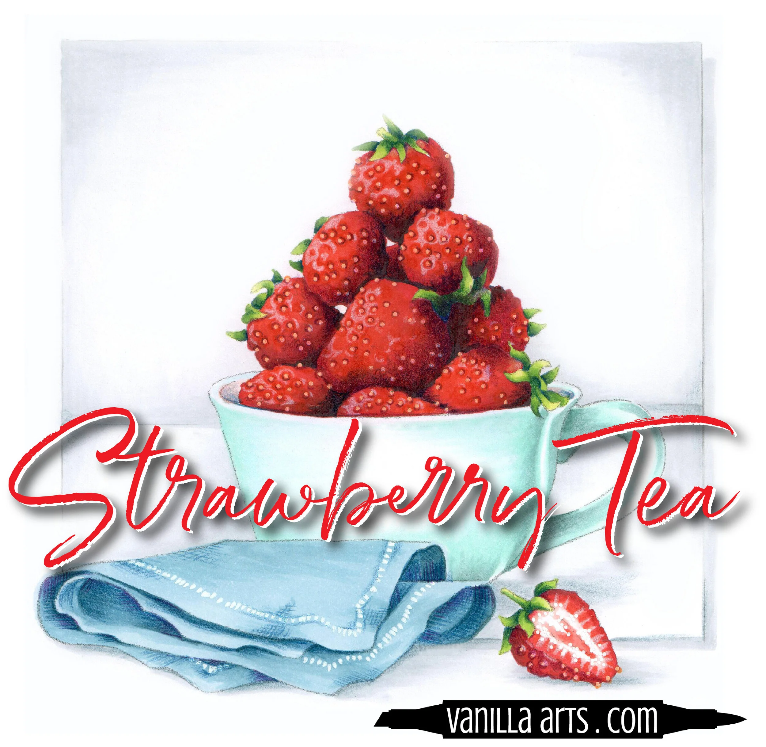
Strawberry Tea: looking for a larger scale image to practice color run techniques? Strawberry Tea is the perfect opportunity to use color runs on your high shine food illustrations. Use this color technique to color any berry! Find more info here.
Vanilla Stamp Shop: a wide variety of Amy Shulke’s original, hand drawn digi stamps. Found at our sister site VanillaArts.com. Visit the stamp shop here.
Color palettes and swatches using BG10:
We are building our palette and swatch collection a little more each week and will update here as more become available.
Visit the color resource page at our sister site VanillaArts.com for a wide variety of Copic palettes and swatches.
Looking for beautiful color palettes?
We absolutely love The Color Catalog 1 & 2 from Sarah Renae Clark. It puts hundreds of Copic friendly color palettes at your fingertips.
(note: affiliate link)



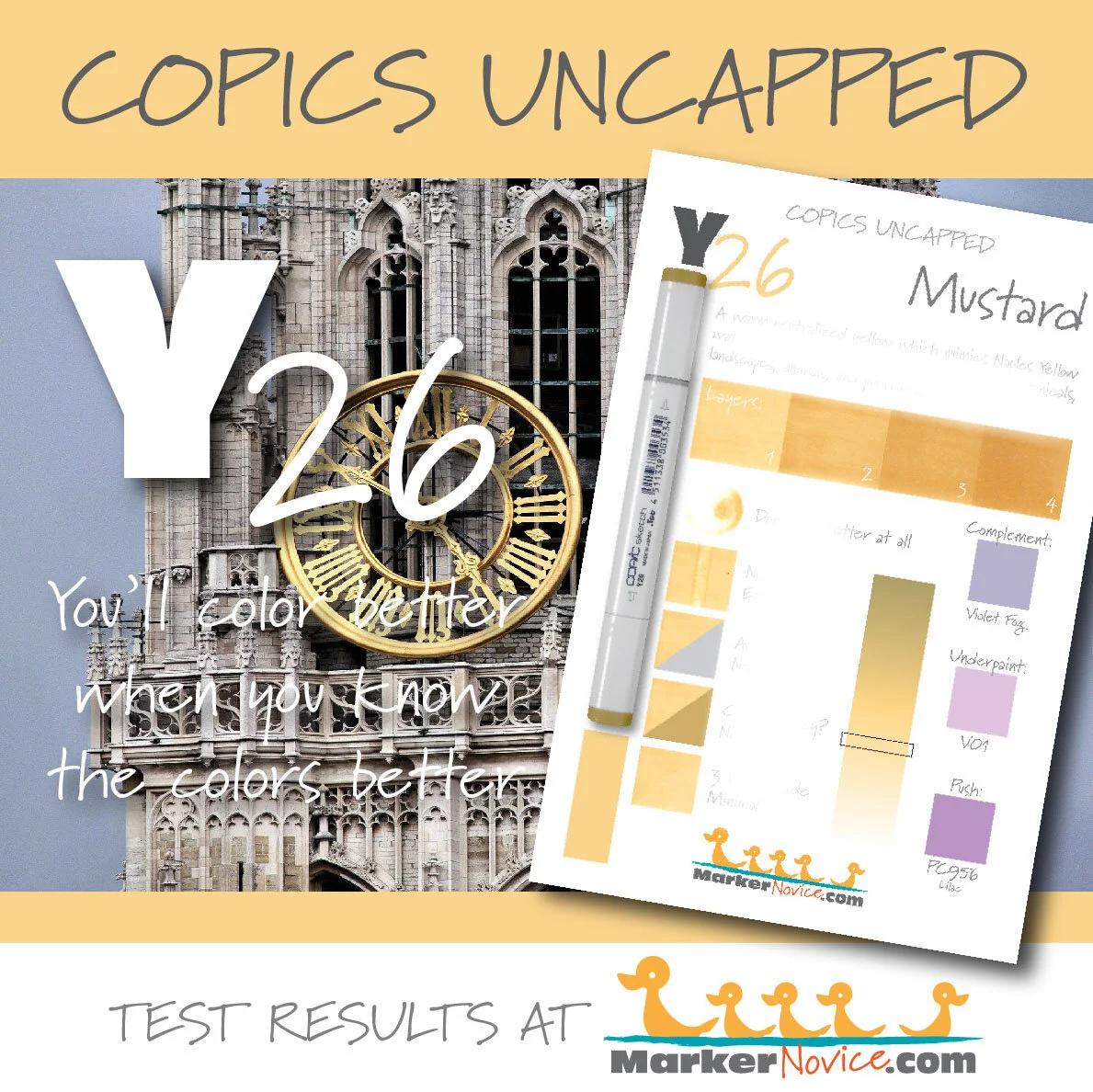
Y26 Mustard: Copics Uncapped (Marker Swatch, Ink Testing)
Y26 Mustard
Let’s take a closer look at this Copic Marker and it’s ink characteristics.
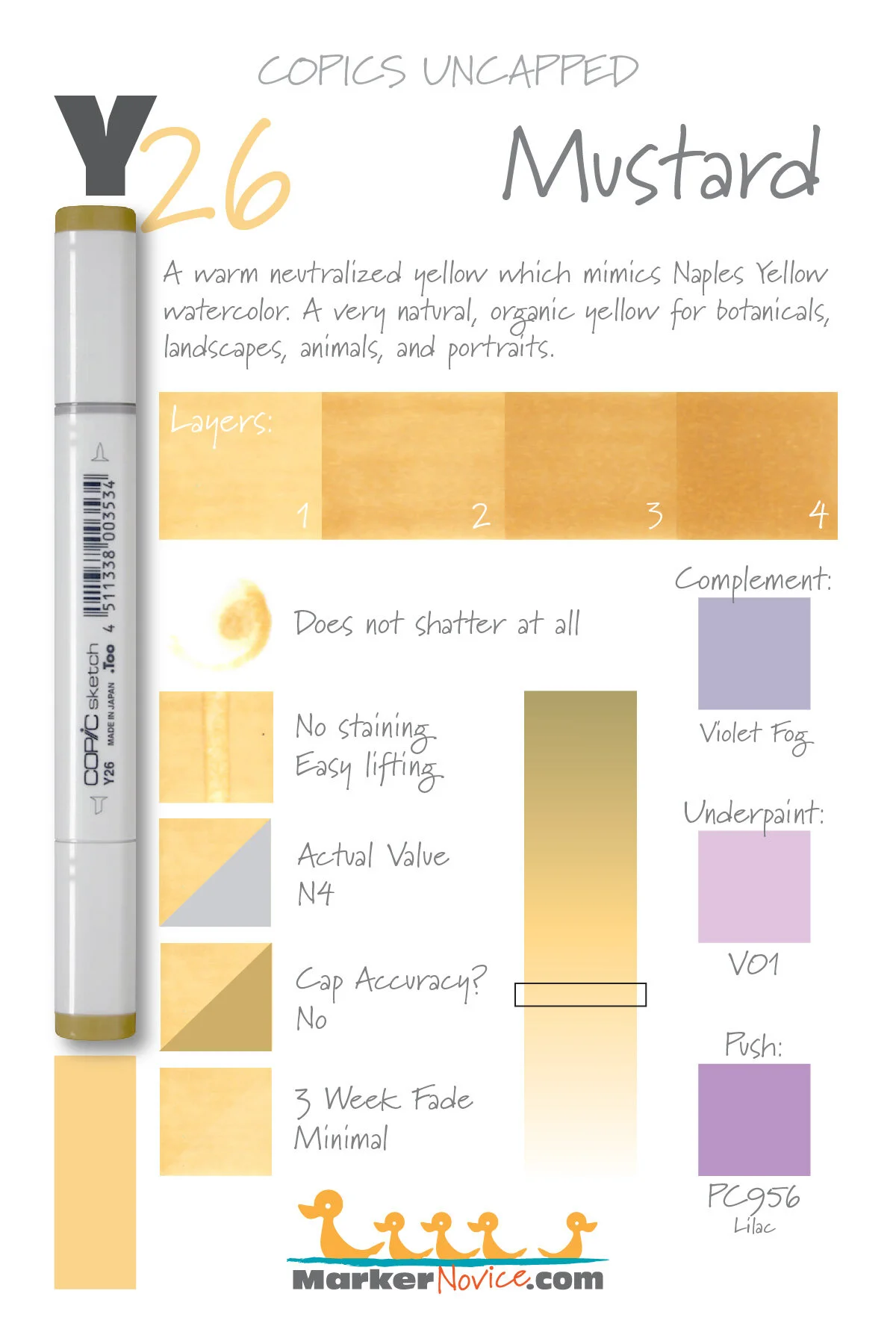

Y26 Mustard is a warm, neutralized yellow Copic Marker reminiscent of Naples Yellow watercolor. This natural, organic marker color is useful for botanicals, landscapes, animals, and portraiture. Y26 is only available in Copic Sketch. It does not come in Ciao or Classic marker styles.
Every Copic Marker has unique characteristics based on its unique ink formula.
Knowing how a color behaves will help you blend effectively and make art with confidence.
Y26 mustard
Let’s take a closer look at this Copic Marker and its ink characteristics.
Temperature: A warm neutralized golden yellow
Resemblance: Moderately diluted Naples Yellow watercolor.
Actual Value: N4
All Copics are measured on a Neutral Gray value scale. The last number on the cap is supposed to indicate value but we’ve found discrepancies where the actual ink value is different than cap designation.
Cap Accuracy: No. The cap end on this Sketch marker is notorious for being ugly and unfortunately discourages people from using it. The cap is dark and dingier while the ink is actually a cheerful golden yellow. A very poor marketing decision by Copic!
Buildup: Y26 is a medium value but it doesn’t have the higher colorant load you’d expect. With its generous level of solvent, this is an easy layering color.
Shattering: Does not shatter at all.

Chromatography testing shows this ink’s behavior when it comes in contact with #0 Colorless Blender (solvent). High shattering colors may leak unexpected color when you make corrections or attempt to blend with any color that has a high solvent to colorant ratio. Shattering is not bad, it’s just something to be aware of.
Staining: Y26 does not stain the paper.
Lift: Easily liftable.
See staining swatch. Sample was given 6 stripes of #0 Colorless Blender, drying between each stripe. Results indicate how much lifting you can expect.
Lightfast: Minimal fading but we would expect this color to be badly damaged if we doubled the test time.
Samples were swatched on X-Press It Blending Card. 1 layer of ink was exposed to windowsill sunlight for 21 days. Approximately 10 hours of sun per day based on weather conditions. Note: we do not recommend displaying original Copic art under these conditions.
Natural Ink Family: Y26 is a slightly diluted of Y28 but the mother ink which forms both markers is likely far more golden brown than anything Copic currently produces. Y21 is the palest dilution available in this family and we wish Copic would produce a sub-zero series for this family as the current Y00’s feel too greenish.
Family Members: Y28, Y26, Y23, Y21
We include this information because many Copic users never think deeper than the letter groupings (R, BV, G, etc.). Every ink has its own temperature variations and underlying flavors. Understanding what an ink looks like in its different dilutions helps when creating your own blending combinations.
Complement: A pale blue violet, perhaps BV32 (which Copic does not currently make).
Underpaint: We suggest V01. Anything too blue starts to look green underneath the Y20 family.
This is simply one suggestion. Many possible colors exist. Test to find a color that pleases you.
Pushing Pencil: Prismacolor 956 Lilac is very pretty if used lightly.
VanillaArts.com (our sister site) teaches a Push & Pull technique for dimensional coloring. This is simply one suggestion. Many possible colors exist. Test to find a color that pleases you.
Vanilla Arts Classes using Y26:
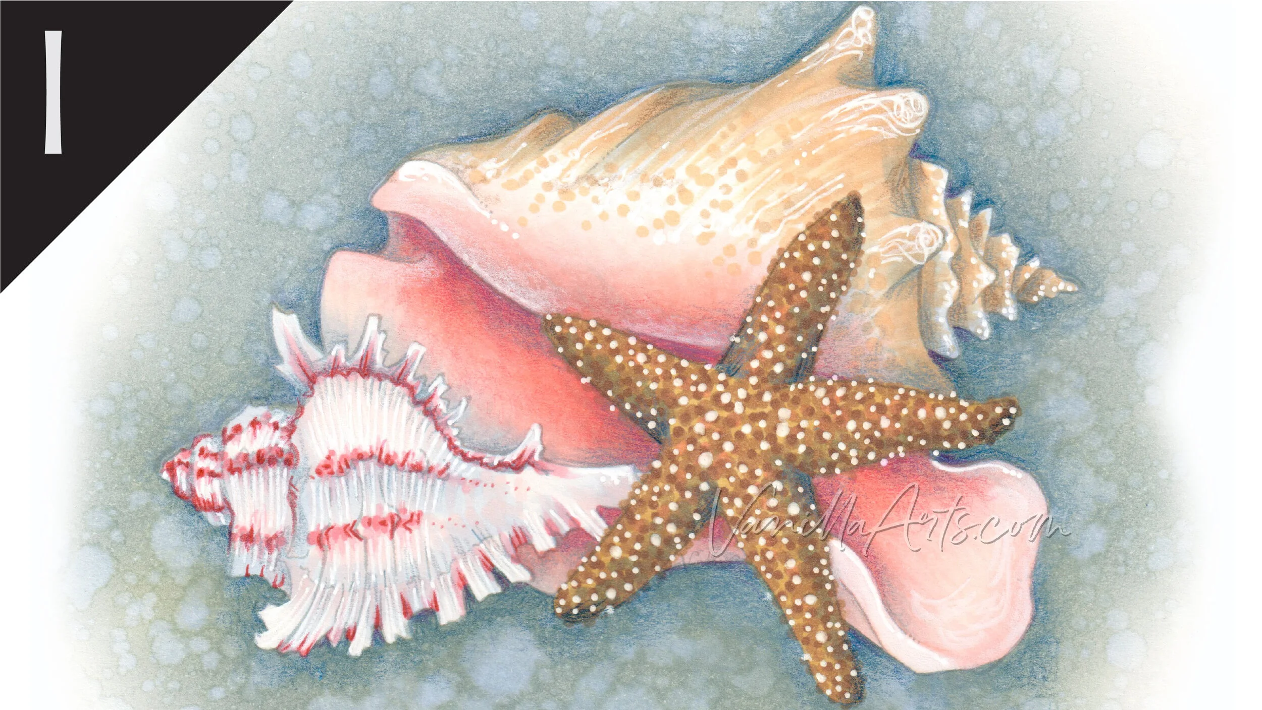
We continue to create new content and classes and we will update here as more become available.
Visit the workshop resource page at our sister site VanillaArts.com for a wide variety of Copic classes.
Vanilla Arts Digi Stamps using Y26:
Color palettes and swatches using Y26:
We are building our palette and swatch collection a little more each week and will update here as more become available.
Visit the color resource page at our sister site VanillaArts.com for a wide variety of Copic palettes and swatches.
Looking for beautiful color palettes?
We absolutely love The Color Catalog 1 & 2 from Sarah Renae Clark. It puts hundreds of Copic friendly color palettes at your fingertips.
(note: affiliate link)


YR04 Chrome Orange: Copics Uncapped (Marker Swatch, Ink Testing)
YR04 Chrome Orange
Let’s take a closer look at this Copic Marker and it’s ink characteristics.


YR04 Chrome Orange is a moderately diluted, warm orange Copic Marker reminiscent of Chrome Orange watercolor. This vibrant marker color is useful for florals, food illustration, and holiday decor. YR04 is available in Copic Sketch, Ciao, and Classic marker styles.
Every Copic Marker has unique characteristics based on its unique ink formula.
Knowing how a color behaves will help you blend effectively and make art with confidence.
YR04 Chrome Orange
Let’s take a closer look at this Copic Marker and its ink characteristics.
Temperature: A medium warm orange.
Resemblance: Diluted Chrome Orange watercolor.
Actual Value: N5
All Copics are measured on a Neutral Gray value scale. The last number on the cap is supposed to indicate value but we’ve found discrepancies where the actual ink value is different than cap designation.
Cap Accuracy: No. The plastic end of a Sketch Marker is significantly darker than the actual ink. The cap resembles 4-5 coats of YR04.
Buildup: YR04 layers well up to 3 coats. Exercise extreme caution for anything beyond this.

Shattering: Does not shatter at all.
Chromatography testing shows this ink’s behavior when it comes in contact with #0 Colorless Blender (solvent). High shattering colors may leak unexpected color when you make corrections or attempt to blend with any color that has a high solvent to colorant ratio. Shattering is not bad, it’s just something to be aware of.
Staining: Moderate staining. Typical of an ink with red in the formula.
Lift: A bit stubborn. The ink can be moved with colorless blender but it took 3 passes of #0 before it budged.
See staining swatch. Sample was given 6 stripes of #0 Colorless Blender, drying between each stripe. Results indicate how much lifting you can expect.
Lightfast: Yes. We were shocked at the test results. We were not able to detect any hint of fade. If we run an extended test in the future, we intend to include this color series for further testing.
Samples were swatched on X-Press It Blending Card. 1 layer of ink was exposed to windowsill sunlight for 21 days. Approximately 10 hours of sun per day based on weather conditions. Note: we do not recommend displaying original Copic art under these conditions.
Natural Ink Family: YR04 is a medium dilution of YR09.
Family Members: YR09, YR07, YR04, YR02, YR01, YR00, YR000, YR0000
We include this information because many Copic users never think deeper than the letter groupings (R, BV, G, etc.). Every ink has its own temperature variations and underlying flavors. Understanding what an ink looks like in its different dilutions helps when creating your own blending combinations.
Complement: We suggest a cyan marker like B04
Underpaint: B32 neutralizes this color well. This entire number series doesn’t cover the underpaint as well as you’d expect, so be careful not to choose a blue too potent to melt.
This is simply one suggestion. Many possible colors exist. Test to find a color that pleases you.
Pushing Pencil: Prismacolor 1008 Parma Violet looks beautiful.
VanillaArts.com (our sister site) teaches a Push & Pull technique for dimensional coloring. This is simply one suggestion. Many possible colors exist. Test to find a color that pleases you.
Vanilla Arts Classes using YR04:

Illustrated Monarch: Learn how Amy approaches animal stamps as a Technical Illustrator and how to add correct details to your realistic coloring. Find more info here.
We continue to create new content and classes and we will update here as more become available.
Visit the workshop resource page at our sister site VanillaArts.com for a wide variety of Copic classes.
Vanilla Arts Digi Stamps using YR04:
We continue to create new content and stamps and we will update here as more become available.
Visit the stamp shop page at our sister site VanillaArts.com for a wide variety of Copic classes.
Color palettes and swatches using YR04:

We are building our palette and swatch collection a little more each week and will update here as more become available.
Visit the color resource page at our sister site VanillaArts.com for a wide variety of Copic palettes and swatches.
Looking for beautiful color palettes?
We absolutely love The Color Catalog 1 & 2 from Sarah Renae Clark. It puts hundreds of Copic friendly color palettes at your fingertips.
(note: affiliate link)


V09 Violet: Copics Uncapped (Marker Swatch, Ink Testing)
V09 Violet
Let’s take a closer look at this Copic Marker and it’s ink characteristics.


V09 Violet is a barely warm purple Copic Marker reminiscent of Dioxazine Violet watercolor. This intense marker color is useful for spring or autumn florals, food illustration, and holiday images. V09 is available in only Copic Sketch and Classic marker styles.
Every Copic Marker has unique characteristics based on its unique ink formula.
Knowing how a color behaves will help you blend effectively and make art with confidence.
V09 Violet
Let’s take a closer look at this Copic Marker and it’s ink characteristics.
Temperature: A warm purple with a hidden pink cast. This color looks cooler as you build up layers which hide the pink flavor.
Resemblance: Dioxazine Violet watercolor.
Actual Value: N9
All Copics are measured on a Neutral Gray value scale. The last number on the cap is supposed to indicate value but we’ve found discrepancies where the actual ink value is different than cap designation.
Cap Accuracy: Yes. The plastic end of a Sketch Marker is very close to the ink color.
Buildup: V09 is heavy with colorant and. Tolerates some layering but exercise extreme caution.
Shattering: Shatters into a blue violet with strong pink leaking.
Chromatography testing shows this ink’s behavior when it comes in contact with #0 Colorless Blender (solvent). High shattering colors may leak unexpected color when you make corrections or attempt to blend with any color that has a high solvent to colorant ratio. Shattering is not bad, it’s just something to be aware of.

Staining: This color is so potent, it can’t help but stain the paper.
Lift: Stubborn with little lift.
See staining swatch. Sample was given 6 stripes of #0 Colorless Blender, drying between each stripe. Results indicate how much lifting you can expect.
Lightfast: No. This color faded by about 10% and shifted even further towards pink. It certainly would fade more in extended testing.
Samples were swatched on X-Press It Blending Card. 1 layer of ink was exposed to windowsill sunlight for 21 days. Approximately 10 hours of sun per day based on weather conditions. Note: we do not recommend displaying original Copic art under these conditions.
Natural Ink Family: V09 is the the mother ink for the V0x family, all other markers in this series are diluted versions of V09. The hidden pink cast to this family is why the sub-zeros feel pale pink rather than purple.
Family Members: V09, V06, V05, V04, V01, V00, V000, V0000
We include this information because many Copic users never think deeper than the letter groupings (R, BV, G, etc.). Every ink has its own temperature variations and underlying flavors. Understanding what an ink looks like in its different dilutions helps when creating your own blending combinations.
Complement: We suggest a clean green like G07
Underpaint: BV29 neutralizes this color well with reliable results.
This is simply one suggestion. Many possible colors exist. Test to find a color that pleases you.
Pushing Pencil: Prismacolor 911 Olive Greenis an unusual choice but looks amazing.
VanillaArts.com (our sister site) teaches a Push & Pull technique for dimensional coloring. This is simply one suggestion. Many possible colors exist. Test to find a color that pleases you.
Vanilla Arts Classes using V09:
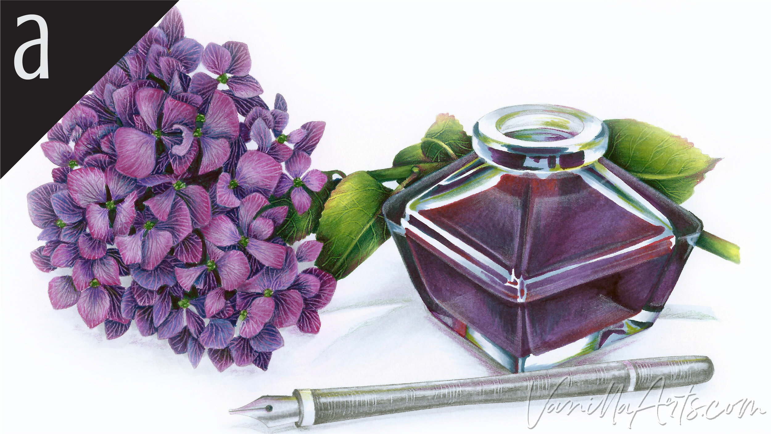
Ink & Hydrangea: Amy shows you the theory behind color shifting for depth and the use of temperature to indicate distance. Find more info here.
Color palettes and swatches using V09:

We are building our palette and swatch collection a little more each week and will update here as more become available.
Visit the color resource page at our sister site VanillaArts.com for a wide variety of Copic palettes and swatches.
Looking for beautiful color palettes?
We absolutely love The Color Catalog 1 & 2 from Sarah Renae Clark. It puts hundreds of Copic friendly color palettes at your fingertips.
(note: affiliate link)


C5 Cool Gray No. 5: Copics Uncapped (Marker Swatch, Ink Testing)
C5 Cool Gray No. 5
Let’s take a closer look at this Copic Marker and it’s ink characteristics.

C5 Cool Gray #5 is a cool medium gray Copic Marker reminiscent of Neutral Tint watercolor. This mid-vaue marker color is useful for shadows, underpainting, and neutralizing overly bright colors. C5 is available in Copic Sketch, Ciao, and Classic marker styles.
Every Copic Marker has unique characteristics based on its unique ink formula.
Knowing how a color behaves will help you blend effectively and make art with confidence.
C5 Cool Gray No. 5
Let’s take a closer look at this Copic Marker and its ink characteristics.
Temperature: A medium cool gray.
Resemblance: A diluted Neutral Tint watercolor.
Actual Value: N4.5
All Copics are measured on a Neutral Gray value scale. The last number on the cap is supposed to indicate value but we’ve found discrepancies where the actual ink value is different than cap designation.
Cap Accuracy: Yes. The plastic end of a Sketch Marker resembles 2 coats of C5.
Buildup: C5 is easy to layer without worry.
Shattering: Does not shatter at all.
Chromatography testing shows this ink’s behavior when it comes in contact with #0 Colorless Blender (solvent). High shattering colors may leak unexpected color when you make corrections or attempt to blend with any color that has a high solvent to colorant ratio. Shattering is not bad, it’s just something to be aware of.

Staining: No. Copic grays are not generally staining.
Lift: Lifts easily. You can consider the color “erasable”.
See staining swatch. Sample was given 6 stripes of #0 Colorless Blender, drying between each stripe. Results indicate how much lifting you can expect.
Lightfast: There was mild fading which we expect would continue during an extended test period.
Samples were swatched on X-Press It Blending Card. 1 layer of ink was exposed to windowsill sunlight for 21 days. Approximately 10 hours of sun per day based on weather conditions. Note: we do not recommend displaying original Copic art under these conditions.
Natural Ink Family: C5 is a medium dilution of C10.
Family Members: C10, C9, C8, C7, C6, C5, C4, C3, C2, C1, C0, C00,
We include this information because many Copic users never think deeper than the letter groupings (R, BV, G, etc.). Every ink has its own temperature variations and underlying flavors. Understanding what an ink looks like in its different dilutions helps when creating your own blending combinations.
Complement: N/A
Underpaint: N/A
Pushing Pencil: We suggest Prismacolor 1065 50% Cool Grey but a medium blue or even PC901 Indigo Blue would look very artistic.
VanillaArts.com (our sister site) teaches a Push & Pull technique for dimensional coloring. This is simply one suggestion. Many possible colors exist. Test to find a color that pleases you.
Vanilla Arts Classes using C5:

Ink & Hydrangea: Amy shows you the theory behind color shifting for depth and the use of temperature to indicate distance. Find more info here.
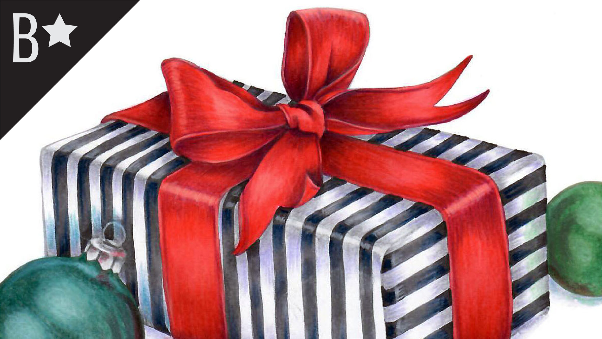
Satin Gift: a lesson on using color temperature and the chameleon nature of color to your advantage. Find more info here.

Red Bird: explores bird anatomy and the use of photo references to improve your coloring on any bird themed stamp. Includes smooth ink background method. Find more info here.
Color palettes and swatches using C5:
We are building our palette and swatch collection a little more each week and will update here as more become available.
Visit the color resource page at our sister site VanillaArts.com for a wide variety of Copic palettes and swatches.
Looking for beautiful color palettes?
We absolutely love The Color Catalog 1 & 2 from Sarah Renae Clark. It puts hundreds of Copic friendly color palettes at your fingertips.
(note: affiliate link)


B34 Manganese Blue: Copics Uncapped (Marker Swatch, Ink Testing)
B34 Manganese Blue
Let’s take a closer look at this Copic Marker and it’s ink characteristics.


B34 Manganese Blue is a green-shade blue Copic Marker reminiscent of Phthalo Blue watercolor. This beautiful marker color is useful for summer skies, denim, and blue eyes. Makes an excellent underpaint color. B34 is available only in Copic Sketch and Classic marker styles.
Every Copic Marker has unique characteristics based on its unique ink formula.
Knowing how a color behaves will help you blend effectively and make art with confidence.
B34 Manganese Blue
Let’s take a closer look at this Copic Marker and it’s ink characteristics.
Temperature: A balanced blue that looks a bit green-shade, but not much.
Resemblance: Diluted Phthalo Blue watercolor.
Actual Value: N4
All Copics are measured on a Neutral Gray value scale. The last number on the cap is supposed to indicate value but we’ve found discrepancies where the actual ink value is different than cap designation.
Cap Accuracy: The plastic on a Sketch cap is a close match to B34.
Buildup: B34 has a low level of colorant and high level of solvent in the formula. This color layers beautifully.
Shattering: No shattering.
Chromatography testing shows this ink’s behavior when it comes in contact with #0 Colorless Blender (solvent). High shattering colors may leak unexpected color when you make corrections or attempt to blend with any color that has a high solvent to colorant ratio. Shattering is not bad, it’s just something to be aware of.

Staining: B34 like most blues, is not staining color.
Lift: Very easy lifting and could be considered “erasable”.
See staining swatch. Sample was given 6 stripes of #0 Colorless Blender, drying between each stripe. Results indicate how much lifting you can expect.
Lightfast: Poor lightfastness. This color faded quickly and we suspect would disappear entirely if we extended the test time.
Samples were swatched on X-Press It Blending Card. 1 layer of ink was exposed to windowsill sunlight for 21 days. Approximately 10 hours of sun per day based on weather conditions. Note: we do not recommend displaying original Copic art under these conditions.
Natural Ink Family: B34 is a moderately diluted version of B39, a dark Prussian Blue.
Family Members: B39, B37, B34, B32
We include this information because many Copic users never think deeper than the letter groupings (R, BV, G, etc.). Every ink has its own temperature variations and underlying flavors. Understanding what an ink looks like in its different dilutions helps when creating your own blending combinations.
Complement: A medium orange. We suggest YR15
Underpaint: We suggest V25
This is simply one suggestion. Many possible colors exist. Test to find a color that pleases you.
Pushing Pencil: Prismacolor 901 Indigo Blue works beautifully over B34. It’s not a revolutionary choice but it works.
VanillaArts.com (our sister site) teaches a Push & Pull technique for dimensional coloring. This is simply one suggestion. Many possible colors exist. Test to find a color that pleases you.
Vanilla Arts Classes using B34:
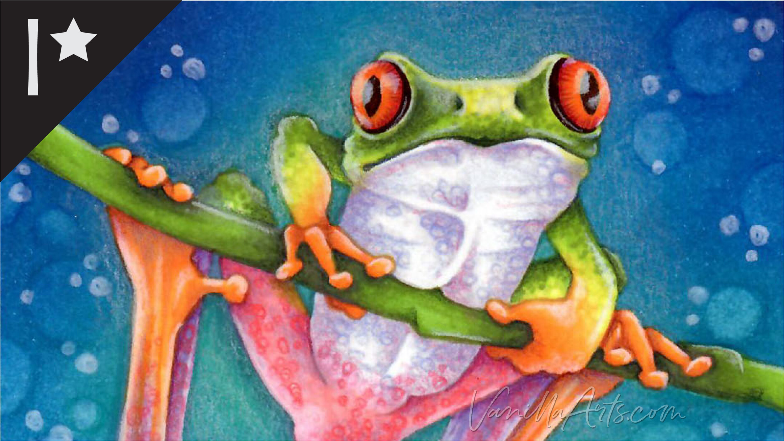
Tree Frog: Join Amy for a challenging lesson on rebel blending that blends green into yellow into violet into pink into white. Find more info here.
Vanilla Arts Digi Stamps using B34:
Snowman Supplies: an incredibly flexible stamp, perfect for birthdays, anniversaries, or any party. Find more info here.

We are building our palette and swatch collection a little more each week and will update here as more become available.
Visit the color resource page at our sister site VanillaArts.com for a wide variety of Copic palettes and swatches.
Looking for beautiful color palettes?
We absolutely love The Color Catalog 1 & 2 from Sarah Renae Clark. It puts hundreds of Copic friendly color palettes at your fingertips.
(note: affiliate link)


BG09 Blue Green: Copics Uncapped (Marker Swatch, Ink Testing)
BG09 Blue Green
Let’s take a closer look at this Copic Marker and it’s ink characteristics.
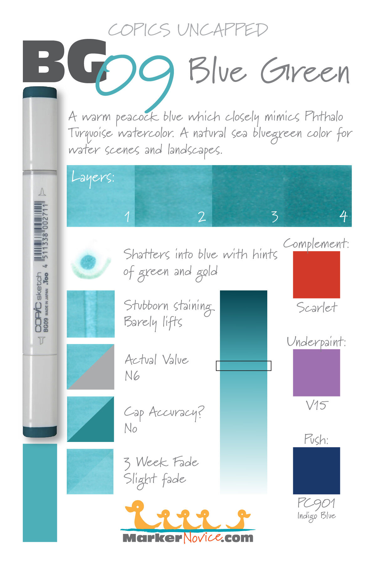

BG09 Blue Green is a warm peacock blue Copic Marker reminiscent of Phthalo Turquoise watercolor. This natural sea-blue marker color is useful for landscapes and waterscapes. BG09 is available in Copic Sketch, Ciao, and Classic marker styles.
Every Copic Marker has unique characteristics based on its unique ink formula.
Knowing how a color behaves will help you blend effectively and make art with confidence.
BG09 Blue Green
Let’s take a closer look at this Copic Marker and it’s ink characteristics.
Temperature: A warm peacock blue
Resemblance: Phthalo Turquoise watercolor.
Actual Value: N6. Please note the big discrepancy between the cap number value (9), the actual value (6) and the extremely dark cap color indicator. We are constantly fooled by this marker, selecting it for darkness, only to find it a washed out mid-value.
All Copics are measured on a Neutral Gray value scale. The last number on the cap is supposed to indicate value but we’ve found discrepancies where the actual ink value is different than cap designation.
Cap Accuracy: No. The cap is extremely misleading; several magnitudes darker than the actual ink color.
Buildup: BG09 is a mid-value marker with a generous amount of colorant in the formula. Be careful when adding anything more than 2 layers.
Shattering: Shatters into a staining turquoise plus leaking bits of green and gold.
Chromatography testing shows this ink’s behavior when it comes in contact with #0 Colorless Blender (solvent). High shattering colors may leak unexpected color when you make corrections or attempt to blend with any color that has a high solvent to colorant ratio. Shattering is not bad, it’s just something to be aware of.

Staining: BG09 is a staining color.
Lift: Stubborn. 6 applications of #0 barely budged the ink and led to an unsightly shattering at the borders of the test. Exercise extreme caution when making corrections with this color.
See staining swatch. Sample was given 6 stripes of #0 Colorless Blender, drying between each stripe. Results indicate how much lifting you can expect.
Lightfast: Slight fading. We would expect this color to be badly damaged if we extended the test time by as little as another week.
Samples were swatched on X-Press It Blending Card. 1 layer of ink was exposed to windowsill sunlight for 21 days. Approximately 10 hours of sun per day based on weather conditions. Note: we do not recommend displaying original Copic art under these conditions.
Natural Ink Family: BG09 is supposedly the darkest marker in this number family but given its low actual value, we know the mother ink is significantly darker. We wish Copic would sell this master ink color as a truly deep blue-green would be a welcome addition to every marker collection!
Family Members: BG09, BG07, BG05, BG02, BG01, BG000, BG0000
We include this information because many Copic users never think deeper than the letter groupings (R, BV, G, etc.). Every ink has its own temperature variations and underlying flavors. Understanding what an ink looks like in its different dilutions helps when creating your own blending combinations.
Complement: A traditional red like R27
Underpaint: We suggest V15 for its melting properties. It desaturates BG09 without announcing its presence as a warm color underneath blue.
This is simply one suggestion. Many possible colors exist. Test to find a color that pleases you.
Pushing Pencil: Prismacolor 901 Indigo Blue is one of our most commonly used push colors but this pencil was practically born to work with turquoise. It’s gorgeous!
VanillaArts.com (our sister site) teaches a Push & Pull technique for dimensional coloring. This is simply one suggestion. Many possible colors exist. Test to find a color that pleases you.
Vanilla Arts Classes using BG09:

Point Betsie: Amy introduces you to coloring realistic landscapes. Learn to incorporate real artistry into your coloring projects, one concept at a time. Find more info here.

Big Sable Point: A lesson on coloring realistic landscapes. Find more info here.
Vanilla Arts Digi Stamps using BG09:
We continue to create new content and stamps and we will update here as more become available.
Visit the stamp shop page at our sister site VanillaArts.com for a wide variety of Copic classes.
Color palettes and swatches using BG09:

We are building our palette and swatch collection a little more each week and will update here as more become available.
Visit the color resource page at our sister site VanillaArts.com for a wide variety of Copic palettes and swatches.
Looking for beautiful color palettes?
We absolutely love The Color Catalog 1 & 2 from Sarah Renae Clark. It puts hundreds of Copic friendly color palettes at your fingertips.
(note: affiliate link)
