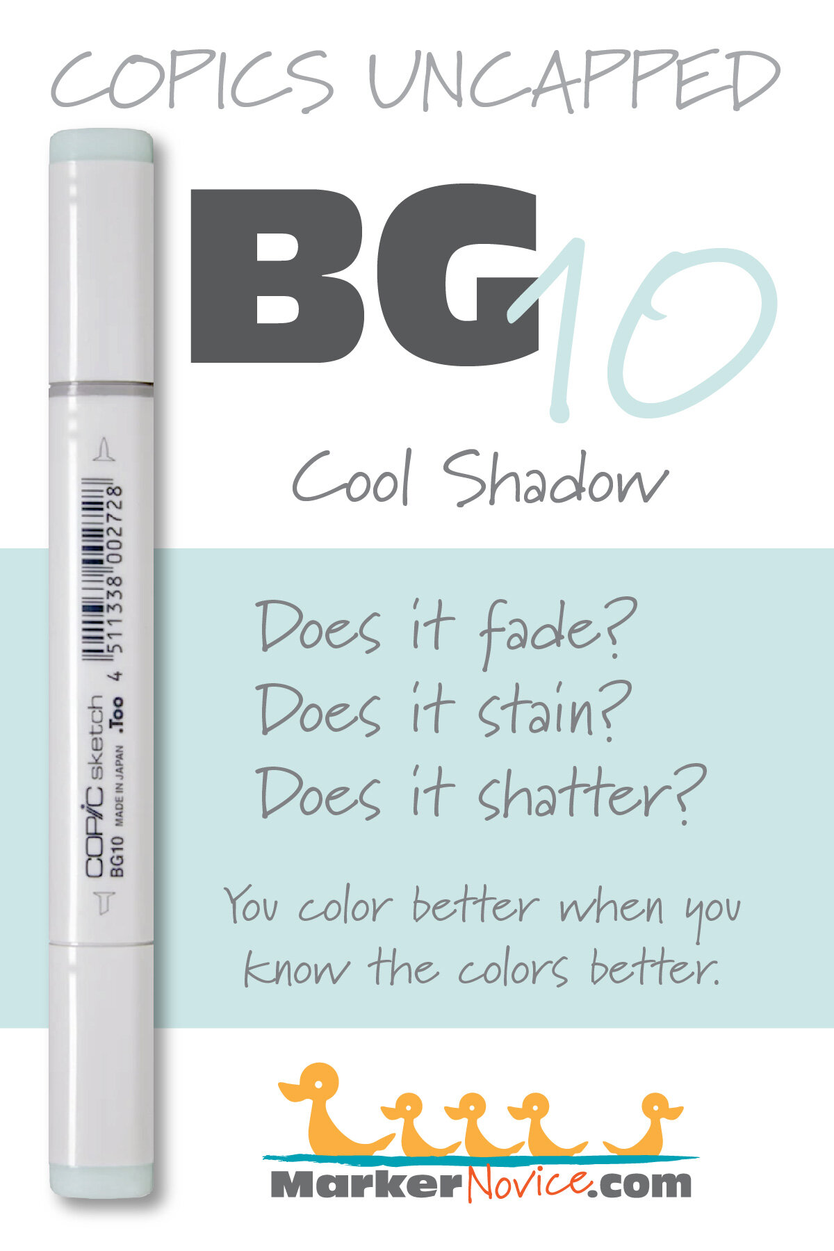
BG10 Cool Shadow is a warm, barely-there teal Copic Marker reminiscent of highly diluted Cobalt Turquoise watercolor. This pale marker color makes beautiful backgrounds and shading delicate white florals. BG10 is available in Copic Sketch, Ciao, and Classic marker styles.
Every Copic Marker has unique characteristics based on its unique ink formula.
Knowing how a color behaves will help you blend effectively and make art with confidence.
BG10 Cool Shadow
Let’s take a closer look at this Copic Marker and its ink characteristics.
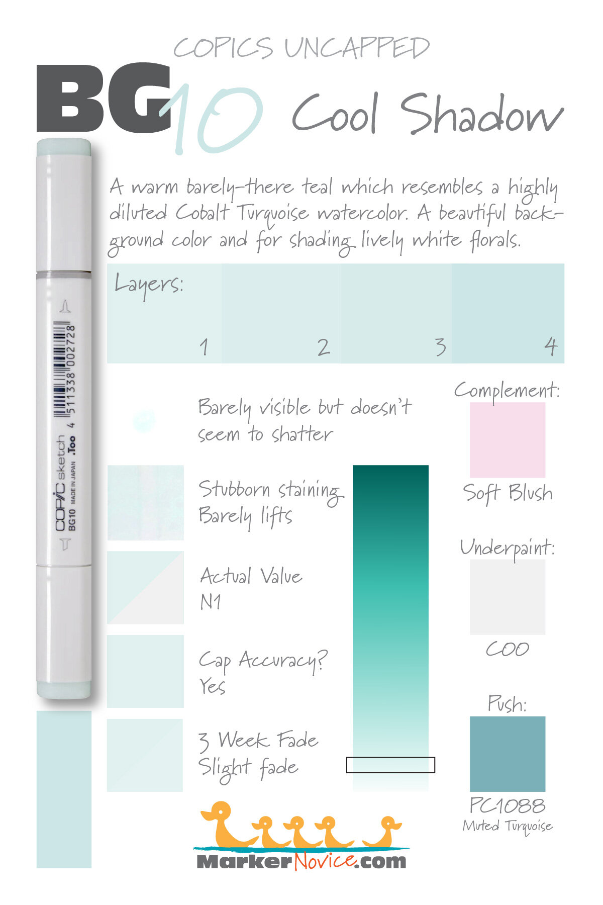
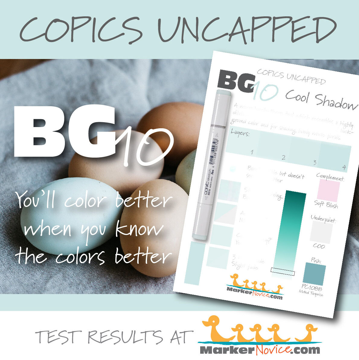
WARNING: This color falls into the non-photo blue/green family. We were unable to capture the real life look of this color in photographs or scans. The chromatography (shattering) sample above is a scan of the actual test swatch. The staining/lift sample is a photograph, darkened slightly to show the lift stripe. All other swatches above were computer generated to replicate the real life look of this difficult-to-capture color.
This should tell you something important about BG10. If you create projects with the intention of distributing them either digitally or printed, use of BG10 may be problematic.
Temperature: A barely-there warm teal
Resemblance: highly diluted Cobalt Turquoise watercolor.
Actual Value: N1
All Copics are measured on a Neutral Gray value scale. The last number on the cap is supposed to indicate value but we’ve found discrepancies where the actual ink value is different than cap designation.
Cap Accuracy: Yes. The colored plastic on the Sketch cap closely resembles this ink color.
Buildup: BG10 has almost no colorant in the formula which allows you to layer this color over itself many times without worry. But be advised, because of the high solvent content, this color can be destructive if layered over other Copic inks.
Shattering: This color is pale to begin with and dilutes even more on contact with solvent. We were unable to see any shattering… in fact, we were barely able to see the test patch.
Chromatography testing shows this ink’s behavior when it comes in contact with #0 Colorless Blender (solvent). High shattering colors may leak unexpected color when you make corrections or attempt to blend with any color that has a high solvent to colorant ratio. Shattering is not bad, it’s just something to be aware of.
Staining: BG10 does not stain.
Lift: Easy. This color can be considered “erasable”.
See staining swatch. Sample was given 6 stripes of #0 Colorless Blender, drying between each stripe. Results indicate how much lifting you can expect.
Lightfast: Slight fading. We expected this faint color to disappear during testing. To the contrary, you have to really hunt for the fade on the test swatch.
Samples were swatched on X-Press It Blending Card. 1 layer of ink was exposed to windowsill sunlight for 21 days. Approximately 10 hours of sun per day based on weather conditions. Note: we do not recommend displaying original Copic art under these conditions.
Natural Ink Family: BG10 is an extreme dilution of BG18 but we suspect the mother ink for this family is significantly darker than BG18.
Family Members: BG18, BG15, BG13, BG11, BG10
We include this information because many Copic users never think deeper than the letter groupings (R, BV, G, etc.). Every ink has its own temperature variations and underlying flavors. Understanding what an ink looks like in its different dilutions helps when creating your own blending combinations.
Complement: A pale magenta leaning red. Copic does not currently make a good complement, R00 is too warm and RV00 is too saccharine pink.
Underpaint: Honestly, this is a color we’ve never needed to underpaint because it’s so rarely used as a local color. If needed, C00 would be a good choice but always exercise caution when dealing with colors this faint.
This is simply one suggestion. Many possible colors exist. Test to find a color that pleases you.
Pushing Pencil: Prismacolor 1088 Muted Turquoise provides a nicely desaturated push for BG10. Build the pencil layer slowly via light layers rather than using pressure. This ink can be easily overwhelmed.
VanillaArts.com (our sister site) teaches a Push & Pull technique for dimensional coloring. This is simply one suggestion. Many possible colors exist. Test to find a color that pleases you.
Vanilla Arts Digi Stamps using BG10:
Strawberry Tea: looking for a larger scale image to practice color run techniques? Strawberry Tea is the perfect opportunity to use color runs on your high shine food illustrations. Use this color technique to color any berry! Find more info here.
Vanilla Stamp Shop: a wide variety of Amy Shulke’s original, hand drawn digi stamps. Found at our sister site VanillaArts.com. Visit the stamp shop here.
Color palettes and swatches using BG10:
We are building our palette and swatch collection a little more each week and will update here as more become available.
Visit the color resource page at our sister site VanillaArts.com for a wide variety of Copic palettes and swatches.
Looking for beautiful color palettes?
We absolutely love The Color Catalog 1 & 2 from Sarah Renae Clark. It puts hundreds of Copic friendly color palettes at your fingertips.
(note: affiliate link)

